Shared by Ben Shoemate
More companies are using the free-cycles of their graphic designers to create infographic advertisements. Education for you, viral marketing for them.
Archive for May, 2011
Infographic: The History of Networks (Social Studies Blog)
17
May
Three-player chess game invented
17
May

A small company has invented a round chess board and a set of rules that enables three people to play chess at once. It's 50% better. ; )
Permalink | Leave a comment  »
Giant snake flees Mississippi floods
17
May

This photo, purportedly taken near Louisiana's Morganza Spillway, is simultaneously horrifying and kind of amusing. The snake just looks so purposeful, with its head raised like that. As though it's out running some errands, or on a morning commute.
That said, I kind of hope somebody spots the pixels that prove this image is a fake. Because the idea of giant snakes hanging out alongside American highways gives my feet a terrible case of the crawling willies.
Via Michael Pata

In-flight iPhone snaps Space Shuttle launch
17
May

The picture at right isn't something you see every day, and it's something there'll only be one more chance to capture: a Space Shuttle launch photographed from an in-flight passenger jet. Stefanie Gordon shot this image of the Space Shuttle Endeavour's launch with her iPhone as her plane descended for a landing.
The shot itself is a rare enough event, but what happened next was an eye-opener for the photographer. According to Mashable, within a few hours of uploading the launch pics to Twitter from her iPhone, Stephanie was getting phone calls from ABC, CNBC and the BBC. Her follower count on Twitter went up by over 1000, and she was getting so many @mentions as a result of the pic that she had to shut them off so her iPhone's battery didn't get drained.
Other people on the plane took pics, but apparently none of them uploaded them to Twitter. The real draw of this story isn't that the photo was taken with an iPhone -- people use the device to take extraordinary pics all the time -- but the colossal and immediate response the photographer got after sharing it. This scenario shows just how interconnected everything has become today thanks to devices like the iPhone, and it's a trend that's only going to become more powerful as more people start sharing information this way.
In-flight iPhone snaps Space Shuttle launch originally appeared on TUAW on Tue, 17 May 2011 09:00:00 EST. Please see our terms for use of feeds.
Random Timelines
16
May

These random timelines from “When The What?†are great. They’re the perfect blend of pop culture and information organization. I really like the ABC TGIF schedule after the jump. It really takes me back to my childhood when we’d order Little Caesar’s pizza and crazy bread, and sit down to watch the antics of Carl Winslow and Steve Urkel.
Jay B Sauceda for PUBLIC SCHOOL, 2011. | Permalink | No footnotes
The Chart That Should Accompany Every Discussion of Deficits
11
May
All the time, and every day.
It's this one, from the Center on Budget and Policy Priorities, released yesterday (and also highlighted by Andrew Sullivan and Ezra Klein today).

Why does this chart matter? Because it makes clear, in that wonderful "worth 1,000 words" way, two realities that are fundamental to sane discussion of public finance, but that most of the public doesn't realize and that the Republican leadership is actively working to obscure. They are:
- The very large, but temporary and self-limiting, expenditures for TARP and other measures proposed by both the Bush and Obama administrations to avoid a second Great Depression, plus Obama stimulus spending. And;
- The very large, but permanent and worsening, budgetary impact of the "Bush tax cuts" -- which when first proposed back in the pre-9/11 era, were supposed to end in 2010 and were in response to what back then seemed to be the "problem" of a burgeoning surplus in federal accounts! Since "extending" those cuts just sounds like business as usual, I think it is hard for most people to envision the profound and growing effect they have. The chart above helps toward that end -- and doesn't even go into how heavily those cuts are skewed to the "haves" of society. Last year Austan Goolsbee had a marvelous chart of his own on that point.
And, as a bonus half-point, the chart clarifies that budget problems would be on the path to self-correction, if the Bush cuts had lapsed as originally planned.
So: print out this chart. Carry it around. Take it to Tea Parties and say you share their determination to get to the root of this deficit problem. Make sure people at least have to grapple with the argument it conveys. Ross Perot changed people's minds with charts 20 years ago. These things make a difference. Thanks to reader Bruce Johnson.
And here's one more for good measure, from the same CBPP source:


It's this one, from the Center on Budget and Policy Priorities, released yesterday (and also highlighted by Andrew Sullivan and Ezra Klein today).
Why does this chart matter? Because it makes clear, in that wonderful "worth 1,000 words" way, two realities that are fundamental to sane discussion of public finance, but that most of the public doesn't realize and that the Republican leadership is actively working to obscure. They are:
- The very large, but temporary and self-limiting, expenditures for TARP and other measures proposed by both the Bush and Obama administrations to avoid a second Great Depression, plus Obama stimulus spending. And;
- The very large, but permanent and worsening, budgetary impact of the "Bush tax cuts" -- which when first proposed back in the pre-9/11 era, were supposed to end in 2010 and were in response to what back then seemed to be the "problem" of a burgeoning surplus in federal accounts! Since "extending" those cuts just sounds like business as usual, I think it is hard for most people to envision the profound and growing effect they have. The chart above helps toward that end -- and doesn't even go into how heavily those cuts are skewed to the "haves" of society. Last year Austan Goolsbee had a marvelous chart of his own on that point.
And, as a bonus half-point, the chart clarifies that budget problems would be on the path to self-correction, if the Bush cuts had lapsed as originally planned.
So: print out this chart. Carry it around. Take it to Tea Parties and say you share their determination to get to the root of this deficit problem. Make sure people at least have to grapple with the argument it conveys. Ross Perot changed people's minds with charts 20 years ago. These things make a difference. Thanks to reader Bruce Johnson.
And here's one more for good measure, from the same CBPP source:
Goodbye ESX
09
May
 |
We got notice that the direct ESX download links were removed from the download page of vSphere: a strong signal from VMware for all those organizations still using the once-flagship hypervisor.
VMware stated multiple times that the future lies in ESXi (or Hypervisor, as it is now named) and tiny hypervisors with very small footprint: ESX will be shifted for ESXi-Hypervisor from the next version of vSphere.
The ESX download page is still reachable from an indirect link in the page, but this is indeed a very strong signal that everyone should start planning for its demise.
VMware is focusing more and more on the high-level centralized management offered by vCenter and the ecosystem, up to vCloud Director: the old-style ESX with its command line switches and fine grained host configuration simply doesn’t fit the new strategy.
VMware already announced shift-out plans, and the removal is a very clear statement in that direction. Quoting VMware:
VMware vSphere 4.1 is the last release to support both the ESX and ESXi hypervisor architectures.
Future vSphere releases will only support the ESXi architecture. VMware recommends:
- New deployments of vSphere 4.x are done on ESXi
- Existing ESX deployments of vSphere 4.x or older are migrated to ESXi
- Take a free new training course on ESXi essentials

Enterprises heavily relying on advanced or custom ESX-only features should start evaluating their exit/upgrade strategy from the platform, moving to the lean ESXi line and embracing the philosophy of “light†hypervisors in full.
UPDATE as the comments pointed out, VMware added a direct download option at the bottom of the page. For a quick reference on how the download page changed, compare the page as of the 5th of May – the difference is easily noticeable, with ESX being taken outside the main download tables and having one of its own.

Labels: VMware
Just How Dangerous Is Sitting All Day? [INFOGRAPHIC]
09
May


Sitting down, which most of us do for at least eight hours each day, might be the worst thing we do for our health all day.
We’ve been preaching the benefits of stand-up desks for a while around here — and no one needs this good news more than social media-obsessed web geeks. A recent medical journal study showed that people who sit for most of their day are 54% more likely to die of a heart attack.
And our readers are receptive to the idea, too. In fact, in a recent poll, three-fourths of you said you already used a stand-up desk or you’d like to try one.
So if you need more convincing, check out these graphically organized stats from Medical Billing and Coding. We like it for the information it contains, but we love it for the Saul Bass, Vertigo-esque graphics.
Click to see full-size image.

Source: medicalbillingandcoding.org
More About: health, infographic, sitting down, stand-up desks
For more Tech & Gadgets coverage:
- Follow Mashable Tech & Gadgets on Twitter
- Become a Fan on Facebook
- Subscribe to the Tech & Gadgets channel
- Download our free apps for Android, Mac, iPhone and iPad
Building Mobile Web Apps the Right Way: Tips and Techniques
09
May
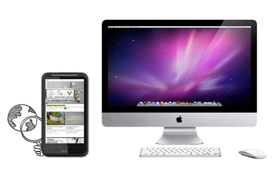
Mobile web apps are useful alternatives to native apps for mobile devices. These days, Android-based products and iOS devices like the iPhone and iPad all come packed with fantastic mobile browsers (Mobile Chrome and Mobile Safari respectively), and Opera fans can install their preferred browser, too.
From a desktop point of view, these products make browsing just about the most pleasurable experience possible. CSS3 transitions, beautifully crafted HTML5 and embellishments mean their users get the highest possible browsing experience (assuming the content being viewed has been crafted with care and consideration).
Their mobile counterparts equally do not disappoint. Fast-loading JavaScript, combined with equally impressive CSS3 and HTML rendering mean that your mobile browser can provide you with as rich an experience as a native app.
Being mobile and Web-based, there are obviously going to be performance concerns. One advantage of native over Web-based mobile apps is that you download much of the interface when you download the app originally, so you are only really loading relevant data when you use them. In addition, native apps can take advantage of the platform’s integrated development features (such as standard UIs), which can further aid performance.
Web-based mobile apps work in the same way as a website would, i.e., you load the content of a page when a user requests to view that page. We can use the browser cache to make things speedier for users with primed caches, but all graphics, images, scripts and data are loaded from your web server as opposed to being on the client’s device (in the case of most native apps).
Mobile Web App vs. Mobile Website
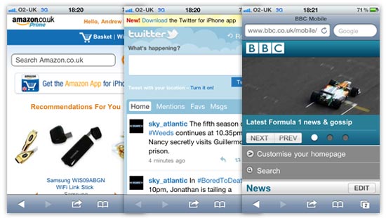
These days, more and more online products come with a mobile version, which is generally a slightly scaled-down version of a main website optimized for small screens (see Amazon, Twitter, and the BBC homepage, for example). A mobile version of a site often takes a site’s content and outputs it so the information can be consumed more easily on a mobile device.
CSS media queries and other feature-detection techniques can be used to determine certain characteristics of a device or browser viewport, which gives developers the option to use the same code to present content at its best for the situation in which it is being viewed.
Mobile web apps are similar in a certain respect, because you want the content to be enjoyed and digested as easily as possible.
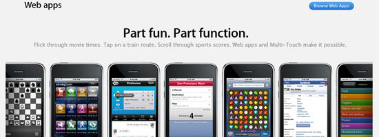
I would argue, though, that a mobile web app differs from a mobile version of a website due to it being tailor-made for the mobile platform. The UI will generally be more customized, and will include more mobile-device-centric user interfaces, as can see from the following examples.
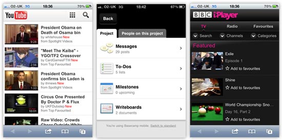
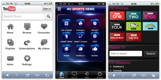
At a quick glance of the mobile web apps above, you can see how the user interfaces are more customized to suit the mobile platform. They use bigger hit areas optimized for fingertips, making them easier to use. The YouTube and iPlayer examples use more grid-based button layouts, presenting controls within the app in a similar way as native mobile apps do.
As an example, shown below, you can the similarities between the two forms of apps and their UI elements by comparing the YouTube and iPlayer web apps, and the Sky Sports News native app on the iPhone.
Mobile as a Platform
We’ve all got a mobile device these days — whether it’s a smartphone like the iPhone or a touchscreen tablet like the iPad — and most of us in the industry will use many different features of our mobile devices for various purposes.
It’s now easier for a greater proportion of people to access the Mobile Web, and that should be an important consideration when you decide to launch a product in this space.
Mobile design and data delivery differs from the traditional desktop environment; let’s talk about that next.
Desktop vs. Mobile
Here’s a quick breakdown of the big differences between desktop and mobile platforms:
- Mobile device hardware is smaller and generally tends to have lower hardware resources than desktops/laptops.
- Smaller screens bring about different design considerations and challenges.
- Touchscreen technology introduces new interaction concepts that differ from traditional input devices (keyboard and mouse).
- With a mobile device, internet connectivity is not always as reliable as a hard-wired broadband connection, which means internet connectivity is a concern and data transfer could be significantly slower.
Although these sound as if they are hurdles to get over, with careful thought and consideration, there’s no reason why they should be.
Touchscreen technology is exciting. The smaller screen design will really make you think about how to get the user to interact with your mobile web app in the most satisfying way possible.
What we should really be doing is looking at the list of differences above and seeing opportunities to deliver our content in a different way.
Building mobile web apps will be a paradigm shift from traditional web development and web design.
Mobile is the platform that people can have with them all of the time. That’s an exciting concept.
In the next sections, we will discuss development/design considerations, as well as concepts and techniques for building mobile web apps.
Keep File Sizes Small
When you don’t have sufficient WiFi coverage, data connection will usually be slower or non-existent. For any mobile product — whether it’s a native app that relies on data transfer, a mobile web app, or a mobile version of a site —  concerns regarding internet connectivity means you should try to cut down on the amount of data that your user has to download.
Quicker experiences are generally more satisfying and are therefore more usable. We can speed things up by keeping files smaller in size and reducing the number of files we serve to users.
Remember:
- Slower download speeds = longer loading times
- Smaller and fewer files = quicker loading times
It’s our responsibility to balance the above equations so that we create a beautiful-looking product that still functions responsively.
Dealing with Image Performance
We want to try to get rid of as many images as we can. For the images we keep, we want them to be as lightweight as possible.
If images are a necessity for particular parts of your mobile web app design, then there are a couple of extra steps we can use to trim off any excess fat from your files.
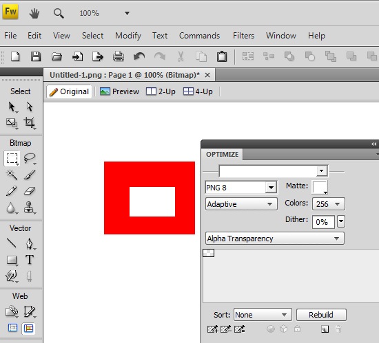
Use Adobe Fireworks for Transparent PNGs
I have to admit that I don’t really use Fireworks that much these days, as Illustrator and Photoshop more than meet my design requirements, but Fireworks does have one powerful ace up its sleeve. If you want to use PNGs with alpha transparency, then unfortunately, Photoshop will only allow you to export 24-bit PNGs (PNG-24), which are heftier than 8-bit PNGs.
Using Fireworks, we can save in 8-bit PNG, even when the image requires alpha transparency. In my experience, this can remove 20% or more off the file size with little to no loss in quality.
All you have to do is open up your 24-bit PNG, then, in the PNG compression settings panel in Fireworks, set it to 8-bit with alpha transparency, and then export. Voila, you have much smaller images to use!
Using ImageAlpha
If Fireworks sounds like too much of a bother, check out ImageAlpha. Once installed, all you need to do is drag your images into its main window and then tweak the export settings to remove excess data from the images.
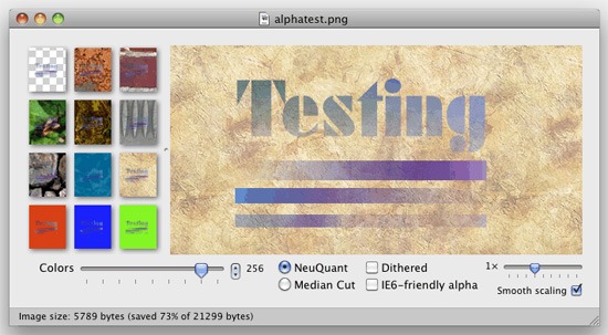
Both techniques are very quick to implement. I would recommend using them for all projects, not just for mobile devices, because they’ll speed up web page loading times for your users due to reduced file sizes.
To learn more about using PNGs in web designs, see the Web Designer’s Guide to PNG Image Format.
Leveraging CSS3
Mobile web browsers these days are pretty advanced. Android devices use a mobile version of Google Chrome, whilst the iPhone does the same with Apple’s Safari. Some mobile devices come with mobile Opera and others allow you to install a browser of your choice such as mobile Firefox. So we’re talking about some pretty good browsers in terms of CSS3 and HTML5 feature support.
CSS3 allows us to render things through code that would previously have required an image. We can use color gradients, draw rounded corners, create drop shadows, apply multiple backgrounds to HTML elements, and more — all of which can help improve performance and decrease development times.
If you look at a typical application interface via your smartphone, it’s almost guaranteed that you’ll find CSS3 being used.
By using CSS3, we can reduce data transfer — particularly images and possibly excess HTML markup. We let the browser and the device do the work to render the interface more quickly.
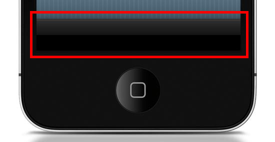
Want the Apple-esque toolbar highlighted above? All you need is the following style rule (which uses CSS3) rather than creating and loading a CSS background image (which is how we’d traditionally do this with CSS2).
.toolbar {
  width: 100%;
  height: 44px;
  background-color: #000000;
  border-top: 1px solid #4B4B4B;
  background-image: -moz-linear-gradient(top, #2F2F2F, #151515 50%, #000000 51%, #000000);
  background-image: -o-linear-gradient(top, #2F2F2F, #151515 50%, #000000 51%, #000000);
  background-image: -WebKit-gradient(linear, 0% 0%, 0% 100%, from(#2F2F2F), color-stop(50%, #151515), color-stop(51%, #000000), to(#000000));
  background-image: linear-gradient(top, #2F2F2F, #151515 50%, #000000 51%, #000000);
}
Here’s what it looks like when applied to a div element viewed in Safari (desktop):
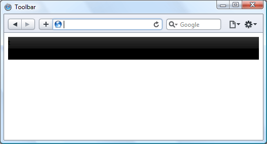
Now, instead of an image that won’t scale well — i.e., if the toolbar’s height needs to be increased, a CSS background image will not scale with it — we have a device-rendered HTML element with a gradient that will scale and adapt nicely for different device orientations and sizes.
It’s true that older browsers such as IE on a Windows Mobile device won’t necessarily render the gradient, but we can circumvent that problem by using the background-color within the same CSS rule as a fallback mechanism. This means all browsers capable of the gradient will show the gradient, but those that can’t will show the solid color instead (which we set to black, #000000).
All users still get to enjoy your mobile web app interface, but older devices just have the extra layer of gloss removed. This technique is called progressive enhancement.
HTML Canvas
If you fancy a little more work, then you can improve speed even further using the canvas element. Although using CSS gradients eradicates the loading of a physical image, that method still causes the device’s rendering engine to construct an image in the browser, which can result in a performance reduction depending on the device and browser.
By using the canvas element and some JavaScript, we can get the browser to draw the gradient without rendering it like an image. This technique can possibly be speedier on certain browsers, even if we need to use JavaScript. At the very least, using canvas is another tool you can use for drawing if it can’t be done in CSS3 or if you find that it’s a better option for performance.
To create the same toolbar above, first we need to create a canvas element in the HTML document like so:
<canvas id="toolbar"></canvas>
Then, with JavaScript, we can use the following script to produce the desired gradient on the canvas:
var canvas = document.getElementById("toolbar");
var context = canvas.getContext("2d");
var gradient = context.createLinearGradient(0, 0, 0, 44);
gradient.addColorStop(0,'#2F2F2F');
gradient.addColorStop(0.5,'#151515');
gradient.addColorStop(0.51,'#000000');
gradient.addColorStop(1,'#000000');
context.fillStyle = gradient;
context.fillRect(0, 0, 300, 44);
This is what the above code looks like:

Hardware Acceleration
When it comes to mobile web apps, Apple’s mobile devices are a major consideration that we need to be aware of because of the current popularity of the iPhone and iPad. Safari 5 (on all platforms) brings hardware acceleration into the mix. If you’re not familiar with the feature, Apple describes it as follows:
"Safari supports hardware acceleration on Mac and PC. With hardware acceleration, Safari can tap into graphics processing units to display computing-intensive graphics and animations, so standards like HTML5 and CSS3 can deliver rich, interactive media smoothly in the browser."
Essentially this means that Safari can use extra hardware device capabilities to enhance the rendering of graphics and transitions, which in turn promises faster user interface performance.

Other browsers have added support for hardware acceleration, too — including Firefox 4, Chrome 10 and Opera 11 — so hopefully we’ll see them integrated into their mobile versions soon, providing silky smooth transitions and lightning quick graphics-rendering for all of us.
Be Cautious of CSS3 Rendering Performance
As brilliant as CSS3 is, certain properties can slow down a web page. WebKit-based browsers, for instance, really seem to struggle with shadows in particular, so just be careful that you don’t apply too many of these to elements of your interface until the issue has been resolved.
As another example, the opacity property can also cause problems with Safari’s hardware-accelerated rendering, so it’s probably worth avoiding over-use of this.
One workaround to the opacity property performance issue is the ability to use RGBa value notation to declare CSS color properties in modern browsers; the significant factor of this being that the a in RGBa stands for alpha. By declaring a color using RGB values, then appending one more value, we can have full control of the transparency of an element without having to use the opacity CSS property.
Instead of:
.myElement {
  background-color: #000000;
  opacity: 0.75;
}
We could use:
.myElement {
  background-color: rgba(0, 0, 0, 0.75);
}
We can achieve the same results for our HTML element by using RGBa values, so when you want to add any transparency to HTML elements, make sure you’re using the most suitable method.
Consider the Offline User Experience
Finally, let’s briefly discuss HTML5 offline data storage.

Making use of local data storage means that once our data has been downloaded to the device, we can use a manifest file which allows us to cache certain files locally. What this means is that when users have no connection, we can continue saving data client-side.
Offline storage opens up a lot of opportunities. For instance, we can now try to maintain the user’s experience even when internet connectivity drops rather than having to defend against the issues posed by the possibility of internet interruptions.
We’re not going to be able to allow data downloads from our server when there’s no connection, but at least we can provide the opportunity to store options and user-decisions on the client’s side, which we can then synchronize back to the server once the internet connection is restored.
Conclusion
Hopefully this article has shown you some best practices, tips, and techniques you can use to design and build quick-loading and beautiful user interfaces for your mobile web products. If you were on the fence, I also hope that this encourages you to get started with mobile web app development.
Some people might think that mobile web apps are not as sexy as fully-fledged native apps for iOS or Android. However, the biggest advantage of mobile web apps is that we are able to build them to be platform-independent — we can maintain independence from devices and operating systems. We can make web apps without the need for extra developer toolkits and platform-specific SDKs, and thus we can still use our everyday development tools.
Further Reading
- Developing Web Apps in 2011
- How to Make an HTML5 iPhone App
- 10 Excellent Tools for Testing Your Site on Mobile Devices
- Mobile Web Design: Is It Worth It?
- Mobile Web Design: Best Practices
Related Content
- Designing Web Apps for the iPad
- Five Things That Will Keep Shaping The Web in 2011
- Situational Design for the Web
- Related categories: Web Development and User Interface
About the Author
 Andrew Devlin is a lead designer with years of experience in the industry. He specializes in multiplatform front-end design and development. Currently working at Clock, a London-based digital agency, he enjoys focusing on the user’s experience with all things digital. See what he has to say on Twitter @toomanydevs and look him up on LinkedIn.
Re: Aether Displacement
08
May
'Frictionless supersolid a step closer'
[link]
"Superfluidity and superconductivity cause particles to move without
friction. Koos Gubbels investigated under what conditions such
particles keep moving endlessly without losing energy, like a swimmer
who takes one mighty stroke and then keeps gliding forever along the
[link]
"Superfluidity and superconductivity cause particles to move without
friction. Koos Gubbels investigated under what conditions such
particles keep moving endlessly without losing energy, like a swimmer
who takes one mighty stroke and then keeps gliding forever along the