
You can never have too much of a good thing–and two good things we rely on in our work are tips and tricks. Nuggets of information, presented clearly and succinctly, help us build solutions and learn best practices. In a previous article, we shared a jam-packed list of 250 quick web design tips. It seems only right to continue the trend by showcasing 100 fresh–and hopefully useful–CSS tips and tricks.
General
Not everything in this list was easy to categorize. All of the tips that are relevant and worthy of mention but don’t cleanly fit into a category are listed in this section.
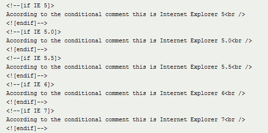 Conditional comments have been a godsend for resolving Internet Explorer inconsistencies.
1 It’s critical when working with CSS to be aware of the various properties at your disposal and how to use them correctly.
2 Using a good editor can increase productivity. Syntax highlighting and auto-complete functionality (plus validation and code references) make life easy. Check out Notepad++, Coda, and don’t discount Dreamweaver CS’s code view until you try it.
3 In many ways, experimentation is the mother of innovation. Give yourself time to play; trial and error will help you learn and memorize techniques quickly. Check out these CSS3 experiments, for inspiration: How to Create Inset Typography with CSS3, Semantic CSS3 Lightboxes, and 10 Interesting CSS3 Experiments and Demos.
4 Enable Gzip compression server-side whenever possible; it shrinks the size of files such as CSS and JavaScript without removing any of the content.
5 Caching will conserve bandwidth for visitors and account for much faster speeds. Take advantage of it whenever you can. Learn about optimizing browser caching.
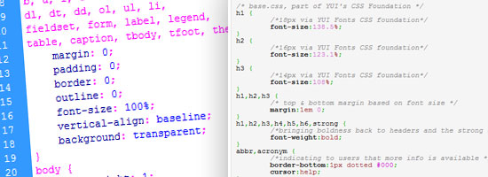
6 Whitespace is important for CSS readability. Using whitespace to format your stylesheet adds bytes to the file size, but it’s made up for in increased readability.
7 Avoid using inline code (in either elements using the style attribute or in the HTML document within <style> tags), and put them instead in your external stylesheets. It’ll be easier to maintain and also takes advantage of browser caching.
8 Whatever method you use to lay code out, be consistent. You’ll avoid potential problems such as misinterpretation.
9 Conditional comments can help you target versions of Internet Explorer for style. Filtering vendor-specific code isn’t ideal, and comments are safer than ugly hacks.
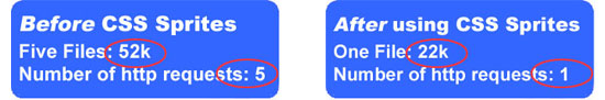
10 This tip is slightly controversial, but I recommend using a single stylesheet rather than multiple ones. It reduces the number of HTTP requests and improves maintainability, giving your site a performance gain. This is a tip supported by Google Page Speed guidelines.
11 When there are conflicting style rules, style rules that are later down the stylesheet supersedes the ones that come before it. Thus, put mission-critical declarations at the end, where they won’t be in danger of being overridden by other styles.
12 If you encounter a bug and can’t determine its cause, disable CSS (using something like Firebug or the Web Developer add-on) or simply comment out all of the styles, and then bring selectors back one by one until the fault is replicated (and thus identified).
13 Make sure your code works in various browsers. Check it against the latest versions of the top five: Internet Explorer, Firefox, Chrome, Safari and Opera.
14 Additionally, ensure that your code will degrade gracefully when CSS is disabled in the user’s browser. To test this, either turn styles off in every browser or use a text browser such as Lynx.
15 Ensuring that your code degrades gracefully is obviously important, but many people forget that some visitors will have a dodgy browser or have styles turned off, so check that your fallbacks work.
16 Every browser has a built-in debugger. In IE and Firefox you can get to the inspector by hitting F12; for Chrome, Safari and Opera, press Ctrl + Shift + I.
17 Browser emulators can’t replace the real thing, so use a real or virtualized edition of a browser or device.
18 Did you know that PHP code can create dynamic CSS files? Here’s a tutorial on that. Just give the file a .php extension and ensure that the file declares the document header with a text/css content type.
19 Naming CSS files can be tricky. One of the best ways to approach the task is to keep file names short and descriptive, like screen.css, styles.css or print.css.
20 Any code or process you create is valuable, and recycling what you’ve produced for other projects is not a bad thing: pre-existing code is a great timesaver, and this is how JavaScript and CSS frameworks are born.
21 While comments in CSS files can assist other people who read or maintain them, avoid writing comments unless they are required. Comments consume bandwidth. Write CSS in a self-explanatory manner by organizing them intuitively and using good naming conventions.
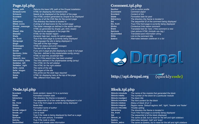
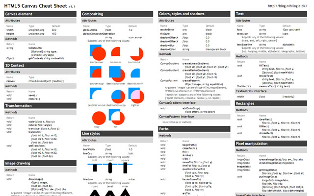
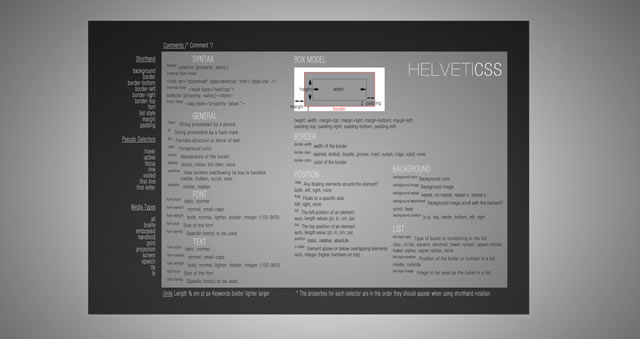
22 If you’re struggling to remember what’s available in CSS (or even CSS3), get some cheat sheets. They’re simple and can help you get used to the syntax. Here are some excellent CSS cheat sheets: CSS Cheat Sheet (Added Bytes), CSS Shorthand Cheat Sheet (Michael Leigeber), CSS 2.1 and CSS 3 Help Cheat Sheets (PDF) (Smashing Magazine).
23 Bad code breaks more websites than anything else. Validate your code by using the free, web-based W3C CSS Validation Service to reduce potential faults.
24 Vendor-specific CSS won’t validate under the current W3C specifications (CSS2.1), but could give your design some useful enhancements. Plus, if you’d like to use some CSS3 for progressive enhancement, there’s no way around using them in some instances. For example, the -webkit-transform and -moz-transform property was used to progressively enhance these CSS3-animated cards for users using Safari, Chrome, and Mozilla Firefox.
25 Keep multiple CSS files in a single directory, with an intuitive name such as css/. If your website has hundreds of pages, maintainability and information architecture are vital.
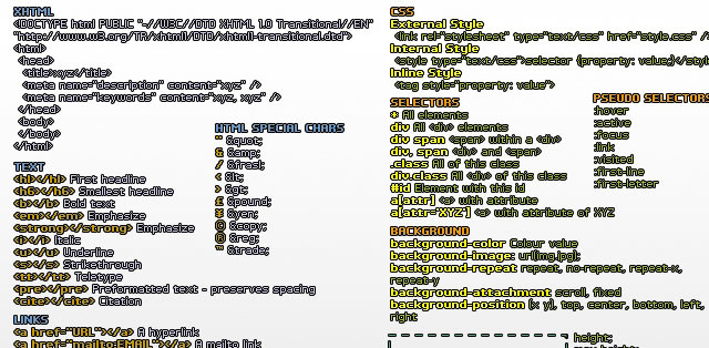
At-rules, Selectors, Pseudo-classes, and Pseudo-elements
Targeting your code for styling is one of the primary functions of CSS. Whether you’re trying to make your code mobile-friendly, printer-friendly or just good old screen-friendly, you’ll be following certain conventions. Ensuring that styles aren’t in conflict, using CSS inheritance correctly and triggering actions in response to events (such as hovering) are all part of the CSS package. This section is dedicated to useful tips related to conventions.
 With CSS3 media queries, designing for non-standard experiences has become easier.
26 Be careful when using the media attribute in your HTML declaration for an external CSS file. You might be unable to use media queries to better provide pre-cached alternative visuals.
27 If you find elements that use the same properties and values, group them together by using a comma (,) to separate each selector. This will save you from repetition.
For example, if you have the following:
h1 { color:#000; }
h2 { color:#000; }
Combine them as such:
h1, h2 { color:#000; }
28 Printer-friendly stylesheets are very important if you want to save your visitors’ ink and paper. Use the @media print at-rule, and remove anything that isn’t necessary on the printed page.
29 Accessibility also has to do with how the written word is spoken. The aural (now deprecated in CSS) and speech media queries can improve usability for screen readers.
30 Unfortunately, the handheld media query in CSS isn’t widely supported. If you want your website to work on mobile devices, don’t depend on it to serve the correct visuals to mobile devices.
31 Take the time to eliminate duplicate references and conflicts in your CSS. It will take some time, but you’ll get a more streamlined render and fewer bytes in your files.
32 When working with mouse hover events, deal with the (1) :link pseudo-class, then (2) :visited, then (3) :hover and finally (4) :active — in that order. This is necessary because of the cascade.
33 Making a website work well on Apple iOS devices is straightforward: to scale your design, just use CSS3 media queries with the appropriate min-width and max-width values. Here’s a tutorial for that.
34 Make the most of CSS inheritance by applying required styles to parent elements before applying them to the children. You could hit several birds with one stone.
35 You can apply multiple classes to an element with space separation, which is great if you want to share properties with numerous elements without overwriting other styles.
36 If you don’t want to deal with IE6’s conditional comment quirks–they require a separate CSS file–then you can use the star hack (* html) selector, which is clean and validates.
37 HTML tooltips are fine for plain text, but the :hover pseudo-class for CSS tooltips gives you more options for showing styled content. Check out this tutorial on how to create CSS-only tooltips.
38 Using attribute selectors, you can add icons or unique styles depending on the file type you link to in an anchor. Here’s an example with which you can add style to a PDF link: a[href$='.pdf].
39 You can also use attribute selectors to target a specific pseudo-protocol such as mailto or skype: [href^="skype:"].
40 Rendering CSS takes time, and listing selectors adds bytes. Reduce the workload of a renderer by using only the selectors you require (an id is better than many child references).
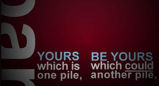
41 Not everyone will agree with this, but I recommend writing every "custom" selector down as a class (before making it an id) to help eliminate duplicate entries.
42 When structuring your CSS file by selectors, the convention is to list elements, then classes (for common components) and finally any ids (for specific, unique styles).
43 Naming conventions for selectors are important. Never use names that describe physical attributes (such as redLink), because changing the value later could render the name inappropriate.
44 Case sensitivity relates to naming conventions. Some people use dashes (e.g. content-wrapper) or underscores (i.e. content_wrapper), but I highly recommend using camel case (e.g. contentWrapper) for simplicity.
45 The universal selector (*) is used widely in CSS reset mechanisms to apply specific properties to everything. Avoid it if you can; it increases the rendering load.
46 With CSS3 media queries, you can easily target the orientation of a viewport with portrait or landscape mode. This way, handheld devices make the most of their display area.
47 Apple’s devices are unique in that they support a <meta name="viewport"> tag, which has stylistic value attached to it. You can use this to force the screen to zoom at a fixed rate of 100%.
48 The two CSS3 pseudo-elements, :target and :checked have great potential. They apply their designated style only to certain events and can be useful as hover event alternatives.
49 Embedding content in CSS is a unique way to give anchor links some description in printer-friendly stylesheets. Try them with the ::before or ::after pseudo-elements.
50 IDs can serve a dual purpose in CSS. They can be used to apply styling to a single element and to act as an anchoring fragment identifier to a particular point on the page.
Layout and the Box Model
When we’re not selecting elements for styling, we spend a lot of time figuring out how things should appear on the page. CSS resets and frameworks help us with consistency, but we should know how to correctly apply styles such as positioning and spacing. This cluster of useful tips relates to the aspects of CSS that fundamentally affect how the components of a website appear and are positioned.
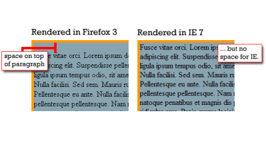
 Positioning plays a critical role in the readability of information and should not be ignored.
51 Many designs are focused on grids and the rectangular regions of the viewport. Instead, create the illusion of breaking out of the box for added effect.
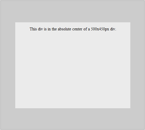
52 If margin: auto; on the left and right sides isn’t getting you the central point you desire, try using left: 50%; position: absolute; and a negative margin half the width of the item.
53 Remember that the width of an item constitutes the specified width as well as the border width and any padding and margins. It’s basically a counting game!
54 Another controversial tip here: don’t use CSS resets. They are generally not needed if you take the time to code well.
55 A CSS framework such as Blueprint or YUI Grids CSS might assist you speed up development time. It’s a bit of extra code for the user to download, but it can save you time.
56 Remember that Internet Explorer 6 does not support fixed positioning. If you want a menu (or something else) to be sticky, it’ll require some hacks or hasLayout trickery.
57 Whitespace in web designs is amazing; don’t forget it. Use margins and padding to give your layout and its content some breathing room. You’ll create a better user experience.
58 If one thing overcomplicates the task of scaling a design the way you want, it’s using inconsistent measurements. Standardize the way you style.
59 Different browsers have different implementations; visually impaired users may want to zoom in, for example. Give your layout a quick zoom-test in web browsers to ensure the style doesn’t break!
60 Most browsers can use box-shadow without extra HTML. IE can do the same with filter: progid:DXImageTransform.Microsoft.Shadow(color='#CCCCCC', Direction=135, Strength=5);
61 Rounded corners aren’t as difficult to make as they used to be. CSS3 lets you use the border-radius property to declare the curvature of each corner without surplus mark-up and the use of images.
62 One disadvantage of liquid layouts is that viewing on a large screen makes content spill across the viewport. Retain your desired layout and its limits by using min-width and max-width.
63 WebKit animations and transitions might work only in Safari and Chrome, but they do add a few extra unique, graceful flourishes worthy of inclusion in interactive content.
64 If you want to layer certain elements over one another, use the z-index property; the index you assign will pull an element to the front or push it behind an item with a higher value.
65 Viewport sizes aren’t a matter of resolution. Your visitors may have any number of toolbars, sidebars or window sizes (e.g. they don’t use their browsers maximized) that alter the amount of available space.
66 Removing clutter from an interface using display:none might seem like a good idea, but screen-reader users won’t be able to read the content at all.
67 Be careful with the overflow CSS property when catering to touch-screen mobile devices. The iPhone, for example, requires two fingers (not one) to scroll an overflowed region, which can be tricky.
68 Have you ever come across CSS expressions? They were Microsoft’s proprietary method of inserting DOM scripts into CSS. Don’t bother with them now; they’re totally deprecated.
69 While the CSS cursor property can be useful in certain circumstances, don’t manipulate it in such a way as to make finding the cursor on the screen more difficult.
70 Horizontal scrolling might seem like a unique way to position and style content, but most people aren’t used to it. Decide carefully when such conventions should be used.
71 Until Internet Explorer 9 is final, CSS3 will have some critical compatibility issues. Don’t rely too heavily on it for stable layouts. Use progressive enhancement concepts.
72 CSS makes it possible to provide information on demand. If you can give people information in small chunks, they’ll be more likely to read it.
73 When showcasing a menu in CSS, be consistent in implementation. People want to know about the relationship between objects, and it’s important to avoid dissonance.
74 CSS isn’t a solution to all of your layout woes–it’s a tool to aid your visual journey. Whatever you produce should be usable and logically designed for users (not search engines).
75 Once your layout is marked up with CSS, get feedback on how usable it really is; ask friends, family, co-workers, visitors or strangers for their opinions.
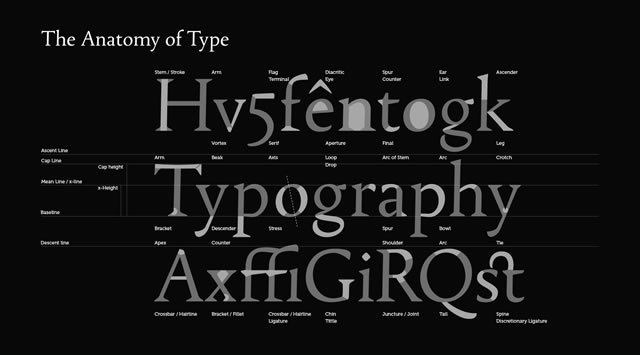
Typography and Color
If one thing deserves its own set of tips, it’s the complex matter of adding typography, color and imagery to CSS. We want readable content and we want it in a consistent layout. In this section, we’ll learn to take advantage of typography and color, which are powerful conventions in design. I’ll talk about "web-safe" and share tips relating to the latest craze of embedding fonts.
 "Web-safe" concepts have changed over time and could soon become a non-issue.
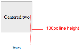
76 Squeezing content too close together can decrease overall readability. Use the line-height property to space lines of text appropriately.
77 Be cautious about letter-spacing: too much space and words will become illegible, too little and the letters will overlap.
78 Unless you have good reason, don’t uppercase (i.e. text-transform:uppercase; ) long passages of text (e.g. HEY GUYS AND GALS WHAT’S UP?). People hate reading what comes off as shouting.
79 Accessible websites have good contrasting colors. Tools exist to measure foreground colors against background colors and give you a contrast ratio. Check out this list of tools for checking your design’s colors. Be sure your text is legible.
80 Remember that default styles might differ greatly from browser to browser. If you want stylistic flourish, reinforce the behavior in the stylesheet.
81 In the old days, the number of colors that a screen could display was rather limited. Some people still use old monitors, but the need for web-safe colors has drastically reduced.
82 Building a font stack is essential when making a design degrade gracefully. Make sure that fallback typefaces exist in case the one you request isn’t available.
83 With Vista, Windows 7 and MS Office 07–10 (and their free viewers), a number of cool new web-safe fonts have become available, such as Candara, Calibri and Constantina. Read about Windows fonts.
84 Plenty of smartphone apps can boost your ability to build a stylesheet, but Typefaces for the iPhone and other iOS4 devices is particularly useful because it shows you every font installed.
85 Web-safe fonts are no guarantee; people could quite possibly uninstall a font even as ubiquitous as Arial (or Comic Sans!). Then their browsers wouldn’t be able to render it.
86 Avoid underlining content with the text-decoration property unless it’s a real link. People associate underlined text with hyperlinks, and an underlined word could give the impression that a link is broken.
87 Avoid the temptation to use symbolic typefaces like Wingdings or Webdings in the layout. It might save KBs on imagery, but it’ll serve nonsensical letters to screen-reader users.
88 Remember that @font-face has different file format requirements depending on which browser the user is on, such as EOT, WOFF, TTF and OTF (as you would find on a PC). Serve the appropriate format to each browser.
89 The outline property is seriously underused as an aid to web accessibility. Rather than leaving it set to the default value, use border styles to enhance an active event’s visibility.
90 Smartphones do not have the same level of core support for web typography that desktop browsers do, which means fewer web-safe fonts and no conventional @font-face embedding.
91 Cross-browser opacity that degrades gracefully can be applied using the -ms-, -moz-, -khtml- vendor prefixes and the filter: alpha(opacity=75); property for Internet Explorer.
92 You can make background-image bullets by using list-style-type:none;, adding a padding-left indent and positioning the background-image to the left (with the required pixel offset).
93 Helping users identify an input box is easy; just add a background image of the name (like "Search" or "Password") and set it so that the image disappears when the box is clicked on by using the :focus pseudo-class and then setting the background property to none.
94 Large and visible click regions enhance the usefulness and usability of anchor links, which in turn guide people among pages. Be attentive when you style these.
95 Remember that background images do not replace textual content. If a negative indent is applied, for example, and images are disabled, then the title will be invisible.
96 Navigation items need to be labeled appropriately. If you use a call-to-action button or an image-based toolbar, make sure a textual description is available for screen readers.
97 If the idea of applying opacity with a bunch of proprietary elements doesn’t appeal to you, try RGBA transparency (in CSS3) instead of background-color: rgba(0,0,0,0.5);.
98 If your visitors use IE6, avoid using px as the unit of measurement for text. IE6 users have no zoom functionality; they rely on text resizing, which doesn’t work with px. Use a relative unit instead, such as em.
99 Providing alternative stylesheets for supported browsers such as Firefox and Opera can enhance readability, as in the case of high-contrast alternatives.
100 If you find choosing colors difficult, web-based tools like Adobe Kuler, desktop tools like ColorSchemer Studio and mobile apps like Palettes Pro might help.
Style Can Be Stylish!
CSS has come a long way in recent years. With browser makers implementing the CSS3 specification even before it’s finalized, adding unique proprietary styles (such as WebKit transformations) to the mix and increasingly supporting web standards, there has never been a better time to be a web designer. In the past, we could only hope that our styles would be correctly applied, but it seems that desktop and mobile platforms are improving like never before.
 Web designs have come a long way since the ’90s, and that’s a good thing.
Implementing CSS can be frustrating, what with ongoing web-browser issues, but it’s still one of the most fun web languages you can engage with. Rather than laying out the structure of objects or fiddling with complex mechanisms, you can dictate how content should appear. It’s like being given a blank piece of paper and a pack of crayons. And designers are experimenting with the available styles to create beautiful experiences for audiences.
Consider the implications of every property and style you declare. CSS can turn the simplest or most minimalist layout into a complex structure of interactivity that would terrify all but the most dedicated individuals. As the capabilities and options in CSS grow and devices are updated to support them, a new wave of unique layouts will appear. Hopefully a number of them will be yours.
Related Content
- 10 Random CSS Tricks You Might Want to Know About
- 12 Common CSS Mistakes Web Developers Make
- 3 Advanced CSS3 Techniques You Should Learn
- Related categories: CSS and Web Design
 Alexander Dawson is a freelance web designer, author and recreational software developer specializing in web standards, accessibility and UX design. As well as running a business called HiTechy and writing, he spends time on Twitter, SitePoint’s forums and other places, helping those in need.
 Michael Tuck is an educator, writer, and freelance web designer. He serves as an advisor to the


 Catalin Rosu, a.k.a. Red, is a web designer and developer with over 5 years experience in the industry. You can find articles or tutorials on CSS tips and tricks by visiting his blog at
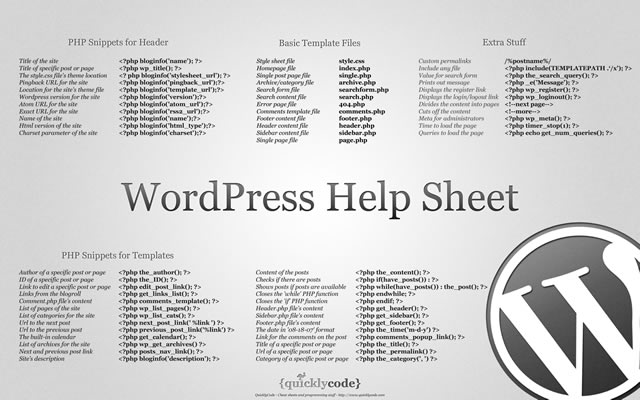


 Peter Richards is a SEO engineer based near Brighton in the UK. He has also spent time as web designer and front-end developer (HTML, CSS, JavaScript). If you wish to connect with him, you can follow Peter on Twitter as @