RSS
 

Posts Tagged ‘Design Showcase / Inspiration’

30 Strikingly Vibrant Web Designs for Inspiration

09 Sep

Advertise here with BSA


30 Strikingly Vibrant Web Designs for Inspiration

Working with bright, high-impact colors in your designs can prove to be a powerful tool in your creative arsenal. Bright colors are able to grab attention and they make a design appear fun, youthful, cheery and modern. Because using loud, bold colors in a design can go from these positive themes to as though a child went a little bit wild with crayons, check out this collection of beautifully vibrant web designs for inspiration.

POPA

Ryan Keiser

Tim Biskup

Sunday Best

Girl Effect

Bit This!

Solo

Tease

Netlife Research

Carsonified

vijufest.ru

Jacob Lee

Daniel Martín

OrangeSprocket

Bzzy App

RUhotEnuf?

Carbonmade

Alfred App

Rice Bowls

Love of My Life

McFarlane

Bestwork

Tori’s Eye

Republic2

Analogue

AZTROLAB

89Bytes

Trent Walton

Denny’s

feels.tv

If you liked this showcase, please also see the following posts:

Related Content

About the Author

Jacob Gube is the Founder and Chief Editor of Six Revisions. He’s also a web developer/designer who specializes in front-end development (JavaScript, HTML, CSS) and also a book author. If you’d like to connect with him, head on over to the contact page and follow him on Twitter: @sixrevisions.


30 Inspiring “About Me” Pages

25 May

Advertise here with BSA


"About me" pages have the ability to engage and inform your site visitors in a personal and friendly way. For web professionals, our "About me" page can be critical in establishing a true connection with potential clients, and it can set us apart from a sea of other designers and developers.

For different types of websites, keep in mind that the About page could be structured differently. For example, an About page for a blog or news site can be vastly different when compared to the same page for a portfolio website.

In this collection, I’ve rounded up 30 excellent "About me" pages from the web portfolios of amazing designers, artists, illustrators, and developers. Enjoy!

Toby Powell

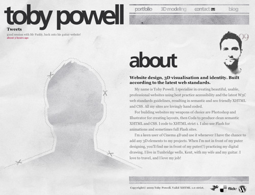
An interesting use of a cutout/silhouette sets this designer’s About page out from the crowd. A halftone self-portrait and a concise biography of the site owner rounds out this web page’s design.

Guomundur

Most designers use a professional headshot photo of themselves on their About pages, but this designer from Sweden presents an interesting and unique perspective with his overhead shot. Bold typography draws you in to create added visual interest.

Guomundur

Dan Joe Design

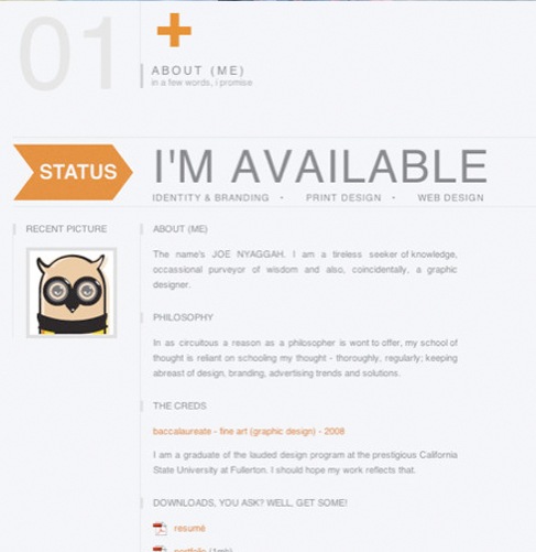
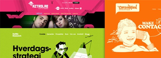
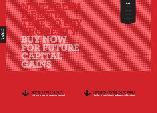
The designer used a grid layout in the layout of his About page. Contemporary colors inform you of the designer’s style, while a status message of his availability to take on new projects makes it clear to prospective clients whether he’s available or not.

Dan Joe Design

Tim Van Damme

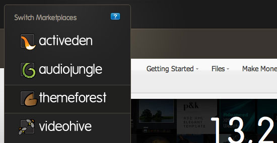
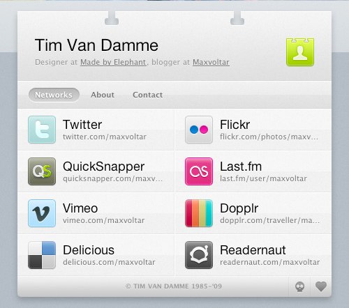
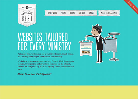
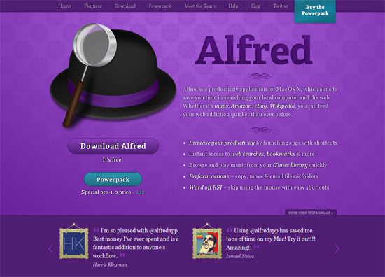
A unique and effective way of organizing your personal information on the web is to create an online business card (vCard). In doing so, we learn who the designer is, other places to connect with him, and how to get in touch with him.

Tim Van Damme

James A. Reeves

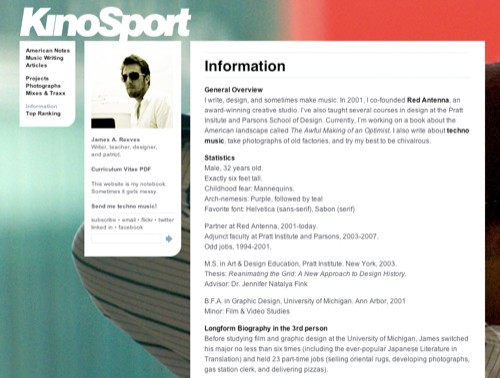
The About page for James A. Reeves is simple and modular, allowing for the large-scale photography in the background.

James A. Reeves

Janis

The artistic design of Janis’s website is very captivating. It gives you a glimpse into the designer’s personal aesthetic style, while supplying the information you need to hire him for your next project. The use of large photography can leave a lasting impression on the visitor if done effectively, as shown in this About page.

Janis

Dan

Here’s another example where the designer used a self-portrait in a unique and engaging way. Including a large self-portrait on your site gives a potential client a real person to relate with.

Dan

Jared Christensen

Jared Christensen used a humorous, catchy self-portrait on his About page to not only allude to his sense of humor, but also allow the client to see his creative side a little more personally.

Jared Christensen

Jason Reed

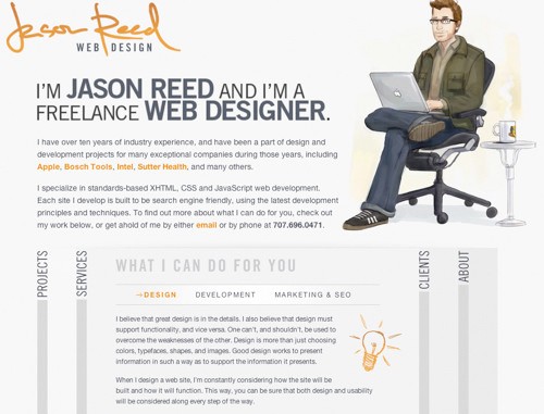
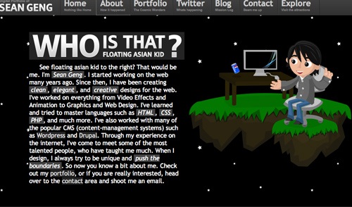
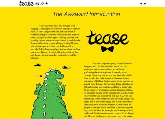
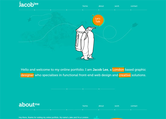
Jason Reed uses a nice illustration of himself in his About page. The use of an illustration is another way to grab the visitor’s attention and add a more character to your About page.

Jason Reed

Soh Tanaka

This designer organized his credentials in an easily digestible format. Large photography offsets the information and gives you an idea of the site owner’s style and influences.

Soh Tanaka

Emerge and Bloom

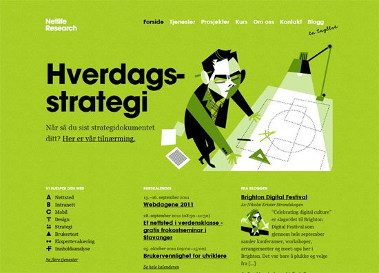
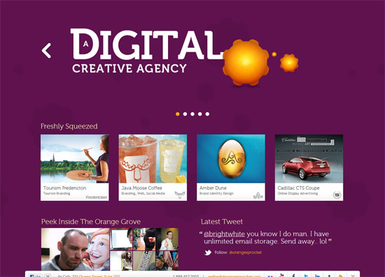
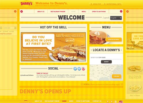
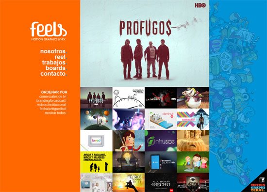
On this website for a design studio, information is organized efficiently, both giving you an idea of their services while presenting attributes of the designers behind the company.

Emerge and Bloom

KitFolio

Here’s another striking About page. As you can see, the design is simple, but fun and illustrative.

KitFolio

Alex Dawson

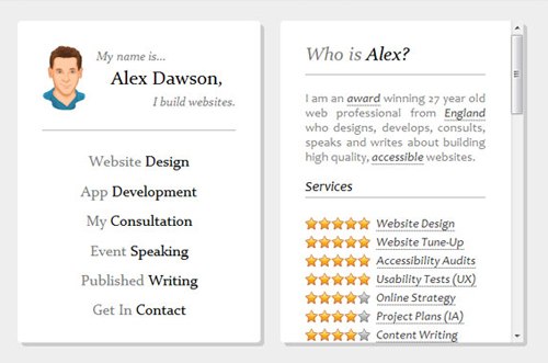
Alexander Dawson (a Six Revisions writer) presents his About page in a very efficient, functional manner. From looking at his credentials, you get a quick overview of who he is, what he does, and the services he excels in. It’s really all you can ask for from an "About me" page, right?

Alex Dawson

Adham Dannaway

Through the use of a grid layout, Adham Dannaway achieves a simple, straightforward About page that also gives you an idea of his skills, illustrated as graphs.

Adam Dannaway

egopop

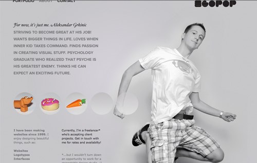
The About page for egopop presents a large-scale photo of the designer as well as a simple biographical statement about himself and his history as it relates to his profession.

egopop

Monkeyworks

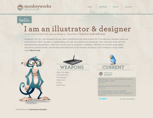
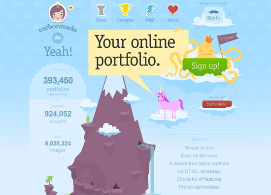
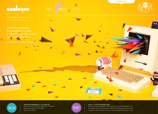
Monkeyworks uses a clean, structured layout on their About page. Not only are the illustrations captivating, but the typography stands out and the graphics used add a nice touch.

Monkeyworks

Darren Hoyt

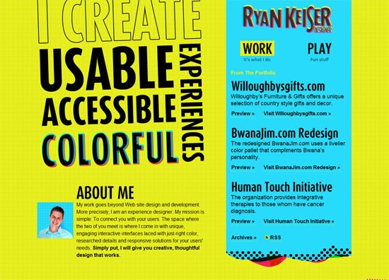
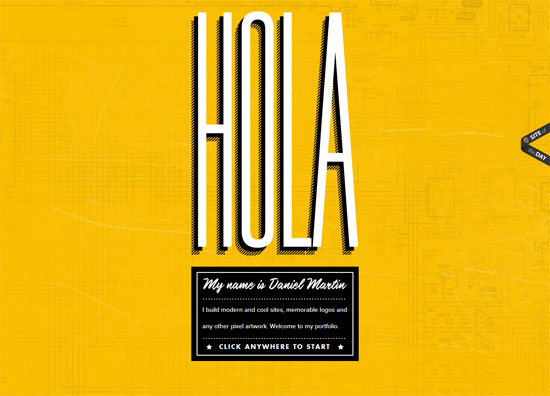
Great use of typography is what stands out in this "About me" page. Not only does the type make the page easy to read, the grid layout increases readability as well.

Darren Hoyt

Mark McGall

The designer took their About page to the next level by superimposing their face on Mount Rushmore. Tastefully done, this tactic adds a unique and memorable visual to an otherwise straightforward page.

Mark McGall

Mr. Joe Payton

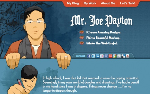
The About page of Joe Payton presents a short bio about him in a beautifully laid out format. The designer also presents information for following him on various social networking sites.

Mr. Joe Payton

Elliot Jay Stocks

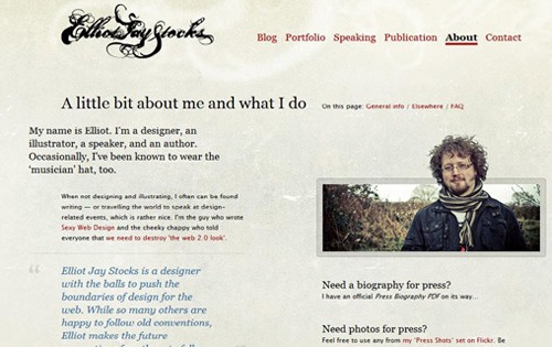
The About page of Elliot Jay Stocks is laid out rather simply, but the typography is carefully thought-out and makes you want to explore this designer’s work further. The designer, who is also a speaker and author, presents you with links to pertinent information related to his professional activities.

Elliot Jay Stocks

Kitschen Sink

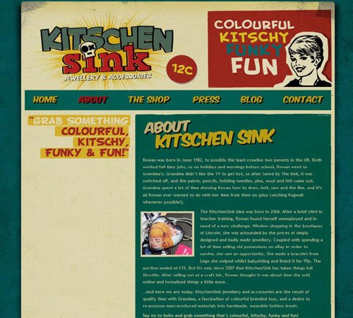
The compelling website for Kitschen Sink made me want to explore the About page. I found out that they’re a jewelry and accessories shop and I learned the history behind the company. Although it’s laid out very simply, captivating branding led me to the About page through curiosity.

Kitschen Sink

Matt Mullenweg

Matt Mullenweg sets the backdrop for his About page on a highly textured background. These visual layers compelled me to read more about the founder of WordPress.

Who is Leon

Who is Leon

This beautiful About page features animations and depth to draw the visitor in. Clear typography and a monochromatic color scheme set this About page apart.

Matt Mullenweg

Amour Chaleur

This designer’s About page is really simple and straightforward. It includes a short bio, links to relevant info, and her library. It’s always the neatly designed pages that attract me the most.

Amour Chaleur

Owltastic

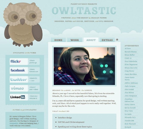
This beautiful About page of designer Meagan Fisher lets you know all the pertinent information about her and the services she provides. Included are links to social networks and other affiliated websites, all organized into a clean and inviting format.

Owltastic

Lord Likely

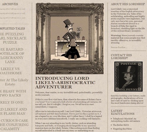
This compelling About page’s character is what draws the visitor in. Inspired by Victorian-era design, the designer implemented old-world style in creating a unique and professional page that serves as an introduction to himself.

Lord Likely

Dustin Curtis

This unique About page presents a timeline of the site owner’s life — from birth to his projected death.

Dustin Curtis

Ian Mintz

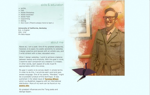
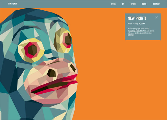
The beautiful watercolor illustrations grabbed my attention on this website. As you can see, his About page is laid out very simply and elegantly. We get a sense of his design influences, on top of his skills and education, through this clean and straightforward approach.

Monsieurlam

Large-scale photography is what sets this "About me" page apart. The page is laid out in a clear format, providing information about the designer and where he can be found.

Monsieurlam

Floating Asian Kid

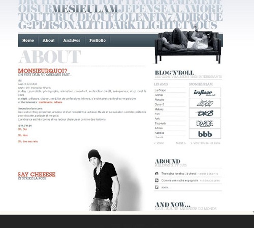
The interaction on this website intrigued me enough to explore its About page. You can see from his short biography what the designer specializes in and how to reach him.

Floating Asian Kid

Related Content

About the Author

Stephanie Hamilton is a freelancer graphic and web designer who runs her own design studio, Stephanie Hamilton Design. You can find her on Twitter @SHamiltonDesign and Linkedin.


50 Examples of Drop-Down Navigation Menus in Web Designs

09 Jul

50 Examples of Drop-Down Navigation Menus in Web Designs

Having a clean and well-structured website navigation is key in designing an effective user interface. Drop-down menus are great for sites that have multiple levels of content hierarchy. The typical design pattern of a drop-down menu is that when a user hovers over the parent navigation item, a submenu of navigation items appears.

In this collection are many different types of drop-down menus used in websites all over the web for your navigation design inspiration.

Here are some related collections regarding site navigation that you may also be interested in:

1. Pure Grips

Pure Grips feature images in their drop-down menu to make it clear to the user which products are which.

Pure Grips

2. Porsche

As you hover over each car, the image on the right changes. It also looks stunning with the semitranspart background.

Porsche

3. B&Q

B&Q has a clean and eye-catching drop-down menu that lists columns of products that customers are looking for.

B and Q, DIY

4. Red Brick Health

This drop-down navigation menu fits perfectly into the site design, and the pink hover highlight is a great touch of detail.

Red Brick Health

5. Carreras Con Futuro

This drop-down menu’s design embodies the hand-drawn theme of the website.

Carreras Con Futuro

6. Galaico Folia

This drop-down submenu has a wonderful animation effect with the smaller pieces of wood folding down from the main menu item.

Galaico Folia

7. Callaway Golf

This is a masterfully neat drop-down navigation design that has an orange hover effect.

Call Away Golf Shop

8. Converse

Converse has a grunge-styled drop-down menu that has a cloth-like texture with frizzy edges.

Converse

9. Puma

This dark drop-down menu really stands out from the rest of the site’s lighter colours.

Puma Shop

10. Sunglass Hut

This drop-down menu is functional in that it also serves as an illustrated visual of the various styles of sunglasses.

SunGlass Hut

11. Nettuts+

Netttuts+ has a clean drop-down navigation menu that works well with their header colours.

Net Tuts+

12. Tennessee Trails & Byways

This drop-down is unique because within the submenu, there’s also tabbed navigation.

Tennessee Trails And ByWays

13. Gateway

The drop-down menu in this design has nice curves and beautiful visuals that serve to display images of the computer manufacturer’s products.

Gateway

14. Bern

This rough grunge style website has an edgy drop-down menu that complement the look-and-feel of the website’s general aesthetics.

Bern

15. Ski Alpine

This drop-down menu highlights the attention to detail that the site designer has.

Ski Alpine

16. Guitar Hero

This simple drop-down menu is practical and doesn’t distract away from the main areas of the web page layout.

Guitar Hero

17. Mac Appstorm

Here’s a clean drop-down menu that fits perfectly with the overall landscape of the site design.

Mac Appstorm

18. Noizi Kidz

This navigation is bright and shaped unconventionally.

Noizi Kidz

19. Audi

This drop-down menu contains thumbnails of the auto maker’s model of cars; when you hover over a car, it displays details about it along with relevant links to other pages.

Audi

20. Famous Cookies

This drop-down navigation menu showcases the yummy cookies that the store makes available to its hungry patrons.

Famous Cookies

21. Duchy of Cornwall Nursery

This paper-styled website design has a nice, clean dropdown menu.

Duchy of Cornwall Nursery

22. EA

Electronic Arts has a playfully styled drop-down menu.

EA

23. Bonfire Snowboarding

Bonfire Snowboarding has an awesome 3-column drop-down submenu on their "Products" main navigation item, placing their products within three categories.

Bonfire Snowboarding

24. Facebook

Facebook has their simple drop-down menu on the site’s "Account" main menu link with relevant links for editing your Facebook account.

Facebook

25. Nick Ad

You have to click-and-hold your mouse pointer for the submenu to appear. Then you move onto the link you want on each drop-down and release your mouse button to visit that page; it’s an interestingly unconventional interaction design.

Nick Ad

26. TN Vacation

This dark blue drop-down menu really stands out.

TN Vacation

27. MTV UK

This site design features a clean and standard drop-down menu.

MTV UK

28. DC Shoes

The red and white text on the semitransparent black background really works its charm.

DC Shoes

29. Envato Marketplaces

This is a really beautiful drop-down menu.

Envato Marketplaces

30. Tennessee Theatre

This navigation is special because it’s clean but creative at the same time. The brown really stands out from the rest of the site’s soft colours.

Tennessee Theatre

31. Boden

Each menu item has a different font and the drop-down menu is very clean.

Boden

32. White House

The white background, blue text, and red top and bottom borders utilizes the the USA flag’s colours.

WhiteHouse

33. Navigant Consulting

The colours used on this site work together like players of a football team.

Navigant Consulting

34. Officers Club

Another clothing website with a drop-down; having a dropdown submenu makes it so much easier to find products. The Officers Club drop-down has a multi-column layout.

The Officers Club

35. Fall For Tennessee

Fall for Tennessee has a horizontal drop-down menu that slides out to the right hand side. The menu items that have a drop-down submenu have a small arrow next to them to indicate that they can be expanded.

Fall For Tennessee

36. Sony

Sony has a very wide and simple drop-down menu on their main UK site.

Sony

37. Project Vino

This drop-down menu uses colours that fit the rest of the site. The big font size and the overall design looks amazing.

Project Vino

38. Media Temple

Media Temple has by far one of the best drop-down menus out there, aesthetically. The small thumbnail of each hosting type next to the name of them looks great, along with excellent JavaScript-based animation transitions.

Media Temple

39. Mozilla

This is a simple yet sleek drop-down menu on the Mozilla.

Mozilla

40. August

The semitransparency effect in this drop-down menu works will with the vivid background image.

August

41. Henleys Clothing

The main navigation colour creeps down onto the drop-down submenu.

Henleys Clothing

42. Digg

The classic Digg drop-down submenus work with their website’s overall design.

Digg

43. Action Envelope

This drop-down menu is special because it has a nice shadow effect that really brings the drop-down menu out of the page from the rest of the site.

Action Envelope

44. Very

Very, a new e-store, has a clean and structured drop-down navigation menu.

Very

45. Incase

The Incase drop-down menu is slightly lighter in color shade than the navigation background, and works well with the site’s overall clean look-and-feel.

Incase

46. American Eagle

I really like the American Eagle drop-down menu because it fills the whole site’s width and also blends in with the clean paper-style look.

American Eagle

47. Mayflower Brewing

The colours used in this drop-down (and the site, in general) are gorgeous.

May Flower Brewing

48. Select Clothing

Select Clothing’s drop-down menu has a dark background that stands out over the sliding images below.

Select Fashion

49. Bird Malaysia

This drop-down menu is special because the colours stand out from the rest of the website, and I quite like the subtle background image at the bottom of each drop-down menu.

Bird Malaysia

50. The Web Squeeze

The Web Squeeze has implemented jQuery into their drop-down menu to give it some nifty hover effects.

The Web Squeeze

Related Content

About the Author

Andy Johnson is a freelance web designer and developer living in the UK. Andy freelances through his own design studio Authentic, and also co-founded a lightning fast UK hosting company called Pixeno. You can follow him on Twitter: @Andy92.