I used to think the beginning of a website design project was the best part. Hopes are high. People are full of great ideas. Nobody is disappointed yet. But as I gained experience, I found that learning about a client’s brand, competitors and customers doesn’t always give clear direction about design goals.
Brand discussions can generate goals like “be modern,†but they don’t necessarily determine how to accomplish those goals. Competitor reviews can devolve into cherry-picking sessions that spawn “frankencomps†rather than provide helpful feedback. And mood boards, which communicate a general feeling, don’t help to articulate or prioritize design goals. With a design matrix, you can guide discussions and establish clear direction.
Hey, You Got Math In My Art…
Sometimes the abstract nature of design is enough to make you envy the people over in accounting, with their definite answers and proven formulas. While the beauty of design is that it transcends the world of definite answers, introducing a little math in the form of design matrices can help you create better websites by providing a clear picture of where the website design is today and where it should go tomorrow.
Design matrices don’t require any serious math skills because they’re based on the coordinate system. Chances are you’ve seen a competitor matrix that ranks brands according to two key attributes on X and Y axes (for example, value could be plotted against profit margin). A design matrix is essentially like a competitor matrix but ranks the client’s website against competitor websites, and it uses design attributes (“clean†and “warm,†for example) instead of other points of competitive comparison.

A typical competitor matrix ranks brands according to rational factors. (This example, which compares a few car models, was created for illustrative purposes only.)

A design matrix ranks website designs according to design attributes. (This example, which compares airline website designs, was created for illustrative purposes only).
Design matrices are powerful tools for determining the path of the website design process, because: they force you to determine two design attributes to focus on; they build consensus within a team; they guide the clients’ perception of competitors; and, most importantly, they lead to differentiated website designs.
The Art (And Math) Of Building A Design Matrix
Step 1: Gather Information
To build a design matrix, you will need to know the client’s core brand attributes and main competitors. You should also have a broad understanding of what the redesign aims to accomplish (from a design perspective): “the website is cluttered†or “our website is not engaging.†The good news is that information gathering is a normal part of the discovery phase.
A design matrix should not be the only piece of work involved in the discovery phase, but it can replace some other approaches. Creating or documenting a brand’s position and defining the key redesign goals are essential. However, a design matrix could potentially replace mood boards. A mood board is a collage or grid of images that capture the “feel†or “tone†of a brand. They are valuable tools for providing direction to new brands, but they provide a less concrete direction than a design matrix. If the brand is in its nascent form and needs broad high-level direction, then mood boards work well; but if you are working with an established brand or a client who prefers a concrete approach, then a design matrix is the best bet.

Document the brand’s position before creating a design matrix. (For illustrative purposes only.)

Image Spark is a great resource for creating online mood boards—particularly useful if you are working with a company that requires high-level brand definition.
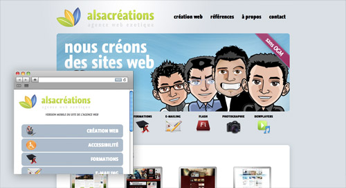
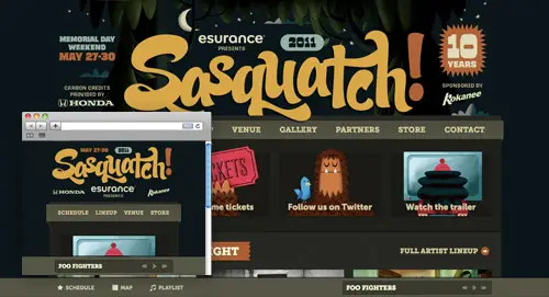
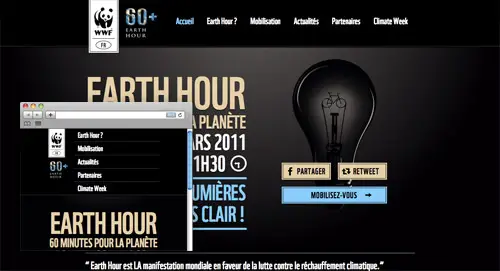
Another common discovery activity that design matrices can replace is the “competitor website review.†Looking at competitors’ websites can generate lively discussion, but too often it either shifts the focus to feature sets instead of design direction, or it becomes a cherry-picking session for disparate design elements from a variety of websites that the designer is somehow supposed to mash together into a single coherent website design.
Create a design matrix that shows the current website in relation to competing websites. This way, you are less likely to get distracted by feature sets or be expected to combine all sorts of design elements. That said, if you are looking for an energizing group activity, competitor reviews can generate more brainstorming than a design matrix. Doing both is an option, but if you do that, then do the matrix after the walk-through of competitors.

Delta Airlines’ website.

United Airlines’ website.
Looking at these individual airline websites, rather than comparing them on a design matrix, can lead to a less design-oriented and more feature-focused conversation.
Step 2: Determine Your X and Y Axes
Narrowing down a design direction to two attributes can be uncomfortable for those of us accustomed to creative briefs that list a litany of brand attributes to guide our design. How often have we heard that a design should be “clean,†“inspiring,†“warm,†“engaging,†“approachable†and “trustworthy� How do we even accomplish just two of these attributes? And if we must choose only two, how do we decide?
Understand that a design matrix is not intended to limit the final design to two attributes. That would be almost impossible. It is intended to illustrate the two most important attributes for taking the website design to the next level and differentiating it from that of competitors.
To determine your X and Y axes, ask yourself the following questions:
- Of all the brand’s attributes, what will make this client stand out from the crowd? Which design traits reinforce those brand attributes?
- What are the competitor websites’ strengths and weaknesses?
- What does the design need to do better in order to accomplish the website’s goals?
The X and Y axes should not be nearly synonymous (for example, “warm†and “engagingâ€), nor should they be mutually exclusive (“innovative†and “traditionalâ€). There should be a slight tension between the two attributes.
The airline websites, for example, are ranked according to how “clean†and “personable†their designs are. There is a slight, but not negating, tension between these two attributes. Clean websites can come across as cold if they don’t have a distinctive voice or warm color palette. Personable websites are often less functionally organized. Achieving a high ranking for both attributes is a worthy challenge, and stepping up to that challenge will definitely create a distinctive website.
You might find that you change the labels of your axes as you place the websites on the matrix (see step 3), but the above process should get you pretty close to determining what the final axes should be.
Step 3: Play a Little
You know the competitors. You have a clear idea of what is important, brand- and design-wise. You have determined your x and y axes. It’s time to try some things out.
Place all of the websites on your matrix as you would rank them off the top of your head. As you begin to place them, you will most likely rearrange some as you compare them to others. This is a natural part of the process because the matrix shows relationships as well as individual rankings.

I was influenced by Jet Blue’s overall branding and so originally ranked its website’s personality fairly high. Later, when I compared it to the Delta and Virgin America websites, I revised the ranking.
Design matrices do not have to be limited to ranking competitors. They can also show a client’s website’s position among affinity brands (i.e. brands with a similar “feel†and customer base). Mini USA and Apple, for example, might be considered affinity brands because they both exemplify modern design and appeal to similar customer types.
Step 4: Get Serious
Things will take shape fairly quickly, but there is a final step before declaring your design direction matrix done and dusted. Before sharing the matrix with the client team, make sure you can defend it. Show it to others in your agency and see if they agree with your placement decisions. Ask these key questions:
- Do my axes represent the two most important design attributes?
- Can I clearly articulate why I placed each website where I did?
- Will the redesign be able to get the website to the top-right corner? If not, what is holding it back?
If you answered yes, yes and yes (or yes, yes and yes if we do a certain thing…), then your website design direction matrix is ready to share with the client.
Creating Buy-In With Design Matrices
Everyone loves talking about design, but with everyone talking, we don’t always hear other ideas. If you show a client a design matrix before creating the initial comprehensives, then you will visibly and quantifiably show that you are on the same page; and because of that, you’ll likely be successful in the long run.
The design matrix will clearly show which websites you think best capture the desired attributes and where the current website falls into the mix. It is a tangible foundation for a conversation about design.
Invite the client to participate actively in this stage of the design process. Clients usually want to feel like they have had direct input in the design, and designers always prefer that the input comes sooner in a high-level, directional form (“The design feels coldâ€), rather than later in an overly specific form (“Make that element blueâ€).
Discuss the following questions:
- Does the matrix address the two most important design attributes?
- Do we all agree on the placement of competing and/or affinity brands?
- Do we all agree on the placement of the client’s brand?
- If we end up in the top-right corner, are we where we want to be?
Using a design matrix can be risky, mainly for one reason. Some clients have difficulty prioritizing the two most important design elements, and then they dig their heels in and declare that there are in fact four equally important elements. Hopefully, the matrix demonstrates how your choice of attributes distinguishes the website. If you meet with a lot of resistance, just create two matrices or conduct a competitor review (as discussed in step one).
Be prepared to explain your rationale and defend your position — but also be open to suggestions. Maybe there are good reasons to focus on different attributes, or maybe the team feels that the placements of some website are not quite right. Revising a design matrix is much easier than revising a design.
Truly Going The Distance
Creating a design matrix is a great first step, and getting client feedback is an awesome second step, but the most important step is to use the matrix as a resource as you design and when you present your designs to the client.
Ultimately, the purpose of a design matrix is to move a website design in the right direction. Specifically, move it to that space in the upper-right corner that represents the best of both worlds. As you design, continually refer to the matrix and see where your new iterations might fall on it.
Think about these questions as you design, and take notes for upcoming presentations:
- Do the new iterations embody the key attributes?
- Are they better than the competing and affinity brands?
- How do they accomplish the design goals?
When presenting designs to a client, review key findings and recommendations made during the discovery phase. Before presenting your designs, review the matrix with the client, and revisit the matrix at the end of the presentation to show that progress has been made.
Training Wheels: A Step-By-Step Overview Of A Design Matrix For Cannondale
The following walk-through illustrates the design matrix process in its entirety and addresses the kinds of decisions that need to be made when creating a matrix. The exercise below is entirely theoretical. I do not work, nor have I ever worked, for any major bicycle manufacturer, including Cannondale. Thoughts about what design attributes Cannondale might strive for are purely my opinion. Thoughts about competing website design attributes are informed by looking at their websites and general industry expertise — just as yours will be.

How would you create a design matrix for Cannondale? (This example is purely illustrative.)
Step 1: Understand
For the purposes of this exercise, let’s assume that Cannondale has chosen you to redesign its website. Your first step will be to understand its brand, its competition and the desired attributes of its new website. Let’s also assume that you left the initial discovery meeting with this information:
- Cannondale’s key competitors are Trek, Giant, Diamondback and Fuji.
- Its brand is about performance, innovation and a superior craftsmanship that inspires riders.
When you ask about the desired design attributes, Cannondale’s representatives say the website should capture the sense of elation that comes with a successful bike ride. They also want the website to showcase technical innovation, dedication to quality and devotion to the individual rider. Your notes read, “inspiring, innovative, technical, individual, quality.â€
Step 2: Determine Your Axes
The X and Y axes reflect the client’s most important and desired design attributes, but do look at competing websites before naming the axes; they will inform your direction and give you ideas about what would be distinctive.
Upon viewing the competitor websites, I found both Trek’s and Fuji’s to be “immersive†and “powerful,†with clean, bold imagery. Fuji’s was slightly colder and more “technical.†Diamondback has an inspiring home page, but the website loses steam and doesn’t showcase the individual bikes distinctively. Giant has a strong focus on teams and individual riders and helpful bike selection tools, but the design is flat.
So, how does all of this play into naming the axes and creating the matrix? Going back to your note about desired design attributes, we see that Cannondale wants to showcase technical innovation, which Trek and Fuji do well on their websites; Cannondale wants to inspire, which Trek and Fuji do through immersive imagery; unlike Giant, though, Cannondale doesn’t want to focus on racing.
At first, it may seem that “inspiring†and “innovative†would be good axes names, but those attributes don’t have quite enough tension. They are not synonyms, but there is no balance either. “Inspiring†and “quality†may come to mind, but “quality†is not a design attribute; it’s something the client wants to showcase (it’s an attribute of the product, not the design).
I chose “inspiring†and “technical†for the desired design attributes. “Inspiring†works because the client wants to inspire riders. “Technical†is a good second attribute because it captures innovation and product quality while striking a balance with “inspiring.†There is a healthy tension between the two words. Capturing both emotion and technical detail is difficult. Accomplish that balance and you’ll leave the competition in the dust.
Step 3: Place Websites on the Matrix
I always start by plotting all of the websites roughly where I think they fall on the matrix, and then I move them around as I consider the relationships between the websites.
I originally placed Cannondale’s website in the lower-left corner but, as I compared it to the other websites, I realized that it’s actually more technically focused than others, including Diamondback and Giant. That said, the Trek and Fuji websites are still more technical, with their bold product showcases and detailed imagery.
Inspiration-wise, the current Cannondale website seems to be on par with Giant’s: there is imagery of bikers, but it feels flat and diminutive. Diamondback’s immersive home page raises it a bit above the others. Trek’s warmth and voice put it in the lead for inspiration. I originally had Trek in the upper-right, but I ultimately decided that Fuji’s website has a more technical feel to it.
The final matrix (below) is informative on many levels. It shows where Cannondale currently is and where the websites are that it needs to surpass in order to get to where we determined it needs to go. Naturally, the final design will have a unique flavor, but looking at the competing designs will partly uncover how to get there.

A design matrix informs the path of the design process.
Step 4: Consensus
This is a purely illustrative example, so I did not show this to a team (or the client) for feedback. Typically, feedback focuses on the desired design attributes (“Is this where we want to go?â€) and the placement of all of the websites on the matrix. The most important thing is to agree on direction, of course, and then to determine the goal. The hard part is to design a website that gets there.
Step 5 (the Big One): Using It
The last step is not so much a step as a big stride. Once you’ve created the matrix, the important part comes: using it to create a better website. Make a copy for everyone involved in the project (including those in other disciplines) and have them put it up somewhere to serve as a daily reminder and motivator.
Refer to the matrix as you design. Are the decisions you are making moving you toward the upper-right? For example, if you were choosing images for the Cannondale website, ask yourself relevant questions:
- Is this image inspirational?
- Does it convey the technical expertise of Cannondale?
- How can the design be more inspiring?
- How can I better convey the technical passion of the brand?
As mentioned, revisiting the matrix when showing comps to the client will help justify your approach, but the real reason to create a matrix isn’t to sell comps or do a fun exercise during discovery; rather, it is to remind us of the path we are on. We could take so many directions, and going down a road that looks good but doesn’t take you where you want to be is all too easy.
Think of your design matrix as a compass. It’s not as precise (or cold) as a GPS; it’s an old pocket compass that wobbles a bit as you walk but still gets you to the summit.
Do’s And Don’ts
The beauty of design matrices is that they provide a new way to look at competitors and a tangible foundation on which to begin discussions with clients. They also enable you to play a little as you tweak the axes’ names and the websites’ placement to get them just right. There is wiggle room in the methodology and application, so have fun with it. That said, there are a few set guidelines worth adhering to for success:
- Don’t be afraid to experiment.
- Do get your ducks in a row. Verify the desired design attributes and the competitor and affinity brands with a client before proceeding, so that the matrix is relevant.
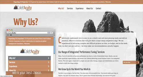
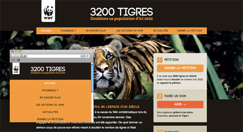
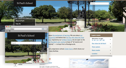
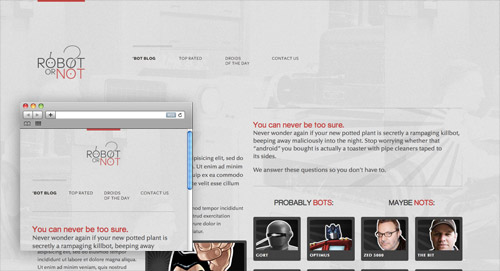
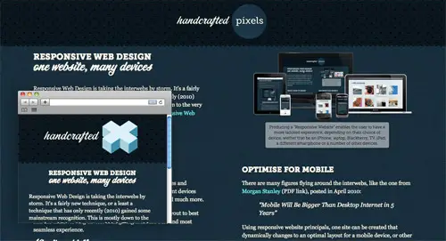
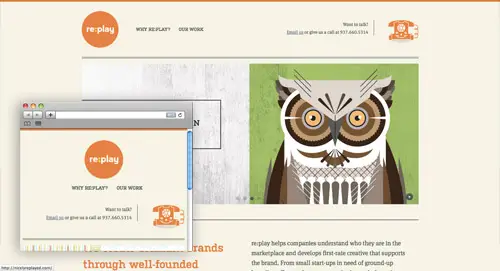
- Don’t base your insights on home pages alone. A website’s design is more than the home page. Your matrix might use a home page screenshot, but include it only if it represents the overall design of the website.
- Do share your toys. Get team input about the placement of websites on the matrix. It’s not an altogether scientific approach, but be as objective as possible.
- Don’t carve it in stone. Be open to recommendations from clients. Changing a matrix is easier than changing a comp.
- Do use it to sell your work. Present the matrix as part of your comp presentation in order to explain your rationale and sell your comps.
- Don’t matrix and run. Don’t abandon the matrix after the discovery process. Refer to it regularly.
Enjoy the process of creating a matrix and of seeing opportunities to design a distinctive website for your client.
Further Reading
(al) (vf)
© Bridge for Smashing Magazine, 2011. | Permalink | Post a comment | Smashing Shop | Smashing Network | About Us
Post tags: business, Design, matrix

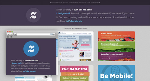
 We developers sometimes take design for granted. And let’s be honest: who doesn’t hate taking things for granted.

 Just in from the UK ~