Apple's commitment to thoughtful design is legendary, and here's another example. The iCloud logo uses the golden ratio.
In short, the golden ratio is an irrational mathematical constant that often occurs in nature. When applied to design, the results are considered aesthetically pleasing. Artists have been using it for centuries, including Leonardo da Vinci and Salvador Dali.
There are many ways to explain the story of Star Wars, and no matter how you tell it, people are always going to be fascinated by the science fiction world. I think I have seen everything from YouTube clips of clueless people trying to tell the story of Star Wars, to complete pocket comic books retelling it. I always enjoy the way people see this huge adventure differently. The characters seem to have their own individual lives in a galaxy far far away, for real that is. It’s a great way to escape reality every once in a while, and I think we will be laughing one day when we have droids of our own and compare them to C-3PO and R2-D2. It’s completely beyond me, by the way, how thin that guy (Anthony Daniels) who played C-3PO must have been back then.
So how many ways can you come up with to retell the Star Wars story, any episode that is? I think until today, I could come up with quite a few, but never did it occur to me that you could completely retell it in small icons that make the story even more interesting. It’s almost like checking out a timeline, but with a whole different aspect to it.
Designer Wayne Dorrington is a master of the icons, and the force is strong with him. He designed and created this awesome Star Wars: A New Hope retold in icons, and you can be sure it’s going to be about the coolest thing you have seen all week. Now to all of you Star Wars fans out there, this is what a real fan does. Now it’s up to you to come up with something that is better. Brilliant!
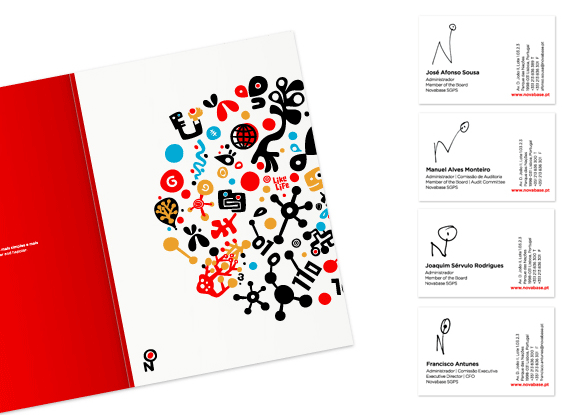
Established in 1989, Novabase is the leading company in IT services, consulting, and implementation. It has 2,000 employees and revenues of over 292 million Euros. A hybrid of companies like IBM, Accenture, and EDS as our Portuguese tipster explained. Self-admittedly "Big in Portugal, but small in the world" Novabase is looking to expand its presence and recognition around the world. This month they introduced a new identity designed by Lisboa-based Albuquerque.
Brand video.
Footage of unveiling. Skip to 1:30 for the real fireworks. Literally.
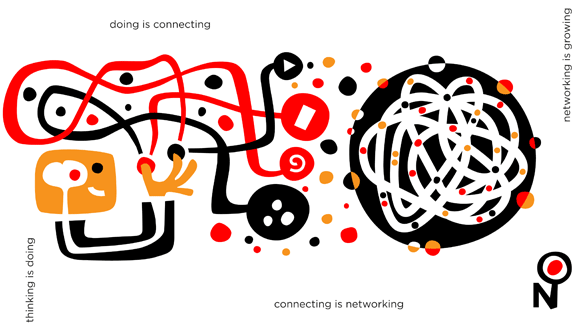
It's unfortunate that the new logo is such an incomprehensible eyesore — actually, the logo might be an eyesore — because the rest of the identity is quite delightful. The illustrations, the colors, the pace of the animation all have a very nice retro quality but with a contemporary flair. Even if the illustrations are mostly abstract, they manage to convey a company making all kinds of connections and actively engaging in business. Back to the logo… although it's supposed to be just an "N" it certainly reads as "No" which is not a good thing, but let's assume that most people just see an "N," then what are we supposed to make of that giant wart? Is it an eye? A portal? An incubator of red eggs? The transition from sharp-edges to a hand-drawn effect within the "N" is not contrasting enough, so it almost looks like someone pulled the wrong bezier curves. The wordmark somehow also feels odd and not so well integrated with the icon.
Folder and business cards (where each person draws their own version of the logo).
Set of icons to represent their vision.
The logo makes just a little more sense when seen in the context of the whole system, which is much more engaging and interesting than the logo itself. The whimsical style is a rarity in big corporations so it's nice to see some of it start to seep into corporate identity.
 Apple's commitment to thoughtful design is legendary, and here's another example. The iCloud logo uses the golden ratio.