RSS
 

Posts Tagged ‘Web Design’

How to Design Browser Themes

11 Apr

Advertise here with BSA


How to Design a Browser Theme

The web browser is probably one of the most frequently used applications on a person’s computer. For designers and developers, a browser theme can be canvas that provides hours of exposure to the artist or brand willing to create a theme for their fan base.

But with such an extreme landscape orientation and a range of functional obstructions, designing browser themes is a creative endeavor with plenty of pitfalls and gotchas.

There are many things to consider when approaching a new theme — from avoiding copyrighted images to achieving designs that work within the confines of a particular browser.

This guide contains some crucial tips and general guidelines for designing custom browser themes for Chrome, Firefox and Internet Explorer.

How to Design a Browser Theme
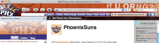
Phoenix Suns browser theme is well balanced with imagery.

Key Considerations for Browser Theme Design

The trickiest part of designing browser themes is the variability of the environment. Keeping designs flexible enough to display well in Firefox and Internet Explorer across Linux, Mac and PC, and across different versions of the browsers is essential. For example, Firefox 4 and IE show part of the background graphics in the title bar while Firefox 3.6 and below do not.

Dimensions and Dealing with Environmental Variability

Firefox offers the greatest design flexibility especially in the browser chrome, which is the area where the navigation button and URL address bar is located as well as the areas outside of the browser viewport.

How to Design a Browser Theme
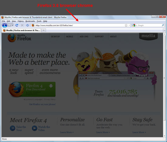
Firefox 3.6 browser chrome in Windows OS.

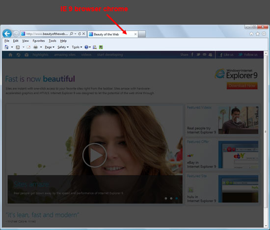
IE 9 browser in Windows OS. Compare the differences with the one above.

When we design a cross-browser theme, Firefox is the baseline from which the other designs evolve.

Below, you’ll see the Indianapolis Colts browser theme shows the diminishing design real estate from Firefox to IE to Chrome.

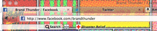
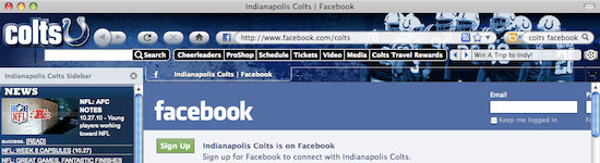
Colts Firefox browser theme.

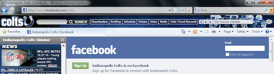
Colts IE browser theme.

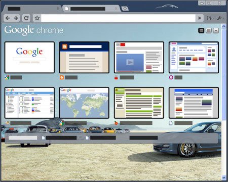
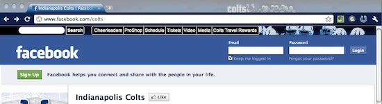
Colts Chrome browser theme.

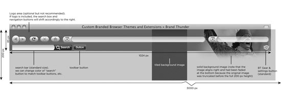
The vertical footprint of the design is kept to a minimum. While 200px tall graphics are required for Firefox, the reality is that only the top 85 pixels are usually visible.

For Internet Explorer, the vertical dimension is locked at 50 pixels; and for Chrome, even less.

Designs that rely on the user being able to see the full image may not work as the top or bottom chrome will not always be visible.

The horizontal size of the image has its special considerations as well. As a browser window is enlarged horizontally, the background images will shift. Designers must keep this in mind, as a browser opened at 500 pixels compared to a browser opened at 1024 pixels will have completely different looks from the background image perspective.

Dimension guidelines for browser themes in our company. The total width of the image is 3000 pixels.

Using images that span the full background or a single element that occupies an entire space is one method to solve the problem, but may also lead to an overly large file size (and thus, a slower-performing theme).

Using Repeating Backgrounds

A method to ensure a fully styled background and lower file sizes entails using screened elements, tiled textures or partial images.

These patterned backgrounds can provide a simple elegance, reduced file sizes, greater flexibility, and potentially a more successful design.

Choosing Image File Formats

Choosing the right file format for your browser theme design is a similar process to deciding what format to use in web designs.

If the images need transparency, use .gif or .png format.

If they’re not transparent, use .jpg as the file format.

Animation

Animated components of the design are also available for Firefox and IE. This can be a nice enhancement (for example, in adding twinkling lights to a Christmas tree browser theme), but can easily be overdone. Keep animation to a minimum as it can be distracting to the user.

Firefox allows for animated GIFs or PNGs. IE can only display animated GIFs.

Dealing with Required Browser UI Components

Designers must bear in mind that there are specific elements that need to be visible when creating any design.

For example, in Microsoft Windows, the controls are in the upper right of browser. Chrome, Firefox and IE all have visual differences in tab opacity depending on if a tab is in focus or in background.

The visibility of the design behind navigation controls, address bar, and search boxes also varies across browsers and operating systems.

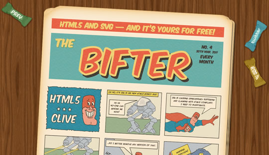
Old Comic browser theme is a fun concept with lots of legibility issues.

Keep It Simple and Avoid Visual Fatigue

Remember: the browser is used for hours a day and the user will have to look at the browser theme design every time they fire up their web browser.

Keeping the design pleasing to the eye is a vital criterion to avoiding visual fatigue and a lost user.

Dealing with the "New Tab" User Experience

Oftentimes, when designing a browser theme, the browser chrome should be the focus because that’s what the user is exposed to for hours at a time.

The "new tab" experience — the event where the user opens a blank tab or opens another browser window — however, also creates theme opportunities within the browser.

In the case of Google Chrome, this is the area least encumbered by restrictions. Rather than a blank page waiting for the user’s next URL, the new tab image can bring a design element to this area. An image is used in Chrome, and HTML in Firefox.

File size is again a consideration to keep the tab loading fast. The browser tab, more and more, has become increasingly functional; it’s become a holding place for new features like search boxes, thumbnail images, and dynamic counts (such as how many unread emails you have in Gmail).

We advise you to put the strength of your design at the bottom so the chance of it being obstructed is limited.

Porsche Panamera browser theme shows off the "new tab" experience.

Things to Avoid in Browser Theme Design

Now that you’re familiar with some general design considerations for creating browser themes, let’s take a look at some things you should avoid.

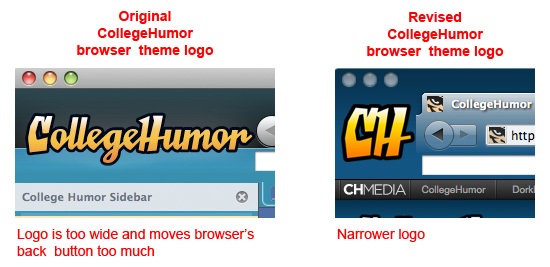
Browser Theme Logos That Are Too Wide

Firefox allows insertion of a logo to the left of the navigation buttons. Your logo can actually shift the entire browser navigational UI to the right.

Users, however, have a strong preference for the browser’s back button to stay where it is — call it "muscle memory" — and it creates frustration if the browser theme moves it too far from its original position. Keep logo width to a minimum.

Designs That Rely on Pixel-Perfect Placement

Designs that rely on the exact placement of vertical elements must be eliminated from consideration because of cross-browser platform variations. For example, background graphical elements can shift upward in some instances and create a conflict between the design and the browser layout.

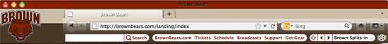
Brown University browser theme needed a refresh to fix the misalignment in Firefox 4 created by the horizontal line.

Getting Started with Browser Theme Design

The browser theme offers you a great place to engage your online audience. For companies, it extends their brand to an application that’s widely used.

For designers, browser themes are a challenging place to show off design skills and their creativity in overcoming restrictions imposed by the environment.

Are you interested in getting started building your own custom browser theme? It’s easy to get started. Here are some resources to get you up and running.

Related Content

About the Author

Patrick Murphy is the founder and CEO of BrandThunder(BT). With its extreme makeovers for Internet browsers, BT creates persistent engagement between major brands and their online consumers. BT’s new platform, BT:Engage currently in private beta, gives everyone the tools to build and share their own browser themes.


Showcase of Outstanding Responsive Web Designs

11 Apr

This showcase rounds up a collection of the most inspiring and outstanding examples of responsive web design. These websites not only look great at full scale monitor resolution, but are designed to gracefully scale according to the user’s screen size. Resize you browser, view the site on a smartphone, tablet or netbook and you’ll see the same design in a range of well presented formats.

What is responsive web design?

Screen resolutions

Websites are no longer viewed only on a computer monitor. Smartphones, tablets and netbooks throw a range of resolutions and different screen sizes into the mix for designers to now worry about. The idea of catering for various resolutions isn’t anything new. Back in the days of table based designs designers either chose the fluid or static route. Today’s responsive websites take a similar approach by using fluid widths in percentages and ems, but go a step further by using scalable images and adjustable layouts depending on the browser size.
To achieve this ‘scalability’, CSS media queries are used to apply different page styling according to certain parameters, such as min-width and orientation. The first step is to create a mobile version, but you could go on to customise your design for a range of resolutions.

Showcase of responsive web designs

Ready for some examples? Here’s a roundup of 50 of the most outstanding examples of responsive web designs. Each one is displayed with a preview of both the full size website and an example of a small resolution, but to get the full experience be sure to visit the live site and play around with it yourself.

Alsacréations

View the responsive website design

Sasquatch Festival

View the responsive website design

Earth Hour

View the responsive website design

Cognition

View the responsive website design

Tileables

View the responsive website design

Philip Meissner

View the responsive website design

Interim

View the responsive website design

Ribot

View the responsive website design

Visua Design

View the responsive website design

Laufbild Werkstatt

View the responsive website design

Sweet Hat Club

View the responsive website design

iamjamoy

View the responsive website design

Andrew Revitt

View the responsive website design

Stijlroyal

View the responsive website design

Sleepstreet

View the responsive website design

Pelican Fly

View the responsive website design

eend

View the responsive website design

Converge SE

View the responsive website design

iwantedrock

View the responsive website design

Joni Korpi

View the responsive website design

Jason Weaver

View the responsive website design

Cohenspire

View the responsive website design

Think Vitamin

View the responsive website design

CalebAcuity

View the responsive website design

3200 Tigres

View the responsive website design

Marco Barbosa

View the responsive website design

Jeremy Madrid

View the responsive website design

Lapse

View the responsive website design

Ryan Merrill

View the responsive website design

Media Queries

View the responsive website design

Electric Pulp

View the responsive website design

Tee Gallery

View the responsive website design

Stephen Caver

View the responsive website design

Happy Cog Hosting

View the responsive website design

Splendid

View the responsive website design

A Different Design

View the responsive website design

This is Texido

View the responsive website design

Edge of my Seat

View the responsive website design

Hardboiled Web Design

View the responsive website design

St Paul’s School

View the responsive website design

Robot… or Not?

View the responsive website design

Handcrafted Pixels

View the responsive website design

re:play

View the responsive website design

Sparkbox

View the responsive website design

SimpleBits

View the responsive website design

UX London

View the responsive website design

CSS-Tricks

View the responsive website design


30 Examples of Websites Using HTML5

10 Apr

Advertise here with BSA


HTML5 is certainly here to stay, from a numerous list of articles, events and buzz about this latest revision of the HTML standard. Some websites using HTML5 proudly show the official logo and state the sentence “support the future now”. So to support all this buzz and the technology we decided to gather a new list showcasing websites using HTML5.

NakshArt

html502

Mat Tomaszewski

html503

welcomebrand

html504

layer 51

html505

Stockholm Hairdresser

html506

Furnace

html507

Virtuti Design

html508

Lifefroots

html509

Float Left

html510

Daniel Scholten

html511

AX Visual Design Studio

html512

robedwards.org

html513

Festival Mundo

html514

The Squad

html515

S5 Style

html516

Bifter SVG Comic

html517

Fidiz

html518

Push

html519

re:play

html520

Blink Lab

html521

Joe Critchley

html522

Lexways

html523

ar-com.co.uk

html524

Kiran Owal

html501

Hallzzz

html525

Birrificio Irpino

html526

Empire State Recordings

html527

McKinney

html528

weluse

html529

Myke Preusss

html530

Source:

HTML5 Gallery
HTML5 Websites


10 Useful Scripts of Calendar for Web Developers

17 Mar
Most popular blogs and personal websites decorated by beautiful calendars. A beautiful calendar in website is so essential to track back new, specified and important older information’s. This article will show you some useful scripts to use in your blog or website. Are you looking to contribute to our design community? Suggest a link to [...]


The Art of the Facebook Page Design

22 Feb

Everyday more and more businesses around the world are creating presences on Facebook.

Some companies opt to bring users directly to the page wall or other tabs (e.g. info, photos, RSS/blog, discussions and links) and use product images or company logos instead of more elaborate landing pages.

Regardless of where a user lands when they first arrive, something needs to capture their attention.

As we’ll see in the examples of pages from the 50 Top Facebook Pages of Brand’s Worldwide represented below, some pages may come right out and ask for the “like”, some may have a variation on the call to action with a contest, gift, upload, sign-up now, or shop now type message. Some may appeal to emotions. Some will be memorable. And some, quickly forgotten.

In truth, Facebook is about more than the ongoing interaction between businesses and users via status updates. We believe it’s also about the art and design of engagement and a vital new component to the corporate brand identity—the Facebook page design.

Coca-Cola

Total Fans 22, 113, 350 | Food and Drink | United States


Starbucks

Total Fans 19, 386, 229 | Restaurant | United States


Oreo

Total Fans 16, 509, 052 | Food and Drink | United States


Red Bull

Total Fans 15, 002, 570 | Food and Drink | Austria


Skittles

Total Fans 14, 903, 838 | Food and Drink| United States


Converse All Star

Total Fans 12, 522, 419 | Fashion | United States


Victoria’s Secret

Total Fans 11, 273, 214 | Fashion | United States


Converse

Total Fans 10, 903, 272 | Fashion | United States


Windows Live Messenger

Total Fans 9, 555, 443 | Technology | United States


Pringles

Total Fans 8, 902, 303 | Food and Drink | United States


PlayStation

Total Fans 8, 328, 915 | Technology | Japan


Monster Energy

Total Fans 8, 264, 999 | Food and Drink | United States


Zara

Total Fans 7, 907, 457 | Fashion | Spain


Victoria’s Secret Pink

Total Fans 7, 861, 520 | Fashion | United States


Dr. Pepper

Total Fans 7, 730, 330 | Food and Drink | United States


Nutella

Total Fans 7, 482, 885 | Food and Drink | Italy


Ferrero Rocher

Total Fans 7, 464, 229 | Food and Drink | Italy


Starburst

Total Fans 7, 428, 300 | Food and Drink | United States


Disneyland

Total Fans 7, 227, 700 | Attraction | United States


McDonald’s

Total Fans 7, 015, 657 | Restaurant | United States


Adidas Originals

Total Fans 6, 983, 666| Sports | Germany


Reese’s

Total Fans 6, 446, 255 | Food and Drink | United States


Xbox

Total Fans 6, 216, 176 | Technology | United States


H&M

Total Fans 6, 111, 927 | Fashion| Sweden


Starbucks Frappucino

Total Fans 5, 632, 778 | Food and Drink | United States


Google Chrome

Total Fans 5, 452, 638 | Technology | United States


Taco Bell

Total Fans 5, 398, 834 | Restaurant | United States


Walt Disney World

Total Fans 5, 224, 835 | Attraction | United States


BlackBerry

Total Fans 5, 196, 258 | Technology | Canada


Picnik

Total Fans 4, 680, 341 | Technology | United States


SUBWAY

Total Fans 4, 663, 512 | Restaurant | United States


Nike Football

Total Fans 4, 622, 955 | Sports | United States


Lacoste

Total Fans 4, 493, 274 | Fashion | France


BMW

Total Fans 4, 429, 660 | Automotive | Germany


Hollister Co

Total Fans 4, 178, 668 | Fashion | United States


Mountain Dew

Total Fans 4, 127, 589 | Food and Drink | United States


Burberry

Total Fans 4, 024, 562 | Fashion | United States


5 Gum

Total Fans 4, 021, 548 | Food and Drink | United States


Forever 21

Total Fans 3, 972, 013 | Fashion | United States


Buffalo Wild Wings

Total Fans 3, 864, 310 | Restaurant | United States


Nike

Total Fans 3, 826, 717 | Sports | United States


Target

Total Fans 3, 816, 027 | Retail | United States


Chik-fil-A

Total Fans 3, 719, 656 | Restaurant | United States


Puma

Total Fans 3, 715, 460 | Sports | Germany


American Eagle Outfitters

Total Fans 3, 689, 587 | Fashion | United States


Subway

Total Fans 3, 679, 491 | Restaurant | United States


Gucci

Total Fans 3, 659, 709 | Fashion | Italy


Sony Ericcson

Total Fans 3, 656, 301 | Technology | Sweden


Abercrombie & Fitch

Total Fans 3, 653, 314 | Fashion | United States


Aéropostale

Total Fans 3, 604, 929 | Fashion | United States


Written and compiled exclusively for Webdesigner Depot by Debbie Hemley. Debbie is a blogger and social media aficionado. She works with businesses to develop content and social media strategies. Read her blog posts on All the News and follow her on Twitter

Have you been creating Facebook pages for your clients? What have your design experiences been like?


If you find an exclusive RSS freebie on this feed or on the live WDD website, please use the following code to download it: O1Rs1S


Get the MediaLoot Premium Icon Collection for only $27


Source


How to Measure the Effectiveness of Web Designs

07 Feb

How to Measure the Effectiveness of Web Designs

At the end of the day, the quality of a web design can only really be measured quantitatively in the results it brings a site. As they say, results speak for themselves.

Being a web analyst for more than four years now and regularly working side-by-side with a designer, the biggest thing I have learned is Data identifies the problem and Design solves it.

This article looks at web design from a web analytics perspective. We will focus around the questions that a web designer should answer using metrics and tools to measure the impact and effectiveness of a web design.

Stages of Visitor Engagement

At any time, website visitors are in one of the following stages:

  1. Attention
  2. Interest
  3. Desire
  4. Action
  5. Satisfaction

At each stage, a visitor has different expectations, and it’s the design that leads the way to making sure those expectations are met.

Designing for Grabbing Visitor Attention

Questions to ask: Does the design grab the attention of your visitors in just a few seconds? Does the design help visitors quickly find the information they are looking for?

While different approaches need to be applied to landing pages and inner pages of a website, one thing is sure: If you don’t manage to garner the user’s attention quickly, she is gone to the next website.

Grabbing Visitor AttentionHeadings are known to have a strong impact in grabbing user attention.

What to measure: Bounce rates and exit rates.

Solution: Most web analytics tools out there will tell you how many times you failed to grab the attention of your users.

Exit rates will tell you how many people left the website through a particular page, while bounce rates tell you how many people left the website without visiting a second page.

You can go a step further and measure the bounce rate as being the rate of people spending less than 10 seconds on your website. The more people are bouncing off your page, the less your design and content have helped them spot the information they were looking for.

Designing for Raising Visitor Interest

Questions to ask: Do visitors think they are in the right place? Can you convince them that the information on your website is (or might be) right for them?

If you manage to get the visitor interested in your site, he will spend more time reading and engaging with it. In such cases, design should make it really easy to scan, read and engage in interactive actions on a page.

How long does it take to read an article versus how much time do most visitors spend reading that article? For example, according to some sources, the average reading speed of college students is between 250 to 350 words per minute. If your article has 1,000 words, it could take between 2.8–4 minutes to read the article fully. If the average time on the article web page is only 5 seconds (in other words, only 4–8% of the time required to read the entire article), it means most of the content isn’t being read and isn’t engaging enough to keep the visitor’s interest. This problem can be pointing to web copy issues, design issues, or both.

Other examples: How many people click the Play button for a video, or check the other product images of a certain product? While content is what generates interest, design is what makes the content easy to spot and engage with.

Web analysts call these interactions and events micro conversions. The more such micro conversions happen, the larger the number of people that will eventually engage in buying, signing up or filling in a lead web form (macro conversions).

The way people interact with a website denotes their interest for what the website has to offer.The way people interact with a website denotes their interest for what the website has to offer.

What to measure: Number of interactions with a design. Time spent on web pages.

Solution: One way to go about measuring how well web designs keep visitors interested is to dive into advanced features of Google Analytics by tracking events of every action that can be interpreted as the user becoming more interested in the web page (such as clicks, scrolls, comments, video plays or anything else you can think of).

You could also give ClickTale a try, a tool that records entire sessions of website visits and allows you to play them back. It can offer great insights about how visitors interact with a web page. Six Revisions uses ClickTale on the front page of the site.

Designing for Increasing Desire and Taking Action

Questions to ask: Does the design explicitly engage the imagination of your visitors and make them feel they will get value from what you’re offering? Do visitors click on the call-to-action buttons?

Every product or service out there on the web is unique, and it’s the web design’s job to point out what makes it different and why the visitor should choose this one instead of another.

If the design does its job well, the path to a user clicking on call-to-actions is a short one. In the very moment the user decides to sign up or buy the product, it’s crucial for the call to action to be within quick reach.

A heat map displaying mouse clicks on a call-to-action button.A heat map displaying mouse clicks on a call-to-action button.

What to measure: Call to action clicks.

Solution: Click-tracking offered by solutions like Crazy Egg will give you the answer about how people interact with your call-to-action buttons.

As for increasing visitors’ desire, multivariate testing and A/B split testing will help you test different designs and find the one that’s most effective.

Designing for Visitor Satisfaction

Question to ask: After they’ve clicked, does the next page satisfy your visitors by providing exactly what they wanted?

The design of what comes after the click is crucial for getting what site owners are looking for: a conversion. You have already managed to get the visitor’s attention, interest and desire so, from now on, design should only have two main roles.

The first role is making the conversion process as easy as possible (e.g. optimizing the checkout process and optimizing the web form submission process).

The other role of the web design is making sure that any question a user might have about the process is answered right there on the spot so that she doesn’t have to abandon the process to search the site looking for her answer.

It would truly be a pity to lose visitors at this stage because of a design flaw.

Funnels give a clear image on conversion success rates.Funnels give a clear image on conversion success rates.

What to measure: Funnels and/or paths taken.

Solution: If you have the budget for it, I would go with Kissmetrics, MixPanel or Performable for tracking funnels and paths to conversion.

Otherwise, you can stick with Google Analytics goal- and funnel-tracking, or use PadiTrack, a free Google Analytics app for building funnels on the fly. (Disclosure: PadiTrack is developed by the company I work for).

Conclusion

In the end, what matters is the impact of every element of a website on reaching its goals. Data-driven, informed design, in all of its forms, has a strong say and quite a big responsibility when it comes to a website’s performance.

Related Content

About the Author

Claudiu Murariu is a web analyst and co-founder of PadiCode, a company building conversion optimization tools. Claudiu can be found on Twitter (as @padicode) and on his conversion optimization blog.


Line25 Sites of the Week for January 7th 2011

07 Jan

Line25 Sites of the Week is a weekly roundup of the most outstanding website designs that I stumble across during my every day browsing. In this week’s collection, we have designs from Lukes Beard, Polecat, Keith Homemade Cakes, Sara Tušar Suhadolc and Pixel Fusion.

Notes from California

View the website

Polecat

View the website

Keith Homemade Cakes

View the website

Sara Tušar Suhadolc

View the website

Pixel Fusion

View the website


15 Useful Google Chrome Extensions for Web Designers and Developers

04 Jan

I have only recently made the switch to using Google Chrome as my default browser, and at the same time I began using it for working on my freelance web design and development projects. Although I still find myself wandering back to Firefox every now and then because of my dependency on the Firebug extension that Chrome has yet to completely duplicate, I am thoroughly satisfied with the Chrome browser’s speed, use of screen space, and more.

In this post, I will share with you some of the best Chrome extensions I have found useful when designing and developing websites, listed in alphabetical order.

1. Aviary Screen Capture

Aviary Screen Capture lets you take a screen shot of any web page. Use the Aviary.com applications after you’ve gotten your screen shot to edit that shot from within your browser. The basic image editor lets you mark up (by drawing arrows and rectangles), edit (crop, rotate and resize) and get the exact pixel colors of the image.

Features include:

  • Save to desktop, host online, or edit in other Aviary apps
  • Captures instantly
  • Screen capture of the visible portion of all web pages and images
  • Capture entire web pages
  • Add visual notes like arrows, text and highlights to your capture
  • Crop your capture
  • Resize, rotate and flip your capture
  • Smart select and move of captured elements
  • Grab color information from the page
  • Quick launch six Aviary design tools including image editor, markup editor, vector editor, color palette editor, effects editor & audio editor

2. Chrome SEO

Chrome SEO provides easy access to search engine optimization tools. These tools help you with daily SEO tasks like competitive analysis, keyword research, backlink checks, page rank checks.

3. Chrome Sniffer

Chrome Sniffer allows web developers to inspect web framework / CMS and JavaScript library running on a website. The extension displays an icon indicating the detected frameworks. Currently, this extension detects up to 70 popular CMS and JavaScript libraries.

4. Eye Dropper

Eye Dropper allows you to pick color from any web page or from an advanced color picker.

5. Firebug Lite for Google Chrome

Firebug Lite for Google Chrome is not a substitute for Firebug (unfortunately), or for Chrome Developer Tools. Instead, you should use this tool with these other tools. Firebug Lite provides the rich visual representation similar to that of Firebug with HTML elements, DOM elements, and Box Model shading. Firebug Lite also provides some cool features such as inspecting HTML elements with your mouse, and live editing CSS properties.

6. IE Tab

The IE Tab is available through Internet Explorer and lets you display web pages in a Chrome tab. This extension is great for web developers who want to cross browser test with the IE rendering engine. (This is a Windows only extension.)

7. Instant Image Editor

Instant Image Editor lets you right-click any image or element on a web page with a background image while holding down the alt key (ctrl key on Linux). You can edit the image instantly in a new tab using Pixlr, which is a fast, easy-to-use app that runs in the browser. When right-clicking an element that is not an image, Instant Image Editor will also try to determine whether the element has a background image that is editable.

8. Lorem Ipsum Generator

The Lorem Ipsum Generator generates random “Lorem Ipsum” text using a minimalist and attractive design.

9. MeasureIt!

MeasureIt! lets you use a ruler to get the pixel width and height of any elements on a web page.

10. Pendule

Pendule provides extended web developer tools for Chrome. Use this extension with the built-in developer tools, which include view, reload and disable CSS, view JavaScript, forms editing, view, hide and get information about images, color picker, ruler, topographic view, markup validators and more!

11. PHP Console

PHP Console is an extension for Lagger (lightweight and flexible open-source PHP library for errors/exceptions/debugs handling in PHP) that displays PHP errors/debug messages in Google Chrome console and in notification popups.

12. Speed Tracer

Speed Tracer helps you to find and fix performance problems in your web applications. This extension visualizes metrics taken from low-level instrumentation points inside of the browser and analyzes them while your application runs.

This application helps you understand where time is being spent in your application. This includes problems caused by:

  • Javascript parsing and execution
  • Layout
  • CSS style recalculation and selector matching
  • DOM Event handling
  • Network resource loading
  • Timer fires
  • XMLHttpRequest callbacks
  • Painting
  • and more …

13. Web Developer

Web Developer adds a toolbar button to the browser with various web developer tools. This is the official port of the popular Web Developer extension for Firefox.

14. Webpage Screenshot

Webpage Screenshot is a fast and simple extension to capture the whole web page. Even long pages are saved in one image file. This extension lets you save PNG/JPG image of any web page with just one click.

Features include:

  • Has drawing tools: line, ellipse, rectangle, arrow
  • Lets you add text to your screenshots
  • Fast Crop your image to desired dimensions
  • Start Editing even before image is ready
  • Upload and share to Facebook, Twitter, Gmail, MySpace
  • Print: Image Sent directly to printer
  • Save to HD: The only extension that let you save large images to your Hard Drive
  • Can capture local files: Can capture “FILE://”
  • Comes with Color Picker: Remembers the last color you used.
  • Can capture horizontal websites as well

15. Window Resizer

Window Resizer resizes the browser’s window to emulate various resolutions. This extension is particularly useful for web designers and developers by helping them test their layouts on different browser resolutions. The resolutions list is completely customizable (add/delete/re-order).

There are three screen types available:

  • Desktop (standard; resize the entire window to the specified resolution)
  • Laptop/Notebook (same as Desktop, but different icon; makes it easier to scan the resolutions list)
  • Mobile (different than the previous two; this applies the specified dimensions to the viewport, not to the entire window, because mobile browsers usually have no borders)

Your Turn

Do you use any of these extensions? Do you use other extensions for your web design and/or development? Which are your favorites and which do you use most often? Please share in the comments below.

Related posts:

  1. 25 Free SEO Add-ons for Mozilla Firefox
  2. 10 Ways To Increase Traffic By Changing Your Code
  3. A Beginner’s Guide to Web Development


20 Great Web Applications Alternatives to Usual Desktop Software

02 Jan

Desktop Software has been a great help in our computer work purposes. They serve as our working tool on our projects, designs, hobbies, interest etc. But web apps have set a great trend over the web. Developers of web applications created applications that are likely powerful as the desktop software but create more great output and easiness.  The best thing is that you don’t need to install any of these web apps to use. Just browse over the web and visit these great web applications.

In this article, I’ll be presenting 20 great web applications alternatives to your usual desktop software. Hope you will love it.

1. Google Docs

Google Docs serves as your online productivity tool. It will let you create your documents, spreadsheets, presentations and more online writing tool.

Web_apps_alternatives_1

Alternative for :

  • Microsoft Office
  • Open Office

2. Meebo

Meebo is a web platform for your mostly chat applications. You can login your IM accounts at the same time or individual accounts.

Web_apps_alternatives_2

Alternative for:

  • Facebook Chat
  • Yahoo Messenger
  • AIM
  • Windows Live Messenger

3. Slide Rocket

Presentations are really vital tool for business, education , projects and more. With Slide Rocket, a web presentation tool that allows you to create your own presentation. It presents some of the features in PowerPoint.

Web_apps_alternatives_3

Alternative for:

  • Microsoft PowerPoint
  • OpenOffice Impress

4. Aviary

Aviary is a powerful web creation tools for photo editing, logos, web templates, color palettes , audio editing and more.  There list includes Phoenix: Image Editor, Toucan: Color Editor, Myna: Audio Editor, Peacock: Effects Editor, Raven: Vector Editor, Falcon: Image Markup and Roc: Music Creator.

Web_apps_alternatives_4

Alternative for:

  • Adobe Photoshop
  • Adobe Illustrator
  • Soundbooth

5. Mint

Are you having a hard time to manage your money? Then Mint is all you need. It is a web tool to access to your free personal financial and online management tool.  It will help you to organize your financial accounts, set your budgets needs, and put up your savings.

Web_apps_alternatives_5

Alternative for:

  • Quicken

6. JayCut

JayCut is a web video editing software. With a user-friendly environment, it will let you create your videos, add and edit clips, transitions, effects, audio, download, export in Youtube and more.

Web_apps_alternatives_6

Alternative for:

  • Windows Movie Maker
  • Ulead
  • Other Video Editing Software

7. WobZip

Wobzip is an online tool that makes you uncompressed your files on the fly. It supports different compression format such as ZIP, RAR, and more zip formats. It has also an active scanner that scan your compressed files before unzipping it.

Web_apps_alternatives_7

Alternative for:

  • Unzipping Softwares

8. Zamzar

Zamzar is a powerful online file conversion tool. It converts various formats for documents, image, music, video, e-book, compressed files, cad formats. Just follow 4 easy steps to convert your files instantly.

Web_apps_alternatives_8

Alternative for:

  • File Conversion Software

9. Hulu

Hulu is a video/TV streaming website that lets you watch your favorite tv shows right at your computer. If you missed some of your favorites episode you can just tune in here and enjoy watching.  Hulu is a US exclusive website, but if you are outside the US and trying to access it, you can try this link.

Web_apps_alternatives_9

Alternative for:

  • TV Tuner Software

10. TokBox

If you love to video chat, TokBox is a great online video chatting applications. For free users, you can chat up to 20 people. Just simply sign up,invite your friends and start video chatting.

Web_apps_alternatives_10

Alternative for:

  • Video Chat

11. Moof

Moof is an online web streaming music online for your favorite music. It is like bringing your all favorite music rolled into one place. One of the great feature is you can export your iTunes library and put it into web so you will never missed out your favorite tune.

Web_apps_alternatives_11

Alternative for:

  • iTunes
  • Music Streaming Software

12. ESET Online Virus Scanner

Everyone wants to be secure in terms of viruses and malware. ESET Online Virus Scanner deep scan your PC using your web browser.  The good thing is that you don’t need to install the software and it is always up to date.

Web_apps_alternatives_12

Alternative for:

  • Anti Virus Software

13. Bitlet

Bitlet is a web application that lets you download your torrents. Just upload .torrent file on your computer or direct Bitlet to torrent and Bitlet will do it for you.

Web_apps_alternatives_13

Alternative for:

  • BitTorrent Client

14. icloud

icloud is a web operating system over the web. It is like bringing your own desktop and files running in your web browser that includes an office suite, media player, chat client, games, productivity tool, utility applications and more. Now you won’t worry that you are working in a different PC.

Web_apps_alternatives_14

Alternative for:

  • Operating System

15. Splashup

Splashup is a powerful editing tool and photo manager.  It will let you manage your images and save it in different format. Various features that are likely with Photoshop.

Web_apps_alternatives_15

Alternative for:

  • Image Editing Tool

16. Wufoo

Wufoo is a great building tool for your forms, invitations and survey applications. It makes your collecting of data much easier and in customize way.

Web_apps_alternatives_16

Alternative for:

  • Survey Creating Tool

17. Google Voice

Google Voice makes a huge deal in international calling communication. It delivers various features such as voicemail transcription, one number calling, sms to email, block callers, screen callers, conference call and more. Bringing your all phone into your gmail account given that you are in US and Canada.

Web_apps_alternatives_17

Alternative for:

  • Skype

18. movavi

movavi is an online video files converter. It supports multiple formats that you need for your videos. In just 3 simple step, you will get your converted video file and watch.

Web_apps_alternatives_18

Alternative for:

  • Videora
  • Xilisoft Video Converter
  • Other Video Converter Tool

19. HootSuite

HootSuite is a web apps for your social  networking experience. Updating and monitoring your social activities such as Twitter, Facebook, LinkedIn, WordPress and Ping.fm will be easy.It is also good for businesses that tracks statistics of their business over the web.

Web_apps_alternatives_19

Alternative for:

  • Social Network Tool
  • Statistics Tracking Tool

20. Balsamiq

Balsamiq is a web wireframing tool that is great for web designer and developers. It will make your drawing more in detailed and rearrange it easily.  It is a great tool to collaborate your team work.

Web_apps_alternatives_20

Hope you will enjoy this great web applications. If there are more great web apps that we missed, please tell us so and we will love to update it.


Showcasing 65 of the Best Website Designs of 2010

27 Dec

Throughout the year I’ve showcased my favourite website designs findings in the Line25 Sites of the Week roundups. This special end of year post showcases the best of the best, pulling together the awesomest designs from all the 2010 Sites of the Weeks into one showcase of super cool sites.

A Modern Eden

View the website

Foundation Six

View the website

Little Black Dress Society

View the website

Themify

View the website

Fudge

View the website

Virb

View the website

Image Mechanics

View the website

Nordkapp

View the website

Dawghouse Design Studio

View the website

Ben the Bodyguard

View the website

Chirp

View the website

Fi

View the website

Fhoke

View the website

Mark Hobbs

View the website

Ideaware

View the website

Analog

View the website

Arbutus

View the website

Pound & Grain

View the website

Simon Collison

View the website

Flourish Web Design

View the website

Lift

View the website

31Three

View the website

80/20

View the website

Ribbons of Red

View the website

Paravel

View the website

Campl.us

View the website

Feedstitch

View the website

Thomas Bishop

View the website

Carsonified

View the website

Box

View the website

Made By Water

View the website

New Adventures in Web Design

View the website

Kaleidoscope

View the website

Yaron Schoen

View the website

Core8

View the website

Fresh01

View the website

Jeroen Homan

View the website

Oliver James Gosling

View the website

Yaili

View the website

Team Excellence

View the website

Pieoneers

View the website

45Royale

View the website

Postbox

View the website

The Visual Click

View the website

Area17

View the website

Adlucent

View the website

Coolendar

View the website

efingo

View the website

Robedwards

View the website

So1o

View the website

Cofa Media

View the website

You Know Who

View the website

Eight Hour Day

View the website

Joey Lomanto

View the website

McKinney

View the website

Amazee Labs

View the website

Review App

View the website

Nosotros

View the website

Allison House

View the website

Iron to Iron

View the website

Galphin Industries

View the website

AwesomeJS

View the website

Savvy

View the website

Rype Arts

View the website

Applicom

View the website