RSS
 

Posts Tagged ‘Web Design’

Google Explores the Human Body With HTML5

16 Dec


Google has just soft-launched its latest browser experiment, the Google Body Browser, which is basically Google Earth for the human body.

Think of it as a three-dimensional, multi-layered browser version of those Visible Man/Woman model kits. Or a virtualized version of Slim Goodbody, if you will.

Google showed off the app at the WebGL Camp. WebGL is a cross-platform low-level 3D graphics API that is designed to bring plugin-free 3D to the web. It uses the HTML5 Canvas element and does not require Flash, Java or other graphical plugins to run.

If you visit bodybrowser.googlelabs.com in a supported web browser, you’ll get a three-dimensional layered model of the human anatomy that you can zoom in on, rotate and search.

WebGL support hasn’t hit mainstream browsers, but the beta versions of Google Chrome, Safari and Firefox all support it.

Once you’ve got a compatible browser, visiting the Body Browser home page shows off the human body. You can adjust the various layers of skin, muscles, tissues and the skeletal system.

What’s really cool is that if you type in an organ or bone or ventricle system, you are taken directly to that area in the anatomy, zoomed in. You can turn labels on or off and the app supports multitouch so users of trackpads (Magic or otherwise) or multi-touch mice can zoom in with ease.

This is a pretty cool display of new web technologies. Presumably the use case is for the healthcare industry, but educators and students can benefit from this kind of demonstration too.

[via PeriVisioN]


Reviews: Firefox, Google, Google Chrome, Safari

More About: google body browser, HTML5, webgl

For more Tech coverage:


60 Questions to Consider When Designing a Website

15 Dec

60 Questions to Consider When Designing a Website

We spend a lot of time asking ourselves, our clients and other people questions. Whether it’s choosing the perfect shade of green for our latest web layout or figuring out how to implement a complex typographical solution, the ability to ask the right questions is among the most critical of skills for a web designer. In this article, we’ll go over 60 specific questions that web professionals should ask before taking their website public.

Why Asking Yourself Questions Is Important

Many professionals work with the aid of checklists, while others routinely check for certain issues as the design evolves. While there isn’t a sure-fire way to avoid the embarrassment of forgetting something post-launch, the habit of continually questioning your work as you develop a website is critical. Sometimes it can be as simple as "Does this work?"; in other cases, more technical questions need to be asked (and answered).

Asking Yourself Questions Is Important
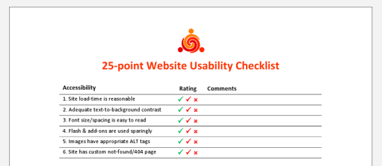
The 25-point Website Usability Checklist (PDF) can be a helpful aid to your workflow.

It doesn’t make the job any easier to second-guess yourself into a state of neurosis  (something perfectionists do quite often) or to make blind decisions. There’s no perfect method for gauging a project’s needs or the decisions we make, but asking difficult questions during the process helps us avoid issues later on.

15 Questions for Project Management

One of the central tasks of web design is project management. Building a new website is like setting the foundation for a house. With so many details to deal with, planning ahead and managing the ongoing tasks is essential.

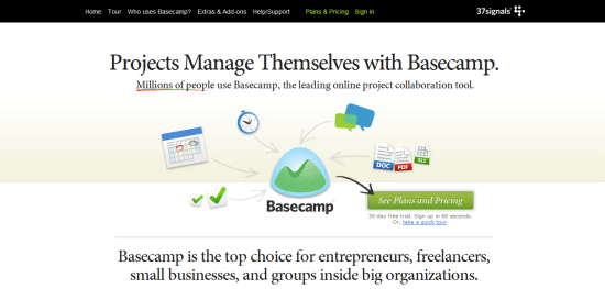
Basecamp is a popular and effective project management app.

1 Has the client signed the contract? Working without a contract is extremely risky.

2 Do you know what the final product should look like? Having a solid plan of action, including a few diagrams, wireframes, prototypes or mock-ups, can enhance clarity.

3 Has all of the content been written? A website without content is like a painting without a canvas; ideally, a website should be built around the content, not vice versa.

4 Does the website require any pre-built solutions? Life can be made easier with tools such as content management systems (e.g. WordPress) and scripts, so determine what you need before you start coding.

5 Do you know what the competition offers? Your rivals are often the best source of ideas, and knowing what they offer can help you meet visitors’ expectations.

6 Have you set appropriate deadlines? Setting realistic deadlines and tracking your progress towards those deadlines is always important.

7 Will you need to factor in additional costs? Websites are relatively inexpensive, and you can build a good one using free software, but still, you must be on top of any expenses you might incur.

8 Do you have the necessary skills? Some websites are more complex than others; consider which technologies you will need to work with and whether your knowledge of them is current.

9 Have you thought about marketing? A website without visitors is useless. Look into your options for social networking, SEO, advertising and more.

10 Will the website actually be useful (or even necessary)? There is no point wasting your energy on a project that will have no value for end users, so start by weeding out bad ideas.

11 Is a target audience mapped out? Knowing what kind of people you hope will visit the website will help you not only write appropriate content but design effectively, too.

12 Do you have a checklist or criteria? Even a set of basic criteria to maintain quality control or a checklist for larger projects would help.

13 Can your host cope with the demand? Getting the right type of hosting is important; there’s no point in having shared hosting if you’re going to be streaming gigabyte-heavy video.

14 Have you got the media?  Some websites require video, audio and special file types such as PDF documents. Accounting for assets early on lessens the risk of launch delays.

15 What features do you hope to include? Perhaps you need to accept payment, or maybe you want a photo gallery. Whatever you need, plan ahead prior to designing the layout.

15 Questions for Code-Authoring

Next up are questions to ask regarding writing code. If you design or develop websites, you’ll find yourself working with HTML, CSS, and JavaScript. Every language has a range of best practices and guidelines to follow, which is great if you want to standardize your end-product. However, there are a lot of other things to consider besides being standards-compliant.

The impact of source code on the effectiveness of your content is often overlooked yet very real.

16 Does the code validate? While validation isn’t a complete testament to code quality, it does help to make sure that your code follows recommended standards and can show you errors in your markup, CSS, and JavaScript.

17 Have you considered using CSS3 and HTML5?  Though many users still don’t use browsers that have CSS3/HTML5 support, if implemented with progressive enhancement in mind, taking advantage of these future W3C recommended standards gives your products added value and improves the craftsmanship of your web designs.

18 How semantic is the code? Using the right tag for the job is essential, and search engines love semantic code. Use <p> for paragraphs, <ul> for listed items that have no ranking, <ol> for items that have a sequential relationship, <a> for hyperlinks and <button> for clickable UI components that perform an action/user task.

19 Are you taking advantage of optional files and site add-ons? Whether in the form of using the Sitemaps XML protocol or including a favicon, these optional files can enhance your website. See five files that can improve your website.

20 Do you need an RSS feed? If your website is content-heavy and is updated frequently (e.g. a blog or news site), having an RSS feed will be a necessary site feature for keeping your users up-to-date with fresh content. If you don’t use a CMS with this feature built-in, check out SimplePie, a PHP class for building your own RSS feed.

21 Will the code degrade gracefully? Graceful degradation (also known as fault-tolerance) — the notion that a system (in this case, a website) will still function under sub-optimal situations — is essential for flexible and web accessible site builds. Learn how to pragmatically apply graceful degradation when using CSS3.

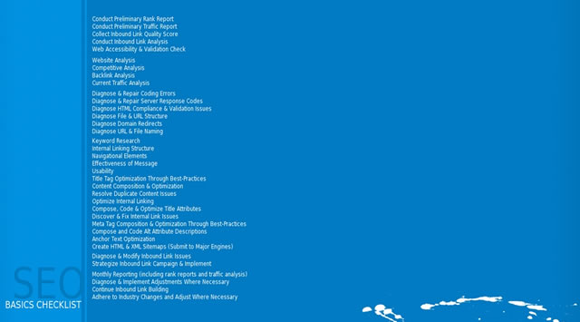
22 Have you considered SEO? While search engine optimization should not dictate your design decisions, it wouldn’t hurt to consider how your website could be more visible in search engine results. Read some SEO tips to remember when building your site and ways to improve the SEO of your web designs.

23 Do you provide a printer-friendly style sheet? Designing a print CSS file is worth the time investment as many users still do print out web pages.

24 Is any of your code deprecated or non-standard? Using "dead code" such as the <font> tag that was deprecated in W3C HTML 4 specifications as well as non-standard code such as the <blink> tag is frowned upon and won’t allow your work to validate against W3C web standards recommendations. Double-check that you’re not using any by taking advantage of free validation tools such as the W3C Markup Validation Service.

25 Do you need to use conditional comments? IE6 isn’t going to go away completely, and if your project requires you to support IE and to use browser-specific code, use conditional comments to serve IE-specific stylesheets instead of using hacks. This does two things: It gives you the ability to get your code to validate under W3C standards, and when you decide to stop using browser-specific code, you only need to remove the conditional comments in your site template. Leveraging JavaScript techniques for fixing IE6 and projects such as HTML5 Boilerplate to solve deprecated-browser rendering issues could be another option, but you’ll be stuck in scenarios where the user uses an old browser with JavaScript disabled — a scenario that is not as uncommon as you might think.

26 Are structure (HTML), presentation (CSS), and behavior (JavaScript) separated? This is important not only because it’s best practice, but also leads to more manageable and maintainable code.

27 Is your site navigation laid out in a practical way? The navigation menu is the most important part of your website. Getting it right is an integral part of an effective site information architecture.

28 Have you checked for unnecessary HTML elements and redundant CSS style rules? Code bloats easily, so strip away any non-essential and repeated bits of code for more maintainable and leaner (and thus, higher performance) website builds. For HTML/CSS optimizing purposes, check out HTML Tidy and CSSTidy.

29 Is the code organized and maintainable? Put care and attention into your code. Lay it out so that it’s easy to read, update and manage.

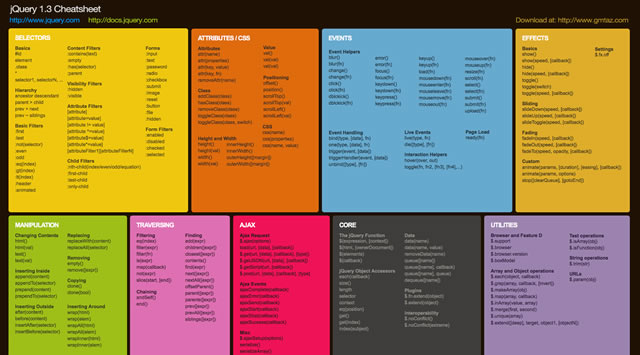
30 Would a framework enhance the site? These days, open source Ajax/web development frameworks such as jQuery and MooTools can speed up code-authoring and ensure fewer headaches due to cross-browser issues. If you suspect these frameworks might help, why not investigate and learn about them?

15 Questions for Web Designing

The process of creating a layout is full of questions related to color, typography and even distinctiveness. While your project management style may be superb and your coding technique beyond measure, design comes with its own set of questions. Web design calls for endless decisions, and that’s what these following questions are supposed to help you resolve.

Asking Yourself Questions Is Important
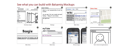
Using a wireframing tool like Balsamiq Mockups ensures a solid layout foundation.

31 Have you optimized your media? Images, videos and audio take up more bandwidth and space than anything else. Consider compressing and optimizing them with tools such as Smush.it.

32 Is the user interface overcrowded? If there’s one thing no one likes, it’s a stuffy and bloated design. Determine whether reductionism can help you design better websites.

33 Is the design distinctive and unique? With site templates in abundance, having a layout that’s fresh and eye-catching is a must. Breaking the mould may improve your brand’s identity.

34 When should I redesign? Are you able to produce something totally different or enhance what you have?

35 Does the layout make sense? Whether you pick one column or three, a lot of scrolling or none, decisions on your pages’ visual hierarchy will directly affect readability.

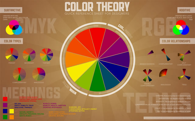
36 Do the colors give off the right feeling? Color is closely linked to emotion; a palette can be the difference between a fun-looking website and professional-looking one.

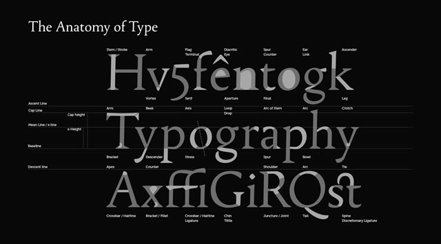
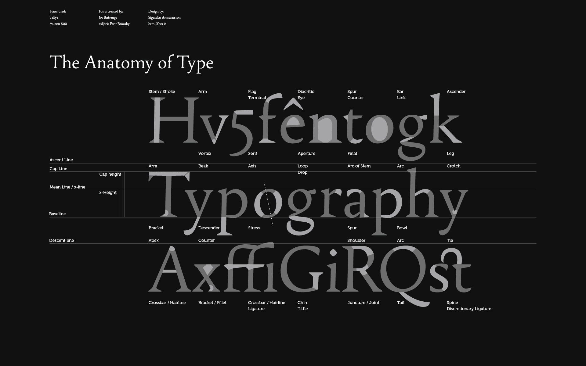
37 What typography is best? As with color, typography affects the feel of the website. Build your font stacks wisely and attentively and take time to craft a masterful typography design.

38 How visible are links? Links have no purpose if they cannot be seen. Make sure you take the time to design your hyperlinks well.

39 Are you using enough white space? Too many websites squeeze everything too close together. If you add some breathing room, the result could be improved readability.

40 Have you considered content on-demand? With the rise of Ajax and fast content switching techniques, packing more data onto the page is easy. Consider doing this with very long web pages.

41 Is the design aesthetically pleasing? While this process is subjective, it’s still a good idea to get feedback from your friends, co-workers and perhaps a stranger or two to determine whether your work is visually appealing or not.

42 Is the content readable? Nothing is more important than content; if it’s legible and coherent, then your site users will be happy.

43 Does the design scale at various resolutions? Displays are getting bigger (bigger desktop monitors) and smaller (mobile devices) at the same time; make sure your work renders in all web-enabled devices. For mobile devices, take advantage of free tools for testing designs in mobile devices.

44 Are important site features emphasized? Some things are more important than others; consider the various ways that relevant content can be highlighted so that visitors can easily find it.

45 Does the website feel complete? This is probably among the most important yet difficult questions to answer. Recognizing when it’s ready requires a lot of care and thought.

15 Questions for the User Experience

The user experience is perhaps the most important factor for determining the success of a website. Here are questions related to UX, usability, and accessibility.

Accessibility, usability and compatibility: few things are more important. Silverback is a popular usability testing app.

46 Does the website work equally well across different browsers? There are plenty of browsers out there — make sure your website works well in the major ones. You can use a web service like Browsershots to preview your work in various operating systems and web browsers.

47 Is the website mobile-friendly? While desktop browsers are pretty straightforward (with the exception of IE), mobile devices require an extra bit of care and attention; read about best practices for the mobile web design.

48 Have you tested the website in a screen reader? Unfortunately, even with free screen readers out there like Fire Vox, a screen-reading add-on for Firefox, few web designers consider testing their designs for screen-reader web accessibility. You might want to.

49 What happens when JavaScript is turned off? Not every experience is the same and we can’t control the visitor’s browsing environment, so try to make sure your website gracefully degrades when JS is turned off.

50 Do you offer alternatives to Flash content? Following on the previous point, if your website is particularly Flash-dependent, you might want to make sure that your use of Flash is accessible.

51 Did you remember alt attributes? One of the simplest accessibility aids to implement is using descriptive and useful alt attribute for images.

52 Have you evaluated your website against Web Content Accessibility Guidelines? Complying with web accessibility best practices is important for users who have disabilities that affect their capability to browse the web. Fulfilling the recommendations in the W3C Web Content Accessibility Guidelines (WCAG) is the perfect place to start.

53 Has the website been tested by other people? Usability testing is quite easy and inexpensive to carry out nowadays. Performing tests could give you ideas for improvements. Check out web services such as Concept Feedback and Feedback Army.

54 Do your URLs make sense? URLs that are easy to read will give potential visitors the chance to predict where they’re headed (and is good for SEO to boot). Using pretty URLs (example.com/about-us) instead of system URLs (example.com/?p=655) can enhance the experience of visitors. If you’re using a content management system or a custom-built app, learn about rewrite engines.

55 How quickly does your site load? Speed is an important factor of usability. Consider how your website will affect visitors, particularly ones on slow connections.

56 Is the search functionality easy to use? Most websites need a search box to help visitors locate the information they need. Ensure that yours is easy to use and that the results are accurate.

57 Will there be any potentially obnoxious behavior? Whether it’s pop-ups and modal windows that won’t close, or scripts that cripple right-clicking, make sure your site doesn’t have behavior that annoys users.

58 Are your web forms usable? If you’re asking for too much information or your forms are too hard to complete, people will enter fake details or simply refuse to submit the data.

59 Can the site owner be contacted without difficulty? While you might get spammed in the process, allowing visitors to send you an email or to initiate a Skype call could be a great way to connect with them.

60 Have you checked for broken links? Root out dead links in every nook and cranny. Tools such as Xenu’s Link Sleuth can automate the process; learn how to discover broken links in your website.

Conclusion

As we learn and grow, our competency increases, which changes our perspective and workflow. Designers and developers who regularly question their methods and ideas are usually the ones who get the job done right and are the ones who consistently improve their processes and products.

Related Content

About the Author

Alexander Dawson is a freelance web designer, author and recreational software developer specializing in web standards, accessibility and UX design. As well as running a business called HiTechy and writing, he spends time on Twitter, SitePoint’s forums and other places, helping those in need.


What Does Web Design Say About Your Small Business?

13 Dec


This post originally appeared on the American Express OPEN Forum, where Mashable regularly contributes articles about leveraging social media and technology in small business.

If you’ve ever been horrified by the design of a small or local business website, you’re not alone. There are so many aesthetic travesties out there, and worse, many small businesses still don’t even have a website. One recent study concluded that a paltry 54% of small businesses maintain a home on the web.

Your business doesn’t need an elaborate multimedia site, but you do need an eye-pleasing and informative destination. After all, you wouldn’t (purposefully) hang an ugly sign on your storefront or office. Why would you present an ugly website to your prospects?

With this in mind, we spoke to some professional web designers about their favorite small business websites. They explained why these sites make sense for each company and why the design is an asset to their business.


Make Business Personal at First Click


Go Realty Website

Jacob Gube, a web developer and the founder/chief editor of Six Revisions, looks at North Carolina real estate firm Go Realty’s website as a way to personalize a sometimes impersonal industry.

“They put a great deal of emphasis towards humanizing the process of buying a home,” said Gube. “To most real estate companies, you’re customer record ID #67343, budget range $200,000 to $225,200, but to Go Realty, you’re the Johnsons with a baby girl named Amy. They convey this personality through their site design.”

Gube notes Go Realty’s very welcoming website that puts people first and properties second.

“The home page has a beautiful image slider that flips through photos of the people they’ve dealt with, with short descriptions of their stories. They have a Fan Mail section that flips through messages from happy clients,” said Gube. “When you see all that, as a prospective home buyer and client, you’d think, ‘Wow, these guys will take care of me.’ ”

When it comes to something as personal as purchasing a home, this is a smart design choice. While it may be the inclination of many companies to put products front and center, a page of property listings can be less inviting than a satisfied customer.

“I think for a real estate company, they have a truly unique angle and they have a web design that manages to convey their core message,” Gube noted.


Accentuate Your Products With Complementary Design


Hardgraft Image

Shopping carts and product galleries have become staples of the e-commerce landscape, but that doesn’t mean they have to look stale. If you sell attractive products, make sure they live on an attractive website.

Tim Van Damme, a freelance web developer based in Belgium who knows a thing or two about web aesthetics, cites online retailer Hardgraft as a case study in minimalism and product display.

“Their website is beautifully designed, featuring just a couple of products with large, beautiful photographs. They’re clearly targeting the more fashion-aware web nerds this way,” said Van Damme.

The site sells cases and sleeves for electronics, as well as handbags and wallets. The sleek modern products sit nicely on a clean, modern website. The presentation is complementary, and there’s nothing to distract the eye from the merchandise. A site like this expresses organization and straightforwardness — qualities your customers are always after.

“Their products are pretty expensive, yet every conference I go to I see multiple of them in the audience,” Van Damme noted.


Sell to the Right Consumers, Visually


If you’re targeting a certain customer demographic, good web design can help.

Kelli Shaver, a web app developer who specializes in user interfaces and experiences, points to Gazel, Inc., purveyors of unique, organic bath towels and robes. Its website evokes a sense of luxury that befits the customers who can afford these products.

“Clearly the site is targeting environmentally conscious consumers with expendable incomes and sophisticated tastes,” said Shaver, noting Gazel is not your typical e-commerce website. “The focus seems more on educating customers about the products than simply selling those products. The combined effect of the colors, typography, textures, and photography just feels expensive and high-quality.”

In essence, the site “feels” like the products it’s selling, and that goes a long way toward user experience, according to Shaver.

“Nearly everything about the site is inviting. Rich, warm colors and earth tones give the visitor a feeling of calm,” she said. “The slide show on the landing page, in addition to showcasing some of the company’s product, also brings in a lot of texture.”

The takeaway here should be that if your customers feel at home on your website, they’re more likely to browse and buy. That may seem obvious, but think about who your customers really are as you develop your web presence. Your web designer won’t know this, so be sure to communicate it effectively. The branding payoff can be big.


Informational Sites Don’t Have to Be Boring


SWFWMD Image

If you thought some small business websites were rough, visit a government agency online sometime. They can be notorious for bad design, poor navigation, and a general disinterest in Web 2.0 functionality.

Not so with the Southwest Florida Water Management District, says Chris Coyier, a web designer and blogger at CSS-Tricks.

“The home page is OK, but the site actually gets better and more interesting the deeper you go,” said Coyier, noting the exceptional layout of the recreation page, and the pages for individual locations administered by the department.

“The most important part they got right was thinking about what the mindset of an actual user of the site is like — in this case, me,” said Coyier. “It’s easy to browse by featured locations, type of activity, and specific regions, all of which were of interest to me, so it was fun to click around.”

This site could so easily have gone with black and white bullet lists, but instead went the extra mile to draw the user in with design.

“The aesthetics are totally appropriate for an outdoors kind of site — tans and greens and browns with flourishes of plant life,” said Coyier. “The location-specific pages are amazing. Everything I would want to see: photos, maps, specifics on what you can do, rules, etc. The visuals are great, but the information architecture is the best feature.”


More Business Resources from Mashable:


- 5 Design Trends That Small Businesses Can Use in 2011
- 10 Free WordPress Themes for Small Businesses
- 5 Beautiful Tumblr Themes for Small Businesses
- 10 Free Drupal Themes for Small Business
- 5 Big Social Media Questions from Small Business Owners

Image courtesy of Flickr, Mike Rohde.


Reviews: Flickr

More About: business, design, small business, web design, Web Development

For more Business coverage:


Cortex for Chrome Makes Sharing Faster, Prettier & More Fun Than Ever [EXCLUSIVE]

08 Dec


We’re having a blast tonight playing with Cortex, an insanely fast, beautifully built extension for Google Chrome. It’s lightweight as all get-out, and it lets you share content all over the web literally faster than you can say, “Hey, look at this.”

Here’s the gist of it: Install the extension, find content you want to share, then click and hold. When you do, your mouse will be surrounded by a wheel of options. Flick your mouse in the correct direction, release your finger and voilà, your content is shared to Twitter, to Tumblr, to a specific Facebook friend’s wall — wherever you desire — accompanied by a charming “whoosh” sound.

The entire process takes about two seconds, and it’s as good-looking as it is fast.

The Cortex interface is incredibly unique. We’re generally big fans of apps that get out of your way when you don’t need them; we love it when features are unobtrusive and recede gracefully.

In that sense alone, Cortex is the perfect antidote to the array of hideous sharing mechanisms that populate the web today — those obnoxious bars, frames and buttons that clutter up the visual space and make your eyes long for rest. From a design perspective, Cortex is a breath of entirely fresh air.

In terms of user experience, the extension also makes sharing incredibly easy for users. It chooses header text and shortens URLs; it even lets users share just an image or specific selected text. Cortex also lets you track your history of shares. The only thing we wish worked a tad better is image sharing; right now, Cortex sends a link to Twitter and Facebook when we try to share images.

Right now, you can share to Facebook, Twitter, Tumblr and Instapaper. More options will be coming soon.

Here’s a brief demo video that shows how Cortex works:

Cortex was just launched along with the all-new Chrome Web Store. It comes from the brain of Google intern-turned-entrepreneur Joey Primiani, who said in an e-mail, “Learning from building successful products at Google, I love focusing on things people use on a daily basis. It’s a technology that I think is really focused, very simple and useful.”

Expect to see tablet and mobile features for Cortex soon. In the meantime, give it a shot and let us know in the comments what you think.

Demo video courtesy of Good Morning Geek.


Reviews: Facebook, Google, Tumblr, Twitter, instapaper

More About: chrome, chrome extension, cortex, Google, joey primiani, trending

For more Social Media coverage:


Parallax Effect In Web Design

30 Nov

A little seen effect in modern web design is the parallax effect or parallax scrolling. Parallax involves layered images that move at different speeds from background to foreground, creating depth and if designed cleverly enough, the illusion of 3D space. The effect can be achieved with plain old CSS and HTML, as well as with jquery powered javascript application jparallax.

One of the most well known individual examples of CSS within the web design community of CSS-based parallax is on Clearleft’s landing page for their Silver Back App. The vines at the top of the page are set as parallax layers.

The images look great as a set of layered static images but there is no mouse interactivity, and the effect can only been seen “in action” while the browser window is being re-sized. Designer Paul Annett says using parallax in such a subtle way where not everybody sees it is “like a hidden Easter egg for those who do.” You can view a full explanation of the css that Paul used for the effect on his article here.

Paul says that designers are free to use the source code from the site to apply the effect to their own designs. He goes on to say that “the technique, combined with others, opens the door to all sorts of possibilities. I can imagine things hiding behind solid foregrounds and only sliding into view as the browser size exceeds a certain dimensions, or elements fading into view as the browser is resized. Show me what you can do!” The effect can also be seen on the footer of the Future of Web Design site, the footer of IconJelly, and in the bird overlay graphics found on the footer of the Forever Circling blog.

Applying parallax with css may look good when applied correctly such as on the SIlverback site, but there is no animation present when the application is seen with simple CSS and HTML. Using pre-built javascript libraries to create the parallax effects also lets the designers control animation, speed, and mouse interactivit.y This really opens up the possibilities of using parallax within a website design to something more than just a pretty picture: with javascript, it’s a pretty, moving picture.

One method of applying the parallax effect to website design is with the the jquery powered plugin jParallax. jParallax creates layers that move in response to the mouse. The demo examples of jParallax show how the effect can be used with various combinations of layered graphics and mouse interactivity.

Another application of the parallax effect using javascript is seen on Brett Taylor’s Parallax Backgrounds. In the example, Brett has set the site content to scroll normally but the background cloud layers to be offset, creating a parallax effect as they scroll faster than the rest of the page. The parallax background example shows another, simple way designers can integrate parallax into their sites design using javascript.

A similar jQuery based parallax effect is called Scrolling Parallax. Scrolling Parallax has more live examples than on the Parallax Background page but the effect and implementation is essentially the same. The layered leaves demo seemingly creates more movement than on the previous cloud example, but it’s really the same effect just with bigger overlapping images. View Jon Raasch’s Scrolling Parallax demo page for examples and source code.

This short introduction to the parallax effect in web design shows how the effect can be achieved with javascript, and with clever CSS as seen in the Silverback example. Parallax is an effect that is not seen too often in website design, but with new javascript powered tools it can be applied to a site’s design in innovative and creative new ways. Have you seen the parallax effect used in a website design that you’d like to share? Let us know below.

Follow up with this GrindSmart Media Author: Rosston Meyer through his web portal Rosstamicah.com, via Twitter, and his Websume.


A sign for dogs that destroy packages

23 Nov

After loosing books, clothes, credit cards, and boxes of every shape and description I finally made this sign for my front gate. Here is the pdf if you need one yourself: my dog eats packages.pdf

A sign for the dog that eats everything.


Create Automated Website Tests with Ease

12 Oct


This post is part of Mashable’s Spark of Genius series, which highlights a unique feature of startups. The series is made possible by Microsoft BizSpark.. If you would like to have your startup considered for inclusion, please see the details here.

Name: Fake

Quick Pitch: Fake is a new browser for Mac OS X that makes web automation and testing simple.

Genius Idea: Inspired by Apple’s Automator, Fake is a tool that lets web designers and developers create graphical workflows that can be run again and again, without human interaction. These workflows can be saved, shared and edited at ease.

Fake is the creation of Todd Ditchendorf’s Celestial Teapot Software. Ditchendorf is the guy responsible for Fluid, one of our favorite single-site browsers.

Whereas Fluid is a great tool that can appeal to a wide array of users, Fake’s target audience consists of developers, web designers or people that have to perform the same automated tasks repeatedly. That is to say, if you aren’t doing a lot of website testing, unit tests or debugging, Fake might not be for you.

However, if you are a web designer or developer, Fake is just awesome. I’ve been using this app for the last month or so and I have to say, the ability to create workflows to perform rudimentary tasks like capturing a screenshot or filling out a form or clicking on a link is just really remarkable.

A common workflow I utilize is taking screenshots. Oftentimes when I’m writing a post, I’ll need a screenshot from lots of different sources. Rather than taking each screenshot individually, I can just enter in each URL into Fake and have it repeat the “capture screenshot” action for each site. That way, while I’m writing in the background, my screenshots are being captured and saved to a folder of my choice.

For testing purposes especially, the fact that Fake has assertions, assertion failure handlers and error handlers makes it really powerful. It’s often hard to get a real sense of how a site or web app is going to perform under certain conditions. User testing is great, but it can be expensive and time consuming, especially if you need to test various alternating aspects of a site.

The great thing about saving workflows is that you can modify or rerun the workflow against other content. So for people doing A/B testing, you can set up the same set of “fake” interactions for each version and compare results.

Fake is $29.95, but you can download a free trial to see how you like the app. The trial doesn’t let you save workflows and limits you to eight actions at a time, but it’s a great way to determine whether you need this kind of app.

Check out this video to see Fake in action:

Designers and developers — what types of tools do you use for unit or automated testing? Let us know.


Sponsored by Microsoft BizSpark


BizSpark is a startup program that gives you three-year access to the latest Microsoft development tools, as well as connecting you to a nationwide network of investors and incubators. There are no upfront costs, so if your business is privately owned, less than three years old, and generates less than U.S.$1 million in annual revenue, you can sign up today.


Reviews: fluid

More About: automator, fake, fluid, mac apps, single-site browser, software, unit testing

For more Dev & Design coverage:


Google Just Lost a Potential Ally in its Legal Tussle with Oracle

12 Oct


The battle between Oracle and Google over Android’s use of Java just got a lot more interesting. That’s because IBM has announced that it will be collaborating with Oracle to work on the OpenJDK project.

This means that IBM will no longer be part of the Apache Software Foundation’s Project Harmony, the project that provides Android with the components it needs to run Java code. With IBM leaving the project, Harmony is basically dead in the water.

Although Android wasn’t mentioned in the announcement, this is all interrelated to the Oracle lawsuit. Google responded to the lawsuit last week, claiming that Oracle, which got Java out of its purchase of Sun Microsystems, was acting in bad faith.

For the non-Java savvy out there, here’s an abbreviated rundown of how and why all of this stuff matters:

Apache Harmony is an open source implementation of Java. The goal in creating the project was to unite all of the various free software Java implementations together under one banner.

The project had a lot of early support, the only problem was that Sun (and then Oracle) never offered the project with a Technology Compatibility Kit (TCK). The TCK is needed to prove that Harmony is compatible with the Java specification and can be seen as a certified Java independent version of Java. When Sun first open sourced aspects of Java in 2007, it said it would provide the Apache Foundation with the necessary TCK for certification.

Sun never made good on those assurances and when Oracle took over Sun, the new company wasn’t interested in sharing the TCKs, instead wanting to focus all of its efforts on the officially sanctioned open source Java implementation, OpenJDK.

IBM’s Bob Sutor discussed the decision on his blog, writing:

“We think this is the pragmatic choice. It became clear to us that first Sun and then Oracle were never planning to make the important test and certification tests for Java, the Java SE TCK, available to Apache. We disagreed with this choice, but it was not ours to make. So rather than continue to drive Harmony as an unofficial and uncertified Java effort, we decided to shift direction and put our efforts into OpenJDK. Our involvement will not be casual as we plan to hold leadership positions and, with the other members of the community, fully expect to have a strong say in how the project is managed and in which technical direction it goes.”

This is a big blow to the Harmony project and by extension, to the libraries and classes that Android implements from Harmony in Android. Without big backing like IBM behind the project, it’s not likely to survive.

For now, the Harmony implementation of Java is fine. The problem will be when future versions of Java are released and Harmony can’t keep up in terms of features.

In Java, staying compatible is key. Interestingly, InfoWorld notes that Google has more developers working on OpenJDK than Oracle. So why choose Harmony for Android?

We think it’s because Google wanted to do an end-run around Sun’s licensing requirements. In essence, getting to take advantage of Java SE on mobile devices (something that Sun explicitly forbade without a license), but not having to pay for it.

Long before Sun’s sale to Oracle, others pointed out the potential licensing and IP quagmire that Google was entering with Android. The reality was, Sun didn’t have the power, the funds or the industry clout to really do anything about it.

Oracle does. In fact, Oracle’s clout and power is underscored by IBM’s decision to join up. IBM may be making its decisions for pragmatic reasons, but in the decision shows that IBM is not willing to side with Google in this elongated fight.

At this point, Google’s only real recourse is to sensibly settle and pay Oracle, or countersue and drag the fight out even longer. By fighting back, Google risks alienating its Java-base of developers.

While we question how important having a strong base of Java developers really is to Android’s success in the long term, it doesn’t mean it’s worth risking the future developments of the platform on a legal gamble.

Oracle is out for blood and IBM just provided the syringe.


Reviews: Android, Google

More About: android, apache foundation, Google, harmony, IBM, java, lawsuits, legal, oracle

For more Tech coverage:


25+ Web Designs with TyPoGrApHy as a Dominating Design Element

10 Oct

25+ Web Designs with TyPoGrApHy as a Dominating Design Element

I lave the diversity and creativity found in web design. With hundred millions of web pages to compete with it is important to have a unique and compelling look and feel. There are many ways to achieve this and working with typography is certainly a good option. This article present a bunch of web sites that have designs making heavy use of typography to deliver the main message.


WooThemes - Made by Designers

waytoogood

salfordstories

foxbone

davidbatra

jprasanen

ourdollarwedding

piksal

surinderthakur

stockholmhairdresser

youandigraphics

.freshme

solidpink

egoitzosa

galp

lemo-design

talkingtelford

thisismypixel

.fsmdesign

tvlcorp

ins.pire.me

fealves htgmeb

Feed provided by tripwrire magazine, Visit this post here: Permalink


Useful Collection of Cheat-Sheet Desktop Wallpaper for Web Designers

07 Oct

Typical cheatsheets tend to be over-sized documents, far too large to be viewed in its entirety on a desktop and not too handy for the super-fast reference that is needed. To get the full benefit of any cheatsheat, your only real option is to print it out and keep it close at hand. Wouldn’t it be nice if there was an easier way, a quicker way. Of course there is – what good be handier than having a cheatsheet set as your desktop wallpaper? Always there for quick reference, no need to print it out and no need to scroll through an over-long document.

In this post we have rounded up a selection of cheatsheet wallpapers, in various sizes, covering various technologies, like CSS, HTML5, WordPress, Javascript and many more.

WordPress Help Sheet Wallpaper

WordPress Help Sheet Wallpaper
The WordPress Help Sheet Wallpaper is a simple desktop wallpaper listing Basic Template Files, PHP Snippets for the Header, PHP Snippets for the Templates, Extra Stuff for WordPress, based on the WPCandy WordPress Help Sheet.
Download: 2560x1600px.

Drupal Cheat Sheet Desktop Wallpaper

Drupal Cheat Sheet Desktop Wallpaper
The Drupal Cheat Sheet Desktop Wallpaper is a desktop wallpaper that features the most popular variables of the open source content management system Drupal.
Download: 1024x768px – 1280x800px – 1440x900px – 1680x1050px – 1920x1200px.

HTML5 Canvas Cheat Sheet

HTML5 Canvas Cheat Sheet
The information on this wallpaper is pretty much just a copy of what is found in the WHATWG specs, just condensed and a little bit easier to read. There are virtually no explanations, and no examples other than some graphics for compositing values. It's basically just a listing of the attributes and methods of the canvas element and the 2d drawing context.
Download: 1388x1027px.

CSS Cheat Sheet Wallpaper in Helvetica

CSS Cheat Sheet Wallpaper in Helvetica
This is the very popular CSS cheat sheet in Helvetica from styl.eti.me. Simplistic in appearance, but very useful for quick referencing. Unfortunately we can not find a working download link for this cool wallpaper, but the good news is they do have a PSD version available. So download it and resize.
Download: CSS Cheat Sheet Wallpaper in Helvetica.

TextMate Shortcuts Wallpaper

TextMate Shortcuts Wallpaper
Here is a TextMate wallpaper that will guide you through some of its powerful features and help you get a handle on all of the keyboard shortcuts. The PSD file is also available.
Download: 1280x800px – 1920x1200px.

Yahoo! UI (YUI) Cheat Sheets as Wallpaper

Yahoo! UI (YUI) Cheat Sheets as Wallpaper
Yahoo! provides a number of cheat sheets for their YUI library widgets however these are all in PDF format and not usable as wallpaper. However, here you will find all of those cheatsheets converted to PNG images of various sizes all for your desktop.
There are wallpapers available for Animation, Calendar, Connection Manager, Dom Collection, Drag & Drop Event, Utility & Custom Event Logger, Slider and TreeView. And all are available in the following desktop sizes: 1400x1050px, 1280x960px, 1165x900px and 1024x768px.
Download: Yahoo! UI (YUI) Cheat Sheets as Wallpaper.

jQuery 1.3 Cheat Sheet Wallpaper

jQuery 1.3 Cheat Sheet Wallpaper
Download: 1440x900px – 1680x1050px – 1920x1200px.

Prototype Dissected Wallpaper

Prototype Dissected Wallpaper
If you need a little help in getting to know Prototype a little better and some help in understanding how the code works, then this is the wallpaper for you. You have a choice of either a dark or white wallpaper, and are available in these sizes: 1280x960px and 1440x900px.
Download: 1280x960px (Dark) – 1440x900px (Dark) – 1280x960px (White) – 1440x900px (White).

Git Cheat Sheet Wallpaper

Git Cheat Sheet Wallpaper
Download: 1100x850px – 3300x2550px.

A Themer's Cheatsheet Wallpaper

A Themer's Cheatsheet Wallpaper
A Themer's Cheatsheet Wallpaper is a quick refresher of web design fundamentals directly on your desktop. It is available for download in several different colors and the original SVG has been released to the Public Domain.
Download: 1280x800px (Blue) – 1280x800px (Red) – 1280x800px (Black) – 1280x800px (Green).

Font Anatomy Wallpaper

Font Anatomy Wallpaper
Download: 1920x1200px.

SEO Wallpapers

SEO Wallpapers
Think of it as a desk reference checklist that is always at your fingertips. From pre-campaign to reporting, the basics (and more) are right here for you to put directly on your desktop.
Download: 1024x768px – 1280x960px – 1280x1024px – 1440x900px.

Periodic Table of Typefaces

Periodic Table of Typefaces
Download: 1024x768px – 1280x800px – 1280x1024px – 1440x900px – 1680x1050px – 1920x1200px.

Color Theory Quick Reference Poster

Color Theory Quick Reference Poster
The Color Theory Quick Reference Poster for Designers has all of the basics of color theory contained in one place – specifically, a cool infographic-esque poster. This way, you can quickly reference things that may have slipped to the back of your mind since design school.
Download: 1280x800px – 1440x900px – 1680x1050px – 1920x1200px.

Web Designer Wallpaper

Web Designer Wallpaper
Download: 1280x1024px (White) – 1280x1024px (Dark) – 1680x10050px (Dark) – 1280x1024px (White).

You might also like…

14 Essential WordPress Development and Design Cheat Sheets »
17 Productive Photoshop Cheatsheets and Reference Cards to Download for Free »
The Best Cheat Sheets for Web Designers and Developers (From CSS, Ajax, Perl, Vbscript…) »
CSS References, Tutorials, Cheat Sheets, Conversion Tables and Short Codes »
20 CSS3 Tutorials and Techniques for Creating Buttons »
50 Useful Tools and Generators for Easy CSS Development »
50 Essential Web Typography Tutorials, Tips, Guides and Best Practices »
The Blueprint CSS Framework – Tutorials, How-to Guides and Tools »