RSS
 

Archive for August, 2011

Budweiser Rocks the Bowtie

05 Aug

Budweiser Can, Before and After

First brewed in 1876, Budweiser is one of the best-selling beers in the United States and probably one of the most recognized beers here and abroad. Budweiser is the flagship brand of Anheuser-Busch, that reportedly holds a 48.3 percent share of U.S. beer sales to retailers. This past Wednesday, Budweiser announced a new can design — the 12th redesign since 1936 when it began using them — focused on the "Budweiser bowtie" which, according to this explanatory diagram was created as a symbol to encourage people to order the beer by its full name, instead of just by "Bud". The new packaging was designed by London-based JKR. (So much for the "All-American" beer).

Budweiser

Our refreshed packaging design gives Budweiser an updated look, which dramatizes the iconic Budweiser bowtie and incorporates the brand hallmarks that loyal Budweiser drinkers will recognize and appreciate.
— Press Release

Budweiser

Budweiser

Using the same design principles as the newly designed can, the redesigned secondary packaging will be used for all package configurations and emphasizes the Budweiser creed, which highlights the beer's unique Beechwood Aging process and 135-year long commitment to quality.
— Press Release

Budweiser

Budweiser

I have always loved Budweiser's can and bottle labels: the busyness, the wordiness, the medallion-ness. Totally over the top but very restrained. And highly recognizable with that striking red and blue on white. The new can has lost pretty much all of that beautiful contrast. The blue is nearly all gone leaving the can mostly red, now with yellow taking on as a secondary color and just some small fields of white coming through. The bowtie element… I don't drink Budweiser so I haven't spent hours philosophizing about its design while I drink (as I usually do when I do drink beer) but I had never associated the bowtie with Budweiser. It's not in any of the previous cans. So it seems a weird thing to be building the brand around.

The secondary packaging relies even more on the bowtie logo and it's big. The logo hasn't changed much from previous versions, it has just been cleaned and beefed up. Overall, the execution of the redesign is very well done, but it's the strategy that seems off. I guess when you hold such a stronghold on the beer market one can afford to make this kind of bold change and just count on the dominance for the packaging to eventually become as iconic, or at least recognizable, as the previous one.

Thanks to Jason Huebsch for first tip.

Vote
Don't forget to cast your vote about this post online

Many thanks to our ADVx3 Partners


Things That Kill More People Than Sharks

04 Aug
It might be Shark Week at Discovery channel, but hot dogs & high school football kill more people than sharks. A good reminder that a fear of sharks is irrational. Check out the list of 20 things that kill more people than sharks every year here. Among them….hippos, lightening, tornadoes….oh, and hotdogs (which target CHILDREN!).


Source: buzzfeed


A test for multiple universes finds four . . . maybe [Mad Science]

04 Aug
Multiple universes are accessed, in fiction, through portals in space or mystical necklaces or sometimes just in dreams, but always when characters break the rules of space time. In reality, alternate universes are not in other dimensions. They're just far, far away. And the reason they are alternate universes is that they can't be reached no matter what. But can they be tested for? More »


Orbiter spots possible water seepage on surface of Mars

04 Aug

Over the last several decades, evidence has piled up that Mars once played host to liquid water on its surface. But in its current geological era, the red planet is too cold and has too little atmosphere to allow liquid to survive for long. Even at the peak of Martian summer, water would evaporate off quickly during the day, or freeze solid as soon as night hit. But that doesn't mean it couldn't exist beneath the surface, where pressures and temperatures might be quite different, so researchers have been looking for signs that some subterranean liquid might bubble to the surface. Now, scientists are reporting some changes on the Martian surface that seem to be best explained by a watery seep.

The information comes courtesy of the finest resolution camera we've ever put in orbit there, the High Resolution Imaging Science Experiment (HiRISE) on the Mars Reconnaissance Orbiter. The MRO has been circulating Mars for long enough that it's been able to image certain areas multiple times over a Martian year or more, which has enabled the authors of a new paper to identify seasonal changes on the planet's surface.

Read the rest of this article...

Read the comments on this post


Volcanic vs. Anthropogenic CO2

04 Aug

Guest Commentary by Terry Gerlach*

TV screen images of erupting and exploding volcanoes spewing forth emissions are typically spectacular, awesome, and vividly suggestive of huge additions of gas to the atmosphere. By comparison, the smokestack and exhaust pipe venting of anthropogenic emissions is comparatively unexciting, unimpressive, and commonplace. Consequently, it easy to get traction with the general public for claims that volcanic CO2 emissions are far greater than those of human activities, or that the CO2 released in some recent or ongoing eruption exceeds anthropogenic releases in all of human history, or that the threat of a future super-eruption makes concerns about our carbon footprint laughable. The evidence from volcanology, however, does not support these claims.


Volcanic plume ** V Fossil fuel plumes**

My article “Volcanic Versus Anthropogenic Carbon Dioxide” appeared in the June 14 issue of the American Geophysical Union’s publication Eos and addresses the widespread mis-perception in the media, the blogosphere, and much of the climate skeptic literature that volcanic CO2 emissions greatly exceed anthropogenic CO2 emissions. I wrote the article to provide a comprehensive overview of the topic using only published peer-reviewed data with a minimum of technical jargon for a broad spectrum of Earth science researchers and educators, students, policy makers, the media, and the general public. AGU has made the article public; anyone can download a copy. There is also an Eos online supplement, although I have a better formatted pdf version that is available upon request.

The bottom line? Annual anthropogenic CO2 emissions exceed annual volcanic CO2 by two orders of magnitude, and probably exceed the CO2 output of one or more super-eruptions***. Thus there is no scientific basis for using volcanic CO2 emissions as an excuse for failing to manage humanity’s carbon footprint.

*Terry Gerlach is retired from the U.S. Geological Survey where he was a volcanic gas geochemist.The views expressed are his own.
** Yes we are aware that CO2 is colorless and that the plumes in the figures are mostly steam. – Eds.
***Super-eruptions are extremely rare, with recurrence intervals of 100,000–200,000 years; none have occurred historically, the most recent examples being Indonesia’s Toba volcano, which erupted 74,000 years ago, and the United States’ Yellowstone caldera, which erupted 2 million years ago.


Quick Install of Concrete Countertops! Kitchen Remodel!

04 Aug
Quick Install of Concrete Countertops!


I had to share what Cassie had to say about the kitchen in her email:

Hi there!
I really wanted to send you my kitchen remodel for a couple reasons:

1) We are renting and didn't want to spend a ton of money, which I think can account for a lot of people out there and...

2) We have done several remodels before but did some things different this time and wanted to share our new, fast and super cheap idea with the world.

We have done a handful of concrete countertops in the past, and wanted the same look without the two weeks of process and the steep price tag. (People think concrete is cheaper, but it is actually the same as granite because of the labor in the long run) So, my husband decided to go right over the existing countertop with Level Quick concrete.  I'll tell you what, it turned out amazing, and I had instant countertops that didn't have to cure for two weeks.

Check out her awesome BIG KITCHEN REVEAL!!
Before:
 Pink cabinets, pink tiled countertops. This picture is blurry, but you get it.
 So we painted the cabinets with  glossy white and added some stainless hardware.


Then we did the countertops:
 My husband made forms around the existing countertops.
 We sanded the tile so the concrete would have something to grab on to.
 Then he poured concrete over the top of them
 The concrete leveled itself out.
 Removed the forms, and my husband smoothed it out.

 Now, we have done several concrete countertops before, and have removed the old countertop and poured a whole new one. This was an experiment to pour concrete over the top of existing countertops. And I must say, it has worked out so far! There are a couple cracks, but ALL concrete cracks. Gives it character. Just wait for it to be done curing, then we put a coat of concrete sealer over the top and heres what they look like now:
Super gorgeous. And it was cheap, and fast-about $200 for a new countertop!! Then we had the ugly backsplash, remember?
So here it is all put together...
 I am thinking a rug in here too....any suggestions?
 New appliances- Craigslist $2500
 New faucet- Ebay $100

 We decided not to stain this countertop, we just left the concrete as is, and it came out with a beautiful color and finish.
 So there is my big reveal! Hope you enjoyed it.  Keep checking in, there is a lot of adding and tweeking to be done!
This project was contributed by one of our fabulous readers! We love to share your projects with this great blogging community. So, if you have projects from kitchen renovation ideas to small bathroom remodels, overhauled and repurposed furniture, spray paint updates you name it please send it in! Thanks for reading Remodelaholic!


If you enjoyed this kitchen remodel check out some of these as well:
If you like this post, please support our Remodelaholic site by visiting when you get the chance


Why Census matters to you

04 Aug

Net person growth

Census is any country is important in making major policy decisions and can affect your day-to-day, but it's not always obvious how. Leading up to the August 9 Australia Census, the Australian Bureau of Statistics put together an interactive called Spotlight, which helps its citizens understand the data a little better.

Spotlight takes some of the data from the last Census - conducted in 2006 - and turns it into a simple interactive movie, to show just a few of the interesting things that the Census can tell us about Australia's people and population.

As you go through the interactive, it asks you little bits about you such as gender and where you live, and then tells you information about what Census says about you and what's around. It also zooms out to put things in perspective.

The voice-over helps to make it extra playful. Even as a non-Australian, I found it pretty entertaining.

[Spotlight | Thanks, Tim]


Hide Your Kids, Hide Your Wi-Fi: Mashable’s Favorite Wi-Fi Names

03 Aug


In honor of Wi-Fi Day Tuesday — 8.02.11 — Mashable asked our community to tell us about the best Wi-Fi network names they’ve seen.

We received a staggering number of responses. Submissions ranged from jeers at people stealing Internet, pop culture references (it seems our community loves Arrested Development and The Offspring), pranks and the occasional obscenity.

Here are some of our favorites (click here to see the rest):

  • Police Surveillance Van 2
  • Hide Your Kids, Hide Your Wi-Fi
  • Use This One Mom
  • Abraham Linksys
  • Series of Tubes
  • 404NetworkUnavailable
  • PlzBringVodkaToApt1310
  • Pretty Fly for a Wi – Fi
  • Bluth Model Hotel
  • The Banana Stand
  • I have Wi-Fi and You Don’t
  • Router? I Hardly Know Her
  • No Free Wi-Fi for You
  • Free Virus
  • SUPERThanksForAsking
  • Network Not Found
  • BAD ERROR 313: disconnect
  • SkyNet Global Defense Network
  • GET OFF MY LAN
  • AllYourBandWidthRbelongToUS
  • lookmanowires

Did we miss your favorite? If you think it’s worthy of inclusion, let us know in the comments.

More About: wi-fi, wi-fi day

For more Tech & Gadgets coverage:


10 Excellent Tools for Responsive Web Design

03 Aug

Advertise here with BSA


10 Excellent Tools for Responsive Web Design

So, you’ve decided to venture into the creation of responsive web designs. Wonderful! With the browsing landscape diversifying into mobile devices, netbooks, desktops and so forth, responsive web designs allow web designers to provide different layouts for specific devices (based on screen size and browser features) giving site visitors an optimal user experience.

So now, you’ve determined that it would be beneficial to create responsive web designs. What tools can help you get the job done?

Tools have started to spring up to provide us with shortcuts and helpers for common responsive web design tasks. Let’s take a look at just  few that I find the most useful.

I divided the tools in this list into four categories:

  • Responsive typography
  • Flexible images
  • Responsive web page layouts
  • Testing and cross-browser support

Responsive Typography

First, let’s look at two tools (out of the many out there) that allow us to create beautiful, adaptive typography.

1. Lettering.js

Lettering.js

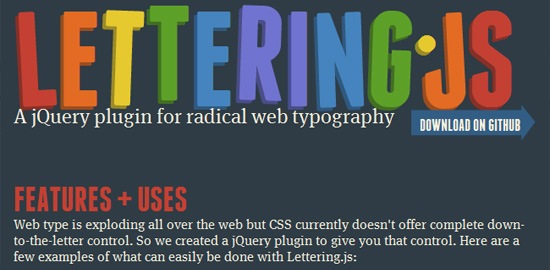
Lettering.js, a jQuery plugin for controlling the appearance of your web type, is a great tool to help designers get a chokehold on their typography. Whether you’re working with a responsive web design or not, having this kind of control over your web type can help you craft a truly creative look without resorting to image-based solutions.

In the context of responsive design, Lettering.js gives designers precise control over typography characteristics such as spacing, leading and kerning in order to produce an optimal reading experience in various visual spaces.

2. FitText

FitText

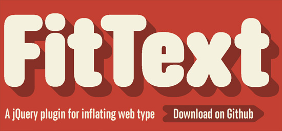
Another jQuery plugin, FitText helps you make your headlines responsive. FitText make sure your display text appears optimally on various devices. This plugin may be simple, but its flexibility leaves the creativity in your hands and is easy to implement.

Flexible Images

After setting type, we can move on to tackling the issue of placing images in our responsive web designs. There’s one tool that should be a part of every responsive web designer’s arsenal.

3. imgSizer.js

Before heading straight to the code of imgSizer.js, make sure to read through Ethan Marcotte’s breakdown of what role this script plays in your responsive web designs. Essentially, this script was designed to make sure your images render cleanly in Microsoft Windows. Marcotte’s script does a pretty nice job of cleaning up images that have been sized down automatically by the browser.

Responsive Web Page Layouts

At the core of every responsive web design is a fluid and flexible layout that adapts itself to the screen size and features of the user’s browser. Let’s move on to resources related to layout, where most of the action happens in responsive web designs.

4. Fluid 960 Grid System

Fluid 960 Grid System

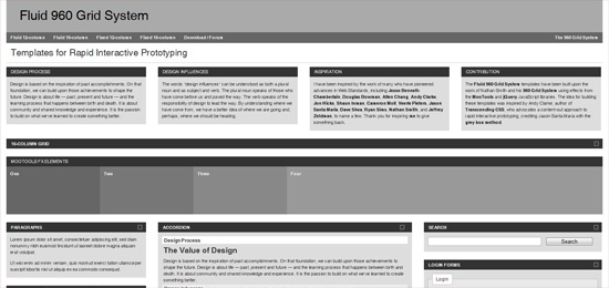
If you’ve been using the ubiquitous 960 Grid System by Nathan Smith (plenty of us have probably used it for projects or experimentation at some point), check out this fluid adaptation of the original project. If you’re comfortable with the original 960.gs, then you already know how to use Fluid 960 Grid System.

5. Gridless

Gridless

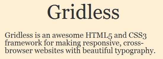
If a grid system for web page layouts seems too restrictive to you, check out Gridless. Gridless is built to be leaner than other grid systems and was constructed with responsive designs in mind. The Gridless code bases its philosophy on the much-discussed mobile first method for crafting websites that must be delivered to a multitude of device environments.

For designers seeking more of a barebones, content-focused approach to responsive web design, you may find yourself quite at home with Gridless.

6. PXtoEM

PXtoEM

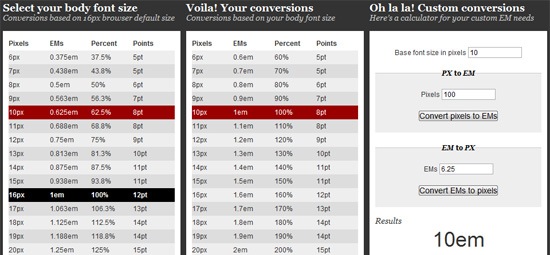
A tedious mathematical process associated with converting fixed-width design work to a fluid layout is converting absolute units of measurements (i.e. px and pt) into relative units of measurement such as ems and percent (%) for typography, spacing, container widths, etc.

PXtoEM is a tool that provides users with a simple conversion tool to help them with all the math. The site also allows designers the ability to quickly and easily change the base font size of their layout to something that leads to more manageable math.

For example, in your HTML document, setting your body element’s font-size to 62.5% gives you the more convenient conversion ratio of 1em is to 10px, making unit conversion a little easier to do.

Testing and Cross-Browser Support

Finally, as we create our responsive web design, we’ll come to the point where our web type is clean and adaptive, our images are flexible and our layout is fluid.

Now we need to make sure that our site works in as many browsing environments as possible.

7. Adobe Device Central

Adobe Device Central

The best way to test your website on different devices is to actually test it from within the devices themselves; nothing compares to seeing how your website actually looks and behaves within a particular mobile gadget or computer.

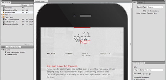
However, for those of us who don’t have the budget for hundreds of new gadgets, the solution comes in the form of Adobe Device Central. Device Central is one of the better pieces of software I’ve used for testing a site out on different devices.

If it’s variety and range you seek, Device Central won’t leave you disappointed. With an actively growing device library to choose from, users will find pretty much every major device on the market, ready to load in and test.

Testing websites has been made easy as well: Simply input the URI of the web page (local or remote) and then you can freely switch between the devices you want to test it in.

8. Web Developer

Web Developer

While Device Central (above) is cheaper than purchasing a bunch of devices, it still may be outside the price range of some designers’ pocketbooks.

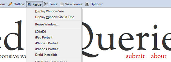
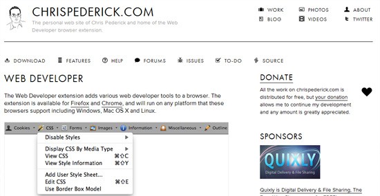
A fantastic alternative (or additional tool alongside Device Central) is the Web Developer browser extension. Available for Firefox and Chrome, this extension provides designers with several tools that come in handy when developing responsive or fluid websites.

Most notable is the built-in ability to resize your browser window with the click of a button. New size presets can be saved and used instantly.

Web Developer

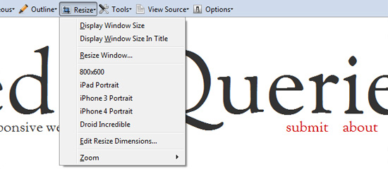
Other helpful features include viewing CSS by media type and outlining your containing elements, which I find useful for quickly identifying break points (or potential break points) in a design.

9. Respond.js

One of the glaring disadvantages of using media queries is that they are part of the CSS3 specifications and therefore is an absent feature in older browsers, such as in IE8 and below.

Of course, one might argue that we don’t see a lot of mobile devices running IE6. But one thing to note is that responsive web design isn’t just about mobile devices, it’s a way of developing sites that become optimized for all types of browsing situations. For example, IE7 or IE8 users might still benefit from a site that renders a different layout on large, widescreen monitors versus a small-screen netbook.

Fortunately, we have Respond.js, a lightweight, open source script that gives us more options for executing media-query-driven responsive web designs in IE6, 7 and 8.

The script is small — only 1KB when served gzipped to site users — and is unobtrusive, so there’s little excuse not to use it!

10. Modernizr

Modernizr

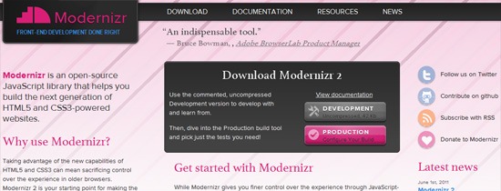
Much like Respond.js, Modernizr is here to bring designers the power of HTML5 and CSS3, even in older browsers. While it’s not as lightweight as Respond.js, it does give you media-query-like abilities in older browsers.

The other exciting capability Modernizr brings us, as it relates to responsive web design, is some added support for the very intriguing — but currently problematic and tumultuous — W3C specifications of the Flexbox model that allows for easier and more robust web page layouts.

Modernizr also provides conditional loading features. If you’re concerned about loading many resources because of page speed concerns, Modernizr allows you to conditionally load certain resources based on the user’s browsing circumstances.

Responsibly Responsive

Not every responsive web design project is going to require all of the resources mentioned here. As always, restrict your design projects to only the components that are required to achieve the goals desired. And then, when appropriate, sprinkle in features that can enhance the user experience for as many users as possible without degrading it for anyone else.

These resources were chosen based on their ability to help you complete your responsive web designs more efficiently.

Adaptive and responsive web design practices are still in its beginning stages, but they are important because the diversification of browsing devices and viewing methods — like 3D on the Web, for example — is going to continue as our industry progresses into the future.

If you know a tool that can help in building responsive web designs, share them in the comments!

Related Content

About the Author

Jason Gross is a freelance web designer focused on creating clean and user friendly websites. Jason currently lives in Indiana and can be found on Twitter as @JasonAGross or on the web at his personal blog and portfolio.


Why diets don’t work: Starved brain cells eat themselves, study finds

02 Aug
A new report might help to explain why it's so frustratingly difficult to stick to a diet. When we don't eat, hunger-inducing neurons in the brain start eating bits of themselves. That act of self-cannibalism turns up a hunger signal to prompt eating.