Last week was the end of our FlowingData personal visualization project. I asked readers to collect data about themselves or their surroundings and then visualize it some way. Thank you to everyone who participated. It put a smile on my face every time I got an email with "summer project" in the subject line :).
The Winner is...
While I enjoyed all the entries (and I hope you all enjoyed making them), there can only be one winner. The winner is Tim Graham who took manual personal data collection to another level. From email spam, to beverage consumption, to aches and pains, Tim embraced the spirit of self-surveillance. He even made his personal data available in the forums. Congratulations, Tim!
Here are Tim's personal data visualization projects along with entries from Brian, John, Kevin C, Kevin M, Lisa, Said, Stacey and Joel, and Tony. Thanks again everyone for participating, and I hope the rest of you will consider getting in on the self-introspection next time.
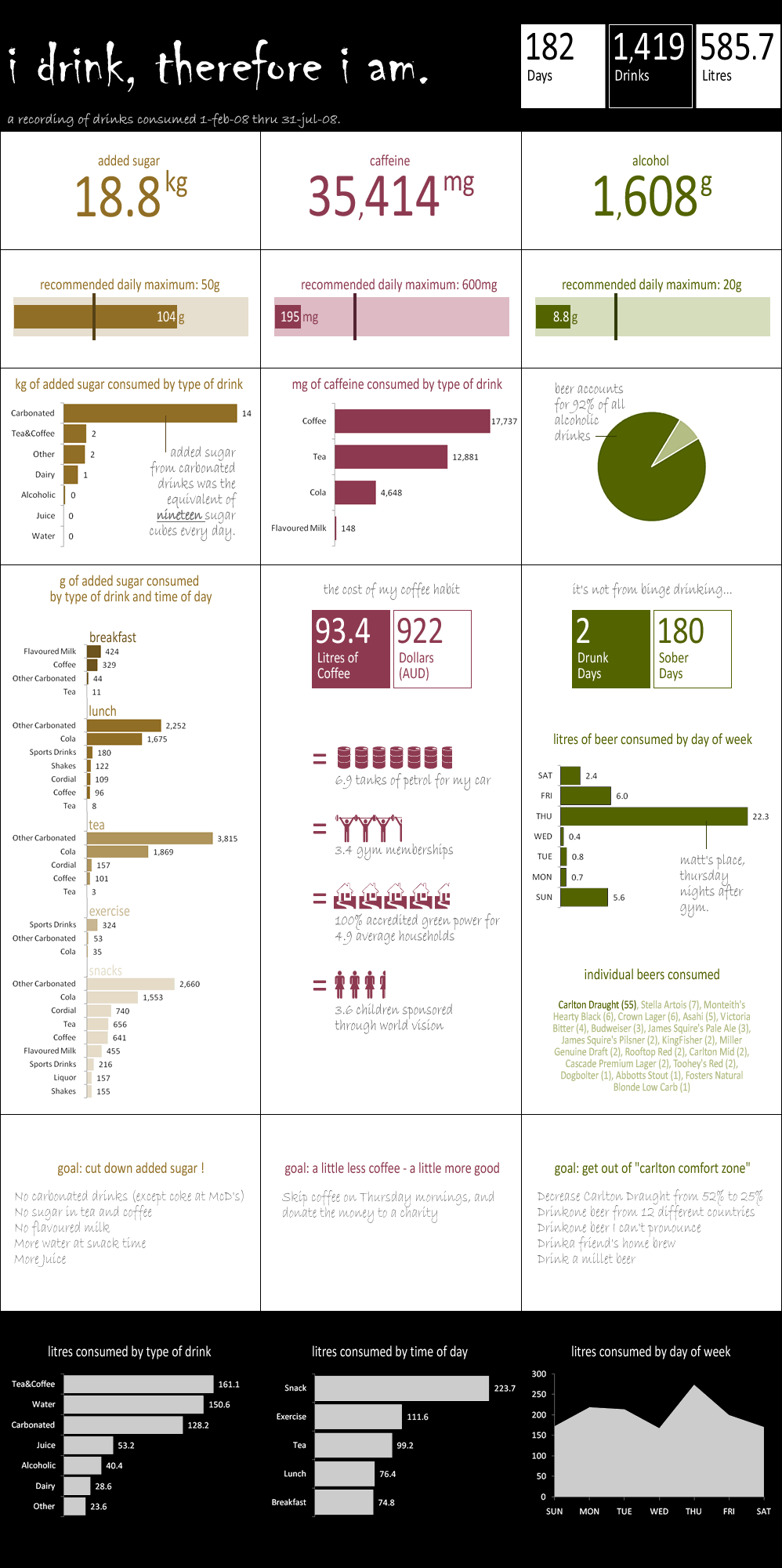
I Drink, Therefore I Am
I originally thought this was all alcoholic beverages. I was going to tell Tim that he might have a problem. Luckily though, it was all beverages he's consumed over the past few months. That's some serious discipline.
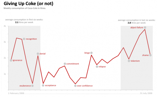
This one focuses on Tim's Coke consumption. It's a short story of a losing battle against his soda addiction.
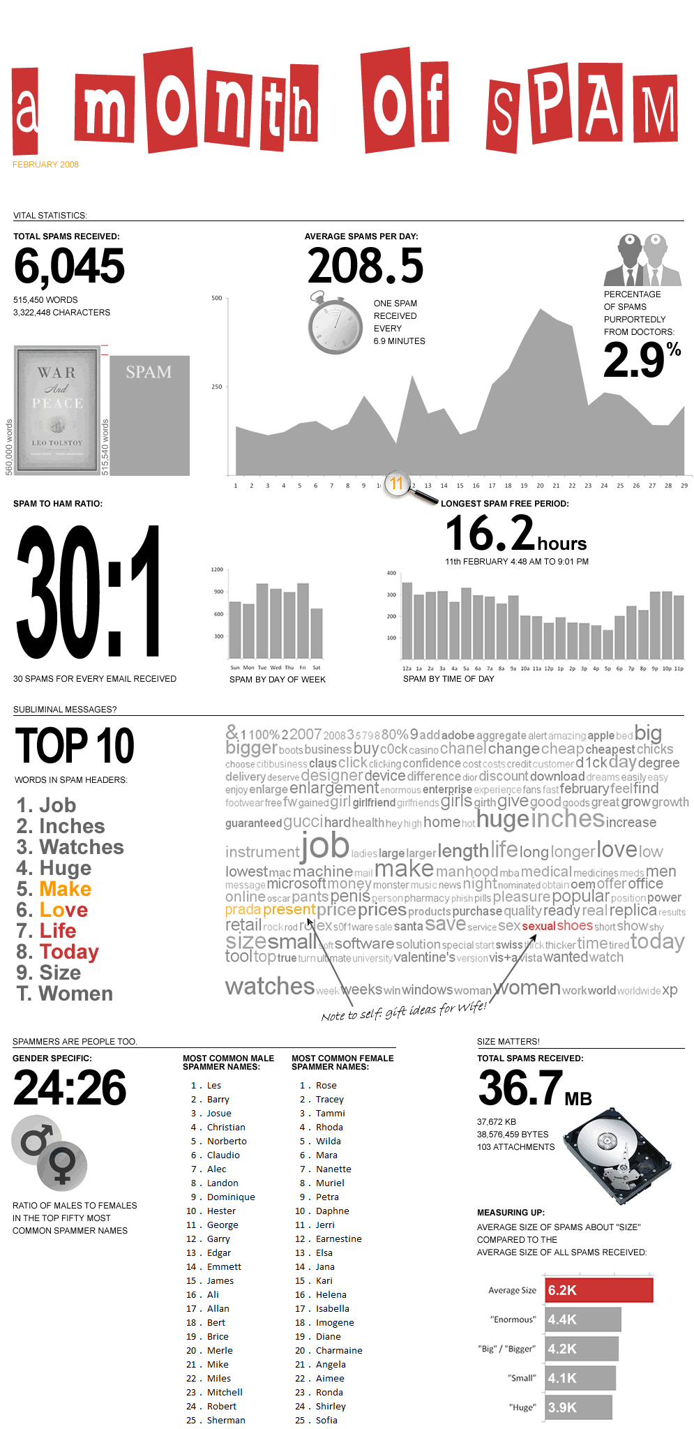
A Month of Email Spam
How about a look at a month of email spam? Almost as many words of spam as in War and Peace.
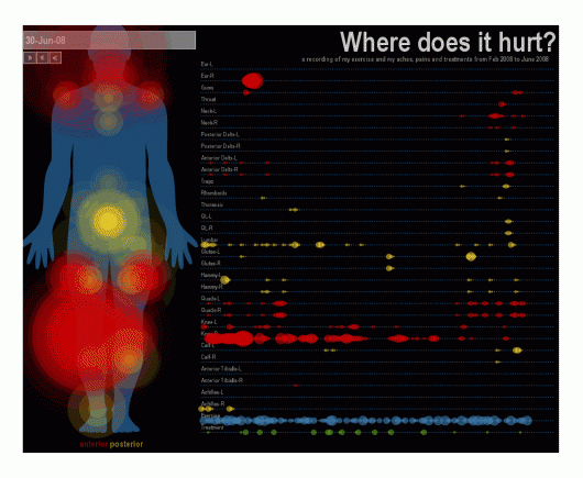
Ouch, My Body Hurts
This is actually an animated aches and pains chart implemented in Processing. Watch as pains fire off on poor Tim's deteriorating body.
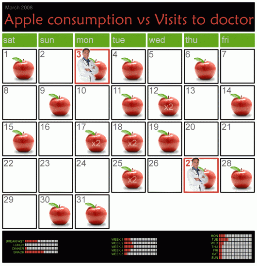
An Apple a Day...
A calendar of apples and doctors...
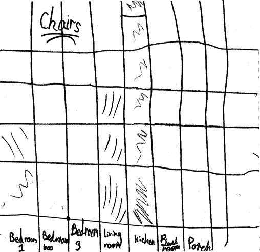
Chairs in the Kitchen
...and even Tim's daughter got in on the action. Here's her very first chart. It shows number of chairs by room. Proud father.
Commits to the SVN Repository
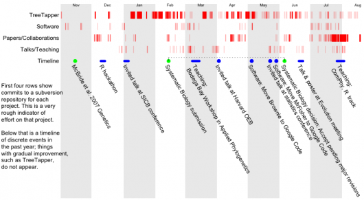
Brian is a postdoc part of an NSF-funded project and displayed commits to subversion, which he used to manage code and documents. He found that there tended me more commits to the repository as deadlines approached.
Is the Power Company Ripping Me Off?
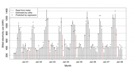
Hey look - it's a chart made in R! John bought a new house in 2000 and charted billed electricity use – estimated by the utility company and the regression.
From John, "Every once in a while, the electric company gets lazy and estimates the meter reading, rather than coming to my house to read it. In the attached graphic, I wanted to see those months in particular to determine whether the utility company tends to over-estimate or under-estimate my electricity use in those months, as compared with my own estimation formula."
Sex
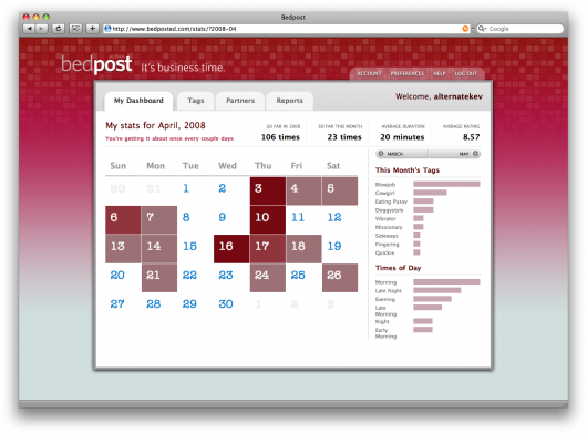
We saw this one earlier during the summer. Kevin C sent in BedPost, his project currently in private beta to track private time with your nighttime buddy.
Are You Happy Today?
Kevin M has his own application, LifeMetric, which lets you enter how you feel and then compare emotions with other users.
How Do I Spend My Time Every Day?
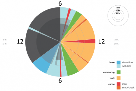
Lisa has been tracking how she (and her family) spends time. Below is one day that shows how she (outside circle) and her husband (middle circle) and her kids spend their day.
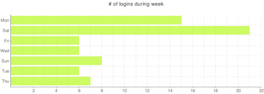
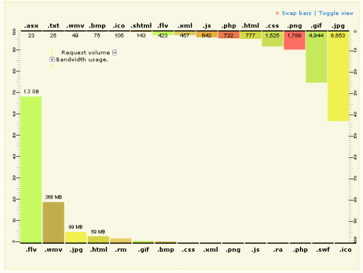
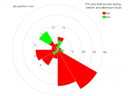
SSH and FTP Logins
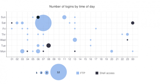
Similar in spirit to Brian's visualization, Said put together a series of visualizations of his SSH and FTP logins. It looks like Said is a morning person?
Old School Networks
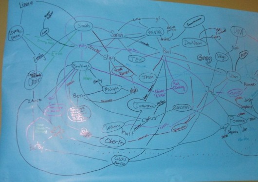
Stacey and Joel held a PieFest with some friends. While they had everyone together they drew up a network. People wrote their name and drew lines to the people they knew.
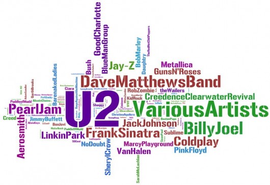
Music Interest
Tony put his iTunes library through Wordle. He's a big fan of various artists.
That's All, Folks!
There you have it. The FlowingData personal visualization project. As you can see, there's lots of personal data for you to collect, visualize, and analyze, so go out and have some fun. Can you think of data worth collecting not here? Let us know in the comments.
Again, thank you to everyone who participated. I enjoyed every entry, and I'm sure FlowingData readers do too.
