RSS
 

Archive for August, 2010

Why natural history museum collections rock!

31 Aug
348916676 551F3Ef390 Z D
Photo: Tom Goskar. Used with permission.

So far, it's been a very interesting experience in the month and a bit into my sabbatical at London's Natural History Museum. First off, there was that element of giddiness: coming back to an iconic institution that takes me back to my time as a kid in awe of dinosaurs, blue whales and all the sparkly stuff in the mineral exhibits. Next came, a weird sort of pride - like as if being in the museum's great hall, looking up at the beautiful ceiling, and standing in between a Diplodoccus skeleton and a statue of Darwin, made me feel privileged to be a scientist. I felt as if I was in the best-club-ever: one that carried on the work of so many pioneers whose efforts are housed in this museum. But then a strange feeling of discomfort settled in. This was because the science that goes on here, by and large, is quite foreign to the medically genetic driven projects of my own background. In other words, the bench tops here do not always require pipettemans and overpriced electronics. However, after having had the privilege of meeting some lovely people at the museum and viewing a few of these collections, I've come to really appreciate the importance of biological curation.

1. The collections serve as the physical and open portal to specimens needed for biodiversity research.

Here, the collections tackle the old adage that "people only really care about things they know." They provide a place for specimens to have a formal and accessible presence. In other words, when a new species is shared and characterized in the world of science (i.e. via a scientific paper), one of the required acts in this scientific culture is that multiple specimens of the new species must be deposited in a few institutions like the museum. Here, they are invaluable as a resource for making sense of the huge variety of form and function of the organisms on our planet (i.e. taxonomic studies). This can be done from the point of view of morphology, but also as a sort of tissue bank, so that people can perhaps later classify a specimen genetically.

I actually saw this facet in action, having had the chance to visit the museum's arachnid collection (spiders!), which was very cool. I asked the curator, Jan Beccaloni, how many spider specimens there were exactly, and she told me that they weren't entirely sure, but that it was something in the millions, or at least equivalent to "the number of legs you can count divided by eight!" She also described how specimens were always coming in and going out, like packets with legs, stored with things to discover. It was marvelous!


Spidersnhm


Imagine multiple rooms filled with shelves of spiders like these. The one on the right is a Theraphosidae specimen (Tarantula type).

2. The collections have huge historical value: not only from a humanities angle, but also as a scientific record of the past.

Many of the collections at the museum are very old and/or span a huge timeline. In fact, they very nicely reflect aspects of the scientific process of different times in history, and therefore offer a wonderful window into the history of science. Here, I also had a chance to talk to Mark Spencer, curator of British and European herbariums, and in particular, he was kind enough to grant me an up close look at the Sloane Herbarium.


Sloaneherbariumnhm


Coolest book shelves ever! (and possibly one of the most expensive)

In case you didn't know, Sir Hans Sloane (1660-1753) was a fellow, a physician, a scientist who had amassed a massive collection of plants, many of which are impressively bound in the 265 volumes that are housed in a very cool book room within the museum (I should also mention that Sloane was an avid collector of many things - in fact his collections are essentially the initial core of what would be become the Natural History Museum as well as the British Museum).

As a small example of the historic relevance of the collection, let's consider Sloane's connection to chocolate:

While in Jamaica, Sloane was introduced to cocoa as a drink favoured by the local people. He found it 'nauseous' but by mixing it with milk made it more palatable. He brought this chocolate recipe back to England where it was manufactured and at first sold by apothecaries as a medicine. Eventually, in the nineteenth century, it was being taken up by Messrs Cadbury who manufactured chocolate using Sloane's recipe. (NHM website)

Essentially, Sloane had a key role in the popularity of "milk" chocolate. In fact, one of the original cocoa (Theobroma cacao) specimens first brought over to England can be seen in the Sloane Herbarium.

These historical collections also provide a scientific snapshot of the past, a sort of biodiversity record book. For this aspect, Johannes Vogel, Keeper of Botany at the museum, provided a great example of this. Here, I was told that the peregrine falcon eggs used to suggest DDT effects on eggshell breakage and population loss are primarily housed at the museum. This was largely work done by Derek Ratcliffe in the 1960s, that was eventually part of the argument used by Rachel Carson in her book "Silent Spring."

Furthermore, in his 1970 paper, "Changes attributable to pesticide in egg breakage and eggshell thickness in some British birds," Derek went on to provide a very nice study that confirmed this link. i.e. population numbers were closely attune to egg breakage within the nest of these birds; which was best explained by the apparent thinning of the eggshells; which closely correlated to the introduction and prevalence of synthetic organic chemicals such as DDT; which was verified by accessing the actual amounts of the synthetics in the various egg shells. Basically, this type of work could not have been done had there not been a collection available, a collection that house various Peregrine eggs from different points in time.

Finally, I should point out that this sort of example is particularly prevalent today. As climate change alters ecosystems and the geochemistry of our planet, these collections, especially ones that stretch far back in time, are providing valuable data on the past. Which is important: as it is this sort of data that helps us more effectively examine the present, as well as provide a possible window into the future.


Brain surgery c. 2000 BCE

31 Aug
Archaeologists at Ikiztepe, Turkey unearthed two glass obsidian blades they believe were used for neurosurgery 4,000 years ago. Why do they think these were tools for Bronze Age brain surgery? Because they found scarred skulls there too. New Scientist interviewed excavation director Önder Bilgi:
 Data Images Ns Cms Mg20727750.200 Mg20727750.200-1 300 What makes you think they were used for surgery?

We have found traces of cuts on skulls in a nearby graveyard. Out of around 700 skulls, 14 have these marks. They could only have been cut with a very sharp tool. At this time, 4000 years ago or more, it could only have been an obsidian blade. The cut marks show that a blade was used to make a rectangular opening all the way through the skull. We know that patients lived at least two to three years after the surgery, because the skull has tried to close the wound.

Have you uncovered any clues to why this surgery was performed?

There seem to be three main reasons. The first is to relieve the pressure of a brain haemorrhage; we found traces of blood on the inside of some of the skulls. The second is to treat patients with brain cancer, as we can see pressure traces from the cancer inside some of the skulls. And the final reason was to treat head injuries, which seem to have been quite common. The people of Ikiztepe got their copper from mines in the local mountains, and we think they had to fight other local people for access to it.

"Scalpels and skulls point to Bronze Age brain surgery"


Philip Wadler: Does Your Language Shape How You Think?

30 Aug

From an article in the New York Times by Guy Deutscher, describing linguistics view of the Sapir-Whorf hypothesis, seventy years on. Taken from his book Through the Language Glass: Why the World Looks Different in Other Languages. Spotted on Lambda the Ultimate.
For instance, some languages, like Matses in Peru, oblige their speakers, like the finickiest of lawyers, to specify exactly how they came to know about the facts they are reporting. You cannot simply say, as in English, “An animal passed here.” You have to specify, using a different verbal form, whether this was directly experienced (you saw the animal passing), inferred (you saw footprints), conjectured (animals generally pass there that time of day), hearsay or such. If a statement is reported with the incorrect “evidentiality,” it is considered a lie. So if, for instance, you ask a Matses man how many wives he has, unless he can actually see his wives at that very moment, he would have to answer in the past tense and would say something like “There were two last time I checked.” After all, given that the wives are not present, he cannot be absolutely certain that one of them hasn’t died or run off with another man since he last saw them, even if this was only five minutes ago. So he cannot report it as a certain fact in the present tense.
I wish all scientists were trained in this language!


Gray Matter: In Which I Fully Submerge My Hand in Liquid Nitrogen

30 Aug

A layer of bubbles protects the flesh from liquid nitrogen, though only for a split second. Need proof? Watch the video

When I first saw this photograph of a man’s hand submerged in liquid nitrogen at somewhere below -320° F, my immediate thought was, “That guy must be crazy! One second in that stuff, and you’re shopping for new skin!” My shock was tempered only slightly by the fact that it was my hand, and we’d taken the picture just a minute earlier.

I hadn’t realized that my hand was quite so deep into the liquid. Amazingly, I barely felt the cold at all. My skin didn’t get hurt for the same reason that water droplets dance on a hot skillet. An insulating layer of steam forms almost instantly between the water and the metal, keeping the droplets relatively cool as they float for several seconds without actually touching the hot surface. To liquid nitrogen, flesh is like that skillet—a surface hundreds of degrees above its boiling point. So the moment my hand touched the liquid, it created a protective layer of evaporated nitrogen gas, just as the skillet created a layer of steam. That gave me just enough time to put my hand in and pull it out again. Any longer than that, and frostbite would have set in.

The phenomenon is called the Leidenfrost effect (after Johann Gottlob Leidenfrost, the doctor who first studied it in 1756). I’d known about it for years, but when it came time to test it in real life, I have to admit that I used my left hand, the one I’d miss less.

I drew the line at another classic example of the effect. According to the books, it’s possible to stick a damp finger directly into molten lead without getting burned, if you do it fast enough. After some consideration, and remembering the times I’ve been burned by molten lead, I decided that it probably wouldn’t make a very good picture anyway.

ACHTUNG! Do not try this. If liquid nitrogen soaks into your clothes, you will not be protected by the Leidenfrost effect, and you can get frostbite very quickly.

ようこそ日本からの皆さん!他の動画はこちらから。


Photo Essay: 18 Places to Feel Dwarfed by Nature

30 Aug
Some places — and activities — have a way of making you feel really, really small.

***Copyrighted Material: The images below are copyrighted against unauthorized use. We were granted special permission to feature them in this Matador photo essay. Please visit the photographer links for licensing conditions for each photo.***

Uluru hikers

1. Uluru, Australia
The massive rock — a.k.a. Ayers Rock — is climbed by 250 every day, despite pleas from local indigenous groups to refrain from doing so.
Photo: Chris Harrison

Whale shark diver

2. Diving with whale sharks
The whale shark is the world’s largest fish species and can grow to be longer than 40 feet. This shot was taken off Christmas Island, Australia, in January 2005.
Photo: Rob Hughes

Cotopaxi summit

3. Cotopaxi, Ecuador
This volcano just south of Quito reaches an elevation of 5,897m (19,347ft) — often higher than the clouds.
Photo: david_rombaut

Stout Grove

4. Redwood country, California
Taken in Stout Grove, Jedediah Smith Redwoods State Park, this picture shows me (in red) straining my neck next to the Stout Tree.
Photo: Aya Padron

Lone kayak

5. Sea Kayaking, solo
Big water, small boat. Shot taken walking the Southwest Coast Path from Land’s End to Plymouth, England.
Photo: nixwilliams

Wild coast

6. Great Ocean Road, Australia
The coast along one of the world’s most spectacular roads is also good for a walk.
Photo: Andrew Ferrier

Spelunking in Romania

7. Ponoras Cave, Romania
Things can get large underground too. Here, spelunkers from CSA explore “Mammoth Hall” in Romania’s Transylvania region. The light trail was produced by a fast-moving caver with a headlamp.
Photo: Bela Nagy

Summer snowboarding

8. Snowfields, Rocky Mountains
This is no photoshop. It’s Matador senior editor David Miller getting in some late-season turns in Rocky Mountain National Park. Read about it in The Dharma Shack Chronicles.
Photo: David Miller

Desert near Ica

9. Desert, southern Peru
Sand accumulates into massive dunes in one of the driest deserts on Earth. Notice the city of Ica, Peru, in the distance — also dwarfed.
Photo: guilherme cecílio

Tent glow, starlight

10. Camping under the stars
So many stars. And camping the best way to let them overwhelm you. This shot was taken near Maupin, Oregon.
Photo: Ben Canales

Mount Bromo volcano

11. Mount Bromo, Indonesia
This very active Javanese volcano attracts lots of tiny visitors up to its steaming rim.
Photo: Jiang

On top of Half Dome

12. Yosemite National Park, California
That’s me again, this time feeling very small (and a little dizzy) at the top of Half Dome. Notice the gloves — not a fashion statement, but what you use to pull yourself up the cables on the final ascent.
Photo: Aya Padron

Lake Fryxell, Antarctica

13. Antarctica
Travelers to Antarctica report losing all sense of distance — the geographic scale is so immense and the ice fields so flat and white. This is Lake Fryxell.
Photo: Nicolas Arthur Salava

Preikestolen

14. Preikestolen, Norway
This rock has a great view of Lysefjorden and is a good place to get close to the edge.
Photo: Sonya Kanelstrand

Hikers on Mont Blanc

15. Mont Blanc, France
Europe’s tallest mountain tops out at 4,810m (15,782ft) and sits in one of The 6 Best Starter Ranges for Mountaineering.
Photo: Sarah Brigden

Uyuni, Bolivia

16. Salar de Uyuni, Bolivia
This salt plain is the world’s largest and traps rainwater during wet winter months, creating a tripped-out sky mirror. Find out how to get there.
Photo: Carlos Díaz

Cliff climber

17. On a cliff ascent
This one happens to be the curved limestone face of Malham Cove, North Yorkshire, England.
Photo: Dubris

Iguazu Falls sunset

18. Iguazu Falls, Brazil
The majority of the falls lies in Argentina, but according to the photographer, “the great thing about the Brazilian side of Iguazu is that there are no limits on taking pictures at any time of day….(unlike the Argentinian side).”
Photo: SF Brit

MatadorU Travel Photography Program

MatadorU’s Travel Photography Program gives you direct feedback on your work, and lifetime access to the most supportive, dynamic, and fun community of Travel Writers, Travel Photographers, and New Media Professionals on the web.

Community Connection

Where have you felt most dwarfed by nature? Share your story (and a link to a photo if you have one) in the comments.


Modern Science Map

30 Aug
500 Years of Science, Reason & Critical Thinking via the medium of gross over simplification, dodgy demarcation, glaring omission and a very tiny font.

The map of modern science was created to celebrate the achievements of the scientific method through the age of reason, the enlightenment and modernity.
Despite many of the scientific disciplines mapped having more ancient origins, I have restricted the map to modern science starting from the 16th century scientific revolution.

The map primarily includes modern scientists who have made significant advances to our understanding of the world, however I have also included many present day scientists who fuel a passion for, and advances in, science through communication and science popularisation.

Click the image below to open Version 1.0 of my html Science Map, you will then be able to pan around the map and click on the scientists for more information.


Postscript (4th Sept 2010):


As I mentioned in the comments field myself, many thanks for all the comments and suggestions for improvements.

I must confess it is a little perverse that a jumped up IT consultant should wield the casting vote on which scientists get on my map. So whilst I have endeavoured to make it the best and most relevant list I can, it is still however my personal, and admittedly rather arbitrary selection.

I have now up issued the map to version 1.0 as I am now reasonably confident I have included most of the key scientists of this period. I do however accept that I could make further improvements. For example I'm considering splitting computing from mathematics and I have had some sensible suggestion for reorganising and splitting the chemistry and micro-biology lines.

In the mean time, thanks for all the comments, tweets and links, and if you could link back to this original post rather than just posting a static snapshot that will go out of date, that would be most appreciated.

Thanks
Crispian


The smell of freshly-cut grass is actually a plant distress call [Mad Science]

26 Aug
The lovely scent of cut grass is the reek of plant anguish: When attacked, plants release airborne chemical compounds. Now scientists say plants can use these compounds almost like language, notifying nearby creatures who can "rescue" them from insect attacks. More »


How to Use Illustrations to Spice Up Your Web Design Work

26 Aug

How to Use Illustrations to Spice Up Your Web Design Work

Graphic illustrations have become commonplace in today’s web design. They can add a unique branding element into an otherwise bland world of templates and corporate logos.

Although just 5 years ago you would be hard-pressed to find many websites looking for illustrators, times have changed, and we’re on the brink of many new and exciting web design trends.

Illustrations that come in the form of beautiful background scenery, animals and mascots for branding, or even cartoon versions of authors and designers can be found all over web design portfolios spanning the globe. Web illustrators and branding gurus have become a staple and have come to be high in demand in the web design industry.

I’ll be touching upon a few tips for incorporating illustrations in your web designs by looking through a handful of websites that use illustrations effectively.

I’m talking about digging deeper into the bedrock of design; truly searching for what makes illustrations "click" in the mind of our website visitors.

Why Branding is So Important

When you build a website, you want the look and feel of the design to be an extension of your business. Whether this means incorporating an already existing logo into the design or creating a memorable experience, the site needs to fit your brand.

When visitors fall into your site, you also want to make sure it leaves a lasting impact. By this, I mean that you want them to remember your site.

Illustrations help a lot with making a site memorable because with an eye-catching graphic scene or vector artwork, the page jumps out and has a visual element that’s unique just to that site. This is what helps your brand stick like fresh sap out of a maple tree!

Users eat creativity up; it shows that you really care about your brand and your site to go through the trouble of incorporating illustrations, which are difficult to conceptualize and pull off effectively in the context of websites.

Let’s take a look at a good example of how illustrations can be used effectively to establish a brand identity: an SEO company called ten24 Media.

Their site uses a background of a circus tent with a beautiful skyline and open grassy fields to entice readers into the upper area of the web design. The concept of using circus tents as a central illustrative element is from creative wordplay: their name spelled out is "tentwentyfour media." The web layout includes a brief description of what they do, as well as a link to their Services page ("Enter the Show").

The branding is consistent throughout the site; continuing onto other pages, you’ll see the circus tent outline near the top navigation links.

In addition, the site’s footer contains more grassy hills.

All these illustrative elements keep the whole site feeling very innovative and fun — the perfect positive emotions you want to create, especially to dispel negative misconceptions some people have about the SEO profession.

Simple Illustrations Work Well

Never underestimate the power of a simple illustration. Adding too much to your design will overwhelm your readers and have the opposite effects you are looking for.

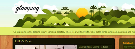
Fatburgr is an interesting web application. Many would classify their design into the realm of new age "Web 2.0" gradients and fluff, but the concept actually stands for itself.

Just browsing the site is appealing and you can enjoy the cartoony aspects of each area.

The footer is good for a few laughs as well. Imagining the detail put into such a web design is breathtaking.

You can recognize each piece and understand how it ties into the overall site brand. Even the buttons and text areas have additional creative effects added to them.

Keeping content where it belongs will help your readers decipher what you’re trying to say a lot faster. Easy-to-read paragraphs with large enough font sizes and plenty of spacing is essential — simplicity at it’s best.

Another concept to take away from this example is the importance of typography.

Typography should match your illustration design concepts; they should be big, and almost pop out to your visitors — something illustrations and simpler structures can complement.

Implementing Your Illustrations into the Site’s User Interface

The next point I want to discuss is creating harmony with the site’s functions and the illustrations you use.

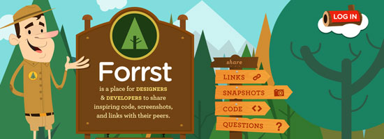
You can see this happening with Forrst, a new community for designers and developers for sharing code snippets and snapshots.

Although currently in private beta, you can check out their homepage with a flourishing background of trees and wooded areas.

In the foreground, you can see a park ranger parading around with a Forrst badge attached to his uniform. You can also see a brief description of the site and informative signs transposed on wooded backgrounds. This all adds to the ambiance of the site, including the clever "log in" log floating on what appears to be some sort of cloud.

And if that were all, you could consider Forrst quite the visual inspiration.

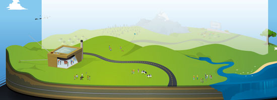
However, they push the use of illustrations further. You can go beneath the ground into the dirt below to see a sign up form. You can apply for membership quickly with just a few details, and the web form looks great.

A design like this can get complicated and will require plenty of skills. To produce this level of illustrative work could take years of practice in software like Adobe Illustrator to master, but they can be just the perfect touch in boosting your site design into the big leagues.

Never Use Illustrations Just for Aesthetics

Looking good is important. But adding design elements just to fancy up your site is the wrong attitude because a web design is a functional product.

All elements of your design should hold a purpose and have importance, including the addition of beautiful intricate illustrations.

Do you really need illustrations? How do they help meet your site’s objectives? These are a couple of questions you should be answering constantly as you conceptualize and execute your illustration ideas.

Sit down with a pen and paper to draft up ideas before even stepping into the digital world. This will help hash out a lot more ideas at once without locking yourself into the medium you use to design websites with.

Using similar ideas for inspiration can help a lot. CSS and graphic design galleries can be found everywhere. Go through a few and take notes on how their designs play out. Do they go a bit overboard compared to what you want? Maybe they don’t use color correctly? How does their content mesh with their illustrations?

Asking these questions will help get you on track. It’s always a long process when designing for the web. Keeping your designs in line with check and balances is a very handy skill to master.

The examples above are just simple ideas, but larger concepts can be implemented to realizing amazing results. Not everybody is an illustrator; I certainly don’t claim to be anywhere near an expert in creating illustrations like Brad Colbow or the guy over at Behind the websites. But with the power of Twitter and other networking tools, it’s not very difficult to meet very creative and talented designers from all over the world.

Your website’s design is a very important piece of the puzzle. It’s the part of a website your users can actually see.

Further Reading

Here are a few articles and resources on the topic of illustrations in web design.

How to Create an Illustrative Web Design in Photoshop

This step-by-step web design tutorial goes over the creation of a web design that has an illustrative landscape baked right in.

30 Creative Illustrative Website Headers

Here is a showcase of website headers that have illustrative design elements.

30 Beautiful Photoshop Illustration Tutorials

Not comfortable with Adobe Illustrator? This is a roundup of Photoshop tutorials to help you become a better illustrator.

30 Creative Examples of Illustrations in Web Design

Here is another showcase of web designs that feature illustrations.

Getting Comical with Brad Colbow

For inspiration, this is an interview of Brad Colbow who is both a web designer and an illustrator. By the way, check out his The Brads comic series, a comical look at the life of web designers.

Related Content

About the Author

Jake Rocheleau is a social media enthusiast and an Internet entrepreneur. Having spent over 4 years working freelance web design, he frequently writes articles involving new-age design concepts and personal motivation. You can find him all around the web via Google Profile or on Twitter as @jakerocheleau.


Google Talk

25 Aug

I gave a tech talk at Google headquarters on the arrow of time, which was a lot of fun. Must be what all of Silicon Valley was like back in the boom days — pool tables, free food, volleyball, and lots of smart people everywhere. Rather than a lecture hall, the talks are held in a big lobby space where people are regularly walking through, so that passers-by can become intrigued and start listening. Also, it became clear during the questions that at least one Google employee is concerned about how to preserve intelligent life past the 10100 year mark when our universe will be nothing but empty space. Glad they’re thinking long-term!

Here is the talk, which is basically at a popular level, although I felt empowered to use the word “logarithm” without explanation. I’ve also tried to collect other talks by me onto one page, for those who just can’t get enough. (Hi, Mom!)


300,000 Largest Websites Visualized with Favicons

25 Aug


An interesting visualization over at Nmap.org shows the favicons of the 300,000 biggest websites on the Internet (according to Alexa), with the size of the favicons corresponding to sites with the most traffic.

The data has been gathered through a “large-scale scan of the top million websites,” performed in “early 2010″ using the Nmap Security Scanner, a powerful network scanning tool used by many online security professionals.

The smallest icons, explain the folks from Nmap, correspond to sites with approximately 0.0001% reach, and rescaled to 16×16 pixels. The largest icon belongs to Google, and it’s 11,936 x 11,936 pixels large; for comparison, Mashable’s favicon (located below and to the left of Facebook) is 640 × 640 pixels large. Of course, to explain Google’s icon in its full size, you need to check out the zoom-enabled, interactive version.

The visualization is also available as a humongous poster, available here.

[via Gizmodo]


Reviews: Facebook, Google, Internet, Mashable

More About: Alexa, favicon, visualization, website

For more Tech coverage: