
Graphic illustrations have become commonplace in today’s web design. They can add a unique branding element into an otherwise bland world of templates and corporate logos.
Although just 5 years ago you would be hard-pressed to find many websites looking for illustrators, times have changed, and we’re on the brink of many new and exciting web design trends.
Illustrations that come in the form of beautiful background scenery, animals and mascots for branding, or even cartoon versions of authors and designers can be found all over web design portfolios spanning the globe. Web illustrators and branding gurus have become a staple and have come to be high in demand in the web design industry.

I’ll be touching upon a few tips for incorporating illustrations in your web designs by looking through a handful of websites that use illustrations effectively.
I’m talking about digging deeper into the bedrock of design; truly searching for what makes illustrations "click" in the mind of our website visitors.
Why Branding is So Important
When you build a website, you want the look and feel of the design to be an extension of your business. Whether this means incorporating an already existing logo into the design or creating a memorable experience, the site needs to fit your brand.
When visitors fall into your site, you also want to make sure it leaves a lasting impact. By this, I mean that you want them to remember your site.
Illustrations help a lot with making a site memorable because with an eye-catching graphic scene or vector artwork, the page jumps out and has a visual element that’s unique just to that site. This is what helps your brand stick like fresh sap out of a maple tree!
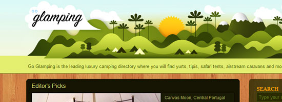
Users eat creativity up; it shows that you really care about your brand and your site to go through the trouble of incorporating illustrations, which are difficult to conceptualize and pull off effectively in the context of websites.
Let’s take a look at a good example of how illustrations can be used effectively to establish a brand identity: an SEO company called ten24 Media.
Their site uses a background of a circus tent with a beautiful skyline and open grassy fields to entice readers into the upper area of the web design. The concept of using circus tents as a central illustrative element is from creative wordplay: their name spelled out is "tentwentyfour media." The web layout includes a brief description of what they do, as well as a link to their Services page ("Enter the Show").

The branding is consistent throughout the site; continuing onto other pages, you’ll see the circus tent outline near the top navigation links.

In addition, the site’s footer contains more grassy hills.

All these illustrative elements keep the whole site feeling very innovative and fun — the perfect positive emotions you want to create, especially to dispel negative misconceptions some people have about the SEO profession.
Simple Illustrations Work Well
Never underestimate the power of a simple illustration. Adding too much to your design will overwhelm your readers and have the opposite effects you are looking for.
Fatburgr is an interesting web application. Many would classify their design into the realm of new age "Web 2.0" gradients and fluff, but the concept actually stands for itself.

Just browsing the site is appealing and you can enjoy the cartoony aspects of each area.
The footer is good for a few laughs as well. Imagining the detail put into such a web design is breathtaking.

You can recognize each piece and understand how it ties into the overall site brand. Even the buttons and text areas have additional creative effects added to them.

Keeping content where it belongs will help your readers decipher what you’re trying to say a lot faster. Easy-to-read paragraphs with large enough font sizes and plenty of spacing is essential — simplicity at it’s best.
Another concept to take away from this example is the importance of typography.

Typography should match your illustration design concepts; they should be big, and almost pop out to your visitors — something illustrations and simpler structures can complement.
Implementing Your Illustrations into the Site’s User Interface
The next point I want to discuss is creating harmony with the site’s functions and the illustrations you use.
You can see this happening with Forrst, a new community for designers and developers for sharing code snippets and snapshots.
Although currently in private beta, you can check out their homepage with a flourishing background of trees and wooded areas.
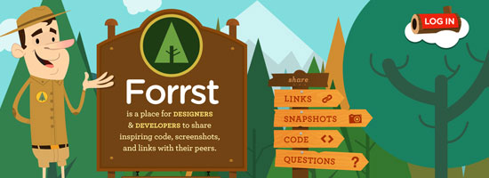
In the foreground, you can see a park ranger parading around with a Forrst badge attached to his uniform. You can also see a brief description of the site and informative signs transposed on wooded backgrounds. This all adds to the ambiance of the site, including the clever "log in" log floating on what appears to be some sort of cloud.
And if that were all, you could consider Forrst quite the visual inspiration.
However, they push the use of illustrations further. You can go beneath the ground into the dirt below to see a sign up form. You can apply for membership quickly with just a few details, and the web form looks great.

A design like this can get complicated and will require plenty of skills. To produce this level of illustrative work could take years of practice in software like Adobe Illustrator to master, but they can be just the perfect touch in boosting your site design into the big leagues.
Never Use Illustrations Just for Aesthetics
Looking good is important. But adding design elements just to fancy up your site is the wrong attitude because a web design is a functional product.
All elements of your design should hold a purpose and have importance, including the addition of beautiful intricate illustrations.
Do you really need illustrations? How do they help meet your site’s objectives? These are a couple of questions you should be answering constantly as you conceptualize and execute your illustration ideas.
Sit down with a pen and paper to draft up ideas before even stepping into the digital world. This will help hash out a lot more ideas at once without locking yourself into the medium you use to design websites with.
Using similar ideas for inspiration can help a lot. CSS and graphic design galleries can be found everywhere. Go through a few and take notes on how their designs play out. Do they go a bit overboard compared to what you want? Maybe they don’t use color correctly? How does their content mesh with their illustrations?
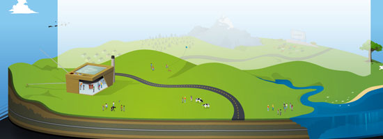
Asking these questions will help get you on track. It’s always a long process when designing for the web. Keeping your designs in line with check and balances is a very handy skill to master.
The examples above are just simple ideas, but larger concepts can be implemented to realizing amazing results. Not everybody is an illustrator; I certainly don’t claim to be anywhere near an expert in creating illustrations like Brad Colbow or the guy over at Behind the websites. But with the power of Twitter and other networking tools, it’s not very difficult to meet very creative and talented designers from all over the world.
Your website’s design is a very important piece of the puzzle. It’s the part of a website your users can actually see.
Further Reading
Here are a few articles and resources on the topic of illustrations in web design.
How to Create an Illustrative Web Design in Photoshop
This step-by-step web design tutorial goes over the creation of a web design that has an illustrative landscape baked right in.
30 Creative Illustrative Website Headers
Here is a showcase of website headers that have illustrative design elements.
30 Beautiful Photoshop Illustration Tutorials
Not comfortable with Adobe Illustrator? This is a roundup of Photoshop tutorials to help you become a better illustrator.
30 Creative Examples of Illustrations in Web Design
Here is another showcase of web designs that feature illustrations.
Getting Comical with Brad Colbow
For inspiration, this is an interview of Brad Colbow who is both a web designer and an illustrator. By the way, check out his The Brads comic series, a comical look at the life of web designers.
Related Content
- How to Use Retro Colors in Your Designs
- Make High-Impact Backgrounds for Your Designs with Photoshop
- 50 Stylish Navigation Menus for Design Inspiration
- Related categories: Web Design and Graphic Design
About the Author
 Jake Rocheleau is a social media enthusiast and an Internet entrepreneur. Having spent over 4 years working freelance web design, he frequently writes articles involving new-age design concepts and personal motivation. You can find him all around the web via Google Profile or on Twitter as @jakerocheleau.