RSS
 

Archive for February, 2011

Now on SlideShare – BP105 – 12 More Things Your Mother Never Told You About Installing Lotus Connections

08 Feb
[Cross posted from blog.collaborationmatters.com]

At Lotusphere 2011, my good friend Rob Wunderlich and I presented a Best Practices session on Lotus Connections 3.0, entitled '12 More Things Your Mother Never Told You About Installing Lotus Connections'

Here it is on SlideShare:


It is also available for download from the SlideShare site, as well as on LS Online.

Please do share with your colleagues, and use for your own benefit.  However, if you'd like to use the content for your own presentations, please ask for permission first.

Obviously, if you have any questions, or need some assistance with your own Lotus Connections 3.0 deployment, please let me know!


Watch the world get fatter over the past three decades

08 Feb

Weight of the world

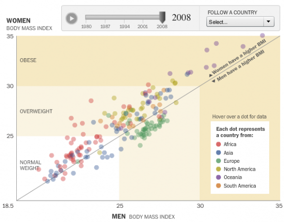
People are getting fatter everywhere. You know this. But there's nothing like the numbers to actually show how we're growing outwards and by how much. With this interactive, Wilson Andrews and Todd Lindeman, for the Washington Post, report:

With a few exceptions, the average body mass index in most countries has risen since 1980, according to a project that tracked risk factors for heart disease and stroke in 199 countries over 28 years.

Each circle represents a country, plotted by men's BMI on the horizontal axis and women's BMI on the vertical. Countries above the diagonal are countries where women have a higher BMI than the men, and vice versa for dots below the diagonal. Press play, and watch how BMI has changed from 1980 to 2008.

While all the countries are moving up and to the right, the Oceanic countries appear to have made the biggest moves over the past few decades, with several countries venturing into the obese BMI range.

Some European countries were actually making a move towards normal weight during the 1990s. Lays got the best of them though, and they could no longer eat just one. Damn you, Lays. I never win that bet.

[Washington Post via @hfairfield]

--
Learn data. Pre-order the FlowingData book.


Zero Motorcycles unveils faster-charging, even quieter 2011 motorcycle lineup (video)

08 Feb
To those who are still convinced that loud motorcycles make you more safe: it's best you look away now. The quietest bikes in the business just got even more silent. Zero Motorcycles just has unveiled its 2011 lineup of electric motorcycles and among a suite of generally tidy enhancements comes a change to belt drive. This means no more chains, no more chain lube, and no more rattling and grating noises. There's nothing but the sound of the wind and the faint scream of the motor, which you can hear for yourself in the video below. Also new is a 12.5 percent boost in battery capacity and a quick-charge option that drops charging times in half -- but does so at an up-front cost of $595. That's on top of the $9,995 for a road-going Zero S. Meanwhile the dual-sport Zero DS starts at $10,495, off-road Zero X at $7,995, and the higher-spec Zero MX $9,495. All are available for order right now.

Update: We spoke with the kind folks at Zero and got a little more information on that new trick charger. A current Zero S or Zero DS will take about four hours to charge, but if you opt for the $595 quick-charge it'll go down to just two hours -- though you can get a 90 percent in about an hour. The X and MX, meanwhile, can be fully charged in about an hour. This is without requiring any fancy plugs or DC converters, it's still just a standard 110 outlet!

[Thanks, Darius]

Continue reading Zero Motorcycles unveils faster-charging, even quieter 2011 motorcycle lineup (video)

Zero Motorcycles unveils faster-charging, even quieter 2011 motorcycle lineup (video) originally appeared on Engadget on Tue, 08 Feb 2011 10:06:00 EDT. Please see our terms for use of feeds.

Permalink   |   | Email this | Comments


How to Measure the Effectiveness of Web Designs

07 Feb

How to Measure the Effectiveness of Web Designs

At the end of the day, the quality of a web design can only really be measured quantitatively in the results it brings a site. As they say, results speak for themselves.

Being a web analyst for more than four years now and regularly working side-by-side with a designer, the biggest thing I have learned is Data identifies the problem and Design solves it.

This article looks at web design from a web analytics perspective. We will focus around the questions that a web designer should answer using metrics and tools to measure the impact and effectiveness of a web design.

Stages of Visitor Engagement

At any time, website visitors are in one of the following stages:

  1. Attention
  2. Interest
  3. Desire
  4. Action
  5. Satisfaction

At each stage, a visitor has different expectations, and it’s the design that leads the way to making sure those expectations are met.

Designing for Grabbing Visitor Attention

Questions to ask: Does the design grab the attention of your visitors in just a few seconds? Does the design help visitors quickly find the information they are looking for?

While different approaches need to be applied to landing pages and inner pages of a website, one thing is sure: If you don’t manage to garner the user’s attention quickly, she is gone to the next website.

Grabbing Visitor AttentionHeadings are known to have a strong impact in grabbing user attention.

What to measure: Bounce rates and exit rates.

Solution: Most web analytics tools out there will tell you how many times you failed to grab the attention of your users.

Exit rates will tell you how many people left the website through a particular page, while bounce rates tell you how many people left the website without visiting a second page.

You can go a step further and measure the bounce rate as being the rate of people spending less than 10 seconds on your website. The more people are bouncing off your page, the less your design and content have helped them spot the information they were looking for.

Designing for Raising Visitor Interest

Questions to ask: Do visitors think they are in the right place? Can you convince them that the information on your website is (or might be) right for them?

If you manage to get the visitor interested in your site, he will spend more time reading and engaging with it. In such cases, design should make it really easy to scan, read and engage in interactive actions on a page.

How long does it take to read an article versus how much time do most visitors spend reading that article? For example, according to some sources, the average reading speed of college students is between 250 to 350 words per minute. If your article has 1,000 words, it could take between 2.8–4 minutes to read the article fully. If the average time on the article web page is only 5 seconds (in other words, only 4–8% of the time required to read the entire article), it means most of the content isn’t being read and isn’t engaging enough to keep the visitor’s interest. This problem can be pointing to web copy issues, design issues, or both.

Other examples: How many people click the Play button for a video, or check the other product images of a certain product? While content is what generates interest, design is what makes the content easy to spot and engage with.

Web analysts call these interactions and events micro conversions. The more such micro conversions happen, the larger the number of people that will eventually engage in buying, signing up or filling in a lead web form (macro conversions).
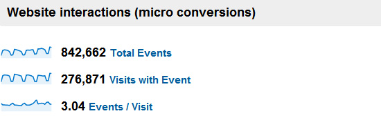
The way people interact with a website denotes their interest for what the website has to offer.The way people interact with a website denotes their interest for what the website has to offer.

What to measure: Number of interactions with a design. Time spent on web pages.

Solution: One way to go about measuring how well web designs keep visitors interested is to dive into advanced features of Google Analytics by tracking events of every action that can be interpreted as the user becoming more interested in the web page (such as clicks, scrolls, comments, video plays or anything else you can think of).

You could also give ClickTale a try, a tool that records entire sessions of website visits and allows you to play them back. It can offer great insights about how visitors interact with a web page. Six Revisions uses ClickTale on the front page of the site.

Designing for Increasing Desire and Taking Action

Questions to ask: Does the design explicitly engage the imagination of your visitors and make them feel they will get value from what you’re offering? Do visitors click on the call-to-action buttons?

Every product or service out there on the web is unique, and it’s the web design’s job to point out what makes it different and why the visitor should choose this one instead of another.

If the design does its job well, the path to a user clicking on call-to-actions is a short one. In the very moment the user decides to sign up or buy the product, it’s crucial for the call to action to be within quick reach.

A heat map displaying mouse clicks on a call-to-action button.A heat map displaying mouse clicks on a call-to-action button.

What to measure: Call to action clicks.

Solution: Click-tracking offered by solutions like Crazy Egg will give you the answer about how people interact with your call-to-action buttons.

As for increasing visitors’ desire, multivariate testing and A/B split testing will help you test different designs and find the one that’s most effective.

Designing for Visitor Satisfaction

Question to ask: After they’ve clicked, does the next page satisfy your visitors by providing exactly what they wanted?

The design of what comes after the click is crucial for getting what site owners are looking for: a conversion. You have already managed to get the visitor’s attention, interest and desire so, from now on, design should only have two main roles.

The first role is making the conversion process as easy as possible (e.g. optimizing the checkout process and optimizing the web form submission process).

The other role of the web design is making sure that any question a user might have about the process is answered right there on the spot so that she doesn’t have to abandon the process to search the site looking for her answer.

It would truly be a pity to lose visitors at this stage because of a design flaw.

Funnels give a clear image on conversion success rates.Funnels give a clear image on conversion success rates.

What to measure: Funnels and/or paths taken.

Solution: If you have the budget for it, I would go with Kissmetrics, MixPanel or Performable for tracking funnels and paths to conversion.

Otherwise, you can stick with Google Analytics goal- and funnel-tracking, or use PadiTrack, a free Google Analytics app for building funnels on the fly. (Disclosure: PadiTrack is developed by the company I work for).

Conclusion

In the end, what matters is the impact of every element of a website on reaching its goals. Data-driven, informed design, in all of its forms, has a strong say and quite a big responsibility when it comes to a website’s performance.

Related Content

About the Author

Claudiu Murariu is a web analyst and co-founder of PadiCode, a company building conversion optimization tools. Claudiu can be found on Twitter (as @padicode) and on his conversion optimization blog.


Feltron 2010 Annual Report: Infographically Reconstructing his Father’s Life

07 Feb

feltron_2010.jpg
If you are just like me, you might have been anxiously waiting for the day Nicholas Felton would finally release the 6th volume of the infographic series titled the "Feltron Annual Reports". Back in 2005, it set the beginning of the crazy and potentially self-destructing "viral" infographic rage we know all too well today.

So here is version 2010 [feltron.com], visually seductive and detailed as ever, revealing various personal self-tracking parameters that range from international travels and weather reports to US naturalizations and electrocardiogram measurements.

The catch? This year's report seems not to deal about Nicholas Felton himself, but focuses solely on his father, reconstructed by the calendars, slides and other artifacts in Nicholas' possession.

Enjoy!

See also:
. Interview with Felton.
. Video Interview with Felton
. Feltron 2009 Annual Report
. Feltron 2008 Annual Report
. Feltron 2007 Annual Report
. Feltron 2006 Annual Report
. Feltron 2005 Annual Report


Interesting Article on Factual (With Nod to Infochimps)

04 Feb

Factual is very ambitious and we share their desire to “liberate the world’s data”. That being said, they are building an open-source database and we are building a frictionless data marketplace. These are two different things, and don’t preclude us from working together towards our shared desire. If we are successful in disrupting the $100 billion data services market, maybe the first sentence in the article below will some day contain names like Jacob Perkins, Joe Kelly, Dhruv Bansal, Flip Kromer, Hollyann Wood, Jesse Crouch, Kurt Bollacker, Michelle Greer, Dennis Yang, Chris Howe, Adam Seever, or heck, maybe even Nick Ducoff.

Read more about Factual at Wall Street Journal’s website.


Reagan’s Toll on the Middle Class

04 Feb

In the lead-up to what would have been Ronald Reagan's 100th birthday on Sunday, conservatives have been trotting out all manner of panegyrics to their patron saint and his creed of trickle-down economics. For 90 percent of the people in this country, here's what should matter:

Source: Economists Thomas Piketty and Emmanuel Saez as cited by PolitifactSource: Economists Thomas Piketty and Emmanuel Saez as cited by Politifact

Digg Facebook Reddit StumbleUpon 


Creating a Cartoon Character for Your Website – Will It Stick?

02 Feb

zologicka

In today’s market of stiff corporate competition, it’s more important than ever to create an effective online marketing strategy. Often, this involves finding a way to set your website’s image apart from those of your top competitors.

To achieve this, some companies have created cartoon characters to represent their online identities. If executed correctly, this strategy can help retain website traffic and develop a unique corporate identity. The following are 3 examples of companies that have effectively used this cartoon character strategy.

Top 3 Cartoon Examples

Fatburgr

cartoon-character-01

Fatbugr’s cartooned website portrays a great execution of this cartoon character strategy. The website’s cartoon icon of a fat boy eating a large hamburger makes visitors feel guilty about the fast food they eat and encourages them to dig further into the website’s information.

Code Button

cartoon-character-02

Code Button provides another great example of proper cartoon usage. By identifying their target market and taking a comical spin on their identity, Code Button’s developers offer a light spin on the career of coding.

Jason Reed: Web Design

cartoon-character-03

Jason Reed showcases how a cartooned version of oneself can help avoid an entrepreneur from coming across as pretentious by using traditional headshots. Jason Reed’s cartoon allows website visitors to learn more about him while still maintaining a degree of mystery regarding the freelancer’s identity.

BrandWood

cartoon-character-04

Other Examples:

iAdvize

cartoon-character-05

Mediocore

cartoon-character-06

StoneSkipper

cartoon-character-07

NybbleTech

cartoon-character-08

Best Website Cartoon Practices

When considering creating a cartoon character for your website, there are certain best practices you should follow. By doing this, you will avoid the most common mistakes made by other companies and incorporate a successful cartoon identity. Here are the best practices to follow with this type project:

  1. Hire a Professional Designer – Whether you plan to create a cartoon version of yourself for your website or develop a unique character, hire a professional designer to complete the job. Various tutorials exist online regarding how to create a cartoon without any previous experience but the results are often less than desirable.
  2. Make it Appropriate – A major mistake of companies using website cartoon characters is that they become carried away with the cartoon’s identity. Don’t make the character over the top or completely off-base from the products you are selling. An obnoxious cartoon character will, more often than not, drive visitors away from the website rather than encourage them to read more about your services.
  3. Test the Cartoon – Before releasing the new cartoon identity to the general online public, conduct polls with a small segment of customers. This testing phase can indicate the overall response you can expect from the general public regarding the character and whether or not this is a good move for your brand identity.

Building a successful corporate identity is of utmost importance when building an online customer base. If your current corporate identity isn’t achieving the desired results, it may be time for a change. Cartoon character identities, when developed correctly, can invite potential customers into your website to learn more about the products and services you offer. If met with positive public response, you may even decide to adopt this character as your company’s long-term mascot.

Sponsored by

Made By Tinder

Advertise on Fuel Brand Network.
Fuel Brand Network 2010 cc (creative commons license)


Creating a Cartoon Character for Your Website – Will It Stick?


How to Reveal Fan Only Content on Facebook

02 Feb

How to Reveal Fan Only Content on Facebook

This content from: Duct Tape Marketing

One cool little trick that marketers often use on Facebook is to hold back content for “Fans” only. The pull behind this is that you can then give a little perk and encourage folks to “Like” your page and become a fan.

There are 3rd party apps like those from North Social or Wildfire that can make this happen for you or you can do a bit of coding with FBML. I wrote a how to article on installing the Static FBML app here - you might want to visit that first as you will need the app installed to take advantage of today’s tidbit.

This image greets non fans

I installed a Static FBML tab called Free eBook and put an image that encourages people to become a fan and offers a free eBook for doing so. There are lots of ways you to take this. Some organizations offer coupons or discounts for becoming a fan or access to early registration – really anything of value can be a great incentive and will generally increase your number of fans. (Visit my Fan Page to see is in action)

The code that makes this possible is the FBML attribute – fb:visible-to-connection. This is the same code that Facebook uses to show or not show your profile to friends or fans and it’s pretty simple to employ.

(One tip – if you are an admin of your page and logged in you will see both the fan and non fan content so you must test your implementation logged off or from a different username.)

The code in the FBML app using fb:visible-to-connection

Okay, so let’s break this down. For the most part this is very simple HTML with a little FBML

  • the fb:visible-to-connection code is what tells Facebook to make and not make parts visible to fans
  • the fb:else is an attribute of this code that identifies what should be shown to non fans – you simply wrap the non fan content in fb:else and the /fb:else closing tags. In this case I have used an image that encourages visitors to become fans.
  • the next code, starting the h3 tag, is the content that is shown only to fans and this can be whatever you wish. I have used simple content with simple HTML.
  • the last bit is close the /fb:visible-to-connection to tag. You can have other content on this page that is not related to the fan only offering and it would outside of this tag
Fan only reveal on Facebook

This is what fans see after they his Like

This is s very simple demonstration of how to use this function. You can add your own style using external style sheets. A good place to learn more is Tim Ware’s HyperArts Blog.

You can directly to the free eBook tab I installed here – if you are already a fan you will see the link to the download. If you are not a fan yet you will see an image urging you to become one – hit Like and you’ll see the free eBook download.


MailChimp

02 Feb

MailChimp

MailChimp recently launched a brand new site design. Overall I think this is very impressive. Especially the way they've managed to make something unique while at the same time keeping it clean and elegant. @obox has posted some criticism about the way they communicate what they do, and I partially agree with this. Still, a wonderful site design both visually and functionally. I have to take a look at the "logged in" view.