RSS
 

Archive for February, 2011

31 Clean and Usable Icon Packs

22 Feb

32 Clean and Usable Icon Packs

Icons may be a small design feature, but often form essential parts of a design. A great icon can either provide a subtle design flourish, or be used more prominently in a logo fashion to promote a product or web app. The following post showcases some really professional, usable icon packs, which are sure to add a nice touch to your web designs. Many of the packs contain more icons than are displayed here, so be sure to go and explore your favorites and leave feedback for the authors!

Yusukek Amiyamane

This is a huge pack of small icons, all being available in the 16×16 pixels size, and the png format.

Simply Professional

This premium icon pack contains 9 icons. Each icon is hugely detailed, and is sure to add a professional touch to your work. Even better, these icons are vector smart objects, and so can be expanded to whatever size you need!
Milky Vector Icons

This is another lovely set of simple but nice icons happily created by IconEden. The Milky set contains more than 131 icons primarily colored in green, giving an eye-pleasant look and prominent display on either dark or bright backgrounds

Kidcomic Icon Pack

I-Kid is a high-quality and well-designed icon pack which is great to be used for mobile applications or some non-websites related projects.

Morcha Icon Pack

This beautiful icon pack contains 9 hi-res browser icons which are great to be used for all kind of projects, from mobile apps to website sidebars.

IcoJoy Icons

The following icon pack has some web 2.0 features like bright colors and high quality. Available in the 24×24 size, the icons are available for commercial and presonal use.

Simplicio Free Icon Set

This is a simple, even minimalistic set which can fit into every project. The set contains 78 free icons in .png and .ico including AI which can be useful for both corporate and personal setting.

Feed Me

The current set contains 5 original and well-designed RSS-feed icons. The icons are available in in .png, .jpg, .eps and .psd. and can be used in your commercial and personal projects.

Onibari Leopard

This is a beautiful and elegant pack of folder icons that are available for free download and can be used in your both, commercial and personal projects.

Kidaubis Chinese

The current pack is a collection of beautiful chinese looking icons with some beautiful details and elements. Can be downloaded for free and used for personal projects.

Colorabo

Colorabo is a big, high-quality and very colorful pack of well-designed icons which are available for free and can be used in your both, commercial and personal projects.

Helix

Helix is a small pack of seven icons which are great for digital projects, and websites. You can download this pack for free and use for personal and commercial projects.

Adobe CS3 Full Pack

Adobe CS3 Full Pack includes 32 stunning icons representing various pieces of software within the Adobe Creative Suite. The icons are fairly basic, but very effective, perfect for a forum or discussion board!

Delli Pack 2

This is a beautiful and elegant pack of stunning web 2.0 icons that cover a broad range of subjects. These icons have a heavily shaded style, and so really look very 3D.

High Quality Icons

This soft, beautiful, and well-designed icons are great to be used for some web templates or posters. Can be used for your personal and commercial projects.

Black Neon

Another pack of high-quality and well-designed icons that are great for mobile applications and software designing. Can be used for commercial and personal purposes.

To Do List

This is a single icon, with a very clean interface and a very beautiful design structure. You can download it for free and use in your both, commercial and personal projects.

Retrofukation

Retrofukation is a stylish set of icons that is great to be used as template icons. Can be downloaded for free and be used for your both, commercial projects.

Airport Express

Airport Express is an elegant and stunning apple icon which is available in 5 sizes and the psd source for the files is available.

Smashing Retro

Smashing Retro Icon Set is a set of 10 beautiful, high-quality “vintage” icons, created by the talented Russian design agency SoftFacade especially for Smashing Magazine and its readers. The set contains 10 original icons: search, sign-up, calendar, news, RSS, comments, email, ads, home and address.

Finance and Applications

Fresh: is an application and financial icon set. This set contains 58 raster and vector icons, designed by Icon Eden. The set includes icons in .png, .icns and .ico-formats. An .EPS vector file is available as well..

Funcion Free Set

This very popular and faimous icon pack by Functions, is great to be used in all kind of projects you’d like. You can download them for free and use in both, commercial and personal projects.

Wip Mania Iconset

This is a huge pack of minimal icons which are great to be used for website layouts. They are available for free and can be used for commercial and personal use.

Peeling Stickers Social

This Icon Pack is chuck full of 20 Grunge Peeling Social Media Stickers. Each icon is in .png format sized at 128x128px with transparent backgrounds. The pack comes with a .PSD source file so that you can customize your own icons.

Watercolor Icon Pack

Each hand drawn icon is in .png format sized at 256x256px with transparent backgrounds. The 36 different icons have varying opaquness that allow the background and texture seep through the icons like watercolor on canvas. This is a huge free icon set you can’t pass up!.

Natsu Icon Set

This is a strange pack of hand and pencil drawn that can be used in your commercial and personal projects also.

Woven Fabric Social Media

This is woven fabric set of social media icons. Although not suitable for every type of site, these icons will look wonderful on websites that use texture and have an organic approach to their design. There are a total of 26 icons available as transparent PNGs and they are completely free for personal and commercial use

Sketchy Icons

Sketchy Icons is a pack of hand-drawn and high-quality icons that are available for free download and can be used in your personal projects.

Red Little Shoes Icon Set

The following online portfolio owned by Dale Harris, has a great and stunning design and color mixes which enhances the design of the website.

Simply Professional 2

This premium icon pack contains 12 icons. Each icon is hugely detailed, and is sure to add a professional touch to your work. Even better, these icons are vector smart objects, and so can be expanded to whatever size you need!



Eliminate Waste – The Elegant 1 Liter Faucet Design

22 Feb

unnamed isyjho52kn Eliminate Waste – The Elegant 1 Liter Faucet Design
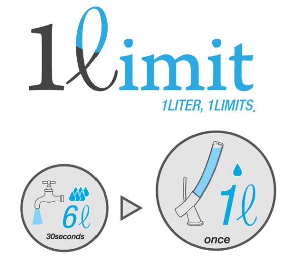
Elegance meets functional design with the 1?imit faucet. The glass holds exactly one liter of water, sufficient for any hand wash. The elegant design hopes to conserve water, as we almost use six liters when one is sufficient. Once the liter has been used, the waiting game begins and you must wait until the liter fills again. This rationing process hopes to help with water conservation. Designed by Dohyung Kim & Sewon Oh.

unnamed 9t3skprhw Eliminate Waste – The Elegant 1 Liter Faucet Design
unnamed e90wym7zm Eliminate Waste – The Elegant 1 Liter Faucet Design

Read and see more entertaining articles here.

 Eliminate Waste – The Elegant 1 Liter Faucet Design
Design You Trust RSS Feed | Design You Trust on FB | Design You Trust on Twitter | Design You Trust


The Art of the Facebook Page Design

22 Feb

Everyday more and more businesses around the world are creating presences on Facebook.

Some companies opt to bring users directly to the page wall or other tabs (e.g. info, photos, RSS/blog, discussions and links) and use product images or company logos instead of more elaborate landing pages.

Regardless of where a user lands when they first arrive, something needs to capture their attention.

As we’ll see in the examples of pages from the 50 Top Facebook Pages of Brand’s Worldwide represented below, some pages may come right out and ask for the “like”, some may have a variation on the call to action with a contest, gift, upload, sign-up now, or shop now type message. Some may appeal to emotions. Some will be memorable. And some, quickly forgotten.

In truth, Facebook is about more than the ongoing interaction between businesses and users via status updates. We believe it’s also about the art and design of engagement and a vital new component to the corporate brand identity—the Facebook page design.

Coca-Cola

Total Fans 22, 113, 350 | Food and Drink | United States


Starbucks

Total Fans 19, 386, 229 | Restaurant | United States


Oreo

Total Fans 16, 509, 052 | Food and Drink | United States


Red Bull

Total Fans 15, 002, 570 | Food and Drink | Austria


Skittles

Total Fans 14, 903, 838 | Food and Drink| United States


Converse All Star

Total Fans 12, 522, 419 | Fashion | United States


Victoria’s Secret

Total Fans 11, 273, 214 | Fashion | United States


Converse

Total Fans 10, 903, 272 | Fashion | United States


Windows Live Messenger

Total Fans 9, 555, 443 | Technology | United States


Pringles

Total Fans 8, 902, 303 | Food and Drink | United States


PlayStation

Total Fans 8, 328, 915 | Technology | Japan


Monster Energy

Total Fans 8, 264, 999 | Food and Drink | United States


Zara

Total Fans 7, 907, 457 | Fashion | Spain


Victoria’s Secret Pink

Total Fans 7, 861, 520 | Fashion | United States


Dr. Pepper

Total Fans 7, 730, 330 | Food and Drink | United States


Nutella

Total Fans 7, 482, 885 | Food and Drink | Italy


Ferrero Rocher

Total Fans 7, 464, 229 | Food and Drink | Italy


Starburst

Total Fans 7, 428, 300 | Food and Drink | United States


Disneyland

Total Fans 7, 227, 700 | Attraction | United States


McDonald’s

Total Fans 7, 015, 657 | Restaurant | United States


Adidas Originals

Total Fans 6, 983, 666| Sports | Germany


Reese’s

Total Fans 6, 446, 255 | Food and Drink | United States


Xbox

Total Fans 6, 216, 176 | Technology | United States


H&M

Total Fans 6, 111, 927 | Fashion| Sweden


Starbucks Frappucino

Total Fans 5, 632, 778 | Food and Drink | United States


Google Chrome

Total Fans 5, 452, 638 | Technology | United States


Taco Bell

Total Fans 5, 398, 834 | Restaurant | United States


Walt Disney World

Total Fans 5, 224, 835 | Attraction | United States


BlackBerry

Total Fans 5, 196, 258 | Technology | Canada


Picnik

Total Fans 4, 680, 341 | Technology | United States


SUBWAY

Total Fans 4, 663, 512 | Restaurant | United States


Nike Football

Total Fans 4, 622, 955 | Sports | United States


Lacoste

Total Fans 4, 493, 274 | Fashion | France


BMW

Total Fans 4, 429, 660 | Automotive | Germany


Hollister Co

Total Fans 4, 178, 668 | Fashion | United States


Mountain Dew

Total Fans 4, 127, 589 | Food and Drink | United States


Burberry

Total Fans 4, 024, 562 | Fashion | United States


5 Gum

Total Fans 4, 021, 548 | Food and Drink | United States


Forever 21

Total Fans 3, 972, 013 | Fashion | United States


Buffalo Wild Wings

Total Fans 3, 864, 310 | Restaurant | United States


Nike

Total Fans 3, 826, 717 | Sports | United States


Target

Total Fans 3, 816, 027 | Retail | United States


Chik-fil-A

Total Fans 3, 719, 656 | Restaurant | United States


Puma

Total Fans 3, 715, 460 | Sports | Germany


American Eagle Outfitters

Total Fans 3, 689, 587 | Fashion | United States


Subway

Total Fans 3, 679, 491 | Restaurant | United States


Gucci

Total Fans 3, 659, 709 | Fashion | Italy


Sony Ericcson

Total Fans 3, 656, 301 | Technology | Sweden


Abercrombie & Fitch

Total Fans 3, 653, 314 | Fashion | United States


Aéropostale

Total Fans 3, 604, 929 | Fashion | United States


Written and compiled exclusively for Webdesigner Depot by Debbie Hemley. Debbie is a blogger and social media aficionado. She works with businesses to develop content and social media strategies. Read her blog posts on All the News and follow her on Twitter

Have you been creating Facebook pages for your clients? What have your design experiences been like?


If you find an exclusive RSS freebie on this feed or on the live WDD website, please use the following code to download it: O1Rs1S


Get the MediaLoot Premium Icon Collection for only $27


Source


User-Friendly SEO

22 Feb

Some web designers (and many web content writers) view on-page SEO as a necessary evil to an effective content strategy on the web. However, when properly executed, SEO can actually enhance a site visitor’s experience, rather than detract from it.

In this article, I’ll run through several examples of how SEO can be improved with the user in mind. Reviewing these examples should help site builders gain a solid understanding of SEO practices that work together to create highly effective sites.

Changing Your Perception About SEO

Misperceptions about SEO generally arise from outdated ideas about what SEO is all about; when people are still under the assumption that keyword stuffing, mammoth blocks of links and stilted wording are still valid SEO tactics.

Rightfully so, web designers and web content writers object to these practices because they interfere with a visitor’s ability to make sense of the site.

Google and SEO have come a long ways since those practices were in vogue. Today, the crucial thing to understand is this:

  • Google trains its spiders to think like humans. Therefore, best of class SEO practices are best of class people practices.
  • When someone conducts a search, Google (and all the other search engines) wants to show results that are relevant and valuable to people. Accordingly, Google designs its search algorithms to reward meaningful content and punish those who try to game the system with user-unfriendly content tricks.

With that in mind, here is a brief review of seven tips  of on-page SEO that demonstrate how good SEO, good writing and good design work together to create an exceptional product. This is not an exhaustive list of content optimization techniques, but websites that get these issues right have an extremely strong foundation.

1. Insert Primary Keyword Phrases at the Beginning of Headlines

The primary keyword phrase on a web page should clearly and concisely describe the main topic of that page. For maximum effect, the phrase should be written at the beginning of the main page heading (<h1> tag).

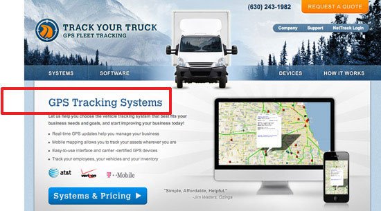
The example illustrated below is taken from a site we recently did for our client Track Your Truck, a firm that sells GPS tracking systems.

The headline, "GPS Tracking Systems", is superior to, say, "Manage Your Fleet Productivity".

When people scan a web page, their attention is drawn to the headline. If they have to pause for even a few seconds to discern its meaning and relevance, they may just click away instead.

Using keywords in the headline helps readers, which is why search engines like Google reward the practice.

2. Use Bold Text for Keywords

Another way to tell search engines — and site users — that content is important is to put it in bold type. Restricting the use of bold text to keywords is a good discipline all the way around. Too much bold text, especially used in a haphazard fashion, confuses the reader. No bold styling creates a clump of undifferentiated text that turns the reader off.

What we want is to focus the reader’s attention on the main theme of the page, so again, SEO and user preference work hand in hand.

Placing text in italics also attracts the attention of search engines and readers, but I discourage its use because italics in body copy can sometimes be difficult to read.

3. Use Bulleted Lists

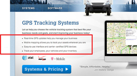
Search engines are attracted to bullet points because they think bulleted content has high importance (otherwise, why would someone bullet it?). Humans think the same way.

Any time content can be transformed from an undifferentiated block of text into a short (3 to 5) list of bullet points, the writer is helping visitors and search engines quickly and decisively grasp the meaning of that page.

As a general rule, extremely long lists are undesirable: they overwhelm the reader and, for that same reason, search engines probably devalue them.

4. Use Keywords in Call to Action Links

By conveying the content of the link using keywords, you alert the reader and search-engine to what the new page is all about.

Some will make the argument that "click here" is the better choice, because readers are more likely to follow a clear command. While I can accept this argument for landing pages and email blasts, I don’t think it applies very well to websites. If the "click here" approach is used globally, you wind up with a site where every link looks the same and thus all of the urgency of the command is lost. For obvious reasons, this situation is bad for both the user reading your site and for web spiders crawling your links for context.

5. Insert Primary Keywords at the Beginning of Meta Titles

A web page’s <title> tag is probably the most significant content on the page, as far as search engines are concerned.

Most designers and web copywriters are indifferent about meta data in general, because there is the perception that human readers don’t see it, even though what goes inside the <head> tag of an HTML document is important.

Site visitors do in fact view meta data. For instance, the <title> tag’s value appears in browser bars, browser tabs, and in a search engine’s results pages when people perform a search.  Also, they’re picked up automatically by tweets through most Twitter apps.

Insert Primary Keywords at the Beginning of Meta Titles

The browser view is quite important in my estimation. If a visitor has several tabs open, I want him or her to easily understand what page(s) of our client’s site is open. Ideally, the tab will display a perfectly constructed meta title, with keywords at the beginning and branding at the end, as you see in the example above.

Constructing great titles can contribute to better usability as well; Usability expert Jakob Nielsen suggests using the passive voice to front-load keywords in headings and page titles, even though the active voice is, overall, better for readability of web content.

6. Build a Strong Internal Link Structure

When web pages within a site are linked together in a logical way, search engines perceive them as being logically connected; that they rely on each other to tell a story. This interconnection causes the search value of these pages — and the domain as a whole — to rise, because the content is seen as important not only on its own, but as part of a bigger picture.

A strong internal link structure is a major component of the overall information architecture of a site and, from the user experience perspective, crucial to a visitor’s ability to maneuver around the site.

Whether internal links manifest themselves as breadcrumbs, footer links, text links or a combination, if the links are easy for the reader to follow, they’ll be easy for search engines to follow as well.

Build a Strong Internal Link Structure

Internal links (and links in general) are strongest for SEO purposes when keywords for the target page are used in the anchor text. The footer links in the example above, part of a design scheme our company uses for many lead generation sites, are optimized for the most important site pages.

7. Optimize Site Images

Very few sites have well optimized images, which is unfortunate on many levels. Poorly optimized images cause sites to miss out on great search opportunities, detract from the user experience, and pass up excellent conversion opportunities.

There are three ways to optimize images for SEO that I want to focus on, because they’re also great for usability.

Fill in the alt attribute. The alt attribute describes the image in plain English. It’s extremely useful for infographics and images that convey complex ideas or valuable data. If a visitor is not able to view the image, he or she will be helpless without an alt attribute; it’s a fallback mechanism for users who have issues rendering images, have images turned off while they browse, and for readers who are unable to see their screen and must rely on screen-reading software.

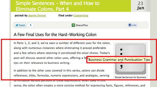
Keyword-optimize the title attribute. The image title appears when hovering over an image. What impression do you want to make on your visitors? Will they see "IMG40481105.jpg" or "Business Grammar and Punctuation Tips"?

Add a keyword-optimized caption. In my view, a caption strengthens most any image, especially on interior product and service pages. A reader will quickly zero in on an image and is very likely to read any content around it. Here is a golden opportunity to highlight a key product benefit, a unique service capability — and give search engines more content to index and rank.

Optimize Site Images

Image search can be a superb source of highly qualified traffic. People search for images for many types of products, and since fewer sites are optimized for image search, there’s less competition.

How Many Words on a Page Are Too Many?

SEOs and designers furiously debate the issue of word count. SEOs want more words, because all other things being equal, Google will rank a page with more and richer content higher than a similar page with less and lacking content.

Designers, on the other hand, fight for fewer words for the sake of elegance and impact. Both sides can make a strong case, and as a content writer, I am often caught in the crossfire.

Here, then, is a web content writer’s take on this very important issue.

First, the issue isn’t how much content to have on a website, it’s where to put it. Although intuition tells us that too many words will put off the visitor, some visitors at some point become interested in detailed information. If we can agree on that statement, we can resolve most word count issues.

For a home page and overview-type interior pages, too much above the fold content will backfire. On pages such as these, visitors are looking for a quick impression. Design effectiveness is paramount.

One way we have tried to balance SEO and design considerations for content on home pages is to "layer" the content. Above the fold, we strive for strong design elements and concise content. Below the fold, we add more detailed copy that incorporates keywords.

Here is the home page for Track Your Truck that follows these practices:

This is not an ideal solution, because in a perfect world, our keywords would be concentrated toward the top of the page, where search engines value them more highly.

However, from an overall UX point of view, I like this approach. If the top part of the site is engaging, some visitors will scroll down and read because they have been inspired to learn more. Others will bypass the optimized content and proceed directly to an interior page or the contact page. Whichever happens, the site scores a win.

In contrast, product and service detail pages can be content heavy above the fold. When visitors get to these pages, they are no longer browsing, but searching for information. A lack of detail can actually detract from the site’s credibility.

Keep in mind that many people who hit interior pages come directly from a search for that product or service. Presumably, such visitors have clicked through because they want detailed information, and for many sites, these interior pages will generate the lion’s share of unbranded search traffic. As a result, high word counts on interior pages serve SEO and users well, and home page word counts become far less significant.

Designers, SEOs and Writers: Why We Can All Just Get Along

Successful web development requires a high level of teamwork. This is the conclusion professional designers, SEOs and writers always reach in the end. When designers disregard SEO, websites fail with search engines. When SEOs disregard design, websites fail with people. Either outcome will fall woefully short of client expectations, because virtually every e-commerce and lead generation site is in pursuit of more search traffic and more conversions.

Writers, too, cannot afford to be purists or operate in a vacuum. The emphasis Google places on quality content is undeniable: Recently, Google announced a new algorithm to combat content spam, a clear signal that it means to punish manipulative SEO techniques and reward high quality, relevant web copy.

Nevertheless, writers who consider themselves "above" the SEO fray are arguing for a strategy of "build it and they shall come." Unfortunately, this strategy almost never wins: Apple and McDonalds may be able to ignore Google — can you?

The strategy that is likely to win is one that balances design, SEO and writing through every step of the development process. This post attempts to describe some common ground, but still, getting all team members on the same page (so to speak) is not always easy. I hope you will share your experiences about this challenge in the comments.

Related Content

About the Author

Brad Shorr is Director of Content Marketing for Straight North, a Chicago-based interactive marketing agency that specializes in marketing strategy, Web development and Internet marketing services that include search engine optimization, PPC management, social media and e-mail marketing. Follow Brad Shorr on Twitter: @bradshorr and Straight North on Facebook.


Mercedes Benz: Left Brain – Right Brain, Passion

22 Feb
Mercedes Benz: Left Brain - Right Brain, Passion

Advertising Agency: Shalmor Avnon Amichay/Y&R Interactive Tel Aviv, Israel
‏Chief Creative Director: Gideon Amichay

Executive Creative Director: Tzur Golan

Creative Director: Yariv Twig
‏Art Directors: Gil Aviyam, Dror Nachumi
‏Illustrators: Gil Aviyam, Lena Guberman
‏Copywriters: Sharon Refael, Oren Meir
‏Executive Client Director: Adam Polachek
‏Account Supervisor: Yael Yuz
‏Account Manager: Mayran Sadeh
‏Head of Strategic Planning: Yoni Lahav
‏Planning Director: Zohar Reznik
‏Planner: Nili Rabinowitz
Published: February 2011

Learn how to do great ads like this on Creative Pro.


Google Releases Data Viz Challenge on Federal Tax Numbers

22 Feb

google_data_viz_challenge.jpg
UPDATE: Oops, hold your programming skills: according to the official rules: "this Challenge is open to users who are physically located in the United States". This seems outdated on so many levels...
Thnkx @driven_by_data

There isn't a real shortage of data visualization competitions lately, as high-profile magazines, communities, ngo's, and popular blogs left and right seem to continuously encourage the home-based information designer to come out and demonstrate their talent in terms of making complex data comprehensible and enjoyable to explore.

The latest contestant in this search for the best visualization designer (or should I say, the next employee?) is Google, who, together with Eyebeam, just announced their profound interest in both federal tax numbers as well as interactive bubble graphs.

This naturally all culminates in an ambitious Data Viz Challenge [datavizchallenge.org], which will be juried by viz gurus like Aaron Koblin and Jonathan Harvis.

Each competition entry must use the data from WhatWePayFor.com, be graphical, and have some legible relationship to the underlying data. That somehow legible relationship though, as they describe here, must be excellent in terms of storytelling, clarity, relevance, utility, and... aesthetics.

So, what are you waiting for?


The Illustrated Guide To a Ph.D

22 Feb

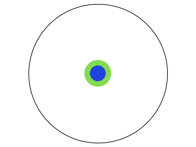
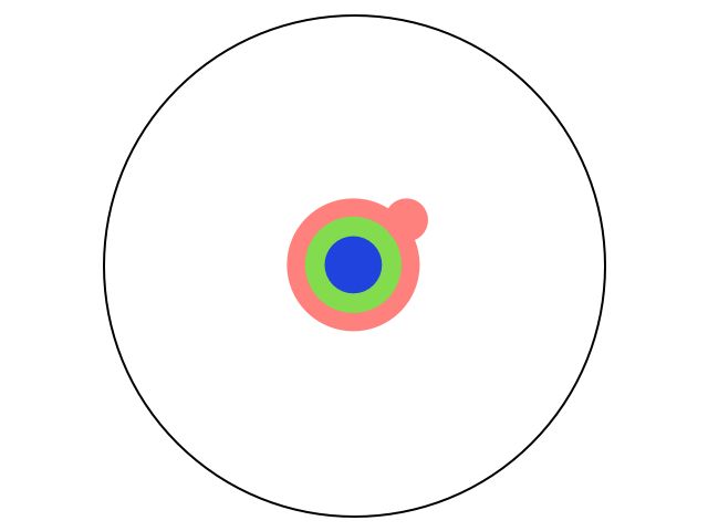
Imagine a circle that contains all of human knowledge:


By the time you finish elementary school, you know a little:

By the time you finish high school, you know a bit more:

With a bachelor's degree, you gain a specialty:

A master's degree deepens that specialty:

Reading research papers takes you to the edge of human knowledge:

Once you're at the boundary, you focus:

You push at the boundary for a few years:


Until one day, the boundary gives way:


And, that dent you've made is called a Ph.D.:

Of course, the world looks different to you now:

So, don't forget the bigger picture:
Keep pushing.


The New SEO is About Relationships and Relevance

21 Feb

The New SEO is About Relationships and Relevance

This content from: Duct Tape Marketing

Last week Google announced an official update to Social Search – something they’ve been playing around with for some time now. The idea behind social search is that if a Google account user does a search for something they will get the most relevant results according to Google now mixed in with results that Google determines are important from those in your social networks.

The news for anyone thinking about SEO is summed by this statement from Google – . . .relevance isn’t just about pages—it’s also about relationships. Google has officially moved from playing with social search to altering the SEO landscape with it.

While the newly socialized results are dependent upon the surfer being logged in to their Google account, the significance from an SEO standpoint is potentially game changing. As Google continues to advance this type of thinking when it comes to placement of search results it will bring the online acts of content creation, network building and social participation to new heights.

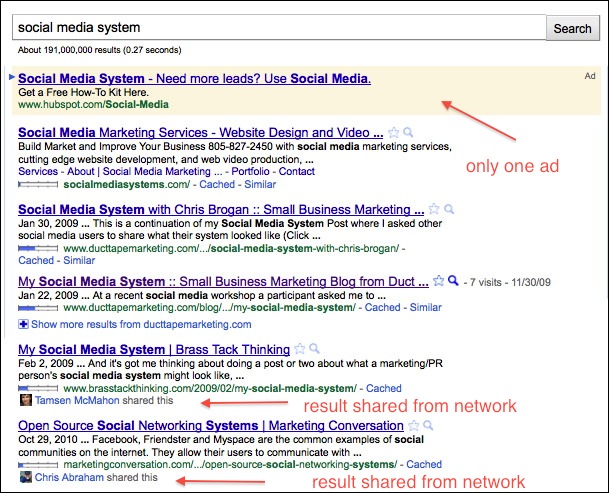
Consider the images below – the first is a search for the term “social media system” while logged out of Google and second while logged in. The results are dramatically different. (Click to enlarge)

Results while logged in

Results while logged out

I’ve been begging and pleading with small business owners for the last five years to create and use blogs, claim all the digital real estate and profiles they could and get active building social networks like LinkedIn, Facebook and Twitter. While this is behavior that has long influenced organic search results in a more mathematical way, social search highlights the direct impact this behavior has in ways that should open some eyes.

The good news is that people that have participated fully in social media, network building and content creation may have just received a very positive jolt in the search game. There is still time to adopt this behavior because it may be years before this social search function becomes fully realized, but there’s no way to deny the need to make online network building and participation a primary business practice.

Now, this doesn’t mean that good SEO practices of link building and content creation around keywords goes out the window – those factors will remain extremely important, but social network participation just got a raise in terms of becoming a ranking factor that isn’t controlled by traditional SEO practices.

Here are a couple unscientific initial thoughts:

  • You can’t play without a Google Profile – if you have one go update it now and add more connections
  • Sharing content from your Google Reader account seems to get high marks right now
  • Twitter results are being adding pretty quickly
  • With Google and Facebook locked in war for social, don’t expect Facebook results to matter as much

You connect accounts that you want to be part of your public profile using the Google Profile tool, but you can also connect account privately through your Google Account. (Google is choosing your networks through the Social Graph tool.)

Results will be spotty and odd for some time now, but it’s still time to rethink your entire approach to SEO.


Our galaxy is home to more than 50 billion planets…and 500 million potentially habitable ones [Astronomy]

20 Feb
The Kepler telescope discovered more than 1,200 planets in just one tiny corner of the Milky Way. Crunching the numbers, a conservative estimate says there should be at least fifty billion planets in the entire galaxy, and about 500 million of those should be inside the habitable zone. But how many of those planets have life on them, let alone other intelligent beings? That's the question we still can't answer...but we're getting closer. More »


Comic for February 20, 2011

20 Feb