In the previous part of this series, we discussed some techniques and best practices for CSS typography. Let’s now delve into the subject further by looking into some case studies, tools, as well as a showcase of excellent CSS typography on the web.
This is the third part of a three-part series of guides on CSS typography that will cover everything from basic syntax to best practices and tools related to CSS typography.
Case Studies on CSS Typography
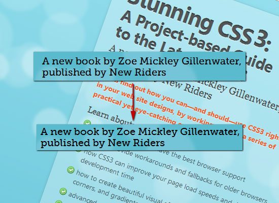
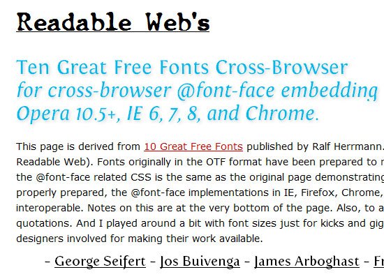
Tutorials and theories can be great, but nothing says proof like a case study. Here are a handful of studies that can provide you with some real-world insights regarding typography on the web.

CSS Typography Tools
Below is a collection of typography-related tools, with most being geared toward helping you work with CSS typography.
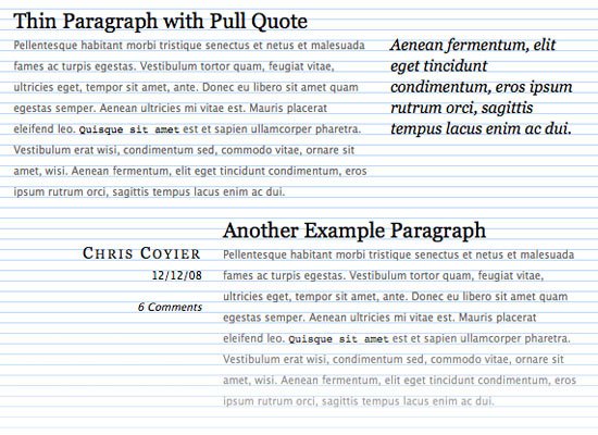
This premade CSS grid by Chris Coyier is composed to a vertical rhythm. It’s a great starting point for anyone working with CSS typography.
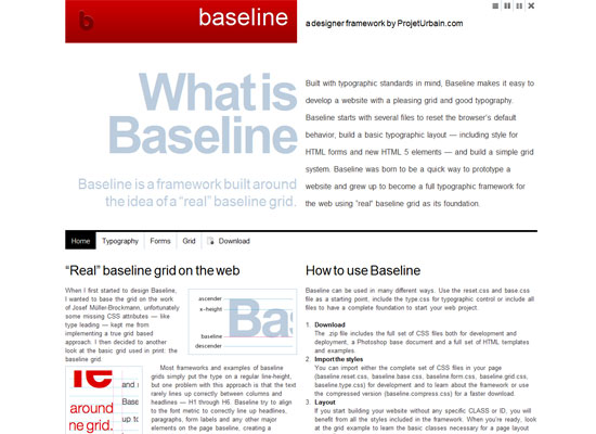
Baseline is a typographic framework that adheres to a baseline grid. It features a CSS reset and basic style rules for HTML text, web forms, and some of the new HTML5 elements.
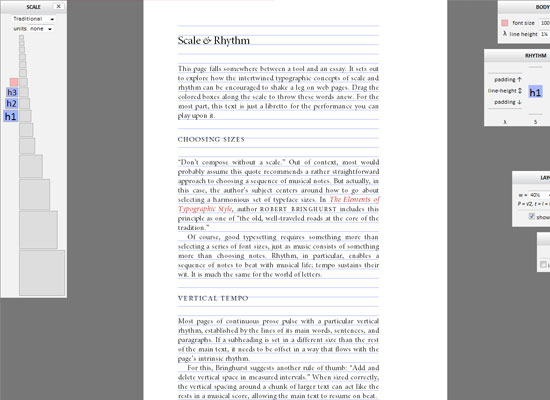
This tool has a drag-and-drop interface for composing typography that aligns to a web layout grid. There are a number of features available including an automatic mathematical scale so that you don’t have to pull out your calculator while working with CSS typography.
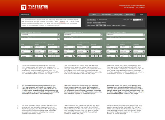
Choose fonts installed in your computer and then play around with its line-height, letter-spacing, and so forth. This tool will show you a preview on the fly so that you can conveniently tweak your font styles to your heart’s delight.
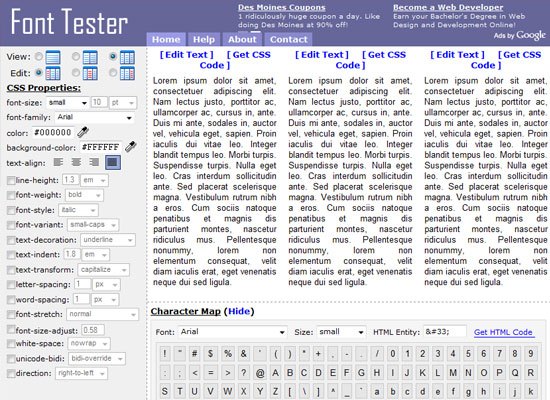
FontTester is similar in purpose to TypeTester (above). FontTester allows you to test various fonts side by side for comparing and contrasting. Test out different font combinations and styles, and then grab the CSS once you’re happy.
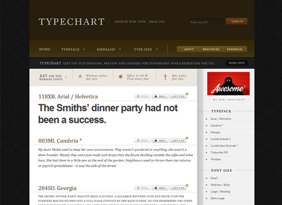
Typechart is a showcase of different font combinations, with easy-to-grab CSS for each combination. It’s great for discovering font combinations and styles quickly.
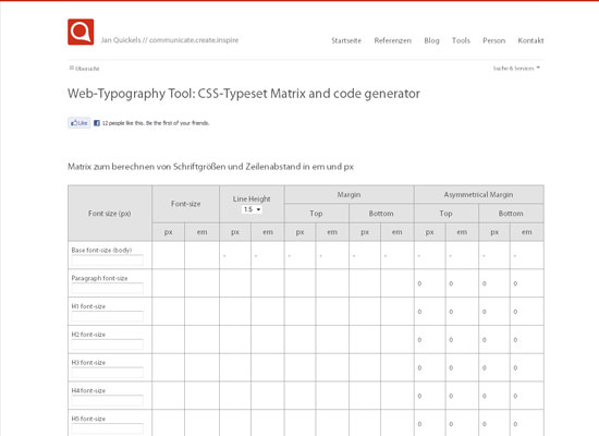
Do you think in terms of pixels? This tool will help convert your units of measurement into em as well as help you find margins and spacing values based on the font sizes and line-heights you specify.
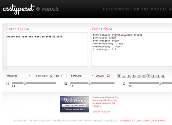
With this tool, you can change the line-height, word-spacing, color, style and text decoration of any text placed in the left input field. See the result of your tweaks immediately, and then copy-and-paste the code from the right input field.
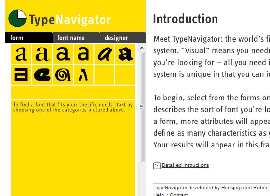
Have you ever come across a font on the web and wondered what it was? With this tool, you can figure out what font you’re looking at by answering a series of questions about its characteristics. Without a particular font in mind, you can use this tool to find a font based on features you like.
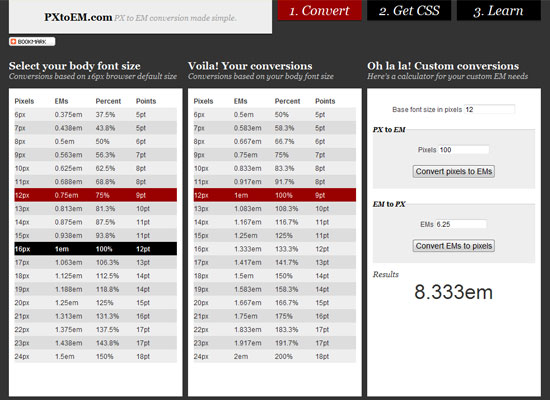
With this tool, simply pick a desired body font-size in any of the four units of measurement (px, em, % or pt) and it will convert it to em for you.
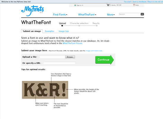
You can use this tool to learn the name of a font by uploading an image of it.
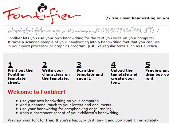
This web-based generator will create a font based on a sample of your own handwriting. The font can be used in a live site using the @font-face rule (for instance). Sampling and creating the font is free, but it costs $9 to download the font.
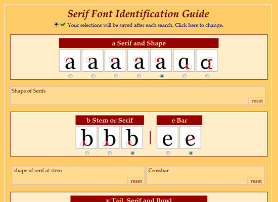
This tool allows you to search for a serif font by its characteristics. If the font you’re looking for is found, Serif Font Search will provide you its name and as well as some information about it.
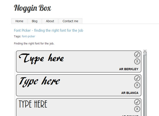
Font Picker allows you to filter through hundreds of fonts based on the characteristic and styles that you are looking for.

For a subscription fee, web designers can use premium web fonts on their website and serve them through this web service. A big benefit to using Typekit is that there’s no need to worry about licensing restrictions of fonts you decide to use — the service does all that work for you.
CSS Typography Showcase
For inspiration, here are a few web designs that have beautiful web typography. We’ll also briefly discuss how CSS is used to compose the web design’s typography.
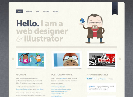
Matt Hamm has created his portfolio website around beautiful typography. The web design’s vertical rhythm is executed well and premium web fonts are served through Typekit. Notice how the web design has variations in capitalization, font size, and other font styles to create excellent visual hierarchy.

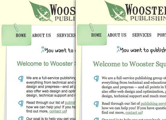
This website uses a few different CSS typography techniques. The website name and tagline leverages CSS3 text-shadow to create a subtle CSS3 inset text effect.

Design Informer’s custom blog post is a great example of beautiful typography in web design. The typography on this page adheres to a baseline grid and font sizes and styles between different textual elements create great visual hierarchy.
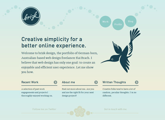
This web design is another example of how to use custom web fonts effectively. The same font is used in headings and in various text blocks throughout the website layout. Note how the first paragraph and heading on each web page is in a bigger font size — a practical use of the CSS :first-child pseudo-element discussed in the second part of this series.
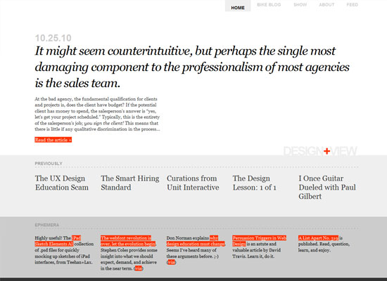
The variations in font sizes are what make this design so smart in terms of typography. Font sizes and typography spacing uses the em unit of measurement.

A List Apart has always been regarded as a website with excellent typography and content readability. This is because good typography is essential to a content-centered site like A List Apart, whose often-lengthy articles take center stage. The web layout features great vertical rhythm and a combination of CSS typography techniques and styles like centered text, capitalization, and an interesting hover state for hyperlinks in the articles.
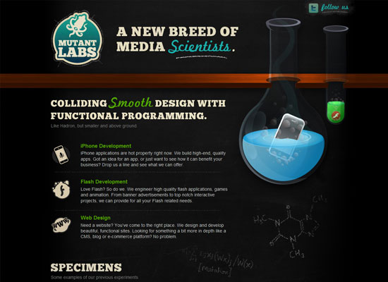
This web design has excellent font styling (in terms of colors, font choices, sizes, and spacing) that results in a great typographic composition.

Jason Santa Maria uses CSS background-image text replacement and some basic CSS typography techniques that result in excellent legibility and readability of content. Vertical rhythm in this design is wonderful.
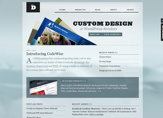
CSS drop cap (discussed in the second part of this series) is used in a main paragraph on the front page of the site.
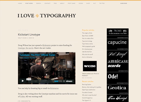
Notice that the serif fonts in this design have been given more whitespace, and sans serif fonts have been given less. This was likely done to create visual hierarchy so that the main content is the primary focal point and the sidebar content the secondary point of interest.
Further Reading and Resources on CSS Typography
Finally, here is some reading material related to CSS typography for you to look into.
Conclusion
Designing web typography takes a good understanding of basic typography principles and practice through real implementation. With a solid understanding of CSS font and text attributes, typography can be created with beautiful results. Efficient and smart coding habits should include knowing what CSS typography can/should and can’t/shouldn’t do.
This concludes our three-part guide on CSS typography. I hope it has helped you in understanding how to work with type in your web designs.
Related Content
About the Author
 Kayla Knight is a web designer and web developer who loves coding way too much for her own good. She does freelance design/development work and helps run the XHTML Shop. Connect with her by visiting her website and following her on Twitter @ KaylaMaeKnight.


 Kayla Knight is a web designer and web developer who loves coding way too much for her own good. She does freelance design/development work and helps run the


