
Archive for April, 2011
An amazing infographic explains what we’d have done with the 205 million gallons of oil if the Gulf Oil Spill hadn’t happened [Video]
27
Apr
Reader Photo: Stunning Interactive Sky Image
27
Apr

This stunning 360 degree panorama of the night sky was stitched together from 37,000 images by a first-time astrophotographer.
Nick Risinger, a 28-year-old native of Seattle, trekked more than 60,000 miles around the western United States and South Africa to create the largest-ever true-color image of the stellar sphere. The final result is an interactive, zoomable sky map showing the full Milky Way and the stars, planets, galaxies and nebulae around it.
“The genesis of this was to educate and enlighten people about the natural beauty that is hidden, but surrounds us,†Risinger said.
The project began in March 2010, when Risinger and his brother took a suite of six professional-grade astronomical cameras to the desert in Nevada. By June, Risinger had quit his job as a marketing director for a countertop company to seek the darkest skies he could find.
Every night, Risinger and his father set up the cameras on a tripod that rotates with Earth. The cameras automatically took between 20 and 70 exposures each night in three different-color wavelengths. Previous professional sky surveys (including the Digitized Sky Survey of the 1980s, which is the source for the World Wide Telescope and Google Sky) shot only in red and blue. Including a third color filter gives the new survey a more real feeling, Risinger said.
“I wanted to create something that was a true representation of how we could see it, if it were 3,000 times brighter,†he said.
‘I wanted to create something that was a true representation of how we could see it, if it were 3,000 times brighter.’
Risinger sought out dry, dark places far from light-polluting civilization. Most of the northern half of the sky was shot from deserts in Arizona, Texas and northern California, although Risinger had one clear, frigid night in Colorado.
“It was January and we were hanging out in Telluride waiting for the weather to clear in Arizona or Texas,†he said. “Finally we realized the weather was hopeless down south, but it was perfectly clear where we were.†They drove an hour away, set up near a frozen lake, and sat in their car with the heat off for 12 hours as the temperature outside dropped to minus 6 degrees Fahrenheit.
“I would have loved to turn the car on for heat, but I was afraid the exhaust would condense on the equipment and make a shutter freeze or ice up the lenses,†Risinger said. “Certainly it was the coldest I’ve ever been, but I’ve still got all 10 toes and fingers.â€
The southern hemisphere was captured in two trips to South Africa, not far from the site of the 11-meter Southern African Large Telescope. While there, Risinger and his father stayed with a sheep farmer who also watched the skies with his own amateur telescope.
Back in Seattle, Risinger used a combination of standard and customized astrophotography software to subtract noise from the cameras, stack the three colors on top of each other, link each picture to a spot on the sky and stitch the whole thing together. He taught himself most of the techniques using online tutorials.
Risinger plans to sell poster-sized prints of the image from his website and is looking for someone to buy his cameras, but otherwise has no plans to make money from his efforts. He wants to make the panorama available to museums and planetariums, or modify it for a classroom tool.
“When Hubble shoots something, it’s a very small piece of the larger puzzle. The purpose of this project is to show the big puzzle,†he said. “It’s the forest-for-the-trees kind of concept. Astronomers spend a lot of their time looking at small bugs on the bark. This is more appreciating the forest.â€

Risinger sets up his cameras in Colorado.
Images: Nick Risinger
See Also:
- Amateur Astrophotographers Unwittingly Help Scientists Track Comet
- Amateurs Find Hidden Gems in Space Photo Contest
- Video: Robo-Camera Rig Animates the Night Sky
- Reader Photo Gallery: Awesome DIY Astronomy
- The Making of a Mind-Blowing DIY Sun Photo
How to raise a language from the dead [Linguistics]
27
Apr

Responsive Data Tables
27
Apr
Data tables don't do so well with responsive design. Just sayin'.
He has a good point. Data tables can be quite wide, and necessarily so. A single row of data needs to be kept together to make any sense in a table. Tables can flex in width, but they can only get so narrow before they start wrapping cells contents uncomfortably or just plain can't get any narrower.
Responsive design is all about adjusting designs to accomodate screens of different sizes. So what happens when a screen is narrower than the minimum width of a data table? You can zoom out and see the whole table, but the text size will be too small to read. Or you can zoom in to the point of readability, but browsing the table will require both vertical and (sad face) horizontal scrolling.

So here's what we are gonna do...
We're going to use "responsive design" principles (CSS @media queries) to detect if the screen is smaller than the maximum squishitude of our table. If it is, we're going to reformat the table.
We're being good boys and using Plain Ol' Semantic Markup here for our table. Bare bones example:
<table>
	<thead>
	<tr>
		<th>First Name</th>
		<th>Last Name</th>
		<th>Job Title</th>
	</tr>
	</thead>
	<tbody>
	<tr>
		<td>James</td>
		<td>Matman</td>
		<td>Chief Sandwich Eater</td>
	</tr>
	<tr>
		<td>The</td>
		<td>Tick</td>
		<td>Crimefighter Sorta</td>
	</tr>
	</tbody>
</table>
Our regular CSS is nothing special:
/*
Generic Styling, for Desktops/Laptops
*/
table {
	width: 100%;
	border-collapse: collapse;
}
/* Zebra striping */
tr:nth-of-type(odd) {
	background: #eee;
}
th {
	background: #333;
	color: white;
	font-weight: bold;
}
td, th {
	padding: 6px;
	border: 1px solid #ccc;
	text-align: left;
}
The small-screen responsive stuff comes in now. We've already figured out our minimum table width is about 760px so we'll set up our media query to take affect when the narrower than that. Also, we'll target iPads as they are right in that zone.
The biggest change is that we are going to force the table to not behave like a table by setting every table-related element to be block-level. Then by keeping the zebra striping we originally added, it's kind of like each table row becomes a table in itself, but only as wide as the screen. No more horizontal scrolling! Then for each "cell", we'll use CSS generated content (:before) to apply the label, so we know what each bit of data means.
/*
Max width before this PARTICULAR table gets nasty
This query will take effect for any screen smaller than 760px
and also iPads specifically.
*/
@media
only screen and (max-width: 760px),
(min-device-width: 768px) and (max-device-width: 1024px)  {

	/* Force table to not be like tables anymore */
	table, thead, tbody, th, td, tr {
		display: block;
	}

	/* Hide table headers (but not display: none;, for accessibility) */
	thead tr {
		visibility: hidden;
		height: 0;
	}

	tr { border: 1px solid #ccc; }

	td {
		/* Behave  like a "row" */
		border: none;
		border-bottom: 1px solid #eee;
		position: relative;
		padding-left: 50%;
	}

	td:before {
		/* Now like a table header */
		position: absolute;
		/* Top/left values mimic padding */
		top: 6px;
		left: 6px;
		width: 45%;
		padding-right: 10px;
		white-space: nowrap;
	}

	/*
	Label the data
	*/
	td:nth-of-type(1):before { content: "First Name"; }
	td:nth-of-type(2):before { content: "Last Name"; }
	td:nth-of-type(3):before { content: "Job Title"; }
	td:nth-of-type(4):before { content: "Favorite Color"; }
	td:nth-of-type(5):before { content: "Wars of Trek?"; }
	td:nth-of-type(6):before { content: "Porn Name"; }
	td:nth-of-type(7):before { content: "Date of Birth"; }
	td:nth-of-type(8):before { content: "Dream Vacation City"; }
	td:nth-of-type(9):before { content: "GPA"; }
	td:nth-of-type(10):before { content: "Arbitrary Data"; }
}
And so, desktops get the regular table experience, mobile (or otherwise small screens) get a reformatted and easier to explore table:

Hey what about IE?
Sigh. Here's the deal. IE (even 9 and 10 preview) don't like you setting table elements as display: block; It does weird stuff and doesn't work right. But those versions of IE do support media queries. So my solution thus far is just to wrap the media query styles in conditional comments.
<!--[if !IE]><!-->
<style>
   /* table-related media query stuff only */
</style>
/* Or an external stylesheet or whatever */
<!--<![endif]-->
If the problem was only that older versions of IE don't support media queries, we could use the css3-mediaqueries-js project (polyfills support for all media queries) or Respond (also polyfill, way smaller, but only does min/max-width). They both work very well. But this isn't our problem in this case.
See it
There are two pages to the demo, one the "regular" table so you can see the problem. Then a link there to the responsive table so you can see the solution.
In the demo I use a couple of extra media queries for mobile to force the body to certain widths so they don't get feisty. View source to snag.
This isn't perfect...
This is just one potential solution to the problem to data tables on small screens. It's not perfect. There may be some accessibility concerns (or maybe not, I'm really not sure). It's likely there are some fancy JavaScript solutions that could approach things differently and also work great. If other solutions to this come along, I'll keep this page updated.
UPDATE: Other ideas
Scott Jehl created two alternative ideas that are both very cool and very different from this. This highlights an important point: it's all about the specific context of your data table that dictates what solution to go with.
One of them makes a pie graph from the data in the chart. On narrower screens, the pie graph shows and the table hides, otherwise only the more information-rich table shows. Arguably, the mobile version is more useful!

The next idea (Scott credits Todd Parker) is to turn the table into a mini graphic of a table on narrow screens, rather than show the whole thing. This shows the user there is a data table here to be seen, but doesn't interfere with the content much. Click the table, get taken to a special screen for viewing the table only, and click to get back.

Bacteria Grow Under 400,000 Times Earth’s Gravity
25
Apr
Some bacteria can even reproduce under the same crushing gravity found on massive stars or in supernova shock waves, a new study says.


Operation Window Seat: HNL-CXI-HNL
22
Apr
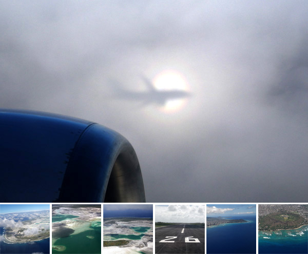 Wow. It’s like an airplane eclipse ~ amazing circular rainbow and shadow of the plane cast on the clouds… apparently it was even more incredible in person, and the camera didn’t even begin to do it justice. This latest Operation Window Seat comes from my dad who just returned from his latest adventures… incredible views as he flies in to Christmas Island… and to Honolulu on the return. The glow of the water and sky ~ the sandy shallows ~ the waves crashing on the shores ~ the dense city by the sea ~ diamondhead crater… and more!
(Want more visual goodness? See NOTCOT.com + NOTCOT.org)


Web Design Evolution: Two Decades of Innovation [INFOGRAPHIC]
17
Apr


The web has come a long way since Tim Berners-Lee created the first website way back in 1991. Here’s an infographic that takes you on a tour of web design, starting with those humble beginnings, and bringing you all the way up to the present day.
It’s like getting into a time machine, where the tremendous progress design has made on the World Wide Web over the past two decades is all laid out in front of you.
Follow along this extensively researched infographic from KISSmetrics, showing us exactly how far we’ve come from those early days where wide pages of text with hyperlinks in between ruled the roost. Do you remember when an animated .gif graphic of a letter folding up and flying into an envelope was seen as the highest of technology? We’re starting to feel nostalgic.
Please note: This graphic is so huge, we had to shrink it to fit our format, but if you’re having a hard time reading it, click the graphic for an enlargement.

Graphic courtesy KISSmetrics
More About: infographic, kissmetrics, Tim Berners-Lee, trending, web design, Web Design evolution
For more Dev & Design coverage:
- Follow Mashable Dev & Design on Twitter
- Become a Fan on Facebook
- Subscribe to the Dev & Design channel
- Download our free apps for Android, Mac, iPhone and iPad