Archive for June, 2011
Cows In China Are Now Producing Human Breast Milk [Video]
All roads lead to philosophy, on Wikipedia
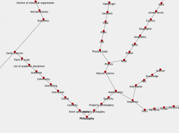
Jeffrey Winter tests a hunch about links leading to philosophy on Wikipedia:
There was an idea floating around that continuously following the first link of any Wikipedia article will eventually lead to "Philosophy." This sounded like a reasonable assertion, one that makes a certain amount of sense in retrospect: any description of something will typically use more general terms. Following that idea will eventually lead… somewhere.
Winter's curiosity led to this simple mashup. Type in some terms in the search bar and see where those topics lead to. Lo and behold, they all reach philosophy somehow. The above was my own search for economy, poop, science, Forrest Gump, hamburger, and Chicago. Philosophy: the Kevin Bacon of Wikipedia.
"Trying To Deter Pedophiles With The Equivalent Of A Speeding Ticket"
"Trying To Deter Pedophiles With The Equivalent Of A Speeding Ticket"
Two women are ticketed for eating donuts on a bench on a Brooklyn playground while unaccompanied by children. Garth Johnson writes on Gothamist:
Yup, this weekend the police gave two young women in Bed-Stuy summonses for eating doughnuts in a playground while unaccompanied by a minor.Tickets for being an adult in or around a playground have been popping up fairly frequently lately--see the Inwood chess players--but instead of giving the offending citizens a warning and urging them to leave, the NYPD's M.O. appears to be to hand out a ticket.
From one of the women's statement at the link:
This cop attempted to be sympathetic. He proceeded to tell us that he was trying to be a gentleman by just giving us summonses instead of taking us in for questioning, because that was what "they" wanted him to do. If he just gave us warnings and told us to leave, he would get in trouble for "doing nothing all day." He went on to say that all he did when he was growing up was "do Tae Kwon Do and go to school." "Are you trying to say that we are bad people for sitting on a bench in a park and eating doughnuts?" I asked him, just trying to figure out where he was going with this. "No, no, I'm just saying that I never got in trouble. Sometimes I play basketball," he said, pointing at the courts behind him. Not in that park, he doesn't. Not unless he has a kid strapped to his back at the time.Finally, we were given our summonses and were free to go. Because we hadn't been drinking alcohol or urinating in public, we do not have the option of pleading guilty by mail. Not that I am planning on pleading guilty. But either way, we have to show up in court or a warrant will be issued for our arrest. My friend does not live in New York and I am out of the country all summer, so this is going to be an ordeal in itself, given that the summons has no information on how to contact the court. Nor do we know how much we owe. Because the cops had no idea about that, either. They were just "doing their jobs," in the most mindless sense of that phrase.
I have three little nephews and I appreciate that keeping children safe is the thinking behind this rule. But this is basically trying to deter pedophiles with the equivalent of a speeding ticket. Meanwhile, in parts of the city with minimal amounts of public green spaces, people are taught that they are being "bad" citizens for sitting on a bench for a few minutes. The regulations are as they are and they were posted, but does the issuing of summonses to people who even the police do not actually believe are posing a danger, with no prior warning, accord with the law's protective intent?
Creating Focal Points in Your Web Design
Web designers don’t have much time to impress website visitors and persuade them to stay on the websites we craft. They want to find things quickly, and we should design sites to aid them do just that. One of the most important ways to do this is with focal points.
A focal point is a prominent section on a web page that we want to guide the user’s attention to. The focal point is the eye-catching centerpiece of the page; it stands out and is distinct than other components.
Here’s the rationale: By designing such an area of interest, we’re able to emphasize the most significant aspect(s) of the web page and convey the main purpose of the website.
The Basics
It’s best to have a single focal point. Find the most important thing on the page, and then accentuate it. The focal point should relate directly to the goals and priorities of the website and to the website owner’s expectations.
It’s possible to have more than one focal point, but I recommend focusing on one main call-to-action. Having many focal points on a page is the same as having none at all because, then, users won’t be able to discern which one’s the most important.
If you must have more than one focal point, they should be distinguishable. Create a visual hierarchy to denote which focal point is more important. Differentiate them from one another with variety in size, color, position, visual weight and other distinction techniques.
Where to Put Focal Points
Most users see the home page first, so that’s probably the best page for your focal point. But creating a focal point only on the home page is a common mistake. All web pages should have a focal point that gives the user quick access to the most important piece of information on the page.
On a scrollable page, for example, put the focal point above the fold (the header is a good candidate location).
On a non-scrollable page (i.e. a page that is visible all at once), you have more freedom. Use elements that already exist, but use them well. Make something simple elaborate; make something ordinary impressive.
If you can, imply a narrative. Inform your design work with a story.
How to Create Focal Points
Here are design elements you can tweak for establishing your focal points. I’ve included some real-world examples and counter-examples of each element.
Typography
Textual elements have strong potential to become attention grabbers, but typical websites are crammed with large amounts of text, so particular parts must be emphasized.
Size, color, spacing (between characters and lines) and typeface are the factors that can be manipulated for increased emphasis of textual elements.
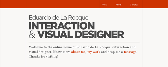
Eduardo de la Rocque uses different typefaces and sizes to make three level of visibility.
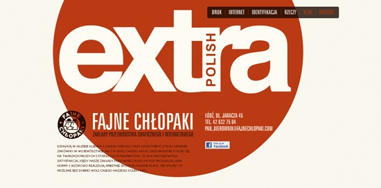
The huge typography on Fajne Chlopaki‘s website catches the eye.
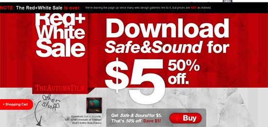
Music band The Autumn Film announces a special offer with bold type, creating a true focal point.
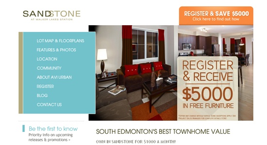
Sandstone shows why good labeling provides a captivating focal point.
Diversity in font sizes can do a lot, but colors are what really draw the eye. The header on the website for Flash Gaming Summit 2011 is a good example.

Illustration
Graphical components convey messages quickly and without needing much description. They also work as visual hooks to grab the user’s attention. It can also be used to show steps in a process, being so vividly descriptive and memorable. Most of the time, graphic elements are silver bullets: save them for the right moment and don’t overuse them.
WPCoder has an appropriate and descriptive focal point. It’s a beauty.

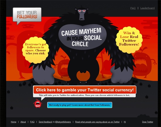
The home page for Bet Your Followers has several focal points, but the main illustration (of the gorilla) is predominant and guides the eye to other points. Notice its arms and the space just below them — a good example of how to handle several focal points.
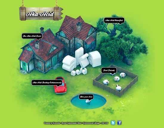
Aka-Acid has a beautiful design, but the lack of a particular focal point is a drawback.
Buttons
One of the most popular elements in web design in recent years is the call-to-action button. Big buttons are on almost every website. They are effective because of their high visibility (due to their size), familiarity and descriptive labeling. Buttons are attractive elements, but overuse or misuse will detract from their effectiveness.
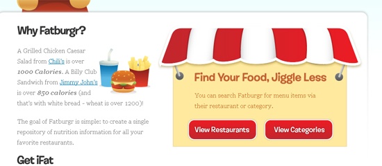
On Fatburgr, two simple buttons catch the user’s attention. Their size and color are effective.
SolidShops uses clear and obvious buttons to create focal points both above and below the fold.

Whitespace
Using whitespace is one of the simplest ways to draw the eye to specific areas of the page without resorting to visible elements.
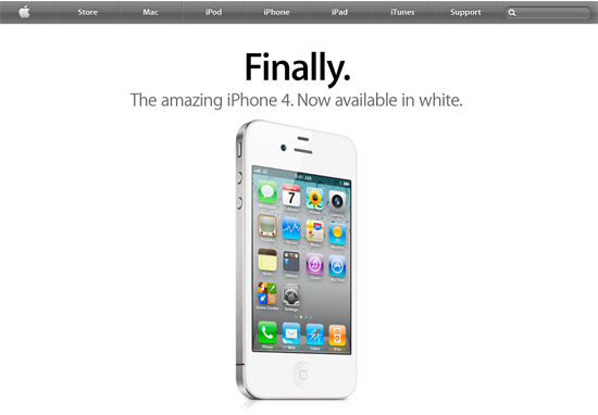
Apple uses whitespace perfectly to make the featured product obvious.
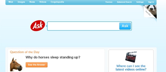
Ask hits the spot by leaving enough whitespace around the search box.
Decoration
A way to distinguish something from its surroundings is to use simple decoration. Color and positioning go a long way towards creating great effects, and the effectiveness of other elements greatly depends on how well these basic elements are used.
On 3rdM, the only thing that immediately attracts attention is the color blue. After that, the eye goes to the largest item in between the blue icons. Simple but effective.
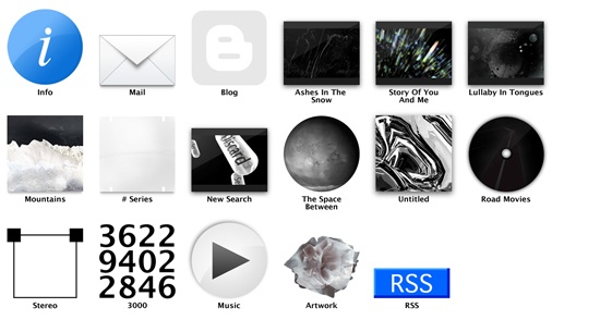
The part of the page that is biggest and has the highest contrast in color usually stands out the most. UX Magazine‘s home page has several focal points on different levels.

As demonstrated by Train-ee, tag clouds are a good way to arrange focal points by size.

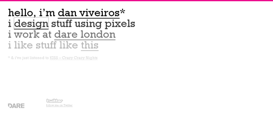
Basic decoration can bring out certain elements in the text. Dan Viveiros‘ website is minimalist and elementary, but it works.
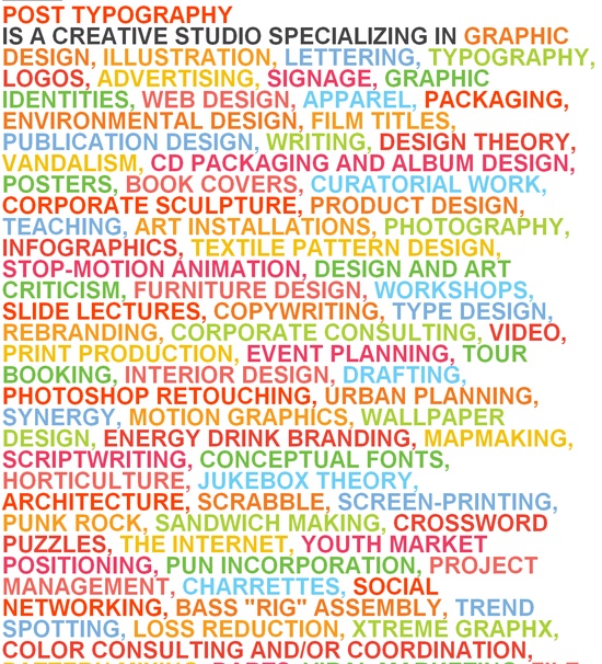
Pages like this one on Post Typography distract users; the eye has nowhere to rest, and, frankly, it’s confusing.
Conclusion
Every web page has to present something useful and attractive to its users. A variety of methods can be used to emphasize certain sections of a web page, and I’ve gone over some of them with you.
Related Content
- Working with Visual Weight in Your Designs
- Designing Websites with Personality
- Craftsmanship in Designing Websites
- Related categories: Web Design and User Interface
About the Author
 Mohammad Moradi is an undergraduate in computer engineering. He spends his free time studying and researching web-related topics such semantic web and search engines. Moreover, he is a web/graphic designer. Contact him via moradi.c85@gmail.com. (He likes email among others!)
What happens if you respond to spam?
While doing some spam research a couple of years ago, we did a series of test purchases from spam e-mails.
We bought pills, software, cigarettes, et cetera. We were a bit surprised that almost all of the orders went through and actually delivered goods. Sure, the Windows CD we got was a poor clone and the Rolex was obviously fake, but at least they sent us something.
We were carefully watching the credit card accounts we created for our tests but we never saw any fraudulent use of them.
The most surprising outcome from this test was that we didn’t see more spam to the e-mail addresses we used to order the goods.
Via Eapen Thampy, the link is here and they cite a new study on spam (pdf), which is interesting throughout. How does the financial side work?
One of the most interesting details in the study is this: almost all spam sales worldwide are handled by just three banks.
The banks? They were:
•  DnB NOR (a Norwegian bank)
•  St. Kitts-Nevis-Anguilla National Bank (in the Caribbean)
•  Azerigazbank (from Azerbaijan)
Drupal contributor statistics
I recently extracted some data from the Drupal project's CVS and Git logs to see how the number of code contributors and total contributions have changed over time. If there was any doubt of our continual growth, the resulting charts demolish it.
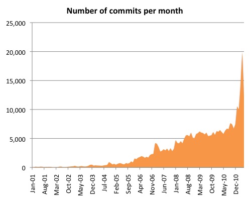
Aggregated results from core and contributed modules.
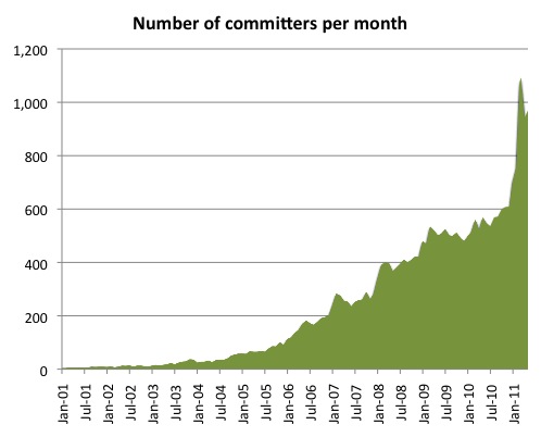
Aggregated results from core and contributed modules.
As can be seen from the graphs, there is a pretty big spike in commit activity post-Git migration.
Creating HTML Emails : An Overview for Web Designers
A lot of the requirements of great HTML emails fly right in the face of what makes great website designs. Until you understand the nuances of HTML email design, it can be a frustrating and fruitless experience. But once you understand and accept that HTML email is a fickle, inconsistent, and bug-prone medium, it’s possible to use it to great effect in marketing both for yourself and your clients.
Below is a gathering of some tried-and-true wisdom from the world of HTML email design that should make diving in just a bit easier. Throughout, interspersed in the narrative, we’ve also included examples of fantastic HTML email designs to give you a taste of what others are doing.
Getting Into the HTML Email Mindset
Before you get started, make sure you give up on the notion of pixel-perfect HTML email design. Get used to the idea that your best bet is controlling how your code breaks, rather than trying to prevent it from breaking at all.
With the variety of ways people check their emails and the number of email clients — desktop clients include Outlook, Mac OS X Mail and Thunderbird and web-based email apps include Gmail, Yahoo! Mail, and Microsoft Exchange Online — it’s nearly impossible to guarantee that your design will look the same.
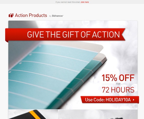 Behance holiday HTML email.
It’s a Fact: Your HTML Email Design Will Break
Your beautiful HTML email design will break. There’s no getting around it. Someone on that list of 10,000 newsletter recipients will be using some email client that’s so obscure or so old that there’s no way you could have prepared for it. And even the popular apps (Gmail, Outlook, Thunderbird, Mail, etc.) have no real consistency when it comes to how they render HTML.
So you’ll have to get over the idea of trying to get your HTML email to look identical and perfect to everyone who sees it. It’s not going to happen. The best you can do is anticipate how each of the major clients will break your design, and then try to control how it breaks, so that it’s still readable by most of your recipients.
 CSS Awards HTML email.
Use HTML Tables for Email Layouts
Designing HTML emails goes against many of the accepted best practices of good web design. For example, although web designers have long given up using tables for web layouts, HTML emails need to be done with HTML tables rather than CSS and div-based layouts. This is because it’s unpredictable to determine how CSS will be treated on various email clients, and div-based layouts (the modern best practice for web page layouts) rely on CSS for positioning and alignment.
Using Photoshop for HTML Table Layouts
If you’ve forgotten how to work with HTML tables for layouts — or if you’re a younger web designer who has never had to work with HTML tables, use the help of Photoshop to get you started. In Photoshop, you can use the Slice Tool.
First, use the Slice Tool to chop your HTML email layout into several components.
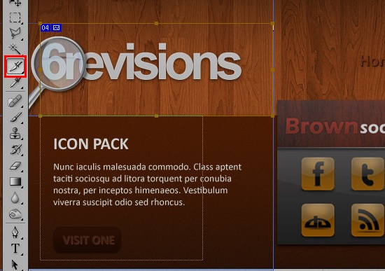
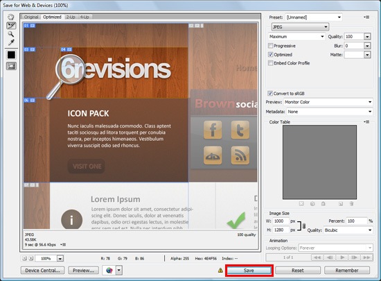
Next, go to File > Save for Web & Devices. Choose your file format (JPG or GIF are more widely supported than PNG), and then press Save.
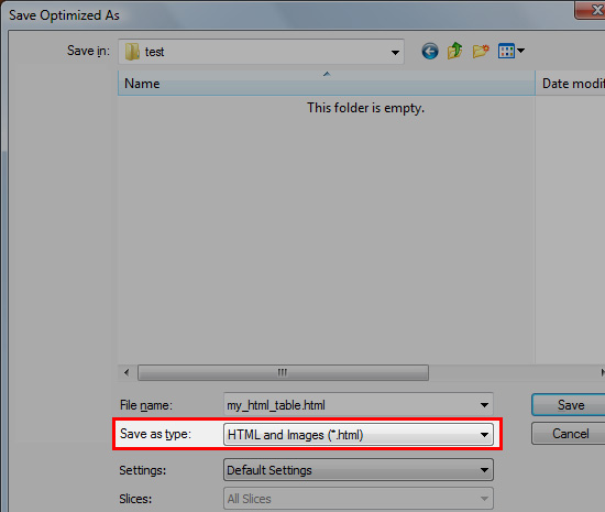
You’ll see a dialog window with some saving options towards the bottom. Under Save as type, choose HTML and Images.
This works fine for laying out the graphical elements of your design, but you’ll want to make sure your text is HTML, not images, so replace them in the markup as necessary.
Additionally, you want to clean up the HTML output because it might add unnecessary HTML junk. An automated tool is not a good replacement for hand-crafted code, but it can at least get you started.
Layout Margins and Padding
One other important thing to remember is that not all email clients treat margins and padding the same. You’re much better off nesting table cells rather than using CSS margin or padding for any vital placement.
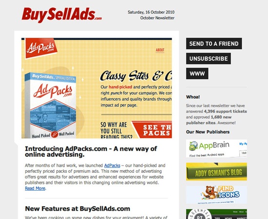 BuySellAds HTML email.
Images Need Special Handling
There are a few considerations to deal with when it comes to images.
Image Format
First of all, you’ll likely want to stick to either JPGs or GIFs for your HTML email template because not all email clients support PNGs. Make sure that you specify your image height and width attributes — which is good practice anyways — to prevent any issues in rendering.
Use Alt Attributes
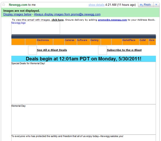
You should always give your images alt attributes; it’s absolutely vital in HTML emails. By default, many email clients do not display images when an email is first opened. Instead, they ask users to actively choose to display images. The repercussion of this extra step is that a lot of users simply won’t bother displaying images. Without alt attributes for your images, the email recipient may lose out on some content.
Below is what an HTML email looks like in Gmail by default. Notice that images in the email have alt attributes that describes the images it’s trying to display.
Avoid CSS Background Images
Background images can also be tricky. For example, Gmail is very particular about how it handles CSS background images (or background colors, depending on how they’re specified in the markup), so make sure you test thoroughly before sending to your list. Outlook 2007 won’t display background images at all without a minor hack.
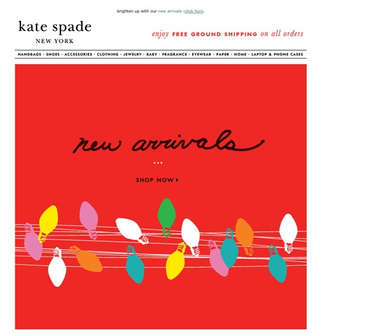 Kate Spade HTML email.
Important Information Should Not Be Images
As a basic rule of thumb, images should be used for graphical elements, and text should be used for text elements. This is good practice whether you’re designing a web page or an HTML email.
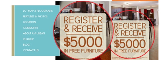
Because images often aren’t shown when an email initially opens, it makes sense for critical information to be in plain HTML text rather than images to guarantee they’re accessible.
 Broadsheet Melbourne HTML email.
HTML Email Layouts Are Narrower
The conventional standard width for HTML emails is around 600px. It can be a big change to go from designing for 960px+ web page layouts back to 600px. You’re effectively losing more than a third or more of the screen real estate you’re accustomed to. This is why it’s important to simplify your designs. One column is ideal, though you can get away with two if you’re careful about proportion and layout. Three or more will be a challenge.
It’s okay to go a little bit wider or narrower than 600px, but you’ll want to use 600px as your baseline. Much wider, and you’re almost certainly going to require a large chunk of your recipients to scroll horizontally. And if you go much narrower, you’re not making good use of the space available.
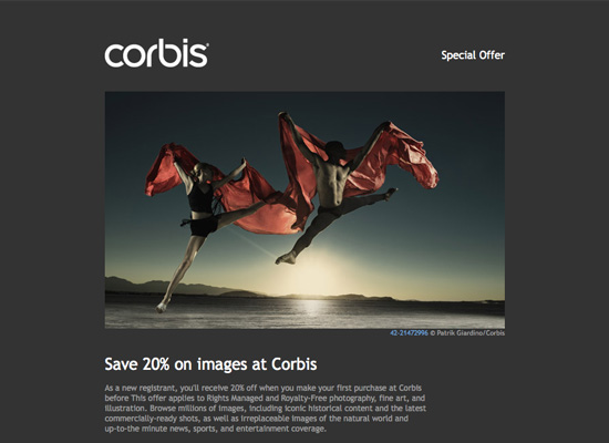 Corbis HTML email.
Keep HTML Emails as Simple as Possible
Simple, minimalist designs often work best. There are a few reasons for this, chief among them being that minimalist designs often have less code and image assets to break.
Focus on creating simple, clean designs that are professional and make great use of a minimal number of images. Look at ways you can simplify your code and your overall layout.
Don’t make the mistake of thinking that a single image with all of the content for your email will solve all of your coding problems. Single-image emails with little to no other content are popular targets for blacklists. So while it seems like a good idea on the surface, it could result in your emails being diverted to junk mail filters or not delivered at all.
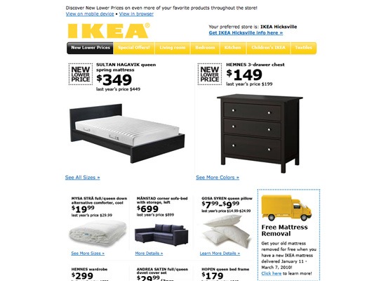 IKEA HTML email.
Use CSS with Care
Using CSS in your HTML emails is tricky. We’ve already discussed how it won’t work for layouts, but there are other things to keep in mind when writing CSS for email rather than the web.
Use Inline CSS
First of all, your CSS properties need to be inline rather than declared in your <head> or on a separate style sheet. This is another bad web design practice we must use in HTML emails.
Don’t Use Shorthand CSS
Second, avoid using CSS shorthand because, as you might have guessed, there is varying support for this between email clients and web apps. Some email clients, for example, won’t support 3-character hex codes for color (e.g. use #FFFFFF for white, not #FFF).
Specify each font property. For example, declare font-family, font-size, font-style separately, Â rather than in one font declaration.
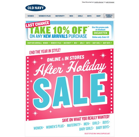 Old Navy HTML email.
Other Common Issues
There are so many possible issues with coding HTML emails that it would be nearly impossible to discuss them all. This is why testing your emails is absolutely vital. Here are a couple of other things to watch out for.
Text Resizing
Automatic text resizing can cause all sorts of issues, especially in table-based layouts. Doubling up on size declarations can help avoid this issue (the idea being that if an email client ignores a set of properties, it will adhere to the another set).
Link Colors
Link color is another area where email clients can have a tendency to revert to the default blue. So either design your emails so that the default link color is okay, or add an extra span inside your link tags and define the color in both the parent and child element, as shown below:
<a href="link" style="color:#000000"><span style="color:#000000">link</span></a>
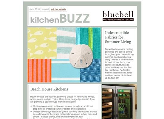 Bluebell HTML email.
Using HTML Email Templates
One of the easiest ways to get started with HTML email design is to adapt existing HTML email templates. Because of email delivery issues, HTML emails are, almost by definition, a bit more standardized than websites. You’re working within more constraints and inconsistencies, so building on the tried and tested work of others can be beneficial at the start of your journey.
Simply studying the templates created by professional HTML email designers can help you craft better and less error-prone HTML emails. Then, once you’re more familiar with the process of email design and the inconsistencies you have to deal with, you’ll have a much easier time designing from scratch.
CampaignMonitor’s Free HTML Email Templates
CampaignMonitor has one of the best HTML email template galleries out there. Being one of the leading email marketing web apps out there, they also happen to be highly regarded experts when it comes to HTML email design and have contributed vast amounts of information about the craft (they’ve even written a book about it).
In their HTML email template gallery, they’ve enlisted some of the top web designers out there —  including Elliot Jay Stocks, Meagan Fisher, MetaLab and Simon Collison — to design more than 100 high-quality HTML email templates that are beautiful, functional, and mostly free from glitches and inconsistencies (as much as any email template can be).
They’re definitely the best place to start if you want to adapt a template, or just to learn HTML email design best practices by studying pre-built templates.
Here are just a few HTML email templates they have to offer:
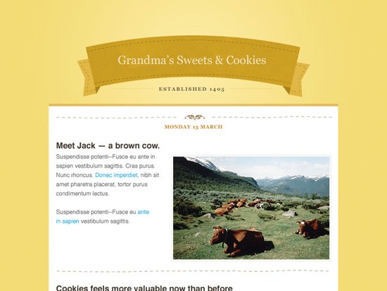 Design by 45royale.
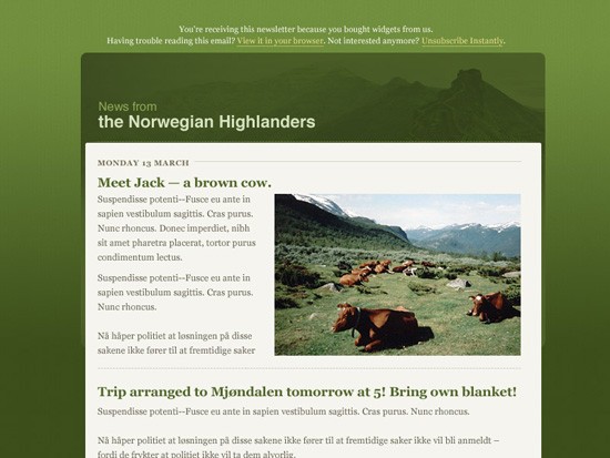 Design by 45royale.
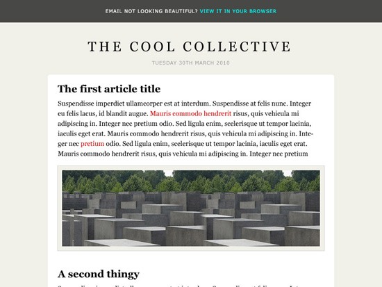 Design by Elliot Jay Stocks.
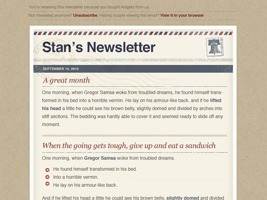 Design by Meagan Fisher.
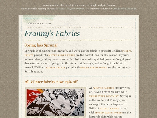 Design by Meagan Fisher.
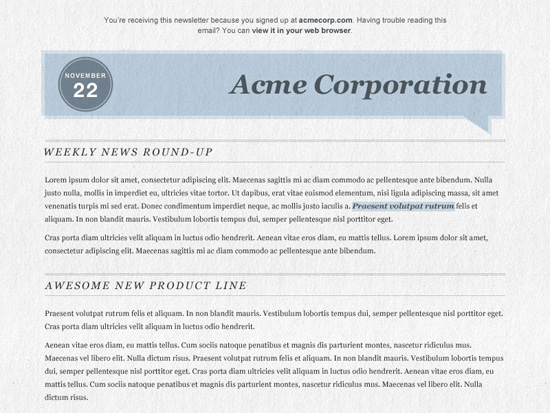 Design by MetaLab.
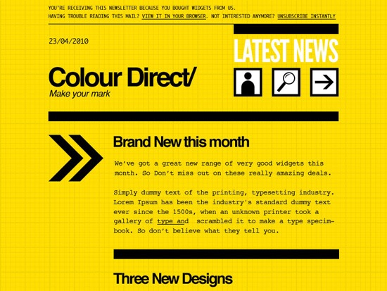 Design by Mike Kus.
 Design by Mike Kus.
 Design by Newism.
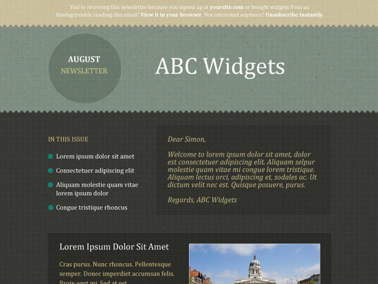 Design by Simon Collison.
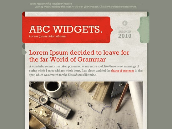 Design by Veerle Pieters.
MailChimp also has a number of free email layout templates you can download. They’re just basic layout designs that you fill in with your own graphical and text elements. They’re a great place to start if you’re more interested in designing from scratch.
Some HTML Email Design Resources
Below, you’ll find a few excellent online resources for HTML email design.
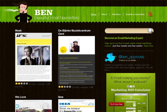
Beautiful Email Newsletters (BEN)
This is a wonderful gallery of HTML email designs from some leading companies.
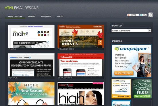
HTML Email Designs
This is another gallery of HTML emails. They have emails from a huge number of top companies.
HTML Email Gallery
This is another wonderful HTML email gallery that showcases a lot of really great HTML emails from companies around the world.
Rock Solid HTML Emails
This article on 24 Ways covers the more technical aspects of HTML email design.
A Designer’s Guide to HTML Email
This guide on SitePoint offers a pretty thorough, step-by-step method for crafting HTML emails.
Related Content
- Website Features That You Can Easily Offload
- 10 Definitive Tips for Writing Captivating Emails
- 10 RSS Feeds for Design and Development Job Seekers
- Related categories: Web Design and Resources
About the Author
 Cameron Chapman is a professional web and graphic designer with over 6 years of experience in the industry. She’s also written for numerous blogs such as Smashing Magazine and Mashable. You can find her personal web presence at Cameron Chapman On Writing. If you’d like to connect with her, check her out on Twitter.

