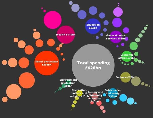
Yishay sez, "The good people of the Open Knowledge Foundation have just released a prototype of their visualisation tool for UK gov spending. This on the same week that the government announced radical plans for opening their data. Open data needs to be seen, not just done."
I'm loving this: you can click on any of those dots (on the actual web-page) to see what it represents. The slider moves you back and forth year-to-year. It's an amazing way of visualizing public spending.
Where Does My Money Go? (Thanks, Yishay!)
Previously: