The web browser is probably one of the most frequently used applications on a person’s computer. For designers and developers, a browser theme can be canvas that provides hours of exposure to the artist or brand willing to create a theme for their fan base.
But with such an extreme landscape orientation and a range of functional obstructions, designing browser themes is a creative endeavor with plenty of pitfalls and gotchas.
There are many things to consider when approaching a new theme — from avoiding copyrighted images to achieving designs that work within the confines of a particular browser.
This guide contains some crucial tips and general guidelines for designing custom browser themes for Chrome, Firefox and Internet Explorer.
 Phoenix Suns browser theme is well balanced with imagery.
Key Considerations for Browser Theme Design
The trickiest part of designing browser themes is the variability of the environment. Keeping designs flexible enough to display well in Firefox and Internet Explorer across Linux, Mac and PC, and across different versions of the browsers is essential. For example, Firefox 4 and IE show part of the background graphics in the title bar while Firefox 3.6 and below do not.
Dimensions and Dealing with Environmental Variability
Firefox offers the greatest design flexibility especially in the browser chrome, which is the area where the navigation button and URL address bar is located as well as the areas outside of the browser viewport.
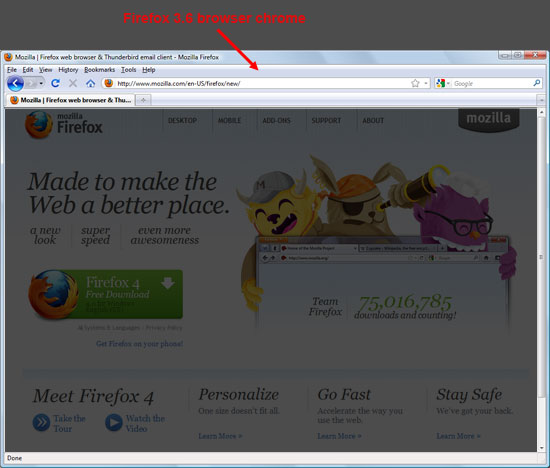 Firefox 3.6 browser chrome in Windows OS.
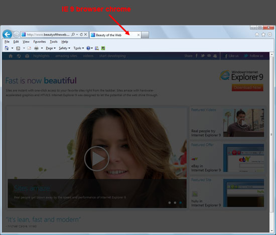 IE 9 browser in Windows OS. Compare the differences with the one above.
When we design a cross-browser theme, Firefox is the baseline from which the other designs evolve.
Below, you’ll see the Indianapolis Colts browser theme shows the diminishing design real estate from Firefox to IE to Chrome.
 Colts Firefox browser theme.
 Colts IE browser theme.
 Colts Chrome browser theme.
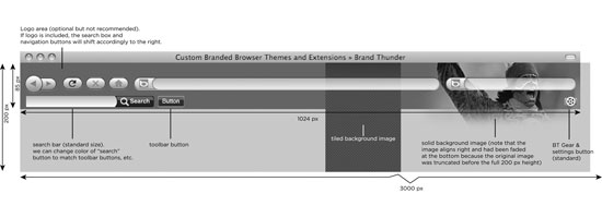
The vertical footprint of the design is kept to a minimum. While 200px tall graphics are required for Firefox, the reality is that only the top 85 pixels are usually visible.
For Internet Explorer, the vertical dimension is locked at 50 pixels; and for Chrome, even less.
Designs that rely on the user being able to see the full image may not work as the top or bottom chrome will not always be visible.
The horizontal size of the image has its special considerations as well. As a browser window is enlarged horizontally, the background images will shift. Designers must keep this in mind, as a browser opened at 500 pixels compared to a browser opened at 1024 pixels will have completely different looks from the background image perspective.
 Dimension guidelines for browser themes in our company. The total width of the image is 3000 pixels.
Using images that span the full background or a single element that occupies an entire space is one method to solve the problem, but may also lead to an overly large file size (and thus, a slower-performing theme).
Using Repeating Backgrounds
A method to ensure a fully styled background and lower file sizes entails using screened elements, tiled textures or partial images.
These patterned backgrounds can provide a simple elegance, reduced file sizes, greater flexibility, and potentially a more successful design.
Choosing Image File Formats
Choosing the right file format for your browser theme design is a similar process to deciding what format to use in web designs.
If the images need transparency, use .gif or .png format.
If they’re not transparent, use .jpg as the file format.
Animation
Animated components of the design are also available for Firefox and IE. This can be a nice enhancement (for example, in adding twinkling lights to a Christmas tree browser theme), but can easily be overdone. Keep animation to a minimum as it can be distracting to the user.
Firefox allows for animated GIFs or PNGs. IE can only display animated GIFs.
Dealing with Required Browser UI Components
Designers must bear in mind that there are specific elements that need to be visible when creating any design.
For example, in Microsoft Windows, the controls are in the upper right of browser. Chrome, Firefox and IE all have visual differences in tab opacity depending on if a tab is in focus or in background.
The visibility of the design behind navigation controls, address bar, and search boxes also varies across browsers and operating systems.
 Old Comic browser theme is a fun concept with lots of legibility issues.
Keep It Simple and Avoid Visual Fatigue
Remember: the browser is used for hours a day and the user will have to look at the browser theme design every time they fire up their web browser.
Keeping the design pleasing to the eye is a vital criterion to avoiding visual fatigue and a lost user.
Dealing with the "New Tab" User Experience
Oftentimes, when designing a browser theme, the browser chrome should be the focus because that’s what the user is exposed to for hours at a time.
The "new tab" experience — the event where the user opens a blank tab or opens another browser window — however, also creates theme opportunities within the browser.
In the case of Google Chrome, this is the area least encumbered by restrictions. Rather than a blank page waiting for the user’s next URL, the new tab image can bring a design element to this area. An image is used in Chrome, and HTML in Firefox.
File size is again a consideration to keep the tab loading fast. The browser tab, more and more, has become increasingly functional; it’s become a holding place for new features like search boxes, thumbnail images, and dynamic counts (such as how many unread emails you have in Gmail).
We advise you to put the strength of your design at the bottom so the chance of it being obstructed is limited.
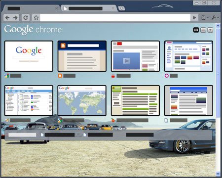 Porsche Panamera browser theme shows off the "new tab" experience.
Things to Avoid in Browser Theme Design
Now that you’re familiar with some general design considerations for creating browser themes, let’s take a look at some things you should avoid.
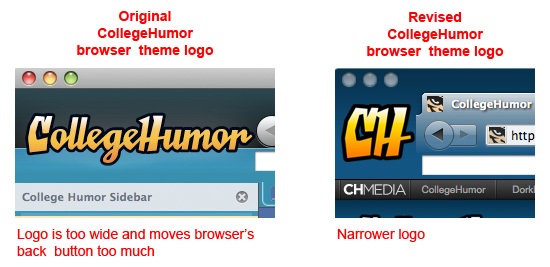
Browser Theme Logos That Are Too Wide
Firefox allows insertion of a logo to the left of the navigation buttons. Your logo can actually shift the entire browser navigational UI to the right.
Users, however, have a strong preference for the browser’s back button to stay where it is — call it "muscle memory" — and it creates frustration if the browser theme moves it too far from its original position. Keep logo width to a minimum.
Designs That Rely on Pixel-Perfect Placement
Designs that rely on the exact placement of vertical elements must be eliminated from consideration because of cross-browser platform variations. For example, background graphical elements can shift upward in some instances and create a conflict between the design and the browser layout.
 Brown University browser theme needed a refresh to fix the misalignment in Firefox 4 created by the horizontal line.
Getting Started with Browser Theme Design
The browser theme offers you a great place to engage your online audience. For companies, it extends their brand to an application that’s widely used.
For designers, browser themes are a challenging place to show off design skills and their creativity in overcoming restrictions imposed by the environment.
Are you interested in getting started building your own custom browser theme? It’s easy to get started. Here are some resources to get you up and running.
- Chrome: Getting Started – Themes – Google Chrome Extensions
- Firefox: How to Create Personas (basic Firefox theming guide)
- Firefox: Create (and Host) Custom Personas
- Firefox and IE: BT:Engage (Design, build and share your own browser themes)
Related Content
- 10 Web Browsers You Probably Haven’t Heard Of
- The History of Web Browsers
- Performance Comparison of Major Web Browsers
- Related categories: Web Development and Resources
About the Author
 Patrick Murphy is the founder and CEO of BrandThunder(BT). With its extreme makeovers for Internet browsers, BT creates persistent engagement between major brands and their online consumers. BT’s new platform, BT:Engage currently in private beta, gives everyone the tools to build and share their own browser themes.
