Archive for the ‘Google Reader’ Category
Google Flights Search Is a Powerful, Intuitive, Lightning-Fast Tool for Finding Cheap Tickets
Whoa – Apple Wins a 3D Display & Imaging System Patent Stunner
Baby Makes Daddy Lose Testosterone
For men hunting for a partner, testosterone’s a good thing. It boosts competitive behavior, and increases men's attractiveness to women. But the hormone has its drawbacks. Men with more of it have more marital problems and divorces. One study even suggested that guys with high testosterone have less sympathy for crying infants. [More]
How to see people, not just our reactions to them
 When we encounter someone, usually the mind automatically slots the person into a category: man, woman, your friend Tom, the kid next door, etc. Watch this happen in your own mind as you meet or talk with a co-worker, salesclerk, or family member.
In effect, the mind summarizes and simplifies tons of details into a single thing – a human thing to be sure, but one with an umbrella label that makes it easy to know how to act. For example: “Oh, that’s my boss (or mother-in-law, or boyfriend, or traffic cop, or waiter) . . . and now I know what to do. Good.â€
This labeling process is fast, efficient, and gets to the essentials. As our ancestors evolved, rapid sorting of friend or foe was very useful. For example, if you’re a mouse, as soon as you smell something in the “cat†category, that’s all you need to know: freeze or run like crazy!
On the other hand, categorizing has lots of problems. It fixes attention on surface features of the person’s body, such as age, gender, attractiveness, or role. It leads to objectifying others (e.g., “pretty woman,†“authority figureâ€) rather than respecting their humanity. It tricks us into thinking that a person comprised of changing complexities is a static unified entity. It’s easier to feel threatened by someone you’ve labeled as this or that. And categorizing is the start of the slippery slope toward “us†and “them,†prejudice, and discrimination.
Flip it around, too: what’s it like for you when you can tell that another person has slotted you into some category? In effect, they’ve thingified you, turned you into a kind of “it†to be managed or used or dismissed, and lost sight of you as a “thou.†What’s this feel like? Personally, I don’t like it much. Of course, it’s a two-way street: if we don’t like it when it’s done to us, that’s a good reason not to do it to others.
The practice I’m about to describe can get abstract or intellectual, so try to bring it down to earth and close to your experience.
When you encounter or talk with someone, instead of reacting to what their body looks like or is doing or what category it falls into:
- Be aware of the many things they are, such as: son, brother, father, uncle, schoolteacher, agnostic, retired, American, fisherman, politically conservative, cancer survivor, friendly, smart, donor to the YMCA, reader of detective novels, etc. etc.
- Recognize some of the many thoughts, feelings, and reactions swirling around in the mind of the other person. Knowing the complexity of your own mind, try to imagine some of the many bubbling-up contents in their stream of consciousness.
- Being aware of your own changes – alert one moment and sleepy another, nervous now and calm later – see changes happening in the other person.
- Feeling how things land on you, tune into the sense of things landing on the other person. There is an experiencing of things over there – pleasure and pain, ease and stress, joy and sorrow – just like there is in you. This inherent subjectivity to experience, this quality of be-ing, underlies and transcends any particular attribute, identity, or role a person might have.
- Knowing that there is more to you than any label could ever encompass, and that there is a mystery at the heart of you – perhaps a sacred one at that – offer the other person the gift of knowing this about them as well.
At first, try this practice with someone who is neutral to you, that you don’t know well, like another driver in traffic or a person in line with you at the deli. Then try it both with people who are close to you – such as a friend, family member, or mate – and with people who are challenging for you, such as a critical relative, intimidating boss, or rebellious teenager.
The more significant the relationship, the more it helps to see beings, not bodies.
Related posts:
- Meditation makes people more rational decision-makers Elizabeth Weise: Meditation, the ancient practice of mindfulness employed by...
- Guided Meditations for Busy People Bodhipaksa has recorded a CD (also available as a download)...
- Tips for busy people for a daily meditation practice Are you one of those people who would like to...
Real-Time Visualization of Discussions about Breast Cancer on Twitter

"Who's talking about breast cancer?" by "socially conscious information visualization firm" Periscopic reveals the currently ongoing discussions on the topic of breast cancer on Twitter.
First, about 1,500 relevant tweets captured within the last 7 hours are collected in a single view that resembles a slowly gravitating space galaxy. Each tweet appears as a unique particle, of which the size depends on how many times it has been retweeted. This highly dense but intuitive view can then be interactively explored and filtered by 3 different interests: 'topics', 'stories' and 'people'. For instance, 'topics' reveals the most used keywords that appeared within these messages (which uses some clever multi-color-coding of the particles to denote overlapping keyword usage), 'stories' show the web links tow external stories that were linked in these tweets, and 'people' ranks the most 'active' Twitter users for this theme.
Geeky Lunch Bag Art From An Awesome Dad
What you see above (and in the huge gallery on the next page) is the awesome Lunch Bag Art made by a dad in San Diego, California. Since at least 2008, he’s been drawing these during his lunch break to use for his kids’ pack lunches. Not since the “Wave at the Bus†dad have we seen a dad’s geeky artistic project as awesome as this. These are way cooler than all those drawings my dad used to put in my lunchbox of him frowning and holding a positive pregnancy test.
Below is a collection of our favorite geek-related bags out of the almost 500 pictures at the Lunch Bag Art tumblr.
[Hat tip and the mystery bag from the back of the fridge to GorillaMask.]


Mapping Tools for Developers

This is a great time to be a geodeveloper. There’s more spatial data, geo-processing tools, geo enabled storage and mapping tools than ever.
Let’s start with storage – not too long ago geo developers had two choices, file formats or proprietary object-relational databases. Today there are production ready open source object-relational databases such as PostgreSQL/PostGIS and MySQL; even mobile devices have lightweight databases with spatial capabilities such as SQLite. In addition to traditional object-relational databases, NoSQL databases such as Cassandra, CouchDB, and MongoDB have a spatial capabilities. Big Table clones such as Hbase can also store spatial data and there is ongoing work for developing a spatial index which facilitates spatial queries and operations. Neo4J is a graph database that also handles spatial data. Finally, even full text search engines such as ElasticSearch provide geospatial search capabilities.
Manipulating spatial data and performing analysis used to be dominated by specialized proprietary Geographic Information Systems (GIS) desktop software.  The geospatial software landscape has expanded into many open source desktop products such as QGIS, UDig and GVSig. While desktop products are typically used for spatial analyses or cartographic production, they also provide a quick way to visualize data and results from API queries. Many open source desktop are built on standard geospatial libraries such as JTS, or the Java Topology Suite, and GEOS, the C port of JTS. These spatial libraries also have bindings to popular scripting languages like Python or Ruby, which lets developers process geospatial data in their language of choice. For example, Shapely is a python library and rgeo and GeoRuby are Ruby geospatial libraries. Software for data extraction, translation and loading (ETL) tasks are also available as open source or as proprietary software. GDAL/OGR is an open source geospatial ETL library and collection of utilities that work with most of the common raster and vector formats. FME (Feature Manipulation Engine) is a commercial product that can perform ETL on most geospatial formats.
Developers want to see their results on a map quickly and there are many services that provide base maps for applications. Google Maps is the most popular map service for mash-ups, but OpenStreet Map and derivative services such as Cloudmade provide maps that use data gathered by volunteers. For some applications, custom base maps are needed, especially when certain features such as roads need to  be de-emphasized. Both Google Maps and Cloudmade support changing map styles; however there are a number of ways to generate custom maps. WMS (or Web Map Service) is a common way to generate custom maps. The main advantage to WMS is that they are interoperable, many mapping clients understand how to talk to WMS to get a map. Their downside is the complexity of configuration, quality of output and lack of scalability for high volume sites. A fast and cartographically attractive alternative is Mapnik, one of the default rendering engines behind OpenStreet Map.  It’s main advantages are speed and high quality output. It has a simpler XML based configuration, but lacks a graphical interface to preview maps. A newer alternative is TileMill which uses CSS to to style maps. TileMill is built on top of node.js (the serverside javascript engine)  and includes a display which lets you see the map while editing styles. Finally, there are geospatial portals that allow you to import your data, perform analysis and, and create maps. ArcGIS Online is a portal based on proprietary ESRI technology that allows users to build mashups in their environments. GeoCommons by GeoIQ provides similar capabilities and offers a wide range of user contributed data.
Maps have evolved from simple mashups of pushpins overlaid on street maps. They are frequently used for interactive visualizations that integrate many types of data with interactions to tell a complex story. For example the New York Times map of Hurricane Irene’s path along the Eastern Seaboard  illustrates the effects and aftermath of the hurricane. Developers have several javascript libraries to choose from when building custm maps. OpenLayers is the largest and most flexible of the javascript map client libraries. Its strengths are:  it can handle many different data formats and mapping services, has a large developer community, and has been integrated into web frameworks such as Drupal and Django.  Polymaps is another map client library that use SVG to make interactive maps. Data can be  attached to the graphic elements of the map to create fast interactive data displays. Recently, there has been a trend towards lightweight clients that do just the minimum to keep the size of the library small and quick to download. Leading this trend is Leaftlet by Cloudmade which provides a minimal framework for displaying map tiles and data. Even smaller than Leaflet is Modest Maps JS which is a javascript port of the Modest Maps actionscript library. Modest Maps JS in conjunction with Wax, a library of UI widgets is a 28K download, making it the smallest of the client libraries.
Â
The growth of geospatial developer tools has been driven by the availability of spatial data. Collecting spatial data was once the domain of government agencies, but widespread availability of consumer GPS on smartphones has created an explosion of spatial data generated through social media and checkin services. Transparency efforts at all levels of government has added to the growing amount of spatial data. While there are a number of options for storing your own data in one of the solutions mentioned previously or hosting it on a service such as Google Fusion Tables, another alternative is to use a service that provides a consistent API to spatial data. A number of data providers, including InfoChimps, provide spatial data, but when working with spatial data it is easy to overwhelm browser based map clients by the volume of data. Schuyler Earle coined the term “red dot fever†to describe the situation where data markers obscure the map and any discernible patterns. Two ways to overcome data overload are clustering data to show outliers and aggregation which decreases spatial resolution but reveals patterns. InfoChimps provides the Summarizer tool to make data query results more usable by organizing data points into intelligent geographic clusters. Another advantage of the InfoChimps Geo API is consistency across data by a unifying schema call the Infochimps Simple Schema (ICSS). ICSS is based on schema.org to provide a consistent and web friendly way to access data The mind map above is a first stab at organizing the ever growing array of geospatial tools and data. It’s a work and progress and comments are welcome.
Â
Interaction Design Tactics For Visual Designers
Anyone designing Web-based properties today requires a basic understanding of interaction design principles. Even if your training is not formally in human-computer interaction, user experience design or human factors, knowing the fundamentals of these disciplines greatly enhances the chances of your design’s success. This is especially true for visual designers. Many visual designers are formally trained in art school and informally trained at interactive agencies.
While these institutions focus on designing communications, neither typically provides a strong interaction design foundation. Having a broader skill set not only makes your designs more successful but makes you more valuable and employable (i.e. you become the unicorn). While in no way exhaustive, to get you started, here are five key tactics to understand and implement in your next project.

Image credit: Kristian Bjornard
1. Talk To Your Customers
The most important thing to understand when designing an online experience is your audience. Understanding who they are, what they do for a living, how old they are, how they work, what they know about the Web, how they use it, on what devices, where and so on provides invaluable insight into their pain points that you are out to solve.
Setting clear constraints on your design also helps. For example, if your audience will predominantly be using mobile devices to access the Web in hospitals, then your design must be responsive to those devices and be compatible with the environments where the devices will be used. In addition, understanding your audience builds on a communication design foundation by revealing your users’ sensitivities (physical or cultural, for example) to things like color and typography.
Understanding your audience requires conversation with target users. These conversations can happen in a variety of forums. While impersonal approaches such as surveys work well enough, nothing beats face-to-face conversations with your customers. Depending on who you’re targeting with your work, finding your target audience may be as simple as going down to the local coffee shop, buying a handful of $5 gift cards and striking up conversations with the patrons there. Most people will gladly exchange 10 to 15 minutes of sharing their opinion for a coffee shop gift card. Other ways to find users are to post ads on websites like Craigslist, pull names off your customer lists, reach out to trade organizations (for specific user types, like nurses) and spend time in locations where your audience spends time (for example, music fans at a concert).
The initial conversations will be awkward, but as more and more take place, a rhythm develops to the questions. Also, patterns begin to emerge, allowing you to tailor the questions more appropriately with each interview. The lessons you take away from these activities can be used to create personas — i.e. aggregate representations of typical users of your design — that can help provide context to future design decisions.

A persona document. (Image: Todd Zaki Warfel)
2. Orient The User
Now that you’ve got an understanding of who your user is, orienting them when they use your design is important. Orienting your users gives them a sense of place in a non-static experience. To effectively provide that sense, your design should tell users three things:
- Where they are
Critical to any online experience is understanding where, in the broader context of the website, the user is currently transacting. If it’s clear to the user where they are, then there is a greater chance they’ll understand what you need them to do on that page. For example, if the user is aware they are on a “product page,†they should expect to see a purchase link and perhaps some other product options. - How they got there
If providing clarity on the user’s current location provides context for expected actions, then showing them the path they took to get there provides a safety net. That safety net is the comfort of knowing that if the user has wound up in the wrong place, they can back out and try again. - Where they can go from here
You’ve made it clear where they are and how they got there; if they are in the wrong spot they can backtrack and try another path. But if they’re ready to move forward or they believe the path back won’t provide the content they desire, then letting your users know what options are available from this point on is imperative. Never leave a user in a dead end. There should always be an option to proceed. A perfect example of this is a search results page that yields no results. While you should let the user know that nothing matches their search query, there should be options that lead them to the answers they seek (for example, related search terms). Ways forward can be manifested in your website’s navigation but can also be implemented as affordances. Affordances are elements in the interface that are obviously clickable, such as buttons and sliders.

Amazon does a good job with its no-results page.
(For a great primer on affordances, pick up Don Norman’s The Design of Everyday Things. While a bit dated, it lays a solid foundation for how product designers should think about their products.)
Clear website orientation provides comfort to users. It also reduces the chances that users will make mistakes and increases the chances that, when they do, they’ll be able to recover quickly.
3. Simpler Is Better
Visual designers are driven to add elements to a layout that may be aesthetically pleasing but don’t necessarily serve an interaction purpose. While certainly much is to be said for aesthetics adding to the polish and feel of an experience, when designing an interactive experience, consider opting for simpler design. Simplification means reducing the elements on the screen down to the most basic ones, the ones that will facilitate the task that the user has to complete. Start with that as a baseline, and then add ornamentation sparingly. Consider the brand of the website. The brand is a reflection not only of the aesthetic but of the experience. If a website is gorgeous, but its beauty makes completing a transaction impossible, then the website (and brand) will ultimately fail.
Aesthetics will always have a place and powerful purpose in any experience, yet ensuring that the experience is usable first is critical.
4. Design For A Dialog
Where visual design training focuses primarily on communication, interaction design puts a heavy focus on feedback loops — in essence, a conversation between the user and the website. As you work out an experience, provide ways for the system to communicate back to the user when they’ve done something right or wrong. Ensure that your experience makes clear when the user has succeeded and when an action is required to complete a transaction. Use your visual design and communication skills to build a visual language for this feedback dialogue. Ensure that no matter where the user is in the experience, any information that is coming from the website is consistent in design and presentation method. Different types of information will require different treatments. The user will learn the system quickly, and a dialogue with the website will begin to occur. In essence, you’re humanizing the experience (and the company behind it) by proactively predicting your users’ needs and presenting information and actions that mitigate user frustration.

Think Vitamin keeps the conversation going with its readers.
5. Workflow: Understanding The Before And After
Visual design is beautiful. It’s also static. Interaction design builds a workflow from page to page and from state to state. As you design each page, consider what the user can do on this page and how the next step in the process fits into the workflow. If you’ve just added a sign-up form to the page, think about what will happen when the user presses the “Submit†button. Will the page refresh? Will there be a confirmation page? What if there are errors in the form? What if the user hits the “Back†button? These are all components of the workflow of the experience. Each page or state is just one small component in the user’s click stream. The challenge is that each user might have a relatively unique click stream, depending on how they got to your website and why they came. You’ve used your knowledge of the user to orient them, and you’ve provided a simple interface that creates a successful dialogue with them: now ensure that each interaction has a logical next step. That next step should fit into the experience and visual language that you’ve created, so that the experience feels whole and consistent. These elements are what add credibility to the brand and increase users’ trust in your design.
Bonus Tip: Understand Your “Materialsâ€
Jonathan Ive, designer of the iPod (among other things), promotes the idea that designers of all types must understand the material they’re working with. This hold true for interaction design as well. Understanding the “materials†that make up the Web is critical. A cursory education in HTML, CSS, JavaScript and related technologies will only enhance your understanding of the medium and provide a realistic perspective on your designs. A great resource for this is the group of developers who will be implementing your work. Strike up regular conversations with them about your design, and get a taste of whether your proposals are feasible given the technologies they employ. Even better, start learning the basics yourself. You don’t have to become a star coder, but knowing enough about how the medium in which you work behaves can greatly shape the interactions you design.
Summary
Interaction design is a multi-faceted discipline that links static communications together to form an experience. Understanding the basic principles of this discipline is core to designing websites that are not only aesthetically pleasing but that actually solve business problems and bring delight to their users. This article just scratches the surface of interaction design. For Web designers of any kind, considering these fundamentals when designing any transaction or interaction is imperative.
(al)
© Jeff Gothelf for Smashing Magazine, 2011.
30 Strikingly Vibrant Web Designs for Inspiration
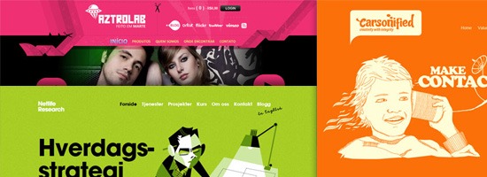
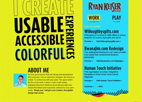
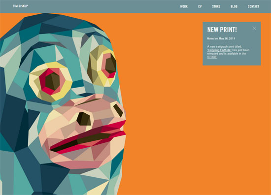
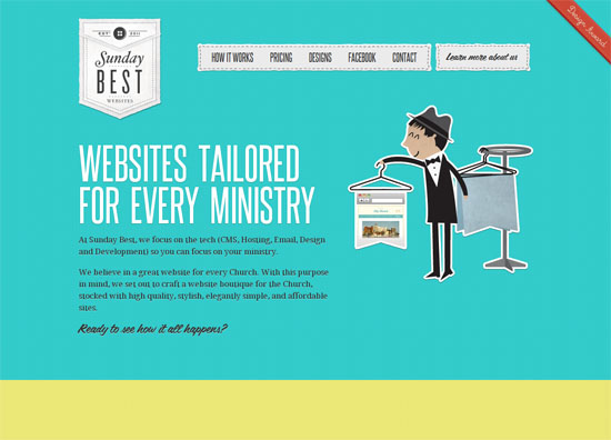
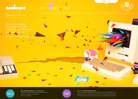
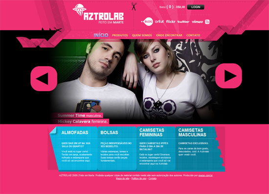
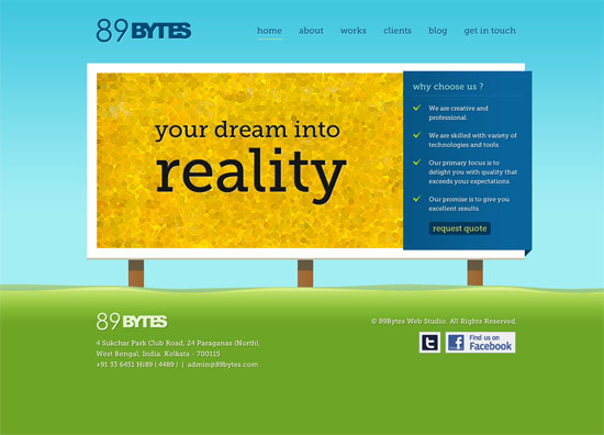
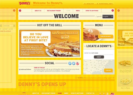
Working with bright, high-impact colors in your designs can prove to be a powerful tool in your creative arsenal. Bright colors are able to grab attention and they make a design appear fun, youthful, cheery and modern. Because using loud, bold colors in a design can go from these positive themes to as though a child went a little bit wild with crayons, check out this collection of beautifully vibrant web designs for inspiration.
POPA
Ryan Keiser
Tim Biskup
Sunday Best
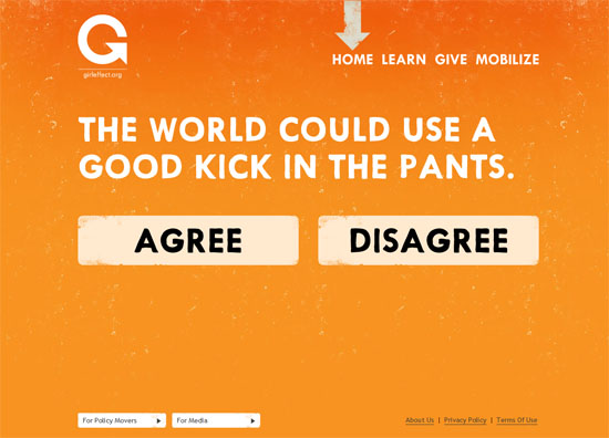
Girl Effect
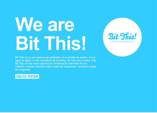
Bit This!
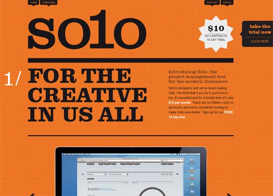
Solo
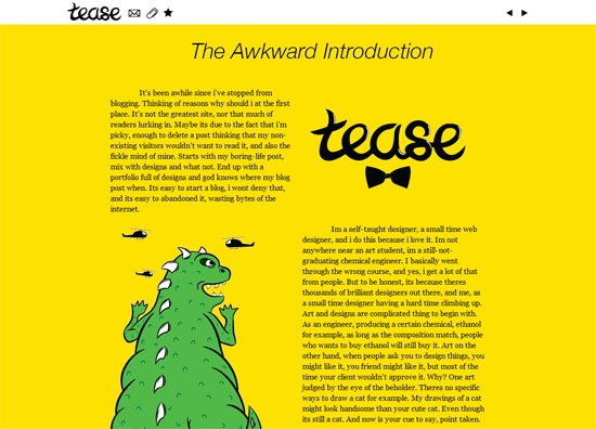
Tease
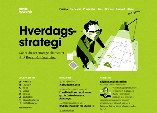
Netlife Research
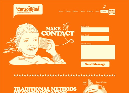
Carsonified
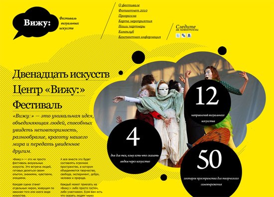
vijufest.ru
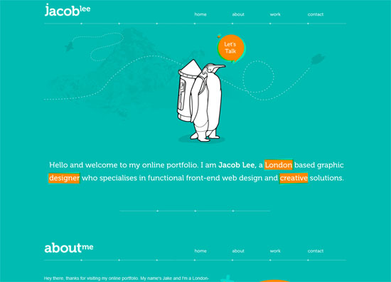
Jacob Lee
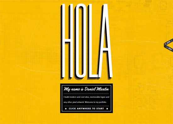
Daniel MartÃn
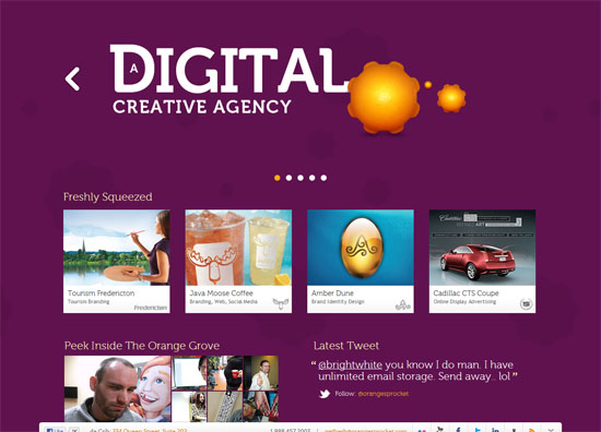
OrangeSprocket
Bzzy App
RUhotEnuf?
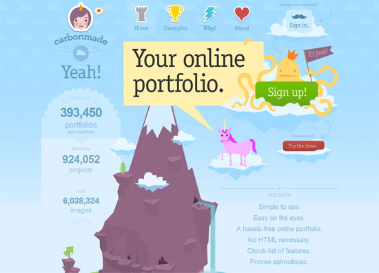
Carbonmade
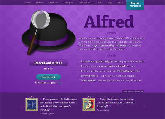
Alfred App
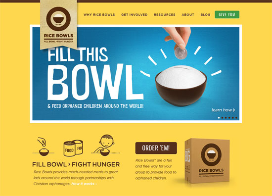
Rice Bowls
Love of My Life
McFarlane
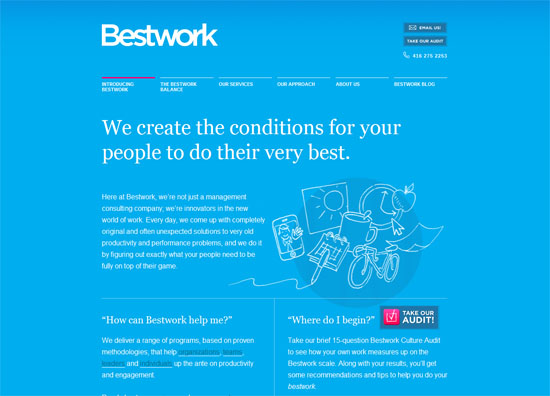
Bestwork
Tori’s Eye
Republic2
Analogue
AZTROLAB
89Bytes
Trent Walton
Denny’s
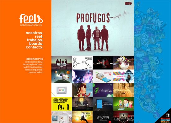
feels.tv
If you liked this showcase, please also see the following posts:
Related Content
- Colors in Web Design: An Exploration
- A Guide to CSS Colors in Web Design
- Color: The Next Limited Resource?
- Related categories: Design Showcase and Web Design
About the Author
 Jacob Gube is the Founder and Chief Editor of Six Revisions. He’s also a web developer/designer who specializes in front-end development (JavaScript, HTML, CSS) and also a book author. If you’d like to connect with him, head on over to the contact page and follow him on Twitter: @sixrevisions.


 Writing content for web users has its challenges. Chief among them is the ease with which your content is read and understood by your visitors (i.e. its readability).


