Archive for the ‘Google Reader’ Category
Saturn’s moon Rhea may have a breathable atmosphere [Future Space Colony]
4th Amendment Wear


Now there’s a way to protest those intrusive TSA X-ray scanners without saying a word. Announcing 4th Amendment Metallic ink-printed undershirts and underwear! Via Fubiz
Showcase Of Beautiful But Unusable Websites
“Form follows function†is a widely accepted — albeit controversial — principle that most designers in a variety of disciplines have adopted since its inception at the turn of the 20th century. On the web, we commonly refer to function as usability which is the ease of use and navigation of a website in order to achieve user’s goals.
In this showcase we present websites that sacrifice usability for beauty and present issues related to clutter, loading, navigation, archiving or visibility. Unfortunately, although the sites featured in this showcase are visually appealing, they are quite difficult to use. By studying such examples, we can learn what mistakes we can avoid in our designs and how not to strive for strong aesthetic appearances on the account of usability.
You may be interested in the showcase of Bizarre Websites On Which You Can Kill Time With Style as well.
Visual Clutter
Where do I look? Where do I click? What do I do? Visual clutter is one of the most serious issues a designer can present to an audience. Not only is the user unlikely to achieve the desired goals (because it’s hidden in the clutter), chances are they’ll just leave out of frustration before they do anything.
Creative With aK
Navigation overload! Not only are we unsure of where to look, we’re unsure of what’s clickable! Having to scan around the design with the mouse is not helpful for usability. And that’s if, and only if, you get past the load screen with no load progress bar. In addition to that, it takes a while until one has figured out that the welcome screen has to be closed to enable the actual in-site navigation. The inexistant scroll finally lets potentially interesting content disappear under the frame of the browser window.
Marc Ecko
Marc Ecko is an extremely successful businessman with countless ventures and he definitely wants us to know it. The problem is, he’s got so much business we don’t know where to start, provided you get used to the almost erratic horizontal scrolling feature! Getting the information you are looking for will take quite some time.
Content Of
Even after reading the “About†page and randomly clicking links, we’re still not sure what this page actually is about. Our best guess is a portfolio, but due to link clutter and no solid explanation of what the navigation does, we’re left confused.
There Studio
Half of the circles that look clickable aren’t; the other half jumble into a new rotation if you drag and drop them. Granted, the movement makes sense for the philosophy of the company, and there isn’t too much clutter, but it took us a minute to figure it all out and that’s 58 seconds too long. If you feel the need for more bubbles, click and drag on the empty space to add more to the confusion.
Loading Issues
As bounce rates increase, and time-on-sites decreases web-wide, it is becoming increasingly important to grab people’s attention immediately. By the time all of your effects load, chances are your user is back on Google or Facebook looking for the next cool site. Loading times, skip buttons, missing instructions on navigation and many other issues are all subject of considerations here.
Coke Light
One of the worst things you can do as a Flash designer is force an introduction on your audience. A long intro and no skip button means this site is likely to be abandoned by most of its visitors before they get in. Add an unclear “Call to Action†and no visual navigation indicators and most people will never encounter the beauty this site has to offer. Long transitions back to the home screen waste time the visitior could have spent successfully “travelling the worldâ€, searching for the numerous balloons hidden within the map.
Design Sul
We’ve never seen so many load issues on one site. Multiple load times for different elements, re-loads once you’re in to the site core, and no clear indication that loading is finished make for an extremely confusing and difficult to use website. Actually, discovering how to reach the content takes some time, what it all has to do with milk cartons is a different question.
Nicola Walbeck
A big loading wait-time at the beginning of the site is excruciating, but sometimes manageable once you enter a beautiful, usable website. Scratch that here, because once you get in, you’ll have to wait again and again for each individual image, forcing you to stare at blurred photographs. A better idea would be to use loading bars on the image to indicate that the image is loading. If you are on a broadband connection, then it’s fine, but if you are not, you start to get nervous very quickly. Add the fact that there’s no prominent back button and the experience could be a bit frustrating.
Navigation Issues
For content/category heavy sites especially, navigation is extremely important. Imagine driving without a map, or the grocery store with no aisle indicators. Navigation tells us where to go and how, or — in these cases — tells us very little. You might consider taking a compass with you, these examples make getting lost easy.
EContent
After quite a long load, this site requires the user to click “enterâ€. Okay, we’re in. Unfortunately, although there is a quick-menu, it does not draw attention and the user is required to blindly scroll over images to see categories. Navigate with caution and carefully look out for navigation buttons!
Prism Girl
Unusable sites have actually developed conventions. When we don’t see clear category navigation on a beautiful site, we poke around with our mouse looking for the category links. This site is beautiful (and complex) enough to poke around for an hour, but you’ll probably never guess you have to click on the mouse trailing icon to enter. Other than impressive design work, this site does not have much to offer.
On Toyota’s Mind
Slow load time leads to an unclear ‘Call to Action’, no visually clear navigation as well as a hard-to-find back action. Our question: What crossed Toyota’s mind when conceptualising this site?
Theologos
No button to skip intro. No visually clear navigation. Slow transitions. And here’s the kicker, a separate page to mute the music player. When visiting the site using a fast connection, the animations make the visit even less enjoyable.
Archiving/Category Issues
Your site loaded fine, it’s clear what you want people to do, you have a solid navigation, but once the user begins moving around, they can’t figure out your category structure. When you want meat, you go to the deli, not the dairy aisle. Some sites, unfortunately, get it wrong.
Self Titled
A hidden quick menu and unclear category organization make this site difficult to navigate. The actual information one gets when entering a category is rather scarce.
Vanalen
Image slivers make-up the category composition on this site, giving us very little information as to where/what to click on. If you’re new to the site, you are likely to spend a while until you find what you were looking for.

Grip Limited
The website does tell you to “click and drag†but finding this instruction amidst what looks like a typographic poster is something we suspect many people weren’t able to do. Realizing this might be a problem, Grip did create an “Open Menu†bar at the top of the page, but what are the chances you’re going to look there?
Kyle Tezak
Another example of an extremely talented visual artist who has great design work, but a small usability problem makes the user experience less enjoyable. There is no actual navigation on this page, just a floating header and illustrations of Kyle’s work. To find the designer’s contact information, you need to click on the “Information†link in the upper right corner. Using more traditional wording would improve usability: e.g. putting an e-mail right there or naming it “Contact information†or adding contact information at the bottom of the page would help. A nice example of how one little detail can improve site’s usability.
Visibility/Scrolling Issues
A site may be uncluttered and have great navigation, but if the magnification is off, or scrolling is dysfunctional, no one is going to see it. Visibility issues can quickly turn to invisibility issues as users navigate away from your site.
Real Casual
This site is invisible until you start hunting with your mouse, at which point different areas of the screen appear. A long roll-over hunt is followed by long load times, during which fade effects additionally take your chance to get a good look at content.
Lego Click
Scrolling is conventionally top to bottom or left to right, but this site starts at the bottom which is confusing. Add to that an inability to retrieve closed elements, and several other minor issues, and you get an extremely frustrating (but beautiful) website from Lego.
Journey to Zero
This site is rather large, but you wouldn’t know it. It starts magnified with no suggestion to drag scroll, leaving the user wondering where all the content is. If you scroll too far on the other hand, you might end up in empty regions of the site, making it hard to get back to the content. Very beautiful website that is difficult to use.
Faub (currently offline)
Another beautiful site that starts magnified and does not let you decrease the magnification, or suggest dragging for navigation.
Uniqlo
Uniqlo presents what looks like a beautiful and usable online store. That is, until you’ve added 10 items to your cart only to find out there is no check-out. Turns out it’s not a store at all, just a wishlist! A truely frustrating experience for every consumer willing to spend!
Bio Bak
Another drag navigation site that’s just too big for its own good. This is one of our favorite sites from a beauty/having fun perspective, but it does an awful job of presenting the design agency from a usability perspective. Using the mouse wheel by chance let us discover that the site has more to offer than what is visible on the first glace.
Summary
Design for function and communication. If your website ends up beautiful in the process, you kill two birds. Design for beauty only if the primary function of your site is to convey beauty.
Be wary of visual clutter, especially in navigation and on landing pages. Designing with too much clutter can make an audience unsure of how to use your site. In the worst case users won’t be able to load your page in the first place. Web customers don’t like to wait. Ensure that your site has a fast, clear load that conveys an easy understanding of how long it will take and when it is finished. This minimizes your risk of losing visitors to other sites in the meanwhile, keeping them occupied with joyous anticipation.
Once users arrive, you want to direct them to certain pages on your site. Always make clear what and where your navigation is, and what each element of your navigation does. Don’t make users guess or poke around to find an answer. On big sites, with lots of content, archiving and categorization is especially important. Make sure people can effectively navigate your archives. Try to make your menus self-explanatory, saving the users time, letting them invest it in effective exploration of your site.
Visibility is a huge issue most people don’t consider. In addition to designing for minimum resolutions, make sure your audience can clearly see the content you want them to at all times. If you’re designing to sell, make sure you’re designing to sell. This is especially important as your goal is to promote purchases. The more difficult you make it to buy your product, the less likely you’ll make money.
Related Articles
- Bizarre Websites On Which You Can Kill Time With Style
- 10 Useful Usability Findings and Guidelines
- Common Usability Blunders and 30 Usability Issues To Be Aware Of
- Common Mistakes in E-Commerce Design And How To Avoid Them
- Principles Of Effective Search In E-Commerce Design
(ik) (vf)
© Daniel Eckler, Glenn Manucdoc for Smashing Magazine, 2010. | Permalink | Post a comment | Add to del.icio.us | Digg this | Stumble on StumbleUpon! | Tweet it! | Submit to Reddit | Forum Smashing Magazine
Post tags: showcases, unusable website, usability
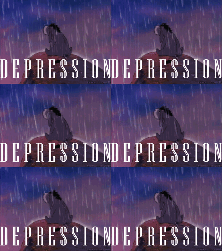
Winnie the Pooh Mental Disorders gifs
Mental disorders by Matthew Wilkinson. These gifs are brilliant and unbearably sad at the same time…
[via dangerousminds]


Amazing Electron Microscope Shots…
Amazing Scanning Electron Microscope Pictures
All these pictures are from the book ' Microcosmos', created by Brandon Brill from London. This book includes many scanning electron microscope (SEM) images of insects, human body parts and household items.Â
These are the most amazing images of what is too small to see with the naked eye.01 - A wood or heathland Ant, Formica fusca, holding a microchip
02 - The surface of an Erasable Programmable Read-Only Memory silicon microchip
03 - Eyelash hairs growing from the surface of human skin
04 - The surface of a strawberry
05 - Bacteria on the surface of a human tongue
06 - Human sperm (spermatozoa), the male sex cells
07 - The nylon hooks and loops of velcro
08 - Household dust which includes long hairs such as cat fur, twisted synthetic and woolen fibers, serrated insect scales, a pollen grain, plant and insect remains
09 -The weave of a nylon stocking
10 - The end of the tongue (proboscis) of a hummingbird hawkmoth
11 - The head of a mosquito
12 - A human head louse clinging to a hair
13 - The eight eyes (two groups of four) on the head of a Mexican red-kneed tarantula
14 - Cut hairs and shaving foam between two razor blades
15 - Cigarette paper
16 - The corroded surface of a rusty metal nail
17 - The head of a Romanesco cauliflower
18 - The fungus Aspergillus fumigatus
19 - Mushrooms spores
20 - A clutch of unidentified butterfly eggs on a raspberry plant
21 - Fimbriae of a Fallopian tube
22 - A daisy bud
23 - Calcium phosphate crystal
24 - The shell of a Foraminiferan
Permalink | Leave a comment  »
Palin: America’s “gotta stand with our North Korean allies”
CO-HOST: How would you handle a situation like the one that just developed in North Korea?
PALIN: But obviously, we've got to stand with our North Korean allies. We're bound to by treaty—
CO-HOST: South Korean.
PALIN: Eh, Yeah. And we're also bound by prudence to stand with our South Korean allies, yes.
TSA ‘Demonstration’ Of Gropings Backfires In Congress
He said that several House staffers were uncomfortable and averted their eyes when the TSA demonstrated an enhanced pat-down in the room of 200 people.Now, will those in Congress actually do anything about all this? It's really amazing how frequently the TSA and its supporters insist that the gropings "aren't so bad." It really suggests a huge disconnect between what they're doing and what people consider "bad" to be.
"The dumbest part: they did two pat-down demonstrations -- male on male, and female on female," the House staffer said. And they used a young female TSA volunteer "and in front of a room of 200 people, they touched her breasts and her buttocks. People were averting their eyes. The TSA was trying to demonstrate 'this is not so bad,' but it made people so uncomfortable to watch, that people were averting their eyes."
"They shot themselves in the foot," the staffer continued.
Permalink | Comments | Email This Story
What is Data Visualization?

What is Data Visualization? How can it be explained through a visual diagram? Can data visualization be... visualized?
David McCandless answered this recursive issue on his impressive blog Information is Beautiful already a while ago, with a 4-layered vendiagram graph that combines the concepts of "Interestingness", "Function", "Form" and "Integrity".
More recently, FFunction attempted to simplify the depiction of data visualization further by proposing a classic 3-layered vendiagram that mash the areas: "Information" , "Design" and "Communication", with its many intermediate steps.
It actually does not necessarily stop there: we proposed back in 2007 (PDF), the combination of "Aesthetics", "Data" and "Interaction".
You can compare the three approaches below.
Are there more models around? Do you have any preferences?


