Posted by Trevor Claiborne, Google Analytics Team
Archive for the ‘Google Reader’ Category
Site Speed gets an upgrade. Hello Performance tab
Posted by Trevor Claiborne, Google Analytics Team
The Art of Good Code Design
 You probably have never heard of Dieter Rams (pictured at left) but certainly know of his work. For many years he was a product designer for Braun and other German companies. Back before Frog and Apple put the "i" in many of its products Braun was selling very elegant items that were well designed, such as calculators, shavers and household appliances. Many of these items can be found in museum collections all over the world today. Rams has had several design shows over the years and is known for his ten principles of "good design," and I thought if we substitute the word "code" for "design" that there is a lot software developers could learn from his principles too. Here they are, with some of my comments.
- Good code is innovative.
 One of the exciting things about working in the tech industry is that we still have plenty of innovation each and every day. And the best coding takes advantage of this innovation and wows us.
- Good code makes an app useful
. This seems fairly obvious. We buy or download apps to use them, just like products. But the best apps carry code that can showcase their use and avoid distractions.
- Good code is aesthetic.
 Some IDEs can turn code into quite elegant arrangements that could almost hang on your wall, they are so attractive. But understanding the aesthetic of what your code does is also important. In the design world, aesthetic is very important because it is reflected in the products we use. Just look at the crowds inside your average Apple store and how things are laid out, and contrast that with the aesthetic, if you can find it, in your average Best Buy. No comparison.
- Good code helps us to understand an app. And bad code helps us to see a badly designed app too.
Things which are different in order simply to be different are seldom better, but that which is made to better is almost always different.
- Dieter Rams, 1993
- Good code is unobtrusive. Perhaps this talks more about the resulting UI than the actual code itself. But it could also refer to the ability to easily read someone else's code too. Certainly this is the case for open software.
- Good code is honest
. No tricks, no hidden trap doors, no malware needed. And no false advertising either: the code is the core essence of an app, nothing more, nothing less.
- Good code is long-lasting.
 Some of the best software programs have been around for decades. They don't go out of style, just like well-designed products.
- Good code is thorough, down to the last detail
 Squash those bugs! Find those corner cases! Test and retest with different browsers and environments. Don't leave anything to chance.
- Good code is concerned with the environment.
 Again, somewhat obvious.
- Good code is as little code as possible. Sadly, we have moved away from this tenet over the years, look how bloated our operating systems have gotten. I remember the early days when APL was considered the ultimate in coding - a single line could pack a ton of programming horsepower. You needed a special keyboard to code in it:
 If you want to see some of Ram's work, go here.
Discuss
Design Inspiration: Blue Websites
I find that when I am looking for inspiration on a color scheme and I know the primary color that will be used, it helps to browse other sites of the same color. So today we’ll be showcasing blue websites, and hopefully this can serve as a source of inspiration for your own work. In the future we will be publishing other similar showcases featuring other colors. Blue is one of the more popular colors in web design, so there is no shortage of inspiration available.
Â
Â
For more design inspiration please see:
- 25 Ecommerce Websites for Your Design Inspiration
- Restaurant Websites: Inspiration and Options
- 40 Impressive Design Agency Websites
- 25 Beautiful Blog Designs
- 25 Non-Profit Websites
Viral Content: Why We Share Some Things and Not Others
There’s been a lot of talk lately in the bustling world of journalism about why some newspaper and magazine content goes viral and other bits fall and fester. As the print industry slowly wanes, magazines and newspapers are hyperaware that online, they have greater control over how their content is received, thanks to quick turn over and tangible reader reaction (I hear these discussions all the time at my day job).
They all know that some of their content gets tweeted more than others. Some of it hits Digg like crazy, some shows up on Reddit.
Surely, there are some common denominators for the good stuff, right?
This is a question the magazines and news rags are all asking, all tightly crossing their fingers that some deeply mysterious algorithm exists that bears the secret to the Almighty Viral Content.
This problem is best approached in two steps.
First, why do people share?
Second, what do they share?
By attacking this problem via users and content, we get the best illustration of what’s actually going on. It’s all triangulation from there.
 Cats. People share cats. Image by red.dahlia.
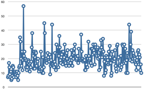
The New York Times, which has one of its articles tweeted every four seconds, recently went ahead and asked the first question — and asked it of Science.
 The tweet counts per minute of a New York Times article. Image from New York Times.
To complement this research, I invoke another study called What Makes Online Content go Viral published in the Journal of Marketing Research which attempts to address the second question.
Articles, videos and songs go viral because they engage their audiences, which is something any content officer should be concerned with. Dead content deadens users.
This isn’t a discussion to further hammer in the now-rather-trite idea that "content is king." What I hope to do here is to share what’s been discovered by marketers and researchers, and see what valuable bits web content developers can take away.
Too little science is covered in the web development community (this applies doubly in content-centered forums), and when it is, it’s often done so by someone trying to sell you on something.
But not this stuff, which is why you should read on.
The Research
When I discuss scientific research, I typically provide a series of caveats centered around the funders of the research, if applicable. For instance, check out this story about how dairy makes women stronger and less fatty. It was paid for by Big Dairy, which is a tiny conflict of interest.
But the two studies I’m talking about now exist in one of the rare areas where businesses and large organizations are paying for bona fide scientific and statistical research.
I say "rare" because, at this point, so little is understood about viral content patterns that no interest group stands to gain anything by tweaking the results; although The New York Times has sanctioned some of the most targeted research, they get nothing if the results simply say "content goes viral because Times’ articles are just awesome."
Granted, this is hardly an academic pursuit — many, many businesses stand to gain a great fat ton out of this type of information. But — and I truly hate to say it — one of the big differences between academic and privately driven research is how immediately practical it is.
So with these things in mind, let’s get to it.
Why Do People Share?
It probably comes as no surprise, but people share things to make themselves feel good, one way or another. It’s very human. It’s what we do.
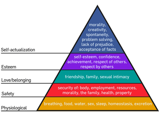
For those of you unfamiliar with Maslow’s Hierarchy of Needs, once we have our physiological needs taken care of, we search for safety. Once we feel safe, we look for a sense of belonging. Then comes self-esteem. Finally, when all else is covered, we search for the "higher" concepts like morality, equality, and other idealistic "alities."
 Image from Wikipedia.
It’s the top two tiers of Maslow’s hierarchy that drive us to share — be it tweeting, watercooler chatter or half a cookie with friend. People want the respect of others, and they want to feel a sense of belonging.
And tweeting helps how, you might ask? Well, according to the NYT’s Consumer Insight Group, whose study consisted of 2,500 subjects, people are sharing content not only to "enrich the lives of others" in their online networks, but also to define themselves in whatever community they’ve taken part in. And we keep sharing to make sure we stay connected.
Of course, that’s a sweeping generalization. The study would be amiss without discussing the different types of sharers. These boil down to some basic personas.
Some people are more geared toward self-promotion, for instance. Others want to get the word out about some cause, and they use social media as a soapbox. Some people are just hipsters, and share things that make them more hipstery. (That’s seriously in the study mentioned earlier; not verbatim, but "hipsters" is a persona.) Others are hyper selective and only interact with a tight community.
But from hipsters to altruists, they all have those top two Maslow tiers urging their behavior.
What Do People Share?
Think about any recent content you’ve shared. Clearly, if you were driven to share it, it struck you as worth it. Let’s see, for me it was a scientific article about researchers making mouse embryos transparent. The one before that was an io9 article about Neil Patrick Harris guesting on Cartoon Network’s Adventure Time.
I shared these things for a number of reasons, but it all boils down to what the researchers in the virality study call emotional valence.
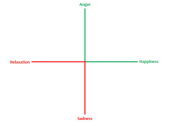
Think of this as graph: on the y-axis, you’ve got anger and sadness, the latter being on the negative end. On the x-axis are happiness and relaxation.
Both "positive" values — anger and happiness — are factors that are very good indicators of what gets passed around the Web.

The more highly charged those "positive" emotions, the better the chance. People want to be surprised and shocked, too (hence the old journalism adage, "If it bleeds, it leads"). And almost universally, people want to laugh.
So What?
These studies have narrowed down the characteristics that make content resonate with readers; I urge content wizards and wranglers to read the studies in full. I’ve by no means been exhaustive here.
As with a lot of psychological or statistical research into human behavior, much of this might strike you as intuitively obvious. It did for me.
But what’s not obvious is how anyone dealing with the direction of Web content should learn from this.
Viral content goes viral because it hits people upside the head, which is good.
It’s not forced. Just ask any marketer, business person or writer — no matter how much we’d love it, we can’t force content to hit home.
Keep viral characteristics in mind when developing and directing any content. All niche communities have their own versions of viral (Keyboard Cat, for instance, might not be super relevant to the antique tractor collector community), so as always, user research is the keystone no matter the content.
Writers must know their audience. Web and content developers, their users.
Related Content
- The Importance of Web Content Strategy
- The Web Strategy Pyramid: A Well-balanced Web Strategy
- Five Social Media Mistakes That Suck
- Related categories: Content Strategy and Website Management
About the Author
 Kristina Bjoran is a science writer based in San Francisco, California. She works in editorial at Wired magazine and is a managing editor at UX Booth. Connect with her on Twitter, Facebook and Google+.
Photo: India-Pakistan Border From Space

- Reuters/NASA/Handout
See the orange line? This is what the border between Pakistan and India, floodlit for surveillance purposes, looks like at night, from space.
The bundles of light in the photo, which was taken from north to south, are the following cities: Delhi (top center), Srinagar (left), Lahore (center, just below the border line), and Islamabad (bottom center.)
The picture, taken by the International Space Station’s Expedition 28 crew, was shot on Aug. 21 and recently released.
Pair claim they can make ammonia to fuel cars for just 20 cents per liter
Back to (the wrong) school
A hundred and fifty years ago, adults were incensed about child labor. Low-wage kids were taking jobs away from hard-working adults.
Sure, there was some moral outrage at seven-year olds losing fingers and being abused at work, but the economic rationale was paramount. Factory owners insisted that losing child workers would be catastrophic to their industries and fought hard to keep the kids at work--they said they couldn't afford to hire adults. It wasn't until 1918 that nationwide compulsory education was in place.
Part of the rationale to sell this major transformation to industrialists was that educated kids would actually become more compliant and productive workers. Our current system of teaching kids to sit in straight rows and obey instructions isn't a coincidence--it was an investment in our economic future. The plan: trade short-term child labor wages for longer-term productivity by giving kids a head start in doing what they're told.
Large-scale education was never about teaching kids or creating scholars. It was invented to churn out adults who worked well within the system.
Of course, it worked. Several generations of productive, fully employed workers followed. But now?
Nobel-prize winning economist Michael Spence makes this really clear: there are tradable jobs (making things that could be made somewhere else, like building cars, designing chairs and answering the phone) and non-tradable jobs (like mowing the lawn or cooking burgers). Is there any question that the first kind of job is worth keeping in our economy?
Alas, Spence reports that from 1990 to 2008, the US economy added only 600,000 tradable jobs.
If you do a job where someone tells you exactly what to do, they will find someone cheaper than you to do it. And yet our schools are churning out kids who are stuck looking for jobs where the boss tells them exactly what to do.
Do you see the disconnect here? Every year, we churn out millions of of workers who are trained to do 1925 labor.
The bargain (take kids out of work so we can teach them to become better factory workers) has set us on a race to the bottom. Some argue we ought to become the cheaper, easier country for sourcing cheap, compliant workers who do what they're told. We will lose that race whether we win it or not. The bottom is not a good place to be, even if you're capable of getting there.
As we get ready for the 93rd year of universal public education, here’s the question every parent and taxpayer needs to wrestle with: Are we going to applaud, push or even permit our schools (including most of the private ones) to continue the safe but ultimately doomed strategy of churning out predictable, testable and mediocre factory-workers?
As long as we embrace (or even accept) standardized testing, fear of science, little attempt at teaching leadership and most of all, the bureaucratic imperative to turn education into a factory itself, we’re in big trouble.
The post-industrial revolution is here. Do you care enough to teach your kids to take advantage of it?
Sneak-and Peek
 There's an interesting chart in New York Magazine that shows what the Patriot Act is used for.
Delayed-notice search warrants issued under the expanded powers of the Patriot Act, 2006–2009:
For drugs: 1,618
For fraud: 122
For Terrorism: 15
The Art Of Clean Up
Photographs by Ursus Wehrli. You know the third assistant had to get those letters in order for that alphabet soup. Hit the jump to see what’s going on here!


