
Above, a letter written by Arthur C. Clarke in 1956 predicting, quite accurately, aspects of the future of communications.
Link [via Letters of Note via dvice]

Above, a letter written by Arthur C. Clarke in 1956 predicting, quite accurately, aspects of the future of communications.
Link [via Letters of Note via dvice]
 In what will surely become a landmark case -- or at least a massive thorn in the MPAA and RIAA's clubbed, pygmy feet -- a judge has ruled that bypassing DRM via hacking, reverse engineering or any other means is not in itself illegal.
 Judge rules that circumventing DRM is not illegal originally appeared on Download Squad on Mon, 26 Jul 2010 08:00:00 EST. Please see our terms for use of feeds.
Read | Read | Permalink | Email this | Comments


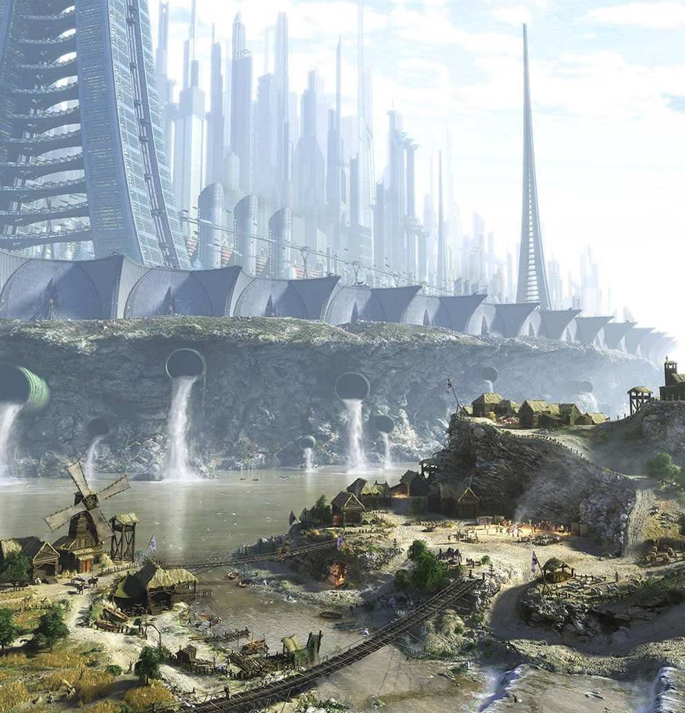
Radoslav Zilinsky’s 2007 artwork “The Worldâ€
A stunning painting of a possible future (or present depending on how you look at it)… walled cities of techno-utopia surrounded by the rest of the world living in the middle ages. Here is a link to the large version on Zilinzky’s site. (Found via Coolvibe.)

You’ve heard it plenty of times before: We’re at the precipice of a transition in the way we, as developers, do things. Leading the way are future standards like CSS3 and HTML5, both already partially implemented in 4 out of the 5 major web browsers, with IE9 promising support, empowering us with new ways of making interactive and rich user experiences.
Just how awesome is CSS3? Find out by checking out these 10 experiments and demos that push the capabilities of the specs.

This experiment presents our solar system’s planetary orbits (fast-forwarded, of course) by utilizing CSS3’s border-radius, transform, and animation. Additionally, hovering over the names of each planet on the right displays an animated tooltip using CSS (learn how to make CSS3 animated tooltips). You can read about how this experiment was developed from this walkthrough by Alex Girón, the creator of this stellar CSS3 demonstration. The animation, at the moment, only works on the WebKit browsers (Google Chrome and Safari).
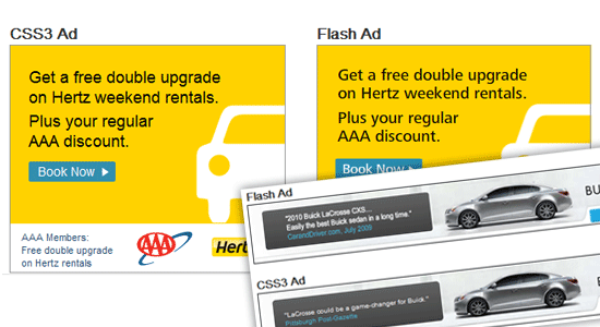
Flash animated web banners are notorious for being intrusive in the user’s experience. Ad-blocking apps can turn these off by looking for all embedded Flash objects on a web page and hiding them. However, using CSS3 animation, these Flash ads can be mimicked in functionality, but will be harder to disable with third-party software. In this experiment, several ads were recreated using CSS3, and the results are almost identical to their Flash-constructed counterpart.
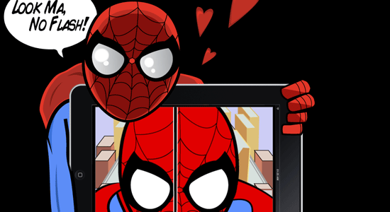
This is a robust animation sequence inspired by the Spider-Man animated television series in the 60’s. Making the sequence work involved using CSS3’s transform, @key-frame and rotate; a bit of jQuery was used to preload the images as well as HTML5 for the audio. The creator wrote an explanation of how the CSS3-Man animated sequence works, which will give you a general idea of the level of effort involved in this amazing experiment.
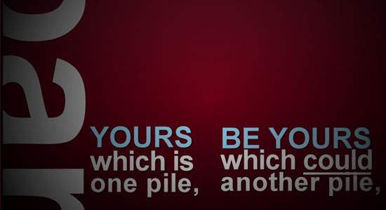
This demonstration is an animated sequence (based on kinetic typography) that explores a way in which we can replace rich animation components such as Flash or After Effects. This proof of concept chiefly utilizes advanced CSS selectors and CSS3 animation, however, it’s not purely CSS since JavaScript was used to toggle element classes on and off.
We often use Flash (or Silverlight) for rich and interactive web-based video games. This CSS3 demonstration is a puzzle game and a proof-of-concept of how we can use open standards to create games — though admittedly, not as facile as Flash yet if you compare it to Flash games on sites like Kongregate. HTML5’s <audio> element was used to embed the sound.
This demonstration is of stacked images that look like Polaroids. Hovering over a photograph transitions it smoothly to the front of the stack, making for an interesting interaction for presenting your photo gallery. The demo was made by leveraging transition, transform, dynamic psuedo-selectors (to animate the target element), as well as stylistic properties such as box-shadow for visual effects. Read the tutorial on how this was constructed if you’d like to learn how this was developed.

With HTML5’s <audio> and <video> APIs, which will enable us to utilize multimedia without dependence from proprietary plugins, we’ll eventually have a need for GUIs that provide our users with controls for the media we serve them. Though we could use static images in conjunction with other HTML elements (such as buttons) to build these interfaces, using just HTML and CSS to render media controls mean we’ll have a more malleable solution. This user interface for a music player was built using only CSS3 (gradient, border-radius, box-shadow and all that good stuff). Read the explanation on how this was contructed in this tutorial.
This demonstration, found in the ZURB Playground, takes vinyl album covers that, when hovered on, animates the sliding out of a vinyl record that contains additional controls ("more information" and "play"). This proof of concept could one day be used as an elegant web-based interface for a site that plays music when combined with HTML5’s <audio> API.

This animated cartoon sequence depicts a fast-forwarded cycle of day and night. It works on WebKit browsers (Safari and Chrome) using the @keyframes CSS3 property for moving and transitioning PNG images.
WebKit presents the capabilities of CSS3’s animate property with a spectacularly smooth demonstration of falling leaves. Tip: Use your browser’s "view source" feature to read the source code of the demonstration — the code’s well documented with explanations of how it works. Read WebKit’s blog post about the animate property to get a better feel for all the possibilities.
 Jacob Gube is the Founder and Chief Editor of Six Revisions. He’s also a web developer/designer who specializes in front-end development (JavaScript, HTML, CSS) and also a book author. If you’d like to connect with him, head on over to the contact page and follow him on Twitter: @sixrevisions.

I know everybody and their brother does logo roundups so you’re probably sick of them, but I don’t believe I’ve ever done one and there is a particularly impressive brand of logo design that I wanted to point out.
Today we’ll look at 50 logos that are the result of going beyond the typical thought process and injecting a little wit and hidden symbolism into the design process.
Like the article? Be sure to subscribe to our RSS feed and follow us on Twitter to stay up on recent content.
To explain what I mean by “clever†logo design, let’s take a look at a typical logo, (i.e. one that isn’t clever).
The logo above is a nice piece of work. The colors are perfect, the lettering is masculine, the overall feel is athletic and the glossy effect works well. It’s everything that it needs to be.
However, my favorite type of logo design is that which takes the assignment one step further. Rather than just making something attractive, these designers look at the design process with a pinch of added intelligence and a perspective that skewed enough to see things differently than the rest of the world.
These types of logos make you smile at the brilliance of both the idea and the execution and have several layers of meaning that can hit you in waves. Some are amazing in their obviousness to all who see them and some find excellence in hidden secrets.
I’ve broken down this collection into three categories: visual double entendres (two things in one), word and character art, and ambigrams. Ambigrams definitely also fall into the word art category but I wanted to give them special recognition because they’re so difficult to pull off effectively (if you don’t believe me, try to make one!).
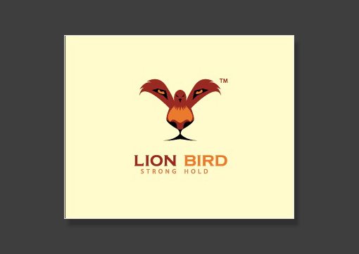
If you stare straight at the bird’s feet for a second, a stunningly clear lion’s face emerges. Brilliant design!
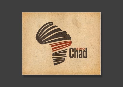
I love this one. There’s a sort of ribbon theme that makes both a face and the continent of Africa.
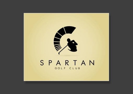
Simply beautiful use of negative space. The golfer and his swing double as a soldier’s face.
A tent and a pencil.
A pepper and a horn.

Green here is symbolized by a tree and labs is represented by the brain. That’s a sharp looking tree brain!
Another pencil idea very similar to the one above. This one is a parachute and a pencil.
A tongue and a leaf. A little creepy but a great idea!
The letter “G†and a guitar. Simple but effective.
This is definitely one of my favorites. The couch has cleverly been crafted to also be a face with a mustache. Excellent work!
The dog’s ears are leaves. Sometimes subtle is better.
The open envelope creates a house shape.

The open book makes a tent. Not my favorite but it makes for a good visual read.

This one makes me laugh. Australia has been turned into a pig’s snout!
The city skyline doubles as a row of cell phones.
I love that the shape of the hills genuinely matches the shape that cards make when you peak at them while they lie face down on the table.
This one goes on and on. The matches come together to make a heart. There are two of them (they match). Fire represents passion. etc. etc.
Ideas are often represented by lightbulbs. Turning the phrase “think tank†into a lightbulb tank was genius.
This one is an excellent piece of art. The rocket blasting off and leaving smoke trails clearly makes a guitar shape.
This one is simple but so incredibly effective. It looks like both a suitcase and a folded dress shirt with a tie. The latter really emphasizes the “suit†aspect and therefore represents professionalism.
Another really subtle double entendre. The hands on the clock make an airplane.
The buildings in the city skyline are all arrows pointing upward.
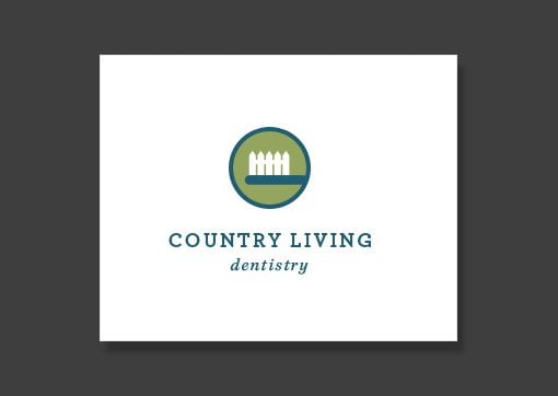
The white picket fence is a perfect picture of country life, here it’s been turned into a toothbrush to symbolize dentistry.
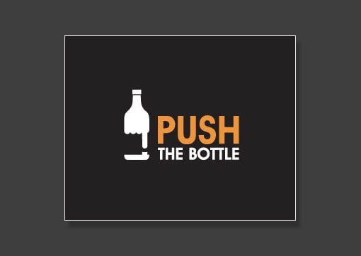
Another excellent use of negative space. The hand pushing a button makes the shape of a bottle. Notice how the fingers of the fist create the liquid in the bottle.
It’s amazing how little had to be added to make a pencil appear (just a triangle!). Some logo designers really have a gift for simple touches that change everything.
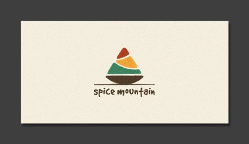
It definitely looks like both a mountain and a pile of spices.
Not only does the round shape of the golf ball reflect that of the moon, the little dips look like craters! A great visual simile.
The logo says everything it needs to. Scales are a clear representation of law and justice and the bowls have been turned into boats to represent the maritime aspect.
This idea seems a little obvious but I’m sure it took a lot of tweaking to get to this point.
The sort of abstract skyline design is a cliche for community and has been transformed into a familiar hand gesture.
Another one of my favorites. The carrot has been beautifully crafted to make a rocket ship.
The car’s headlights make it look like a big nerd with glasses. Yet another example of the use of subtlety in wit.
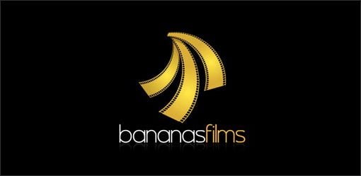
The film strips have been hung to mirror the shape of a group of bananas.
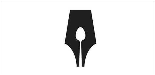
The negative space in the tip of the old style fountain pen has been turned into a spoon.
This is definitely not the best logo in the world, but the whole lightbulb spark plug idea is pretty clever.
The word fish has been crafted into the form of a fish. What more could you want in a logo?
A few simple typographic characters that perfectly represent the word below.
Coding is all about characters so it was perfect to build the fish out of typography.
The equality symbol has been slightly modified so that the bottom is shorter than the top; a perfect statement of inequality.
The quote has been simply turned on its side and it looks remarkably like a gas pump.
The symbol for infinity has been altered to look like pair of mischievous eyes.
If you’re at all familiar with music theory you know that an octave has eight notes (hence “octâ€). Here the “o†and “c†have been stacked to make an eight.

The impressive part here is how naturally the word seems to make a face. It’s an excellent designer that makes complex ideas look effortless.
The two has been pushed over to look like an “n.†Since the word is “twins,†hiding a two in the logo was a great decision.

This one you have to stare at for a second to really appreciate. All the letters are upside down. The “w†is an “mâ€, the “d†is a “pâ€, etc.
The obvious solution was to make a spoon and a fork illustration. However, putting the ampersand in represents an extra step in the thought process that makes the idea really unique.
At first glance this logo says “brella.†Can you spot the other two letters?
In case you’ve never heard of them before, ambigrams are words or phrases that you can spin around 180 degrees and still read them. They often require quite a bit of work and thought in order to make them easily readable.
That sort of Old English look is definitely one of the styles you see the most with ambigrams. Notice how the “e†and “o†have been heavily transformed but still read well in the context of the word as a whole.
It’s not easy to create an “e†that still looks like an “e†when you spin it around. Well done.
This one feels like an ambigram, but as one astute commenter pointed out, it actually isn’t. The beginning “e†and ending “a†are the same, but the letters in between don’t work when flipped. Nice illusion regardless!
I hope the collection above isn’t just another “list post†but instead is a healthy dose of inspiration that encourages you to put a little thought into your logo creation process. When appropriate, consider how you can infuse something unique and witty to make the logo that much better.
Leave a link below and tell us your favorites. Also point us to any logos that match this style that you’ve seen on the web.
The Evolution of Commitment
This content from: Duct Tape Marketing

Most of us want to sell something – want to get people to commit to plopping down the hard won cash in an exchange of value. That’s certainly one of the reasons millions of business folks have jumped into online networks and social platforms – to gain access to the hundreds of millions that hang out there and prospect for customers.
But while social technology has made it much easier to gain access to people, I think in some ways it’s actually made it harder to get those same people to commit to buy (or at least it hasn’t really made it easier.) While selling in the old days (2 years ago) was still very much about getting someone’s attention and making them an offer, it has now become much more of an intentional act of gaining trust and helping prospects evolve towards a customer commitment.
The Evolution of Commitment looks a bit like this:
The response in the last point above is the dilemma of the free online world that people have grown accustomed to. Scads of smart marketers have mastered the pre commitment dance of know, like and trust, only to fall flat when asking for the ultimate commitment – money.
So what does it take to get fans and followers to commit, take the act of paying for your offerings?
I asked some of my followers on Twitter that very question and receive responses like:
“there needs to have been serious “can’t live without†value on the free version that would make me test out the paid version.â€
“the idea that what i’m paying for has real life value, isn’t free somewhere else, or won’t lose half it’s value in < 1yr."
"add'l features get me from free to paid, as does a great free experience."
"It has to inspire me, be enjoyable and/or fulfill a true need."
As I look around at some of the successful freemium models, Basecamp, Evernote, and those that have experience challenges going to a paid model, Ning, I’m struck with the impression that commitment comes from an experience that so exceeds expectation, so motivates people to talk, and is so valuable that people actually feel bad not paying for the experience or come to understand their life will be better by making the commitment.
That’s a pretty high standard, but the clear message is this – people will buy anything that’s free, even crap, but they won’t commit unless it’s remarkably free and freeing.
But think about that for a moment – isn’t there a similar bar for any commitment? What gets someone to say yes to a marriage proposal? What gets someone to commit to giving up smoking? What gets someone to go after a job at a company with no current opening?
Commitment, and it’s semi-evil twin non-commitment, is all around us every day. What can we learn from it to bring to our business, culture and marketing? I think there is much to explore on this topic.
So, what tips you to a commit to something?


