
Archive for the ‘Google Reader’ Category
Why are clouds white? [Madscience]
10
Jul
10 Fresh Galleries for Web Design Inspiration
10
Jul

Creativity needs a jumpstart at times. When you’re feeling creatively low, one of the best ways to get inspired is to admire and look at exceptional web designs. In this collection, you’ll discover some new web design galleries to check out. I hope you find at least a couple of new favorites that you’ll bookmark and visit regularly!
Want to find more design galleries? Check out these other collections:
- Where to Go to Find Design Inspiration
- 20 Fresh & New Design Galleries
- 16 Best Web Design Galleries for Inspiration
1. Wireframe Showcase
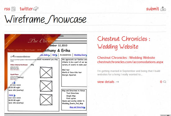
Wireframe Showcase lets you peek under the hood of a web design. Instead of focusing just on the finished layout — which is how most web design galleries work — featured designs on the site have a discussion by the web designer and screenshots of preliminary sketches, prototypes, and wireframes, giving you insight on their production process.
2. Heart Directed
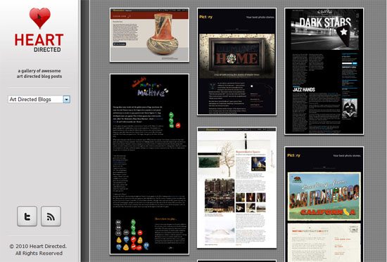
A recently popular design trend is blogs that publish custom-designed blog posts. Heart Directed, a web project by Design Informer, highlights some masterfully crafted and visually stunning blog posts.
3. siiimple

siiimple, as the site’s name implies, features clean and simple web designs. It’s a great place to visit if you want to see how great designs can become when they’re boiled down to the bare essentials.
4. Grid-Based

Using grid layouts gives your designs a sense of order through systematic placement and alignment of design elements. Grid-Based is a niche web design gallery that showcases beautiful sites that employ grid systems (of course, presented to you as thumbnails aligned on a grid).
5. MephoBox

Typical web design galleries feature an entire screenshot (or a partial thumbnail) of web designs. However, MephoBox steps outside of this convention by placing common website components such as headers and web forms on center stage.
6. HTML5 Gallery

The HTML5 Gallery seeks to promote the use of HTML5 by inspiring web designers with real websites that already use the new standards. Richard Clark, a front-end designer in the UK and owner of the site, hopes that "a side effect of this [website] is that browser developers will see how many people are implementing HTML5 and add more support for it."
7. Typekit Design Gallery
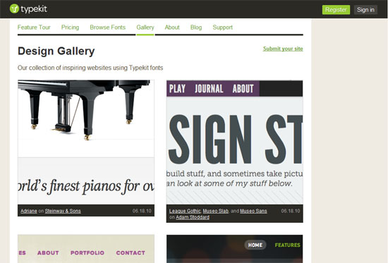
We’ve talked about @font-face in the recent past through a guide on @font-face as well as a tutorial on the free Google’s Fonts API web service. Typekit, a leading subscription-based service for web fonts, has a web design gallery featuring the use of web fonts on real sites.
8. Mobile Awesomeness

Though some may contest the value of having a mobile design today, Mobile Web — without a doubt — is certainly the future. Mobile Awesomeness indexes and presents aesthetically awesome mobile web designs for your inspiration.
9. HTML Email Design Gallery
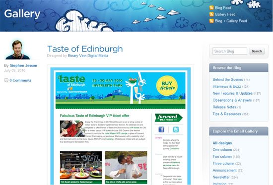
A popular task amongst web designers is the construction of HTML emails. For web designers looking to be inspired in the oftentimes hair-pulling-inducing activity of designing HTML emails, check out Campaign Monitor’s gallery of beautiful HTML emails.
10. The Drawar Design Gallery

Drawar, a blog by 9rules and CSSVault founder, Paul Scrivens, curates an on-site web design gallery where you can find meticulously handpicked web designs. The process of getting your site featured involves a highly sophisticated quality decision algorithm with an equally arduous submission guideline that’s best described by Scrivens himself: "You submit a site and it gets put into the system. I look at the site and if I like it then it gets moved into the Gallery."
Related Content
- 16 Best Web Design Galleries for Inspiration
- Readers Pick: 16 Sites for Web Design Inspiration
- The Top 15 Google Products for People Who Build Websites
- Related categories: Web Design and Design Showcase \ Inspiration
About the Author
 Jacob Gube is the Founder and Chief Editor of Six Revisions. He’s also a web developer/designer who specializes in front-end development (JavaScript, HTML, CSS) and PHP development, and a book author. If you’d like to connect with him, head on over to the contact page and follow him on Twitter: @sixrevisions.
– All about perspective…
09
Jul

Mapping Nuclear Bomb Explosions
09
Jul
![]() Quick question for you: how many nukes have ever been detonated? A few? A couple dozens? How about over 2,000.
Quick question for you: how many nukes have ever been detonated? A few? A couple dozens? How about over 2,000.
Japanese artist Isao Hashimoto created a video clip mapping every single nuclear explosion from 1945 to 1998:
A metronomic beep every second represents months passing, and a different tone indicates explosions from different countries. It starts out slowly, with the Manhattan Project’s single test in the US and the two terrible bombs dropped on Hiroshima and Nagasaki that ended World War II.
After a couple of minutes or so, however, once the USSR and Britain entered the nuclear club, the tests really start to build up, reaching a peak of nearly 140 in 1962, and remaining well over 40 each year until the mid-80s.
It’s a compelling insight into the history of humanity’s greatest destructive force, especially when you remember that only two nuclear explosions have ever been detonated offensively, both in 1945. Since then, despite more than 2,000 other tests and billions of dollars having been spent on their development, no nuclear warheads have been used in anger.
Wired has the video clip: Link (it starts off slow, but then it picks up frighteningly fast) – via Fark
Is Our Electrical Grid Dying?
09
Jul

The Vincent substation along California’s State Route 14 is crucial to bringing wind and solar power to the Los Angeles Basin. Photo: Joe McNally
If you think about it, it’s a marvel of modern engineering that most of us aren’t even aware of "The Grid". Yet it is what made modern life possible. When you watch TV, work on the computer, or even turn the light on, you’re using the electricity and that juice comes to your house via the electrical grid.
"The electrical grid is still basically 1960s technology," says physicist Phillip F. Schewe, author of The Grid. "The Internet has passed it by. The meter on the side of your house is 1920s technology." Sometimes that quaintness becomes a problem. On the grid these days, things can go bad very fast.
When you flip a light switch, the electricity that zips into the bulb was created just a fraction of a second earlier, many miles away. Where it was made, you can’t know, because hundreds of power plants spread over many states are all pouring their output into the same communal grid. Electricity can’t be stored on a large scale with today’s technology; it has to be used instantly. At each instant there has to be a precise balance between generation and demand over the whole grid. In control rooms around the grid, engineers constantly monitor the flow of electricity, trying to keep voltage and frequency steady and to avoid surges that could damage both their customers’ equipment and their own.
When I flip a switch at my house in Washington, D.C., I’m dipping into a giant pool of electricity called the PJM Interconnection. PJM is one of several regional operators that make up the Eastern grid; it covers the District of Colum bia and 13 states, from the Mississippi River east to New Jersey and all the way down to the Outer Banks of North Carolina. It’s an electricity market that keeps supply and demand almost perfectly matched—every day, every minute, every fraction of a second—among hundreds of producers and distributors and 51 million people, via 56,350 miles of high-voltage transmission lines.
So it should worry you that the grid is sick. America’s electrical grid infrastructure is a patchwork of networks built with antiquated equipments. Over decades, this infrastructure has fallen behind the nation’s ever-growing demand for electricity. So, how do we fix it? (And for those of you who shout "no more oil" should know that our "addiction" to foreign oil has nothing to do with electricity – oil is predominantly used for transportation, not electricity).
Joel Achenbach of National Geographic wrote a fascinating article about the Electrical Grid (with fantastic photos by Joe McNally): Link – Thanks Marilyn!
Turbulence Discovery Could Lead to Better Planes
09
Jul

With just a single measurement, a new model may deftly describe turbulent fluid flows near an airplane wing, ship hull or cloud, researchers report in the July 9 Science. If the long-sought model proves successful, it may lead to more efficient airplanes, better ways to curb pollution dispersal and more accurate weather forecasts.
![]() Fluid dynamicist Alexander Smits of Princeton University calls the new model “a very significant advance†that opens up a new way of thinking about chaotic, energy-sapping turbulence.
Fluid dynamicist Alexander Smits of Princeton University calls the new model “a very significant advance†that opens up a new way of thinking about chaotic, energy-sapping turbulence.
Turbulence is a problem that extends far beyond a bumpy plane ride. Fluid flowing past a body — whether it’s air blowing by a fuselage or water streaming across Michael Phelps’s swimming suit — contorts and twists as it bounces off an edge and interferes with incoming flows, creating highly chaotic patterns. Airliners squander up to half of their fuel just overcoming the turbulence within a foot or so of the aircraft, and turbulent patterns in the bottom 100 meters of the atmosphere confound weather and climate predictions.
Physicists and engineers have had a good grip on the basic behaviors of fluids since the mid-1800s, but have been baffled by the complexity of the tumultuous flows near a boundary. “We don’t really have a handle on the physics,†says study co-author Ivan Marusic of the University of Melbourne in Australia. “So even though the problem is over a hundred years old, we still really haven’t had a major breakthrough.â€
In their new study Marusic and his colleagues measured forces in a giant wind tunnel, both near and away from a wall. Data collected by probes suggested a tight link between the small-scale turbulence near a wall and large, smoother patterns of air flow farther from the wall. In particular, newly identified flow patterns called superstructures turn out to have a big effect on the turbulence near the wall. These smooth, predictable flow patterns away from the wall change the turbulence right next to the wall in predictable ways, a link that allowed Marusic and colleagues to write a mathematical formula relating the two.
“The fact is that we were sort of amazed because it’s such a simple formulation,†Marusic says. “Now with this model, all we need to do is measure the outer flow and we can predict what’s happening near the wall.â€
If it pans out, the formula may be incorporated into models of climate, weather and pollution dispersal. And now that they have a better understanding of the near-wall turbulence, Marusic and his colleagues are trying to reduce it by manipulating the smooth flow of fluids away from a wall.
One of the strengths of the new model is that it allows the complex flow near boundaries to be reduced to a bare-bones motion that can be easily understood, says engineer Ronald Adrian of Arizona State University in Tempe, who authored an accompanying article in the same issue of Science.
“This model is a breakthrough step, but we’re not ready to say that it’s going to solve all our problems,†he says. “I don’t know if we have enough evidence yet to call it universal, but the hope is that it will be universal.â€
Image: zoagli/Flickr
50 Examples of Drop-Down Navigation Menus in Web Designs
09
Jul

Having a clean and well-structured website navigation is key in designing an effective user interface. Drop-down menus are great for sites that have multiple levels of content hierarchy. The typical design pattern of a drop-down menu is that when a user hovers over the parent navigation item, a submenu of navigation items appears.
In this collection are many different types of drop-down menus used in websites all over the web for your navigation design inspiration.
Here are some related collections regarding site navigation that you may also be interested in:
- 30 Exceptional CSS Navigation Techniques
- 50 Stylish Navigation Menus for Design Inspiration
- 20 Excellent JavaScript Navigation Techniques and Examples
1. Pure Grips
Pure Grips feature images in their drop-down menu to make it clear to the user which products are which.

2. Porsche
As you hover over each car, the image on the right changes. It also looks stunning with the semitranspart background.

3. B&Q
B&Q has a clean and eye-catching drop-down menu that lists columns of products that customers are looking for.

4. Red Brick Health
This drop-down navigation menu fits perfectly into the site design, and the pink hover highlight is a great touch of detail.

5. Carreras Con Futuro
This drop-down menu’s design embodies the hand-drawn theme of the website.

6. Galaico Folia
This drop-down submenu has a wonderful animation effect with the smaller pieces of wood folding down from the main menu item.

7. Callaway Golf
This is a masterfully neat drop-down navigation design that has an orange hover effect.

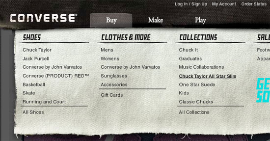
8. Converse
Converse has a grunge-styled drop-down menu that has a cloth-like texture with frizzy edges.
9. Puma
This dark drop-down menu really stands out from the rest of the site’s lighter colours.

10. Sunglass Hut
This drop-down menu is functional in that it also serves as an illustrated visual of the various styles of sunglasses.

11. Nettuts+
Netttuts+ has a clean drop-down navigation menu that works well with their header colours.

12. Tennessee Trails & Byways
This drop-down is unique because within the submenu, there’s also tabbed navigation.

13. Gateway
The drop-down menu in this design has nice curves and beautiful visuals that serve to display images of the computer manufacturer’s products.

14. Bern
This rough grunge style website has an edgy drop-down menu that complement the look-and-feel of the website’s general aesthetics.

15. Ski Alpine
This drop-down menu highlights the attention to detail that the site designer has.

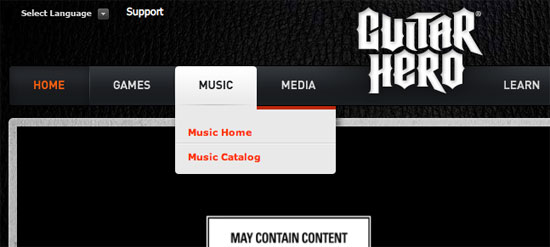
16. Guitar Hero
This simple drop-down menu is practical and doesn’t distract away from the main areas of the web page layout.
17. Mac Appstorm
Here’s a clean drop-down menu that fits perfectly with the overall landscape of the site design.
18. Noizi Kidz
This navigation is bright and shaped unconventionally.

19. Audi
This drop-down menu contains thumbnails of the auto maker’s model of cars; when you hover over a car, it displays details about it along with relevant links to other pages.

20. Famous Cookies
This drop-down navigation menu showcases the yummy cookies that the store makes available to its hungry patrons.

21. Duchy of Cornwall Nursery
This paper-styled website design has a nice, clean dropdown menu.

22. EA
Electronic Arts has a playfully styled drop-down menu.

23. Bonfire Snowboarding
Bonfire Snowboarding has an awesome 3-column drop-down submenu on their "Products" main navigation item, placing their products within three categories.

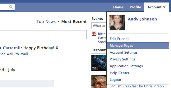
24. Facebook
Facebook has their simple drop-down menu on the site’s "Account" main menu link with relevant links for editing your Facebook account.
25. Nick Ad
You have to click-and-hold your mouse pointer for the submenu to appear. Then you move onto the link you want on each drop-down and release your mouse button to visit that page; it’s an interestingly unconventional interaction design.

26. TN Vacation
This dark blue drop-down menu really stands out.

27. MTV UK
This site design features a clean and standard drop-down menu.

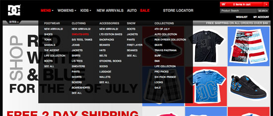
28. DC Shoes
The red and white text on the semitransparent black background really works its charm.
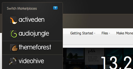
29. Envato Marketplaces
This is a really beautiful drop-down menu.
30. Tennessee Theatre
This navigation is special because it’s clean but creative at the same time. The brown really stands out from the rest of the site’s soft colours.

31. Boden
Each menu item has a different font and the drop-down menu is very clean.

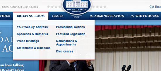
32. White House
The white background, blue text, and red top and bottom borders utilizes the the USA flag’s colours.
33. Navigant Consulting
The colours used on this site work together like players of a football team.

34. Officers Club
Another clothing website with a drop-down; having a dropdown submenu makes it so much easier to find products. The Officers Club drop-down has a multi-column layout.

35. Fall For Tennessee
Fall for Tennessee has a horizontal drop-down menu that slides out to the right hand side. The menu items that have a drop-down submenu have a small arrow next to them to indicate that they can be expanded.

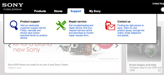
36. Sony
Sony has a very wide and simple drop-down menu on their main UK site.
37. Project Vino
This drop-down menu uses colours that fit the rest of the site. The big font size and the overall design looks amazing.

38. Media Temple
Media Temple has by far one of the best drop-down menus out there, aesthetically. The small thumbnail of each hosting type next to the name of them looks great, along with excellent JavaScript-based animation transitions.

39. Mozilla
This is a simple yet sleek drop-down menu on the Mozilla.

40. August
The semitransparency effect in this drop-down menu works will with the vivid background image.

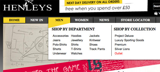
41. Henleys Clothing
The main navigation colour creeps down onto the drop-down submenu.
42. Digg
The classic Digg drop-down submenus work with their website’s overall design.
43. Action Envelope
This drop-down menu is special because it has a nice shadow effect that really brings the drop-down menu out of the page from the rest of the site.

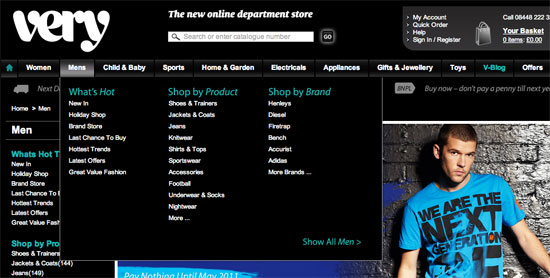
44. Very
Very, a new e-store, has a clean and structured drop-down navigation menu.
45. Incase
The Incase drop-down menu is slightly lighter in color shade than the navigation background, and works well with the site’s overall clean look-and-feel.

46. American Eagle
I really like the American Eagle drop-down menu because it fills the whole site’s width and also blends in with the clean paper-style look.

47. Mayflower Brewing
The colours used in this drop-down (and the site, in general) are gorgeous.

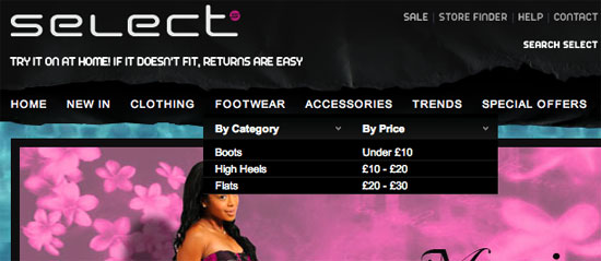
48. Select Clothing
Select Clothing’s drop-down menu has a dark background that stands out over the sliding images below.
49. Bird Malaysia
This drop-down menu is special because the colours stand out from the rest of the website, and I quite like the subtle background image at the bottom of each drop-down menu.

50. The Web Squeeze
The Web Squeeze has implemented jQuery into their drop-down menu to give it some nifty hover effects.

Related Content
- 30 Exceptional CSS Navigation Techniques
- 50 Stylish Navigation Menus for Design Inspiration
- 20 Excellent JavaScript Navigation Techniques and Examples
- Related categories: Design Showcase / Inspiration and Web Design
About the Author
 Andy Johnson is a freelance web designer and developer living in the UK. Andy freelances through his own design studio Authentic, and also co-founded a lightning fast UK hosting company called Pixeno. You can follow him on Twitter: @Andy92.
Gmail Now Offers Rich Text Signatures
09
Jul

Gmail users have often complained about the lack of rich text signatures in Gmail, and after a long period of waiting, Google has finally announced that rich text signatures are now supported in the desktop version of Gmail. All you have to do is visit the settings page, and play with the rich text editor in the signature section. Aside from that, Gmail also supports a unique signature for each email address associated with your account, so you'll be able to assign different signatures for different addresses. The older version, HTML version, and mobile versions don't support rich text just yet, but we hope that they will in the near future.
Permalink: Gmail Now Offers Rich Text Signatures from Ubergizmo | Hot: Evo 4G Review, iPad Review
How Finely-Tuned is the Universe? | Cosmic Variance
08
Jul
Breaking radio silence here to report on some of the actual work I’ve been able to complete: a new paper with Heywood Tam.
Unitary Evolution and Cosmological Fine-Tuning
Authors: Sean M. Carroll, Heywood Tam
(Submitted on 8 Jul 2010)Abstract: Inflationary cosmology attempts to provide a natural explanation for the flatness and homogeneity of the observable universe. In the context of reversible (unitary) evolution, this goal is difficult to satisfy, as Liouville’s theorem implies that no dynamical process can evolve a large number of initial states into a small number of final states. We use the invariant measure on solutions to Einstein’s equation to quantify the problems of cosmological fine-tuning. The most natural interpretation of the measure is the flatness problem does not exist; almost all Robertson-Walker cosmologies are spatially flat. The homogeneity of the early universe, however, does represent a substantial fine-tuning; the horizon problem is real. When perturbations are taken into account, inflation only occurs in a negligibly small fraction of cosmological histories, less than 10-6.6×10^7. We argue that while inflation does not affect the number of initial conditions that evolve into a late universe like our own, it nevertheless provides an appealing target for true theories of initial conditions, by allowing for small patches of space with sub-Planckian curvature to grow into reasonable universes.
In English: our universe looks very unusual. You might think we have nothing to compare it to, but that’s not quite right; given the particles that make up the universe (or the quantum degrees of freedom, to be technical about it), we can compare their actual configuration to all the possible configurations they could have been in. The answer is, our observed universe is highly non-generic, and in the past it was even more non-generic, or “finely tuned.†One way of describing this state of affairs is to say that the early universe had a very low entropy. We don’t know why; that’s an important puzzle, worth writing books about.
Part of the motivation of this paper was to put some quantitative meat on some ideas I discussed in my book. The basic argument is an old one, going back to Roger Penrose in the late 1970’s. The advent of inflation in the early 1980’s seemed to change things — it showed how to get a universe just like ours starting from a tiny region of space dominated by “false vacuum energy.†But a more careful analysis shows that inflation doesn’t really change the underlying problem — sure, you can get our universe if you start in the right state, but that state is even more finely-tuned than the conventional Big Bang beginning.
We revisit this question, bringing to bear some mathematical heavy machinery developed in the 1980’s by Gary Gibbons, Stephen Hawking, and John Stewart. Previous discussions have invoked general ideas of entropy or reversibility, but we were able to do a relatively down-to-earth calculation using conventional cosmological models. And we tried our best to explicitly list all of the caveats of the argument, which is important in a context like this where we don’t know all the rules.
We find that inflation is very unlikely, in the sense that a negligibly small fraction of possible universes experience a period of inflation. On the other hand, our universe is unlikely, by exactly the same criterion. So the observable universe didn’t “just happenâ€; it is either picked out by some general principle, perhaps something to do with the wave function of the universe, or it’s generated dynamically by some process within a larger multiverse. And inflation might end up playing a crucial role in the story. We don’t know yet, but it’s important to lay out the options to help us find our way.
