RSS
 

Archive for the ‘Google Reader’ Category

Are You Reading Too Much?

20 Oct

I ran across and interesting quote by Albert Einstein the other day.

Reading, after a certain age, diverts the mind too much from its creative pursuits. Any man who reads too much and uses his own brain too little falls into lazy habits of thinking.
~ Albert Einstein

This isn’t exactly the best known quote by Einstein and I doubt many teachers quote this to their students. Reading is generally a good thing, but if it starts becoming a substitute for thinking on your own it can hold you back from reaching your potential.

This quote touches on a problem that holds many people back from actually accomplishing things. It is easy to spend so much time researching that you never actually execute.  That doesn’t mean you shouldn’t read, do research and try to learn from others, but at some point you have to decide that you’ve gathered enough data and the time has come to do something. That may be starting your own business, writing a book or even repainting your living room.  You have a very finite lifespan. Some people spend their life preparing for what they want to do without ever actually doing what they want to do.

Sometimes the most helpful situations are the ones that force you to go ahead and do something by removing the option to try to collect more information.

Business minded? Subscribe to Mark Shead’s business consulting blog.

This article was useful when looking for:
  • reading too much (73)
  • too much reading (29)
  • read too much (18)
  • i read too much (12)
  • how much reading is too much (8)
  • can you read too much (6)
  • how much is too much reading (1)
  • too much reading time (1)

---
Related Articles at Productivity501:


Scientists are from Mars, the public is from Earth

19 Oct

The American Geophysical Union blog has a link up to a very interesting table, and I feel strongly enough about this topic that I want to share it with you. It’s a list of words scientists use when writing or otherwise communicating science, what the scientists mean when they use that word, and most importantly what the public hears.

[Click to enverbumnate.]

I’ll admit, when I read it I laughed. But then my chuckle dried up when I realized just how dead accurate this is. And the smile pretty much left my face when I read that this table is from an article called "Communicating the Science of Climate Change," by Richard C. J. Somerville and Susan Joy Hassol, from the October 2011 issue of Physics Today.

Yup. I think they have a pretty good point.

My career at the moment could pretty much be called "Science Communicator". I do it here on this blog, I do it on Blastr and in Discover magazine, and when I give talks. Before that (and I guess it’s an occupation that never really leaves you) I was a professional scientist for many years. My training ran deep: 4 years undergrad, 6-7 in grad school, then a decade or so of research after that. I could toss around the phrase "Don’t over-iterate the Lucy-Richardson deconvolution algorithm or else you’ll amplify the noise and get spurious data spikes" with the best of ‘em.

As a science writer, though, I can’t use that! I have to say, "Cleaning up a digital image means using sophisticated mathematical techniques that can sometimes mess the image up and fool you into thinking something’s there that really isn’t."

I hope you can appreciate the difference.

So when I write, I try pretty hard to make the science topic accessible without "dumbing it down". I assume my reader is intelligent, but unfamiliar with the concepts I might be discussing. I try to define words if a reader might not know them, or link to someplace they can get more info if they need it.

But as that table shows, there are plenty of words I use all the time that someone else might know, and think means something else. And this is incredibly important, especially if a science writer — as happens more and more often these days — needs to defuse some sort of political spin thrust upon a topic. A classic example in the wholly-manufactured Climategate "controversy". A lot of hot air was generated over the use of the word "trick" in the stolen emails — which most people interpreted as meaning the scientists did something underhanded and sneaky to hide something important. In reality, we use that word to just mean a method of doing something that’s clever. It’s like saying, "The trick in never losing your car keys is to always hang them on a hook by the door that leads outside." See the difference?

But over that, political battles are won or lost.

There are times I fret over a word in a post. It took me a while to start using the word "denier" instead of "skeptic", for example, but the difference is important. I’ve fought for years to teach people that skepticism is not cynicism or denial; it’s asking for and looking at evidence logically and rationally (in a nutshell). What’s funny is that now the media uses phrases like "climate skeptic" when talking about some people who are not skeptics, in that they are not looking at the evidence logically and rationally. They look at evidence so they can figure out how to spin it, cast doubt in the mind of the public over something that is actually a fact.

That’s why I call it "denial". The word fits, and I intend to continue using it when it does.

I could go on and on.

But here’s the point: communication isn’t simply casting out information from atop a tower. There are two parts to it: presenting an idea to someone, and them understanding it. Sometimes we have to change the way we word things to make that second half happen. Otherwise we’re shouting all the facts in the Universe to an empty room.

Tip o’ the thesaurus to Joanne Manaster.


Apple Steve Jobs The Crazy Ones – NEVER BEFORE AIRED 1997

10 Oct
I liked a YouTube video: Steve Jobs narrates the first Think different commercial "Here's to the Crazy Ones". It never aired. Richard Dreyfuss did the voice for spot however Steve's is much better 1997


Apple Steve Jobs The Crazy Ones – NEVER BEFORE AIRED 1997

10 Oct
I liked a YouTube video: Steve Jobs narrates the first Think different commercial "Here's to the Crazy Ones". It never aired. Richard Dreyfuss did the voice for spot however Steve's is much better 1997


Facebook Changes Present Interesting Business Dilemma

10 Oct

Facebook Changes Present Interesting Business Dilemma

This content from: Duct Tape Marketing

Initially there was the Facebook persona profile and, since that was all we had, businesses jumped in and made the best of using this not so ideal business tool.

Then came business pages and again businesses embraced them and in many cases tried to separate business and personal with this approach.

With the recent overhaul of the personal profiles another kind of use has been created – one that may have some business folks moving back to the personal profile.

Facebook subscribe to public

Public personal vs. Page

The subscribe function introduced recently allows Facebook profile owners to offer the ability for people who are not friends to subscribe to receive updates that are marked public. Now, couple this with the fact that Facebook has made it much easier to share with selected groups and you’ve got the makings of a nice business tool that is actually more suited for celebrities, authors, experts and independent business owners than a Facebook page.

How to manage the subscribe function

If you want people to subscribe to your public updates you must first turn this function on here. Once you do so you then must use the public setting to mark who can see an update. Of course, you’ll want to pay attention to that setting and make sure you only use it for things you want public.

Facebook claims that a tool, which would allow fan page owner to convert fans to subscribers of the personal profile is in the works. High profile Facebook employees, including founder Mark Zuckerberg appear to have done this migration already.

The new look is coming to all personal profiles this week

Facebook Cover

No matter which approach you take, get ready for an entirely new look on your personal profile. Facebook claims all profiles will be switched Oct 14th. (Want to switch yours today – here are the instructions)

Two big changes, the cover photo and the Time Line, offer the business user a better tool.

The cover photo is one dominating image that could be used very effectively by an expert wanting to showcase speaking for example.

The new view also presents the public information in a what I think is a more user friendly manner.

Get that cover image ready

Here is Facebook’s official information on the Cover image.

Expect designer types to have a blast hacking this image into some pretty cool things, but for now know that you need to look for an image with a width of 833px and a minimum height of 310px. Facebook makes it easy to position an existing image of most any size as well, but images that are already large in size will show better.

You can upload new photos or simply choose a photo in one of your Facebook albums to act as your cover photo.

MyFBCovers offers some simple ways to create custom cover images and cover collages made up of images of friends.


Facebook Changes Present Interesting Business Dilemma

10 Oct

Facebook Changes Present Interesting Business Dilemma

This content from: Duct Tape Marketing

Initially there was the Facebook persona profile and, since that was all we had, businesses jumped in and made the best of using this not so ideal business tool.

Then came business pages and again businesses embraced them and in many cases tried to separate business and personal with this approach.

With the recent overhaul of the personal profiles another kind of use has been created – one that may have some business folks moving back to the personal profile.

Facebook subscribe to public

Public personal vs. Page

The subscribe function introduced recently allows Facebook profile owners to offer the ability for people who are not friends to subscribe to receive updates that are marked public. Now, couple this with the fact that Facebook has made it much easier to share with selected groups and you’ve got the makings of a nice business tool that is actually more suited for celebrities, authors, experts and independent business owners than a Facebook page.

How to manage the subscribe function

If you want people to subscribe to your public updates you must first turn this function on here. Once you do so you then must use the public setting to mark who can see an update. Of course, you’ll want to pay attention to that setting and make sure you only use it for things you want public.

Facebook claims that a tool, which would allow fan page owner to convert fans to subscribers of the personal profile is in the works. High profile Facebook employees, including founder Mark Zuckerberg appear to have done this migration already.

The new look is coming to all personal profiles this week

Facebook Cover

No matter which approach you take, get ready for an entirely new look on your personal profile. Facebook claims all profiles will be switched Oct 14th. (Want to switch yours today – here are the instructions)

Two big changes, the cover photo and the Time Line, offer the business user a better tool.

The cover photo is one dominating image that could be used very effectively by an expert wanting to showcase speaking for example.

The new view also presents the public information in a what I think is a more user friendly manner.

Get that cover image ready

Here is Facebook’s official information on the Cover image.

Expect designer types to have a blast hacking this image into some pretty cool things, but for now know that you need to look for an image with a width of 833px and a minimum height of 310px. Facebook makes it easy to position an existing image of most any size as well, but images that are already large in size will show better.

You can upload new photos or simply choose a photo in one of your Facebook albums to act as your cover photo.

MyFBCovers offers some simple ways to create custom cover images and cover collages made up of images of friends.


Two men walk into a bar…

10 Oct


How to Bulletproof @font-face Web Fonts

10 Oct

Advertise here with BSA


How to Bulletproof @font-face Web Fonts

You’re interviewing for your dream job, and you’re ready to kick some butt. A small group is gathered around a conference phone and some coding exercises, and they’re pulling up your portfolio on a projector so that everyone can review it.

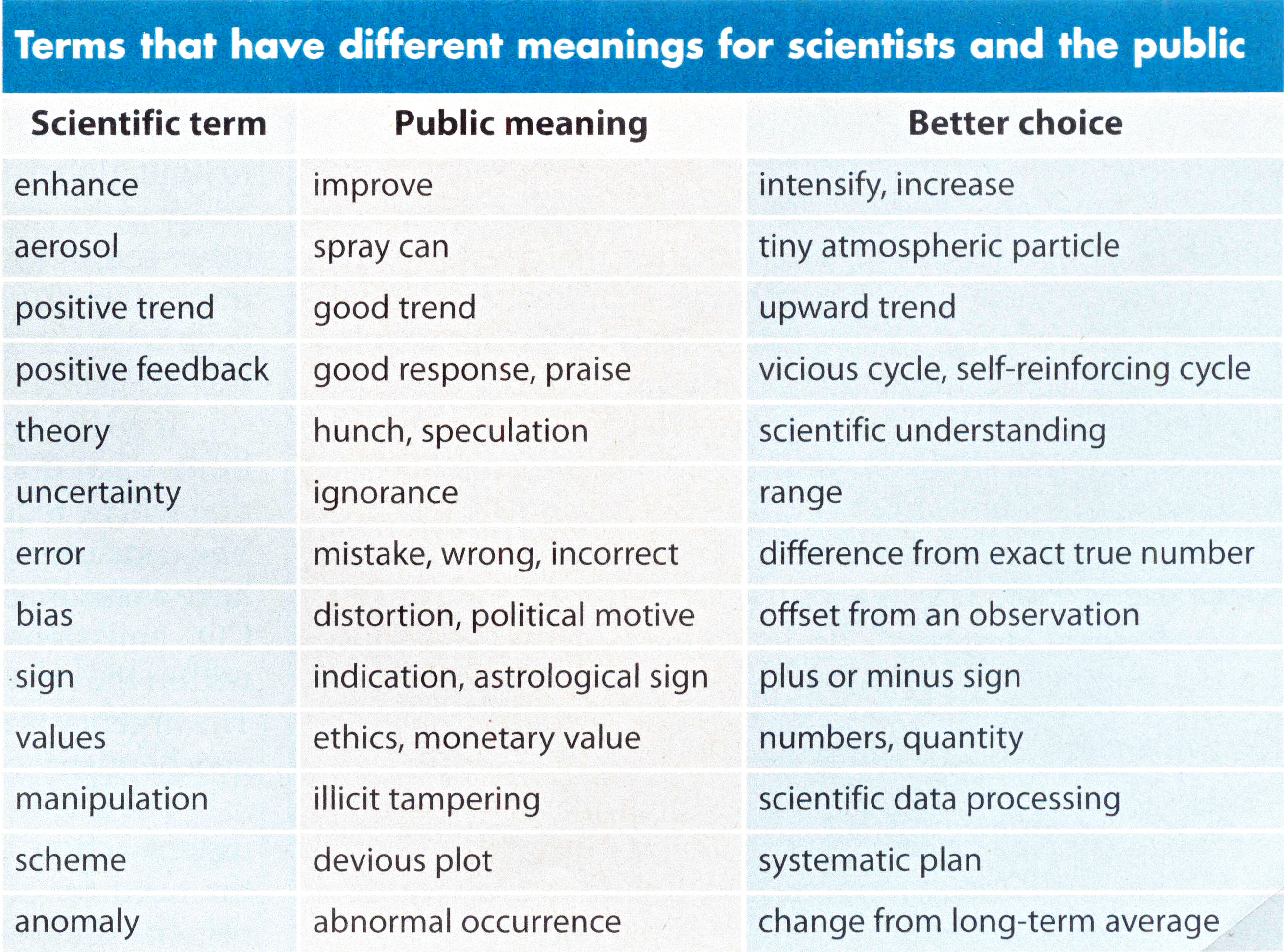
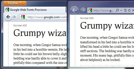
It looks great, except for one thing: All of your beautiful web fonts are gone and have been replaced with… Arial.

No, this isn’t just a bad dream: It actually happened to me recently when I interviewed at a web design company (352 Media Group). It was painful. I ended up getting the job anyway, but the experience made me realize that even following best practices recommended by industry-leading developers such as Paul Irish’s Bulletproof @font-face syntax and in the current situation where there’s much wider browser support for @font-face, web fonts just aren’t foolproof.

Getting them just right on most platforms and browsers takes work. Below, we will discuss some of the common issues with using web fonts.

Web Fonts Aren’t Displaying

The disappearing web font has to do with HTTP response headers.

Firefox and IE treat web fonts a little like JavaScript documents. For security reasons, a website on a different domain generally cannot display a web font that’s been loaded from another domain. (The Mozilla Developer Network has more information on this policy than you’d ever want to know.)

In cases were you want to allow cross-domain access to such files, the server that hosts the files can include an Access-Control-Allow-Origin header in its HTTP responses. This header can specify specific domains that are allowed to access the files, or it can just list an asterisk to let everyone access the files. The Google Font API does the latter, which makes the service available to all websites.

Workaround for Web Servers that Remove Response Headers

On some networks — including, apparently, that of the office where I interviewed — this header is removed before the response makes it to the web browser. Perhaps an overzealous firewall is to blame. As a result, Firefox and IE refuse to render the web fonts.

Chrome and Safari, on the other hand, happily display the fonts anyway.

Unpredictable networks are a fact of life, but luckily there’s a way to address them. You can use the WebFont Loader, a JavaScript tool that was co-developed by Google and TypeKit to fail over to fonts that are hosted elsewhere where necessary.

The code to fail over to local fonts goes inside your <head> tag and looks something like this:

<script>
WebFontConfig = {
  google: { families: ['FontOne', 'FontTwo'] },
    fontinactive: function (fontFamily, fontDescription) {
   //Something went wrong! Let's load our local fonts.
    WebFontConfig = {
      custom: { families: ['FontOne', 'FontTwo'],
      urls: ['font-one.css', 'font-two.css']
    }
  };
  loadFonts();
  }
};

function loadFonts() {
  var wf = document.createElement('script');
  wf.src = ('https:' == document.location.protocol ? 'https' : 'http') +
    '://ajax.googleapis.com/ajax/libs/webfont/1/webfont.js';
  wf.type = 'text/javascript';
  wf.async = 'true';
  var s = document.getElementsByTagName('script')[0];
  s.parentNode.insertBefore(wf, s);
}

(function () {
  //Once document is ready, load the fonts.
  loadFonts();
  })();
</script>

If the client is on a network that deletes the Access-Control-Allow-Origin header, her browser will load the font from Google, fail to display it, and then load your locally-hosted font.

This is slower than just loading fonts from Google. Newer versions of Firefox will take a solid three seconds before they give up trying to display the font from Google, but it’s better than no web fonts at all, and it won’t affect users who aren’t on such networks.

Debugging Response Header Issues with Developer Tools

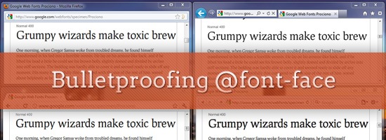
If you ever have to troubleshoot a problem like this, the developer tools in most browsers have a Net panel where you can inspect file requests and the associated headers. For example, for Firefox you can use Firebug and for Google Chrome, there’s Chrome Developer Tools.

Below is a screenshot of response headers using Firebug. As you can see, the Access-Control-Allow-Origin response header’s value is set to *, which means the document is able to be requested and rendered from other websites.

Troubleshooting with VPN Services

VPN services such as TunnelBear are also helpful in troubleshooting these sorts of problems. Because VPNs encrypt all traffic between you and the VPN provider, your local network won’t be able to mess with your headers.

If the site looks fine through the VPN but breaks when you connect without a VPN, it’s likely that there’s a problem with your local network.

Flash of Unstyled Text (on Slow Internet Connections)

A slow connection can result in a flash of unstyled text — what Paul Irish abbreviates as FOUT — while your web fonts load.

By default, Safari, Chrome, and IE 6-8 won’t display text at all until the text’s associated web font loads.

IE9, on the other hand, will display text in a default font while the web font loads — even in compatibility mode.

Firefox 3.5 will do the same, but versions 4 and later will wait three seconds for a font to load. If the font still hasn’t loaded at that point, only then will the browser display unstyled text. A similar "waiting period" is planned for WebKit.

Browser How It Handles Web Font Loading
Safari Won’t display any text until web font loads
Google Chrome Won’t display any text until web font loads
Internet Explorer 8 and below Won’t display any text until web font loads
Internet Explorer 9 Displays default/fallback font until web font loads
Firefox 3.5 and below Displays default/fallback font until web font loads
Firefox 4.0 and up Waits 3 seconds for a font to load

You might get a more noticeable FOUT in cases where you have to fail over to a locally-hosted font, but you can hide unstyled text using the WebFont loader, as we’ll discuss shortly.

It’s easy to miss such behavior on a fast connection. Most web designers are probably not on dial-up, after all.

Not everyone will have the same experience, though: According to a 2010 survey, 50% of broadband users in the US are subscribed to their ISP’s basic service. There are still some towns that have limited or no broadband Internet access.

The National Broadband Map can help you figure out whether your users fall into this group. Users outside of the U.S. may have even flakier connections, or they might have great connections but live far from your server. A recent report noted that the average luxury site takes 16.2 seconds to load in China. What will your users see while this happens?

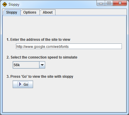
Simulating a Slow Internet Connection

There are a variety of tools that can simulate a slow connection so that you can see how your users might experience your site. I personally like Sloppy, which is free, runs on all platforms, and (unlike some other tools) requires no command-line geekery.

A few caveats: redirections and absolute links will send you out of Sloppy’s slowed-down environment, and browsers often cache these redirections. To be sure that you’re really getting a slowed-down page, make sure your address bar displays an IP address instead of a domain, and clear your browser’s cache if you’re continually getting redirected to a web page other than the one that you specified in Sloppy.

You can make the FOUT less noticeable in the same way that you’d tackle other web performance problems: Compress files using gzip, ask browsers to cache the files far into the future, only request the versions of the fonts that you really need, etc. Some delay is inevitable, though.

The WebFont Loader can help here, too. The script applies a CSS class called wf-loading to text for which web fonts haven’t loaded yet, and you can use this class to force browsers to hide or show unstyled text while web fonts load.

You could even get really granular. Maybe your logo uses a web font, so you don’t want it to display at all until the font has loaded, but want the content area to display in Arial while web fonts load.

What’s best for your site depends on how you use web fonts, how different the fonts are from system fonts, and how fast you expect your users’ connections to be.

Web Fonts Render Inconsistently on Different Operating Systems

In addition to issues with varied connections and browsers, it’s also important to consider how fonts are rendered across operating systems.

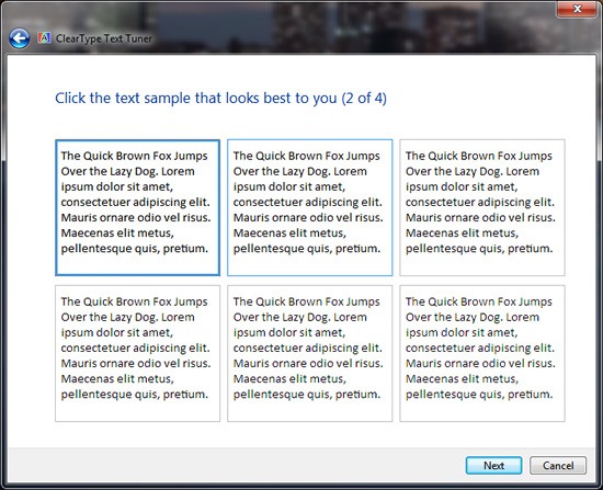
Mac OS and Windows have fundamentally different philosophies when it comes to rendering text. Mac OS uses anti-aliasing to smooth text, while Windows Vista and 7 use a technology called ClearType to render more detailed text. (Read more about ClearType here.)

Windows Font Rendering

Windows XP doesn’t do either (at least by default), and Linux might do any number of things depending on how it’s configured.

Windows also has two different rendering modes: the newer DirectWrite and the older GDI. The two modes can produce substantially different results.

IE9 and Firefox use DirectWrite, and they can use hardware acceleration to render pages. If hardware acceleration isn’t available or has been turned off, fonts don’t look quite as smooth in these browsers.

Chrome uses GDI, and Firefox 7 is slated to use GDI for common fonts such as Arial.

Safari actually lets you switch between Windows-style rendering and Mac OS-style smoothing — see the "font smoothing" option in the "Appearance" section of the Safari preferences dialog.

Windows Standard uses GDI, while "Light," "Medium," and "Strong" mimic Mac OS’s font rendering. Try toggling between Windows Standard and Medium, and you’ll see that the font heights switch back and forth. The takeaway here is that the size of text can vary, so it can’t be relied on to exactly position other elements.

Another variable on Windows is ClearType, which takes advantage of the fact that pixels on LCD screens are comprised of red, green, and blue vertical bars. It treats these bars as narrow pixels, allowing Windows to display more detail in text.

At best, ClearType makes text sharper and more readable. At worst, it creates colored "halos" around text — including your lovely web fonts. What you see depends largely on whether you’ve used the "Adjust ClearType Text" tool to configure ClearType for your display. If the software isn’t configured properly, it can actually make text harder to read.

Mac OS Font Rendering

It’s worth noting, of course, that not everyone is wild about Apple’s font rendering either; some Windows users argue that Mac OS sacrifices readability for the sake of making text prettier.

Test in Different Operating Systems

The differences in how operating systems render fonts mean that it’s worth testing your site on two different platforms.

If you’re a Windows user, it’s useful to test your site on Mac OS once in a while (or at least try Safari’s font smoothing on Windows).

If you’re a Mac OS user, you probably already have a copy of Windows somewhere so that you can test on IE. It’s worth trying WebKit or Firefox on Windows so that you can see how different rendering modes affect your site.

It might be tempting to sidestep this whole process and use Cufón to render fonts as vector images, which are then smoothed in much the same way as text on Mac OS is.

It might be equally tempting to use a CSS tweak to disable ClearType in older versions of IE. The problem is that doing so violates users’ expectations and ignores their preferences.

The user may have already configured ClearType or other settings to her liking, and she likely expects text in web pages to look the same as text in a word processor or dialog box. (It’s also worth noting that web fonts are faster than Cufón, particularly when you’re working with large amounts of text.)

Conclusion

It’s difficult to completely account for all situations, when it comes to web fonts. The best we can do is make sure we implement safeguards and fallback mechanisms for the less-than-ideal web browsing scenario.

It’s inevitable: Fonts will look different across browsers and operating systems, and they will perform differently across various connections. This is okay (even good)!

With a little testing and tweaking, you can accommodate users on broadband and dial-up, Macs and PCs, corporate networks and coffee shop Wi-Fi.

Related Content

About the Author

Ryan DeBeasi is an interactive designer at the web design company 352 Media Group, which offers custom web design and development for large corporations and small business web design. He’s passionate about front-end development, user experience and writing. His portfolio no longer breaks on corporate networks. Follow him on Twitter: @RyanDeBeasi.