
Some web designers (and many web content writers) view on-page SEO as a necessary evil to an effective content strategy on the web. However, when properly executed, SEO can actually enhance a site visitor’s experience, rather than detract from it.
In this article, I’ll run through several examples of how SEO can be improved with the user in mind. Reviewing these examples should help site builders gain a solid understanding of SEO practices that work together to create highly effective sites.
Changing Your Perception About SEO
Misperceptions about SEO generally arise from outdated ideas about what SEO is all about; when people are still under the assumption that keyword stuffing, mammoth blocks of links and stilted wording are still valid SEO tactics.
Rightfully so, web designers and web content writers object to these practices because they interfere with a visitor’s ability to make sense of the site.
Google and SEO have come a long ways since those practices were in vogue. Today, the crucial thing to understand is this:
- Google trains its spiders to think like humans. Therefore, best of class SEO practices are best of class people practices.
- When someone conducts a search, Google (and all the other search engines) wants to show results that are relevant and valuable to people. Accordingly, Google designs its search algorithms to reward meaningful content and punish those who try to game the system with user-unfriendly content tricks.
With that in mind, here is a brief review of seven tips of on-page SEO that demonstrate how good SEO, good writing and good design work together to create an exceptional product. This is not an exhaustive list of content optimization techniques, but websites that get these issues right have an extremely strong foundation.
1. Insert Primary Keyword Phrases at the Beginning of Headlines
The primary keyword phrase on a web page should clearly and concisely describe the main topic of that page. For maximum effect, the phrase should be written at the beginning of the main page heading (<h1> tag).
The example illustrated below is taken from a site we recently did for our client Track Your Truck, a firm that sells GPS tracking systems.
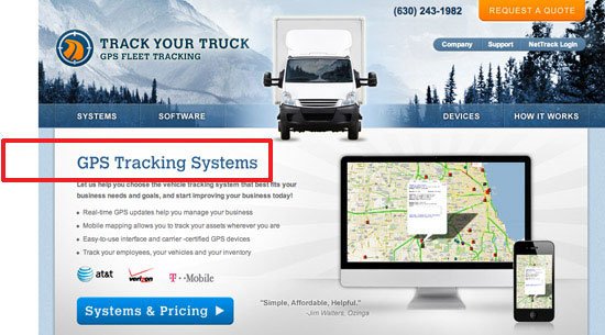
The headline, "GPS Tracking Systems", is superior to, say, "Manage Your Fleet Productivity".
When people scan a web page, their attention is drawn to the headline. If they have to pause for even a few seconds to discern its meaning and relevance, they may just click away instead.
Using keywords in the headline helps readers, which is why search engines like Google reward the practice.
2. Use Bold Text for Keywords
Another way to tell search engines — and site users — that content is important is to put it in bold type. Restricting the use of bold text to keywords is a good discipline all the way around. Too much bold text, especially used in a haphazard fashion, confuses the reader. No bold styling creates a clump of undifferentiated text that turns the reader off.

What we want is to focus the reader’s attention on the main theme of the page, so again, SEO and user preference work hand in hand.
Placing text in italics also attracts the attention of search engines and readers, but I discourage its use because italics in body copy can sometimes be difficult to read.
3. Use Bulleted Lists
Search engines are attracted to bullet points because they think bulleted content has high importance (otherwise, why would someone bullet it?). Humans think the same way.
Any time content can be transformed from an undifferentiated block of text into a short (3 to 5) list of bullet points, the writer is helping visitors and search engines quickly and decisively grasp the meaning of that page.
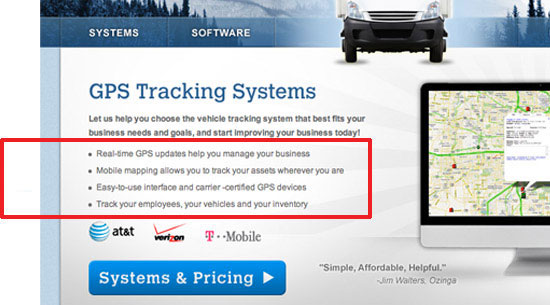
As a general rule, extremely long lists are undesirable: they overwhelm the reader and, for that same reason, search engines probably devalue them.
4. Use Keywords in Call to Action Links
By conveying the content of the link using keywords, you alert the reader and search-engine to what the new page is all about.

Some will make the argument that "click here" is the better choice, because readers are more likely to follow a clear command. While I can accept this argument for landing pages and email blasts, I don’t think it applies very well to websites. If the "click here" approach is used globally, you wind up with a site where every link looks the same and thus all of the urgency of the command is lost. For obvious reasons, this situation is bad for both the user reading your site and for web spiders crawling your links for context.
5. Insert Primary Keywords at the Beginning of Meta Titles
A web page’s <title> tag is probably the most significant content on the page, as far as search engines are concerned.
Most designers and web copywriters are indifferent about meta data in general, because there is the perception that human readers don’t see it, even though what goes inside the <head> tag of an HTML document is important.
Site visitors do in fact view meta data. For instance, the <title> tag’s value appears in browser bars, browser tabs, and in a search engine’s results pages when people perform a search.  Also, they’re picked up automatically by tweets through most Twitter apps.

The browser view is quite important in my estimation. If a visitor has several tabs open, I want him or her to easily understand what page(s) of our client’s site is open. Ideally, the tab will display a perfectly constructed meta title, with keywords at the beginning and branding at the end, as you see in the example above.
Constructing great titles can contribute to better usability as well; Usability expert Jakob Nielsen suggests using the passive voice to front-load keywords in headings and page titles, even though the active voice is, overall, better for readability of web content.
6. Build a Strong Internal Link Structure
When web pages within a site are linked together in a logical way, search engines perceive them as being logically connected; that they rely on each other to tell a story. This interconnection causes the search value of these pages — and the domain as a whole — to rise, because the content is seen as important not only on its own, but as part of a bigger picture.
A strong internal link structure is a major component of the overall information architecture of a site and, from the user experience perspective, crucial to a visitor’s ability to maneuver around the site.
Whether internal links manifest themselves as breadcrumbs, footer links, text links or a combination, if the links are easy for the reader to follow, they’ll be easy for search engines to follow as well.

Internal links (and links in general) are strongest for SEO purposes when keywords for the target page are used in the anchor text. The footer links in the example above, part of a design scheme our company uses for many lead generation sites, are optimized for the most important site pages.
7. Optimize Site Images
Very few sites have well optimized images, which is unfortunate on many levels. Poorly optimized images cause sites to miss out on great search opportunities, detract from the user experience, and pass up excellent conversion opportunities.
There are three ways to optimize images for SEO that I want to focus on, because they’re also great for usability.
Fill in the alt attribute. The alt attribute describes the image in plain English. It’s extremely useful for infographics and images that convey complex ideas or valuable data. If a visitor is not able to view the image, he or she will be helpless without an alt attribute; it’s a fallback mechanism for users who have issues rendering images, have images turned off while they browse, and for readers who are unable to see their screen and must rely on screen-reading software.
Keyword-optimize the title attribute. The image title appears when hovering over an image. What impression do you want to make on your visitors? Will they see "IMG40481105.jpg" or "Business Grammar and Punctuation Tips"?
Add a keyword-optimized caption. In my view, a caption strengthens most any image, especially on interior product and service pages. A reader will quickly zero in on an image and is very likely to read any content around it. Here is a golden opportunity to highlight a key product benefit, a unique service capability — and give search engines more content to index and rank.
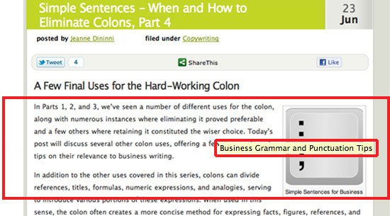
Image search can be a superb source of highly qualified traffic. People search for images for many types of products, and since fewer sites are optimized for image search, there’s less competition.
How Many Words on a Page Are Too Many?
SEOs and designers furiously debate the issue of word count. SEOs want more words, because all other things being equal, Google will rank a page with more and richer content higher than a similar page with less and lacking content.
Designers, on the other hand, fight for fewer words for the sake of elegance and impact. Both sides can make a strong case, and as a content writer, I am often caught in the crossfire.
Here, then, is a web content writer’s take on this very important issue.
First, the issue isn’t how much content to have on a website, it’s where to put it. Although intuition tells us that too many words will put off the visitor, some visitors at some point become interested in detailed information. If we can agree on that statement, we can resolve most word count issues.
For a home page and overview-type interior pages, too much above the fold content will backfire. On pages such as these, visitors are looking for a quick impression. Design effectiveness is paramount.
One way we have tried to balance SEO and design considerations for content on home pages is to "layer" the content. Above the fold, we strive for strong design elements and concise content. Below the fold, we add more detailed copy that incorporates keywords.
Here is the home page for Track Your Truck that follows these practices:

This is not an ideal solution, because in a perfect world, our keywords would be concentrated toward the top of the page, where search engines value them more highly.
However, from an overall UX point of view, I like this approach. If the top part of the site is engaging, some visitors will scroll down and read because they have been inspired to learn more. Others will bypass the optimized content and proceed directly to an interior page or the contact page. Whichever happens, the site scores a win.
In contrast, product and service detail pages can be content heavy above the fold. When visitors get to these pages, they are no longer browsing, but searching for information. A lack of detail can actually detract from the site’s credibility.
Keep in mind that many people who hit interior pages come directly from a search for that product or service. Presumably, such visitors have clicked through because they want detailed information, and for many sites, these interior pages will generate the lion’s share of unbranded search traffic. As a result, high word counts on interior pages serve SEO and users well, and home page word counts become far less significant.
Designers, SEOs and Writers: Why We Can All Just Get Along
Successful web development requires a high level of teamwork. This is the conclusion professional designers, SEOs and writers always reach in the end. When designers disregard SEO, websites fail with search engines. When SEOs disregard design, websites fail with people. Either outcome will fall woefully short of client expectations, because virtually every e-commerce and lead generation site is in pursuit of more search traffic and more conversions.
Writers, too, cannot afford to be purists or operate in a vacuum. The emphasis Google places on quality content is undeniable: Recently, Google announced a new algorithm to combat content spam, a clear signal that it means to punish manipulative SEO techniques and reward high quality, relevant web copy.
Nevertheless, writers who consider themselves "above" the SEO fray are arguing for a strategy of "build it and they shall come." Unfortunately, this strategy almost never wins: Apple and McDonalds may be able to ignore Google — can you?
The strategy that is likely to win is one that balances design, SEO and writing through every step of the development process. This post attempts to describe some common ground, but still, getting all team members on the same page (so to speak) is not always easy. I hope you will share your experiences about this challenge in the comments.
Related Content
About the Author
 Brad Shorr is Director of Content Marketing for Straight North, a Chicago-based interactive marketing agency that specializes in marketing strategy, Web development and Internet marketing services that include search engine optimization, PPC management, social media and e-mail marketing. Follow Brad Shorr on Twitter: @bradshorr and Straight North on Facebook.






 Brad Shorr is Director of Content Marketing for