RSS
 

Archive for the ‘Google Reader’ Category

Interesting Article on Factual (With Nod to Infochimps)

04 Feb

Factual is very ambitious and we share their desire to “liberate the world’s data”. That being said, they are building an open-source database and we are building a frictionless data marketplace. These are two different things, and don’t preclude us from working together towards our shared desire. If we are successful in disrupting the $100 billion data services market, maybe the first sentence in the article below will some day contain names like Jacob Perkins, Joe Kelly, Dhruv Bansal, Flip Kromer, Hollyann Wood, Jesse Crouch, Kurt Bollacker, Michelle Greer, Dennis Yang, Chris Howe, Adam Seever, or heck, maybe even Nick Ducoff.

Read more about Factual at Wall Street Journal’s website.


Reagan’s Toll on the Middle Class

04 Feb

In the lead-up to what would have been Ronald Reagan's 100th birthday on Sunday, conservatives have been trotting out all manner of panegyrics to their patron saint and his creed of trickle-down economics. For 90 percent of the people in this country, here's what should matter:

Source: Economists Thomas Piketty and Emmanuel Saez as cited by PolitifactSource: Economists Thomas Piketty and Emmanuel Saez as cited by Politifact

Digg Facebook Reddit StumbleUpon 


Creating a Cartoon Character for Your Website – Will It Stick?

02 Feb

zologicka

In today’s market of stiff corporate competition, it’s more important than ever to create an effective online marketing strategy. Often, this involves finding a way to set your website’s image apart from those of your top competitors.

To achieve this, some companies have created cartoon characters to represent their online identities. If executed correctly, this strategy can help retain website traffic and develop a unique corporate identity. The following are 3 examples of companies that have effectively used this cartoon character strategy.

Top 3 Cartoon Examples

Fatburgr

cartoon-character-01

Fatbugr’s cartooned website portrays a great execution of this cartoon character strategy. The website’s cartoon icon of a fat boy eating a large hamburger makes visitors feel guilty about the fast food they eat and encourages them to dig further into the website’s information.

Code Button

cartoon-character-02

Code Button provides another great example of proper cartoon usage. By identifying their target market and taking a comical spin on their identity, Code Button’s developers offer a light spin on the career of coding.

Jason Reed: Web Design

cartoon-character-03

Jason Reed showcases how a cartooned version of oneself can help avoid an entrepreneur from coming across as pretentious by using traditional headshots. Jason Reed’s cartoon allows website visitors to learn more about him while still maintaining a degree of mystery regarding the freelancer’s identity.

BrandWood

cartoon-character-04

Other Examples:

iAdvize

cartoon-character-05

Mediocore

cartoon-character-06

StoneSkipper

cartoon-character-07

NybbleTech

cartoon-character-08

Best Website Cartoon Practices

When considering creating a cartoon character for your website, there are certain best practices you should follow. By doing this, you will avoid the most common mistakes made by other companies and incorporate a successful cartoon identity. Here are the best practices to follow with this type project:

  1. Hire a Professional Designer – Whether you plan to create a cartoon version of yourself for your website or develop a unique character, hire a professional designer to complete the job. Various tutorials exist online regarding how to create a cartoon without any previous experience but the results are often less than desirable.
  2. Make it Appropriate – A major mistake of companies using website cartoon characters is that they become carried away with the cartoon’s identity. Don’t make the character over the top or completely off-base from the products you are selling. An obnoxious cartoon character will, more often than not, drive visitors away from the website rather than encourage them to read more about your services.
  3. Test the Cartoon – Before releasing the new cartoon identity to the general online public, conduct polls with a small segment of customers. This testing phase can indicate the overall response you can expect from the general public regarding the character and whether or not this is a good move for your brand identity.

Building a successful corporate identity is of utmost importance when building an online customer base. If your current corporate identity isn’t achieving the desired results, it may be time for a change. Cartoon character identities, when developed correctly, can invite potential customers into your website to learn more about the products and services you offer. If met with positive public response, you may even decide to adopt this character as your company’s long-term mascot.

Sponsored by

Made By Tinder

Advertise on Fuel Brand Network.
Fuel Brand Network 2010 cc (creative commons license)


Creating a Cartoon Character for Your Website – Will It Stick?


How to Reveal Fan Only Content on Facebook

02 Feb

How to Reveal Fan Only Content on Facebook

This content from: Duct Tape Marketing

One cool little trick that marketers often use on Facebook is to hold back content for “Fans” only. The pull behind this is that you can then give a little perk and encourage folks to “Like” your page and become a fan.

There are 3rd party apps like those from North Social or Wildfire that can make this happen for you or you can do a bit of coding with FBML. I wrote a how to article on installing the Static FBML app here - you might want to visit that first as you will need the app installed to take advantage of today’s tidbit.

This image greets non fans

I installed a Static FBML tab called Free eBook and put an image that encourages people to become a fan and offers a free eBook for doing so. There are lots of ways you to take this. Some organizations offer coupons or discounts for becoming a fan or access to early registration – really anything of value can be a great incentive and will generally increase your number of fans. (Visit my Fan Page to see is in action)

The code that makes this possible is the FBML attribute – fb:visible-to-connection. This is the same code that Facebook uses to show or not show your profile to friends or fans and it’s pretty simple to employ.

(One tip – if you are an admin of your page and logged in you will see both the fan and non fan content so you must test your implementation logged off or from a different username.)

The code in the FBML app using fb:visible-to-connection

Okay, so let’s break this down. For the most part this is very simple HTML with a little FBML

  • the fb:visible-to-connection code is what tells Facebook to make and not make parts visible to fans
  • the fb:else is an attribute of this code that identifies what should be shown to non fans – you simply wrap the non fan content in fb:else and the /fb:else closing tags. In this case I have used an image that encourages visitors to become fans.
  • the next code, starting the h3 tag, is the content that is shown only to fans and this can be whatever you wish. I have used simple content with simple HTML.
  • the last bit is close the /fb:visible-to-connection to tag. You can have other content on this page that is not related to the fan only offering and it would outside of this tag
Fan only reveal on Facebook

This is what fans see after they his Like

This is s very simple demonstration of how to use this function. You can add your own style using external style sheets. A good place to learn more is Tim Ware’s HyperArts Blog.

You can directly to the free eBook tab I installed here – if you are already a fan you will see the link to the download. If you are not a fan yet you will see an image urging you to become one – hit Like and you’ll see the free eBook download.


MailChimp

02 Feb

MailChimp

MailChimp recently launched a brand new site design. Overall I think this is very impressive. Especially the way they've managed to make something unique while at the same time keeping it clean and elegant. @obox has posted some criticism about the way they communicate what they do, and I partially agree with this. Still, a wonderful site design both visually and functionally. I have to take a look at the "logged in" view.


Microsoft’s Bing uses Google search results—and denies it

01 Feb
By now, you may have read Danny Sullivan’s recent post: “Google: Bing is Cheating, Copying Our Search Results” and heard Microsoft’s response, “We do not copy Google's results.” However you define copying, the bottom line is, these Bing results came directly from Google.

I’d like to give you some background and details of our experiments that lead us to understand just how Bing is using Google web search results.

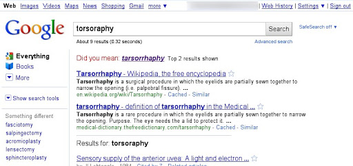
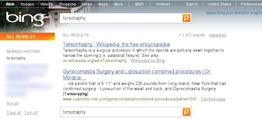
It all started with tarsorrhaphy. Really. As it happens, tarsorrhaphy is a rare surgical procedure on eyelids. And in the summer of 2010, we were looking at the search results for an unusual misspelled query [torsorophy]. Google returned the correct spelling—tarsorrhaphy—along with results for the corrected query. At that time, Bing had no results for the misspelling. Later in the summer, Bing started returning our first result to their users without offering the spell correction (see screenshots below). This was very strange. How could they return our first result to their users without the correct spelling? Had they known the correct spelling, they could have returned several more relevant results for the corrected query.


This example opened our eyes, and over the next few months we noticed that URLs from Google search results would later appear in Bing with increasing frequency for all kinds of queries: popular queries, rare or unusual queries and misspelled queries. Even search results that we would consider mistakes of our algorithms started showing up on Bing.

We couldn’t shake the feeling that something was going on, and our suspicions became much stronger in late October 2010 when we noticed a significant increase in how often Google’s top search result appeared at the top of Bing’s ranking for a variety of queries. This statistical pattern was too striking to ignore. To test our hypothesis, we needed an experiment to determine whether Microsoft was really using Google’s search results in Bing’s ranking.

We created about 100 “synthetic queries”—queries that you would never expect a user to type, such as [hiybbprqag]. As a one-time experiment, for each synthetic query we inserted as Google’s top result a unique (real) webpage which had nothing to do with the query. Below is an example:


To be clear, the synthetic query had no relationship with the inserted result we chose—the query didn’t appear on the webpage, and there were no links to the webpage with that query phrase. In other words, there was absolutely no reason for any search engine to return that webpage for that synthetic query. You can think of the synthetic queries with inserted results as the search engine equivalent of marked bills in a bank.

We gave 20 of our engineers laptops with a fresh install of Microsoft Windows running Internet Explorer 8 with Bing Toolbar installed. As part of the install process, we opted in to the “Suggested Sites” feature of IE8, and we accepted the default options for the Bing Toolbar.

We asked these engineers to enter the synthetic queries into the search box on the Google home page, and click on the results, i.e., the results we inserted. We were surprised that within a couple weeks of starting this experiment, our inserted results started appearing in Bing. Below is an example: a search for [hiybbprqag] on Bing returned a page about seating at a theater in Los Angeles. As far as we know, the only connection between the query and result is Google’s result page (shown above).


We saw this happen for multiple queries. For the query [delhipublicschool40 chdjob] we inserted a search result for a credit union:


The same credit union soon showed up on Bing for that query:


For the query [juegosdeben1ogrande] we inserted a page of hip hop bling jewelry:


And the same hip hop bling page showed up in Bing:


As we see it, this experiment confirms our suspicion that Bing is using some combination of:
or possibly some other means to send data to Bing on what people search for on Google and the Google search results they click. Those results from Google are then more likely to show up on Bing. Put another way, some Bing results increasingly look like an incomplete, stale version of Google results—a cheap imitation.

At Google we strongly believe in innovation and are proud of our search quality. We’ve invested thousands of person-years into developing our search algorithms because we want our users to get the right answer every time they search, and that’s not easy. We look forward to competing with genuinely new search algorithms out there—algorithms built on core innovation, and not on recycled search results from a competitor. So to all the users out there looking for the most authentic, relevant search results, we encourage you to come directly to Google. And to those who have asked what we want out of all this, the answer is simple: we'd like for this practice to stop.

Posted by Amit Singhal, Google Fellow


You Can Now Buy Up to 16 Terabytes of Storage from Google

01 Feb

Yesterday we told you how Google Docs is inching closer to being the mythical "Gdrive." Today Google announced that users can now buy up to 16 terabytes of storage for $4,096.00 per year. The storage can be used with Gmail, Picasa Web Albums and Google Docs. Those that don't need quite that much can choose from cheaper options:

  • 20 GB ($5.00 per year)
  • 80 GB ($20.00 per year)
  • 200 GB ($50.00 per year)
  • 400 GB ($100.00 per year)
  • 1 TB ($256.00 per year)
  • 2 TB ($512.00 per year)
  • 4 TB ($1,024.00 per year)
  • 8 TB ($2,048.00 per year)
  • 16 TB ($4,096.00 per year)

Sponsor

Sixteen terabytes may seem like an insane amount, but consider the benefit this will provide to media professionals who work with large video and audio files or architects and engineers working with 3D modeling software. However, there is still a limit of one gigabyte per file.

This offering, which comes as Mozy is reducing its users' storage limits, demonstrates the importance of storage to Google's long-term strategy. We've written about how storage plays into Google plans previously:

The devices will be secondary in value. Storage will be critical. And that's what these big companies recognize.

The Cloud Storage blog refers to a 451 Group report, which states that the cloud computing market is supposed to reach $16.3 billion by 2013. Storage will drive that growth.

Google's even going to bat for other companies over copyright issues to ensure the future viability of the cloud storage market.

Discuss


Free Encyclopedia of Interactive Design, Usability and User Experience

31 Jan

interaction_design_encyclopedia.jpg
The recently released Free Encyclopedia of Interactive Design, Usability and User Experience [interaction-design.org] has been developed under the manifesto of "Democratization of Knowledge", as it aims for people from all the far corners of the world to get free access to world-class educational materials. It also deliberately takes the opposite approach of Wikipedia or other crowd-sourcing initiatives, as all entries are written by leading figures who either invented or contributed significantly to a particular topic.

The website contains various topics that relate to data visualization. For instance, one can enjoy an elaborate introduction on visual representation by Alan Blackwell (with additional commentaries by some renowned professors like Ben Shneiderman, Clive Richards and Brad A. Myers), or more specifically dive into the topic of Data Visualization for Human Perception by Stephen Few (including a blog shortlist on which I will refrain commenting).

Be sure to check out the other topics that have been covered in a chapter, and might well be interesting to you.


World Income Inequality

31 Jan

Here, courtesy of Catherine Rampell of Economix, is a remarkable chart from Branko Milanovic's book The Haves and Have Nots. Along the horizontal axis are within-country income percentiles running from the bottom 5% (1st ventile) to the top 5% (20th ventile). Along the vertical axis are world income percentiles.

Economix-28milanovic-custom1
The graph shows that the bottom 5% of Brazilians are among the poorest people in the world but the top 5% are among the richest. Thus the vertical range of the curve tells us about within-country inequality.

Comparing between countries we see that the poorest 5% of Americans are among the richest people in the world (richer than nearly 70% of other people in the world). The poorest 5% of Americans, for example, are richer than the richest 5% of Indians.


Wireless electricity enables next generation of annoying packaging

28 Jan

Yep, these cereal boxes light up. They’re using a new branded-technology called eCoupling that provides electricity via induction, which means the shelves have a coil with AC power running through it. The “printed coils” on the boxes allow inventory control and data exchange presumably thanks to a low-power microcontroller. But in the video after the break you can see that the printed lighting on the boxes lets them flash parts of the box art as a way to attract customers’ attention. We’d bet that they’re using electroluminescent materials but we weren’t able to get find specifics on how this is done. We just hope advertisers don’t start rolling noise-makers into their packaging.

[Crave via Laughing Squid]


Filed under: wireless hacks