
Visualizing Friendships: This is a reaffirmation of the impact Facebook has on connecting people, even across oceans and borders. Beautiful! Important to note China (and a few other places) are mostly absent from this map.
Visualizing Friendships: This is a reaffirmation of the impact Facebook has on connecting people, even across oceans and borders. Beautiful! Important to note China (and a few other places) are mostly absent from this map.
Statisticians investigate data, and it may seem like missing data should be ignored since no data means no analysis, right? Well, in practice, it turns out that the knowledge that data is missing is very powerful, and statisticians are, in fact, always wary of missingness.
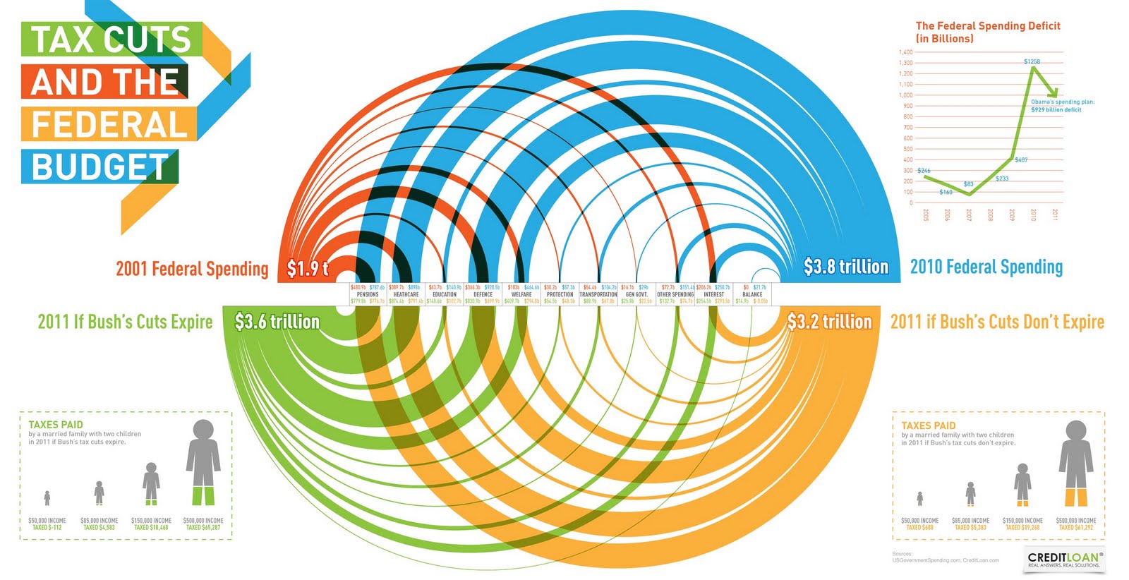
A reader pointed me to Daily Kos for another chart which I'll eventually talk about -- but I got waylaid by this one (shown on the right), depicting the relative proportions of favorable and unfavorable ratings for a set of political players.
The data is simple, and the chart is sufficient although I'd avoid the blue/red coloring which connotes party affiliation in American politics. The graph also fails our self-sufficiency test.
But really, the big problem with this chart is not on the page. Alert readers might realize that very few people (in fact, only just over half) have an opinion of John Boehner.
In the following version, the proportion of missing/no opinion/don't know is plotted right beside favorables and unfavorables, revealing that this proportion ranges wildly from only 4% for Obama and Bush to 48% for Boehner.
This is one data set which makes stacked bar charts look better than they typically are. The two main categories of favorable and unfavorable can be stacked to the sides so that they can individually be compared. The middle part, which represents missing data, will usually not provide much information but in this dataset, the gaping blank space makes us think about how we should treat the missing data.
In this chart, we give equal weight to those who have an opinion and those who don't.
***
Alternatively, we could ignore the people with no opinion, and look at the proportion of favorables and unfavorables among those who have an opinion. There is a danger in doing this because as seen above, the large proportion of don't knows would be hidden from view, and in the case of Boehner, and even for Pelosi and Tea Party, the amount of missing raises interesting questions: have people not heard of these players? are they afraid of providing an opinion? are they conflicted? etc.
Here is the alternative view, in which I have added a couple of comments to highlight things that otherwise would have been missed. One notable feature is that the respondents in this survey essentially view most of these players in similar light (40-50% favorable), as I don't see the differences in the center of the chart as meaningful.
Â


We spend a lot of time asking ourselves, our clients and other people questions. Whether it’s choosing the perfect shade of green for our latest web layout or figuring out how to implement a complex typographical solution, the ability to ask the right questions is among the most critical of skills for a web designer. In this article, we’ll go over 60 specific questions that web professionals should ask before taking their website public.
Many professionals work with the aid of checklists, while others routinely check for certain issues as the design evolves. While there isn’t a sure-fire way to avoid the embarrassment of forgetting something post-launch, the habit of continually questioning your work as you develop a website is critical. Sometimes it can be as simple as "Does this work?"; in other cases, more technical questions need to be asked (and answered).
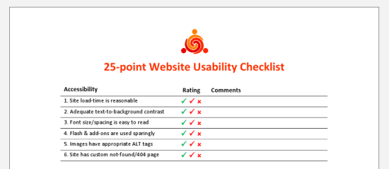 The 25-point Website Usability Checklist (PDF) can be a helpful aid to your workflow.
It doesn’t make the job any easier to second-guess yourself into a state of neurosis (something perfectionists do quite often) or to make blind decisions. There’s no perfect method for gauging a project’s needs or the decisions we make, but asking difficult questions during the process helps us avoid issues later on.
One of the central tasks of web design is project management. Building a new website is like setting the foundation for a house. With so many details to deal with, planning ahead and managing the ongoing tasks is essential.
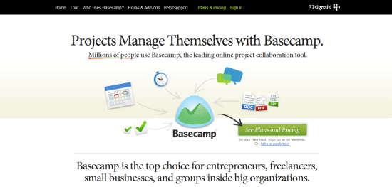 Basecamp is a popular and effective project management app.
1 Has the client signed the contract? Working without a contract is extremely risky.
2 Do you know what the final product should look like? Having a solid plan of action, including a few diagrams, wireframes, prototypes or mock-ups, can enhance clarity.
3 Has all of the content been written? A website without content is like a painting without a canvas; ideally, a website should be built around the content, not vice versa.
4 Does the website require any pre-built solutions? Life can be made easier with tools such as content management systems (e.g. WordPress) and scripts, so determine what you need before you start coding.
5 Do you know what the competition offers? Your rivals are often the best source of ideas, and knowing what they offer can help you meet visitors’ expectations.
6 Have you set appropriate deadlines? Setting realistic deadlines and tracking your progress towards those deadlines is always important.
7 Will you need to factor in additional costs? Websites are relatively inexpensive, and you can build a good one using free software, but still, you must be on top of any expenses you might incur.
8 Do you have the necessary skills? Some websites are more complex than others; consider which technologies you will need to work with and whether your knowledge of them is current.
9 Have you thought about marketing? A website without visitors is useless. Look into your options for social networking, SEO, advertising and more.
10 Will the website actually be useful (or even necessary)? There is no point wasting your energy on a project that will have no value for end users, so start by weeding out bad ideas.
11 Is a target audience mapped out? Knowing what kind of people you hope will visit the website will help you not only write appropriate content but design effectively, too.
12 Do you have a checklist or criteria? Even a set of basic criteria to maintain quality control or a checklist for larger projects would help.
13 Can your host cope with the demand? Getting the right type of hosting is important; there’s no point in having shared hosting if you’re going to be streaming gigabyte-heavy video.
14 Have you got the media? Some websites require video, audio and special file types such as PDF documents. Accounting for assets early on lessens the risk of launch delays.
15 What features do you hope to include? Perhaps you need to accept payment, or maybe you want a photo gallery. Whatever you need, plan ahead prior to designing the layout.
Next up are questions to ask regarding writing code. If you design or develop websites, you’ll find yourself working with HTML, CSS, and JavaScript. Every language has a range of best practices and guidelines to follow, which is great if you want to standardize your end-product. However, there are a lot of other things to consider besides being standards-compliant.
 The impact of source code on the effectiveness of your content is often overlooked yet very real.
16 Does the code validate? While validation isn’t a complete testament to code quality, it does help to make sure that your code follows recommended standards and can show you errors in your markup, CSS, and JavaScript.
17 Have you considered using CSS3 and HTML5? Though many users still don’t use browsers that have CSS3/HTML5 support, if implemented with progressive enhancement in mind, taking advantage of these future W3C recommended standards gives your products added value and improves the craftsmanship of your web designs.
18 How semantic is the code? Using the right tag for the job is essential, and search engines love semantic code. Use <p> for paragraphs, <ul> for listed items that have no ranking, <ol> for items that have a sequential relationship, <a> for hyperlinks and <button> for clickable UI components that perform an action/user task.
19 Are you taking advantage of optional files and site add-ons? Whether in the form of using the Sitemaps XML protocol or including a favicon, these optional files can enhance your website. See five files that can improve your website.
20 Do you need an RSS feed? If your website is content-heavy and is updated frequently (e.g. a blog or news site), having an RSS feed will be a necessary site feature for keeping your users up-to-date with fresh content. If you don’t use a CMS with this feature built-in, check out SimplePie, a PHP class for building your own RSS feed.
21 Will the code degrade gracefully? Graceful degradation (also known as fault-tolerance) — the notion that a system (in this case, a website) will still function under sub-optimal situations — is essential for flexible and web accessible site builds. Learn how to pragmatically apply graceful degradation when using CSS3.
22 Have you considered SEO? While search engine optimization should not dictate your design decisions, it wouldn’t hurt to consider how your website could be more visible in search engine results. Read some SEO tips to remember when building your site and ways to improve the SEO of your web designs.
23 Do you provide a printer-friendly style sheet? Designing a print CSS file is worth the time investment as many users still do print out web pages.
24 Is any of your code deprecated or non-standard? Using "dead code" such as the <font> tag that was deprecated in W3C HTML 4 specifications as well as non-standard code such as the <blink> tag is frowned upon and won’t allow your work to validate against W3C web standards recommendations. Double-check that you’re not using any by taking advantage of free validation tools such as the W3C Markup Validation Service.
25 Do you need to use conditional comments? IE6 isn’t going to go away completely, and if your project requires you to support IE and to use browser-specific code, use conditional comments to serve IE-specific stylesheets instead of using hacks. This does two things: It gives you the ability to get your code to validate under W3C standards, and when you decide to stop using browser-specific code, you only need to remove the conditional comments in your site template. Leveraging JavaScript techniques for fixing IE6 and projects such as HTML5 Boilerplate to solve deprecated-browser rendering issues could be another option, but you’ll be stuck in scenarios where the user uses an old browser with JavaScript disabled — a scenario that is not as uncommon as you might think.
26 Are structure (HTML), presentation (CSS), and behavior (JavaScript) separated? This is important not only because it’s best practice, but also leads to more manageable and maintainable code.
27 Is your site navigation laid out in a practical way? The navigation menu is the most important part of your website. Getting it right is an integral part of an effective site information architecture.
28 Have you checked for unnecessary HTML elements and redundant CSS style rules? Code bloats easily, so strip away any non-essential and repeated bits of code for more maintainable and leaner (and thus, higher performance) website builds. For HTML/CSS optimizing purposes, check out HTML Tidy and CSSTidy.
29 Is the code organized and maintainable? Put care and attention into your code. Lay it out so that it’s easy to read, update and manage.
30 Would a framework enhance the site? These days, open source Ajax/web development frameworks such as jQuery and MooTools can speed up code-authoring and ensure fewer headaches due to cross-browser issues. If you suspect these frameworks might help, why not investigate and learn about them?
The process of creating a layout is full of questions related to color, typography and even distinctiveness. While your project management style may be superb and your coding technique beyond measure, design comes with its own set of questions. Web design calls for endless decisions, and that’s what these following questions are supposed to help you resolve.
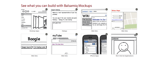 Using a wireframing tool like Balsamiq Mockups ensures a solid layout foundation.
31 Have you optimized your media? Images, videos and audio take up more bandwidth and space than anything else. Consider compressing and optimizing them with tools such as Smush.it.
32 Is the user interface overcrowded? If there’s one thing no one likes, it’s a stuffy and bloated design. Determine whether reductionism can help you design better websites.
33 Is the design distinctive and unique? With site templates in abundance, having a layout that’s fresh and eye-catching is a must. Breaking the mould may improve your brand’s identity.
34 When should I redesign? Are you able to produce something totally different or enhance what you have?
35 Does the layout make sense? Whether you pick one column or three, a lot of scrolling or none, decisions on your pages’ visual hierarchy will directly affect readability.
36 Do the colors give off the right feeling? Color is closely linked to emotion; a palette can be the difference between a fun-looking website and professional-looking one.
37 What typography is best? As with color, typography affects the feel of the website. Build your font stacks wisely and attentively and take time to craft a masterful typography design.
38 How visible are links? Links have no purpose if they cannot be seen. Make sure you take the time to design your hyperlinks well.
39 Are you using enough white space? Too many websites squeeze everything too close together. If you add some breathing room, the result could be improved readability.
40 Have you considered content on-demand? With the rise of Ajax and fast content switching techniques, packing more data onto the page is easy. Consider doing this with very long web pages.
41 Is the design aesthetically pleasing? While this process is subjective, it’s still a good idea to get feedback from your friends, co-workers and perhaps a stranger or two to determine whether your work is visually appealing or not.
42 Is the content readable? Nothing is more important than content; if it’s legible and coherent, then your site users will be happy.
43 Does the design scale at various resolutions? Displays are getting bigger (bigger desktop monitors) and smaller (mobile devices) at the same time; make sure your work renders in all web-enabled devices. For mobile devices, take advantage of free tools for testing designs in mobile devices.
44 Are important site features emphasized? Some things are more important than others; consider the various ways that relevant content can be highlighted so that visitors can easily find it.
45 Does the website feel complete? This is probably among the most important yet difficult questions to answer. Recognizing when it’s ready requires a lot of care and thought.
The user experience is perhaps the most important factor for determining the success of a website. Here are questions related to UX, usability, and accessibility.
 Accessibility, usability and compatibility: few things are more important. Silverback is a popular usability testing app.
46 Does the website work equally well across different browsers? There are plenty of browsers out there — make sure your website works well in the major ones. You can use a web service like Browsershots to preview your work in various operating systems and web browsers.
47 Is the website mobile-friendly? While desktop browsers are pretty straightforward (with the exception of IE), mobile devices require an extra bit of care and attention; read about best practices for the mobile web design.
48 Have you tested the website in a screen reader? Unfortunately, even with free screen readers out there like Fire Vox, a screen-reading add-on for Firefox, few web designers consider testing their designs for screen-reader web accessibility. You might want to.
49 What happens when JavaScript is turned off? Not every experience is the same and we can’t control the visitor’s browsing environment, so try to make sure your website gracefully degrades when JS is turned off.
50 Do you offer alternatives to Flash content? Following on the previous point, if your website is particularly Flash-dependent, you might want to make sure that your use of Flash is accessible.
51 Did you remember alt attributes? One of the simplest accessibility aids to implement is using descriptive and useful alt attribute for images.
52 Have you evaluated your website against Web Content Accessibility Guidelines? Complying with web accessibility best practices is important for users who have disabilities that affect their capability to browse the web. Fulfilling the recommendations in the W3C Web Content Accessibility Guidelines (WCAG) is the perfect place to start.
53 Has the website been tested by other people? Usability testing is quite easy and inexpensive to carry out nowadays. Performing tests could give you ideas for improvements. Check out web services such as Concept Feedback and Feedback Army.
54 Do your URLs make sense? URLs that are easy to read will give potential visitors the chance to predict where they’re headed (and is good for SEO to boot). Using pretty URLs (example.com/about-us) instead of system URLs (example.com/?p=655) can enhance the experience of visitors. If you’re using a content management system or a custom-built app, learn about rewrite engines.
55 How quickly does your site load? Speed is an important factor of usability. Consider how your website will affect visitors, particularly ones on slow connections.
56 Is the search functionality easy to use? Most websites need a search box to help visitors locate the information they need. Ensure that yours is easy to use and that the results are accurate.
57 Will there be any potentially obnoxious behavior? Whether it’s pop-ups and modal windows that won’t close, or scripts that cripple right-clicking, make sure your site doesn’t have behavior that annoys users.
58 Are your web forms usable? If you’re asking for too much information or your forms are too hard to complete, people will enter fake details or simply refuse to submit the data.
59 Can the site owner be contacted without difficulty? While you might get spammed in the process, allowing visitors to send you an email or to initiate a Skype call could be a great way to connect with them.
60 Have you checked for broken links? Root out dead links in every nook and cranny. Tools such as Xenu’s Link Sleuth can automate the process; learn how to discover broken links in your website.
As we learn and grow, our competency increases, which changes our perspective and workflow. Designers and developers who regularly question their methods and ideas are usually the ones who get the job done right and are the ones who consistently improve their processes and products.
 Alexander Dawson is a freelance web designer, author and recreational software developer specializing in web standards, accessibility and UX design. As well as running a business called HiTechy and writing, he spends time on Twitter, SitePoint’s forums and other places, helping those in need.

The P&P Office Waste Paper Professor turns paper into pencils when you add the lead, glue, and power. It also includes a pencil sharpener on the side. Designed by Chinese natives Chengzhu Ruan, Yuanyuan Liu, Xinwei Yuan and Chao Chen, this innovation has gained a lot of intrigue. What do you think?
Genrocks's "Filmography 2010" remixes 270 of this year's big budget movies into "one giant ass video" -- six minutes of thematically linked, brilliantly edited loveliness.
Filmography 2010
(via Kottke)

Page edited by Cody Burleson
 I feel like Neo in The Matrix now; I am 'the one'. I can see things other people can't see and do things other people can't do. I have special powers. I have GreenHopper
![]() - a plugin for Atlassian JIRA
- a plugin for Atlassian JIRA![]() that is rockin' my world. For me, GreenHopper has made JIRA fun all over again.
that is rockin' my world. For me, GreenHopper has made JIRA fun all over again.
In my last post, I explained how GreenHopper is good for JIRA, whether you're Agile or not, because it vastly improves the ability to rank issues and visualize priorities in JIRA. Today, on the fourth day of my evaluation, I want to share something else I've discovered that makes the plugin a delight to use.
Defining 'sprints' or phases in a product release
JIRA allows you to define and manage versions in a project and typically, we use these versions to define a software product release. For example, you might set up a project for a software product to have the following versions:
With project versions defined, we can capture all issues whether or not they are relevant to the current phase of a project or release of a product. We can continue to capture new feature requests, for example, even if the scope of our current release is 'locked down'. In this way, we can use JIRA to manage what is in progress while still capturing new feature requests that might apply to a successive release. We can also move issues from one version to another to account for various project dynamics.
Suppose, however, that you want to use JIRA's version management to define Agile 'sprints'. You might define your project versions to look something like the following:
Alternatively, in a more traditional approach, you might define phases within a given project or product release:
These strategies can be useful for keeping things organized, but with JIRA alone, the versions are still separate and distinct. We've only related versions of a project to a given release by labeling the versions to imply the relationship. Since there is no mechanism for explicitly defining these relationships, we are left to hope that our team understands the metaphor and flags issues appropriately. With this model, for example, we'd have to ask our users to tag an issue with both a given sprint or phase as well as the product release. Any lack of discipline or mistakes could ultimately degrade the accuracy of our insight and reporting.
The GreenHopper plugin fills this gap by allowing us to explicitly define parent->child relationships between versions. Once these relationships are established, it then flags issues more appropriately and automatically as we work within the GreenHopper interface. For example, if we define a version 'Release 1.0' as the master of 'Sprint 1', then applying issues to the sprint automatically applies them to the release also.
(click to enlarge...)

We can toggle between different planning boards by changing the version filter on the view. That means we can look at a planning board for a given release or we can drill down deeper and see a planning board for a particular sprint or phase within that release. We can reassign issues to different sprints, phases, or releases by simply dragging and dropping them atop the version in the right-hand column.
 If you drop an issue atop Sprint 1, it is then automatically flagged as an issue of Release 1 also as shown at left. GreenHopper understands the explicitly defined relationship between the sprint and the release and thus can help in appropriately flagging issues. All in all, this gives us the ability to 'turn the cube' on our project and analyze it from various different perspectives while helping to ensure that those reports are more accurate.
Now, I know that a little feature like this is not going to change your world, but if, like me, you are also trying to improve your overall approach to project management in JIRA, it sure as hell helps. It is just another small example in a rising heap of features that are adding up fast as I evaluate GreenHopper - just another little thing that gives me a feeling I'll be opening my wallet unashamedly the day my trial ends. For me, GreenHopper is a powerful new guide on my journey towards an improved approach.
Neo: What are you trying to tell me? That I can dodge bullets?
Morpheus: No, Neo. I'm trying to tell you that when you're ready, you won't have to.
Hans Rosling of GapMinder is one of my heroes. He has become an engaging and powerful teller of quantitative stories. He’s making a difference in the world. Even the most talented among us, however, sometimes slip up. Rosling’s recent video, produced by BBC Four, takes advantage of technology to place him behind a transparent bubble chart, making it possible for him to direct our attention to particular items with greater ease and clarity, without blocking our view-a worthy goal for statistical narrative. This approach suffers, however, from one significant flaw: in addition to Rosling, an entire room with bright lights, beams, and windows appears in the background as well, resulting in a great deal of distraction.


The production crew could have easily used a clean backdrop for the video, which would have removed all distractions and made it easy to focus on the data and Rosling’s narration. This problem perhaps never occurred to the technicians (although it should have), and I suspect that Rosling had no idea that all those windows and lamps with glaring lights would show up in the finished video. Attention to these details, however, makes the difference between fun and engaging data visualizations that tell stories effectively and those that feature novelty and entertainment over substance. To focus attention on the story, all distractions must be removed. As we venture into new opportunities that technology makes possible, we dare not forget the important lessons of the past. In the years since Edward Tufte began promoting the reduction of non-data ink in visual displays, research has confirmed the importance of this practice due to limitations in human perception, cognition, and memory. We can only focus on a small portion of the visual field at one time, we can only consciously attend to one task at a time, and we can only hold about three chunks of visual information at a time. There is no room for distraction of any kind. Anything that isn’t data must have a good reason to be there or it should be eliminated. As Antoine de Saint-Exupery once wrote, “Perfection is achieved, not when there is nothing more to add, but when there is nothing left to take away.†This is especially true when telling quantitative stories.
Take care,


I don’t know if you’ve noticed, but NERDS. ARE. BACK. Actually, we nerds have always been here, I’ll have you know. It just so happens that right now we are basking in the warm glow of acceptance. As someone who still has cafeteria-stress dreams, I can’t be thankful enough . . . although this news is like, 14 years overdue. The damage was done.
So guess what? Chances are pretty good that you are a nerd, you love a nerd or a nerd loves you. Compute those crazy stats in your head and then hopefully you’ll want to browse through this guide for great gift ideas. I tried to find some lovely things that would suit various nerd vices, so fantasy, sci-fi, techie and scholarly gifts abound, all passed through the filter of good design.
Who knows? If everyone gives a nerdy (chic!) gift this year, maybe the whole world will soon become one big Redshirt-loving, Quidditch-playing, LARP-ing geeky lovefest :) Happy Holidays, Nerds! — Kate
Image above: 1. Sectional Globe, $60; 2. Vintage Wire Sculpture Kit, $16; 3. Poppy Recycled Cotton Socks, $19; 4. Molecule Set, $80; 5. Luddite Parakeet Pipe Pillow, $70; 6. Black Amphibolite Specimen, $35; 7. Moby Dick Fleece Sweatshirt, $38; 8. Cricket Bowtie, $65; 9. Herman Miller Walnut Top Set, $149

Image above, left: Geometry Post-Its, $8; right: Bone China Skeleton Plates, $187

Image above: 1. Chocolate Pie Chart, $20; 2. Pop Quiz Backpack (in Mauve), $65; 3. Ceramic Chemistry Flask (small), $30; 4. Stripe Earmuffs, $65; 5. Vintage Plaid Thermos, $8; 6. Pocket Ringbooks, $15; 7. Four Eyes USB Drive, $32; 8. Unicorn Cashmere Wool Throw, $392; 9. Orange Prize Ribbon, $10; 10. Pictorial Webster’s, $35


CLICK HERE for the rest of the gift guide after the jump!