


The above photo is probably one of the coolest things you’ll see all day. Not only does the guy wearing the Obama shirt look incredibly calm about meeting the President, but he’s also offering President Obama his iPad to sign. And, no – not with a permanent marker; with President Obama’s finger, using Adobe’s Ideas application. How cool is that?
Sylvester Cann IV, the iPad-toting gentleman, told TechCrunch:
At a rally in Seattle, WA at the University of Washington, the President used the touchscreen on my iPad to give me his autograph. Secret service was leery about the idea, but they warmed up to the idea and the President thought it was cool.
He looked slightly surprised, but proceeded to use his finger to scribble on the iPad using the Adobe Ideas app.
I have a video of the event as well. This HAS to be the first time an iPad has received a Presidential autograph.
We’ve embedded Sylvester’s video below, along with an iPad screenshot showing President Obama’s signature. In addition to this, you can also check out Sylvester’s mini-site which pays homage to the event, titled: “I figured, ‘Why not ask?’†All that’s left to say is: well done, Sylvester!


Daring Fireball points to this little gem in the hands-on gallery our sister site Engadget had with forthcoming Windows would-be iPad competitor, the HP Slate. To explain what you're looking at, you'll need to look into this crystal ball showing an image of HP's product design offices six months ago...
"Hey boss, this HP Slate we're making. It'd be a shame to mess up our sculpted backplate with our usual eleventy billion barcodes and the Windows licence sticker and all that stuff. Maybe we should just slim all that info down somehow?"
The Boss sits back in his chair and sips his Tab. He thinks about how much work it would be to renegotiate the licence sticker requirement with Microsoft, or even to try and convince the support guys that they could make do with just one serial number per product. He sips his Tab again. Then inspiration strikes and he cries, "No, peon! I have a better idea! Tabs! Retractable tabs!"
Yes, dear reader, that's a little pull-out drawer who's only role in life is to hold and display a dizzying array of licencing and serial number data. There's even more of this stuff on the back too.
If an Apple designer pitched this craplution to Steve Jobs, he'd rip their still-beating heart clear out of their chest.
HP Slate has a bad solution to "too many stickers" syndrome originally appeared on TUAW on Fri, 22 Oct 2010 09:30:00 EST. Please see our terms for use of feeds.

CSS is the fundamental way of styling our web pages. Its deceptively easy syntax allows us to do many things to affect the visual layer of our work. And especially with CSS3, the language has gotten even more powerful.
There are many useful CSS techniques and tricks out there for you to take advantage of. This is a collection of a few useful CSS snippets that you might want to keep in your toolkit.
If you would like to use relative units (em) for your font sizes, declaring 62.5% for the font-size property of the body will make it easier to convert px to em. By doing it this way, converting to em is a matter of dividing the px value by 10 (e.g. 24px = 2.4em).
body {
  font-size: 62.5%; /* font-size 1em = 10px */
}
p {
  font-size: 1.2em; /* 1.2em = 12px */
}
When you focus (:focus) on an input element, perhaps you have noticed that Safari adds a blue border around it (and Chrome, a yellow one).

If you would like to remove this border outline, you can use the following style rule (this removes the outline from text fields):
input[type="text"]:focus {
  outline: none;
}
Please note that outline is used for accessibility purposes so that it is easier to see what input field is active. This is beneficial for those with motor impairments who cannot use a point-and-click device (such as a mouse), and thus must rely on alternative means of navigating a web page, such as the Tab key. The outline is also useful for able-bodied users who use keyboard shortcuts to get to web form input fields (it’s easier for them to see which input is currently active). Therefore, rather than completely taking out the outline, consider styling your input fields such that it indicates that it is the focused element.
For progressive enhancement, you could use the transform property that is supported by many browsers that have CSS3 support.
Here’s a trick for enlarging a elements on hover by 110%.
a {
  -moz-transform: scale(1.1);
  -webkit-transform: scale(1.1);
  -o-transform: scale(1.1);
}

Need to target IE browsers? Here is a quick hack that doesn’t require conditional comments (note that your CSS will therefore not pass auto-validation, which is fine if you are aware of why it doesn’t).
The code below will change the background-color of divs depending on what browser the user is viewing the web page under. Since * cascades down to IE7 and below, we use _ after that declaration so that IE6 (and below) has a different background color from IE7.
div {
  background-color: #999; /* all browsers */
  *background-color: #ccc; /* add a * before the property - IE7 and below */
  _background-color: #000; /* add a _ before the property - IE6 and below */
}
This example gives the div element a 70% opacity. We need to use proprietary CSS to get it to work on Internet Explorer (which will invalidate our code under W3C standards).
div {
/* standards-compliant browsers */
opacity:0.7;
/* The following is ignored by standards-based browsers */
-ms-filter: "progid:DXImageTransform.Microsoft.Alpha(Opacity=70)";Â /* IE8 */
filter: alpha(opacity=70); /* IE 5-7Â */
}
In CSS, when two properties apply to the same element, the one that is farther down the stylesheet is the one that will take effect. However, by using !important at the end of a property value, this can be changed.
Let’s take, for example, this set of style rules:
h1 { color: green; }
h1 { color: red; }
The h1 element will have a red color with the CSS above.
If we wanted to change the style rule’s priority without changing the order of the property declaration, then we simply do the following:
h1 { color: green !important; }
h1 { color: red; }
Now, the <h1> element will be green.
Here is one way to center a fixed-width/fixed-height div at the center of its container. This could be adapted to centering text, images, etc. within their containers. Essentially, we do a bit of arithmetic to get the fixed-sized element centered using absolute positioning and margins. Note that the parent container must have a position: relative property for this to work.
div {
  position: absolute;
  top: 50%;
  left: 50%;
  width: 400px;
  height: 300px;
  margin-top: -150px; /* 1/2 of your element height*/
  margin-left: -200px; /* 1/2 of your element width */
}

Web fonts allow you to step outside of the normal web-safe fonts by taking advantage of CSS’s @font-face rule. However, right now, browsers aren’t uniform in its implementation of @font-face. More specifically, web browsers differ in the types of font files they support (hopefully this will change with the WOFF standards). Additionally, you must be careful with the fonts you use since some of them might not be licensed for web use.
To sidestep the issues with @font-face, the Google Font API is here to the rescue.
Here is an example of using the Cantarell font on <h1> elements that takes advantage of Google Fonts API.
If you want to use the Cantarell font from Google Font API, first reference the remote stylesheet inside your <head> tags as such:
<link href="http://fonts.googleapis.com/css?family=Cantarell" rel="stylesheet" type="text/css">
To use the font in h1 elements, simply use the font-family CSS property.
h1 {
font-family: 'Cantarell', Arial, serif;Â /* Use a font stack, just in case. */
}

Sometimes, you don’t want your text to wrap to the next line if it happens to reach the end of the width of its containing element.
Here is how a normal anchor text works when it reaches the end of its parent element’s width:

Notice that the link wraps at a whitespace in the text. What if we always want our links to be on the same line all the time (i.e. to prevent wrapping)? Simple. We just use the white-space property.
a { white-space: nowrap; }
Now, our links won’t wrap.

We can use a variety of methods for horizontally aligning text (such as text-align: center or margin: 0 auto) but it’s slightly trickier to vertically align text.
However, for single-line text, we can use the line-height property. By setting the line-height property of the text element to the same height of its container, it will become vertically centered.
Here is a p element that is horizontally-centered inside a 100×100px div using text-align: center:
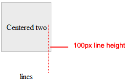
As you can see, text-align doesn’t center it vertically. To fix that, we can set line-height to the same height as the containing div (100px).
div { width:100px; height:100px; }
div p { line-height:100px; }
Note that this assumes the p element has no margin or padding. If you have margin or padding at the top or bottom of the p element, you need to compensate for them accordingly or just simply set padding and margin to 0 to make life easier.
Also, this trick becomes troublesome when there is more than one line of text (i.e. when the text wraps) because there will be a space between the text lines that is equivalent to the line-height value.
It’s your turn to share. Share your own favorite CSS tricks and techniques in the comments.
 Catalin Rosu, a.k.a. Red, is a web designer and developer with over 5 years experience in the industry. You can find articles or tutorials on CSS tips and tricks by visiting his blog at red-team-design.com. You can connect with him on Twitter as @catalinred.

From Phillipe Leybaert:
2010 developer’s problem solving sequence:

A marathoner’s worst nightmare — hitting “the wall†— may be completely avoidable if athletes adhere to personalized pace limits proposed by a biomedical engineer and runner. Benjamin Rapoport’s mathematical formula, published online Oct. 21 in PLoS Computational Biology, shows the speediest pace any marathoner can sustain for the entire race.
 “A 10-second difference in pace per mile could make the difference between success and a dramatic failure,†says Rapoport, of Harvard Medical School and MIT, who experienced his own traumatic wall splat in the 2005 New York City Marathon. He started out pushing too hard, he says, and was out of steam by the last few miles. Rapoport finished, but with a slower time than he wanted.
To avoid this scenario, a runner has to maintain a pace that conserves carbohydrates, the body’s main source of quick-burn energy, all the way to mile 26.2. Rapoport calculates the ideal pace from a measure of aerobic capacity called VO2max, along with a few other variables. VO2max indicates how efficiently a body consumes oxygen.
“This is a unique area that hadn’t been addressed in the medical literature in any substantial way,†says Mark Cucuzzella, a physician and running coach based in Harpers Ferry, W.Va. “He’s lending some hard numbers to what experienced runners and coaches have been doing.â€
A man with a VO2max of 60 — which, after training, is attainable by only the top 10 percent of male runners — can achieve a 3:10 marathon finish time, according to the model. This time happens to be the cutoff for 18- to 34-year-old men to qualify for the Boston Marathon.
Elite male marathoners clock in with a VO2max in the high 70s. The average untrained young man’s number is in the 40s. (Incidentally, Rapoport, who has run 18 marathons, has a VO2max above 70 and breezes through marathons in less than three hours.)
VO2max is usually measured with specialized equipment while someone exercises at maximum exertion, but the value can also be estimated by measuring heart rate while running at a constant pace.
Rapoport’s model also shows that a slightly faster pace can be maintained by consuming a midrace snack.
This carb-eating strategy can help, but it can’t win races, since the body can store only so much fuel, says Cucuzzella, chief medical consultant for the Air Force Marathon and a marathoner himself. “It’s not about how much sugar or spaghetti you eat the night before a race,†he says. “There’s a critical pace.â€
Rapoport plans to put an easy-to-use version of his formula on the Internet to help runners calculate their ideal pace. “My primary goal is to give any marathon runner a qualitative plan for their training,†he says.
Image: Flickr/Stijn Bokhove
See Also:

A couple of years ago, I wrote a story for Boys' Life about privy pit archaeology—the fine art and science of digging up the contents of centuries old toilets. It's less horrific than it sounds, mainly because privy pits weren't just toilets. In the time before regular sanitation service, they did double-duty as landfills. Most of what you pull out of a privy pit is people's trash—a pretty basic element of studying how people lived, and what was going on in their lives.
That's part of why I love this interview with Robin Nagle, the New York City Department of Sanitation's anthropologist-in-residence. As part of her (unpaid) position, Nagle is digging into the cultural and political history of trash in one of the world's largest cities. Turns out, 19th century New York City was a pretty vile place to live, with a sanitation-related death rate to rival medieval London.
Wasn't the public outraged? Why didn't the powers-that-be respond better?
Nagle: Because the corruption at that time was so deep. The money set aside for street cleaning was going into the pockets of the Tweed and Tammany politicians. Eventually, it got to be that it was so dirty for so long, no one thought that it could be any different. Imagine, on your own block, that you can't cross the street, even at the corner, without paying a street kid with a broom to clear a path for you, because the streets were layered in this sludge of manure, rotting vegetables, ash, broken up furniture, debris of all kind. It was called "corporation pudding" after the city government. And it was deep -- in some cases knee-deep.
OnEarth: Digging into New York City's Trashy History
(Via Philip Bump)
Image: Some rights reserved by D'Arcy Norman

As has been oft remarked on this blog, we are in a golden age of astrophysics and cosmology. The data is pouring down from the heavens, in large part from 14 state-of-the-art NASA space telescopes. However, this cornucopia of astronomy is about to come to a crashing stop. We are at the high-water mark, and the next few years are going to see a rapid decline in the number of observatories in space. In five years most, if not all, of these telescopes will be defunct (WMAP is already in the graveyard), and it’s not clear what will be replacing them. This is brought into startling focus by the following plot:

The dotted line shows “todayâ€. In a few years, the only significant US space observatory may be the James Webb Space Telescope (assuming it’s on budget and on time, neither of which are to be taken for granted). The reasons for the current “bubble†in resources, and the impending crash, are myriad and complex. These missions take many years, if not multiple decades, to plan and execute, and we are currently reaping the harvest of ancient boom times. But one aspect subtly implied by this graph is the impact of JWST on space funding. The cost of this mission is now over $5 billion, and continues to rise. Very optimistically, the mission will be in space in 2014, and will continue to consume major developmental resources until then. In an era of fiscal austerity, it is difficult to imagine that the immense ongoing cost of JWST leaves room for much else to be done. The community has gone through the painful exercise of winnowing down its “wish list†to a few key, high-impact missions (as detailed by Julianne here, here, and here; my summary here). It is not immediately apparent that even this fairly “modest†list is attainable given current budget realities. Astronomical data from space over the next decade will pale in comparison to the previous one. We are at a unique moment in the history of space astronomy; it is highly unlikely that we will have fourteen major space astrophysics missions flying again within our lifetimes. We need to make the most of what we have, while we still have it.
 Want to see your tax dollars at work? There’s a more exciting way to do it than watching a road crew pour asphalt for the latest highway expansion. Now you can watch the next Mars rover being built in a clean room at NASA’s Jet Propulsion Laboratory, thanks to a well-positioned webcam.
Curiosity rover, also known as the Mars Science Laboratory, is a hulking beast compared to its smaller cousins, Spirit and Opportunity. The six-wheeled Curiosity is about the size of a car and weighs 2,000 pounds. The rover is scheduled to blast off toward Mars in the winter of 2011, and to reach the planet in August 2012. Its mission: to probe rocks, take pictures, and generally cruise around looking for signs of life, past or present.
The “Curiosity Cam†went live today. It will typically show technicians working from 8 in the morning until 11 at night, Monday through Friday, but the bunny suit-clad engineers sometimes disappear from the shot when their work draws them to other parts of the building. (During their lunch break today one commenter groused that it was boring to stare at an empty room.) Right now the technicians are working on the rover’s instruments, tomorrow they’re scheduled to put the suspension system and wheels on. Be sure to tune in!
Related Content:
80beats: It’s Alive! NASA Test-Drives Its New Hulking Mars Rover, Curiosity
80beats: James Cameron to Design a 3D Camera for Next-Gen Mars Rover
80beats: Spirit Doesn’t Return NASA’s Calls; Rover Might Be Gone for Good
80beats: Mars Rover Sets Endurance Record: Photos From Opportunity’s 6 Years On-Planet
Image: NASA / JPL