![]()
![]()
Read more of this story at Slashdot.
![]()
![]()
Read more of this story at Slashdot.


We're five days and counting from the Federal Communications Commission issuing new net neutrality rules. Nobody beyond insiders at the agency has seen the draft Order in question. But Senator Al Franken (D-MN) has a message for the Commission. If the Order exempts wireless broadband from any nondiscrimination provisions, it might be better to put the whole matter off.
"I am very worried that the draft Order does not do enough to preserve that openness," he wrote to FCC Chair Julius Genachowski. In fact, as presently written, it could do "more harm than doing nothing at all."

Read the comments on this post


 |
Compositing is a skill and process that spans the entire spectrum of creative industries. At the high end, compositing boasts its own specialized profession in film and television post production and visual effects. Dedicated software such as NUKE and Shake have taken the craft to powerful levels of its own, leaving behind the relatively basic compositing toolset of Adobe Photoshop. However, for many graphics practitioners compositing is a vital everyday process — and as with all pixel-pushing endeavors, Photoshop remains the entry point and hub to learning and ultimately mastering the fundamentals of this important skill.
In this article, I’ll share some of my own time-saving tips for compositing in Photoshop. Tips such as these should never replace a solid understanding of your craft; however, being able to adapt a technique to make it work for you is part of being a creative professional. I encourage you to share your own creative compositing tips in the comments to this article, and think about how you have adapted existing techniques to work for you.
One of the challenges we face when compositing is matching the colors and tones of various images to produce a realistic and convincing composite. This method aims to save you from spending time fiddling around with color balances and layers upon layers of adjustments, by showing you a systematic approach that should become second nature and enhance your compositing skill set.

These are the three images we will composite together
In the following example, we will composite three people into one shot and address the differences in lighting, tone and color balance. I use this technique most often as a way of quickly grouping my subjects into a similar tonal range for further global color adjustments.

Masked images placed on background
In the above image, I have masked out the images and placed them together on a background. (Read on for some time-saving tips on masking.)
The key to this technique is selecting one of the images as your target, and then matching the other two images to the tone and lighting of this target. Out of the three images, I like the colors, tones and contrast in figure 1 the most, so I’ve chosen it as our target.
Throughout this article, you will see that I am using Smart Objects. This is an excellent habit to get into when starting any Photoshop workflow. Smart Objects allow us to perform non-destructive transformations on a layer, as well as non-destructive filtering.
We are now entering the exciting world of greyscale tonal evaluation, deep inside the channels of our RGB image — the bare bones of bitmap imaging. We are going to go through each channel of the image and simply try to match the greyscale luminence levels to the target layer:
1. In the Channels palette, solo the red channel by either clicking the channel or using the keyboard shortcut Cmd/Ctrl + 3. You should see the entire image in greyscale, representing the luminance values of red.
2. Select the layer for figure 2 and add a Curves adjustment layer just above it. Make this adjustment layer a clipping mask by Alt/Opt clicking between the two layers in the layer palette. You could also select the adjustment layer and use the keyboard shortcut Cmd/Ctrl + Alt/Opt + G. Now select the red channel inside Curves.

3. Now make a quick, overall visual evaluation of the two images: make a point right in the middle of your curve. If the mid-tones in your target layer (figure 1) look darker than your current layer (figure 2), move the midpoint down to darken the layer to better match your target. If the tones in the target appear lighter than your current layer, move the midpoint up to lighten the layer and better match your target. Use small increments, and continuously use your eyes to evaluate the changes.
If things don’t look quite right still, locate the lightest shade of grey (but not white, as this could be a specular highlight — not something you want to factor in much, with compositing) on the target image, and do the same with figure 2. With your eyes darting between these two greyscale shades, move the white slider on the Curves dialog box until the shades visually match. Next, do exactly the same process with the darkest part of the image, moving the black slider in the Curves dialog.

Curves adjustments for the red channel
4. Swap over to the blue channel, by either clicking the channel in the Channels palette or using the keyboard shortcut Cmd/Ctrl + 4. Select the blue channel within the Curves dialog box. Perform the same adjustment, starting by creating a center point on the curve, and dragging until the mid-tones in your image match those in the target.

Curves adjustments for the blue channel
5. Repeat these adjustments for the green channel. Click the green channel in the Channels palette or use the keyboard shortcut Cmd/Ctrl + 5.

Curves adjustments for the green channel
6. You can now revert back to your RGB composite image by selecting the RGB channel in the Channels palette, or by using the keyboard shortcut Cmd/Ctrl + 2, and review the changes you have made. It is sometimes necessary to reduce the opacity of the adjustment layer if the change has been too drastic. Toggle the visibility of the adjustment layer to see a “before†and “after†for your adjustment. As we are using adjustment layers, our changes are non-destructive, so it is always possible to go back into the channels and curves to make further adjustments at any time.
7. Now, repeat steps 1–6 for figure 3, adjusting the curves per channel as before.

(From left) “before†and “after†adjustments to figure 2

(From left) “before†and “after†adjustments to figure 3
The registered changes make an excellent starting point to a compositing task, providing the perfect platform for further color corrections and adjustments. It is very rare that the image will be perfect at this stage, but the images will be more homogeneous and in a better relative condition to each other than before.

As you get more comfortable with this technique, start adding additional points to your curves by sampling tones from your image using the Curves sampler tool.
Although this is not essentially a compositing technique, it is an especially useful adjustment to perform on a composited image, where the colors and tones often require this type of homogeneous tweaking and subtle realignment. This technique works well as a final adjustment to an image. It has the effect of bringing all colors and tones slightly closer together, whilst still retaining their independence and relevance to the whole image.
1. Add a new Gradient Map Adjustment layer on top of all other layers. You will want to make sure that the layer thumbnail is selected, and not the layer mask thumbnail which is usually selected as default.
2. Next, turn off the visibility of the gradient map layer by deselecting either the eyeball next to the layer, or the eyeball at the bottom of the Gradient Map Adjustment panel.

Open a Gradient Map Adjustment layer, turning off visibility
3. Click on the gradient bar in the gradient map dialog box to open up the gradient editor. As default the gradient map is set to a black to white gradient — not particularly useful for this technique, but actually quite handy at giving us an initial idea of the direction the dark to light tones we will select, should be going in.
We are going to set ten points on the gradient bar — with colors picked directly from our image — going from darkest to lightest. First, click on the black point of the gradient and hover over the image; you should see the Eyedropper tool. Locate the very darkest point of your image and click; if it is black or very close to black, you won’t see much change in your gradient map. Now click just below the gradient bar, a small space away from the gradient point you just changed, to add a new gradient point.
Don’t worry about the distance between the points at this stage; we can change this at the end. Hover over your image again, select the next darkest area, and click. Continue with this process, adding progressively lighter points to the gradient bar all the way down to the white point, changing that to the lightest color in your image. You should aim to have ten points in total, although a few more or less is fine. Try to space out the points evenly before pressing OK.

Sample ten colors from your image on the gradient bar
4. Turn on the visibility of the gradient map layer once more. You will probably see a frightening rendering of your carefully composited image, and you may be wondering now what you have just gone and done. Don’t worry; this is to be expected. Change the gradient map layer’s blending mode to Soft Light and reduce the opacity until you are happy with the image once more. Check the change by toggling the adjustment layer visibility on and off.

Before

After
This is a great, quick trick for compositing that is perfect for those times when simply closing the job is a priority. The effect applies a stylized adjustment which tempers the colors in the image and increases contrast, especially useful in stylized shots such as sports imagery. The effect of the adjustment immediately makes the images more congruent, and this is what compositing is about.
1. Add a new Black & White adjustment layer above all layers you want to affect, and set the adjustment layer’s blending mode to Overlay.

Add the Black & White adjustment layer
2. The great thing about the Black & White adjustment layer is the amount of control it gives you over the desaturation effect you have made. Adjust the color balances in the adjustment panel, and finally reduce the opacity of the layer to an effect you are happy with.

Final image with Black & White adjustment layer (set to overlay)
Often, one of the most difficult aspects of compositing is dealing with the direction light is coming from. Different images may be lit with the same intensity, with the same coloring and within the same tonal range, yet if the direction of the light is different, it can be fatal to the realism of the image.

The images above will be composited into one shot with an efficient, non-destructive way of addressing light directionality.

Masked images placed on background
Once masked and placed on the background, we can see that the light on the two buildings is coming from opposite directions. We could flip one of the buildings horizontally, but this is often not an option in cases where we need to preserve the original angle and direction of an image.
We will choose the light direction we wish to maintain, out of the two, and only work on the layer which we need to change. There are a multitude of methods for painting in shadows, so my main piece of advice is: do it non-destructively. Try this method:
1. Add a new Curves adjustment layer above the layer you wish to affect. Make this adjustment layer a clipping mask by Alt/Opt clicking the line beneath the layer in the layer palette. You could also select the adjustment layer, and use the keyboard shortcut Cmd/Ctrl + Alt/Opt + G.
2. Make a point on the middle of the curve and move downwards to darken the layer. Fill the adjustment layer’s mask with black, and paint with a soft white brush into the layer mask to add shadow.

Shadow added to building
3. Reduce the opacity until you are happy with the effect. You can always paint back into the layer, or use lower-opacity brushes, to get the effect just right.
4. To neutralize the shadow which exists on the wrong side of this same building, repeat the process by adding another Curves adjustment layer and setting it as a clipping mask. Add a mid point to your curve and move the curve upward to lighten the image. Fill the adjustment layer mask with black, and paint with a white brush over the shadow you wish to remove. Reduce the opacity quite a lot, until the shadow is no longer prevalent.
Of course the composited image is still nowhere near perfect, but that change in lighting has made a difference which now lets us imagine these images could exist in the same world; that’s a great starting point for a compositing task.

Shadow is neutralized
Blending modes and tools offer a really powerful set of compositing features which can be used to speed up a lot of tasks. The following is a very simple trick which many people know about, but often forget.
Here is the scenario: you need to composite an image of a glass of milk on an image of a table.


Sourced images for compositing
You have sourced the images you think would work together, and you need to check if the glass will sit realistically on the table, if the angles will line up and if the perspective will be convincing. However, you are so squeezed for time that even a rough trace of the glass would take too long. Luckily for you, the glass of milk has a black background.
Photoshop offers ready-made blending modes for removing black and white from one layer placed on top of another. The Multiply blending mode will render white pixels transparent, while the Screen mode does the same with black pixels. Both blending modes will also affect how other tones in your layer interact with the layer below, so unless this effect is something you are going for, this technique is usually best used to preview images which are on solid black or white backgrounds. This is massively time saving, and is a great way of ensuring you are happy with the image before you commit to masking it out.
This can also help you when sourcing images for a time-sensitive task; knowing that solid black or white backgrounds can be so easily removed for previewing will help you identify the images most appropriate for your use.

Preview of how the elements fit, using only blending modes
Masking out an image is key to almost all compositing workflows, and is often the most time-consuming, tedious part. You have two main areas of masking to choose from when an image needs to be isolated from its surroundings. Manual masking is the preferred method of most top graphics professionals: usually this means using the pen tool, brushing in Quick Mask mode, or using the images channels to create an Alpha Channel mask. Alternatively, automatic masking can be effected from an ever-increasing range of tools and third-party plug-ins within Photoshop. Which method you choose will often be determined by how much time you have, the complexity of the task and the intended use of the image.
Rather than going through every masking technique (there are plenty of resources out there, if you want to learn about how each tool works), here is a quick run down of some time savers.
It might sound obvious as a time-saving trick, but when you need to mask an image in super-quick time, the Quick Mask really can be a life saver. I use it for Web imagery, as the edge details will then not be so apparent at the fixed pixel view the user will have. It is also important to choose an image with decent contrast between your masking subject and its background, or the Quick Selection tool will not do a great job with really tough selections.

Quick Mask tool
You can often save a lot of time masking, if you know and bear in mind what background your masked image will be composited on. Keep you goal in mind; when you need to get the job done, release your mind from the constraints of perfect masking and do the bare minimum!
The Refine Edge tool set is a very powerful, non-destructive set of tools to help you refine any selection that is currently active. It can save you time, in fixing problem edges you may have encountered with other selection tools. The values in the Refine Edge dialog box remain constant from one adjustment to the next, meaning this tool can also be great for ensuring the edges of composited images have the same level of softness, smoothing and contrast.
For Photoshop CS5 only: Photoshop CS5 has a time- and frustration-saving tool lodged inside its Refine Edge feature which can yield outstanding results. When it comes to masking fine details, every designer will tell you that hair is the most challenging. The Edge Detection tool allows you to identify the unwanted colors in your image while intelligently masking edge details; it can effectively identify the finest hair details and mask them out in a non-destructive dialog box, with minimal work on your part, and do a very convincing job.

Refine Edge dialog box
One thing I always do with the Pen tool, is keep a finger hovered over the Alt key; this is really useful as at any point, you can hold it down to move just one handle, and to freeze the corresponding handle in place. You can also Alt-click any point on your path to toggle between a corner point and a smooth point.
There is no shortcut to becoming proficient on your chosen tool or in your chosen craft, be it Photoshop or anything else; but once you have mastered a tool and understand its power, it is then up to you to do what you do best: be creative with it. This means looking at those everyday tasks you do, the time limitations you are faced with and your ability to improvise. Look under the hood once in a while, and be creative and inventive with everything you do!
(wcp) (vf)
© Daniel Durrans for Smashing Magazine, 2010. | Permalink | Post a comment | Add to del.icio.us | Digg this | Stumble on StumbleUpon! | Tweet it! | Submit to Reddit | Forum Smashing Magazine
Post tags: compositing, photoshop, tools
![]()
Established in 1989, Novabase is the leading company in IT services, consulting, and implementation. It has 2,000 employees and revenues of over 292 million Euros. A hybrid of companies like IBM, Accenture, and EDS as our Portuguese tipster explained. Self-admittedly "Big in Portugal, but small in the world" Novabase is looking to expand its presence and recognition around the world. This month they introduced a new identity designed by Lisboa-based Albuquerque.
Brand video.
Footage of unveiling. Skip to 1:30 for the real fireworks. Literally.
It's unfortunate that the new logo is such an incomprehensible eyesore — actually, the logo might be an eyesore — because the rest of the identity is quite delightful. The illustrations, the colors, the pace of the animation all have a very nice retro quality but with a contemporary flair. Even if the illustrations are mostly abstract, they manage to convey a company making all kinds of connections and actively engaging in business. Back to the logo… although it's supposed to be just an "N" it certainly reads as "No" which is not a good thing, but let's assume that most people just see an "N," then what are we supposed to make of that giant wart? Is it an eye? A portal? An incubator of red eggs? The transition from sharp-edges to a hand-drawn effect within the "N" is not contrasting enough, so it almost looks like someone pulled the wrong bezier curves. The wordmark somehow also feels odd and not so well integrated with the icon.
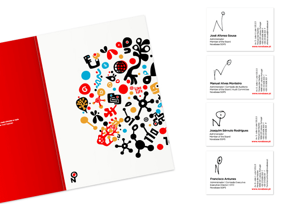
Folder and business cards (where each person draws their own version of the logo).
![]()
Set of icons to represent their vision.
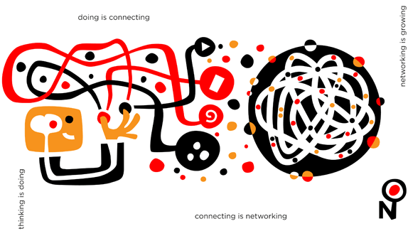

The logo makes just a little more sense when seen in the context of the whole system, which is much more engaging and interesting than the logo itself. The whimsical style is a rarity in big corporations so it's nice to see some of it start to seep into corporate identity.
Thanks to Manuel de Freitas for the tip.


If these reports are accurate, Facebook’s annual revenue would have more than doubled since last year, when the company made around $800 million.
While astronomical compared to most startups’ revenues, these figures are hardly a surprise to anyone familiar with Facebook’s advertising and virtual currency advances in the past 12 months.
The company now competes with Google for online ad dollars from major brands as well as small businesses that need targeted marketing with high ROI. In fact, Facebook serves around 50 billion display ads per month and is on track to serve 1 trillion display ads for all of 2010.
And when it comes to revenue from virtual currency — revenue that comes, in a roundabout way, directly from Facebook users themselves — Facebook is seeing more cash all the time. The blockbuster success of casual games from studios such as Zynga add up to more coin in Facebook’s coffers when users pay with Facebook Credits; for every dollar the user spends on Facebook Credits, the social network gets 30 cents.
Virtual currencies aside, the lion’s share of Facebook’s revenue still comes from advertising and marketing — a game that Facebook is really just beginning to play well.
Right now, Google and Facebook are both ramping up for an epic battle for location-based ad dollars, especially where small and medium-sized businesses are concerned. How Facebook performs in 2011 may have a lot to do with how it competes in offering a compelling and effective location-based marketing platform for businesses of all sizes.
More About: facebook, facebook credits, Revenue
For more Business coverage:

Most people know by now that Pluto has been downgraded. Astronomers have decided that, conceptually, we should reserve the word "planet" for the small number of dominant bodies in the solar system. Pluto doesn't come close to making the cut. But it didn't just get shoved into the corner as "insignificant object," it got to be part of a brand new class of objects never before defined, the "dwarf planets."
Now, before you complain that, clearly, by virtue of the power of the English language, a "dwarf planet" must certainly be a planet first, a dwarf second, I would just like to mention two things. First all adjective noun combination in the English language are not noun first, adjective second. A matchbox car is, in fact, not a real car. It's OK if a dwarf planet is not a real planet. Second, though, I will acknowledge that the language is unfortunate and misleading. I preferred the term "planetoid" myself, rather than the (intentionally?) misleading "dwarf planet."
Still, forgetting the vagaries of language, we are left with dwarf planets which are not planets. How many are out there besides Pluto? And what is a dwarf planet? The International Astronomical Union (the group responsible for all astronomical nomenclature) has officially declared there to be five dwarf planet (in order of mass: Eris, Pluto, Makemake, Haumea, Ceres), and we are likely in for a dry spell on new dwarf planets. The preliminary searches of the sky are all but complete, and (as far as I know) no one has any new objects the size of Haumea hiding in their back pockets. We'll probably be at five official dwarf planets for a while.
Now is a good time, then, to remind ourselves what a dwarf planet really is.
When the final vote on the definition of "planet" was made, and the eight dominant bodies in the solar system were declared (quite rationally) a class separate from the others, a new class of objects was defined. The "dwarf planets" are all of those objects which are not one of the eight dominant bodies (Mercury through Neptune) yet still, at least in one way, resemble a planet. The best description I can come up with is that a dwarf planet is something that looks like a planet, but is not a planet. The official definition is that dwarf planets are bodies in the solar system which are large enough to become round due to their own gravitational attraction.
Why do astronomers care about round? If you place a boulder in space it will just stay whatever irregular shape it is. If you add more boulders to it you can still have an irregular pile. But if you add enough boulders to the pile they will eventually pull themselves into a round shape. This transition from irregularly shaped to round objects is important in the solar system, and, in some ways, marks the transition from an object which is geologically dead and one which might have interesting processes worthy of study.
[Haumea is, of course, not round, but that is only because it is spinning so fast. If you stopped it spinning it would become a sphere. That still counts.]
So how many dwarf planets are there? Five, of course. The IAU says so.
But let's ask the more scientifically interesting question: how many (non-planet) objects in the solar system are large enough to be round due to their own gravitational pull?
Still five, right?
Well, no. Here is where the IAU and reality part ways.
There are many more objects that precisely fit the definition of dwarf planet but that the IAU chosen not to recognize. But if the category of dwarf planet is important, then it is the reality that is important, not the official list. So let's examine reality.
So how many dwarf planets are there? Ceres is still the only asteroid that is known to be round. Vesta, the next largest, is close, but has a large crater blasted out of its side that makes it distinctly oblong. After that it gets complicated. All of the rest of the new dwarf planets are in the distant region of the Kuiper belt, where we can't actually see them well enough to know for sure if they are round or not.
While we can't see most of the objects in the Kuiper belt well enough to determine whether they are round or not, we can estimate how big an object has to be before it becomes round and therefore how many objects in the Kuiper belt are likely round. In the asteroid belt Ceres, with a diameter of 900 km, is the only object large enough to be round, so somewhere around 900 km is a good cutoff for rocky bodies like asteroids. Kuiper belt objects have a lot of ice in their interiors, though. Ice is not as hard as rock, so it less easily withstands the force of gravity, and it takes less force to make an ice ball round.
The best estimate for how big an icy body needs to be to become round comes from looking at icy satellites of the giant planets. The smallest body that is generally round is Saturn's satellite Mimas, which has a diameter of about 400 km. Several satellites which have diameters around 200 km are not round. So somewhere between 200 and 400 km an icy body becomes round. Objects with more ice will become round at smaller sizes while those with less rock might be bigger. We will take 400 km as a reasonable lower limit and assume that anything larger than 400 km in the Kuiper belt is round, and thus a dwarf planet. We might be a bit off in one direction or another, but 400 km seems like a good estimate.
How many objects larger than 400 km are there in the Kuiper belt? We can't answer this question precisely, because we don't know the sizes of more than a handful of Kuiper belt objects, but, again, we can make a reasonable guess. If we assume that the typical small Kuiper belt object reflects 10% of the sunlight that hits its surface we know how bright a 400 km object would be in the Kuiper belt. As of now, about 50 objects this size or larger are known in the Kuiper belt (including, of course, Eris, Pluto, Makemake, and Haumea). Our best estimate is that a complete survey of the Kuiper belt would double this number, so there are roughly 100 dwarf planets in the Kuiper belt, of which 50 are currently known.
The new dwarf planets in the solar system are very different from the previous 8 planets. Most are so small that they are smaller across than the distance from Los Angeles to San Francisco. They are so small that about 30,000 of them could fit inside the earth.
Does it matter how many dwarf planets we say there are?
I think the answer is "yes." If you believe that there are only 4 dwarf planets in the Kuiper belt then you place an oversized importance on those 4 objects and you get an exceedingly warped picture of what the outer solar is like. The important thing about the Kuiper belt is that beyond Neptune there are many many many objects with hundreds being large enough to be round. The four "IAU Dwarf Planets" in the outer solar system are all fascinating objects -- hey! I discovered 3 of them, I must think there are at least a little interesting -- but it would be a gross exaggeration to think of them as the only objects, or even the only important objects, in the fascinating region of space beyond Neptune.
I love dwarf planets. All hundred of them or so.


