To conclude our selections on a positive note — although I bet Part I was infinitely more satisfying — here is Part II: The Best.
See also Part I: The Worst.

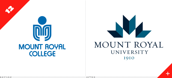
Mount Royal University
Designed by: Cundari
Release date: February 2010
There are two key elements that put this logo in this round-up. The first is that it was able to escape the typical antics associated with university redesigns where alumni and students get all offended and someone asks how come the students in the art program didn't design the logo for free. Second, where they could have used Trajan, they used Hoefler & Frere-Jones' Requiem. Royal!
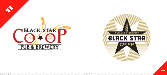
Black Star Co-Op Pub and Brewery

Designed by: Ptarmak
Release date: June 2010
It's easy to get away with cool stuff when it comes to über local co-op breweries. So if you are indeed getting away with it, make it count and make it so cool that all you want to do is put down that mouse, turn off the computer and head for a beer.
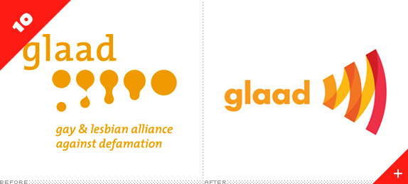
GLAAD
Designed by: Lippincott
Release date: March 2010
For the Gay & Lesbian Alliance Against Defamation "amplifying" is a key word and this lovely, simple icon translates it to an icon in a bold, vibrant, and memorable way. Pretty colors and pretty typography help make it a stand-out in the non-profit category of this year's crop.
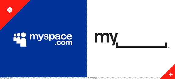
Myspace
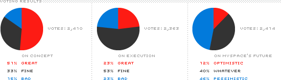
Designed by: In-house
Release date: October 2010
Left behind as the multitudes flocked to Facebook and Twitter, Myspace is trying to claw its way back to relevance as we launch into the second decade of the twenty-first century and they are doing it with a rather unconventional identity which deserves to be applauded. While there are still holes to fill (pun!) the concept shows promise… it mostly depends on whether people care about Myspace at all. If they don't that blank space might end up being too poignant for its own good.
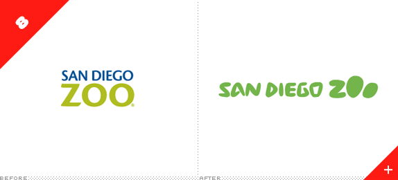
San Diego Zoo
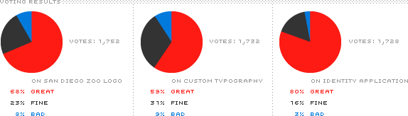
Designed by: Landor
Release date: October 2010
At the intersection of the International Typographic Style and The Flinstones — or not — lies the new identity for the San Diego Zoo, which encompasses the zoo itself (one of the largest in the world), the San Diego Zoo Safari Park, and San Diego Zoo's Institute for Conservation Research. With this redesign they all now share a unique, playful identity despite being three relatively disparate entities.
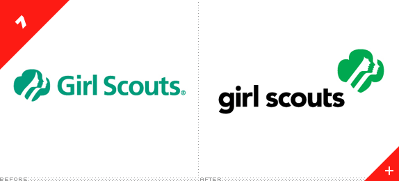
Girl Scouts of the USA
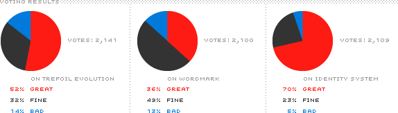
Designed by: Original Champions of Design
Release date: July 2010
Like in the Worst category, a Saul Bass logo gets the "Before" treatment, except that instead of getting the axe, it went under the scalpel and shears for a few modernifications. The much debated bang was a nice addition if you ask me and the perkier noses gave it a more youthful look. But the "trefoil" icon was only part of a larger revitalization of the brand that resulted in a vibrant and playful array of identity elements.
CNN en Español
Designed by: In-house
Release date: November 2010
In terms of visual puns, this was the best of the year — although it was probably the only of the year. Despite some commenters asking if this was supposed to be read as CÑÑ, or questioning the grammatical correctness of it as an acronym, or some other party-pooping minutia, this is a great concept with a swift execution that doesn't pander to the lowest common deñomiñator.
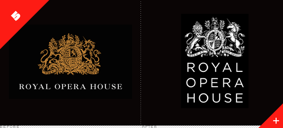
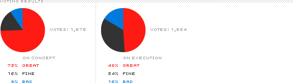
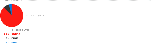
Royal Opera House
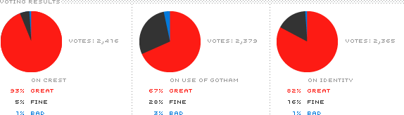
Designed by: SomeOne
Release date: August 2010
And in terms of flawless execution, this was the best of the year. Although crests are not the most popular visual device in our industry this one got almost perfect marks for being expertly crafted and with a proper inverse version of the original that looks so hot against dark backgrounds. Even the use of Gotham, which typically goes crucified, was well received.
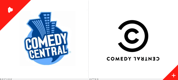
Comedy Central
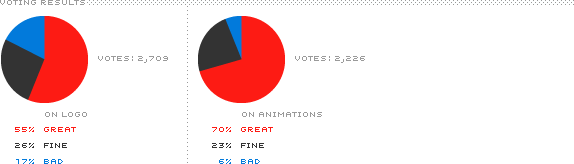
Designed by: thelab
Release date: December 2010
While some people were expecting the equivalent of a Gallagher watermelon smash in the Comedy Central redesign what we got instead was the Louis CK equivalent: considerate funny, if you will. Through a very simple device that mocks and co-opts the copyright symbol, Comedy Central will be deploying a very lively on-air graphics package in 2011. It's no LOL, but that's what John Stewart, Stephen Colbert, and Cartman are for.
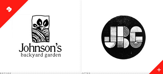
Johnson's Backyard Garden
Designed by: Ryan Rhodes
Release date: July 2010
Like the 11th spot in the Best category, this identity is for a relatively small enterprise, allowing for a bit more exploration. (Both of these entries also happen to be by Austin designers for Austin companies — make of that what you will). For JBG, a range of texturally delicious wood blocks serve as the source material to create an infinite range of applications that all share the same DNA.
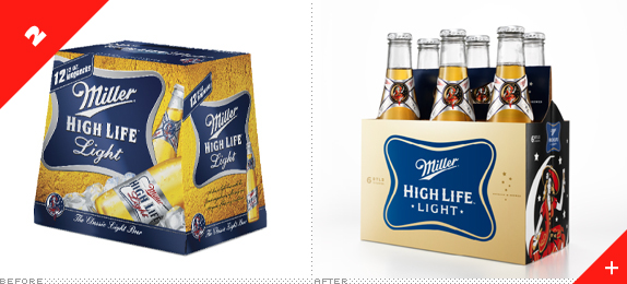
Miller High Life
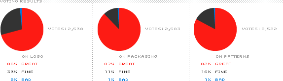
Designed by: Landor
Release date: July 2010
As a general rule, mass consumer products don't fare very well on Brand New, since they are generally gaudy explosions of shadows, bevels, and fake droplets of water to signify freshness. So it was rather surprising to see the comprehensive identity and packaging for Miller High Life be good. Actually: very, really good. The redesign resulted in a sophisticated, bold, crisp, and fun look for all the various beer options and it got high marks all around. The beer ain't that great, but at least it looks great.
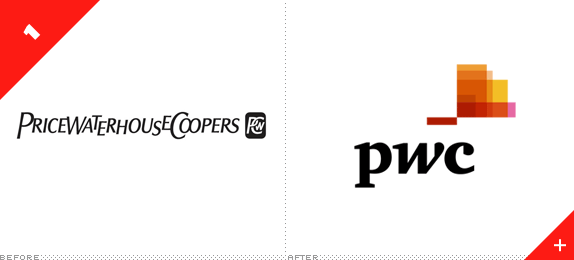
PwC
Designed by: Wolff Olins
Release date: September 2010
Even though the logo didn't get high marks and plenty of commenters went WTF about what the icon stood for, the overall identity represents one of the most drastic redesigns all year and in a category — global corporations — that is notoriously conservative and difficult to create something beyond a wordmark set in a sans serif and colored blue. The old logo was pathetic, even if some "liked" it. It had to go. And in its place we got an extremely refreshing and vibrant identity that adapts so nicely to dozens of different communication materials. Not only does Wolff Olins deserve credit for executing this but PwC for adopting and implementing it.

Don't forget to cast your vote about this post online
