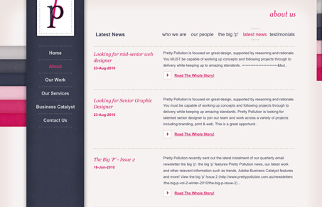
Really beautiful colors on this design, I also love the dark blue with that slight texture. It almost feels like cloth. I like the blocky nature of the elements in contrast to those colors and slight texture. I like that slide out box in the top right, I like the idea of it, but not the final execution of the elements within that box. Really nice looking website!
Posts Tagged ‘Big Image’
lostworldsfairs.com/moon/
12
Oct
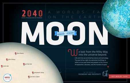
This is the “Moon†website or page from the Lost World’s Fairs website project designed by Jason Santa Maria.
I love this design for “Moonâ€, the visual depth is really nice. I also love the movement as you scale your browser window down and then back up. The little illustrations are sweet too. It’s really hard to believe this is done with web fonts.
No Comments
Posted in Google Reader

