The second speaker at this mornings An Event Apart in Boston is Whitney Hess. Here goes with the liveblogging…
Whitney’s talk is about design principles. As a consultant, she spends a lot of time talking about UX and inevitably, the talk turns to deliverables and process but really we should be establishing a philosophy about how to treat people, in the same way that visual design is about establishing a philosophy about how make an impact. Visual design has principles to achieve that: contrast, emphasis, balance, proportion, rhythm, movement, texture, harmony and unity.
Why have these principles? It’s about establishing a basis for your design decisions, leading to consistency. It’s about having a shared vision and they allow for an objective evaluation of the outcome.
But good design doesn’t necessarily equate to a good experience. The Apple G4 Cube was beautifully designed but it was limited in where and how it could be used.
Good design can equal good experience. That’s why Whitney does what she does. But she needs our help. She’s going to propose a set of design principles that she feels are universally applicable.
- Stay out of people’s way. The Tumblr homepage does this. You can find out more about Tumblr further down the page, but it doesn’t assume that’s what you want to have thrust in your face. Instead the primary content is all about getting started with Tumblr straight away.
- Create a hierarchy that matches people’s needs. This is about prioritisation. Mint.com uses different font sizes to match the hierarchy of importance on its “ways to save†page. Give the most crucial elements the greatest prominence. Use hierarchy to help people process information.
- Limit distractions. Don’t put pregnancy test kits next to condoms. On the web, Wanderfly does this right: one single path, completely self-contained. Multi-tasking is a myth. Let people focus on one task. Design for consecutive tasks, not concurrent.
- Provide strong information scent. Quora does a great job at this with its suggested search options. It’s actively helping you choose the right one. People don’t like to guess haphazardly, they like to follow their nose.
- Provide signposts and cues. Labelling is important. The Neiman Marcus e-commerce site does this right. It’s always clear where you are: the navigation is highlighted. You’d think that in 2011 this would be standard but you’d be surprised. Never let people get lost, especially on the web where there’s a limitless number of paths. Show people where they came from and where they’re going.
- Provide context. A sign that says “Back in 30 minutes†isn’t helpful if you’re in a hurry—you don’t know when the sign was put up. On the web, AirBnB provides everything you need to know on a listing page, all in one place. It’s self-contained and everything is communicated up-front.
- Use constraints appropriately. Preventing error is a lot better than recovering from it. If you know there are restrictions ahead of time, stop people from going down that route in the first place.
- Make actions reversible. (illustrated with a misspelled Glee tattoo) Remember The Milk provides an “undo?†link with almost every action. There’s no such thing as perfect design; people will make errors, so you should have a contingency plan. Undo is probably the most powerful control you can provide to people.
- Provide feedback. How do you know when you’re asthma inhaler is empty? You don’t. You won’t find out until the worst moment. On the web, loading indicators provide useful feedback. Tell people that a task is underway. Design is a conversation, not a monologue.
- Make a good first impression. Vimeo has one of the best first-time user experiences: “Welcome. You’re new, aren’t you?†Establish the rules, set expectations about the relationship you’re about to initiate on your site.
The basis for all of these principles are Aristotle’s modes of persuasion: logos, ethos and pathos—the rhetorical triangle.
Are universal principles enough? Probably not. Every company is different. Some companies publicly share their principles. Take Google’s “Ten Principles That Contribute to a Googley User Experience†as an example, or Facebook’s design principle …or Windows design principles for a good laugh. Look beyond the tech world too, like Charles and Ray Eames or Burning Man’s design principles.
So what are your company’s principles? Without principles, we don’t know what we’re trying to achieve. Here are some guiding ideas:
- Research available principles from elsewhere.
- Gather, list and print out the business goals and user needs.
- Brainstorm with key collaborators.
- Narrow down to no more than 10, preferably 7.
- Make sure they don’t overlap.
- Make them peppy.
Use the design principles at kickoff meetings, when your prioritising features, brainstorming sessions, design critiques, stakeholder presentations, resolving conflict, postmortems and web metric analysis: evaluating the success of the feature or product.
Remember, user experience is the establishment of a philosophy of how to treat people. Help people make their lives better.
Tagged with
aea
aneventapart
aeabos
liveblogging
conference
whitneyhess
ux
design
principles
 Emily Singer, a journalist with MIT’s Technology Review, has an extensive series of articles and interviews on “The Measured Life“. She was at the Quantified Self Conference a month ago, seems to have talked with everyone, and has since been writing up a storm.
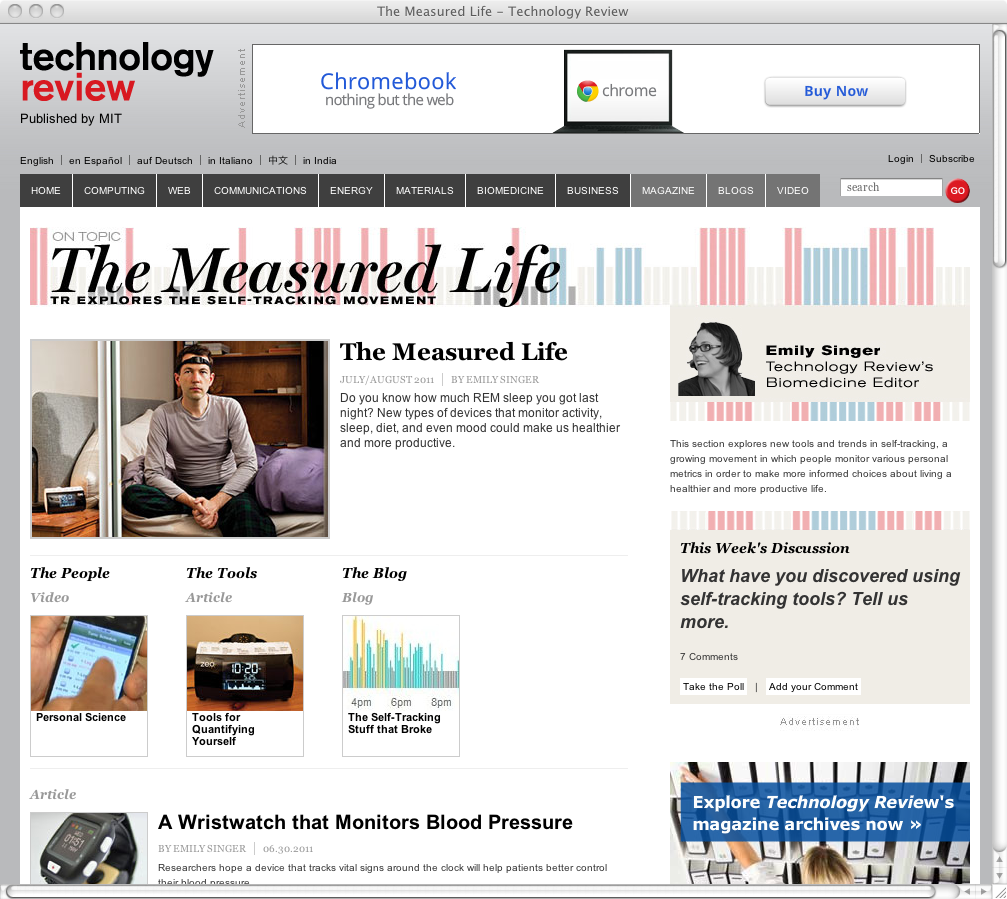 There’s much, much more on the web.