RSS
 

Posts Tagged ‘CSS’

How to Bulletproof @font-face Web Fonts

10 Oct

Advertise here with BSA


How to Bulletproof @font-face Web Fonts

You’re interviewing for your dream job, and you’re ready to kick some butt. A small group is gathered around a conference phone and some coding exercises, and they’re pulling up your portfolio on a projector so that everyone can review it.

It looks great, except for one thing: All of your beautiful web fonts are gone and have been replaced with… Arial.

No, this isn’t just a bad dream: It actually happened to me recently when I interviewed at a web design company (352 Media Group). It was painful. I ended up getting the job anyway, but the experience made me realize that even following best practices recommended by industry-leading developers such as Paul Irish’s Bulletproof @font-face syntax and in the current situation where there’s much wider browser support for @font-face, web fonts just aren’t foolproof.

Getting them just right on most platforms and browsers takes work. Below, we will discuss some of the common issues with using web fonts.

Web Fonts Aren’t Displaying

The disappearing web font has to do with HTTP response headers.

Firefox and IE treat web fonts a little like JavaScript documents. For security reasons, a website on a different domain generally cannot display a web font that’s been loaded from another domain. (The Mozilla Developer Network has more information on this policy than you’d ever want to know.)

In cases were you want to allow cross-domain access to such files, the server that hosts the files can include an Access-Control-Allow-Origin header in its HTTP responses. This header can specify specific domains that are allowed to access the files, or it can just list an asterisk to let everyone access the files. The Google Font API does the latter, which makes the service available to all websites.

Workaround for Web Servers that Remove Response Headers

On some networks — including, apparently, that of the office where I interviewed — this header is removed before the response makes it to the web browser. Perhaps an overzealous firewall is to blame. As a result, Firefox and IE refuse to render the web fonts.

Chrome and Safari, on the other hand, happily display the fonts anyway.

Unpredictable networks are a fact of life, but luckily there’s a way to address them. You can use the WebFont Loader, a JavaScript tool that was co-developed by Google and TypeKit to fail over to fonts that are hosted elsewhere where necessary.

The code to fail over to local fonts goes inside your <head> tag and looks something like this:

<script>
WebFontConfig = {
  google: { families: ['FontOne', 'FontTwo'] },
    fontinactive: function (fontFamily, fontDescription) {
   //Something went wrong! Let's load our local fonts.
    WebFontConfig = {
      custom: { families: ['FontOne', 'FontTwo'],
      urls: ['font-one.css', 'font-two.css']
    }
  };
  loadFonts();
  }
};

function loadFonts() {
  var wf = document.createElement('script');
  wf.src = ('https:' == document.location.protocol ? 'https' : 'http') +
    '://ajax.googleapis.com/ajax/libs/webfont/1/webfont.js';
  wf.type = 'text/javascript';
  wf.async = 'true';
  var s = document.getElementsByTagName('script')[0];
  s.parentNode.insertBefore(wf, s);
}

(function () {
  //Once document is ready, load the fonts.
  loadFonts();
  })();
</script>

If the client is on a network that deletes the Access-Control-Allow-Origin header, her browser will load the font from Google, fail to display it, and then load your locally-hosted font.

This is slower than just loading fonts from Google. Newer versions of Firefox will take a solid three seconds before they give up trying to display the font from Google, but it’s better than no web fonts at all, and it won’t affect users who aren’t on such networks.

Debugging Response Header Issues with Developer Tools

If you ever have to troubleshoot a problem like this, the developer tools in most browsers have a Net panel where you can inspect file requests and the associated headers. For example, for Firefox you can use Firebug and for Google Chrome, there’s Chrome Developer Tools.

Below is a screenshot of response headers using Firebug. As you can see, the Access-Control-Allow-Origin response header’s value is set to *, which means the document is able to be requested and rendered from other websites.

Troubleshooting with VPN Services

VPN services such as TunnelBear are also helpful in troubleshooting these sorts of problems. Because VPNs encrypt all traffic between you and the VPN provider, your local network won’t be able to mess with your headers.

If the site looks fine through the VPN but breaks when you connect without a VPN, it’s likely that there’s a problem with your local network.

Flash of Unstyled Text (on Slow Internet Connections)

A slow connection can result in a flash of unstyled text — what Paul Irish abbreviates as FOUT — while your web fonts load.

By default, Safari, Chrome, and IE 6-8 won’t display text at all until the text’s associated web font loads.

IE9, on the other hand, will display text in a default font while the web font loads — even in compatibility mode.

Firefox 3.5 will do the same, but versions 4 and later will wait three seconds for a font to load. If the font still hasn’t loaded at that point, only then will the browser display unstyled text. A similar "waiting period" is planned for WebKit.

Browser How It Handles Web Font Loading
Safari Won’t display any text until web font loads
Google Chrome Won’t display any text until web font loads
Internet Explorer 8 and below Won’t display any text until web font loads
Internet Explorer 9 Displays default/fallback font until web font loads
Firefox 3.5 and below Displays default/fallback font until web font loads
Firefox 4.0 and up Waits 3 seconds for a font to load

You might get a more noticeable FOUT in cases where you have to fail over to a locally-hosted font, but you can hide unstyled text using the WebFont loader, as we’ll discuss shortly.

It’s easy to miss such behavior on a fast connection. Most web designers are probably not on dial-up, after all.

Not everyone will have the same experience, though: According to a 2010 survey, 50% of broadband users in the US are subscribed to their ISP’s basic service. There are still some towns that have limited or no broadband Internet access.

The National Broadband Map can help you figure out whether your users fall into this group. Users outside of the U.S. may have even flakier connections, or they might have great connections but live far from your server. A recent report noted that the average luxury site takes 16.2 seconds to load in China. What will your users see while this happens?

Simulating a Slow Internet Connection

There are a variety of tools that can simulate a slow connection so that you can see how your users might experience your site. I personally like Sloppy, which is free, runs on all platforms, and (unlike some other tools) requires no command-line geekery.

A few caveats: redirections and absolute links will send you out of Sloppy’s slowed-down environment, and browsers often cache these redirections. To be sure that you’re really getting a slowed-down page, make sure your address bar displays an IP address instead of a domain, and clear your browser’s cache if you’re continually getting redirected to a web page other than the one that you specified in Sloppy.

You can make the FOUT less noticeable in the same way that you’d tackle other web performance problems: Compress files using gzip, ask browsers to cache the files far into the future, only request the versions of the fonts that you really need, etc. Some delay is inevitable, though.

The WebFont Loader can help here, too. The script applies a CSS class called wf-loading to text for which web fonts haven’t loaded yet, and you can use this class to force browsers to hide or show unstyled text while web fonts load.

You could even get really granular. Maybe your logo uses a web font, so you don’t want it to display at all until the font has loaded, but want the content area to display in Arial while web fonts load.

What’s best for your site depends on how you use web fonts, how different the fonts are from system fonts, and how fast you expect your users’ connections to be.

Web Fonts Render Inconsistently on Different Operating Systems

In addition to issues with varied connections and browsers, it’s also important to consider how fonts are rendered across operating systems.

Mac OS and Windows have fundamentally different philosophies when it comes to rendering text. Mac OS uses anti-aliasing to smooth text, while Windows Vista and 7 use a technology called ClearType to render more detailed text. (Read more about ClearType here.)

Windows Font Rendering

Windows XP doesn’t do either (at least by default), and Linux might do any number of things depending on how it’s configured.

Windows also has two different rendering modes: the newer DirectWrite and the older GDI. The two modes can produce substantially different results.

IE9 and Firefox use DirectWrite, and they can use hardware acceleration to render pages. If hardware acceleration isn’t available or has been turned off, fonts don’t look quite as smooth in these browsers.

Chrome uses GDI, and Firefox 7 is slated to use GDI for common fonts such as Arial.

Safari actually lets you switch between Windows-style rendering and Mac OS-style smoothing — see the "font smoothing" option in the "Appearance" section of the Safari preferences dialog.

Windows Standard uses GDI, while "Light," "Medium," and "Strong" mimic Mac OS’s font rendering. Try toggling between Windows Standard and Medium, and you’ll see that the font heights switch back and forth. The takeaway here is that the size of text can vary, so it can’t be relied on to exactly position other elements.

Another variable on Windows is ClearType, which takes advantage of the fact that pixels on LCD screens are comprised of red, green, and blue vertical bars. It treats these bars as narrow pixels, allowing Windows to display more detail in text.

At best, ClearType makes text sharper and more readable. At worst, it creates colored "halos" around text — including your lovely web fonts. What you see depends largely on whether you’ve used the "Adjust ClearType Text" tool to configure ClearType for your display. If the software isn’t configured properly, it can actually make text harder to read.

Mac OS Font Rendering

It’s worth noting, of course, that not everyone is wild about Apple’s font rendering either; some Windows users argue that Mac OS sacrifices readability for the sake of making text prettier.

Test in Different Operating Systems

The differences in how operating systems render fonts mean that it’s worth testing your site on two different platforms.

If you’re a Windows user, it’s useful to test your site on Mac OS once in a while (or at least try Safari’s font smoothing on Windows).

If you’re a Mac OS user, you probably already have a copy of Windows somewhere so that you can test on IE. It’s worth trying WebKit or Firefox on Windows so that you can see how different rendering modes affect your site.

It might be tempting to sidestep this whole process and use Cufón to render fonts as vector images, which are then smoothed in much the same way as text on Mac OS is.

It might be equally tempting to use a CSS tweak to disable ClearType in older versions of IE. The problem is that doing so violates users’ expectations and ignores their preferences.

The user may have already configured ClearType or other settings to her liking, and she likely expects text in web pages to look the same as text in a word processor or dialog box. (It’s also worth noting that web fonts are faster than Cufón, particularly when you’re working with large amounts of text.)

Conclusion

It’s difficult to completely account for all situations, when it comes to web fonts. The best we can do is make sure we implement safeguards and fallback mechanisms for the less-than-ideal web browsing scenario.

It’s inevitable: Fonts will look different across browsers and operating systems, and they will perform differently across various connections. This is okay (even good)!

With a little testing and tweaking, you can accommodate users on broadband and dial-up, Macs and PCs, corporate networks and coffee shop Wi-Fi.

Related Content

About the Author

Ryan DeBeasi is an interactive designer at the web design company 352 Media Group, which offers custom web design and development for large corporations and small business web design. He’s passionate about front-end development, user experience and writing. His portfolio no longer breaks on corporate networks. Follow him on Twitter: @RyanDeBeasi.


How to Bulletproof @font-face Web Fonts

10 Oct

Advertise here with BSA


How to Bulletproof @font-face Web Fonts

You’re interviewing for your dream job, and you’re ready to kick some butt. A small group is gathered around a conference phone and some coding exercises, and they’re pulling up your portfolio on a projector so that everyone can review it.

It looks great, except for one thing: All of your beautiful web fonts are gone and have been replaced with… Arial.

No, this isn’t just a bad dream: It actually happened to me recently when I interviewed at a web design company (352 Media Group). It was painful. I ended up getting the job anyway, but the experience made me realize that even following best practices recommended by industry-leading developers such as Paul Irish’s Bulletproof @font-face syntax and in the current situation where there’s much wider browser support for @font-face, web fonts just aren’t foolproof.

Getting them just right on most platforms and browsers takes work. Below, we will discuss some of the common issues with using web fonts.

Web Fonts Aren’t Displaying

The disappearing web font has to do with HTTP response headers.

Firefox and IE treat web fonts a little like JavaScript documents. For security reasons, a website on a different domain generally cannot display a web font that’s been loaded from another domain. (The Mozilla Developer Network has more information on this policy than you’d ever want to know.)

In cases were you want to allow cross-domain access to such files, the server that hosts the files can include an Access-Control-Allow-Origin header in its HTTP responses. This header can specify specific domains that are allowed to access the files, or it can just list an asterisk to let everyone access the files. The Google Font API does the latter, which makes the service available to all websites.

Workaround for Web Servers that Remove Response Headers

On some networks — including, apparently, that of the office where I interviewed — this header is removed before the response makes it to the web browser. Perhaps an overzealous firewall is to blame. As a result, Firefox and IE refuse to render the web fonts.

Chrome and Safari, on the other hand, happily display the fonts anyway.

Unpredictable networks are a fact of life, but luckily there’s a way to address them. You can use the WebFont Loader, a JavaScript tool that was co-developed by Google and TypeKit to fail over to fonts that are hosted elsewhere where necessary.

The code to fail over to local fonts goes inside your <head> tag and looks something like this:

<script>
WebFontConfig = {
  google: { families: ['FontOne', 'FontTwo'] },
    fontinactive: function (fontFamily, fontDescription) {
   //Something went wrong! Let's load our local fonts.
    WebFontConfig = {
      custom: { families: ['FontOne', 'FontTwo'],
      urls: ['font-one.css', 'font-two.css']
    }
  };
  loadFonts();
  }
};

function loadFonts() {
  var wf = document.createElement('script');
  wf.src = ('https:' == document.location.protocol ? 'https' : 'http') +
    '://ajax.googleapis.com/ajax/libs/webfont/1/webfont.js';
  wf.type = 'text/javascript';
  wf.async = 'true';
  var s = document.getElementsByTagName('script')[0];
  s.parentNode.insertBefore(wf, s);
}

(function () {
  //Once document is ready, load the fonts.
  loadFonts();
  })();
</script>

If the client is on a network that deletes the Access-Control-Allow-Origin header, her browser will load the font from Google, fail to display it, and then load your locally-hosted font.

This is slower than just loading fonts from Google. Newer versions of Firefox will take a solid three seconds before they give up trying to display the font from Google, but it’s better than no web fonts at all, and it won’t affect users who aren’t on such networks.

Debugging Response Header Issues with Developer Tools

If you ever have to troubleshoot a problem like this, the developer tools in most browsers have a Net panel where you can inspect file requests and the associated headers. For example, for Firefox you can use Firebug and for Google Chrome, there’s Chrome Developer Tools.

Below is a screenshot of response headers using Firebug. As you can see, the Access-Control-Allow-Origin response header’s value is set to *, which means the document is able to be requested and rendered from other websites.

Troubleshooting with VPN Services

VPN services such as TunnelBear are also helpful in troubleshooting these sorts of problems. Because VPNs encrypt all traffic between you and the VPN provider, your local network won’t be able to mess with your headers.

If the site looks fine through the VPN but breaks when you connect without a VPN, it’s likely that there’s a problem with your local network.

Flash of Unstyled Text (on Slow Internet Connections)

A slow connection can result in a flash of unstyled text — what Paul Irish abbreviates as FOUT — while your web fonts load.

By default, Safari, Chrome, and IE 6-8 won’t display text at all until the text’s associated web font loads.

IE9, on the other hand, will display text in a default font while the web font loads — even in compatibility mode.

Firefox 3.5 will do the same, but versions 4 and later will wait three seconds for a font to load. If the font still hasn’t loaded at that point, only then will the browser display unstyled text. A similar "waiting period" is planned for WebKit.

Browser How It Handles Web Font Loading
Safari Won’t display any text until web font loads
Google Chrome Won’t display any text until web font loads
Internet Explorer 8 and below Won’t display any text until web font loads
Internet Explorer 9 Displays default/fallback font until web font loads
Firefox 3.5 and below Displays default/fallback font until web font loads
Firefox 4.0 and up Waits 3 seconds for a font to load

You might get a more noticeable FOUT in cases where you have to fail over to a locally-hosted font, but you can hide unstyled text using the WebFont loader, as we’ll discuss shortly.

It’s easy to miss such behavior on a fast connection. Most web designers are probably not on dial-up, after all.

Not everyone will have the same experience, though: According to a 2010 survey, 50% of broadband users in the US are subscribed to their ISP’s basic service. There are still some towns that have limited or no broadband Internet access.

The National Broadband Map can help you figure out whether your users fall into this group. Users outside of the U.S. may have even flakier connections, or they might have great connections but live far from your server. A recent report noted that the average luxury site takes 16.2 seconds to load in China. What will your users see while this happens?

Simulating a Slow Internet Connection

There are a variety of tools that can simulate a slow connection so that you can see how your users might experience your site. I personally like Sloppy, which is free, runs on all platforms, and (unlike some other tools) requires no command-line geekery.

A few caveats: redirections and absolute links will send you out of Sloppy’s slowed-down environment, and browsers often cache these redirections. To be sure that you’re really getting a slowed-down page, make sure your address bar displays an IP address instead of a domain, and clear your browser’s cache if you’re continually getting redirected to a web page other than the one that you specified in Sloppy.

You can make the FOUT less noticeable in the same way that you’d tackle other web performance problems: Compress files using gzip, ask browsers to cache the files far into the future, only request the versions of the fonts that you really need, etc. Some delay is inevitable, though.

The WebFont Loader can help here, too. The script applies a CSS class called wf-loading to text for which web fonts haven’t loaded yet, and you can use this class to force browsers to hide or show unstyled text while web fonts load.

You could even get really granular. Maybe your logo uses a web font, so you don’t want it to display at all until the font has loaded, but want the content area to display in Arial while web fonts load.

What’s best for your site depends on how you use web fonts, how different the fonts are from system fonts, and how fast you expect your users’ connections to be.

Web Fonts Render Inconsistently on Different Operating Systems

In addition to issues with varied connections and browsers, it’s also important to consider how fonts are rendered across operating systems.

Mac OS and Windows have fundamentally different philosophies when it comes to rendering text. Mac OS uses anti-aliasing to smooth text, while Windows Vista and 7 use a technology called ClearType to render more detailed text. (Read more about ClearType here.)

Windows Font Rendering

Windows XP doesn’t do either (at least by default), and Linux might do any number of things depending on how it’s configured.

Windows also has two different rendering modes: the newer DirectWrite and the older GDI. The two modes can produce substantially different results.

IE9 and Firefox use DirectWrite, and they can use hardware acceleration to render pages. If hardware acceleration isn’t available or has been turned off, fonts don’t look quite as smooth in these browsers.

Chrome uses GDI, and Firefox 7 is slated to use GDI for common fonts such as Arial.

Safari actually lets you switch between Windows-style rendering and Mac OS-style smoothing — see the "font smoothing" option in the "Appearance" section of the Safari preferences dialog.

Windows Standard uses GDI, while "Light," "Medium," and "Strong" mimic Mac OS’s font rendering. Try toggling between Windows Standard and Medium, and you’ll see that the font heights switch back and forth. The takeaway here is that the size of text can vary, so it can’t be relied on to exactly position other elements.

Another variable on Windows is ClearType, which takes advantage of the fact that pixels on LCD screens are comprised of red, green, and blue vertical bars. It treats these bars as narrow pixels, allowing Windows to display more detail in text.

At best, ClearType makes text sharper and more readable. At worst, it creates colored "halos" around text — including your lovely web fonts. What you see depends largely on whether you’ve used the "Adjust ClearType Text" tool to configure ClearType for your display. If the software isn’t configured properly, it can actually make text harder to read.

Mac OS Font Rendering

It’s worth noting, of course, that not everyone is wild about Apple’s font rendering either; some Windows users argue that Mac OS sacrifices readability for the sake of making text prettier.

Test in Different Operating Systems

The differences in how operating systems render fonts mean that it’s worth testing your site on two different platforms.

If you’re a Windows user, it’s useful to test your site on Mac OS once in a while (or at least try Safari’s font smoothing on Windows).

If you’re a Mac OS user, you probably already have a copy of Windows somewhere so that you can test on IE. It’s worth trying WebKit or Firefox on Windows so that you can see how different rendering modes affect your site.

It might be tempting to sidestep this whole process and use Cufón to render fonts as vector images, which are then smoothed in much the same way as text on Mac OS is.

It might be equally tempting to use a CSS tweak to disable ClearType in older versions of IE. The problem is that doing so violates users’ expectations and ignores their preferences.

The user may have already configured ClearType or other settings to her liking, and she likely expects text in web pages to look the same as text in a word processor or dialog box. (It’s also worth noting that web fonts are faster than Cufón, particularly when you’re working with large amounts of text.)

Conclusion

It’s difficult to completely account for all situations, when it comes to web fonts. The best we can do is make sure we implement safeguards and fallback mechanisms for the less-than-ideal web browsing scenario.

It’s inevitable: Fonts will look different across browsers and operating systems, and they will perform differently across various connections. This is okay (even good)!

With a little testing and tweaking, you can accommodate users on broadband and dial-up, Macs and PCs, corporate networks and coffee shop Wi-Fi.

Related Content

About the Author

Ryan DeBeasi is an interactive designer at the web design company 352 Media Group, which offers custom web design and development for large corporations and small business web design. He’s passionate about front-end development, user experience and writing. His portfolio no longer breaks on corporate networks. Follow him on Twitter: @RyanDeBeasi.


Behind The Scenes Of Nike Better World

12 Jul

Advertisement in Behind The Scenes Of Nike Better World
 in Behind The Scenes Of Nike Better World  in Behind The Scenes Of Nike Better World  in Behind The Scenes Of Nike Better World

Perhaps one of the most talked about websites in the last 12 months has been Nike Better World. It’s been featured in countless Web design galleries, and it still stands as an example of what a great idea and some clever design and development techniques can produce.

In this article, we’ll talk to the team behind Nike Better World to find out how the website was made. We’ll look at exactly how it was put together, and then use similar techniques to create our own parallax scrolling website. Finally, we’ll look at other websites that employ this technique to hopefully inspire you to build on these ideas and create your own variation.

Nike Better World

Nike-Better-World in Behind The Scenes Of Nike Better World

Nike Better World is a glimpse into how Nike’s brand and products are helping to promote sports and its benefits around the world. It is a website that has to be viewed in a browser (preferably a latest-generation browser, although it degrades well) rather than as a static image, because it uses JavaScript extensively to create a parallax scrolling effect.

A good deal of HTML5 is used to power this immersive brand experience and, whatever your views on Nike and its products, this website has clearly been a labor of love for the agency behind it. Although parallax scrolling effects are nothing new, few websites have been able to sew together so many different design elements so seamlessly. There is much to learn here.

An “Interactive Storytelling Experience”

In our opinion, technologies are independent of concept. Our primary focus was on creating a great interactive storytelling experience.

– Widen+Kennedy

Nike turned to long-time collaborator Widen+Kennedy (W+K), one of the largest independent advertising agencies in the world, to put together a team of four people who would create Nike Better World: Seth Weisfeld was the interactive creative director, Ryan Bolls produced, while Ian Coyle and Duane King worked on the design and interaction.

Wiedenkennedy in Behind The Scenes Of Nike Better World

I started by asking the team whether the initial concept for the website pointed to the technologies they would use. As the quote above reveals, they in fact always start by focusing on the concept. This is a great point. Too many of us read about a wonderful new technique and then craft an idea around it. W+K walk in the opposite direction: they create the idea first, and sculpt the available technologies around it.

So, with the concept decided on, did they consciously do the first build as an “HTML5 website,” or did this decision come later?

There were some considerations that led us to HTML5. We knew we wanted to have a mobile- and tablet-friendly version. And we liked the idea of being able to design and build the creative only once to reach all the screens we needed to be on. HTML5 offered a great balance of creativity and technology for us to communicate the Nike Better World brand message in a fresh and compelling way.

– W+K

HTML5 is still not fully supported in all browsers (read “in IE”) without JavaScript polyfills, so just how cross-browser compatible did the website have to be?

The primary technical objectives were for the site to be lightweight, optimized for both Web and devices, as well as to be scalable for future ideas and platforms.

– W+K

To achieve these goals, the website leans on JavaScript for much of the interactivity and scrolling effects. Later, we’ll look at how to create our own parallax scrolling effect with CSS and jQuery. But first, we should start with the template and HTML.

The Starting Boilerplate

It’s worth pointing out the obvious first: Nike Better World is original work and should not be copied. However, we can look at how the website was put together and learn from those techniques. We can also look at other websites that employ parallax scrolling and then create our own page, with our own code and method, and build on these effects.

I asked W+K if it starts with a template.

We started without a framework, with only reset styles. In certain cases, particularly with experimental interfaces, it ensures that complete control of implementation lies in your hands.

– W+K

If you look through some of the code on Nike Better World, you’ll see some fairly advanced JavaScript in a class-like structure. However, for our purposes, let’s keep things fairly simple and rely on HTML5 Boilerplate as our starting point.

Download HTML5 Boilerplate. The “stripped” version will do. You may want to delete some files if you know you won’t be using them (crossdomain.xml, the test folder, etc.).

As you’ll see from the source code (see the final code below), our page is made up of four sections, all of which follow a similar pattern. Let’s look at one individual section:

<section class="story" id="first" data-speed="8" data-type="background">
 <div data-type="sprite" data-offsetY="950" data-Xposition="25%" data-speed="2"></div>
 <article>
  <h2>Background Only</h2>
  <div>
   <p>Pellentesque habitant morbi tristique senectus et netus et malesuada fames ac turpis egestas. Vestibulum tortor quam, feugiat vitae, ultricies eget, tempor sit amet, ante. Donec eu libero sit amet quam egestas semper. Aenean ultricies mi vitae est. Mauris placerat eleifend leo.</p>
  </div>
 </article>
</section>

I’m not sure this is the best, most semantic use of those HTML5 tags, but it’s what we need to make this effect work. Normally, a section has a heading, so, arguably, the section should be a div and the article should be a section. However, as W+K points out, the HTML5 spec is still young and open to interpretation:

HTML5 is still an emerging standard, particularly in implementation. A lot of thought was given to semantics. Some decisions follow the HTML5 spec literally, while others deviate. As with any new technology, the first to use it in real-world projects are the ones who really shape it for the future.

– W+K

This is a refreshing interpretation. Projects like Nike Better World are an opportunity to “reality check” an emerging standard and, for the conscientious among us, to provide feedback on the spec.

In short, is the theory of the spec practical? W-K elaborates:

We use the article tag for pieces of content that can (and should) be individually (or as a group) syndicated. Each “story” is an article. We chose divs to wrap main content. We took the most liberty with the section tag, as we feel its best definition in the spec is as chapters of content, be it globally.

– W+K

As an aside (no pun intended!), HTML5 Doctor has begun a series of mark-up debates called Simplequizes, which are always interesting and illustrate that there is rarely one mark-up solution for any problem. Make sure to check them out.

In style.css, we can add a background to our section with the following code:

section { background: url(../images/slide1a.jpg) 50% 0 no-repeat fixed; }

We should also give our sections a height and width, so that the background images are visible:

.story { height: 1000px; padding: 0; margin: 0; width: 100%; max-width: 1920px; position: relative; margin: 0 auto; }

I’ve set the height of all our sections to 1000 pixels, but you can change this to suit your content. You can also change it on a per-section basis.

We have also made sure that the maximum width of the section is the maximum width of the background (1920 pixels), and we have specified a relative position so that we can absolutely position its children.

Here’s the page before adding JavaScript. It’s worth digging into the source code to see how we’ve duplicated the sections in the HTML and CSS.

Backgroundonly in Behind The Scenes Of Nike Better World

Even with this code alone, we already have a pleasing effect as we scroll down the page. We’re on our way.

The HTML5 Data Attribute

Before looking at parallax scrolling, we need to understand the new data attribute, which is used extensively throughout the HTML above.

Back in the good old days, we would shove any data that we wanted to be associated with an element into the rel attribute. If, for example, we needed to make the language of a story’s content accessible to JavaScript, you might have seen mark-up like this:

<article class='story' id="introduction" rel="en-us"></article>

Sometimes complex DOM manipulation requires more information than a rel can contain, and in the past I’ve stuffed information into the class attribute so that I could access it. Not any more!

The team at W+K had the same issue, and it used the data attribute throughout Nike Better World:

The data attribute is one of the most important attributes of HTML5. It allowed us to separate mark-up, CSS and JavaScript into a much cleaner workflow. Websites such as this, with high levels of interaction, are almost application-like behind the scenes, and the data attribute allows for a cleaner application framework.

– W+K

Sportisanaddress in Behind The Scenes Of Nike Better World

So, what is the data attribute? You can read about it in the official spec, which defines it as follows:

Custom data attributes are intended to store custom data private to the page or application, for which there are no more appropriate attributes or elements.

– W+K

In other words, any attribute prefixed with data- will be treated as storage for private data; it does not affect the mark-up, and the user cannot see it. Our previous example can now be rewritten as:

<article class='story' id="introduction" data-language="en-us"></article>

The other good news is that you can use more than one data attribute per element, which is exactly what we’re doing in our parallax example. You may have spotted the following:

<div data-type="sprite" data-offsetY="100" data-Xposition="50%" data-speed="2"></div>

Here, we are storing four pieces of information: the x and y data offsets and the data speed, and we are also marking this element as a data type. By testing for the existence of data-type in the JavaScript, we can now manipulate these elements as we wish.

Parallax Scrolling

On our page, three things create the parallax scrolling illusion:

  • The background scrolls at the slowest rate,
  • Any sprites scroll slightly faster than the background,
  • Any section content scrolls at the same speed as the window.

With three objects all scrolling at different speeds, we have created a beautiful parallax effect.

AnExplanation in Behind The Scenes Of Nike Better World

It goes without saying that we don’t need to worry about the third because the browser will take care of that for us! So, let’s start with the background scroll and some initial jQuery.

$(document).ready(function(){
 // Cache the Window object
 $window = $(window);
// Cache the Y offset and the speed
$('[data-type]').each(function() {
  $(this).data('offsetY', parseInt($(this).attr('data-offsetY')));
  $(this).data('speed', $(this).attr('data-speed'));
});
// For each element that has a data-type attribute
 $('section[data-type="background"]').each(function(){
  // Store some variables based on where we are
  $(this).data('speed', parseInt($(this).attr('data-speed')));
   var $self = $(this),
   offsetCoords = $self.offset(),
   topOffset = offsetCoords.top;
   $(window).scroll(function(){
    // The magic will happen in here!
   }); // window scroll
 });	// each data-type
}); // document ready

First, we have our trusty jQuery document ready function, to ensure that the DOM is ready for processing. Next, we cache the browser window object, which we will refer to quite often, and call it $window. (I like to prefix jQuery objects with $ so that I can easily see what is an object and what is a variable.)

We also use the jQuery .data method to attach the Y offset (explained later) and the scrolling speed of the background to each element. Again, this is a form of caching that will speed things up and make the code more readable.

We then iterate through each section that has a data attribute of data-type="background" with the following:

$('section[data-type="background"]').each(function(){}

Already we can see how useful data attributes are for storing multiple pieces of data about an object that we wish to use in JavaScript.

Inside the .each function, we can start to build up a picture of what needs to be done. For each element, we need to grab some variables:

// Store some variables based on where we are
var $self = $(this),
    offsetCoords = $self.offset(),
    topOffset = offsetCoords.top;

We cache the element as $self (again, using the $ notation because it’s a jQuery object). Next, we store the offset() of the element in offsetCoords and then grab the top offset using the .top property of offset().

Finally, we set up the window scroll event, which fires whenever the user moves the scroll bar or hits an arrow key (or moves the trackpad or swipes their finger, etc.).

We need to do two more things: check that the element is in view and, if it is, scroll it. We test whether it’s in view using the following code:

// If this section is in view
if ( ($.Window.scrollTop() + $.Window.height()) > ($offsetCoords.top) &&
( ($offsetCoords.top + $self.height()) > $.Window.scrollTop() ) ) {
}

The first condition checks whether the very top of the element has scrolled into view at the very bottom of the browser window.

The second condition checks whether the very bottom of the element has scrolled past the very top of the browser window.

You could use this method to check whether any element is in view. It’s sometimes useful (and quicker) to process elements only when the user can see them, rather than when they’re off screen.

So, we now know that some part of the section element with a data-type attribute is in view. We can now scroll the background. The trick here is to scroll the background slower or faster than the browser window is scrolling. This is what creates the parallax effect.

Here’s the code:

// Scroll the background at var speed
// the yPos is a negative value because we're scrolling it UP!
var yPos = -($window.scrollTop() / $self.data('speed'));

// If this element has a Y offset then add it on
if ($self.data('offsetY')) {
  yPos += $self.data('offsetY');
}

// Put together our final background position
var coords = '50% '+ yPos + 'px';

// Move the background
$self.css({ backgroundPosition: coords });

The y position is calculated by dividing the distance that the user has scrolled from the top of the window by the speed. The higher the speed, the slower the scroll.

Next, we check whether there is a y offset to apply to the background. Because the amount that the background scrolls is a function of how far the window has scrolled, the further down the page we are, the more the background has moved. This can lead to a situation in which the background starts to disappear up the page, leaving a white (or whatever color your background is) gap at the bottom of each section.

The way to combat this is to give those backgrounds an offset that pushes them down the page an extra few hundred pixels. The only way to find out this magic offset number is by experimenting in the browser. I wish it was more scientific than this, but this offset really does depend on the height of the browser window, the distance scrolled, the height of your sections and the height of your background images. You could perhaps write some JavaScript to calculate this, but to me this seems like overkill. Two minutes experimenting in Firebug yields the same result.

The next line defines a variable coords to store the coordinates of the background. The x position is always the same: 50%. This was the value we set in the CSS, and we won’t change it because we don’t want the element to scroll sideways. Of course, you’re welcome to change it if you want the background to scroll sideways as the user scrolls up, perhaps to reveal something.

(Making the speed a negative number for slower scrolling might make more sense, but then you’d have to divide by -$speed. Two negatives seems a little too abstract for this simple demonstration.)

Finally, we use the .css method to apply this new background position. Et voila: parallax scrolling!

Here’s the code in full:

// Cache the Window object
$window = $(window);

// Cache the Y offset and the speed of each sprite
$('[data-type]').each(function() {
  $(this).data('offsetY', parseInt($(this).attr('data-offsetY')));
  $(this).data('speed', $(this).attr('data-speed'));
});

// For each element that has a data-type attribute
$('section[data-type="background"]').each(function(){

// Store some variables based on where we are
var $self = $(this),
    offsetCoords = $self.offset(),
    topOffset = offsetCoords.top;

$(window).scroll(function(){

// If this section is in view
if ( ($window.scrollTop() + $window.height()) > (topOffset) &&
( (topOffset + $self.height()) > $window.scrollTop() ) ) {

  // Scroll the background at var speed
  // the yPos is a negative value because we're scrolling it UP!
  var yPos = -($window.scrollTop() / $self.data('speed'));

  // If this element has a Y offset then add it on
  if ($self.data('offsetY')) {
    yPos += $self.data('offsetY');
  }

  // Put together our final background position
  var coords = '50% '+ yPos + 'px';

  // Move the background
  $self.css({ backgroundPosition: coords });

  }; // in view

}); // window scroll

});	// each data-type

Of course, what we’ve done so far is quite a bit simpler than what’s on Nike Better World. W+K admits that the parallax scrolling threw it some challenges:

The parallax scrolling presented a few small challenges in cross-browser compatibility. It took a little experimenting to ensure the best scrolling experience. In the end, it was less about the actual parallax effect and more about synchronized masking of layers during transitions.

– W+K

W+K also reveals how it maintained a fast loading and paint speed by choosing its tools wisely:

The key to maintaining faster speeds is to use native CSS where possible, because DOM manipulation slows down rendering, particularly on older browsers and processors.

– W+K

For example, the “More” button below spins on hover, an effect achieved with CSS3. In browsers that don’t support CSS3 transforms, the purpose of the graphic is still obvious.

CSSuse in Behind The Scenes Of Nike Better World

Adding More Elements

Of course, one of the other common features of parallax scrolling is that multiple items on the page scroll. So far, we have two elements that move independently of each other: the first is the page itself, which scrolls when the user moves the scroll bar, and the second is the background, which now scrolls at at slower rate thanks to the jQuery above and the background-position CSS attribute.

For many pages, this would be enough. It would be a lovely effect for the background of, say, a blog. However, Nike and others push it further by adding elements that move at a different speed than that of the page and background. To make things easy — well, easier — I’m going to call these new elements sprites.

Here’s the HTML:

<div id="smashinglogo" data-type="sprite" data-offsetY="1200" data-Xposition="25%" data-speed="2"></div>

Put this just before the closing </article> tag, so that it appears behind the contents of <article>. First, we give the div an id so that we can refer to it specifically in the CSS. Then we use our HTML5 data attribute to store a few values:

  • The status of a sprite,
  • A y (vertical) offset of 1200 pixels,
  • An x (horizontal) position as a percentage,
  • A scrolling speed.

We give the x position of the sprite a percentage value because it is relative to the size of the viewport. If we gave it an absolute value, which you’re welcome to try, there’s a chance it could slide out of view on either the left or right side.

Now about that y offset…

Inception

This is the bit that’s going to mess with your noodle and is perhaps the hardest part of the process to grasp.

Thanks to the logic in the JavaScript, the sprite won’t move until the parent section is in view. When it does move, it will move at (in this case) half the speed. You need the vertical position, then, to account for this slower movement; elements need to be placed higher up if they will be scrolling more slowly and, therefore, moving less on the y axis.

We don’t know how far the user has to scroll before the section appears at the bottom of the page. We could use JavaScript to read the viewport size and then do some calculations based on how far down the page the section is positioned. But that is already sounding too complicated. There is an easier way.

What we do know is how far the user has scrolled before the current section is flush with the top of the viewport: they have scrolled the y offset of that particular section. (Put another way, they have scrolled the height of all of the elements above the current one.)

So, if there are four sections, each 1000 pixels high, and the third section is at the top of the viewport, then the user must have scrolled 2000 pixels, because this is the total height of the preceding sections.

If we want our sprite to appear 200 pixels from the top of its parent section, you’d figure that the total vertical offset we give it should be 2200 pixels. But it’s not, because this sprite has speed, and this speed (in our example) is a function of how far the page has been scrolled.

Let’s assume that the speed is set as 2, which is half the speed at which the page is scrolling. When the section is fully in view, then the window has scrolled 2000 pixels. But we divide this by the speed (2) to get 1000 pixels. If we want the sprite to appear 200 pixels from the top, then we need to add 200 to 1000, giving us 200 pixels. Therefore, the offset is 1200. In the JavaScript, this number is inverted to -1200 because we are pushing the background-position down off the bottom of the page.

Here’s a sketch to show this in action.

Parallax-sketch in Behind The Scenes Of Nike Better World

This is one of those concepts that is easier to understand when you view the page and source code and scroll around with the console open in Firebug or Developer Tools.

The JavaScript looks like this:

// Check for other sprites in this section
$('[data-type="sprite"]', $self).each(function() {

  // Cache the sprite
  $sprite = $(this);

  // Use the same calculation to work out how far to scroll the sprite
  var yPos = -($.Window.scrollTop() / $sprite.data('speed'));
  var coords = $sprite.data('Xposition') + ' ' + (yPos + $sprite.data('offsetY')) + 'px';
  $sprite.css({ backgroundPosition: coords });
}); // sprites

HTML5 Video

One criticism levelled at Nike Better World is that it didn’t use HTML5 video. HTML5 is still not fully supported across browsers (I’m looking at you, Internet Explorer), but for the purposes of this article, we’ll embrace HTML5 video, thanks to the lovely folks at Vimeo and Yum Yum London.

But we can’t set a video as a background element, so we have a new challenge: how to position and scroll this new sprite?

Well, there are three ways:

  1. We could change its margin-top property within its parent section;
  2. We could make it a position: absolute element and change its top property when its parent section comes into view;
  3. We could define it as position: fixed and set its top property relative to the viewport.

Because we already have code for the third, let’s grab the low-hanging fruit and adapt it to our purposes.

Here’s the HTML we’ll use, which I’ve placed after the closing </article> tag:

<video controls width="480" width="320" data-type="video" data-offsetY="2500" data-speed="1.5">
  <source src="video/parallelparking.theora.ogv" type="video/ogg" />
  <source src="video/parallelparking.mp4" type="video/mp4" />
  <source src="video/parallelparking.webm" type="video/webm" />
</video>

First, we’ve opened our HTML5 video element and defined its width and height. We then set a new data-type state, video, and defined our y offset and the speed at which the element scrolls. It’s worth nothing that some experimentation is needed here to make sure the video is positioned correctly. Because it’s a position: fixed element, it will scroll on top of all other elements on the page. You can’t cater to every viewport at every screen resolution, but you can play around to get the best compromise for all browser sizes (See “Bespoke to Broke” below).

The CSS for the video element looks like this:

video { position: fixed; left: 50%; z-index: 1;}

I’ve positioned the video 50% from the left so that it moves when the browser’s size is changed. I’ve also given it a z-index: 1. This z-index prevents the video element from causing rendering problems with neighbouring sections.

And now for the JavaScript! This code should be familiar to you:

// Check for any Videos that need scrolling
$('[data-type="video"]', $self).each(function() {

  // Cache the sprite
  $video = $(this);

  // Use the same calculation to work out how far to scroll the sprite
  var yPos = -($window.scrollTop() / $video.data('speed'));
  var coords = (yPos + $video.data('offsetY')) + 'px';

  $video.css({ top: coords });

}); // video

And there you have it! A parallax scrolling HTML5 video.

Bespoke or Broke

Of course, every design is different, which means that your code for your design will be unique. The JavaScript above will plug and play, but you will need to experiment with values for the y offset to get the effect you want. Different viewport sizes means that users will scroll different amounts to get to each section, and this in turn affects how far your elements scroll. I can’t control it any more than you can, so you have to pick a happy medium. Even Nike Better World suffers when the viewport’s vertical axis stretches beyond the height of the background images.

I asked W+K how it decides which effects to power with JavaScript and which are better suited to modern CSS techniques:

Key points that required complex interaction relied on JavaScript, while visual-only interactivity relied on CSS3. Additionally, fewer browsers support native CSS3 techniques, so items that were more important to cross-browser compatibility were controlled via JavaScript as well.

– W+K

This is a wonderful example of “real-world design.” So often we are bamboozled with amazing new CSS effects, and we make websites that sneer at older browsers. The truth is, for most commercial websites and indeed for websites like Nike Better World that target the biggest audience possible, stepping back and considering how best to serve your visitors is important.

W+K explains further:

We started by creating the best possible version, but always kept the needs of all browsers in mind. Interactive storytelling must balance design and technology to be successful. A great website usable in one or two browsers ultimately fails if you want to engage a wide audience.

– W+K

And Internet Explorer?!

IE was launched in tandem with the primary site. Only IE6 experienced challenges, and as a deprecated browser, it gracefully degrades.

– W+K

The Final Code

The code snippets in this piece hopefully go some way to explaining the techniques required for a parallax scrolling effect. You can extend them further to scroll multiple elements in a section at different speeds, or even scroll elements sideways!

Feel free to grab the full source code from GitHub, and adapt it as you see fit. Don’t forget to let us know what you’ve done, so that others can learn from your work.

Of course, remember that manipulating huge images and multiple sprites with JavaScript can have huge performance drawbacks. As Keith Clark recently tweeted:

KeithClark1 in Behind The Scenes Of Nike Better World

Test, test and test again. Optimize your images, and be aware that you may have to compromise to support all browsers and operating systems.

Tell A Story

Above and beyond the technical wizardry of parallax websites — some of the best of which are listed below — the common thread that each seems to embody is story. That’s what makes them great.

I asked W+K what it learned from the project:

That a strong voice, simplicity and beauty are integral to a great interactive storytelling experience. We often hear things like “content is king, and technology is just a tool to deliver it,” but when you’re able to successfully combine a powerful message with a compelling execution, it creates an experience that people really respond to and want to spend time with.

– W+K

We really have just scratched the surface of the work that goes into a website like Nike Better World. The devil is in the details, and it doesn’t take long to see how much detail goes into both the design and development.

However, if you have a compelling story to tell and you’re not afraid of a little JavaScript and some mind-bending offset calculations, then a parallax website might just be the way to communicate your message to the world.

More Examples

Nike wasn’t the first and won’t be the last. Here are some other great examples of parallax scrolling:

Manufacture d’essai

Manufacture-dEssai in Behind The Scenes Of Nike Better World

Yebo Creative

Yebocreative in Behind The Scenes Of Nike Better World

TEDx Portland

TEDxPortland1 in Behind The Scenes Of Nike Better World

Ben the Bodyguard

BenTheBodyguard in Behind The Scenes Of Nike Better World

Campaign Monitor Is Hiring

CampaignMonitor1 in Behind The Scenes Of Nike Better World

Nizo App

Nizo1 in Behind The Scenes Of Nike Better World

7 Best Things of 2010

7BestThings in Behind The Scenes Of Nike Better World

If you’ve seen or built a great parallax website, please let us know about it in the comments.

… If you need any more encouragement to create a website as compelling as these, here’s what the team at W+K used to put together Nike Better World: MacBook Air 13″, Canon 5D Mark II, Coda, Adobe Photoshop and Adobe Illustrator.

Thanks

Putting together this article took the cooperation of a number of people. I’d like to thank Seth, Ryan, Ian and Duane for answering my questions; Katie Abrahamson at W+K for her patience and for helping coordinate the interview; and Nike for allowing us to dissect its website so that others could learn.

(al)


© Richard Shepherd for Smashing Magazine, 2011.


Showcase of Outstanding Responsive Web Designs

11 Apr

This showcase rounds up a collection of the most inspiring and outstanding examples of responsive web design. These websites not only look great at full scale monitor resolution, but are designed to gracefully scale according to the user’s screen size. Resize you browser, view the site on a smartphone, tablet or netbook and you’ll see the same design in a range of well presented formats.

What is responsive web design?

Screen resolutions

Websites are no longer viewed only on a computer monitor. Smartphones, tablets and netbooks throw a range of resolutions and different screen sizes into the mix for designers to now worry about. The idea of catering for various resolutions isn’t anything new. Back in the days of table based designs designers either chose the fluid or static route. Today’s responsive websites take a similar approach by using fluid widths in percentages and ems, but go a step further by using scalable images and adjustable layouts depending on the browser size.
To achieve this ‘scalability’, CSS media queries are used to apply different page styling according to certain parameters, such as min-width and orientation. The first step is to create a mobile version, but you could go on to customise your design for a range of resolutions.

Showcase of responsive web designs

Ready for some examples? Here’s a roundup of 50 of the most outstanding examples of responsive web designs. Each one is displayed with a preview of both the full size website and an example of a small resolution, but to get the full experience be sure to visit the live site and play around with it yourself.

Alsacréations

View the responsive website design

Sasquatch Festival

View the responsive website design

Earth Hour

View the responsive website design

Cognition

View the responsive website design

Tileables

View the responsive website design

Philip Meissner

View the responsive website design

Interim

View the responsive website design

Ribot

View the responsive website design

Visua Design

View the responsive website design

Laufbild Werkstatt

View the responsive website design

Sweet Hat Club

View the responsive website design

iamjamoy

View the responsive website design

Andrew Revitt

View the responsive website design

Stijlroyal

View the responsive website design

Sleepstreet

View the responsive website design

Pelican Fly

View the responsive website design

eend

View the responsive website design

Converge SE

View the responsive website design

iwantedrock

View the responsive website design

Joni Korpi

View the responsive website design

Jason Weaver

View the responsive website design

Cohenspire

View the responsive website design

Think Vitamin

View the responsive website design

CalebAcuity

View the responsive website design

3200 Tigres

View the responsive website design

Marco Barbosa

View the responsive website design

Jeremy Madrid

View the responsive website design

Lapse

View the responsive website design

Ryan Merrill

View the responsive website design

Media Queries

View the responsive website design

Electric Pulp

View the responsive website design

Tee Gallery

View the responsive website design

Stephen Caver

View the responsive website design

Happy Cog Hosting

View the responsive website design

Splendid

View the responsive website design

A Different Design

View the responsive website design

This is Texido

View the responsive website design

Edge of my Seat

View the responsive website design

Hardboiled Web Design

View the responsive website design

St Paul’s School

View the responsive website design

Robot… or Not?

View the responsive website design

Handcrafted Pixels

View the responsive website design

re:play

View the responsive website design

Sparkbox

View the responsive website design

SimpleBits

View the responsive website design

UX London

View the responsive website design

CSS-Tricks

View the responsive website design


CSS Typography: Examples and Tools

22 Mar

CSS Typography: Examples and Tools

In the previous part of this series, we discussed some techniques and best practices for CSS typography. Let’s now delve into the subject further by looking into some case studies, tools, as well as a showcase of excellent CSS typography on the web.

This is the third part of a three-part series of guides on CSS typography that will cover everything from basic syntax to best practices and tools related to CSS typography.

Case Studies on CSS Typography

Tutorials and theories can be great, but nothing says proof like a case study. Here are a handful of studies that can provide you with some real-world insights regarding typography on the web.

Southern Savers Case Study: Typography

Southern Savers Case Study, Part IV: Typography

Serif Fonts vs. Sans Serif Fonts: A Working Case Study

Southern Savers Case Study, Part IV: Typography

Fixing Web Fonts, A Case Study

Southern Savers Case Study, Part IV: Typography

Ten Great Free Fonts Cross-Browser: A Case Study in @Font-Face

Southern Savers Case Study, Part IV: Typography

CSS Typography Tools

Below is a collection of typography-related tools, with most being geared toward helping you work with CSS typography.

Typographic Grid

Typographic Grid

This premade CSS grid by Chris Coyier is composed to a vertical rhythm. It’s a great starting point for anyone working with CSS typography.

Baseline

Baseline

Baseline is a typographic framework that adheres to a baseline grid. It features a CSS reset and basic style rules for HTML text, web forms, and some of the new HTML5 elements.

Typograph

Typograph

This tool has a drag-and-drop interface for composing typography that aligns to a web layout grid. There are a number of features available including an automatic mathematical scale so that you don’t have to pull out your calculator while working with CSS typography.

TypeTester

TypeTester

Choose fonts installed in your computer and then play around with its line-height, letter-spacing, and so forth. This tool will show you a preview on the fly so that you can conveniently tweak your font styles to your heart’s delight.

FontTester

FontTester

FontTester is similar in purpose to TypeTester (above). FontTester allows you to test various fonts side by side for comparing and contrasting. Test out different font combinations and styles, and then grab the CSS once you’re happy.

Typechart

Typechart

Typechart is a showcase of different font combinations, with easy-to-grab CSS for each combination. It’s great for discovering font combinations and styles quickly.

CSS Typeset Matrix

CSS Typeset Matrix

Do you think in terms of pixels? This tool will help convert your units of measurement into em as well as help you find margins and spacing values based on the font sizes and line-heights you specify.

CSS Typeset

CSS Typeset

With this tool, you can change the line-height, word-spacing, color, style and text decoration of any text placed in the left input field. See the result of your tweaks immediately, and then copy-and-paste the code from the right input field.

Type Navigator

Type Navigator

Have you ever come across a font on the web and wondered what it was? With this tool, you can figure out what font you’re looking at by answering a series of questions about its characteristics. Without a particular font in mind, you can use this tool to find a font based on features you like.

PX to EM

PX to EM

With this tool, simply pick a desired body font-size in any of the four units of measurement (px, em, % or pt) and it will convert it to em for you.

What the Font

What the Font

You can use this tool to learn the name of a font by uploading an image of it.

Fontifier

Fontifier

This web-based generator will create a font based on a sample of your own handwriting. The font can be used in a live site using the @font-face rule (for instance). Sampling and creating the font is free, but it costs $9 to download the font.

Serif Font Search

Serif Font Search

This tool allows you to search for a serif font by its characteristics. If the font you’re looking for is found, Serif Font Search will provide you its name and as well as some information about it.

Font Picker

Font Picker

Font Picker allows you to filter through hundreds of fonts based on the characteristic and styles that you are looking for.

Typekit

Typekit

For a subscription fee, web designers can use premium web fonts on their website and serve them through this web service. A big benefit to using Typekit is that there’s no need to worry about licensing restrictions of fonts you decide to use — the service does all that work for you.

CSS Typography Showcase

For inspiration, here are a few web designs that have beautiful web typography. We’ll also briefly discuss how CSS is used to compose the web design’s typography.

Matt Hamm

Matt Hamm

Matt Hamm has created his portfolio website around beautiful typography. The web design’s vertical rhythm is executed well and premium web fonts are served through Typekit. Notice how the web design has variations in capitalization, font size, and other font styles to create excellent visual hierarchy.

Kilian Muster

Kilian Muster

This website uses a few different CSS typography techniques. The website name and tagline leverages CSS3 text-shadow to create a subtle CSS3 inset text effect.

Grid Based Web Design

Grid Based Web Design

Design Informer’s custom blog post is a great example of beautiful typography in web design. The typography on this page adheres to a baseline grid and font sizes and styles between different textual elements create great visual hierarchy.

Brizk

Brizk

This web design is another example of how to use custom web fonts effectively. The same font is used in headings and in various text blocks throughout the website layout. Note how the first paragraph and heading on each web page is in a bigger font size — a practical use of the CSS :first-child pseudo-element discussed in the second part of this series.

Design View

Design View

The variations in font sizes are what make this design so smart in terms of typography. Font sizes and typography spacing uses the em unit of measurement.

A List Apart

A List Apart

A List Apart has always been regarded as a website with excellent typography and content readability. This is because good typography is essential to a content-centered site like A List Apart, whose often-lengthy articles take center stage. The web layout features great vertical rhythm and a combination of CSS typography techniques and styles like centered text, capitalization, and an interesting hover state for hyperlinks in the articles.

Mutant Labs

Mutant Labs

This web design has excellent font styling (in terms of colors, font choices, sizes, and spacing) that results in a great typographic composition.

Jason Santa Maria

Mutant Labs

Jason Santa Maria uses CSS background-image text replacement and some basic CSS typography techniques that result in excellent legibility and readability of content. Vertical rhythm in this design is wonderful.

Darren Hoyt

Darren Hoyt

CSS drop cap (discussed in the second part of this series) is used in a main paragraph on the front page of the site.

I Love Typography

I Love Typography

Notice that the serif fonts in this design have been given more whitespace, and sans serif fonts have been given less. This was likely done to create visual hierarchy so that the main content is the primary focal point and the sidebar content the secondary point of interest.

Further Reading and Resources on CSS Typography

Finally, here is some reading material related to CSS typography for you to look into.

Conclusion

Designing web typography takes a good understanding of basic typography principles and practice through real implementation. With a solid understanding of CSS font and text attributes, typography can be created with beautiful results. Efficient and smart coding habits should include knowing what CSS typography can/should and can’t/shouldn’t do.

This concludes our three-part guide on CSS typography. I hope it has helped you in understanding how to work with type in your web designs.

Related Content

About the Author

Kayla Knight is a web designer and web developer who loves coding way too much for her own good. She does freelance design/development work and helps run the XHTML Shop. Connect with her by visiting her website and following her on Twitter @ KaylaMaeKnight.


CSS Specific for Internet Explorer

23 Feb

Leadin Image

As much as we don’t like to deal with the IE bugs, we still have to face it because your boss and visitors are still using Explorer. It gets frustrating when different versions of Explorer displays web pages differently due to the inconsistent rendering engine. We typically use IE conditional comments to fix the IE issues. But there are more ways than the conditional comments…

View Demo IE Specific


Responsive Web Design: What It Is and How To Use It

12 Jan

Advertisement in Responsive Web Design: What It Is and How To Use It
 in Responsive Web Design: What It Is and How To Use It  in Responsive Web Design: What It Is and How To Use It  in Responsive Web Design: What It Is and How To Use It

Almost every new client these days wants a mobile version of their website. It’s practically essential after all: one design for the BlackBerry, another for the iPhone, the iPad, netbook, Kindle — and all screen resolutions must be compatible, too. In the next five years, we’ll likely need to design for a number of additional inventions. When will the madness stop? It won’t, of course.

In the field of Web design and development, we’re quickly getting to the point of being unable to keep up with the endless new resolutions and devices. For many websites, creating a website version for each resolution and new device would be impossible, or at least impractical. Should we just suffer the consequences of losing visitors from one device, for the benefit of gaining visitors from another? Or is there another option?

Responsive Web design is the approach that suggests that design and development should respond to the user’s behavior and environment based on screen size, platform and orientation. The practice consists of a mix of flexible grids and layouts, images and an intelligent use of CSS media queries. As the user switches from their laptop to iPad, the website should automatically switch to accommodate for resolution, image size and scripting abilities. In other words, the website should have the technology to automatically respond to the user’s preferences. This would eliminate the need for a different design and development phase for each new gadget on the market.

The Concept Of Responsive Web Design

Ethan Marcotte wrote an introductory article about the approach, “Responsive Web Design,” for A List Apart. It stems from the notion of responsive architectural design, whereby a room or space automatically adjusts to the number and flow of people within it:

“Recently, an emergent discipline called “responsive architecture” has begun asking how physical spaces can respond to the presence of people passing through them. Through a combination of embedded robotics and tensile materials, architects are experimenting with art installations and wall structures that bend, flex, and expand as crowds approach them. Motion sensors can be paired with climate control systems to adjust a room’s temperature and ambient lighting as it fills with people. Companies have already produced “smart glass technology” that can automatically become opaque when a room’s occupants reach a certain density threshold, giving them an additional layer of privacy.”

Transplant this discipline onto Web design, and we have a similar yet whole new idea. Why should we create a custom Web design for each group of users; after all, architects don’t design a building for each group size and type that passes through it? Like responsive architecture, Web design should automatically adjust. It shouldn’t require countless custom-made solutions for each new category of users.

Obviously, we can’t use motion sensors and robotics to accomplish this the way a building would. Responsive Web design requires a more abstract way of thinking. However, some ideas are already being practiced: fluid layouts, media queries and scripts that can reformat Web pages and mark-up effortlessly (or automatically).

But responsive Web design is not only about adjustable screen resolutions and automatically resizable images, but rather about a whole new way of thinking about design. Let’s talk about all of these features, plus additional ideas in the making.

Adjusting Screen Resolution

With more devices come varying screen resolutions, definitions and orientations. New devices with new screen sizes are being developed every day, and each of these devices may be able to handle variations in size, functionality and even color. Some are in landscape, others in portrait, still others even completely square. As we know from the rising popularity of the iPhone, iPad and advanced smartphones, many new devices are able to switch from portrait to landscape at the user’s whim. How is one to design for these situations?

Portrait-landscape in Responsive Web Design: What It Is and How To Use It

In addition to designing for both landscape and portrait (and enabling those orientations to possibly switch in an instant upon page load), we must consider the hundreds of different screen sizes. Yes, it is possible to group them into major categories, design for each of them, and make each design as flexible as necessary. But that can be overwhelming, and who knows what the usage figures will be in five years? Besides, many users do not maximize their browsers, which itself leaves far too much room for variety among screen sizes.

Morten Hjerde and a few of his colleagues identified statistics on about 400 devices sold between 2005 and 2008. Below are some of the most common:

Sizes in Responsive Web Design: What It Is and How To Use It

Since then even more devices have come out. It’s obvious that we can’t keep creating custom solutions for each one. So, how do we deal with the situation?

Part of the Solution: Flexible Everything

A few years ago, when flexible layouts were almost a “luxury” for websites, the only things that were flexible in a design were the layout columns (structural elements) and the text. Images could easily break layouts, and even flexible structural elements broke a layout’s form when pushed enough. Flexible designs weren’t really that flexible; they could give or take a few hundred pixels, but they often couldn’t adjust from a large computer screen to a netbook.

Now we can make things more flexible. Images can be automatically adjusted, and we have workarounds so that layouts never break (although they may become squished and illegible in the process). While it’s not a complete fix, the solution gives us far more options. It’s perfect for devices that switch from portrait orientation to landscape in an instant or for when users switch from a large computer screen to an iPad.

In Ethan Marcotte’s article, he created a sample Web design that features this better flexible layout:

Moreflexible in Responsive Web Design: What It Is and How To Use It

The entire design is a lovely mix of fluid grids, fluid images and smart mark-up where needed. Creating fluid grids is fairly common practice, and there are a number of techniques for creating fluid images:

For more information on creating fluid websites, be sure to look at the book “Flexible Web Design: Creating Liquid and Elastic Layouts with CSS” by Zoe Mickley Gillenwater, and download the sample chapter “Creating Flexible Images.” In addition, Zoe provides the following extensive list of tutorials, resources, inspiration and best practices on creating flexible grids and layouts: “Essential Resources for Creating Liquid and Elastic Layouts.”

While from a technical perspective this is all easily possible, it’s not just about plugging these features in and being done. Look at the logo in this design, for example:

Croppinglogo in Responsive Web Design: What It Is and How To Use It

If resized too small, the image would appear to be of low quality, but keeping the name of the website visible and not cropping it off was important. So, the image is divided into two: one (of the illustration) set as a background, to be cropped and to maintain its size, and the other (of the name) resized proportionally.

<h1 id="logo"><a href="#"><img src="site/logo.png" alt="The Baker Street Inquirer" /></a></h1>

Above, the h1 element holds the illustration as a background, and the image is aligned according to the container’s background (the heading).

This is just one example of the kind of thinking that makes responsive Web design truly effective. But even with smart fixes like this, a layout can become too narrow or short to look right. In the logo example above (although it works), the ideal situation would be to not crop half of the illustration or to keep the logo from being so small that it becomes illegible and “floats” up.

Flexible Images

One major problem that needs to be solved with responsive Web design is working with images. There are a number of techniques to resize images proportionately, and many are easily done. The most popular option, noted in Ethan Marcotte’s article on fluid images but first experimented with by Richard Rutter, is to use CSS’s max-width for an easy fix.

img { max-width: 100%; }

As long as no other width-based image styles override this rule, every image will load in its original size, unless the viewing area becomes narrower than the image’s original width. The maximum width of the image is set to 100% of the screen or browser width, so when that 100% becomes narrower, so does the image. Essentially, as Jason Grigsby noted, “The idea behind fluid images is that you deliver images at the maximum size they will be used at. You don’t declare the height and width in your code, but instead let the browser resize the images as needed while using CSS to guide their relative size”. It’s a great and simple technique to resize images beautifully.

Note that max-width is not supported in IE, but a good use of width: 100% would solve the problem neatly in an IE-specific style sheet. One more issue is that when an image is resized too small in some older browsers in Windows, the rendering isn’t as clear as it ought to be. There is a JavaScript to fix this issue, though, found in Ethan Marcotte’s article.

While the above is a great quick fix and good start to responsive images, image resolution and download times should be the primary considerations. While resizing an image for mobile devices can be very simple, if the original image size is meant for large devices, it could significantly slow download times and take up space unnecessarily.

Filament Group’s Responsive Images

This technique, presented by the Filament Group, takes this issue into consideration and not only resizes images proportionately, but shrinks image resolution on smaller devices, so very large images don’t waste space unnecessarily on small screens. Check out the demo page here.

Filamentgroup in Responsive Web Design: What It Is and How To Use It

This technique requires a few files, all of which are available on Github. First, a JavaScript file (rwd-images.js), the .htaccess file and an image file (rwd.gif). Then, we can use just a bit of HTML to reference both the larger and smaller resolution images: first, the small image, with an .r prefix to clarify that it should be responsive, and then a reference to the bigger image using data-fullsrc.

<img src="smallRes.jpg" data-fullsrc="largeRes.jpg">

The data-fullsrc is a custom HTML5 attribute, defined in the files linked to above. For any screen that is wider than 480 pixels, the larger-resolution image (largeRes.jpg) will load; smaller screens wouldn’t need to load the bigger image, and so the smaller image (smallRes.jpg) will load.

The JavaScript file inserts a base element that allows the page to separate responsive images from others and redirects them as necessary. When the page loads, all files are rewritten to their original forms, and only the large or small images are loaded as necessary. With other techniques, all higher-resolution images would have had to be downloaded, even if the larger versions would never be used. Particularly for websites with a lot of images, this technique can be a great saver of bandwidth and loading time.

This technique is fully supported in modern browsers, such as IE8+, Safari, Chrome and Opera, as well as mobile devices that use these same browsers (iPad, iPhone, etc.). Older browsers and Firefox degrade nicely and still resize as one would expect of a responsive image, except that both resolutions are downloaded together, so the end benefit of saving space with this technique is void.

Stop iPhone Simulator Image Resizing

One nice thing about the iPhone and iPod Touch is that Web designs automatically rescale to fit the tiny screen. A full-sized design, unless specified otherwise, would just shrink proportionally for the tiny browser, with no need for scrolling or a mobile version. Then, the user could easily zoom in and out as necessary.

There was, however, one issue this simulator created. When responsive Web design took off, many noticed that images were still changing proportionally with the page even if they were specifically made for (or could otherwise fit) the tiny screen. This in turn scaled down text and other elements.

Iphonescale in Responsive Web Design: What It Is and How To Use It
(Image: Think Vitamin | Website referenced: 8 Faces)

Because this works only with Apple’s simulator, we can use an Apple-specific meta tag to fix the problem, placing it below the website’s <head> section. Thanks to Think Vitamin’s article on image resizing, we have the meta tag below:

<meta name="viewport" content="width=device-width; initial-scale=1.0">

Setting the initial-scale to 1 overrides the default to resize images proportionally, while leaving them as is if their width is the same as the device’s width (in either portrait or lanscape mode). Apple’s documentation has a lot more information on the viewport meta tag.

Custom Layout Structure

For extreme size changes, we may want to change the layout altogether, either through a separate style sheet or, more efficiently, through a CSS media query. This does not have to be troublesome; most of the styles can remain the same, while specific style sheets can inherit these styles and move elements around with floats, widths, heights and so on.

For example, we could have one main style sheet (which would also be the default) that would define all of the main structural elements, such as #wrapper, #content, #sidebar, #nav, along with colors, backgrounds and typography. Default flexible widths and floats could also be defined.

If a style sheet made the layout too narrow, short, wide or tall, we could then detect that and switch to a new style sheet. This new child style sheet would adopt everything from the default style sheet and then just redefine the layout’s structure.

Here is the style.css (default) content:

/* Default styles that will carry to the child style sheet */

html,body{
   background...
   font...
   color...
}

h1,h2,h3{}
p, blockquote, pre, code, ol, ul{}

/* Structural elements */
#wrapper{
	width: 80%;
	margin: 0 auto;

	background: #fff;
	padding: 20px;
}

#content{
	width: 54%;
	float: left;
	margin-right: 3%;
}

#sidebar-left{
	width: 20%;
	float: left;
	margin-right: 3%;
}

#sidebar-right{
	width: 20%;
	float: left;
}

Here is the mobile.css (child) content:

#wrapper{
	width: 90%;
}

#content{
	width: 100%;
}

#sidebar-left{
	width: 100%;
	clear: both;

	/* Additional styling for our new layout */
	border-top: 1px solid #ccc;
	margin-top: 20px;
}

#sidebar-right{
	width: 100%;
	clear: both;

	/* Additional styling for our new layout */
	border-top: 1px solid #ccc;
	margin-top: 20px;
}

Movingcontent in Responsive Web Design: What It Is and How To Use It

Media Queries

CSS3 supports all of the same media types as CSS 2.1, such as screen, print and handheld, but has added dozens of new media features, including max-width, device-width, orientation and color. New devices made after the release of CSS3 (such as the iPad and Android devices) will definitely support media features. So, calling a media query using CSS3 features to target these devices would work just fine, and it will be ignored if accessed by an older computer browser that does not support CSS3.

In Ethan Marcotte’s article, we see an example of a media query in action:

<link rel="stylesheet" type="text/css"
	media="screen and (max-device-width: 480px)"
	href="shetland.css" />

This media query is fairly self-explanatory: if the browser displays this page on a screen (rather than print, etc.), and if the width of the screen (not necessarily the viewport) is 480 pixels or less, then load shetland.css.

New CSS3 features also include orientation (portrait vs. landscape), device-width, min-device-width and more. Look at “The Orientation Media Query” for more information on setting and restricting widths based on these media query features.

One can create multiple style sheets, as well as basic layout alterations defined to fit ranges of widths — even for landscape vs. portrait orientations. Be sure to look at the section of Ethan Marcotte’s article entitled “Meet the media query” for more examples and a more thorough explanation.

Multiple media queries can also be dropped right into a single style sheet, which is the most efficient option when used:

/* Smartphones (portrait and landscape) ----------- */
@media only screen
and (min-device-width : 320px)
and (max-device-width : 480px) {
/* Styles */
}

/* Smartphones (landscape) ----------- */
@media only screen
and (min-width : 321px) {
/* Styles */
}

/* Smartphones (portrait) ----------- */
@media only screen
and (max-width : 320px) {
/* Styles */
}

The code above is from a free template for multiple media queries between popular devices by Andy Clark. See the differences between this approach and including different style sheet files in the mark-up as shown in the post “Hardboiled CSS3 Media Queries.”

CSS3 Media Queries

Above are a few examples of how media queries, both from CSS 2.1 and CSS3 could work. Let’s now look at some specific how-to’s for using CSS3 media queries to create responsive Web designs. Many of these uses are relevant today, and all will definitely be usable in the near future.

The min-width and max-width properties do exactly what they suggest. The min-width property sets a minimum browser or screen width that a certain set of styles (or separate style sheet) would apply to. If anything is below this limit, the style sheet link or styles will be ignored. The max-width property does just the opposite. Anything above the maximum browser or screen width specified would not apply to the respective media query.

Note in the examples below that we’re using the syntax for media queries that could be used all in one style sheet. As mentioned above, the most efficient way to use media queries is to place them all in one CSS style sheet, with the rest of the styles for the website. This way, multiple requests don’t have to be made for multiple style sheets.

@media screen and (min-width: 600px) {
     .hereIsMyClass {
          width: 30%;
          float: right;
     }
}

The class specified in the media query above (hereIsMyClass) will work only if the browser or screen width is above 600 pixels. In other words, this media query will run only if the minimum width is 600 pixels (therefore, 600 pixels or wider).

@media screen and (max-width: 600px) {
     .aClassforSmallScreens {
          clear: both;
		  font-size: 1.3em;
     }
}

Now, with the use of max-width, this media query will apply only to browser or screen widths with a maximum width of 600 pixels or narrower.

While the above min-width and max-width can apply to either screen size or browser width, sometimes we’d like a media query that is relevant to device width specifically. This means that even if a browser or other viewing area is minimized to something smaller, the media query would still apply to the size of the actual device. The min-device-width and max-device-width media query properties are great for targeting certain devices with set dimensions, without applying the same styles to other screen sizes in a browser that mimics the device’s size.

@media screen and (max-device-width: 480px) {
     .classForiPhoneDisplay {
          font-size: 1.2em;
     }
}
@media screen and (min-device-width: 768px) {
     .minimumiPadWidth {
          clear: both;
		  margin-bottom: 2px solid #ccc;
     }
}

There are also other tricks with media queries to target specific devices. Thomas Maier has written two short snippets and explanations for targeting the iPhone and iPad only:

For the iPad specifically, there is also a media query property called orientation. The value can be either landscape (horizontal orientation) or portrait (vertical orientation).

@media screen and (orientation: landscape) {
     .iPadLandscape {
          width: 30%;
		  float: right;
     }
}
@media screen and (orientation: portrait) {
     .iPadPortrait {
          clear: both;
     }
}

Unfortunately, this property works only on the iPad. When determining the orientation for the iPhone and other devices, the use of max-device-width and min-device-width should do the trick.

There are also many media queries that make sense when combined. For example, the min-width and max-width media queries are combined all the time to set a style specific to a certain range.

@media screen and (min-width: 800px) and (max-width: 1200px) {
     .classForaMediumScreen {
          background: #cc0000;
          width: 30%;
          float: right;
     }
}

The above code in this media query applies only to screen and browser widths between 800 and 1200 pixels. A good use of this technique is to show certain content or entire sidebars in a layout depending on how much horizontal space is available.

Some designers would also prefer to link to a separate style sheet for certain media queries, which is perfectly fine if the organizational benefits outweigh the efficiency lost. For devices that do not switch orientation or for screens whose browser width cannot be changed manually, using a separate style sheet should be fine.

You might want, for example, to place media queries all in one style sheet (as above) for devices like the iPad. Because such a device can switch from portrait to landscape in an instant, if these two media queries were placed in separate style sheets, the website would have to call each style sheet file every time the user switched orientations. Placing a media query for both the horizontal and vertical orientations of the iPad in the same style sheet file would be far more efficient.

Another example is a flexible design meant for a standard computer screen with a resizable browser. If the browser can be manually resized, placing all variable media queries in one style sheet would be best.

Nevertheless, organization can be key, and a designer may wish to define media queries in a standard HTML link tag:

<link rel="stylesheet" media="screen and (max-width: 600px)" href="small.css" />
<link rel="stylesheet" media="screen and (min-width: 600px)" href="large.css" />
<link rel="stylesheet" media="print" href="print.css" />

JavaScript

Another method that can be used is JavaScript, especially as a back-up to devices that don’t support all of the CSS3 media query options. Fortunately, there is already a pre-made JavaScript library that makes older browsers (IE 5+, Firefox 1+, Safari 2) support CSS3 media queries. If you’re already using these queries, just grab a copy of the library, and include it in the mark-up: css3-mediaqueries.js.

In addition, below is a sample jQuery snippet that detects browser width and changes the style sheet accordingly — if one prefers a more hands-on approach:

<script type="text/javascript" src="http://ajax.googleapis.com/ajax/libs/jquery/1.4.4/jquery.min.js"></script>

<script type="text/javascript">
	$(document).ready(function(){
		$(window).bind("resize", resizeWindow);
		function resizeWindow(e){
			var newWindowWidth = $(window).width();

			// If width width is below 600px, switch to the mobile stylesheet
			if(newWindowWidth < 600){ 				$("link[rel=stylesheet]").attr({href : "mobile.css"});	 			} 			// Else if width is above 600px, switch to the large stylesheet 			else if(newWindowWidth > 600){
				$("link[rel=stylesheet]").attr({href : "style.css"});
			}
		}
	});
</script>

There are many solutions for pairing up JavaScript with CSS media queries. Remember that media queries are not an absolute answer, but rather are fantastic options for responsive Web design when it comes to pure CSS-based solutions. With the addition of JavaScript, we can accomodate far more variations. For detailed information on using JavaScript to mimic or work with media queries, look at “Combining Media Queries and JavaScript.”

Showing or Hiding Content

It is possible to shrink things proportionally and rearrange elements as necessary to make everything fit (reasonably well) as a screen gets smaller. It’s great that that’s possible, but making every piece of content from a large screen available on a smaller screen or mobile device isn’t always the best answer. We have best practices for mobile environments: simpler navigation, more focused content, lists or rows instead of multiple columns.

Diggmobile in Responsive Web Design: What It Is and How To Use It

Responsive Web design shouldn’t be just about how to create a flexible layout on a wide range of platforms and screen sizes. It should also be about the user being able to pick and choose content. Fortunately, CSS has been allowing us to show and hide content with ease for years!

display: none;

Either declare display: none for the HTML block element that needs to be hidden in a specific style sheet or detect the browser width and do it through JavaScript. In addition to hiding content on smaller screens, we can also hide content in our default style sheet (for bigger screens) that should be available only in mobile versions or on smaller devices. For example, as we hide major pieces of content, we could replace them with navigation to that content, or with a different navigation structure altogether.

Note that we haven’t used visibility: hidden here; this just hides the content (although it is still there), whereas the display property gets rid of it altogether. For smaller devices, there is no need to keep the mark-up on the page — it just takes up resources and might even cause unnecessary scrolling or break the layout.

Showinghidingcontent in Responsive Web Design: What It Is and How To Use It

Here is our mark-up:

<p class="sidebar-nav"><a href="#">Left Sidebar Content</a> | <a href="#">Right Sidebar Content</a></p>

<div id="content">
	<h2>Main Content</h2>
</div>

<div id="sidebar-left">
	<h2>A Left Sidebar</h2>

</div>

<div id="sidebar-right">
	<h2>A Right Sidebar</h2>
</div>

In our default style sheet below, we have hidden the links to the sidebar content. Because our screen is large enough, we can display this content on page load.

Here is the style.css (default) content:

#content{
	width: 54%;
	float: left;
	margin-right: 3%;
}

#sidebar-left{
	width: 20%;
	float: left;
	margin-right: 3%;
}

#sidebar-right{
	width: 20%;
	float: left;
}
.sidebar-nav{display: none;}

Now, we hide the two sidebars (below) and show the links to these pieces of content. As an alternative, the links could call to JavaScript to just cancel out the display: none when clicked, and the sidebars could be realigned in the CSS to float below the content (or in another reasonable way).

Here is the mobile.css (simpler) content:

#content{
	width: 100%;
}

#sidebar-left{
	display: none;
}

#sidebar-right{
	display: none;
}
.sidebar-nav{display: inline;}

With the ability to easily show and hide content, rearrange layout elements and automatically resize images, form elements and more, a design can be transformed to fit a huge variety of screen sizes and device types. As the screen gets smaller, rearrange elements to fit mobile guidelines; for example, use a script or alternate style sheet to increase white space or to replace image navigation sources on mobile devices for better usability (icons would be more beneficial on smaller screens).

Below are a couple of relevant resources:

Touchscreens vs. Cursors

Touchscreens are becoming increasingly popular. Assuming that smaller devices are more likely to be given touchscreen functionality is easy, but don’t be so quick. Right now touchscreens are mainly on smaller devices, but many laptops and desktops on the market also have touchscreen capability. For example, the HP Touchsmart tm2t is a basic touchscreen laptop with traditional keyboard and mouse that can transform into a tablet.

Touchscreen in Responsive Web Design: What It Is and How To Use It

Touchscreens obviously come with different design guidelines than purely cursor-based interaction, and the two have different capabilities as well. Fortunately, making a design work for both doesn’t take a lot of effort. Touchscreens have no capability to display CSS hovers because there is no cursor; once the user touches the screen, they click. So, don’t rely on CSS hovers for link definition; they should be considered an additional feature only for cursor-based devices.

Look at the article “Designing for Touchscreen” for more ideas. Many of the design suggestions in it are best for touchscreens, but they would not necessarily impair cursor-based usability either. For example, sub-navigation on the right side of the page would be more user-friendly for touchscreen users, because most people are right-handed; they would therefore not bump or brush the navigation accidentally when holding the device in their left hand. This would make no difference to cursor users, so we might as well follow the touchscreen design guideline in this instance. Many more guidelines of this kind can be drawn from touchscreen-based usability.

A Showcase Of Responsive Web Design

Below we have a few examples of responsive Web design in practice today. For many of these websites, there is more variation in structure and style than is shown in the pairs of screenshots provided. Many have several solutions for a variety of browsers, and some even adjust elements dynamically in size without the need for specific browser dimensions. Visit each of these, and adjust your browser size or change devices to see them in action.

Art Equals Work
Art Equals Work is a simple yet great example of responsive Web design. The first screenshot below is the view from a standard computer screen dimension. The website is flexible with browser widths by traditional standars, but once the browser gets too narrow or is otherwise switched to a device with a smaller screen, then the layout switches to a more readable and user-friendly format. The sidebar disappears, navigation goes to the top, and text is enlarged for easy and simple vertical reading.

Artequalswork1 in Responsive Web Design: What It Is and How To Use It

Artequalswork2 in Responsive Web Design: What It Is and How To Use It

Think Vitamin
With Think Vitamin, we see a similar approach. When on a smaller screen or browser, the sidebar and top bar are removed, the navigation simplifies and moves directly above the content, as does the logo. The logo keeps its general look yet is modified for a more vertical orientation, with the tagline below the main icon. The white space around the content on larger screens is also more spacious and interesting, whereas it is simplified for practical purposes on smaller screens.

Thinkvitamin1 in Responsive Web Design: What It Is and How To Use It

Thinkvitamin2 in Responsive Web Design: What It Is and How To Use It

8 Faces
8 Faces’ website design is flexible, right down to a standard netbook or tablet device, and expands in content quantity and layout width when viewed on wider screens or expanded browsers. When viewed on narrower screens, the featured issue on the right is cut out, and the content below is shortened and rearranged in layout, leaving only the essential information.

8faces1 in Responsive Web Design: What It Is and How To Use It

8faces2 in Responsive Web Design: What It Is and How To Use It

Hicksdesign
The Hicksdesign website has three columns when viewed on a conventional computer screen with a maximized browser. When minimized in width, the design takes on a new layout: the third column to the right is rearranged above the second, and the logo moves next to the introductory text. Thus, no content needs to be removed for the smaller size. For even narrower screens and browser widths, the side content is removed completely and a simplified version is moved up top. Finally, the font size changes with the screen and browser width; as the browser gets narrower, the font size throughout gets smaller and remains proportional.

Hicksdesign1 in Responsive Web Design: What It Is and How To Use It

Hicksdesign2 in Responsive Web Design: What It Is and How To Use It

Information Architects
Here is a great example of a flexible image. The image in this design automatically resizes after certain “break” points, but in between those width changes, only the side margins and excess white space are altered. On smaller screens and minimized browsers, the navigation simplifies and the columns of navigation at the top fall off. At the design’s smallest version, the navigation simplifies to just a drop-down menu, perfect for saving space without sacrificing critical navigation links.

Informationarchitects1 in Responsive Web Design: What It Is and How To Use It

Informationarchitects2 in Responsive Web Design: What It Is and How To Use It

Garret Keizer
The website for Garret Keizer is fully flexible in wider browsers and on larger screens: the photo, logo and other images resize proportionally, as do the headings and block areas for text. At a few points, some pieces of text change in font size and get smaller as the screen or browser gets narrower. After a certain break point, the layout transforms into what we see in the second screenshot below, with a simple logo, introductory text and a simple vertical structure for the remaining content.

Garretkeizer1 in Responsive Web Design: What It Is and How To Use It

Garretkeizer2 in Responsive Web Design: What It Is and How To Use It

Simon Collison
With four relatively content-heavy columns, it’s easy to see how the content here could easily be squished when viewed on smaller devices. Because of the easy organized columns, though, we can also collapse them quite simply when needed, and we can stack them vertically when the space doesn’t allow for a reasonable horizontal span. When the browser is minimized or the user is on a smaller device, the columns first collapse into two and then into one. Likewise, the horizontal lines for break points also change in width, without changing the size or style of each line’s title text.

Colly1 in Responsive Web Design: What It Is and How To Use It

Colly2 in Responsive Web Design: What It Is and How To Use It

CSS Tricks
On the CSS Tricks website, like many other collapsible Web designs, the sidebars with excess content are the first to fall off when the screen or browser gets too narrow. On this particular website, the middle column or first sidebar to the left was the first to disappear; and the sidebar with the ads and website extras did the same when the browser got even narrower. Eventually, the design leaves the posts, uses less white space around the navigation and logo and moves the search bar to below the navigation. The remaining layout and design is as flexible as can be because of its simplicity.

Csstricks1 in Responsive Web Design: What It Is and How To Use It

Csstricks2 in Responsive Web Design: What It Is and How To Use It

Tee Gallery
As one can see, the main navigation here is the simple layout of t-shirt designs, spanning both vertically and horizontally across the screen. As the browser or screen gets smaller, the columns collapse and move below. This happens at each break point when the layout is stressed, but in between the break points, the images just change proportionally in size. This maintains balance in the design, while ensuring that any images (which are essential to the website) don’t get so small that they become unusable.

Teegallery1 in Responsive Web Design: What It Is and How To Use It

Teegallery2 in Responsive Web Design: What It Is and How To Use It

City Crawlers: Berlin
When varied between larger screen sizes and browser widths, this design remains flexible. It also remains flexible after a few layout pieces collapse into a more vertical orientation for small screens and narrow browsers. At first, the introductory image, logo and navigation image links resize proportionally to accommodate variations in screen and browser widths, as do the blocks of content below. The bottom columns of content eventually collapse and rearrange above or below other pieces, until (at the narrowest point) they are all stacked vertically. In the layout for the smallest screen and narrowest browser, the slideshow is left out altogether, the navigation is moved below the logo and other images are also removed.

Berlin1 in Responsive Web Design: What It Is and How To Use It

Berlin2 in Responsive Web Design: What It Is and How To Use It

Ten by Twenty
Ten by Twenty is another design that does not resort to changing layout structure at all after certain break points, but rather simplifies responsive Web design by making everything fully flexible and automatically resizing, no matter what the screen or browser width. After a while, the design does stress a bit and could benefit from some rearrangement of content. But overall, the image resizing and flexible content spaces allow for a fairly simple solution that accommodates a wide range of screen sizes.

Tenbytwenty1 in Responsive Web Design: What It Is and How To Use It

Tenbytwenty2 in Responsive Web Design: What It Is and How To Use It

Hardboiled Web Design
On wide screens and browsers, all of the content on this simply designed website is well organized into columns, sidebar and simple navigation up top. It’s a fairly standard and efficient layout. On smaller screens, the sidebar is the first to drop off, and its content is moved below the book previews and essential information. Being limited in space, this design preserves its important hierarchy. Whereas on a wider screen we’d look left to right, on a narrower screen we’d tend to look from top to bottom. Content on the right is moved below content that would appear on the left on a wider screen. Eventually, when the horizontal space is fully limited, the navigation is simplified and stacked vertically, and some repeated or inessential elements are removed.

Hardboiled1 in Responsive Web Design: What It Is and How To Use It

Hardboiled2 in Responsive Web Design: What It Is and How To Use It

Teixido
This design features a complex layout that looks inspired by a print style. When viewed on a standard wide computer screen, more portfolio pieces are featured and spanned horizontally across the page. As one moves down the page, more graphics and imagery span the space. On a smaller screen, the portfolio piece is cut down to one, and then eventually left out altogether for very small screens and narrow browsers. The visualizations below collapse into fewer columns and more rows, and again, some drop off entirely for very small screens. This design shows a creative and intelligent way to make a not-so-common layout work responsively.

Teixido1 in Responsive Web Design: What It Is and How To Use It

Teixido2 in Responsive Web Design: What It Is and How To Use It

Stephen Caver
This design has three main stages at which the design and layout collapse into a more user-friendly form, depending on how wide the screen or browser is. The main image (featuring type) is scaled proportionally via a flexible image method. Each “layout structure” is fully flexible until it reaches a breaking point, at which point the layout switches to something more usable with less horizontal space. The bottom four columns eventually collapse into two, the logo moves above the navigation, and the columns of navigation below are moved on top or below each other. At the design’s narrowest stage, the navigation is super-simplified, and some inessential content is cut out altogether.

Stephancaver1 in Responsive Web Design: What It Is and How To Use It

Stephancaver2 in Responsive Web Design: What It Is and How To Use It

Unstoppable Robot Ninja
This layout does not change at all; no content is dropped or rearranged; and the text size does not change either. Instead, this design keeps its original form, no matter what the change in horizontal and vertical space. Instead, it automatically resizes the header image and the images for the navigation. The white space, margins and padding are also flexible, giving more room as the design expands and shrinks.

Unstoppablerobotninja1 in Responsive Web Design: What It Is and How To Use It

Unstoppablerobotninja2 in Responsive Web Design: What It Is and How To Use It

Bureau
This is perhaps the simplest example of a responsive Web design in this showcase, but also one of the most versatile. The only piece in the layout that changes with the browser width is the blog post’s date, which moves above the post’s title or to the side, depending on how much horizontal space is available. Beyond this, the only thing that changes is the width of the content area and the margin space on the left and right. Everything is centered, so a sense of balance is maintained whatever the screen or browser width. Because of this design’s simplicity, switching between browser and screen widths is quick and easy.

Bureu1 in Responsive Web Design: What It Is and How To Use It

Bureu2 in Responsive Web Design: What It Is and How To Use It

CSS Wizardry
Harry Roberts shows that responsive design can also have quite humble uses. If the user has a large viewport, the website displays three columns with a navigation menu floating on the left. For users with a viewport between 481px and 800px, a narrow version is displayed: the navigation jumps to the top of the site leaving the area for the content column and the sidebar. Finally, the iPhone view displays the sidebar under the content area. Harry also wrote a detailed article about the CSS styles he added to the stylesheet in his article “Media queries, handier than you think“. A nice example of how a couple of simple CSS adjustments can improve the website’s appearance across various devices.

Css-wizardry in Responsive Web Design: What It Is and How To Use It

Css-wizardry2 in Responsive Web Design: What It Is and How To Use It

Bryan James
This last design by Bryan James shows that responsive Web design need not apply only to static HTML and CSS websites. Done in Flash, this one features a full-sized background image and is flexible up to a certain width and height. As a result of the design style, on screens that are too small, the background image gets mostly hidden and the content can become illegible and squished. Instead of just letting it be, though, a message pops up informing the user that the screen is too small to adequately view the website. It then prompts the user to switch to a bigger screen. One can discuss if the design solution is good or bad in terms of usability, but the example shows that Flash websites can respond to user’s viewport, too.

Bryanjames1 in Responsive Web Design: What It Is and How To Use It

Bryanjames2 in Responsive Web Design: What It Is and How To Use It

Conclusion

We are indeed entering a new age of Web design and development. Far too many options are available now, and there will be far too many in the future to continue adjusting and creating custom solutions for each screen size, device and advancement in technology. We should rather start a new era today: creating websites that are future-ready right now. Understanding how to make a design responsive to the user doesn’t require too much learning, and it can definitely be a lot less stressful and more productive than learning how to design and code properly for every single device available.

Responsive Web design and the techniques discussed above are not the final answer to the ever-changing mobile world. Responsive Web design is a mere concept that when implemented correctly can improve the user experience, but not completely solve it for every user, device and platform. We will need to constantly work with new devices, resolutions and technologies to continually improve the user experience as technology evolves in the coming years.

Besides saving us from frustration, responsive Web design is also best for the user. Every custom solution makes for a better user experience. With responsive Web design, we can create custom solutions for a wider range of users, on a wider range of devices. A website can be tailored as well for someone on an old laptop or device as it can for the vast majority of people on the trendiest gadgets around, and likewise as much for the few users who own the most advanced gadgets now and in the years to come. Responsive Web design creates a great custom experience for everyone. As Web designers, we all strive for that every day on every project anyway, right?

Further Resources

(al) (vf)


© Kayla Knight for Smashing Magazine, 2011. | Permalink | Post a comment | Add to del.icio.us | Digg this | Stumble on StumbleUpon! | Tweet it! | Submit to Reddit | Forum Smashing Magazine
Post tags: , , , , ,


Showcasing 65 of the Best Website Designs of 2010

27 Dec

Throughout the year I’ve showcased my favourite website designs findings in the Line25 Sites of the Week roundups. This special end of year post showcases the best of the best, pulling together the awesomest designs from all the 2010 Sites of the Weeks into one showcase of super cool sites.

A Modern Eden

View the website

Foundation Six

View the website

Little Black Dress Society

View the website

Themify

View the website

Fudge

View the website

Virb

View the website

Image Mechanics

View the website

Nordkapp

View the website

Dawghouse Design Studio

View the website

Ben the Bodyguard

View the website

Chirp

View the website

Fi

View the website

Fhoke

View the website

Mark Hobbs

View the website

Ideaware

View the website

Analog

View the website

Arbutus

View the website

Pound & Grain

View the website

Simon Collison

View the website

Flourish Web Design

View the website

Lift

View the website

31Three

View the website

80/20

View the website

Ribbons of Red

View the website

Paravel

View the website

Campl.us

View the website

Feedstitch

View the website

Thomas Bishop

View the website

Carsonified

View the website

Box

View the website

Made By Water

View the website

New Adventures in Web Design

View the website

Kaleidoscope

View the website

Yaron Schoen

View the website

Core8

View the website

Fresh01

View the website

Jeroen Homan

View the website

Oliver James Gosling

View the website

Yaili

View the website

Team Excellence

View the website

Pieoneers

View the website

45Royale

View the website

Postbox

View the website

The Visual Click

View the website

Area17

View the website

Adlucent

View the website

Coolendar

View the website

efingo

View the website

Robedwards

View the website

So1o

View the website

Cofa Media

View the website

You Know Who

View the website

Eight Hour Day

View the website

Joey Lomanto

View the website

McKinney

View the website

Amazee Labs

View the website

Review App

View the website

Nosotros

View the website

Allison House

View the website

Iron to Iron

View the website

Galphin Industries

View the website

AwesomeJS

View the website

Savvy

View the website

Rype Arts

View the website

Applicom

View the website


A Comprehensive Guide to CSS Resets

13 Dec

This guide examines the infinite-like variety of CSS resets created by web developers and designers across the world.

While almost all of these CSS resets are generally provided free for public use (many through Creative Commons licensing), it is incumbent upon you to check the terms of use before putting them to use in your projects.

This guide follows Part 1, where the history of CSS resets was discussed; you’re advised to read that before this one to get the most out of this guide.

This is a three-part series of articles on the topic of CSS resets.

In putting together this guide, the 2007 collection of resets by Jeff Starr — who, as an aside, has contributed articles on Six Revisions — was used as a jumping-off point.

"Hard" Reset

As discussed in Part 1 of this series, the original version of the "hard" reset was by web designer Andrew Krespanis:

* {padding:0; margin:0;}

It wasn’t long before folks added border: 0; and outline: 0; to the list of properties, giving us:

* {padding:0; margin:0; border: 0; outline: 0;}

Because of the universal selector (*), this succinct style rule has a powerful transformative effect on any web page in which it is used.

Unfortunately, because of the well-documented ill effects of such an all-encompassing selector, many designers have moved away from this method towards something more controlled.

Tantek Çelik’s undohtml.css (2010 Version)

Tantek Çelik, who is thought to have kick-started the use of CSS resets back in 2004, updated his reset this year. What follows is the updated version of undohtml.css:

/* undohtml.css */
/* (c) 2004-2010 Tantek Çelik. Some Rights Reserved. http://tantek.com */
/* This style sheet is licensed under a Creative Commons License.      */
/*             http://creativecommons.org/licenses/by/2.0              */

/* Purpose: undo some of the default styling of common browsers        */

/* link underlines tend to make hypertext less readable,
   because underlines obscure the shapes of the lower halves of words */
:link,:visited,ins { text-decoration:none }

/* no list-markers for nav lists, default markers work well for item lists */
nav ul,nav ol { list-style:none }

/* avoid browser default inconsistent heading font-sizes */
/* and pre/code/kbd too */
h1,h2,h3,h4,h5,h6,pre,code,kbd { font-size:1em; }

/* remove the inconsistent (among browsers) default ul,ol padding or margin  */
/* the default spacing on headings does not match nor align with
   normal interline spacing at all, so let's get rid of it. */
/* zero out the spacing around pre, form, body, html, p, blockquote as well */
/* form elements are oddly inconsistent, and not quite CSS emulatable. */
/*  nonetheless strip their margin and padding as well */
dl,ul,ol,li,
h1,h2,h3,h4,h5,h6,
html,body,pre,p,blockquote,
form,fieldset,input,label
{ margin:0; padding:0 }

/* who thought blue linked image borders were a good idea? no abbr borders */
abbr, img, object,
a img,:link img,:visited img,
a object,:link object,:visited object
{ border:0 }

/* de-italicize address,abbr */
address,abbr { font-style:normal }

/* get rid of ad frames inserted by local wifi connections e.g. AnchorFree */
iframe:not(.auto-link) { display:none ! important; visibility:hidden ! important; margin-left: -10000px ! important  }

/* more varnish stripping as necessary... */

The comments in the stylesheet explain the idea behind the update, but to reiterate, here is a breakdown of what the updated file does:

  • Removes underlines (text-decoration: none) from links
  • Removes style properties from ordered/unordered lists
  • Resizes heading elements (<h1> through <h6>) as well as the pre, code, and kbd elements
  • Removes the margins and paddings from most HTML elements
  • Removes the border around linked images (i.e. <a><img /></a>)
  • Removes italicization of address and abbr elements
  • Renders iframes invisible, mostly to stop "ad frames inserted by local wifi connections" from appearing

Poor Man’s Reset

The "poor man’s reset" sets the margin, padding, font-size, and borders of the html and body elements instead of all elements. This not only removes the reliance on the universal selector, but is also more conservative with what elements and CSS properties are reset.

html, body {padding: 0; margin: 0;}
html {font-size: 1em;}
body {font-size: 100%;}
a img, :link img, :visited img {border: 0;}

Siolon Reset

In 2008, Chris Poteet developed a hybrid reset, incorporating the universal selector reset for a number of CSS properties, along with some selected (and idiosyncratic) reset values for individual elements such as table and li:

* {vertical-align: baseline; font-family: inherit; font-style: inherit; font-size: 100%; border: none; padding: 0; margin: 0;}
body {padding: 5px;}
h1, h2, h3, h4, h5, h6, p, pre, blockquote, form, ul, ol, dl {margin: 20px 0;}
li, dd, blockquote {margin-left: 40px;}
table {border-collapse: collapse; border-spacing: 0;}

Poteet says the "idea is that you intercept the default browser stylesheet (that is used first in the cascade), reset, and then apply generic styles including margin/padding."

Inman Reset

Designer/developer Shaun Inman used the following targeted global reset on his personal site:

body, div, dl, dt, dd, ul, ol, li, h1, h2, h3, h4, h5, h6, pre, form, fieldset, input, p, blockquote, table, th, td, embed, object {padding: 0; margin: 0;}
table {border-collapse: collapse; border-spacing: 0;}
fieldset, img, abbr {border: 0;}
address, caption, cite, code, dfn, em, h1, h2, h3, h4, h5, h6, strong, th, var {font-weight: normal; font-style: normal;}
ul {list-style: none;}
caption, th {text-align: left;}
h1, h2, h3, h4, h5, h6 {font-size: 1.0em;}
q:before, q:after {content: '';}
a, ins {text-decoration: none;}

The Inman Reset is reminiscent of a terser version of Eric Meyer’s Reset CSS.

Tripoli Reset

One of the most far-reaching resets outside of Eric Meyer’s Reset CSS is the Tripoli Reset by David Hellsing. It is intended to work along with a foundational stylesheet to rebuild the CSS after the reset tears it down.

* {margin: 0; padding: 0; text-decoration: none; font-size: 1em; outline: none;}
code, kbd, samp, pre, tt, var, textarea, input, select, isindex, listing, xmp, plaintext {font: inherit; font-size: 1em; white-space: normal;}
dfn, i, cite, var, address, em {font-style: normal;}
th, b, strong, h1, h2, h3, h4, h5, h6 {font-weight: normal;}
a, img, a img, iframe, form, fieldset, abbr, acronym, object, applet, table {border: none;}
table {border-collapse: collapse; border-spacing: 0;}
caption, th, td, center {text-align: left; vertical-align: top;}
body {line-height: 1; background: white; color: black;}
q {quotes: "" "";}
ul, ol, dir, menu {list-style: none;}
sub, sup {vertical-align: baseline;}
a {color: inherit;}
hr {display: none;} /* we don't need a visual hr in layout */
font {color: inherit !important; font: inherit !important; color: inherit !important;} /* disables some nasty font attributes in standard browsers */
marquee {overflow: inherit !important; -moz-binding: none;}
blink {text-decoration: none;}
nobr {white-space: normal;}

Hellsing’s reset addresses many deprecated HTML elements — often by disabling them — such as the <blink> and <marquee> elements, which could be handy for projects that are used by several people with varying levels of HTML knowledge. Some developers love the Tripoli Reset, others consider it major overkill.

Dan Schulz’s Reset

In August 2008, Dan Schulz, a vastly talented web designer who has since passed away, posted his idiosyncratic version of a "global" reset (which he extensively documented in the SitePoint thread he posted it in):

/* CSS RESET RULES */
html, body, a, abbr, acronym, address, area, b, bdo, big, blockquote, button, caption, cite, code,
col, colgroup, dd, del, dfn, div, dl, dt, em, fieldset, form, h1, h2, h3, h4, h5, h6, hr, i, img,
ins, kbd, label, legend, li, map, object, ol, p, param, pre, q, samp, small, span, strong, sub,
sup, table, tbody, td, textarea, tfoot, th, thead, tr, tt, ul, var {
    margin: 0;
    padding: 0;
    vertical-align: baseline;
}

body {
    background: #FFF;
    color: #000;
    font: 85%/1.5 verdana, arial, helvetica, sans-serif;
}

code, pre {
    white-space: pre;
}

del {
    text-decoration: line-through;            /* it's deleted text - show it as such */
}

dfn {
    font-style: italic;
    font-weight: bold;
}

em {
    font-style: italic;
}

fieldset {
    border: 0;
    display: inline;
}

h1, h2, h3, h4, h5, h6 {
    font: bold 1em/1.5 georgia, garamond, "times new roman", times, serif;
}

img {
    border: 0;
    vertical-align: bottom;
}

ins {
    text-decoration: none;
}

strong {
    font-weight: bold;
}

tt {
    display: block;
    margin: 0.5em 0;
    padding: 0.5em 1em;
}

.skip {
    position: absolute;
    left: -999em;
}

Schulz explained that he didn’t want to use the universal selector, but he did want to zero out the margins and padding on most elements. Since he always coded under Strict doctype, he didn’t bother resetting deprecated HTML elements. Schulz set basic font families, and went into some detail about font sizing. He used some of Meyer’s work on Reset CSS, adding a few "bug-squashing" inclusions.

Thierry Koblentz’s base.css

In March 2010, developer/designer Thierry Koblentz decided to turn the idea of a "global reset" on its head and created a base stylesheet that reset many browser defaults, not necessarily to zero, but to a value he wanted to begin his designs with.

Koblentz’s base.css is big, but much of it has to do with extensive comment documentation:

/*
 * base.css | v0.4 (06132010) | Thierry Koblentz
 *
 * The purpose of this styles sheet is to set default styles for common browsers and address common issues (missing scrollbar, extended buttons in IE, gap below images, etc.)
 *
 * See: http://thinkvitamin.com/design/setting-rather-than-resetting-default-styling/
 *
 * Changes in this version:
 *    - input, button, textarea, select, optgroup, option {line-height: 1.4 !important;} (to override FF's default styling)
 *    - styling <ol> inside <ul> (merci Goulven)
 */

/* using height:100% on html and body allows to style containers with a 100% height
 * the overflow declaration is to make sure there is a gutter for the scollbar in all browsers regardless of content
 * note that there is no font-size declaration set in this rule. If you wish to include one, you should use font-size: 100.01% to prevent bugs in IE and Opera
 */
html {
  height: 100%;
  overflow-y: scroll;
}
/* not all browsers set white as the default background color
 * color is set to create not too much contrast with the background color
 * line-height is to ensure that text is legible enough (that there is enough space between the upper and lower line)
 */	
body {
  height: 100%;
  background: #fff;
  color: #444;
  line-height: 1.4;
}

/* this choice of font-family is supposed to render text the same across platforms
 * letter-spacing makes the font a bit more legible
 */
body, input, button, textarea, select {
  font-family: "Palatino Linotype", Freeserif, serif;
  letter-spacing: .05em;
}
h1, h2, h3, h4, h5, h6 {
  font-family: Georgia, "DejaVu Serif", serif;
  letter-spacing: .1em;
}
pre, tt, code, kbd, samp, var {
  font-family: "Courier New", Courier, monospace;
}

/* These should be self explanatory
 */
h1 {font-size: 1.5em;}
h2 {font-size: 1.4em;}
h3 {font-size: 1.3em;}
h4 {font-size: 1.2em;}
h5 {font-size: 1.1em;}
h6 {font-size: 1em;}

h1, h2, h3, h4, h5 {font-weight: normal;}

/* styling for links and visited links as well as for links in a hovered, focus and active state
 * make sure to keep these rules in that order, with :active being last
 * text-decoration: none is to make the links more legible while they are in a hovered, focus or active state
 * a:focus and :focus are used to help keyboard users, you may change their styling, but make sure to give users a visual clue of the element's state.
 * outline:none used with the pseudo-class :hover is to avoid outline when a user clicks on links
 * note that these last rules do not do anything in IE as this browser does not support "outline"
 */
a:link {color: #000;}
a:visited {text-decoration: none;}
a:hover {text-decoration: none;}
a:focus {text-decoration: none;}
a:focus,:focus {outline: 1px dotted #000;}
a:hover,a:active {outline: none;}

/*
 * This one is commented out as it may be overkill (users who use both a mouse and the keyboard would lose keyboard focus)
 * Besides, this may create a performance issue
 * html:hover a {outline: none;}
 */

/* margin and padding values are reset for all these elements
 * you could remove from there elements you do not used in your documents, but I don't think it'd worth it
 */
body, p, dl, dt, dd, ul, ol, li, h1, h2, h3, h4, h5, h6, pre, code, form, fieldset, legend, input, button, textarea, blockquote, th, td {
  margin: 0;
  padding: 0;
}

/* this is to prevent border from showing around fieldsets and images (i.e., images inside anchors)
 */
fieldset, img {
  border: 0;
}

/* to prevent a gap from showing below images in some browsers
 */
img {vertical-align: bottom;}

/* Styling of list items
 * This styles sheet contains a class to apply on lists to reset list-type and margin on LIs
 */
ol li,
ul ol li {list-style-type: decimal;}
ul li {list-style-type: disc;}
ul ul li {list-style-type: circle;}
ul ul ul li {list-style-type: square;}
ol ol li {list-style-type: lower-alpha;}
ol ol ol li {list-style-type: lower-roman;}

/* These should be self explanatory
 * I believe *most* UAs style sub and sup like this by default so I am not sure there is value to include these rules here
 */
sub {
  vertical-align: sub;
  font-size: smaller;
}

sup {
  vertical-align: super;
  font-size: smaller;
}

/* color is to make that element stands out (see color set via body)
 * padding is used so Internet Explorer does not cut-off descenders in letters like p, g, etc.)
 */
legend {
  color: #000;
  padding-bottom: .5em;
}

/* according to Eric Meyer's reset: tables still need 'cellspacing="0"' in the markup
 */
table {
  border-collapse: collapse;
  border-spacing: 0;
}

/* caption and summary are very important for tabular data but because caption is nearly impossible to style across browsers many authors do not use it or use display:none to "hide" it (which is almost the same as not using it).
 * so to prevent such workaround, I am positioning this element off-screen
 */
caption {
  position: absolute;
  left: -999em;
}

/* all th should be centered unless they are in tbody (table body)
 */
th {text-align: center;}
tbody th {text-align: left;} 

/* See Eric Meyer's article about Fixed Monospace Sizing
 * http://meyerweb.com/eric/thoughts/2010/02/12/fixed-monospace-sizing/
 */
code {color: #06f;}
code, pre {font-family: "Courier New", monospace, serif; font-size: 1em;}

/* This should be self explanatory
 */
blockquote, q, em, cite, dfn, i, cite, var, address {
  font-style: italic;
}

/* to prevent some browsers from inserting quotes on "q" and "p" ("p" in blockquotes)
 */
blockquote p:before, blockquote p:after, q:before, q:after {content: '';}

/* These should be self explanatory
 */
th, strong, dt, b {
  font-weight: bold;
}

ins {
  text-decoration: none;
  border-bottom: 3px double #333;
}

del {text-decoration: line-through;} 

abbr,
acronym {
  border-bottom: 1px dotted #333;
  font-variant: normal;
} 

/* Creating white space (vertical gutters) via padding
 * most authors do not set right/left padding or margin on these elements, they rather use an extra wrapper or style the container with padding to create the left and right gap/gutter they need
 * I find that the latter creates less robust layouts because it leads authors to mix padding with width which creates issue with the broken box model (IE5 or IE6 in quirks mode)
 * so imho, setting this style using the child combinator (i.e., div > h1) should be the best way to do it, but unfortunately IE 6 does not support such syntax, so I have to go with the following + a reset (see next rule)
 */
h1, h2, h3, h4, h5, h6, p, pre, ul, ol, dl, fieldset, address {padding:0 30px;}

/* this is to reset the left/right gaps (created by the previous and next rules) on nested elements
 */
dd p, dd pre, dd ul, dd ol, dd dl, li p, li pre, li ul, li ol, li dl, fieldset p, fieldset ul, fieldset ol {
  padding-right: 0;
  padding-left: 0;
}

/* These should be self explanatory
 */
dd {
  padding-left: 20px;
  margin-top: .5em;
}

li {margin-left:30px;}

/* we cannot use padding on a table to create left and right gaps (as we do with the elements above), instead we use margin
 */ 
table {
  margin-right: 30px;
  margin-left: 30px;
} 

/* we use margin for hr for the same reason we do for table
 */
hr {
  margin-right: 30px;
  margin-left: 30px;
  border-style: inset;
  border-width: 1px;
}

/* top margin solution */
/* this is my approach to create white space between elements, you do not have to adhere to it
 * rather than stylling these elements with top and bottom margin, or simply bottom margin I only use top margin
 */
h1, h2, h3, h4, h5, h6, p, pre, dt, li, hr, legend, input, button, textarea, select, address, table {margin-top: 1.2em;}

/* top padding solution */
/* this is a different approach which may be less frustrating for novice because it avoids running into collapsing margin and allows to clear floats while preserving space above the element
 * if you decide to give this a try, then comment out the above rule and uncomment the two next ones
 */
 /*
 h1, h2, h3, h4, h5, h6, p, pre, dt, dd, li, legend, address {padding-top: 1.2em;}
 hr, input, button, textarea, select, table {margin-top: 1.2em;}
 */

/* form elements
 * this should not affect the layout of the labels unless you style them in a way that padding applies
 * if I include this here it is mostly because when labels are styled with float and clear, top padding creates a gap between labels (bottom margin would, but not top margin)
 */
label {padding-top: 1.2em;}

/* line height helps to set the vertical alignment of radio buttons and check boxes (remember to group these in fieldsets)
 */
fieldset {line-height: 1;}

/* vertical alignment of checkboxes (a different value is served to IE 7)
 */
input[type="checkbox"] {
  vertical-align: bottom;
  *vertical-align: baseline;
}

/* vertical alignment of radio buttons
 */
input[type="radio"] {vertical-align: text-bottom;}

/* vertical alignment of input fields for IE 6
 */
input {_vertical-align: text-bottom;}

/* a specific font-size is set for these elements
 * the line-height is to override FF's default styling
 */
input, button, textarea, select, optgroup, option {
  font-size: .9em;
	line-height: 1.4 !important;
}

/* this is to fix IE 6 and 7 which create extra right/left padding on buttons
 * IMPORTANT: because IE 6 does not understand the first selector below, you need to apply the class "inputButton" to all input of type="button" in your documents
 * the first declaration is for IE 6 and 7, the second one for IE 6 only, the third one is for all browsers.
 */
button,
input[type="submit"],
input[type="reset"],
input[type="button"],
.inputButton {
  *overflow: visible;
  _width: 0;
  padding: .2em .4em;
}

/* classes
 * to style elements with the default padding and margin we set on headings, paragraphs, lists, etc.
 * for example, this class could be used on a DIV inside a blockquote or a DIV inside a FORM, etc.
 */
.block {
  padding: 0 30px;
  margin-top: 1.2em;
}

/* to swap padding for margin
 * for example, this class could be used on a heading you'd style with a bottom border
 */
.padding2margin {
  margin-right: 30px;
  margin-left: 30px;
  padding-right: 0;
  padding-left: 0;
}
/* list items are styled by default with markers (disc, etc.) and left margin
 * if you apply the class "noMarker" to a list, its items won't display markers and won't have left margin
 */
.noMarker li {
  list-style: none;
  margin-left: 0;
}

Koblentz’s base.css does a number of things other resets do not, including:

  • Forcing a gutter for a vertical scrollbar
  • Incorporating an IE button fix
  • Prevention of what he calls "mysterious gaps below images"
  • Stopping the descender of some letters from being cut off inside <legend> elements in IE
  • Vertically aligning checkboxes and radio buttons with their label
  • Setting a default color background for the document
  • Styling lists by default
  • Creating horizontal and vertical whitespace

Like some other resets, Koblentz warns that base.css includes IE "hacks" that prevent the stylesheet from validating.

Simple Reset

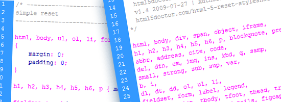
In April 2010, Russ Weakley gave us a much more targeted and limited reset, which he called Simple Reset.

/* ----------------------------
simple reset
---------------------------- */

html, body, ul, ol, li, form, fieldset, legend
{
	margin: 0;
	padding: 0;
}

h1, h2, h3, h4, h5, h6, p { margin-top: 0; }

fieldset,img { border: 0; }

legend { color: #000; }

li { list-style: none; }

sup { vertical-align: text-top; }

sub { vertical-align: text-bottom; }

table
{
	border-collapse: collapse;
	border-spacing: 0;
}

caption, th, td
{
	text-align: left;
	vertical-align: top;
	font-weight: normal;
}

input, textarea, select
{
	font-size: 110%;
	line-height: 1.1;
}

abbr, acronym
{
	border-bottom: .1em dotted;
	cursor: help;
}

In his explanation of Simple Reset, he noted that it removed margins and padding only from selected elements, as opposed to the wholesale removal made by the resets that rely on the universal selector.

Other things Simple Reset does:

  • Removes top margins on paragraphs and headings
  • Removes borders from fieldsets and images
  • Sets table borders and spacing
  • Sets values for a number of table-related elements (such as <th> and <td>)
  • Applies font-size and line-height to form elements
  • Removes list item bullets
  • Gives attributes to the rarely styled <abbr> and <acronym> elements
  • Gives a vertical alignment value to <sup> and <sub> elements to avoid line-height issues

Weakley reminded CSS reset users: "As with any of the resets, you should do what you feel comfortable doing!"

He echoed Eric Meyer in reminding users of Reset CSS that these style rules are not "self-contained black box[es] of no-touchiness," but tools to be used, tweaked, and modified for the project’s needs.

CSS Mini Reset

Designer Vladimir Carrer combined elements from Weakley’s and Meyer’s resets to create what he called the CSS Mini Reset:

/* CSS Mini Reset */

html, body, div, form, fieldset, legend, label
{
 margin: 0;
 padding: 0;
}

table
{
 border-collapse: collapse;
 border-spacing: 0;
}

th, td
{
 text-align: left;
 vertical-align: top;
}

h1, h2, h3, h4, h5, h6, th, td, caption { font-weight:normal; }

img { border: 0; }

It is much less overarching than either Weakley’s or Meyer’s efforts, focusing primarily on resetting margins and padding, stripping default values from table elements, resetting headings to normal font weight, and removing borders from margins.

Carrer says that CSS Mini Reset is best used "when you actually don’t want to reset everything."

Carrer based his reset on Azbuka, an earlier and much more complex effort at a typographically-based reset and base stylesheet he created in 2009.

Soft Reset

Around the same time Carrer released his reset, web designer Mark Aplet contributed his Soft Reset. Aplet explained that his reset "attempts to hone in and reset only the properties that really need to be reset, leaving some styling to the browser."

/* Soft Reset */
body, div, dl, dt, dd, h1, h2, h3, h4, h5, h6, pre, code, form, fieldset, legend, input, textarea, p, blockquote, th, td { margin:0; padding:0; }
table { border-collapse:collapse; border-spacing:0; }
fieldset, img { border:0; }
h1, h2, h3, h4, h5, h6, address, caption { font-style:normal; font-size:100%; font-weight:normal; }
caption, th { text-align:left; }
ol.listreset, .listreset ol, ul.listreset, .listreset ul, .listreset li { margin:0; padding:0; list-style:none; }

Aplet’s .listreset class was inspired by Nicole Sullivan’s Object Oriented CSS, (OO CSS) stating that reusable classes are "performance freebies." On large-scale sites, he says that abstracting CSS "can greatly improve your application performance" and "save you hundreds of lines of code."

Less is More Reset

In June 2007, Web developer Ed Eliot provided an even more stripped-down reset; something he called the Less is More reset:

body {
padding: 0;
margin: 0;
font: 13px Arial, Helvetica, Garuda, sans-serif;
*font-size: small;
*font: x-small;
}
h1, h2, h3, h4, h5, h6, ul, li, em, strong, pre, code {
padding: 0;
margin: 0;
line-height: 1em;
font-size: 100%;
font-weight: normal;
font-style: normal;
}
table {
font-size: inherit;
font: 100%;
}
ul {
list-style: none;
}
img {
border: 0;
}
p {
margin: 1em 0;
}

Less is More, Eliot explains, "only affects the elements I most often find myself needing to reset."

There are hacks in the stylesheet that handle some IE issues (highlighted above); unfortunately, they render the CSS invalid when checked against W3C standards.

For those who insist on validation, Eliot recommends moving them to a separate file and using conditional comments.

The Visibility:Inherit Reset

In August 2009, web designer Eric Watson made his own base stylesheet available. It included a small but powerful reset, shown below:

/* -------------------- Resets --------------------- */
body, form, fieldset, ol, ul, li, h1, h2, h3, h4, h5, h6, p {
margin:0;
padding:0;
}
img {
border:0; /* kills Gecko bug when img's are placed inside links */
vertical-align:bottom; /* set vertical align to bottom for IE */
}

Homebrewed CSS Reset

Jeffrey Way at Nettuts+ shared a method for creating your own reset file. The steps he includes for homebrewing your own reset.css are:

  1. Zeroing out margins and padding on many elements
  2. Taking control of font sizing
  3. Creating "default" classes for elements you will use in all of your designs

Way shared his own home-brewed reset.css at the end of his discussion (shown below):

body, html, div, blockquote, img, label, p, h1, h2, h3, h4, h5, h6, pre, ul, ol,
li, dl, dt, dd, form, a, fieldset, input, th, td
{
margin: 0; padding: 0; border: 0; outline: none;
}  

body
{
line-height: 1;
font-size: 88% /* Decide for yourself if you want to include this. */;
}  

h1, h2, h3, h4, h5, h6
{
font-size: 100%;
padding: .6em 0;
margin: 0 15px;
}  

ul, ol
{
list-style: none;
}  

a
{
color: black;
text-decoration: none;
}  

a:hover
{
text-decoration: underline;
}  

.floatLeft
{
float: left;
padding: .5em .5em .5em 0;
}  

.floatRight
{
float: rightright;
padding: .5em 0 .5em .5em;
}

HTML5 Resets

Many professionals are eager to dance with the cute new kid on the block: HTML5. Here are some projects that deal with CSS reset in HTML5.

HTML5Reset

Rich Clark and the folks at HTML5Reset have given us an expansive reset crafted for HTML5.

HTML5Reset

The project comes in several flavors; here is the Bare Bones version:

/*
html5doctor.com Reset Stylesheet
v1.6.1
Last Updated: 2010-09-17
Author: Richard Clark - http://richclarkdesign.com
Twitter: @rich_clark
*/

html, body, div, span, object, iframe,
h1, h2, h3, h4, h5, h6, p, blockquote, pre,
abbr, address, cite, code,
del, dfn, em, img, ins, kbd, q, samp,
small, strong, sub, sup, var,
b, i,
dl, dt, dd, ol, ul, li,
fieldset, form, label, legend,
table, caption, tbody, tfoot, thead, tr, th, td,
article, aside, canvas, details, figcaption, figure,
footer, header, hgroup, menu, nav, section, summary,
time, mark, audio, video {
    margin:0;
    padding:0;
    border:0;
    outline:0;
    font-size:100%;
    vertical-align:baseline;
    background:transparent;
}

body {
    line-height:1;
}

article,aside,details,figcaption,figure,
footer,header,hgroup,menu,nav,section {
    display:block;
}

nav ul {
    list-style:none;
}

blockquote, q {
    quotes:none;
}

blockquote:before, blockquote:after,
q:before, q:after {
    content:'';
    content:none;
}

a {
    margin:0;
    padding:0;
    font-size:100%;
    vertical-align:baseline;
    background:transparent;
}

/* change colours to suit your needs */
ins {
    background-color:#ff9;
    color:#000;
    text-decoration:none;
}

/* change colours to suit your needs */
mark {
    background-color:#ff9;
    color:#000;
    font-style:italic;
    font-weight:bold;
}

del {
    text-decoration: line-through;
}

abbr[title], dfn[title] {
    border-bottom:1px dotted;
    cursor:help;
}

table {
    border-collapse:collapse;
    border-spacing:0;
}

/* change border colour to suit your needs */
hr {
    display:block;
    height:1px;
    border:0;
    border-top:1px solid #cccccc;
    margin:1em 0;
    padding:0;
}

input, select {
    vertical-align:middle;
}

The CSS reset is based on Eric Meyer’s Reset CSS. As explained by Clark, it goes significantly farther than your average global reset stylesheet. It removes elements that have been deprecated from the HTML5 specs, adds new HTML5 elements to remove default padding, margins, and borders, and corrects the frequently repeated "unstyling" of the :focus pseudo-class.

Clark notes that some of the code included in the HTML5 reset is there more by personal preference than anything else (a caveat that is essentially true of all the resets available).

The creators of HTML5Reset says that although the reset is not "the end-all and beat-all" solution, they think that "it’s a fairly good starting place that anyone can take and make their own."

Clark explained some of his thinking behind the HTML5 reset:

When I decided to create a reset stylesheet for HTML5, it was primarily for a project I was working on and figured I might as well release it to be used, modified and improved by the community at large. The main differences from Eric’s stylesheet … are the removal of those absent elements in HTML5, including the new elements and declaring those as block level elements (something that will later be built into browser stylesheets and can be removed from the reset). Also included is some baseline styling for the mark element and a few other bits that I tend to use in every project so it makes sense for me to include them. I also decided to remove the default anchor styling from Eric’s stylesheet so that the outline wasn’t suppressed on links. It has a comment in Eric’s original but rarely seemed to get changed by authors. This highlights one of the biggest issues with CSS resets — you have to craft your own that works for you and for specific projects. It’s unlikely that a reset that works for one site will be exactly what’s required for the next. I’d always suggest using a reset as a starting point and then modifying it for your own needs.

CSS Reset – Refreshed

Web designer Jeffrey King updated Meyer’s original reset for HTML5; his revision is called CSS Reset – Refreshed:

/* v1.2 | 20100218 */

/* Eric Meyer's original CSS Reset is found at
   http://meyerweb.com/eric/tools/css/reset/ */

/* This version's permalink is
   http://kingdesk.com/articles/css-reset/ */

html, body, div, span, applet, object, iframe,
h1, h2, h3, h4, h5, h6, p, blockquote, pre,
a, abbr, acronym, address, big, cite, code,
del, dfn, em, font, img, ins, kbd, q, s, samp,
small, strike, strong, sub, sup, tt, var,
b, u, i, center,
dl, dt, dd, ol, ul, li,
fieldset, form, label, legend,
table, caption, tbody, tfoot, thead, tr, th, td,
section, article, aside, hgroup, header,
footer, nav, dialog, figure, menu,
video, audio, mark, time, canvas, details {
	margin: 0;
	padding: 0;
	border: 0;
	outline: 0;
	font-size: 100%;
	vertical-align: baseline;
	background: transparent;
	}
section, article, aside, hgroup, header,
footer, nav, dialog, figure, figcaption {
	display: block;
	}
body {
	line-height: 1;
	}
ol, ul {
	list-style: none;
	}
blockquote, q {
	quotes: none;
	}
blockquote:before, blockquote:after,
q:before, q:after {
	content: '';
	content: none;
	}
:focus { /* remember to define focus styles! */
	outline: 0;
	}
ins { /* remember to highlight inserts somehow! */
	text-decoration: none;
	}
del {
	text-decoration: line-through;
	}
table { /* markup tables with 'cellspacing="0"' */
	border-collapse: collapse;
	border-spacing: 0;
	}

HTML5 Boilerplate

Let’s end the guide with a wildly popular project that many of us are constantly talking about: Paul Irish’s and Divya Manian’s HTML5 Boilerplate, a fully developed "framework" — the creators say that it isn’t a framework — that includes a robust, HTML5-friendly reset.

The CSS reset in HTML5 Boilerplate is an amalgamation of HTML5Reset and Eric Meyer’s Reset Reloaded + HTML5 baseline.

/*
  html5doctor.com Reset Stylesheet (Eric Meyer's Reset Reloaded + HTML5 baseline)
  v1.4 2009-07-27 | Authors: Eric Meyer & Richard Clark
  html5doctor.com/html-5-reset-stylesheet/
*/

html, body, div, span, object, iframe,
h1, h2, h3, h4, h5, h6, p, blockquote, pre,
abbr, address, cite, code,
del, dfn, em, img, ins, kbd, q, samp,
small, strong, sub, sup, var,
b, i,
dl, dt, dd, ol, ul, li,
fieldset, form, label, legend,
table, caption, tbody, tfoot, thead, tr, th, td,
article, aside, canvas, details, figcaption, figure,
footer, header, hgroup, menu, nav, section, summary,
time, mark, audio, video {
  margin:0;
  padding:0;
  border:0;
  outline:0;
  font-size:100%;
  vertical-align:baseline;
  background:transparent;
}                  

article, aside, details, figcaption, figure,
footer, header, hgroup, menu, nav, section {
    display:block;
}

nav ul { list-style:none; }

blockquote, q { quotes:none; }

blockquote:before, blockquote:after,
q:before, q:after { content:''; content:none; }

a { margin:0; padding:0; font-size:100%; vertical-align:baseline; background:transparent; }

ins { background-color:#ff9; color:#000; text-decoration:none; }

mark { background-color:#ff9; color:#000; font-style:italic; font-weight:bold; }

del { text-decoration: line-through; }

abbr[title], dfn[title] { border-bottom:1px dotted; cursor:help; }

/* tables still need cellspacing="0" in the markup */
table { border-collapse:collapse; border-spacing:0; }

hr { display:block; height:1px; border:0; border-top:1px solid #ccc; margin:1em 0; padding:0; }

input, select { vertical-align:middle; }

/* END RESET CSS */

Clark (one of the creators of HTML5Reset) says that HTML5 Boilerplate "really highlights how the web community is very good at sharing and opening up for public use."

Conclusion

There are many options for setting your CSS to baseline defaults, as can be seen above. What’s important to note is that you should use what works best for you and the project at hand. You can use an already-existing reset stylesheet, piece several of them together, or build your own from scratch; the choice is yours.

The third and final part of this series discusses the ongoing debate on whether or not we should reset our CSS in our site builds.

This is a three-part series of articles on the topic of CSS resets.

Related Content

About the Author

Michael Tuck is an educator, writer, and freelance web designer. He serves as an advisor to the Web Design forum on SitePoint. When he isn’t teaching or designing sites, he is doing research for the History Commons. You can contact him through his website, Black Max Web Design.


Using the LESS CSS Preprocessor for Smarter Style Sheets

06 Dec

Advertisement in Using the LESS CSS Preprocessor for Smarter Style Sheets
 in Using the LESS CSS Preprocessor for Smarter Style Sheets  in Using the LESS CSS Preprocessor for Smarter Style Sheets  in Using the LESS CSS Preprocessor for Smarter Style Sheets

As a Web designer you’re undoubtedly familiar with CSS, the style sheet language used to format markup on Web pages. CSS itself is extremely simple, consisting of rule sets and declaration blocks—what to style, how to style it—and it does pretty much everything you want, right? Well, not quite.

You see, while the simple design of CSS makes it very accessible to beginners, it also poses limitations on what you can do with it. These limitations, like the inability to set variables or to perform operations, mean that we inevitably end up repeating the same pieces of styling in different places. Not good for following best practices—in this case, sticking to DRY (don’t repeat yourself) for less code and easier maintenance.

Enter the CSS preprocessor. In simple terms, CSS preprocessing is a method of extending the feature set of CSS by first writing the style sheets in a new extended language, then compiling the code to vanilla CSS so that it can be read by Web browsers. Several CSS preprocessors are available today, most notably Sass and LESS.

Less-css in Using the LESS CSS Preprocessor for Smarter Style Sheets

What’s the difference? Sass was designed to both simplify and extend CSS, so things like curly braces were removed from the syntax. LESS was designed to be as close to CSS as possible, so the syntax is identical to your current CSS code. This means you can use it right away with your existing code. Recently, Sass also introduced a CSS-like syntax called SCSS (Sassy CSS) to make migrating easier.

If It Ain’t Broke…?

By now you might be thinking, “So what? Why should I care about these things, and how exactly will they make my life as a Web designer easier?” I’ll get to that in a moment, and I promise it will be worth your time. First, let me clarify the focus of this article.

In this tutorial, I’ll be using LESS to demonstrate how CSS preprocessing can help you code CSS faster. But that doesn’t mean you must use LESS. It’s my tool of choice, but you may find that Sass fits your workflow better, so I suggest giving them both a shot. I’ll talk a bit more about their differences at the end of the article.

I’ll start off by explaining how LESS works and how to install it. After, I’ll list a set of problems that large CSS files pose, one by one, and exactly how you can use LESS to solve them.

Let’s go!

Installing It

There are two parts to any CSS preprocessor: the language and the compiler. The language itself is what you’ll be writing. LESS looks just like CSS, except for a bunch of extra features. The compiler is what turns that LESS code into standard CSS that a Web browser can read and process.

Many different compilers are actually available for LESS, each programmed in a different language. There’s a Ruby Gem, a PHP version, a .NET version, an OS X app and one written in JavaScript. Some of these are platform-specific, like the OS X app. For this tutorial, I recommend the JavaScript version (less.js) because it’s the easiest to get started with.

Using the JavaScript compiler is extremely easy. Simply include the script in your HTML code, and then it will process LESS live as the page loads. We can then include our LESS file just as we would a standard style sheet. Here’s the code to put between the <head> tags of your mark-up:

<link rel="stylesheet/less" href="/stylesheets/main.less" type="text/css" />
<script src="http://lesscss.googlecode.com/files/less-1.0.30.min.js"></script>

Note that I’m referencing the less.js script directly from the Google Code server. With this method, you don’t even have to download the script to use it. The style sheet link goes above the script to ensure it gets loaded and is ready for the preprocessor. Also, make sure that the href value points to the location of your .less file.

That’s it. We can now begin writing LESS code in our .less file. Let’s go ahead and see how LESS makes working with CSS easier.

1. Cleaner Structure With Nesting

In CSS, we write out every rule set separately, which often leads to long selectors that repeat the same stuff over and over. Here’s a typical example:

#header {}
#header #nav {}
#header #nav ul {}
#header #nav ul li {}
#header #nav ul li a {}

LESS allows us to nest rule sets inside other rule sets, as a way to show hierarchy. Let’s rewrite the above example with nesting:

# header {
  #nav {
    ul {
      li {
        a {}
      }
    }
  }
}

I’ve omitted the content from the selectors for simplicity, but you can see how the structure of the code quickly changes. Now you don’t have to repeat selectors over and over again; simply nest the relevant rule set inside another to indicate the hierarchy. It’s also a great way to keep code organized because it groups related items together visually.

Also, if you want to give pseudo-classes this nesting structure, you can do so with the & symbol. Pseudo-classes are things such as :hover, :active and :visited. Your code would look as follows:

a {
  &:hover {}
  &:active {}
  &:visited {}
}

2. Variables For Faster Maintenance

We usually apply a palette of colors across an entire website. Any given color could be used for multiple items and so would be repeated throughout the CSS code. To change the color, you’d have to do a “Find and replace.”

But that’s not quite it. You could also isolate those values into separate rule sets; but with this method, the rule sets would keep growing as you add more colors across the website, leading to bloated selectors. Here’s what I’m talking about:

#header, #sidebar .heading, #sidebar h2, #footer h3, .aside h3 { color: red; }

To make a simple color change, we’re faced with long selectors, all dedicated to that one color. It’s not pretty. LESS allows us to specify variables in one place—such as for brand colors, border lengths, side margins and so on—and then reuse the variables elsewhere in the style sheet. The value of the variable remains stored in one place, though, so making a change is as simple as changing that one line. Variables start with an @ and are written like this:

@brand-color: #4455EE;

#header { background-color: @brand-color; }
#footer { color: @brand-color; }
h3 { color: @brand-color; }

In LESS, variables also have scope, so you could use variables with the same name in various places; when they’re called, the compiler would check for the variable locally first (i.e. is there anything with that name where the declaration is currently nested?), and then move up the hierarchy until it finds it. For example, the following code:

@great-color: #4455EE;

#header {
  @great-color: #EE3322;
  color: @great-color;
}

…compiles to:

#header { color: #EE3322; }

3. Reusing Whole Classes

Variables are great, but we often reuse more than single values. A good example is code that’s different for every browser, like the CSS3 property border-radius. We have to write at least three declarations just to specify it:

-webkit-border-radius: 5px;
-moz-border-radius: 5px;
border-radius: 5px;

If you use a lot of CSS3, then this sort of repeating code adds up quickly. LESS solves this by allowing us to reuse whole classes simply by referencing them in our rule sets. For example, let’s create a new class for the above border-radius and reuse it in another rule set:

.rounded-corners {
  -webkit-border-radius: 5px;
  -moz-border-radius: 5px;
  border-radius: 5px;
}
#login-box {
  .rounded-corners;
}

Now #login-box will inherit the properties of the rounded-corners class. But what if we want more control over the size of the corners? No problem. We can pass along variables to the “mixin” (these reusable classes are called mixins) to get a more specific outcome. First, we rewrite the original mixin to add the variable we want to manipulate:

.rounded-corners(@radius: 5px) {
  -webkit-border-radius: @radius;
  -moz-border-radius: @radius;
  border-radius: @radius;
}

Now we’ve replaced the values for a variable, and we’ve specified the default value inside the parentheses. To give mixins multiple values, you’ll just need to separate them with a comma. Now, if we want our #login-box to have a border radius of three pixels instead of five, we do this:

#login-box {
  .rounded-corners(3px);
}

4. Operations

Variables let us specify things such as common palettes of colors, but what about relative design elements, like text that’s just a bit lighter than the background, or an inner border that’s one pixel thicker than the outer border?

Rather than add more variables, we can perform operations on existing values with LESS. For example, we can make colors lighter or darker or add values to borders and margins. And when we change the value that these operations depend on, they update accordingly. Take the following:

@base-margin: 25px;
#header { margin-top: @base-margin + 10px; }

This gives the #header element a top margin of 35 pixels. You can, of course, also multiply, divide and subtract, and perform operations on colors like #888 / 4 and #EEE + #111.

5. Namespaces and Accessors

What if you want to group variables or mixins into separate bundles? You can do this by nesting them inside a rule set with an id, like #defaults. Mixins can also be grouped in this way:

#defaults {
  @heading-color: #EE3322;
  .bordered { border: solid 1px #EEE; }
}

Then, to call a variable and a mixin from that particular group, we do this:

h1 {
  color: #defaults[@heading-color];
  #defaults > .bordered;
}

We can even access values of other properties in a given rule set directly, even if they’re not variables. So, to give the sidebar heading the same color as your main h1 heading, you’d write:

h1 { color: red; }

.sidebar_heading { color: h1['color']; }

There’s not much difference between variables and accessors, so use whichever you prefer. Accessors probably make more sense if you will be using the value only once. Variable names can add semantic meaning to the style sheet, so they make more sense when you look at them at a later date.
A couple more things to mention: You can use two slashes, //, for single-line comments. And you can import other LESS files, just as in CSS, with @import:

@import 'typography';
@import 'layout';

To Conclude

I hope by now you’ve got a pretty good idea why CSS preprocessors exist, and how they can make your work easier. The JavaScript version of the LESS compiler, less.js, is of course just one way to use LESS. It’s probably the easiest to get started with, but it also has some downsides, the biggest one being that the compiling takes place live. This isn’t a problem on modern browsers with fast JavaScript engines, but it might work slower on older browsers. Note that less.js actually caches the CSS once it’s processed, so the CSS isn’t regenerated for each user.

To use the generated CSS instead of LESS in your markup, you can compile your files using the various other compilers. If you’re on OS X, I suggest trying out the LESS App, a desktop app that watches your LESS files for changes as you work and automatically compiles them into CSS files when you update them. The Ruby Gem has the same watcher functionality but is trickier to install if you’re not familiar with Ruby (see the official website for details on that). There are also PHP and .NET versions.

Finally, LESS isn’t your only option for a CSS preprocessor. The other popular choice is Sass, but there are still more options to check out, such as xCSS. The advantage of LESS is that it uses existing CSS syntax, so getting started is just a matter of renaming your .css file to .less. This might be a disadvantage if you dislike the CSS syntax and curly braces, in which case Sass would probably be a better choice. There is also the Compass framework available for Sass, which is worth checking out if you go with Sass.

(al) (sp)


© Dmitry Fadeyev for Smashing Magazine, 2010. | Permalink | Post a comment | Add to del.icio.us | Digg this | Stumble on StumbleUpon! | Tweet it! | Submit to Reddit | Forum Smashing Magazine
Post tags: ,