RSS
 

Posts Tagged ‘CSS3’

Showcase of Outstanding Responsive Web Designs

11 Apr

This showcase rounds up a collection of the most inspiring and outstanding examples of responsive web design. These websites not only look great at full scale monitor resolution, but are designed to gracefully scale according to the user’s screen size. Resize you browser, view the site on a smartphone, tablet or netbook and you’ll see the same design in a range of well presented formats.

What is responsive web design?

Screen resolutions

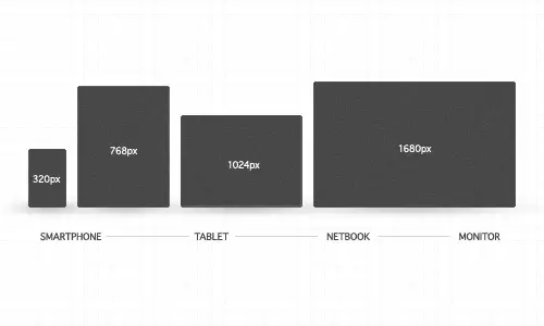
Websites are no longer viewed only on a computer monitor. Smartphones, tablets and netbooks throw a range of resolutions and different screen sizes into the mix for designers to now worry about. The idea of catering for various resolutions isn’t anything new. Back in the days of table based designs designers either chose the fluid or static route. Today’s responsive websites take a similar approach by using fluid widths in percentages and ems, but go a step further by using scalable images and adjustable layouts depending on the browser size.
To achieve this ‘scalability’, CSS media queries are used to apply different page styling according to certain parameters, such as min-width and orientation. The first step is to create a mobile version, but you could go on to customise your design for a range of resolutions.

Showcase of responsive web designs

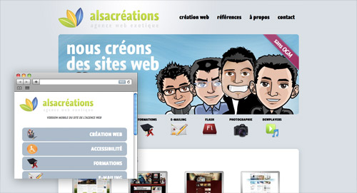
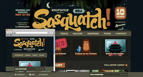
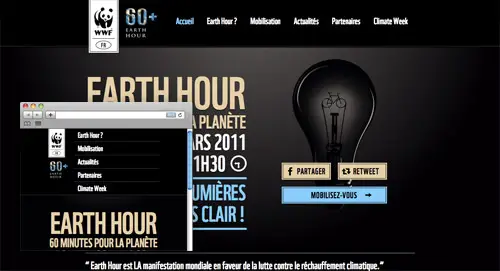
Ready for some examples? Here’s a roundup of 50 of the most outstanding examples of responsive web designs. Each one is displayed with a preview of both the full size website and an example of a small resolution, but to get the full experience be sure to visit the live site and play around with it yourself.

Alsacréations

View the responsive website design

Sasquatch Festival

View the responsive website design

Earth Hour

View the responsive website design

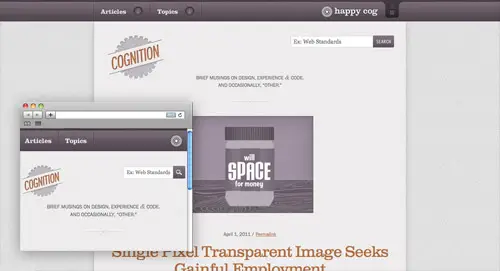
Cognition

View the responsive website design

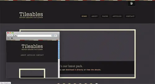
Tileables

View the responsive website design

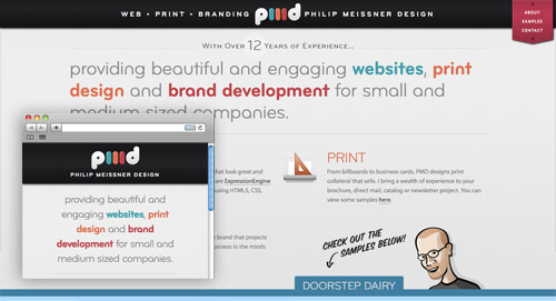
Philip Meissner

View the responsive website design

Interim

View the responsive website design

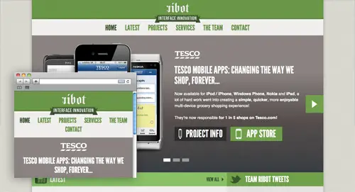
Ribot

View the responsive website design

Visua Design

View the responsive website design

Laufbild Werkstatt

View the responsive website design

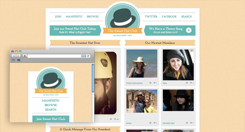
Sweet Hat Club

View the responsive website design

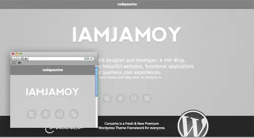
iamjamoy

View the responsive website design

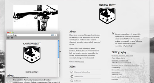
Andrew Revitt

View the responsive website design

Stijlroyal

View the responsive website design

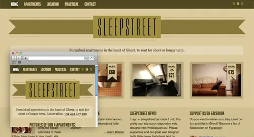
Sleepstreet

View the responsive website design

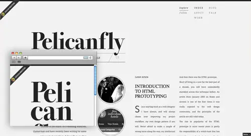
Pelican Fly

View the responsive website design

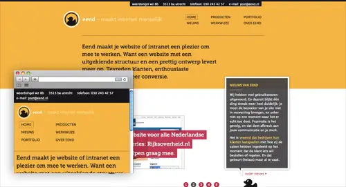
eend

View the responsive website design

Converge SE

View the responsive website design

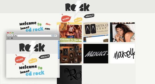
iwantedrock

View the responsive website design

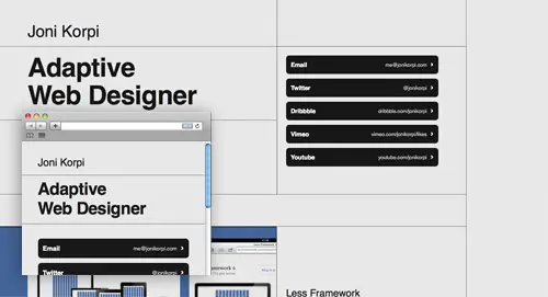
Joni Korpi

View the responsive website design

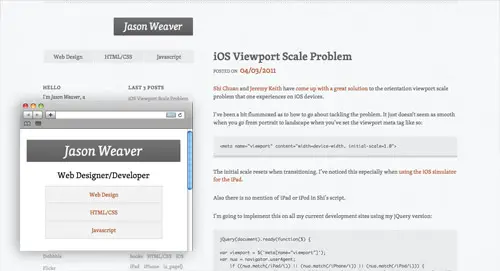
Jason Weaver

View the responsive website design

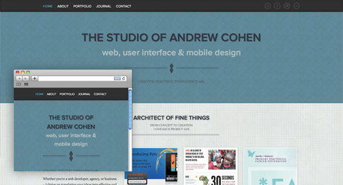
Cohenspire

View the responsive website design

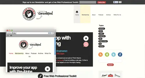
Think Vitamin

View the responsive website design

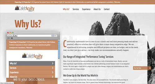
CalebAcuity

View the responsive website design

3200 Tigres

View the responsive website design

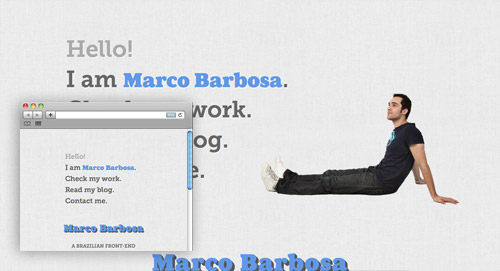
Marco Barbosa

View the responsive website design

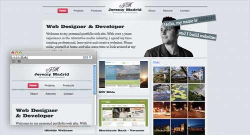
Jeremy Madrid

View the responsive website design

Lapse

View the responsive website design

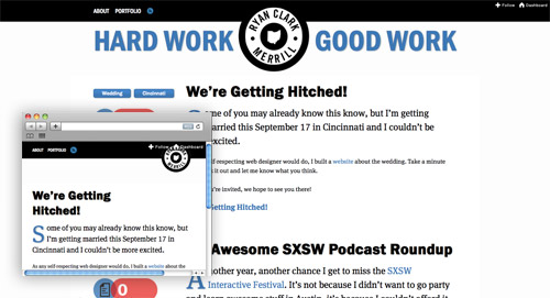
Ryan Merrill

View the responsive website design

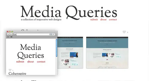
Media Queries

View the responsive website design

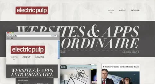
Electric Pulp

View the responsive website design

Tee Gallery

View the responsive website design

Stephen Caver

View the responsive website design

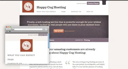
Happy Cog Hosting

View the responsive website design

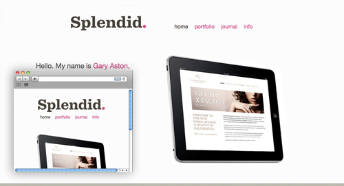
Splendid

View the responsive website design

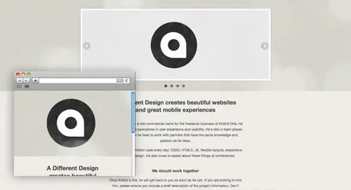
A Different Design

View the responsive website design

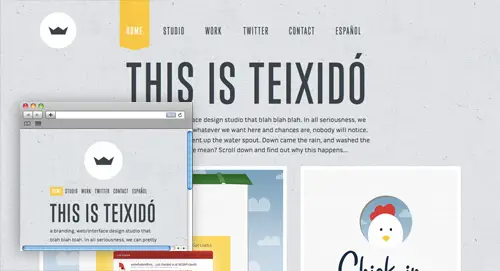
This is Texido

View the responsive website design

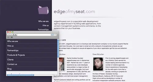
Edge of my Seat

View the responsive website design

Hardboiled Web Design

View the responsive website design

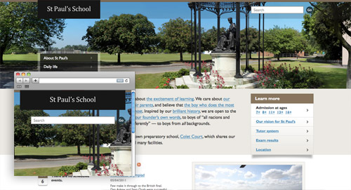
St Paul’s School

View the responsive website design

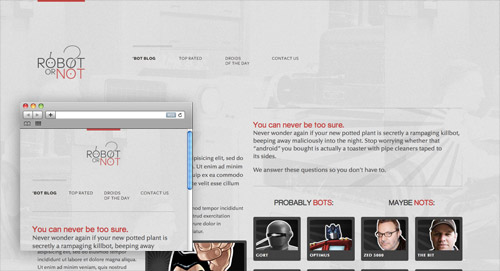
Robot… or Not?

View the responsive website design

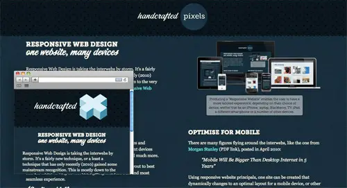
Handcrafted Pixels

View the responsive website design

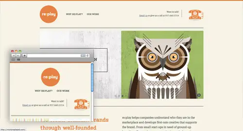
re:play

View the responsive website design

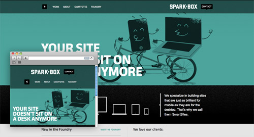
Sparkbox

View the responsive website design

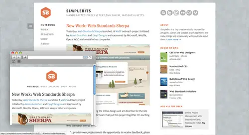
SimpleBits

View the responsive website design

UX London

View the responsive website design

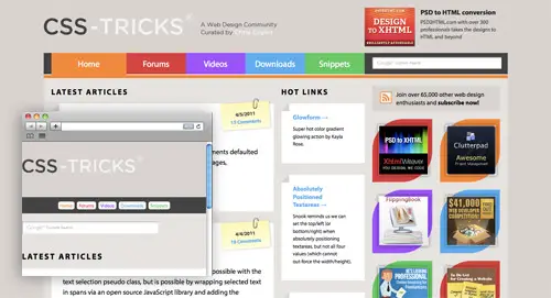
CSS-Tricks

View the responsive website design


HTML5 and CSS3 Without Guilt

17 Dec

Not every HTML5 or CSS3 feature has widespread browser support, naturally. To compensate for this, enterprising developers have created a number of tools to let you use these technologies today, without leaving behind users who still live in the stone age.


Prologue

HTML5 Semantic Elements

The good news is that, except for Internet Explorer, you can create more semantic markup by using the new HTML5 elements — even in browsers which don’t officially support them. Just remember to set the correct display mode: block. The following snippet should reference all necessary elements:

article,aside,details,figcaption,figure,
footer,header,hgroup,menu,nav,section {
   display: block;
}

IE Conditional Comments

Implementing many of the solutions in this tutorial involves including some JavaScript for specific Internet Explorer releases. Here is a quick overview: the test expression is enclosed in square brackets. We can check for specific versions or versions above or below a stated version. lt and gt mean lower than and greater than, respectively, while lte and gte mean lower than or equal to and greater than or equal to.

Here are some quick examples:

[if IE 6]

Checks if the browser is Internet Explorer 6.

[if gt IE 6]

Checks for a version of Internet Explorer greater than 6.


Tool 1: HTML5 Shiv

In anything IE, excluding the most recent version (IE9), you cannot apply styles to elements that the browser does not recognize. Your spiffy, new HTML5 elements, in all their glory, are impervious to CSS rules in that environment. This is where Remy Sharp’s html5shiv (sometimes called html5 shim) comes to the rescue. Simply include it in your page’s <head> section and you will be able to style the new HTML5 elements perfectly.

<!--[if lt IE 9]>

<script src="http://html5shiv.googlecode.com/svn/trunk/html5.js"></script>
<![endif]-->

Notice how the conditional comments only load the html5shiv code on the condition that the version of Internet Explorer is lower than 9. Other browsers, such as Firefox and Chrome, will also ignore this tag and won’t execute the script, thus saving bandwidth.

html5 shiv is based on a simple workaround: it directs IE to create the elements with JavaScript (they don’t even need to be inserted into the DOM).

document.createElement('header');

At this point, they can be styled normally. Additionally, the more recent versions integrate IE Print Protector, which fixes a bug where the HTML5 elements disappear when printing the page..


Tool 2: Modernizr

Modernizr allows you to provide “backup” styling in browsers that do not support certain HTML5 and CSS3 features.

Modernizr is perhaps the best known of these tools, but it is also fairly misunderstood (the name does not help). Take a deep breath: contrary to popular misconception, Modernizr does not enable HTML5 and CSS3 functionalities in browsers that do not support them (although it does include html5shiv to allow you to use HTML5 elements in IE < 9).

Apart from the html5shiv functionality, Modernizr does one thing and one thing only: it runs a series of feature detection tests when loaded, and then inserts the results into the class attribute of the <html> tag.

Modernizr’s primary purpose is to allow you to offer “backup” styling in browsers that do not support certain HTML5 and CSS3 features. This is somewhat different than traditional graceful degradation, where we use the same CSS styling in all browsers, and then engineer it so that, when specific capabilities are missing, the result is still acceptable.

Now for an example of how Modernizr operates: if a browser supports border-radius and the column-count property, the following classes will be applied:

     <html class="csscolumns borderradius">

On the other hand, if the same properties are not supported — say, in IE7 — you will find:

     <html class="no-csscolumns no-borderradius">

At this point, you can then use these classes to apply unique styling in browsers with different capabilities. For instance, if you want to apply a different style to a paragraph, depending on whether CSS columns are supported, you can do:

  .csscolumns p {
    /* Style when columns available */
   }

  .no-csscolumns p {
    /* Style when columns not available */
   }

If a browser does not support columns, the .csscolumns class will not be present in the body, and the browser will never have a chance to apply the rule which uses it.

Some might object that this brings us back to the old times of building a different site for each browser. It is true that nothing stops you from writing so many style declarations that use advanced CSS3 features that your stylesheet becomes virtually empty when these rules cannot be applied.

If you want to use Modernizr in a way that makes sense, you must rely on your design talent to conceive alternative styles that don’t break the design and don’t require throwing away the rest of the stylesheet. For example, you might try replacing drop shadows on letters, when they are not available, with a bold typeface or transparency with a different color.

Usage

To use Modernizr, include the minified file, and apply a class of no-js to the <html> element. This last precaution allows you to provide styles for when JavaScript is completely deactivated; obviously, in those cases, Modernizr can’t help you at all. If JavaScript is enabled, Modernizr will kick in and replace the no-js with the results of its feature detection operations.

<head>
<script src="modernizr-1.x.min.js" type="text/javascript"></script>

</head>
<body class="no-js">
. . . . .
</body>

If you’re willing to accept that all websites needn’t display identically across all browsers, you’ll find that Modernizr is an essential tool in your web dev belt!


Tool 3: IE 6 Universal CSS

On the same note, designer Andy Clarke has devised an elegant solution for solving IE6′s lack of standard compliance. Called “Universal IE6″, this stylesheet focuses exclusively on typography. The key is to use conditional comments to hide all other stylesheets from IE 6.

<!--[if ! lte IE 6]><!-->
/* Stylesheets for browsers other than Internet Explorer 6 */
<!--<![endif]-->

<!--[if lte IE 6]>
<link rel="stylesheet" href="http://universal-ie6-css.googlecode.com/files/ie6.1.1.css" media="screen, projection">
<![endif]-->

Important Note: Remember to include the latest version, as instructions for older ones are still floating around the web. The final results looks like so:

Universal IE6 CSS sample result

You have zero work to do to support IE 6 on a new site.

This approach has a pretty obvious advantage compared to classical alternate stylesheets: you have zero work to do to support IE 6 on a new site. The disadvantage, of course, is that the site displays very little of your design. Further, your HTML foundations also has to be rock-solid, in order for the page to be usable even with most styling disabled.

Note that Universal IE6 CSS does not include any styling for HTML5-only elements such as <section> or <footer>. It is not a problem unless you are relying on those elements exclusively to obtain block level display for some parts of the page. Generally, you would always wrap your text also at least in a paragraph or list element.

This solution is clearly not for everybody, and you might find clients who flat out disagree with their site looking brokenwhen viewed in IE6.

You might also argue that, at this point, you can just as well drop IE6 support entirely. Andy Clarke has summarized his answers to these objections here.

This approach works best for content-centric sites, and catastrophically for web applications; but then again, building a modern web application to work well on IE 6 is a challenge in itself.


Tool 4: Selectivizr

Selectivizr Support

Our next champion is a JavaScript utility which aims to introduce new capabilities into older browsers (well, actually just IE 6-8): Selectivizr works in tandem with other JavaScript libraries such as jQuery, Dojo or MooTools to add support for a range of more advanced CSS selectors.

I’ve listed a few below, though note that the full list of capabilities will be dependent upon your preferred JavaScript library.

  • :hover
  • :focus
  • :first-child
  • :last-child
  • :first-line
  • :first-letter

To use Selectivizr, download it from their home page and include it within your <head> section, together with one of the support libraries. Here is an example with jQuery:

<script src="jquery-1.4.4.min.js"></script>
<!--[if lte IE 8]>
  <script src="selectivizr.js"></script>

 <![endif]--> 

Selectivizr works in tandem with other JavaScript libraries to provide CSS3 support for IE 6-8.

This point is very important: Selectivizr cannot work alone; it requires your preferred library to be present. Luckily, it is compatible with the huge majority of popular JavaScript libraries. Chances are, if you are using JavaScript on your site, you probably have an appropriate library already included.

DOMAssisant

On the other hand, if you won’t be using a library as well, an alternative solution is to use the light weight DOMAssistant, although you might still prefer your usual JavaScript library for greater ease in managing files.

Be careful though, as the precise selectors that Selectivizr makes available depends on which supporting library is chosen. According to the home page, right now the greatest range of selectors is available with MooTools, while unfortunately jQuery makes the least number of selectors available. It must also be said that some of the selectors that are not available with jQuery are quite exotic and rarely used in the real world usage. Refer to our “30 CSS Selectors you Must Memorize” article for a full list of selectors.

As it happens, with most JavaScript solutions for CSS woes, some restrictions apply.

  • For Selectivizr to perform its magic, stylesheets must be loaded from the same domain as HTML pages. This rules out, for instance, hosting stylesheets and other assets on a CDN.
  • You are forced to use the <link> element to include your stylesheets (as opposed to <style>).
  • Selectivizr does not update styling if the DOM changes after the page has finished loading (if you add elements in response to a user action, for instance).

Tool 5: CSS3Pie

CSS3Pie also enhances Internet Explorer’s [6-8] capabilities, but in a much more native way, as it effectively enables the use of a number of spiffy CSS3 properties, like border-radius, linear-gradient, box-shadow, border-image as well as adds support for multiple backgrounds. Use CSS3Pie and say goodbye to manually sliced and positioned rounded corners.

CSS3Pie: say goodbye to manually sliced and positioned rounded corners.

The way it works is by leveraging little known proprietary Microsoft extensions: the CSS behavior property and HTML component files (official documentation). This extension allows you to attach JavaScript to certain HTML elements using CSS. The JavaScript is included together with some Microsoft proprietary tags, in .htc files which are referenced within the style rules.

For this reason alone, many developers might argue that you shouldn’t use CSS3Pie. Internet Explorer’s proprietary tags are performance heavy and produce less-attractive output.

Why doesn’t CSS3Pie use plain JavaScript? Well there is a JS-specific version, though the team advises against its usage, due to the fact that the JavaScript blocks the parsing of the page.

With the current .htc solution, implementation is quite simple: you only need to upload a single file from the CSS3Pie distribution, PIE.htc, to your server. Afterward, every time you use one of the supported CSS3 properties, add the code below:

behavior: url(path/to/PIE.htc);

Above, path/to/PIE.htc is the path, relative to the HTML file being served; not the stylesheet.

Server Side Instructions

Of course, CSS3Pie can only do its magic in Internet Explorer. It also needs a bit of care and feeding on the server side:

  • You should ensure that the PIE.htc file is served with a text/x-component content type. The distribution includes a PHP script that can take care of this if you are not allowed to modify your server configuration, for instance on a shared host.
  • PIE.htc can also trigger ActiveX warnings, usually when you are testing it on your localhost. This last problem requires the Mark of the Web workaround to be solved.

CSS3Pie is still, at the time of this writing, in beta mode – as there are still some kinks to be ironed out.


Tool 6: HTML5 Boilerplate

HTML5 Boilerplate goes much further than your standard starter templates.

HTML5 Boilerplate can be described as a set of templates to help you get started building modern HTML5 websites as rapidly as possible. But HTML5 Boilerplate goes much further than your standard starter templates.

For instance, it bundles the latest version of Modernizr (same creator), and the HTML even links to the latest Google-hosted jQuery, Yahoo profiler and Google Analytics scripts for you. The CSS contains the usual reset rules, but also a wealth of @media queries to get you started with responsive web design targeting mobile devices.

Configuration Files

The most unique feature is that, on top of client configuration, you also get the server side: configuration files for Apache and Nginx. This allows you to maximize download speeds and optimize HTML5 video delivery. In particular, the .htaccess files for Apache might be very convenient to drop into a shared hosting account, as often things like gzip compression and expires are not active by default.

Does it do too Much?

Some people might argue that HTML5 Boilerplate takes a bit too many decisions for them (hell, the Apache configuration even automatically strips www. in front of the domain name!) or that it is somewhat Google-centric, though, nonetheless, it’s always interesting to study the files and find what problems the authors have anticipated.

Further, you’re certainly encouraged to break it down for your personal needs. This is simply a boilerplate to get you started.

A Visual Overview

If you want a detailed breakdown of everything HTML5 Boilerplate includes, Paul Irish recorded an exclusive screencast for Nettuts+.

A fully commented version is available at html5boilerplate.com.


Epilogue: Be Bold

Often, the fear of implementing features which do not enjoy full browser support discourages designers from adopting the latest technologies. While the demographics of your audience has to be considered carefully, as well as your client’s wishes, if you accept that sites don’t have to look the same in all browsers, it is possible to make full use today of HTML5 and CSS3.

Think of it this way: if you wait until CSS3 “is complete,” you’ll be waiting forever. CSS2 isn’t even fully supported across all browsers yet! The guiding principle here is that every user should get the most bang for his buck: if he is using a bleeding edge browser, why not take advantage of all the features that browser provides?

Let us know what you think about these issues in the comments. Thank you so much for reading!


Useful Collection of Cheat-Sheet Desktop Wallpaper for Web Designers

07 Oct

Typical cheatsheets tend to be over-sized documents, far too large to be viewed in its entirety on a desktop and not too handy for the super-fast reference that is needed. To get the full benefit of any cheatsheat, your only real option is to print it out and keep it close at hand. Wouldn’t it be nice if there was an easier way, a quicker way. Of course there is – what good be handier than having a cheatsheet set as your desktop wallpaper? Always there for quick reference, no need to print it out and no need to scroll through an over-long document.

In this post we have rounded up a selection of cheatsheet wallpapers, in various sizes, covering various technologies, like CSS, HTML5, WordPress, Javascript and many more.

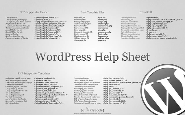
WordPress Help Sheet Wallpaper

WordPress Help Sheet Wallpaper
The WordPress Help Sheet Wallpaper is a simple desktop wallpaper listing Basic Template Files, PHP Snippets for the Header, PHP Snippets for the Templates, Extra Stuff for WordPress, based on the WPCandy WordPress Help Sheet.
Download: 2560x1600px.

Drupal Cheat Sheet Desktop Wallpaper

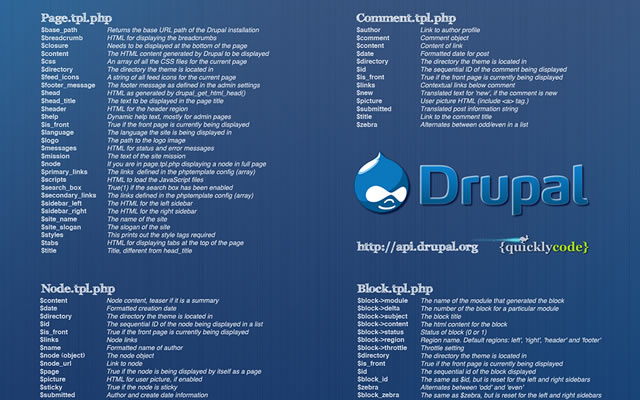
Drupal Cheat Sheet Desktop Wallpaper
The Drupal Cheat Sheet Desktop Wallpaper is a desktop wallpaper that features the most popular variables of the open source content management system Drupal.
Download: 1024x768px – 1280x800px – 1440x900px – 1680x1050px – 1920x1200px.

HTML5 Canvas Cheat Sheet

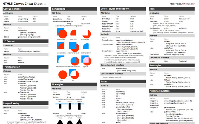
HTML5 Canvas Cheat Sheet
The information on this wallpaper is pretty much just a copy of what is found in the WHATWG specs, just condensed and a little bit easier to read. There are virtually no explanations, and no examples other than some graphics for compositing values. It's basically just a listing of the attributes and methods of the canvas element and the 2d drawing context.
Download: 1388x1027px.

CSS Cheat Sheet Wallpaper in Helvetica

CSS Cheat Sheet Wallpaper in Helvetica
This is the very popular CSS cheat sheet in Helvetica from styl.eti.me. Simplistic in appearance, but very useful for quick referencing. Unfortunately we can not find a working download link for this cool wallpaper, but the good news is they do have a PSD version available. So download it and resize.
Download: CSS Cheat Sheet Wallpaper in Helvetica.

TextMate Shortcuts Wallpaper

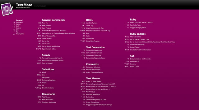
TextMate Shortcuts Wallpaper
Here is a TextMate wallpaper that will guide you through some of its powerful features and help you get a handle on all of the keyboard shortcuts. The PSD file is also available.
Download: 1280x800px – 1920x1200px.

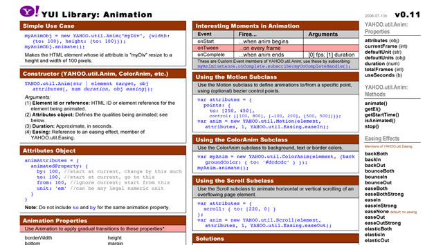
Yahoo! UI (YUI) Cheat Sheets as Wallpaper
Yahoo! UI (YUI) Cheat Sheets as Wallpaper
Yahoo! provides a number of cheat sheets for their YUI library widgets however these are all in PDF format and not usable as wallpaper. However, here you will find all of those cheatsheets converted to PNG images of various sizes all for your desktop.
There are wallpapers available for Animation, Calendar, Connection Manager, Dom Collection, Drag & Drop Event, Utility & Custom Event Logger, Slider and TreeView. And all are available in the following desktop sizes: 1400x1050px, 1280x960px, 1165x900px and 1024x768px.
Download: Yahoo! UI (YUI) Cheat Sheets as Wallpaper.

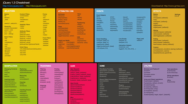
jQuery 1.3 Cheat Sheet Wallpaper

jQuery 1.3 Cheat Sheet Wallpaper
Download: 1440x900px – 1680x1050px – 1920x1200px.

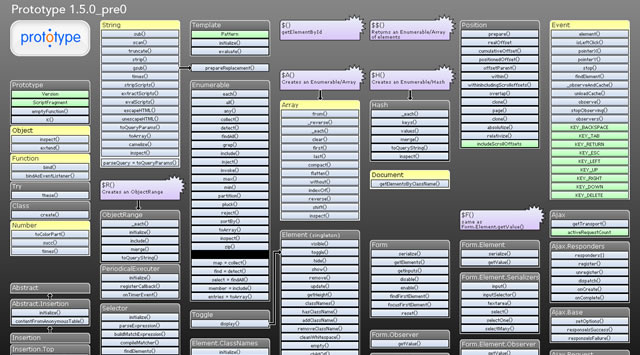
Prototype Dissected Wallpaper

Prototype Dissected Wallpaper
If you need a little help in getting to know Prototype a little better and some help in understanding how the code works, then this is the wallpaper for you. You have a choice of either a dark or white wallpaper, and are available in these sizes: 1280x960px and 1440x900px.
Download: 1280x960px (Dark) – 1440x900px (Dark) – 1280x960px (White) – 1440x900px (White).

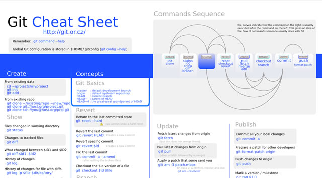
Git Cheat Sheet Wallpaper

Git Cheat Sheet Wallpaper
Download: 1100x850px – 3300x2550px.

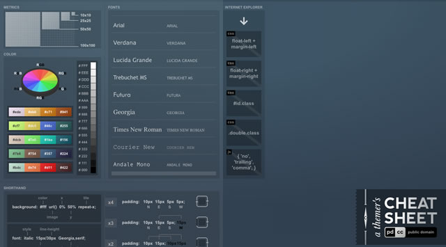
A Themer's Cheatsheet Wallpaper

A Themer's Cheatsheet Wallpaper
A Themer's Cheatsheet Wallpaper is a quick refresher of web design fundamentals directly on your desktop. It is available for download in several different colors and the original SVG has been released to the Public Domain.
Download: 1280x800px (Blue) – 1280x800px (Red) – 1280x800px (Black) – 1280x800px (Green).

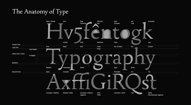
Font Anatomy Wallpaper

Font Anatomy Wallpaper
Download: 1920x1200px.

SEO Wallpapers

SEO Wallpapers
Think of it as a desk reference checklist that is always at your fingertips. From pre-campaign to reporting, the basics (and more) are right here for you to put directly on your desktop.
Download: 1024x768px – 1280x960px – 1280x1024px – 1440x900px.

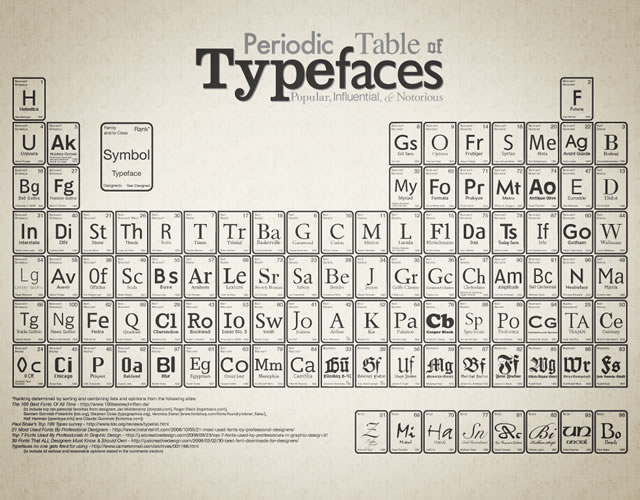
Periodic Table of Typefaces

Periodic Table of Typefaces
Download: 1024x768px – 1280x800px – 1280x1024px – 1440x900px – 1680x1050px – 1920x1200px.

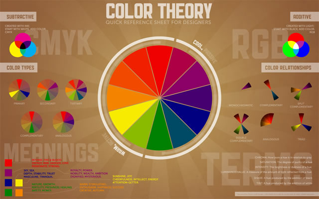
Color Theory Quick Reference Poster

Color Theory Quick Reference Poster
The Color Theory Quick Reference Poster for Designers has all of the basics of color theory contained in one place – specifically, a cool infographic-esque poster. This way, you can quickly reference things that may have slipped to the back of your mind since design school.
Download: 1280x800px – 1440x900px – 1680x1050px – 1920x1200px.

Web Designer Wallpaper

Web Designer Wallpaper
Download: 1280x1024px (White) – 1280x1024px (Dark) – 1680x10050px (Dark) – 1280x1024px (White).

You might also like…

14 Essential WordPress Development and Design Cheat Sheets »
17 Productive Photoshop Cheatsheets and Reference Cards to Download for Free »
The Best Cheat Sheets for Web Designers and Developers (From CSS, Ajax, Perl, Vbscript…) »
CSS References, Tutorials, Cheat Sheets, Conversion Tables and Short Codes »
20 CSS3 Tutorials and Techniques for Creating Buttons »
50 Useful Tools and Generators for Easy CSS Development »
50 Essential Web Typography Tutorials, Tips, Guides and Best Practices »
The Blueprint CSS Framework – Tutorials, How-to Guides and Tools »


30+ Very Useful HTML5 Tutorials, Techniques and Examples for Web Developers

07 Jul

html5tutorials

HTML5 is being developed as the next major revision of HTML (HyperText Markup Language). The major market and internet leaders are already switching to the HTML 5 platform. With Apple and Google both pushing the standards in order to facilitate more advanced web development, we should see HTML 5 implementations popping up in the next year or two as more companies get on board with the advanced features.

With the constant drop of Flash usage in web and internet applications, HTML5 is opening new doors to web designers and developers. In this scenario, it is indeed imperative for every web developer to know about basic tutorials, tricks and terms of HTML5.

Here we present before you, a comprehensive list of more than 30 HTML5 tutorials and techniques that you can’t afford to miss if you are a web developer.

Create Offline Web Application On Mobile Devices With HTML5

image

A comprehensive article from the technical library of IBM by IT Architect Dietmar Krueger. In this article, the author describes and explains how challenging it i s to write application for operating systems and mobile platforms. Instead of relying on learning the platform specific languages like Objective-C with Cocoa (on iPhone), the author takes the open way of developing things through HTML5.  A very clearly explained and in-depth article.

HTML 5 Demos and Examples

image

HTML 5 experimentation and demos I’ve hacked together. Click on the browser support icon or the technology tag to filter the demos (the filter is an OR filter).

WTF is HTML5

image

One page overview of HTML5 – very useful!

Building a live news blogging system in PHP, Spiced with HTML5

image

This tutorial show you how to build a news website in HTML5 and CSS3. Every line of code is explained  for both HTML and CSS

Designing A Blog With HTML5

image

Much of HTML 5’s feature set involves JavaScript APIs that make it easier to develop interactive web pages but there are a slew of new elements that allow you extra semantics in your conventional Web 1.0 pages. This tutorial investigate these by setting u a blog layout.

Semantics in HTML 5

image

HTML 5, the W3C’s recently redoubled effort to shape the next generation of HTML, has, over the last year or so, taken on considerable momentum. It is an enormous project, covering not simply the structure of HTML, but also parsing models, error-handling models, the DOM, algorithms for resource fetching, media content, 2D drawing, data templating, security models, page loading models, client-side data storage, and more.

There are also revisions to the structure, syntax, and semantics of HTML, some of which Lachlan Hunt covered in “A Preview of HTML 5.”

In this article, let’s turn solely to the semantics of HTML. It’s something the author has been interested in for many years, and something which he believe is fundamentally important to the future of HTML.

HTML5 Web Applications

image

HTML 5 browser compatibility overview.

Dive into HTML5

image

Dive Into HTML 5 seeks to elaborate on a hand-picked Selection of features from the HTML5 specification and other fine Standards. I shall publish Drafts periodically, as time permits. Please send feedback. The final manuscript will be published on paper by O’Reilly, under the Google Press imprint. Pre-order the printed Work and be the first in your Community to receive it.

When Can I Use

image

Here you will find very useful compatibility tables for features in HTML5, CSS3, SVG and other upcoming web technologies.

HTML5 & CSS3 Readiness

image

How to Draw with HTML 5 Canvas

image

Among the set of goodies in the HTML 5 specification is Canvas which is a way to programmatically draw using JavaScript. We’ll explore the ins and outs of Canvas in this article, demonstrating what is possible with examples and link

Have a Field Day with HTML5 Forms

image

Forms are usually seen as that obnoxious thing we have to markup and style. I respectfully disagree: forms (on a par with tables) are the most exciting thing we have to work with.

Here we’re going to take a look at how to style a beautiful HTML5 form using some advanced CSS and latest CSS3 techniques. I promise you will want to style your own forms after you’ve read this article.

Coding Up a Web Design Concept into HTML5

image

Code a Backwards Compatible, One Page Portfolio with HTML5 and CSS3

image

HTML5 is the future of web development but believe it or not you can start using it today. HTML5 is much more considerate to semantics and accessibility as we don’t have to throw meaningless div’s everywhere. It introduces meaningful tags for common elements such as navigations and footers which makes much more sense and are more natural.

This is a run through of the basics of HTML5 and CSS3 while still paying attention to older browsers. Before we start, make note of the answer to this question.

Coding A HTML 5 Layout From Scratch

image

While it is true HTML5 and CSS3 are both a work in progress and is going to stay that way for some time, there’s no reason not to start using it right now. After all, time’s proven that implementation of unfinished specifications does work and can be easily mistaken by a complete W3C recommendation. That’s were Progressive Enhancement and Graceful Degradation come into play.

How to Make an HTML5 iPhone App

image

You’ve been depressed for like a year now, I know. All the hardcore Objective-C developers have been having a hay-day writing apps for the iPhone. You might have even tried reading a tutorial or two about developing for the iPhone, but its C—or a form of it—and it’s really hard to learn.

You can also do it with the skill set you probably already have: HTML(5), CSS, and JavaScript.

This tutorial show you how to create an offline HTML5 iPhone application. More specifically, I’ll walk you through the process of building a Tetris game.

Create An Elegant Website With HTML 5 And CSS3

image

Learn five macro-steps to build an effective website using brain, pencil, paper, Photoshop, HTML and CSS. But technology doesn’t stop, luckily, and we have other two great allies for the future to design better website: HTML 5 and CSS3.

Coding a CSS3 & HTML5 One-Page Website Template

image

See how to create a HTML5 web template, using some of the new features brought by CSS3 and jQuery, with the scrollTo plug-in. As HTML5 is still a work in progress, you can optionally download a XHTML version of the template here.

Design & Code a Cool iPhone App Website in HTML5

image

HTML5 is definitely the flavor of the month, with everyone in the design community getting excited about its release. In this tutorial we’ll get a taste of what’s to come by building a cool iPhone app website using a HTML5 structure, and visual styling with some CSS3 effects.

HTML 5 and CSS 3: The Techniques You’ll Soon Be Using

image

In this tutorial, we are going to build a blog page using next-generation techniques from HTML 5 and CSS 3. The tutorial aims to demonstrate how we will be building websites when the specifications are finalized and the browser vendors have implemented them. If you already know HTML and CSS, it should be easy to follow along.

HTML5 for Beginners. Use it now, its easy!

image

HTML5 for Beginners. Use it now, its easy! This article cover some of the HTML5 basics in a funny way…

Rocking HTML5

image

This presentation is an HTML5 website and it is a very informative and easy to use overview of the HTML5 elements.

Building Web Pages With HTML 5

image

Depending on who you ask, HTML 5 is either the next important step toward creating a more semantic web or a disaster that’s going to trap the web in yet another set of incomplete tags and markup soup.

The problem with both sides of the argument is that very few sites are using HTML 5 in the wild, so the theoretical solutions to its perceived problems remain largely untested.

That said, it isn’t hard to see both the benefits and potential hang-ups with the next generation of web markup tools.

HTML5 Cheat Sheet

image

HTML 5 Visual Cheat Sheet is an useful cheat sheet for web designers and developers designed by me. This cheat sheet is essentially a simple visual grid with a list of all HTML tags and of their related attributes supported by HTML versions 4.01 and/or 5. The simple visual style I used to design this sheet allows you to find at a glance everything you are looking for.

html5test.com

image

This is a browser test with a lot of detail. Very useful.

HTML5 Canvas Experiment

image

Time for us to play with this technology. We’ve created a little experiment which loads 100 tweets related to HTML5 and displays them using a javascript-based particle engine. Each particle represents a tweet – click on one of them and it’ll appear on the screen. (click on the image to see it in action)

HTML 5 Cheat Sheet (PDF)

image

html5 Pocketbooks

image

OK You have seen that HTML 5 is here, but should you use it?

Generally I think it depends on the site you are working on. If it is a high traffic commercial website you may want to hold it back a bit. However if it is a personal blog I believe it is time to get started and learn how to use the new features in HTML 5.

Actually HTML5 is used more than you may think already. You should check out the sites featured on HTML 5 Gallery and view source to see what they’re doing. Also there is already a HTML 5 Wordpress theme available.

Other interesting posts on this topic

Feed provided by tripwrire magazine, Visit this post here: Permalink