RSS
 

Posts Tagged ‘Development’

Sliding Background Image Menu with jQuery

03 Jul


View demoDownload source
Today we want to share another jQuery menu with you. This menu will have several panels, each one corresponding to a different background image that will show on all panels when we hover over a panel label. Also, a submenu will slide out from the bottom. This menu comes with some configuration possibilities, such as the size of the image, the hover effect and custom default states.

The idea of this navigation is based on the Beautiful Background Image Navigation with jQuery, a tutorial that had a similar effect. Since it was very popular and a lot of our readers asked for some very useful additions, we decided to revamp it and make it easier to customize.

The beautiful gastronomy photography is by Manoel Petry:
Manoel Petry’s Flickr Photostream
Manoel Petry’s Website
The images are licensed under a Creative Commons Attribution-NonCommercial-ShareAlike 2.0 Generic License.

Examples

Take a look at all the examples (you can also navigate from them to all the other demos):

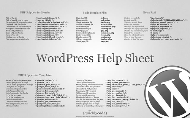
The HTML structure consists of the “sbi_container” which will have all the panels inside:

<div id="sbi_container" class="sbi_container">
	<div class="sbi_panel" data-bg="images/1.jpg">
		<a href="#" class="sbi_label">About</a>
		<div class="sbi_content">
			<ul>
				<li><a href="#">Subitem</a></li>
				<li><a href="#">Subitem</a></li>
				<li><a href="#">Subitem</a></li>
			</ul>
		</div>
	</div>
	<div class="sbi_panel" data-bg="images/2.jpg">
		...
	</div>
	...
</div>

The “data-bg” attribute contains the path to the background image that will appear when hovering over the label of the respective panel.

Let’s take a look at an example for using the alternating vertical up/down sliding effect:

$('#sbi_container').bgImageMenu({
	defaultBg	: 'images/default.jpg',
	menuSpeed	: 300,
	border		: 1,
	type		: {
		mode		: 'verticalSlideAlt',
		speed		: 450,
		easing		: 'easeOutBack'
	}
});

The following parameters can be used/set:
defaultBg: the default image shown when no label is hovered
pos: if no defaultBg set, pos will indicate the panel that should be shown/open
width: the width of the container and the images (they should all be of the same size)
height: the height of the container and the images
border: the width of the margin between the panels
menuSpeed: the speed with which the menu should slide up

mode: the type of animation; you can use def | fade | seqFade | horizontalSlide | seqHorizontalSlide | verticalSlide | seqVerticalSlide | verticalSlideAlt | seqVerticalSlideAlt
speed: the speed of the panel animation
easing: the easing effect for the animation
seqfactor: delay between each item animation for seqFade | seqHorizontalSlide | seqVerticalSlide | seqVerticalSlideAlt

We hope you find this little menu interesting and useful, enjoy!

View demoDownload source

Share and Enjoy:Diggdel.icio.usFacebookLinkedInRedditRSSTwitterGoogle BookmarksStumbleUponTechnoratiDZoneemailblogmarksDesign FloatDiigoFriendFeedGoogle BuzzIdenti.caMisterWongNewsVinePing.fmPlurkPosterousSlashdotSuggest to Techmeme via TwitterTumblr


All of Facebook’s Like Buttons on Third-Party Sites Now Publish a Full News Feed Story

27 Feb

When users click the Like or Recommend button on a third-party website or within a Facebook app, it now publishes a full news feed story instead of just a one-line Recent Activity story. Previously, full stories with headlines, thumbnail images, and captions were only published if the website chose to implement the “Like with Comment” version of the button and users chose to add this additional context.

As the Like button now encompasses the functionality of the Share button, which Facebook has removed from its documentation, Facebook may phase out the Share button entirely. The change gives more prominence to outbound links in the news feed and on a user’s wall, and so will increase referral traffic and draw more sites to add the Like button.

Full stories appear larger, more compelling since they often include an image, and are ranked better in the news feed than Recent Activity stories. Therefore, the stories generated from clicks of the Like / Recommend button will been seen by more of a user’s friends and drive more traffic to third-party websites and apps than before.

Since Facebook launched its social plugins including the Like button at last year’s f8 conference, over 2.5 million websites have integrated them. In July, Facebook introduced Like with Comment, allowing some implementation to publish full feed stories.

By August, 350,000 sites had Like buttons, and that count is probably much higher now. Facebook has since allowed developers to integrate Like buttons with social games and other Facebook apps, and is trying to increase third-party awareness of their ability to publish news feed stories to those who click their buttons.

Up until now, Facebook had supported three different ways to share third-party content to the news feed:

  • The Share button –  When clicked, users see a Facebook Publisher dialog pop up allowing them to add a comment. It publishes a full feed story, similar to if the user had copied the link into the Publisher on Facebook.com. The Share button doesn’t subscribe users to future updates from the owner of the button.
  • The Like / Recommend button without comment – When third-parties use the standard iframe Like button with a width less than 400 pixels, the button_count, or  box_count version of the Like / Recommend button, users aren’t given the option to comment. A simple, one-line story linking to the content is published to the Recent Activity feed of the user’s wall, and the story is less frequently displayed in the news feeds of friends. Users are subscribed to future updates from the button’s owner.
  • The Like / Recommend button with comment – When third-parties implement the XFBML version or the standard iframe version with a width of 400 pixels or more, users are always given the option to comment. If they comment, a full story is published. If they don’t comment, a simple story is published. Users are subscribed to future updates from the button’s owner.

Now, all versions of the Like / Recommend button publish a full feed story, whether a comment is added or not. The change has been applied retroactively, so old Recent Activity feed simple stories from Likes now appear as full stories.

Likes allow third-parties to publish future updates to a user, and therefore drive more traffic and create more lifetime value than Shares. This value lures additional third parties to implement Facebook’s social plugins, so it’s in Facebook’s interest to shift everyone from Share buttons to Like buttons.

The Share button is often displayed amongst a set of other buttons for Twitter, Digg, bookmarking, and email, but Facebook would rather have its own real estate opposed to being lost amongst the competition. Now that Facebook has given the Like button almost a year to prove its worth, third-parties would probably implement a Like button if they could no longer use the Share button, granting Facebook this improved placement.

The phase out of the Share button is evident in Facebook’s documentation. The “Facebook Share” typeahead result  shown when searching for “Share” on the developers site directs to the Like button documentation page.

One potential downside for users is if they participate in contests run by sites or apps that use Like buttons to tabulate votes. Some users might not want to publish a full feed story for each vote, and would have to delete the posts one by one after they’re published.

Overall, the change will benefit users, third-parties, and Facebook. Compelling Liked content from around the web will appear in the news feed more frequently, initiating discussions between friends. Third-parties will gain traffic from new users, inspiring more to implement Facebook’s social plugins.

This increased presence across the internet will spread awareness of Facebook, raise barriers for its competitors, and seed a client base for a potentially monetizable plugin, such as an Open Graph ad unit.

[Thanks to Amit Lavi and Paula Ford for the tips]


Parallax Effect In Web Design

30 Nov

A little seen effect in modern web design is the parallax effect or parallax scrolling. Parallax involves layered images that move at different speeds from background to foreground, creating depth and if designed cleverly enough, the illusion of 3D space. The effect can be achieved with plain old CSS and HTML, as well as with jquery powered javascript application jparallax.

One of the most well known individual examples of CSS within the web design community of CSS-based parallax is on Clearleft’s landing page for their Silver Back App. The vines at the top of the page are set as parallax layers.

The images look great as a set of layered static images but there is no mouse interactivity, and the effect can only been seen “in action” while the browser window is being re-sized. Designer Paul Annett says using parallax in such a subtle way where not everybody sees it is “like a hidden Easter egg for those who do.” You can view a full explanation of the css that Paul used for the effect on his article here.

Paul says that designers are free to use the source code from the site to apply the effect to their own designs. He goes on to say that “the technique, combined with others, opens the door to all sorts of possibilities. I can imagine things hiding behind solid foregrounds and only sliding into view as the browser size exceeds a certain dimensions, or elements fading into view as the browser is resized. Show me what you can do!” The effect can also be seen on the footer of the Future of Web Design site, the footer of IconJelly, and in the bird overlay graphics found on the footer of the Forever Circling blog.

Applying parallax with css may look good when applied correctly such as on the SIlverback site, but there is no animation present when the application is seen with simple CSS and HTML. Using pre-built javascript libraries to create the parallax effects also lets the designers control animation, speed, and mouse interactivit.y This really opens up the possibilities of using parallax within a website design to something more than just a pretty picture: with javascript, it’s a pretty, moving picture.

One method of applying the parallax effect to website design is with the the jquery powered plugin jParallax. jParallax creates layers that move in response to the mouse. The demo examples of jParallax show how the effect can be used with various combinations of layered graphics and mouse interactivity.

Another application of the parallax effect using javascript is seen on Brett Taylor’s Parallax Backgrounds. In the example, Brett has set the site content to scroll normally but the background cloud layers to be offset, creating a parallax effect as they scroll faster than the rest of the page. The parallax background example shows another, simple way designers can integrate parallax into their sites design using javascript.

A similar jQuery based parallax effect is called Scrolling Parallax. Scrolling Parallax has more live examples than on the Parallax Background page but the effect and implementation is essentially the same. The layered leaves demo seemingly creates more movement than on the previous cloud example, but it’s really the same effect just with bigger overlapping images. View Jon Raasch’s Scrolling Parallax demo page for examples and source code.

This short introduction to the parallax effect in web design shows how the effect can be achieved with javascript, and with clever CSS as seen in the Silverback example. Parallax is an effect that is not seen too often in website design, but with new javascript powered tools it can be applied to a site’s design in innovative and creative new ways. Have you seen the parallax effect used in a website design that you’d like to share? Let us know below.

Follow up with this GrindSmart Media Author: Rosston Meyer through his web portal Rosstamicah.com, via Twitter, and his Websume.


Useful Collection of Cheat-Sheet Desktop Wallpaper for Web Designers

07 Oct

Typical cheatsheets tend to be over-sized documents, far too large to be viewed in its entirety on a desktop and not too handy for the super-fast reference that is needed. To get the full benefit of any cheatsheat, your only real option is to print it out and keep it close at hand. Wouldn’t it be nice if there was an easier way, a quicker way. Of course there is – what good be handier than having a cheatsheet set as your desktop wallpaper? Always there for quick reference, no need to print it out and no need to scroll through an over-long document.

In this post we have rounded up a selection of cheatsheet wallpapers, in various sizes, covering various technologies, like CSS, HTML5, WordPress, Javascript and many more.

WordPress Help Sheet Wallpaper

WordPress Help Sheet Wallpaper
The WordPress Help Sheet Wallpaper is a simple desktop wallpaper listing Basic Template Files, PHP Snippets for the Header, PHP Snippets for the Templates, Extra Stuff for WordPress, based on the WPCandy WordPress Help Sheet.
Download: 2560x1600px.

Drupal Cheat Sheet Desktop Wallpaper

Drupal Cheat Sheet Desktop Wallpaper
The Drupal Cheat Sheet Desktop Wallpaper is a desktop wallpaper that features the most popular variables of the open source content management system Drupal.
Download: 1024x768px – 1280x800px – 1440x900px – 1680x1050px – 1920x1200px.

HTML5 Canvas Cheat Sheet

HTML5 Canvas Cheat Sheet
The information on this wallpaper is pretty much just a copy of what is found in the WHATWG specs, just condensed and a little bit easier to read. There are virtually no explanations, and no examples other than some graphics for compositing values. It's basically just a listing of the attributes and methods of the canvas element and the 2d drawing context.
Download: 1388x1027px.

CSS Cheat Sheet Wallpaper in Helvetica

CSS Cheat Sheet Wallpaper in Helvetica
This is the very popular CSS cheat sheet in Helvetica from styl.eti.me. Simplistic in appearance, but very useful for quick referencing. Unfortunately we can not find a working download link for this cool wallpaper, but the good news is they do have a PSD version available. So download it and resize.
Download: CSS Cheat Sheet Wallpaper in Helvetica.

TextMate Shortcuts Wallpaper

TextMate Shortcuts Wallpaper
Here is a TextMate wallpaper that will guide you through some of its powerful features and help you get a handle on all of the keyboard shortcuts. The PSD file is also available.
Download: 1280x800px – 1920x1200px.

Yahoo! UI (YUI) Cheat Sheets as Wallpaper

Yahoo! UI (YUI) Cheat Sheets as Wallpaper
Yahoo! provides a number of cheat sheets for their YUI library widgets however these are all in PDF format and not usable as wallpaper. However, here you will find all of those cheatsheets converted to PNG images of various sizes all for your desktop.
There are wallpapers available for Animation, Calendar, Connection Manager, Dom Collection, Drag & Drop Event, Utility & Custom Event Logger, Slider and TreeView. And all are available in the following desktop sizes: 1400x1050px, 1280x960px, 1165x900px and 1024x768px.
Download: Yahoo! UI (YUI) Cheat Sheets as Wallpaper.

jQuery 1.3 Cheat Sheet Wallpaper

jQuery 1.3 Cheat Sheet Wallpaper
Download: 1440x900px – 1680x1050px – 1920x1200px.

Prototype Dissected Wallpaper

Prototype Dissected Wallpaper
If you need a little help in getting to know Prototype a little better and some help in understanding how the code works, then this is the wallpaper for you. You have a choice of either a dark or white wallpaper, and are available in these sizes: 1280x960px and 1440x900px.
Download: 1280x960px (Dark) – 1440x900px (Dark) – 1280x960px (White) – 1440x900px (White).

Git Cheat Sheet Wallpaper

Git Cheat Sheet Wallpaper
Download: 1100x850px – 3300x2550px.

A Themer's Cheatsheet Wallpaper

A Themer's Cheatsheet Wallpaper
A Themer's Cheatsheet Wallpaper is a quick refresher of web design fundamentals directly on your desktop. It is available for download in several different colors and the original SVG has been released to the Public Domain.
Download: 1280x800px (Blue) – 1280x800px (Red) – 1280x800px (Black) – 1280x800px (Green).

Font Anatomy Wallpaper

Font Anatomy Wallpaper
Download: 1920x1200px.

SEO Wallpapers

SEO Wallpapers
Think of it as a desk reference checklist that is always at your fingertips. From pre-campaign to reporting, the basics (and more) are right here for you to put directly on your desktop.
Download: 1024x768px – 1280x960px – 1280x1024px – 1440x900px.

Periodic Table of Typefaces

Periodic Table of Typefaces
Download: 1024x768px – 1280x800px – 1280x1024px – 1440x900px – 1680x1050px – 1920x1200px.

Color Theory Quick Reference Poster

Color Theory Quick Reference Poster
The Color Theory Quick Reference Poster for Designers has all of the basics of color theory contained in one place – specifically, a cool infographic-esque poster. This way, you can quickly reference things that may have slipped to the back of your mind since design school.
Download: 1280x800px – 1440x900px – 1680x1050px – 1920x1200px.

Web Designer Wallpaper

Web Designer Wallpaper
Download: 1280x1024px (White) – 1280x1024px (Dark) – 1680x10050px (Dark) – 1280x1024px (White).

You might also like…

14 Essential WordPress Development and Design Cheat Sheets »
17 Productive Photoshop Cheatsheets and Reference Cards to Download for Free »
The Best Cheat Sheets for Web Designers and Developers (From CSS, Ajax, Perl, Vbscript…) »
CSS References, Tutorials, Cheat Sheets, Conversion Tables and Short Codes »
20 CSS3 Tutorials and Techniques for Creating Buttons »
50 Useful Tools and Generators for Easy CSS Development »
50 Essential Web Typography Tutorials, Tips, Guides and Best Practices »
The Blueprint CSS Framework – Tutorials, How-to Guides and Tools »


Starbucks Is the First Brand to Reach 10 Million Facebook Likes

14 Jul

Starbucks became the first brand on Facebook to collect a fan base of 10 million on Wednesday. This growth comes on the heels of Lady Gaga becoming the first person to gather the same number of fans.

Starbucks has undoubtedly been one of the most successful brands on Facebook, partly due to the store’s popularity and ubiquitousness, but also because the company maintains a very active presence on Facebook.

The company’s audience of 10 million people around the world has been hard won with marketing, promotions and advertising. Over the years Starbucks has given away free ice cream on Facebook, been recognized by Facebook and was also the most popular brand.

The Page is consistently one of the top 20 fastest growing Pages, as evidenced by our weekly posts showing the number of fans added to the Pages with the aid of our PageData tool. And Starbucks consistently has an update or promotion for every occasion.