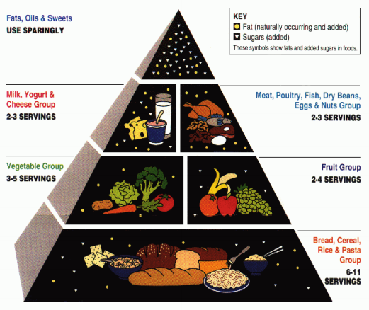
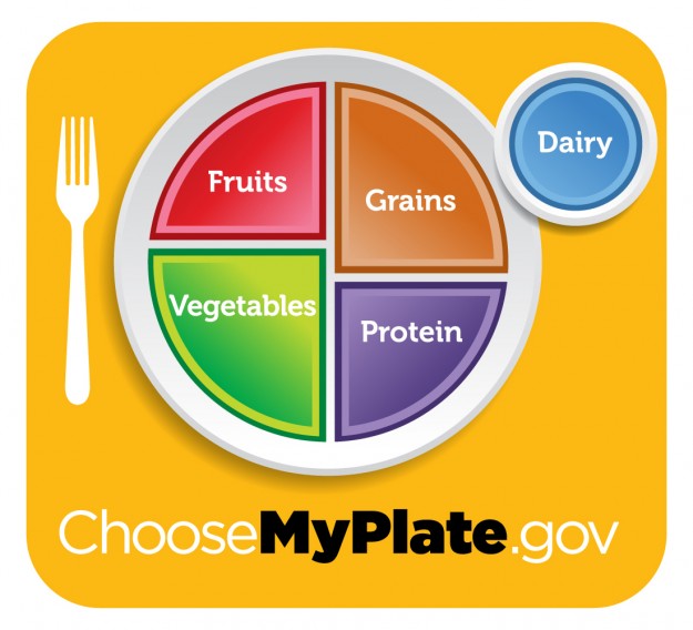
In an effort to decrease obesity and improve general health, the US government announced their newest guide to food proportions: the food plate. This of course is a departure from the food pyramid that has been around in one form or another since the 1990s. Instead of slivers or sections on a pyramid, we now have a pie chart type of thing. Well, more like a Simon.
So here's the question: Does the plate work better than the pyramid?


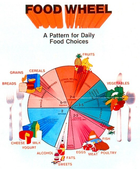
Or how about better than designs past, from the 1970s?


