RSS
 

Posts Tagged ‘Featured’

Fundamentals of Web Design Layout: Part 1

28 Sep

Layout is the foundation of all visual design, yet it commonly sits back seat to "sexier" design techniques like depth, color and typography. When layout is ignored, designs become fundamentally unusable, rendering a website useless to both users and stakeholders.

To respect the role of layout requires a solid understanding of what it is.

Layout Defined

The classic definition of layout is "The way in which parts of something are arranged." In web design specifically, layout is "The way elements, content and graphics are organized on the page." A key distinction here is the substation of "arranged" for "organized." Arranging elements without organizing them doesn't create a layout, it creates visual vomit.

The purpose of a layout is organization, more specifically layout uses organization to:

  • Convey relative importance of content
  • Group similar content and separate unrelated
  • Optimize visual flow
  • Establish a basic visual hierarchy

Each aspect of layout might not be compelling alone, but together they make or break a design.

When Good Layouts Go Bad

A great layout makes design look easy. Every element fits so well within the design, you would never consider putting them anywhere else. The "logical" organization of elements makes navigating the website easy. Users don't need to think where desired content is located, the layout tells them. If users are looking for important content, they know to look in the primary content area, typically located in the area with the most space. If they are looking for something less important, like navigation, they look for secondary or tertiary areas which are smaller and placed in less prominent locations.

Because layouts are purely visual, the best way to understand what works and what doesn't is through example.

Well Organized Layouts

Information Architects

The Information Architects website, while minimal to the point of being plain, has a beautiful designed layout. The layout is so predominate, it's actually the strongest design element.

The design makes no attempt to hide the underlying grid structure. Ample whitespace makes it easy to identify where each section within the layout starts and stops. The few graphical elements that are on the page receive maximum attention because they heavily contrast the otherwise white and text heavy design.

In terms of layout, the first element a user encounters is the top navigation which is broken up into four columns (1). That same four column structure is retained at the bottom where the footer navigation lies (2). By using the same column structure, users can easily extrapolate that the footer elements are also navigation. This occurs based on principles of consistency. Elements which look alike are thought as related, elements that look different are considered to be unrelated.

The primary area is bold, and large, equipped with a massive photo and supported with text which is broken up into three columns (3). Immediately below lives a news section, which for all intensive purposes is a single column. By shifting that column to the right and confining it to a smaller column whitespace and legibility are maximized (4).

Why this Layout Works

The primary goal of any layout is to clearly organize and locate information. The Information Architects website does so beautifully. By observing the layout you can decipher what's most important and in what order. Larger, higher up elements are clearly most important and as elements become less importance they shrink and are moved further down the page. The grid keeps everything organized neatly, everything falls into place in a logical way and your focus is never divided between two elements that seem equally important.

In this design, the layout is fitted the content.

Mark Boulton Design

The Mark Boulton Design website also employs a well executed layout. Like Information Architects, the design uses a grid to clearly organize content on the page. Unlike Information Architects, the design is bold, vibrant and graphical in nature. This demonstrating that using a grids and organization doesn't mean the site must be graphically stark.

The page header is placed at the very top of the page and is larger than anything else by a factor of at least 100. This clearly communicates it's the most important element (1). The header content is case studies, intentionally telling the user that above else, they should be aware of the companies previous work. Once you travel past the header, there is a full column tagline describing what the company does (2). Because the tagline is smaller and placed further down the page, it's apparent that Mark Boulton Design feels previous work is more compelling.

Below the tagline resides four equal width columns (3). The content with in those columns seem unrelated, but their size and placement indicates they are of equal importance. The ample whitespace makes it easy to read and digest content within a column, if you choose to do so.

Why this Layout Works

It doesn't feel like it, but there is a lot of content on this page: Case studies, navigation, a logo, the mission statement (or tagline), a brief company description, news, contact information and a portfolio section... phew! Because the content is laid out in a logical, well organized way it is easy to read and comprehend. The layout tells you what to look at and in what capacity.

With a quick glance you know what's most important (the header), almost as important (the tagline) and that everything else is equally important. Additionally, by using four equal width columns you can easily scan the headline of each to determine if the column contains the content you are seeking. If not, you continue scanning until you find the one that does.

Again the design puts content together like a puzzel. Everything fit's into place perfectly.

What's Next

Hopefully these examples illustrate what a well designed layout is composed of. Specifically, the layout organizes the content on the page based on it's importance and relationship. More important content is placed in large containers and located at the top of the page. Less important content is contained in smaller cells and placed lower on the page. Similar content (or content that's related) is grouped together which communicates their relationship.

In our next installment we will cover how to design your own layout in the most effective way.

Read the Whole Series

Fundamentals of Web Design Layout Part 1

Fundamentals of Web Design Layout Part 2


How do Americans spend their days?

20 Sep

How Americans spend their day -full

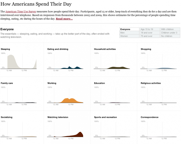
One of my favorite data graphics is an interactive piece by The New York Times that shows how Americans spend their day, based on the American Time Use Survey (ATUS). I've also been wanting to play with Mike Bostock's Data-Driven Documents, or D3 for short, for a while now. So put the two together, and this is what I got.

Main takeaway: we spend most of our time sleeping, eating, working, and watching television.

I followed the NYT aesthetic mostly for myself. I've found that a good way to learn is to try to copy something you like, and then use what you learn to do your own thing.

The NYT version was a stacked area chart with a number of interactions that made the data easier to read. I took a different route and split up some of the main activities, such as sleeping, eating, and working, into separate time series charts to see if it allowed you to see anything new. Showing separate charts at once places more focus on comparisons than on the distributions.

There was one challenge with the data that I didn't anticipate. ATUS provides a table of percentages by hour, but you'll notice with the NYT graphic the numbers are per ten minutes. You can actually calculate this with the ATUS microdata, which is basically the raw survey data from a few thousand respondents. I did this at first but lost patience, because I really just wanted to play with D3 rather than spend all my time building estimates.

I went with the hourly data which are averages for the sample population. The demographic breakdowns were only available in PDF, so I had some data entry fun, too. Luckily, I got my hands on Able2Extract (going off of Matthew Ericson's advice) to ease some of the pain.

Once the graphic was done, I noticed that the transitions are actually a nice way to show differences. For example, if you look at the time use for men and then women, the differences are subtle, but because the change is animated it's easier to spot. I think I knew this already, but probably never thought about it very deeply.

Anyways, it was fun playing around with D3. The beginning learning curve was kind of steep for me, but now that I know my way around a little better, I'm expecting more fun to come.

Mess around with the final graphic here. Let me know what you think.

[How Americans Spend Their Day]


Love the One You’re With

17 Aug

After C. S. Lewis lost his wife, Helen, to cancer, he realized he didn’t have a single good picture of her. Maybe that’s hard to grasp in our culture of profile pics from every angle, but he wasn’t upset about it. In fact, he saw the distinct advantage of lacking a quality image of his wife. He wrote:

I want H., not something that is like her. A really good photograph might become in the end a snare, a horror, and an obstacle.

How could a photo of the woman he loved become a snare? Because in the absence of the real person, he saw his tendency to fill the image with his own fancy. In fact, this was one of the prominent themes for Lewis in A Grief Observed. He was terrified at the prospect of shaping Helen into a phantom of his own making. Particularly alarming was his inclination to long for certain aspects of Helen’s personality more than others. Of course he would never intentionally import something fictitious about her, but, he mused, “won’t the composition inevitably become more and more my own?” What worried Lewis most was that Helen would become to him merely an extension of himself, of his old bachelor pipe-dreams.

Spousal Resistance

Lewis illuminates an overlooked gift in marriage: spousal resistance. I am not talking about red-faced tension or caustic defiance. I mean the simple fact that your spouse is a real person whose very existence will not conform to the image you have of him or her. Spousal resistance anchors you to reality, a reality in which God calls you to love your actual spouse, not your preferred one. Lewis observed:

All reality is iconoclastic. The earthly beloved, even in this life, incessantly triumphs over your mere idea of her. And you want her to; you want her with all her resistances, all her faults, all her unexpectedness. That is, in her foursquare and independent reality. And this, not any image or memory, is what we are to love still, after she is dead.

And, I would argue, when she is alive, too. As odd as it sounds, we can be thankful for the thousands of little disagreements that season the marital relationship, the countless differences of perspective that make it alive. These indicate that you are interacting with an independent being, one you’ve been entrusted with to love sacrificially.

The Original and Best

The very essence of sacrificial love is accommodating another rather than expecting another to accommodate self. Taking Lewis’s insight, then, we should be suspicious of our tendency to admire only those characteristics we approve of in our spouse and to revise those we don’t. When remembering a deceased spouse, this is bad enough; you aren’t loving her, but an edited memory of her. When serving a living spouse, it is worse; you aren’t pursuing her, but what you hope she would be. Far better is to love the original, not your revised edition. After all, you’re an original, too.

Loving the original requires lifelong adjustment on your part, and this deference is a key proof of the marital love that Christians are called to (Eph. 5:21-33). Don’t be discouraged when you don’t see eye-to-eye with your spouse. Where there is no disagreement, no annoyance, no resistance, there is no opportunity for sacrifice. If we love only what is pleasing to us in our spouse, we are loving only our preferences. We don’t need the gospel to do that.

We do need it to free us from our tendency to adjust one another constantly to our liking. Jesus came to serve an impulsive Peter, a distracted Martha, a dubious Thomas. And he came to serve a silly person like each one of us. And yes, Christ’s redemptive love changes us by degree, but this change is about conformity to righteousness, not conformity to personal preference.

So if your wife laughs too easily for your taste, love her for it. If she’s more pessimistic than you prefer, minister to her fears. If your husband is quieter in social gatherings than you’d like, be grateful for it. If he has more difficulty making plans than you think reasonable, come alongside happily. In all the little spousal resistances, celebrate the privilege of loving a person, not an image.

As Lewis said, reality is iconoclastic. And thank God this is especially true in marriage.


Google To FCC: Stop Letting The Voice Network Tail Wag The Internet Dog

20 Jun

The Internet carries nearly 160 times more traffic than voice networks in North America, yet many of the regulations and inter-carrier traffic fees are based on the quickly receding era when voice networks ruled. Google calls this the “Tail Wagging The Dog” in a letter to the FCC (embedded below) urging them not to impose antiquated per-minute voice traffic fees on IP networks. This is becoming an issue as IP voice traffic approaches that of traditional circuit-switched voice traffic. Google’s lawyers write in their letter:

Standalone voice traffic already is decreasing markedly relative to other forms of communications traffic; in fact, as depicted in the attached, the majority of voice traffic will be IP-based in just a few years. Accordingly, the FCC should not allow what amounts to the very small tail of legacy voice wireline services to wag the very large dog of all communications traffic exchange. In particular, per-minute voice traffic origination and termination charges are a persistent but unwelcome relic from the circuit-switched telephony era, and not best-suited for modern IP traffic and networks.

Google illustrates the changing nature of the network in a series of dramatic slides. Back in 1997, U.S. Internet traffic was only 3,300 terabytes per month, compared to 54,000 terabytes per month for the voice network. Three years later in 2000, voice traffic peaked at 66,000 terabytes per month, while Internet traffic had grown more than eightfold to 28,000 terabytes oer month.

By 2005, consumer IP traffic had reached 669,000 terabytes per month (with 2 terabytes of that being IP voice traffic), while voice traffic had shrunk to 48,000 terabytes per month.

In 2010, consumer IP traffic in North America completely dwarfed voice traffic with 5.7 terabytes per month versus 36,000 for the aging voice network. What’s more, IP voice traffic (Skype, Google Voice, etc.) accounted for 21,000 terabytes per month, or nearly 60 percent of what was going over the old switched network.

All of these networks, both data and voice, are going to IP networks. By 2015, Google estimates that consumer IP traffic in North America will more than triple again to 19.4 million terabytes per month, whereas the voice network will shrink further to 26,000 terabytes per month. And IP voice traffic will be almost as big at 21,000 terabytes per month (See top slide). The entire letter with all the slides is embedded below.


Zetros, Zetros, Golly! Ultra-Luxury Mercedes-Benz 6×6 RVs Tackle Mongolian Wilderness (And We’ve Got Interior Photos)

31 Mar

In Ulaanbaatar, Mongolia, there are a couple of guys who’ve done well for themselves in the business world. One owns a brewery that specializes in German-style beer; the other made his bones in the mining industry. Sometimes, they like to use eagles to hunt for wolves in the Altai mountains.

Now, after a long day of raptor-vs.-lupine action, your average Mongolian businessman might be content to retire to a lean-to by the side of his Land Rover, settling down with his companions and birds of prey for the night. These two, however, have decided to wet-sand the bejeezus out of the concept of roughing it. They bring the indoors with them, bolted to the chassis of Mercedes-Benz Zetros 6×6 trucks. Equipped with a 7.2-liter diesel inline-six that thwacks out 959 lb-ft of torque, the Zetros has three locking differentials and routes the power to all six wheels through a transfer case with a 1.69:1 low ratio.

The interior’s where things really get nutty. Far more opulent than our beloved GMC MotorHome, these custom-built living stations were designed and constructed by Hartmann in Alsfeld, Germany and outfitted by RV-interior specialist Huenerkopf. They feature fully insulated walls, furniture designed to withstand the harsh realm of the Gobi desert, a fully equipped galley, and perhaps most important, heated marble floors and a combo bidet/toilet in the head. One of the trucks also features a parking bay for a quad.

Tech amenities include two TV monitors (in 40- and 46-inch diagonals)—ironically seen in these pics showing a documentary about the wonders of the wild world—satellite communications and a Mac-mini based media hub plugged into a Bose sound system. It’s all run off four 220-Ah batteries charged automatically by a diesel generator and two 80-watt solar panel units mounted on the roof.

In the 1982 cinema classic Conan the Barbarian, the eponymous hero spends some time bunking with a Mongol horde. After a day of battle, a general asks his jubilant charges a simple question, “What is best in life?”

A proud Mongol warrior immediately replies “The open steppe! Fleet horse! Falcons at your wrist and the wind in your hair!”

“Wrong!” interjects the General. “Conan! What is best in life?”

“To crush your enemies, see them driven before you, and to hear the lamentation of their women!”

What if the answer were actually both? These custom Zetros trucks may well be your rides.

(Check out our gallery below for even more photos.)


Meet +1: Google’s Answer To The Facebook Like Button

30 Mar
Nearly a year after Facebook Like buttons spread out across the web, Google has announced its own rival, the +1 button. It launches today as part of Google’s search engine, allowing you to “+1″ the search results and ads that you like. And in a few months, it’ll be arriving...

Please visit Search Engine Land for the full article.


It’s time for English teachers to stop teaching that the earth is flat

18 Mar

Tweet

By Dennis Baron


When I asked a class of prospective teachers to discuss the impact on students of prescriptive rules like “Don’t split infinitives,” “Don’t end sentences with prepositions,” and “Don’t use contractions,” one student ignored the descriptive grammar we had been studying and instead equated correctness in language with intelligent design:

I think I support prescriptivism. I believe that some words are absolutely unacceptable in any situation. I think there should be an accepted way of speaking and deviation would not be tolerated. I believe in a set of absolute values. I believe there is one right and wrong for everyone. Perhaps what I think is right is not what you think is right but in the final analysis that isn’t going to matter. What God thinks is right is what really matters and He doesn’t have one right for you and one right for me.

Her faith-based answer, God speaks standard English so you should too, may be extreme, but her emphasis on correct language is one that too many English teachers accept without question. So far as grammar lessons go, it’s time they stopped teaching that the earth is flat.

Even though creationists attack evolution as “just a theory,” high school biology covers the origin of species, along with DNA, microbes and the circulatory system. Physics teaches the big bang, subatomic particles, and as even Galileo knew 400 years ago, an earth that moves around the sun. And students in chem labs aren’t turning lead into gold, except perhaps at Hogwarts. There are no fundamentalist wingnuts enforcing the view that the rules of English are written in stone, yet English teachers act like the study of language hasn’t advanced since eighteenth-century grammarians started making lists of good grammar and bad or decided that a noun is the name of a person, place, or thing.

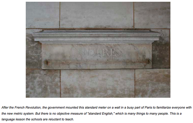
It’s not that English teachers don’t know that linguistic knowledge has progressed over the past 250 years. Prospective teachers get a healthy dose of sociolinguistics, transformational grammar, and the history of English. They study the emergence of dialects and the social contexts from which language standards grow. And they learn that unlike the standard meter or kilogram, which can be measured with scientific precision, there is no single, objective standard language which everybody speaks. They study language contact, assimilation, and heritage language loss, and they learn that when schools abandon bilingual education and leave non-English-speaking students to sink or swim in English-only classes, most sink. And last but not least, they’re taught to regard their students’ language not as something to be constantly graded and corrected, but as an energetic, highly-competent, continually-evolving form of language, complete with its own standards and variants.

But when they get their own classrooms, many of these same teachers reject such knowledge in favor of the simplistic language model they absorbed when they were in school, a model that ignores the complexities of the language people use every day in favor of a few prescriptive rules that can be memorized and tested, but that have little connection with what really happens when we talk or write.

Galileo, sitting in a science class today, would be mystified by a curriculum that has gone way beyond his experiment with an inclined plane, but Apollonius, the 2nd-century CE Greek grammarian who was one of the first to write about the parts of speech, would be perfectly at home with a modern grammar lesson, assuming he could follow it in English. And speaking of immigrants, if we could actually transport Apollonius and Archimedes, the Greek mathematician who first described the principle of buoyancy, to the local high school, they might find themselves sinking in an English-only immersion program.

For years linguists have been trying with little success to bring school grammar back to the present. We’re not proposing to do away with notions of correctness — ideas about appropriate usage form an important part of the way that English speakers function. Instead, we’d like to transmute the conventional right-wrong language dichotomy into a contextually-dependent sliding scale of language that works in particular situations, and language that may not work so well, demonstrating that there are many varieties of standard English, not just one. Plus, we’d like to point out that even in an English-speaking country, the language people use doesn’t always have to be English.

Unfortunately our schools have always been too focused on enforcing and testing a monolithic model of standard English to encourage teachers and their students to explore the language phenomena that surround us. As a result, teachers find it easier to tell students simply to avoid the passive voice than to get them to understand that although the passive can be problematic, it’s often useful and sometimes mandatory.

But even with the simplistic rule, “the passive should be avoided,” it turns out that many students can’t figure out the difference between the passive voice and the past tense. So in the end, standard English, which may or may not actually exist, often remains a mystery, and too many students leave school convinced that whether or not language is the product of intelligent design, its design is far from intelligible to them.

Luckily, outside the classroom things linguistic are neither obscure nor monochromatic. It’s true that when put on the spot, most people will parrot what they learned in school, that there’s a right and a wrong way to speak or write. But mostly people take a practical approach to correctness in language, recognizing as correct what works in a given context, not what’s categorically good or bad.

Perhaps the most important grammar lesson to learn, then, is to trust our language instincts instead of mimicking some ideal which turns out to be a moving target. We need to finally leave the eighteenth-century prescriptions behind and aim for language that is simply good enough to do the job of expressing whatever it is we need to say. And when we study language, we should study what it is, not what someone thinks it should be.

Dennis Baron is Professor of English and Linguistics at the University of Illinois. His book, A Better Pencil: Readers, Writers, and the Digital Revolution, looks at the evolution of communication technology, from pencils to pixels. You can view his previous OUPblog posts here or read more on his personal site, The Web of Language, where this article originally appeared. Until next time, keep up with Professor Baron on Twitter: @DrGrammar.


Contact lenses of the future projects images onto eyeballs

11 Jan

The future does bring some rather interesting additions to the fore, among them include contact lenses that are capable of projecting images right on top of your retinas, according to researchers at the University of Washington who have been hard at work on super small and semi-transparent LEDs which will be integrated into existing contact lenses. To date, they managed to develop red and blue pixels, awaiting the day when they are able to figure out green ones to create full color displays. Now fret not that the images are just millimeters away from your retinas – they will still be in perfect focus, and once the display is turned off, everything else will end up being transparent. As the lenses themselves are inside your eyelids, you won’t be able to not see anything that is projected – so closing your eyes won’t work at all. Does this mean we will have to pay more to get ad-free contact lenses in the future? That is certainly open to debate.

Contact lenses of the future projects images onto eyeballs, By Ubergizmo, 11 Jan 2011. Top Stories : Contact lenses of the future projects images onto eyeballs, Verizon iPhone announced, CES Trends That You Should Not Miss,


Word Lens Translates Words Inside of Images. Yes Really.

16 Dec

Ever been confused at a restaurant in a foreign country and wish you could just scan your menu with your iPhone and get an instant translation? Well as of today you are one step closer thanks to Word Lens from QuestVisual.

The iPhone app, which hit iTunes last night,  is the culmination of 2 1/2 years of work from founders Otavio Good and John DeWeese. The paid app, which currently offers only English to Spanish and Spanish to English translation for $4.99, uses Optical Character Recognition technology to execute something which might as well be magic. This is what the future, literally, looks like.

Founder Good explains the app’s process simply, “It tries to find out what the letters are and then looks in the dictionary. Then it draws the words back on the screen in translation.” Right now the app is mostly word for word translation, useful if you’re looking to get the gist of something like a dish on a menu or what a road sign says.

At the moment the only existing services even remotely like this are Pleco, a Chinese learning app and a feature on Google Goggles where you can snap a stillshot and send that in for translation. Word Lens is currently self-funded.

Good says that the obvious steps for Word Lens’ future is to get more languages in. He’s planning on incorporating major European languages and is also thinking about other potential uses including a reader for the blind, “I wouldn’t be surprised if we did French next, Italian and since my mom is Brazilian, Portuguese.”

Says Good, modestly, “The translation isn’t perfect, but it gets the point across.” You can try it out for yourself here.