
I never expected the Gap logo to be such a lightning bolt of attention. Yes, it's bad and yes it's a popular brand, but to have captured the attention of the whole internet, even reaching meme levels wasn't something I ever expected the grilled chicken of retail brands to achieve. Despite not being the first blog to jump on the news, our traffic tripled to over 115,000 pageviews on Wednesday and doubled to 84,000 yesterday. This is not to brag about traffic, but a factual representation of the mainstream interest this redesign has gotten. The aftermath of the new logo's launch has been both hilarious and painful. Following are the most interesting developments of the last 48 hours.

Gap Responds
On their Facebook page, Gap posts a status update on Wednesday with the idiocy quoted below. It fuels speculation on whether this was all a hoax to get attention. Because it gets a lot of attention, you have to either think Gap is genius or just smarter than a trash can.
Thanks for everyone's input on the new logo! We've had the same logo for 20+ years, and this is just one of the things we're changing. We know this logo created a lot of buzz and we're thrilled to see passionate debates unfolding! So much so we're asking you to share your designs. We love our version, but we'd like to see other ideas. Stay tuned for details in the next few days on this crowd sourcing project.
— Gap's Facebook status update
On Thursday, there is a little more official confirmation that this redesign actually happened and that someone at Gap was aware of what was going on. Alissa Walker at Co. had a little conversation with Bill Chandler, vice president of corporate communications, who confirms that the logo was designed by New York-based Laird and Partners.
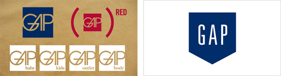
The new logo was designed by Trey Laird and his firm Laird and Partners, who have served as Gap's creative directors for many years, while working closely with Gap of North America president Marka Hansen. While Chandler stresses that Gap stands by the logo they've created, they also want it to signify that the company itself is changing — and that should come with input from consumers.
"I'm not going to comment on specific aspects of the dialogue. But we're thrilled about the energy and passion that customers have shown. We want to collaborate with them."
— Bill Chandler, vice president of corporate communications on Co.
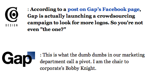
This morning, Friday, on good ol' HuffPo — where important people sometimes go to openly repent — Marka Hansen, President, Gap North America expands on the idiocy above by confirming their commitment to engaging the whole nation in spec work.
From this online dialogue, it's clear that Gap still has a close connection to our customers, so tapping into this energy is right. We've posted a message on the Gap Facebook Page that says we plan to ask people to share their designs with us as well. We welcome the participation we've seen so far.
— Marka Hansen, President, Gap North America on Huffington Post
Open letters
What is a design debacle without open letters? First, it's Mat Dolphin's, who emerged as the voice of reason on Wednesday by having a post that asked for people to wait and hear about why the logo changed the way it did and that maybe we should live with it before jumping to conclusions. Sorry Mat, things don't work that way. Like glands that make our tongues salivate, humans have a trigger that makes us jump to conclusions. Especially with things that suck. Bryan Byczek has another open letter. Word on the Twitter is that AIGA, the professional association for design, has also sent a letter on behalf of designers but I haven't seen that yet.
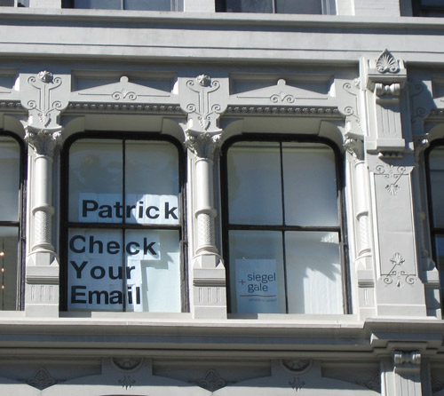
One late addition to the open letters comes from Siegel+Gale, whose office happens to be directly across the street from Gap Inc.'s offices. The message, intended for Patrick Robinson, Gap's executive vice president of global design, is a timely new business pitch. Get 'em while they are hot, I say.
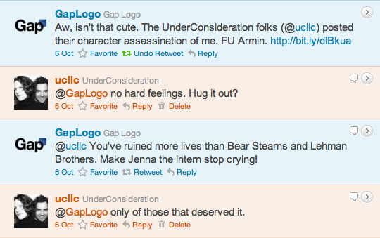
@GapLogo
Perhaps the funniest and sharpest manifestation of everyone's disappointment came in the form of the sassy yet self-deprecating @GapLogo on Twitter. Well played to whoever is behind it. On Wednesday, @GapLogo and @UCllc had a little têtê-à -têtê.
Alissa Walker, again, at Co. took on the identity (pun!) of the Co. logo and had a heart-to-heart interview with the @GapLogo.
Logo Alternatives
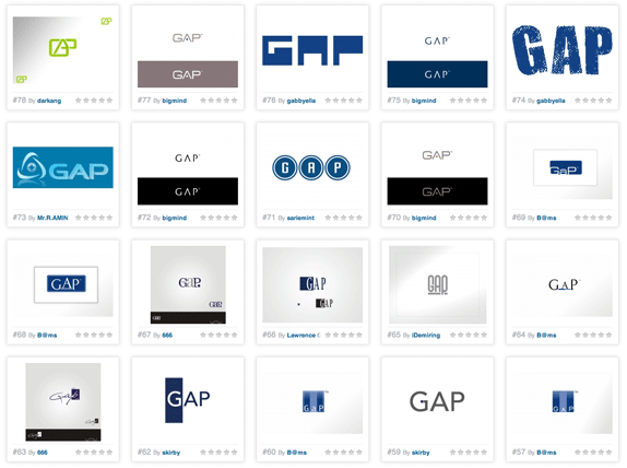
Then came the inevitable "Design the Gap Logo!!!!" posts that are at times hilarious but more often than not are heart braking because some people actually believe that the logo they put together in five minutes is infinitely better. Hate to break it to some of you but, as bad as the new logo is, some of the stuff submitted without irony or a wink — and I can smell those miles away — are nasty.
First up was ISO50, posting an open call for submissions first thing on Wednesday morning. So far it has received 238 entries. As I mentioned above, some are just embarrassing. Others are actually passable.
In the parody category we have Matt Ipcar, Guillaume Marais. Poking fun at AOL and iTunes respectively.
These I could actually see thrown in into an initial presentation to Gap. By Ryan Lockwood and Trisha Salge.
No comment. No, I take that back. These are painful to watch. The first one, by Soxy Fleming, isn't even in blue, and worse it's just inverted in Photoshop. The second, by Evan Hensleigh, like many, attempted to do a first semester typography exercise of putting a gap in Gap. No.
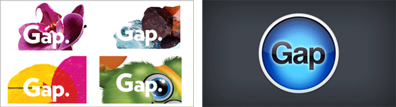
But there is nothing like actually tapping into the grand coliseum of logo crowdsourcing. 99designs is hosting its own competition offering a reward of $500 to the most popular vote getter. After 920 entries there, it's clear that civilization is doomed.
Gap recently announced a new logo which has received criticism from designers and customers all over the world. We think the 99designs community of designers can do much, much better!
The winning design will be decided by community vote and 99designs will present the winning logo to the management of The Gap Inc as a gesture of goodwill. The winning designer will also be featured in the next 99designs newsletter!
— "Brief" at 99designs
The Gap Meme
Both the Barbarian Group and James Yu quickly cobbled together one-page sites that allow anyone to type in text and get their own Gap logo.
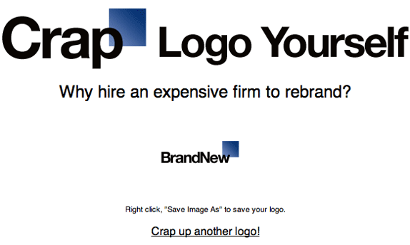
The Barbarian Group's CrapLogoMe, unfortunately down at the moment.
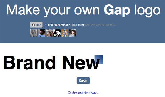
James Yu's Make Your Own Gap Logo. Hey, Erik Spiekermann likes it!
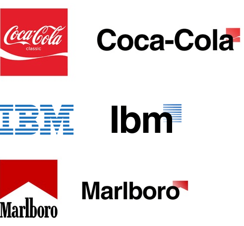
There is also the Gapify Tumblr by Joseph Ippolito, probably my favorite parody, applying the same design strategy to a number of other popular logos.
There you have it. That's what has transpired in the last two-plus days. If this was all a PR stunt by Gap, bravo, you got us. Hardy har har. If it wasn't, I think that's an even more frightening thought. It places identity design as a task that requires no real commitment and that it can be toyed with by the client. The crappy new logo can be forgiven in time, but this behavior by Gap shouldn't be. Good luck Gap.
 Don't forget to cast your vote about this post online


