RSS
 

Posts Tagged ‘General’

Fundamentals of Web Design Layout: Part 1

28 Sep

Layout is the foundation of all visual design, yet it commonly sits back seat to "sexier" design techniques like depth, color and typography. When layout is ignored, designs become fundamentally unusable, rendering a website useless to both users and stakeholders.

To respect the role of layout requires a solid understanding of what it is.

Layout Defined

The classic definition of layout is "The way in which parts of something are arranged." In web design specifically, layout is "The way elements, content and graphics are organized on the page." A key distinction here is the substation of "arranged" for "organized." Arranging elements without organizing them doesn't create a layout, it creates visual vomit.

The purpose of a layout is organization, more specifically layout uses organization to:

  • Convey relative importance of content
  • Group similar content and separate unrelated
  • Optimize visual flow
  • Establish a basic visual hierarchy

Each aspect of layout might not be compelling alone, but together they make or break a design.

When Good Layouts Go Bad

A great layout makes design look easy. Every element fits so well within the design, you would never consider putting them anywhere else. The "logical" organization of elements makes navigating the website easy. Users don't need to think where desired content is located, the layout tells them. If users are looking for important content, they know to look in the primary content area, typically located in the area with the most space. If they are looking for something less important, like navigation, they look for secondary or tertiary areas which are smaller and placed in less prominent locations.

Because layouts are purely visual, the best way to understand what works and what doesn't is through example.

Well Organized Layouts

Information Architects

The Information Architects website, while minimal to the point of being plain, has a beautiful designed layout. The layout is so predominate, it's actually the strongest design element.

The design makes no attempt to hide the underlying grid structure. Ample whitespace makes it easy to identify where each section within the layout starts and stops. The few graphical elements that are on the page receive maximum attention because they heavily contrast the otherwise white and text heavy design.

In terms of layout, the first element a user encounters is the top navigation which is broken up into four columns (1). That same four column structure is retained at the bottom where the footer navigation lies (2). By using the same column structure, users can easily extrapolate that the footer elements are also navigation. This occurs based on principles of consistency. Elements which look alike are thought as related, elements that look different are considered to be unrelated.

The primary area is bold, and large, equipped with a massive photo and supported with text which is broken up into three columns (3). Immediately below lives a news section, which for all intensive purposes is a single column. By shifting that column to the right and confining it to a smaller column whitespace and legibility are maximized (4).

Why this Layout Works

The primary goal of any layout is to clearly organize and locate information. The Information Architects website does so beautifully. By observing the layout you can decipher what's most important and in what order. Larger, higher up elements are clearly most important and as elements become less importance they shrink and are moved further down the page. The grid keeps everything organized neatly, everything falls into place in a logical way and your focus is never divided between two elements that seem equally important.

In this design, the layout is fitted the content.

Mark Boulton Design

The Mark Boulton Design website also employs a well executed layout. Like Information Architects, the design uses a grid to clearly organize content on the page. Unlike Information Architects, the design is bold, vibrant and graphical in nature. This demonstrating that using a grids and organization doesn't mean the site must be graphically stark.

The page header is placed at the very top of the page and is larger than anything else by a factor of at least 100. This clearly communicates it's the most important element (1). The header content is case studies, intentionally telling the user that above else, they should be aware of the companies previous work. Once you travel past the header, there is a full column tagline describing what the company does (2). Because the tagline is smaller and placed further down the page, it's apparent that Mark Boulton Design feels previous work is more compelling.

Below the tagline resides four equal width columns (3). The content with in those columns seem unrelated, but their size and placement indicates they are of equal importance. The ample whitespace makes it easy to read and digest content within a column, if you choose to do so.

Why this Layout Works

It doesn't feel like it, but there is a lot of content on this page: Case studies, navigation, a logo, the mission statement (or tagline), a brief company description, news, contact information and a portfolio section... phew! Because the content is laid out in a logical, well organized way it is easy to read and comprehend. The layout tells you what to look at and in what capacity.

With a quick glance you know what's most important (the header), almost as important (the tagline) and that everything else is equally important. Additionally, by using four equal width columns you can easily scan the headline of each to determine if the column contains the content you are seeking. If not, you continue scanning until you find the one that does.

Again the design puts content together like a puzzel. Everything fit's into place perfectly.

What's Next

Hopefully these examples illustrate what a well designed layout is composed of. Specifically, the layout organizes the content on the page based on it's importance and relationship. More important content is placed in large containers and located at the top of the page. Less important content is contained in smaller cells and placed lower on the page. Similar content (or content that's related) is grouped together which communicates their relationship.

In our next installment we will cover how to design your own layout in the most effective way.

Read the Whole Series

Fundamentals of Web Design Layout Part 1

Fundamentals of Web Design Layout Part 2


‘Made In China’ Accounts For Less Than 3 Percent Of American Personal Consumption Expenditures

09 Aug

A very interesting analysis by Galina Hale and Bart Hobijn of the San Francisco Fed concludes that very little of American personal consumption spending actually ends up in China. When Americans go buy stuff, they’re overwhelmingly buying things that are made in America:

In part, this reflects the fact that 67 percent of spending is on services rather than goods, and services are 96 percent made in the USA. But even durable goods, which only account for about 10 percent of total spending, are mostly made in America — 66.6 percent to 12 percent for China with the rest coming from the rest of the world. In fact the only category of spending in which Made in the USA doesn’t account for the majority is clothing and shoes. What’s more, even a lot of the spending on imported goods actually reflects the cost of shipping them around the United States:

Table 1 shows that, of the 11.5% of U.S. consumer spending that goes for goods and services produced abroad, 7.3% reflects the cost of imports. The remaining 4.2% goes for U.S. transportation, wholesale, and retail activities. Thus, 36% of the price U.S. consumers pay for imported goods actually goes to U.S. companies and workers.

This U.S. fraction is much higher for imports from China. Whereas goods labeled “Made in China” make up 2.7% of U.S. consumer spending, only 1.2% actually reflects the cost of the imported goods. Thus, on average, of every dollar spent on an item labeled “Made in China,” 55 cents go for services produced in the United States. In other words, the U.S. content of “Made in China” is about 55%. The fact that the U.S. content of Chinese goods is much higher than for imports as a whole is mainly due to higher retail and wholesale margins on consumer electronics and clothing than on most other goods and services.

Hale & Hobijn draw from this the narrow point that inflation in China is not likely to have a substantial effect on the price level in the United States. There’s no reason, in other words, for the Fed to worry that inflation in developing countries is a reason for tight money at home. But the broader point, as Doug Henwood says is to serve as “an antidote to the widespread belief that the U.S. is hollowed out and all the action is in China.”


Bad News For Lamb Fans

19 Jul

I’ve long felt that the American consumer’s aversion to lamb was slightly odd. It’s got a more delicious flavor than beef, in my opinion, and sheep are generally raised in more humane conditions than other mass market animals. Unfortunately, lamb turns out to be an ecological catastrophe:

That meat in general is bad news, climate-wise, is familiar. But it’s interesting what a big gap there is. The carbon gap between lamb & beef on the one hand and pork & chicken on the other is larger than the gap between between pork & chicken and vegetarianism.


Real Interest On Government Debt Is Negative

11 Jul

Karl Smith observes that the flight to quality has become so severe that the real interest rate on some classes of government debt is negative:

Suppose the government had two choices. It could either pay for infrastructure improvements as it went along out of tax revenue or it could borrow money build the infrastructure now and then repay the money with tax revenues. Ordinarily the question would be, does the advantage of building quickly outweigh the cost of the interest. However, right now the interest cost is negative. The government saves money by borrowing now rather than waiting and paying cash. Let me say again because I have noticed that this goes against so much intuition that its hard for many people to wrap around when I first say it.

In a sane political environment, Washington would be obsessed with the question of how much can get done within this window. How many projects is it logistically possible to complete quickly enough to take advantage of the cheapness of debt. Instead, we’re attempting to resolve thorny and ideologically freighted questions about the long-term trajectory of the welfare state even though resolving these issues won’t change anything about the present environment. It’s weird. It’s sad.


The most epic diaper commercial of all time

06 Jan

Fredrick Bond got together with Mass Market to give Huggies the Philips Carousel treatment. Despite its ironically gratuitous approach, the concept and tag definitely work. You are marketing to parents after all, so why not ditch the cute animated characters and have some fun with the execution.

Client/Product: Huggies Little Movers Diapers

Agency: JWT, New York
Executive Creative Director: Walt Connelly
Creative Director: Richie Glickman
Art Director: David Suarez
Copywriter: Daniel Gonzalez
Head of Art: Aaron Padin
Title Animation: Chadwick Whitehead
Director of Integrated Production: Clair Grupp
Director of Brand Production: Joe Calabrese
Senior Integrated Producer: Owen Katz
Assistant Producer: Mike McLoughlin
Business Director: Karyn Rockwell
Account Executives: Aissatou Balde, Raymond Lynch

Production Company: MJZ
Director: Fredrik Bond
Executive Producer: Lisa Margulis
Senior Executive Producer: Jeff Scruton
Producer: Nicholas Wrathall
DP: Hoyte van Hoytema

Visual Effects and Editorial: MassMarket, New York
Executive Producers: Rich Rama, Justin Lane
Producer: Nancy Nina Hwang
Associate Producers: Marcus Lansdell, Justin Romero
Editor: Cass Vanini
Lead Flame: David Parker
Senior Flame: Jamie Scott
CG Supervisor: Damon Ciarelli
CG Lead: Andy Jones
CG: Todd Akita, Jonah Friedman, Soo Hee Han, Xuan Siefert
CG Modeler: Tom Cushwa
CG Previz: Ian Brauner
Tracking Lead: Joerg Liebold
Tracking: Denis Trutanic
Flame: Joanne Unger
Junior Flame: Jeen Lee, Adam Flynn

Audio Post: JWTwo
Sound Mixer: Andy Green
Music Producer: Dan Burt
Audio Producer: Greg Tiefenbrun

Animation Company: Buck, New York
Executive Producer: Kate Treacy, Anne Skopas
Producer: Kevin Hall
Creative Director: Orion Tait
CG Supervisor: Lars Holmgren
3D Generalist: Kevin Couture, Arvid Volz, Dave Soto
CG Lead/Modeling/Comping: Ryan O’Phelan

Posted on Motionographer


Gmail Now Offers Rich Text Signatures

09 Jul
Gmail Now Offers Rich Text Signatures

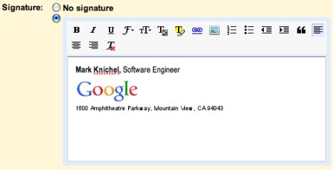
Gmail users have often complained about the lack of rich text signatures in Gmail, and after a long period of waiting, Google has finally announced that rich text signatures are now supported in the desktop version of Gmail. All you have to do is visit the settings page, and play with the rich text editor in the signature section. Aside from that, Gmail also supports a unique signature for each email address associated with your account, so you'll be able to assign different signatures for different addresses. The older version, HTML version, and mobile versions don't support rich text just yet, but we hope that they will in the near future.

Permalink: Gmail Now Offers Rich Text Signatures from Ubergizmo | Hot: Evo 4G Review, iPad Review


Spacewatch: Milky Way Over Canyonlands

12 Oct

By Evan Ackerman

This picture of the milky way galaxy was taken by amateur astrophotographer Wally Pacholka in Canyonlands National Park in Utah. It’s a panorama of 4 individual pictures stitched together, each one a 25 second exposure on a Canon 5D at 1600 ISO with a 24mm lens. The lighting inside the cave comes from flashlights bouncing soft light off rocks, but the rest of the lightning comes from nothing but a crescent moon and the stars. It took him five 1600 mile trips out to Utah, plus a 2 mile hike in the dark (and he got lost every time) to get this one image. Worth it? Yeah, obviously. You can buy 11 x 14 prints of this picture starting at $55.

[ Wally Pacholka ] VIA [ Digg ]

 
Comments Off on Spacewatch: Milky Way Over Canyonlands

Posted in Uncategorized


Video: Tilt-Shift Time-Lapse

09 Oct


Bathtub III

By Evan Ackerman

Remember that post from January about Nikon’s then new tilt-shift lens? You know, the one where I wrote a bunch of interesting stuff and then painstakingly photoshopped a sample tilt-shift image? You DO? Oh, you were just kidding. Sigh. Anyway, tilt-shift photography is a technique of narrowing depth of field to make things look like miniatures, and if you combine that with time-lapse photography, you can make some sweet movies of normal life, tinyified.

This video was taken by Keith Loutit; see another of his, after the jump.


Beached

[ Keith Loutit ] VIA [ Gizmodo ]

 
Comments Off on Video: Tilt-Shift Time-Lapse

Posted in Uncategorized


New Research: Social Network Analysis of Wikipatterns.com

01 Oct

Wikipatterns.comFor the past few months, I’ve been working on a social network analysis of Wikipatterns.com with Laurence Lock Lee of Optimice and James Matheson of CustomWare Asia Pacific.

Laurence approached me earlier this year about studying the relationships between people who are members of the Wikipatterns.com community, and we conducted a survey of users in June. Laurence presented preliminary results at the International Forum on Enterprise 2.0 in Varese, Italy, and now the final report is available.

 
Comments Off on New Research: Social Network Analysis of Wikipatterns.com

Posted in social networking