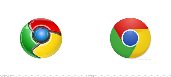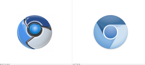
First released for Windows XP in December of 2008, Google Chrome is a browser developed by, yes, Google. Versions for Mac OS X and Linux followed a few months later and since then Chrome has become one of the most popular browsers — 19.26% of you are reading Brand New on Chrome, in third "place" behind Safari and Firefox. Chrome's most current stable release is version 10.0.648.134 (but you knew that, right?) and currently in development is dev version 11.0.696.12 which is not released to the public yet but for those that are taking it for an early spin they have gotten a glimpse at the new logo for Chrome. The new logo for Chrome surfaced after a new logo for Chromium — the open source version of Chrome — made its debut earlier this year.

It's certainly nice and welcome to move away from logos that looked as if they came out of a mash-up of Fisher-Price and Tron and the new "abstract," flat logos are slightly slicker but there is still something odd about them. There is shading still involved, so dimension is meant to be implied, yet it's hard to tell what that dimension is supposed to be. If the light source is coming from above, how come there are shadows being cast from bottom to top as seen in the green-to-red transition? The red-to-yellow pane indicates one kind of dimension but the rest doesn't follow. Realistic dimension is not about taking one shape and step-repeating it, shadow and all, a couple of times to form the circle. The previous versions of Chrome and Chromium were garish but at least it was clear what the dimension was. With the new ones, Google tried some kind of compromise between full 3D rendering and flat and it didn't quite pay off. Maybe I'm just misinterpreting what I'm seeing or trying to extract too much sense out of it — indeed, I'm just glad for the move towards simplicity.
Thanks Lucian Marin for first tip.

Don't forget to cast your vote about this post online
