RSS
 

Posts Tagged ‘HTML5’

Why Google+ won’t hurt Facebook, but Skype will hate it

28 Jun

Google launched its much awaited and highly anticipated social networking platform today to a limited number of users. Dubbed Google+ (Plus), the service may take its cue from social networking giant Facebook, but in the end it is about the harsh reality of Google saving and enhancing its core franchise — Google Search. It is search (and, by extension, advertising) that made Google a company that has run afoul of the Federal Trade Commission because of its huge size and influence.

At the time of Google’s founding, search was broadly defined as a sifting through a directory of websites. As the web grew, search became all about pages. Google, with its PageRank, came to dominate that evolution of search.

Today, search is not just about pages, but also about people and the relevance of information to them.

Google’s senior executives — long dismissive of the idea of importance of social to search — were contrite during their briefing earlier this week. “It is about time we have come to the realization,” said Bradley Horowitz, vice president of product with Google, “If you don’t know people, then you can’t organize the information for people.”

Google’s realization — however late – that it needs to use social, location and other signals to enhance its core search platform is welcome. “Google needs to understand these relationships and basically use those to make search better,” said Vic Gundotra, Google’s senior vice president for Social in an hour-long briefing earlier this week.

Why? Because the the internet (and information) are expanding with such rapidity that there is no room for assumptions, and as such our systems need to adapt to this world of no (or alternatively infinite) assumptions. Google needs to adapt, and getting social and location signals is important for the company. Search is now search relevant to you in the context of your world — and that is where Google+ comes in.

What is Google Plus?

Is Google+ a destination like Facebook.com? Is it a social network? Is this an identity play? The answer to those questions is yes and no. Google’s Gundotra said that this is the first step by the company in its long social journey, which is going to evolve.

Today, you can get to Google Plus by visiting a website – Google.com/+. But it also travels with you across different Google web properties, thanks to a Google Toolbar. The toolbar is personal to you and allows you to share and send photos, videos, links or just simple messages. A notification icon informs you if others have shared stuff with you.

Google, Gundotra says, has leveraged its infrastructure to offer an array of services, and at the same time the company is attacking Facebook’s noticeable shortcoming — granular privacy that average folks can understand. More importantly it is trying hard to not be compared with Facebook.

Some of Google + Features:

In order to use Google +, you need to have a Google account, though it doesn’t necessarily mean you need to have a Google Mail account. Once you set-up your Google account, you can use your address book to invite people to your network and use that as a starting point.

Circles: Google has come up with the concept of circles — you can create a circle of contacts that are family, friends, work friends, former co-workers and so on. With these groups or circles you can define who gets to see what kind of updates. Facebook currently doesn’t offer the ability to control who sees what goes in our life that we share online.

Hangout: This just might be the killer feature of Google + effort. It is essentially group video chat done right. You click on the Hangout button and invite members of a certain group by sending them a notification. If there is no one around, all I could do is hang about without much drain on the system waiting for someone to show up. So theoretically I could invite all members of team GigaOM circle and have a quick video chat. In the demo at least, Hangout felt intuitive and easy to use (Google uses its own video codec and not Adobe Flash for this feature).

Huddle: This is a mobile group-chat service that is very much like Beluga, the fast-growing service that was snapped up by Facebook weeks after it was launched and is now said to be part of a major new communications push by Facebook. I think this is a great little feature and frankly, if Google was smart they should be rolling this out to all Google Apps for the Enterprise customers.

Instant Uploads: It has also come up with a new approach to mobile photos & videos. Google calls it Instant Uploads. Take a photo and it uploads to your Picasa or YouTube account and then you can share those videos via Google+  to specific “circles.”

Sparks: It is a new feature that allows you to create topics of interest and use them as source of information and then share it with various different groups. For instance, I could share results of Top Gear with my “petrol head” friends. These “interest” or “topic” packs offer a lot of content and not surprisingly YouTube videos. Circles, Hangout and Huddle are about personal sharing and personal communications. Sparks on the other hand is devoid of that connection and stands out as a sore thumb.

Google Plus + Chrome + Android

A few months ago, I wrote about how Google could beat Facebook, pointing out that it was not going to be on the web, and instead on the mobile.

I’ve always maintained Google has to play to its strengths – that is, tap into its DNA of being an engineering-driven culture that can leverage its immense infrastructure. It also needs to leverage its existing assets even more, instead of chasing rainbows. In other words, it needs to look at Android and see if it can build a layer of services that get to the very essence of social experience: communication.

However, instead of getting bogged down by the old-fashioned notion of communication – phone calls, emails, instant messages and text messages – it needs to think about interactions. In other words, Google needs to think of a world beyond Google Talk, Google Chat and Google Voice.

To me, interactions are synchronous, are highly personal, are location-aware and allow the sharing of experiences, whether it’s photographs, video streams or simply smiley faces. Interactions are supposed to mimic the feeling of actually being there. Interactions are about enmeshing the virtual with the physical.

The ability to interact on an ongoing basis anywhere, any time and sharing everything, from moments to emotions – is what social is all about. From my vantage point, this is what Google should focus on.

I am glad to see Google is thinking along these lines and is building products with a mobile-first point of view, a concept that former CEO Eric Schmidt has often talked about.

While I was given a demo by the Google executives on a notebook computer, the heavy use of HTML5 makes Google Plus an experience that could easily work on Android tablets and Android phones. Instant Uploads, Circles, Huddle and Hangout can work on these mobile devices without much textual input, making them easy to use on the touch-centric mobile platforms. Google at the same is also making  Google Plus available as an app – for Android and the iPhone platform – ensuring that it is getting the experience right.

Facebook Has Nothing To Worry About

I don’t think Facebook has anything to worry about. However, there is a whole slew of other companies that should be on notice. Just as Apple put several app developers on notice with the announcement of its new iOS 5 and Mac OS X Lion, Google+ should give folks at companies such as Blekko, Skype and a gaggle of group messaging companies a pause. I personally think Skype Video can easily be brought to its knees by Google Plus’ Hangout. And even if Google+ fails, Google could easily make Hangout part of the Google office offering.

One of the reasons why I think Facebook is safe is because it cannot be beaten with this unified strategy. Theoretically speaking, the only way to beat Facebook is through a thousand cuts. Photo sharing services such as Instagram can move attention away from Facebook, much like other tiny companies who can bootstrap themselves based on Facebook social graph and then built alternative graphs to siphon away attention from Facebook. Google, could in theory go one step further – team up with alternative social graphs such as Instagram, Twitter and Tumblr and use those graphs to create an uber graph.

Build it, But Will They Come?

View This Poll
online surveysIn the past, I have been pretty skeptical of Google’s social ambitions, mostly because of company’s DNA. Based on a briefing and a demo, I am not yet ready to change my opinion.

Google needs this social effort to work — it needs to get a lot of people using the service to create an identity platform that can rival Facebook Connect. It needs the people to improve its search offering. Of course, the Google’s biggest challenge is to convince people to sign-up for yet another social platform, especially since more and more people are hooked into Facebook (750 million) and Twitter. I don’t feel quite compelled to switch from Facebook or Twitter to Google, just as I don’t feel too compelled to switch to Bing from Google for Search.

I can easily see services such as Hangout and Huddle get traction, but will that be enough to get traction with hundreds of millions of people? Doubtful, though I am happy to be proven wrong, for it would surely be nice to have a counterbalance to Facebook.

Related content from GigaOM Pro (subscription req’d):


‘World’s Biggest Pac-Man’ connects user-created mazes in your browser

14 Apr
Yesterday at the MIX11 conference, Microsoft revealed a project undertaken with Soap Creative and Namco Bandai: The World's Biggest Pac-Man, an HTML 5 version of the iconic arcade game with user-created levels. Every maze is connected, allowing players to use the "exits" on the side of a maze to enter another one -- even if it feels really wrong to leave a maze partially completed (so wrong). The rapidly expanding continent of Pac-Man mazes currently includes 1420 separate screens.

The app requires users to sign into Facebook before creating new mazes, but no login is required to explore the growing selection of levels. It should run on any browser (despite being released as promotion for Internet Explorer 9), but based on our experience iOS devices aren't compatible.

Joystiq'World's Biggest Pac-Man' connects user-created mazes in your browser originally appeared on Joystiq on Thu, 14 Apr 2011 09:30:00 EST. Please see our terms for use of feeds.

Permalink | Email this | Comments


30 Examples of Websites Using HTML5

10 Apr

Advertise here with BSA


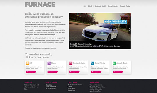
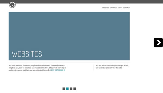
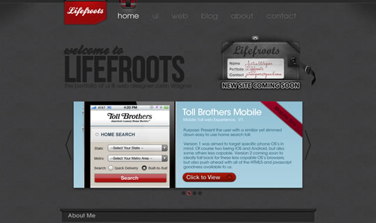
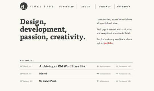
HTML5 is certainly here to stay, from a numerous list of articles, events and buzz about this latest revision of the HTML standard. Some websites using HTML5 proudly show the official logo and state the sentence “support the future now”. So to support all this buzz and the technology we decided to gather a new list showcasing websites using HTML5.

NakshArt

html502

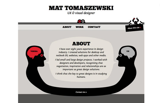
Mat Tomaszewski

html503

welcomebrand

html504

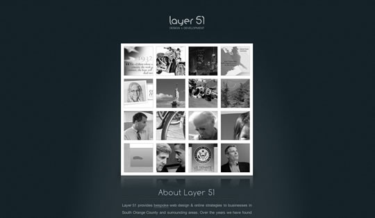
layer 51

html505

Stockholm Hairdresser

html506

Furnace

html507

Virtuti Design

html508

Lifefroots

html509

Float Left

html510

Daniel Scholten

html511

AX Visual Design Studio

html512

robedwards.org

html513

Festival Mundo

html514

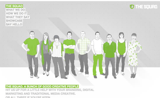
The Squad

html515

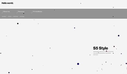
S5 Style

html516

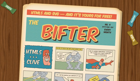
Bifter SVG Comic

html517

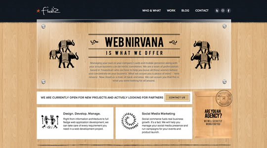
Fidiz

html518

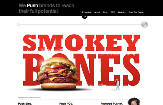
Push

html519

re:play

html520

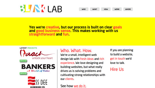
Blink Lab

html521

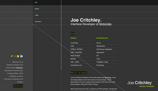
Joe Critchley

html522

Lexways

html523

ar-com.co.uk

html524

Kiran Owal

html501

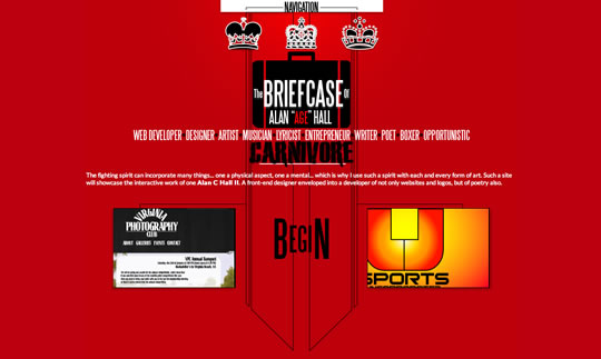
Hallzzz

html525

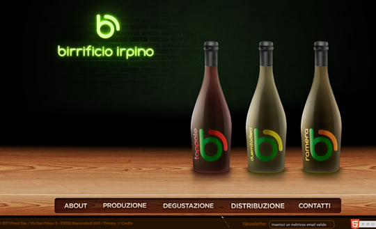
Birrificio Irpino

html526

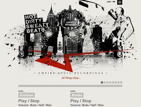
Empire State Recordings

html527

McKinney

html528

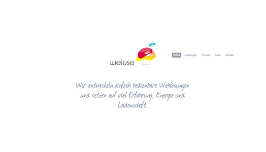
weluse

html529

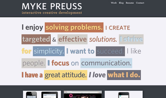
Myke Preusss

html530

Source:

HTML5 Gallery
HTML5 Websites


HTML5 and CSS3 Without Guilt

17 Dec

Not every HTML5 or CSS3 feature has widespread browser support, naturally. To compensate for this, enterprising developers have created a number of tools to let you use these technologies today, without leaving behind users who still live in the stone age.


Prologue

HTML5 Semantic Elements

The good news is that, except for Internet Explorer, you can create more semantic markup by using the new HTML5 elements — even in browsers which don’t officially support them. Just remember to set the correct display mode: block. The following snippet should reference all necessary elements:

article,aside,details,figcaption,figure,
footer,header,hgroup,menu,nav,section {
   display: block;
}

IE Conditional Comments

Implementing many of the solutions in this tutorial involves including some JavaScript for specific Internet Explorer releases. Here is a quick overview: the test expression is enclosed in square brackets. We can check for specific versions or versions above or below a stated version. lt and gt mean lower than and greater than, respectively, while lte and gte mean lower than or equal to and greater than or equal to.

Here are some quick examples:

[if IE 6]

Checks if the browser is Internet Explorer 6.

[if gt IE 6]

Checks for a version of Internet Explorer greater than 6.


Tool 1: HTML5 Shiv

In anything IE, excluding the most recent version (IE9), you cannot apply styles to elements that the browser does not recognize. Your spiffy, new HTML5 elements, in all their glory, are impervious to CSS rules in that environment. This is where Remy Sharp’s html5shiv (sometimes called html5 shim) comes to the rescue. Simply include it in your page’s <head> section and you will be able to style the new HTML5 elements perfectly.

<!--[if lt IE 9]>

<script src="http://html5shiv.googlecode.com/svn/trunk/html5.js"></script>
<![endif]-->

Notice how the conditional comments only load the html5shiv code on the condition that the version of Internet Explorer is lower than 9. Other browsers, such as Firefox and Chrome, will also ignore this tag and won’t execute the script, thus saving bandwidth.

html5 shiv is based on a simple workaround: it directs IE to create the elements with JavaScript (they don’t even need to be inserted into the DOM).

document.createElement('header');

At this point, they can be styled normally. Additionally, the more recent versions integrate IE Print Protector, which fixes a bug where the HTML5 elements disappear when printing the page..


Tool 2: Modernizr

Modernizr allows you to provide “backup” styling in browsers that do not support certain HTML5 and CSS3 features.

Modernizr is perhaps the best known of these tools, but it is also fairly misunderstood (the name does not help). Take a deep breath: contrary to popular misconception, Modernizr does not enable HTML5 and CSS3 functionalities in browsers that do not support them (although it does include html5shiv to allow you to use HTML5 elements in IE < 9).

Apart from the html5shiv functionality, Modernizr does one thing and one thing only: it runs a series of feature detection tests when loaded, and then inserts the results into the class attribute of the <html> tag.

Modernizr’s primary purpose is to allow you to offer “backup” styling in browsers that do not support certain HTML5 and CSS3 features. This is somewhat different than traditional graceful degradation, where we use the same CSS styling in all browsers, and then engineer it so that, when specific capabilities are missing, the result is still acceptable.

Now for an example of how Modernizr operates: if a browser supports border-radius and the column-count property, the following classes will be applied:

     <html class="csscolumns borderradius">

On the other hand, if the same properties are not supported — say, in IE7 — you will find:

     <html class="no-csscolumns no-borderradius">

At this point, you can then use these classes to apply unique styling in browsers with different capabilities. For instance, if you want to apply a different style to a paragraph, depending on whether CSS columns are supported, you can do:

  .csscolumns p {
    /* Style when columns available */
   }

  .no-csscolumns p {
    /* Style when columns not available */
   }

If a browser does not support columns, the .csscolumns class will not be present in the body, and the browser will never have a chance to apply the rule which uses it.

Some might object that this brings us back to the old times of building a different site for each browser. It is true that nothing stops you from writing so many style declarations that use advanced CSS3 features that your stylesheet becomes virtually empty when these rules cannot be applied.

If you want to use Modernizr in a way that makes sense, you must rely on your design talent to conceive alternative styles that don’t break the design and don’t require throwing away the rest of the stylesheet. For example, you might try replacing drop shadows on letters, when they are not available, with a bold typeface or transparency with a different color.

Usage

To use Modernizr, include the minified file, and apply a class of no-js to the <html> element. This last precaution allows you to provide styles for when JavaScript is completely deactivated; obviously, in those cases, Modernizr can’t help you at all. If JavaScript is enabled, Modernizr will kick in and replace the no-js with the results of its feature detection operations.

<head>
<script src="modernizr-1.x.min.js" type="text/javascript"></script>

</head>
<body class="no-js">
. . . . .
</body>

If you’re willing to accept that all websites needn’t display identically across all browsers, you’ll find that Modernizr is an essential tool in your web dev belt!


Tool 3: IE 6 Universal CSS

On the same note, designer Andy Clarke has devised an elegant solution for solving IE6′s lack of standard compliance. Called “Universal IE6″, this stylesheet focuses exclusively on typography. The key is to use conditional comments to hide all other stylesheets from IE 6.

<!--[if ! lte IE 6]><!-->
/* Stylesheets for browsers other than Internet Explorer 6 */
<!--<![endif]-->

<!--[if lte IE 6]>
<link rel="stylesheet" href="http://universal-ie6-css.googlecode.com/files/ie6.1.1.css" media="screen, projection">
<![endif]-->

Important Note: Remember to include the latest version, as instructions for older ones are still floating around the web. The final results looks like so:

Universal IE6 CSS sample result

You have zero work to do to support IE 6 on a new site.

This approach has a pretty obvious advantage compared to classical alternate stylesheets: you have zero work to do to support IE 6 on a new site. The disadvantage, of course, is that the site displays very little of your design. Further, your HTML foundations also has to be rock-solid, in order for the page to be usable even with most styling disabled.

Note that Universal IE6 CSS does not include any styling for HTML5-only elements such as <section> or <footer>. It is not a problem unless you are relying on those elements exclusively to obtain block level display for some parts of the page. Generally, you would always wrap your text also at least in a paragraph or list element.

This solution is clearly not for everybody, and you might find clients who flat out disagree with their site looking brokenwhen viewed in IE6.

You might also argue that, at this point, you can just as well drop IE6 support entirely. Andy Clarke has summarized his answers to these objections here.

This approach works best for content-centric sites, and catastrophically for web applications; but then again, building a modern web application to work well on IE 6 is a challenge in itself.


Tool 4: Selectivizr

Selectivizr Support

Our next champion is a JavaScript utility which aims to introduce new capabilities into older browsers (well, actually just IE 6-8): Selectivizr works in tandem with other JavaScript libraries such as jQuery, Dojo or MooTools to add support for a range of more advanced CSS selectors.

I’ve listed a few below, though note that the full list of capabilities will be dependent upon your preferred JavaScript library.

  • :hover
  • :focus
  • :first-child
  • :last-child
  • :first-line
  • :first-letter

To use Selectivizr, download it from their home page and include it within your <head> section, together with one of the support libraries. Here is an example with jQuery:

<script src="jquery-1.4.4.min.js"></script>
<!--[if lte IE 8]>
  <script src="selectivizr.js"></script>

 <![endif]--> 

Selectivizr works in tandem with other JavaScript libraries to provide CSS3 support for IE 6-8.

This point is very important: Selectivizr cannot work alone; it requires your preferred library to be present. Luckily, it is compatible with the huge majority of popular JavaScript libraries. Chances are, if you are using JavaScript on your site, you probably have an appropriate library already included.

DOMAssisant

On the other hand, if you won’t be using a library as well, an alternative solution is to use the light weight DOMAssistant, although you might still prefer your usual JavaScript library for greater ease in managing files.

Be careful though, as the precise selectors that Selectivizr makes available depends on which supporting library is chosen. According to the home page, right now the greatest range of selectors is available with MooTools, while unfortunately jQuery makes the least number of selectors available. It must also be said that some of the selectors that are not available with jQuery are quite exotic and rarely used in the real world usage. Refer to our “30 CSS Selectors you Must Memorize” article for a full list of selectors.

As it happens, with most JavaScript solutions for CSS woes, some restrictions apply.

  • For Selectivizr to perform its magic, stylesheets must be loaded from the same domain as HTML pages. This rules out, for instance, hosting stylesheets and other assets on a CDN.
  • You are forced to use the <link> element to include your stylesheets (as opposed to <style>).
  • Selectivizr does not update styling if the DOM changes after the page has finished loading (if you add elements in response to a user action, for instance).

Tool 5: CSS3Pie

CSS3Pie also enhances Internet Explorer’s [6-8] capabilities, but in a much more native way, as it effectively enables the use of a number of spiffy CSS3 properties, like border-radius, linear-gradient, box-shadow, border-image as well as adds support for multiple backgrounds. Use CSS3Pie and say goodbye to manually sliced and positioned rounded corners.

CSS3Pie: say goodbye to manually sliced and positioned rounded corners.

The way it works is by leveraging little known proprietary Microsoft extensions: the CSS behavior property and HTML component files (official documentation). This extension allows you to attach JavaScript to certain HTML elements using CSS. The JavaScript is included together with some Microsoft proprietary tags, in .htc files which are referenced within the style rules.

For this reason alone, many developers might argue that you shouldn’t use CSS3Pie. Internet Explorer’s proprietary tags are performance heavy and produce less-attractive output.

Why doesn’t CSS3Pie use plain JavaScript? Well there is a JS-specific version, though the team advises against its usage, due to the fact that the JavaScript blocks the parsing of the page.

With the current .htc solution, implementation is quite simple: you only need to upload a single file from the CSS3Pie distribution, PIE.htc, to your server. Afterward, every time you use one of the supported CSS3 properties, add the code below:

behavior: url(path/to/PIE.htc);

Above, path/to/PIE.htc is the path, relative to the HTML file being served; not the stylesheet.

Server Side Instructions

Of course, CSS3Pie can only do its magic in Internet Explorer. It also needs a bit of care and feeding on the server side:

  • You should ensure that the PIE.htc file is served with a text/x-component content type. The distribution includes a PHP script that can take care of this if you are not allowed to modify your server configuration, for instance on a shared host.
  • PIE.htc can also trigger ActiveX warnings, usually when you are testing it on your localhost. This last problem requires the Mark of the Web workaround to be solved.

CSS3Pie is still, at the time of this writing, in beta mode – as there are still some kinks to be ironed out.


Tool 6: HTML5 Boilerplate

HTML5 Boilerplate goes much further than your standard starter templates.

HTML5 Boilerplate can be described as a set of templates to help you get started building modern HTML5 websites as rapidly as possible. But HTML5 Boilerplate goes much further than your standard starter templates.

For instance, it bundles the latest version of Modernizr (same creator), and the HTML even links to the latest Google-hosted jQuery, Yahoo profiler and Google Analytics scripts for you. The CSS contains the usual reset rules, but also a wealth of @media queries to get you started with responsive web design targeting mobile devices.

Configuration Files

The most unique feature is that, on top of client configuration, you also get the server side: configuration files for Apache and Nginx. This allows you to maximize download speeds and optimize HTML5 video delivery. In particular, the .htaccess files for Apache might be very convenient to drop into a shared hosting account, as often things like gzip compression and expires are not active by default.

Does it do too Much?

Some people might argue that HTML5 Boilerplate takes a bit too many decisions for them (hell, the Apache configuration even automatically strips www. in front of the domain name!) or that it is somewhat Google-centric, though, nonetheless, it’s always interesting to study the files and find what problems the authors have anticipated.

Further, you’re certainly encouraged to break it down for your personal needs. This is simply a boilerplate to get you started.

A Visual Overview

If you want a detailed breakdown of everything HTML5 Boilerplate includes, Paul Irish recorded an exclusive screencast for Nettuts+.

A fully commented version is available at html5boilerplate.com.


Epilogue: Be Bold

Often, the fear of implementing features which do not enjoy full browser support discourages designers from adopting the latest technologies. While the demographics of your audience has to be considered carefully, as well as your client’s wishes, if you accept that sites don’t have to look the same in all browsers, it is possible to make full use today of HTML5 and CSS3.

Think of it this way: if you wait until CSS3 “is complete,” you’ll be waiting forever. CSS2 isn’t even fully supported across all browsers yet! The guiding principle here is that every user should get the most bang for his buck: if he is using a bleeding edge browser, why not take advantage of all the features that browser provides?

Let us know what you think about these issues in the comments. Thank you so much for reading!


Google Explores the Human Body With HTML5

16 Dec


Google has just soft-launched its latest browser experiment, the Google Body Browser, which is basically Google Earth for the human body.

Think of it as a three-dimensional, multi-layered browser version of those Visible Man/Woman model kits. Or a virtualized version of Slim Goodbody, if you will.

Google showed off the app at the WebGL Camp. WebGL is a cross-platform low-level 3D graphics API that is designed to bring plugin-free 3D to the web. It uses the HTML5 Canvas element and does not require Flash, Java or other graphical plugins to run.

If you visit bodybrowser.googlelabs.com in a supported web browser, you’ll get a three-dimensional layered model of the human anatomy that you can zoom in on, rotate and search.

WebGL support hasn’t hit mainstream browsers, but the beta versions of Google Chrome, Safari and Firefox all support it.

Once you’ve got a compatible browser, visiting the Body Browser home page shows off the human body. You can adjust the various layers of skin, muscles, tissues and the skeletal system.

What’s really cool is that if you type in an organ or bone or ventricle system, you are taken directly to that area in the anatomy, zoomed in. You can turn labels on or off and the app supports multitouch so users of trackpads (Magic or otherwise) or multi-touch mice can zoom in with ease.

This is a pretty cool display of new web technologies. Presumably the use case is for the healthcare industry, but educators and students can benefit from this kind of demonstration too.

[via PeriVisioN]


Reviews: Firefox, Google, Google Chrome, Safari

More About: google body browser, HTML5, webgl

For more Tech coverage:


icelab.com.au

04 Nov

icelabcomau

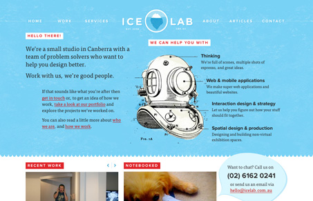
This is a really beautiful website, the colors and light textures mixed in with some great illustration work make for a super great experience. Looking at the experience of the site there are lots of great little spots that just shine, like the mouse over on the logo and the “back to top” link in the footer area. The sub pages have enough variance to keep it interesting too. Really great site.


lostworldsfairs.com/moon/

12 Oct


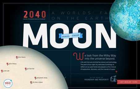
This is the “Moon” website or page from the Lost World’s Fairs website project designed by Jason Santa Maria.

I love this design for “Moon”, the visual depth is really nice. I also love the movement as you scale your browser window down and then back up. The little illustrations are sweet too. It’s really hard to believe this is done with web fonts.


Useful Collection of Cheat-Sheet Desktop Wallpaper for Web Designers

07 Oct

Typical cheatsheets tend to be over-sized documents, far too large to be viewed in its entirety on a desktop and not too handy for the super-fast reference that is needed. To get the full benefit of any cheatsheat, your only real option is to print it out and keep it close at hand. Wouldn’t it be nice if there was an easier way, a quicker way. Of course there is – what good be handier than having a cheatsheet set as your desktop wallpaper? Always there for quick reference, no need to print it out and no need to scroll through an over-long document.

In this post we have rounded up a selection of cheatsheet wallpapers, in various sizes, covering various technologies, like CSS, HTML5, WordPress, Javascript and many more.

WordPress Help Sheet Wallpaper

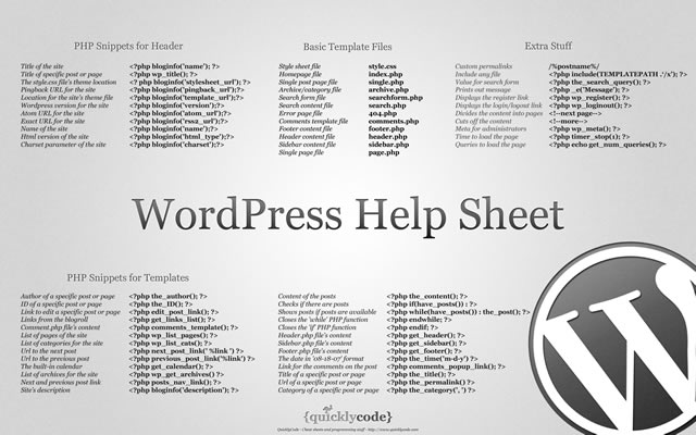
WordPress Help Sheet Wallpaper
The WordPress Help Sheet Wallpaper is a simple desktop wallpaper listing Basic Template Files, PHP Snippets for the Header, PHP Snippets for the Templates, Extra Stuff for WordPress, based on the WPCandy WordPress Help Sheet.
Download: 2560x1600px.

Drupal Cheat Sheet Desktop Wallpaper

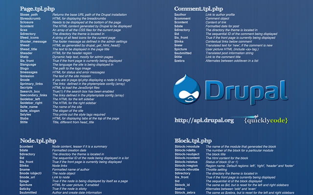
Drupal Cheat Sheet Desktop Wallpaper
The Drupal Cheat Sheet Desktop Wallpaper is a desktop wallpaper that features the most popular variables of the open source content management system Drupal.
Download: 1024x768px – 1280x800px – 1440x900px – 1680x1050px – 1920x1200px.

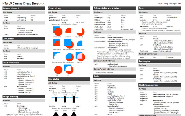
HTML5 Canvas Cheat Sheet

HTML5 Canvas Cheat Sheet
The information on this wallpaper is pretty much just a copy of what is found in the WHATWG specs, just condensed and a little bit easier to read. There are virtually no explanations, and no examples other than some graphics for compositing values. It's basically just a listing of the attributes and methods of the canvas element and the 2d drawing context.
Download: 1388x1027px.

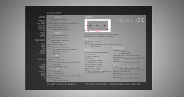
CSS Cheat Sheet Wallpaper in Helvetica

CSS Cheat Sheet Wallpaper in Helvetica
This is the very popular CSS cheat sheet in Helvetica from styl.eti.me. Simplistic in appearance, but very useful for quick referencing. Unfortunately we can not find a working download link for this cool wallpaper, but the good news is they do have a PSD version available. So download it and resize.
Download: CSS Cheat Sheet Wallpaper in Helvetica.

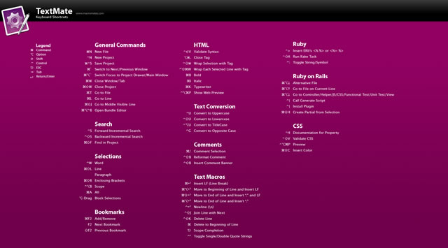
TextMate Shortcuts Wallpaper

TextMate Shortcuts Wallpaper
Here is a TextMate wallpaper that will guide you through some of its powerful features and help you get a handle on all of the keyboard shortcuts. The PSD file is also available.
Download: 1280x800px – 1920x1200px.

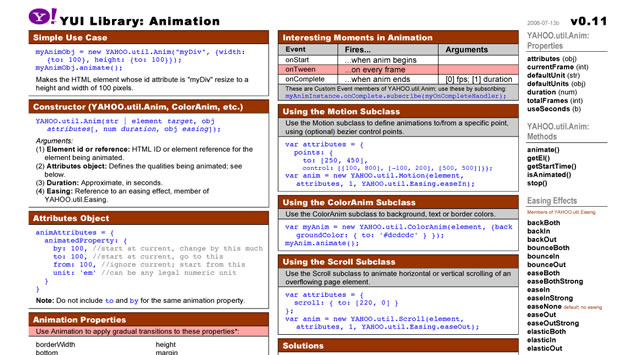
Yahoo! UI (YUI) Cheat Sheets as Wallpaper

Yahoo! UI (YUI) Cheat Sheets as Wallpaper
Yahoo! provides a number of cheat sheets for their YUI library widgets however these are all in PDF format and not usable as wallpaper. However, here you will find all of those cheatsheets converted to PNG images of various sizes all for your desktop.
There are wallpapers available for Animation, Calendar, Connection Manager, Dom Collection, Drag & Drop Event, Utility & Custom Event Logger, Slider and TreeView. And all are available in the following desktop sizes: 1400x1050px, 1280x960px, 1165x900px and 1024x768px.
Download: Yahoo! UI (YUI) Cheat Sheets as Wallpaper.

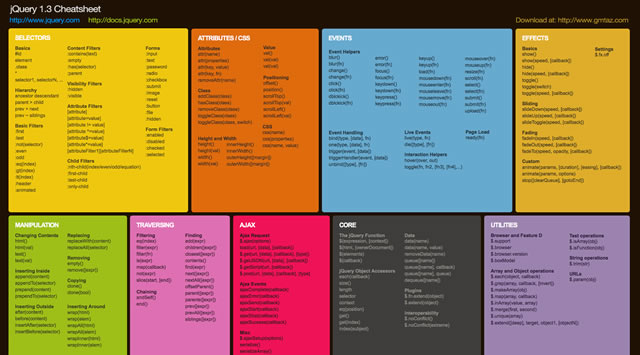
jQuery 1.3 Cheat Sheet Wallpaper

jQuery 1.3 Cheat Sheet Wallpaper
Download: 1440x900px – 1680x1050px – 1920x1200px.

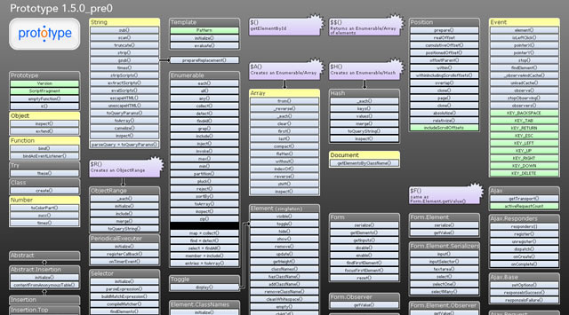
Prototype Dissected Wallpaper

Prototype Dissected Wallpaper
If you need a little help in getting to know Prototype a little better and some help in understanding how the code works, then this is the wallpaper for you. You have a choice of either a dark or white wallpaper, and are available in these sizes: 1280x960px and 1440x900px.
Download: 1280x960px (Dark) – 1440x900px (Dark) – 1280x960px (White) – 1440x900px (White).

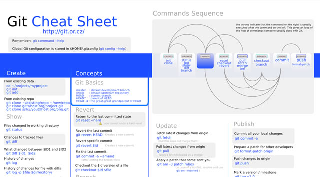
Git Cheat Sheet Wallpaper

Git Cheat Sheet Wallpaper
Download: 1100x850px – 3300x2550px.

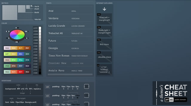
A Themer's Cheatsheet Wallpaper

A Themer's Cheatsheet Wallpaper
A Themer's Cheatsheet Wallpaper is a quick refresher of web design fundamentals directly on your desktop. It is available for download in several different colors and the original SVG has been released to the Public Domain.
Download: 1280x800px (Blue) – 1280x800px (Red) – 1280x800px (Black) – 1280x800px (Green).

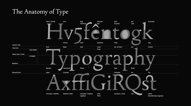
Font Anatomy Wallpaper

Font Anatomy Wallpaper
Download: 1920x1200px.

SEO Wallpapers

SEO Wallpapers
Think of it as a desk reference checklist that is always at your fingertips. From pre-campaign to reporting, the basics (and more) are right here for you to put directly on your desktop.
Download: 1024x768px – 1280x960px – 1280x1024px – 1440x900px.

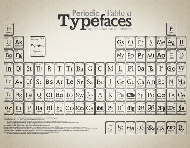
Periodic Table of Typefaces

Periodic Table of Typefaces
Download: 1024x768px – 1280x800px – 1280x1024px – 1440x900px – 1680x1050px – 1920x1200px.

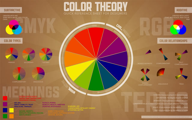
Color Theory Quick Reference Poster

Color Theory Quick Reference Poster
The Color Theory Quick Reference Poster for Designers has all of the basics of color theory contained in one place – specifically, a cool infographic-esque poster. This way, you can quickly reference things that may have slipped to the back of your mind since design school.
Download: 1280x800px – 1440x900px – 1680x1050px – 1920x1200px.

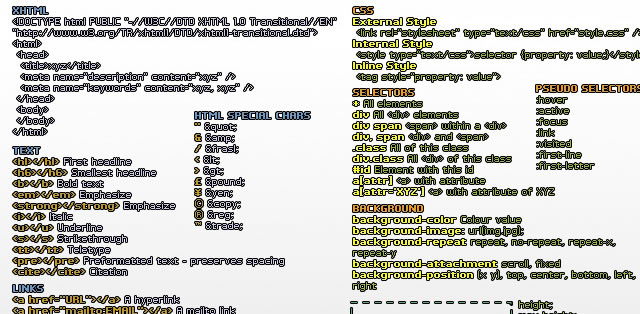
Web Designer Wallpaper

Web Designer Wallpaper
Download: 1280x1024px (White) – 1280x1024px (Dark) – 1680x10050px (Dark) – 1280x1024px (White).

You might also like…

14 Essential WordPress Development and Design Cheat Sheets »
17 Productive Photoshop Cheatsheets and Reference Cards to Download for Free »
The Best Cheat Sheets for Web Designers and Developers (From CSS, Ajax, Perl, Vbscript…) »
CSS References, Tutorials, Cheat Sheets, Conversion Tables and Short Codes »
20 CSS3 Tutorials and Techniques for Creating Buttons »
50 Useful Tools and Generators for Easy CSS Development »
50 Essential Web Typography Tutorials, Tips, Guides and Best Practices »
The Blueprint CSS Framework – Tutorials, How-to Guides and Tools »