RSS
 

Posts Tagged ‘infographics’

How Airlines Have Taken Flight With Social Media [INFOGRAPHIC]

16 Sep


The Social Media Infographics Series is supported by Vocus‘ Social Media Strategy Tool, a free, six-step online tool that lets you build a custom social media framework tailored to your organization’s goals.

Thousands of flights each and every day transport millions of passengers all over the world. As we all know, traveling can make one irritable, and delays or lost baggage prompt many consumers to complain. Before social media, these complaints might dissipate in the ether or be left on hold for 30 minutes. Fortunately, the airline industry has taken note of the social web as a customer service tool, fielding complaints, inquiries and yes, even compliments, on Twitter and Facebook. Never has the airline industry been so responsive, helpful, compassionate and human.

But aside from customer service, airlines use the social web to build their brand and grow a fan base, whether that’s via YouTube webisodes, special Twitter-only fares or offering free entry to a terminal lounge for an airport’s Foursquare mayor — the mark of a frequent traveler.

Check out the infographic below to see what some of the most social airlines are doing to reach new heights with social media.


Series supported by Vocus

This series is supported by Vocus‘ Social Media Strategy Tool, a free online tool which lets you build your own custom social media framework in six easy steps. It helps you determine your organization’s goals, explore the latest MarketingSherpa research data, and create your own workbook packed with the strategies, tactics and resources you need. Try it today!

Infographic design by Lorena Guerra

More About: Airlines, features, infographics, Mashable Infographics, Social Media, Social Media Infographics Series

For more Social Media coverage:


BBC Knowledge

15 Sep

This is totally sunshine and lollipops, but it has a good flow to it, and well, I totally wanted to know more about BBC Knowledge. Too bad it's not available in my region that is America.

[Video Link via datavisualization]


The Sexperience 1000 shows a (statistical) view of what goes on in the bedroom

16 Aug

Age and virginity

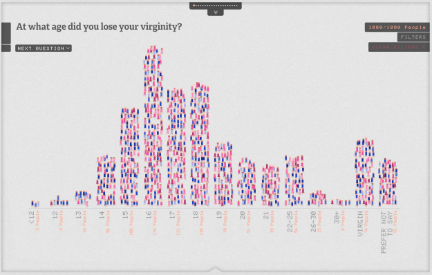
The bedroom is a private place, and what goes on in the bedroom usually stays in the bedroom. However, the Sexperience 1000 (by Mint Digital and Lingobee), using data from the "Great Britain Sex Survey," provides a statistical picture of what people do or have done.

The collection of small icons represents a sample of 1,000 people, and each icon represents an individual. They're color-coded by age and gender. Mouse over to see the age and the area they're from. From there, you can scroll through each question, such as, "At what age did you lose your virginity?" and the icons move around to their proper category.

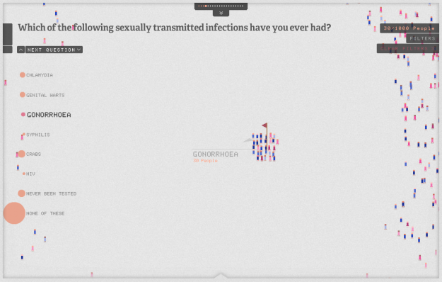
Because the individual that each icon represents stays consistent throughout, you can loosely follow individuals as you flip through questions and categories. For example, people were asked what sexually transmitted diseases they've had. Select different diseases — Chlamydia, Gonorrhoea, etc — and there are a few people who seem to have been exposed to a lot of things.

Then there's the filters on the right that let you zoom in on the demographic you're interested in. Again, the icons sort themselves in a way that is useful.

One caveat: The sample of 1,000 people is supposed to be a demographic representative of the UK population, however, that sample itself is taken from another sample of 7,500 people who watch The Sex Education Show. So the answers to some of the questions are probably skewed. Plus, people often lie about sex. Still though, it's worth a look.

[The Sexperience 1000 | Thanks, Andy]


Things That Kill More People Than Sharks

04 Aug
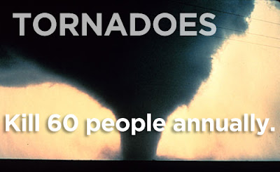
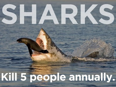
It might be Shark Week at Discovery channel, but hot dogs & high school football kill more people than sharks. A good reminder that a fear of sharks is irrational. Check out the list of 20 things that kill more people than sharks every year here. Among them….hippos, lightening, tornadoes….oh, and hotdogs (which target CHILDREN!).


Source: buzzfeed


Why Census matters to you

04 Aug

Net person growth

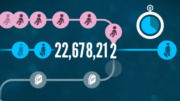
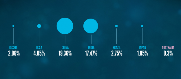
Census is any country is important in making major policy decisions and can affect your day-to-day, but it's not always obvious how. Leading up to the August 9 Australia Census, the Australian Bureau of Statistics put together an interactive called Spotlight, which helps its citizens understand the data a little better.

Spotlight takes some of the data from the last Census - conducted in 2006 - and turns it into a simple interactive movie, to show just a few of the interesting things that the Census can tell us about Australia's people and population.

As you go through the interactive, it asks you little bits about you such as gender and where you live, and then tells you information about what Census says about you and what's around. It also zooms out to put things in perspective.

The voice-over helps to make it extra playful. Even as a non-Australian, I found it pretty entertaining.

[Spotlight | Thanks, Tim]


What Are The Hardest Languages To Learn? (Infographic)

25 May
This simple chart shows the process of studying foreign languages. It explains which languages are too difficult to master, how much time it requires to finish the studies and how many native speakers are in the world.

It is common sense that many Romance languages are gauged as “easy,” based on their similarity to English, but I was surprised that Russian is only “medium.” Arabic, Chinese, Japanese, and Korean comprise the list of “hard” languages to learn for native English speakers.

More Infographics.

Click to Enlarge.

Source: voxy


Women’s dress sizes demystified

28 Apr

Whose size 8 are you wearing?

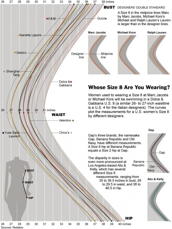
Women's clothing sizes have always confused me. My wife always has to try on an array of sizes, and it seems to vary by store. For me, on the other hand, when I'm looking for pants, I just look for waist, length, and maybe cut. As we've seen, men's actual sizes can change by brand, but it looks a lot more confusing for women, as shown in this graphic from The New York Times.

Take a woman with a 27-inch waist. In Marc Jacobs’s high-end line, she is between an 8 and a 10. At Chico’s, she is a triple 0. And that does not consider whether the garment fits in the hips and bust. (Let’s not get into length; there is a reason most neighborhood dry cleaners also offer tailoring.)

The top measurement is bust, the middle is waist, and bottom is hip. While every line represents a size 8 for a different brand, you can see how much variation there is.

The good news is that some companies are working on making it easier to figure out the right sizes.

[New York Times via Chart Porn]


Sugar consumption buckets

13 Apr

Sugar consumption

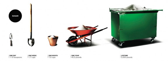
Lovely imagery showing sugar consumption for day through lifetime. The average American consumes 45.3 pounds of sugar in a year. It's a part of a read-later NYT article on the toxicity of sugar. Check out the similar pic for high fructose corn syrup. [via]


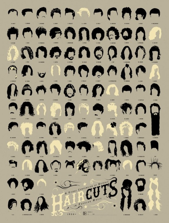
Visual history of hot haircuts in popular music

18 Mar

haircuts

A Visual Compendium of Notable Haircuts in Popular Music from Pop Chart Lab has a look at, well, haircuts. Lots of long hair and sideburns.

From the pompadour to the moptop to the metal mane to whatever it is Lady Gaga has atop her head, here is a history of popular music as told through the notable haircuts on this signed, limited edition print.

If you pre-order a print by this weekend, you get 20 percent off.

See also Beatles hair history, trustworthiness of beards, and typographic moustaches.

[Pop Chart Lab via Laughing Squid]


Light entertainment: how to compare apples and oranges

09 Mar

According to this infographics, created by Jess B. who submitted it, you can compare apples and oranges.

  Apples-oranges1

 Fun stuff. The entire chart is here.

***

Advice to marketers trying to reach "Edward": You might want to check out Ask ET. Your chance of getting mentioned here drops drastically if you can't figure out who's writing this blog.