RSS
 

Posts Tagged ‘Mapping’

World population densities mapped

16 Sep

World of Seven Billion

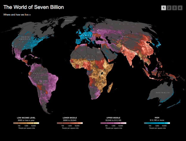
National Geographic has a look at where and how we live:

The map shows population density; the brightest points are the highest densities. Each country is colored according to its average annual gross national income per capita, using categories established by the World Bank (see key below). Some nations — like economic powerhouses China and India — have an especially wide range of incomes. But as the two most populous countries, both are lower middle class when income is averaged per capita.

It's interesting, but the map is a little wonky, because the income levels and population densities differ in granularity. It kind of works. Kinda doesn't. There seems to be a lot of missing data — or does population density in northern Africa really drop off that quickly (it is desert land, albeit)? A little more explanation in the description or the legend would have been useful.

There are also three other slides that follow the map (like the one below), but they're mostly just run-of-the-mill list of facts with cutesy icons to show percentages. Not a fan of those at all. Actually, they kind of bother me.

I dunno, I'm on the fence here. What do you think?

[National Geographic | Thanks, Laura]


US post offices spreading over time, 1700 to 1900

09 Aug

Using data from the USPS Postmaster Finder and the USGS Geographic Names Information System, geography graduate student Derek Watkins maps the opening of new post offices from 1700 to 1900. As you know, the mail must go through. No matter if it rains or snows. The mail must go through. So it's also a great way to see expansion of the US.

Some interesting spots: In 1776, after the revolution, new offices open along the east coast; in 1848, during the gold rush, offices sprout up on the west coast; in the 1870s, offices along the railroad open up.

[Derek Watkins]


Complexity of time zones explained

30 Mar

Brief history of time zones

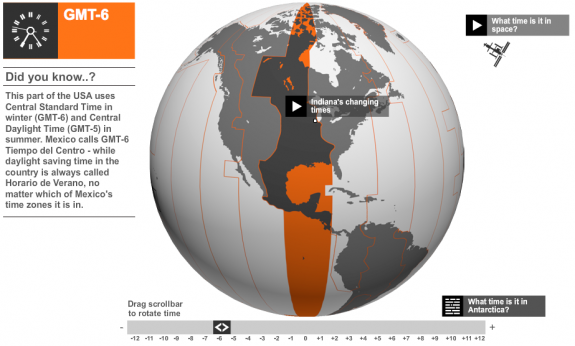
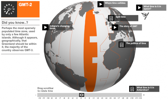
Do you understand how time zones work around the world and when exactly you need to move your watch forward or back? Me neither. BBC News provides a brief history of time zones via interactive globe.

Theoretically, the world should be divide into 24 equal time zones, in which each zone differs from the last by one hour. But as the years have passed, the world has turned into a much more complicated place. Time zones are now much more irregular and sometimes seem positively eccentric, affected as they are by political, geographical and social changes in the real world.

Rotate the globe to see where each time zone lands. Some of the zones seem relatively straight, but even in some areas like the GMT-2 time zone, there's some crookedness. There must be some small islands there or something. It's either that or the Royal Observatory is fond of puzzles. No, there aren't any other options.

[BBC News via @kelsosCorner]


Chinese provinces compared to countries

15 Mar

China provinces compared

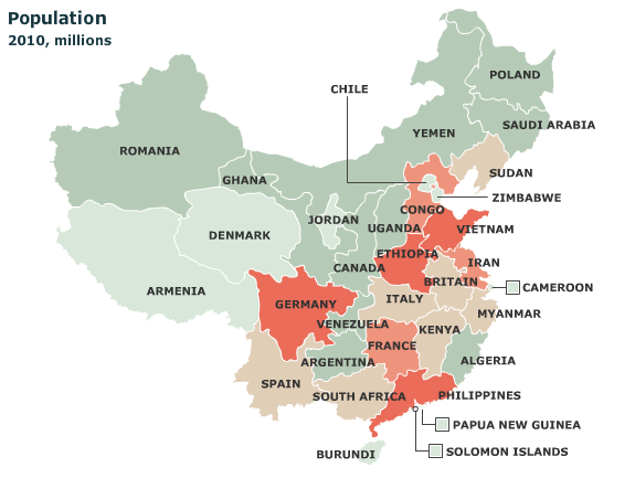
It's easy to forget just how big some countries are. For example, China:

China is now the world’s second-biggest economy, but some of its provinces by themselves would rank fairly high in the global league. Our map shows the nearest equivalent country. For example, Guangdong's GDP (at market exchange rates) is almost as big as Indonesia's; the output of both Jiangsu and Shandong exceeds Switzerland’s.

Select among GDP, GDP per person, population, and exports. There's a similar interactive for the United States.

[The Economist via Strange Maps | Thanks, Elise]


Animation: North and South Poles melting away

11 Mar

Melting poles

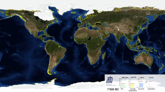
Adrian Meyer and Karl Rege of Zurich University of Applied Sciences visualize the melting poles, starting 21,000 years ago and advancing 1,000 years into the future.

End summer sea ice is shown. The yellow line shows the actual shoreline. The future projection is based on the assumption of complete cessation of carbon dioxide emissions in 2100 (IPCC A2). Because world population is rather uncertain we froze to its current value.

Check out the video below. Adding some speed could've made it more dramatic, but wow.

[Blue Marble 3000 | Thanks, Geoffrey]


Well-being of the nation mapped

07 Mar

Well-being of nation

Analyzing Facebook and Twitter updates to gauge happiness is all the rage these days, but Gallup has been doing it old school for the past three years. Every day, Gallup has called 1,000 randomly selected American adults and asked them a series of questions about their well-being such as, "Did you experience feelings of happiness during a lot of the day yesterday?" and "Do you smoke?"

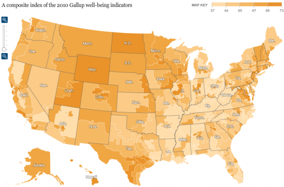
Matthew Bloch and Bill Marsh for the New York Times mapped the responses for the past calendar year. Use the browser to quickly compare well-being in your area and across the country.

Above is the composite index of all the indicators. Looks like there's some good stuff going up north. Maybe not so much in the southeast.

The interactive is most interesting when you start comparing areas (especially near your own) and indicators. For example, here's the map for percentage who exercise:

Now with almost a complete flip, here's the map for smoking:

Find anything interesting? Let's hear it in the comments.

[New York Times via @rothzilla]