RSS
 

Posts Tagged ‘MARKETING’

7 Best Practices for Improving Your Website’s Usability

12 Sep


The Web Design Usability Series is supported by join.me, an easy way to instantly share your screen with anyone. join.me lets you collaborate on-the-fly, put your heads together super-fast and even just show off.

Writing content for web users has its challenges. Chief among them is the ease with which your content is read and understood by your visitors (i.e. its readability).

When your content is highly readable, your audience is able to quickly digest the information you share with them — a worthy goal to have for your website, whether you run a blog, an e-store or your company’s domain.

Below are a handful of dead-simple tips and techniques for enhancing the usability and readability of your website’s content.

These tips are based on research findings and suggestions by well-regarded usability experts such as Jakob Nielsen.

This list is not exhaustive, and is meant merely to arm you with a few ideas that you can implement right away. If you have additional tips to add, please share them in the comments.


General Goals of User-Friendly Web Content


Usable, readable web content is a marriage of efforts between web designers and web content writers.

Web pages must be designed to facilitate the ease of reading content through the effective use of colors, typography, spacing, etc.

In turn, the content writer must be aware of writing strategies that enable readers to quickly identify, read and internalize information.

As we go through the seven tips below, keep these three general guidelines in mind:

  • Text and typography have to be easy and pleasant to read (i.e. they must legible).
  • Content should be easy to understand.
  • Content should be skimmable because web users don’t read a lot. Studies show that in a best-case scenario, we only read 28% of the text on a web page.

What simple things can we do to achieve these goals? Read on to see.


1. Keep Content as Concise as Possible


It’s pretty well known that web users have very short attention spans and that we don’t read articles thoroughly and in their entirety. A study investigating the changes in our reading habits behaviors in the digital age concluded that we tend to skim webpages to find the information we want.

We search for keywords, read in a non-linear fashion (i.e. we skip around a webpage instead of reading it from top to bottom) and have lowered attention spans.

This idea that we’re frugal when it comes to reading stuff on the web is reinforced by a usability study conducted by Jakob Nielsen. The study claims a that a 58% increase in usability can be achieved simply by cutting roughly half the words on the webpages being studied.

Shorter articles enhance readability, so much so that many popular readability measurement formulas use the length of sentences and words as factors that influence ease of reading and comprehension.

What you can do:

  • Get to the point as quickly as possible.
  • Cut out unnecessary information.
  • Use easy-to-understand, shorter, common words and phrases.
  • Avoid long paragraphs and sentences.
  • Use time-saving and attention-grabbing writing techniques, such using numbers instead of spelling them out. Use “1,000″ as opposed to “one thousand,” which facilitates scanning and skimming.
  • Test your writing style using readability formulas that gauge how easy it is to get through your prose. The Readability Test Tool allows you to plug in a URL, then gives you scores based on popular readability formulas such as the Flesch Kincaid Reading Ease.


2. Use Headings to Break Up Long Articles


A usability study described in an article by web content management expert Gerry McGovern led him to the conclusion that Internet readers inspect webpages in blocks and sections, or what he calls “block reading.”

That is, when we look at a webpage, we tend to see it not as a whole, but rather as compartmentalized chunks of information. We tend to read in blocks, going directly to items that seem to match what we’re actively looking for.

An eye-tracking study conducted by Nielsen revealed an eye-movement pattern that could further support this idea that web users do indeed read in chunks: We swipe our eyes from left to right, then continue on down the page in an F-shaped pattern, skipping a lot of text in between.

We can do several things to accommodate these reading patterns. One strategy is to break up long articles into sections so that users can easily skim down the page. This applies to block reading (because blocks of text are denoted by headings) as well as the F-shaped pattern, because we’re attracted to the headings as we move down the page.

Below, you’ll see the same set of text formatted without headings (version 1) and with headings (version 2). See which one helps readers quickly skip to the sections that interest them the most.

What you can do:

  • Before writing a post, consider organizing your thoughts in logical chunks by first outlining what you’ll write.
  • Use simple and concise headings.
  • Use keyword-rich headings to aid skimming, as well as those that use their browser’s search feature (Ctrl + F on Windows, Command + F on Mac).

3. Help Readers Scan Your Webpages Quickly


As indicated in the usability study by Nielsen referenced earlier, as well as the other supporting evidence that web users tend to skim content, designing and structuring your webpages with skimming in mind can improve usability (as much as 47% according to the research mentioned above).

What you can do:

  • Make the first two words count, because users tend to read the first few words of headings, titles and links when they’re scanning a webpage.
  • Front-load keywords in webpage titles, headings and links by using the passive voice as an effective writing device.
  • Use the inverted pyramid writing style to place important information at the top of your articles.


4. Use Bulleted Lists and Text Formatting


According to an eye-tracking study by ClickTale, users fixate longer on bulleted lists and text formatting (such as bolding and italics).

These text-styling tools can garner attention because of their distinctive appearance as well as help speed up reading by way of breaking down information into discrete parts and highlighting important keywords and phrases.

What you can do:

  • Consider breaking up a paragraph into bulleted points.
  • Highlight important information in bold and italics.

5. Give Text Blocks Sufficient Spacing


The spacing between characters, words, lines and paragraphs is important. How type is set on your webpages can drastically affect the legibility (and thus, reading speeds) of readers.

In a study called “Reading Online Text: A Comparison of Four White Space Layouts,” the researchers discovered that manipulating the amount of margins of a passage affected reading comprehension and speed.

What you can do:

  • Evaluate your webpages’ typography for spacing issues and then modify your site’s CSS as needed.
  • Get to know CSS properties that affect spacing in your text. The ones that will give you the most bang for your buck are margin, padding, line-height, word-spacing, letter-spacing and text-indent.

6. Make Hyperlinked Text User-Friendly


One big advantage of web-based content is our ability to use hyperlinks. The proper use of hyperlinks can aid readability.

What you can do:

  • Indicate which links have already been visited by the user by styling the :visited CSS selector differently from normal links, as suggested by Nielsen, so that readers quickly learn which links they’ve already tried.
  • Use the title attribute to give hyperlinks additional context and let users know what to expect once they click the link.
  • For additional tips, read >Visualizing Links: 7 Design Guidelines.

7. Use Visuals Strategically


Photos, charts and graphs are worth a thousand words. Using visuals effectively can enhance readability when they replace or reinforce long blocks of textual content.

In fact, an eye-tracking study conducted by Nielsen suggests that users pay “close attention to photos and other images that contain relevant information.”

Users, however, also ignore certain images, particularly stock photos merely included as decorative artwork. Another eye-tracking study reported a 34% increase in memory retention when unnecessary images were removed in conjunction with other content revisions.

What you can do:

  • Make sure images you use aid or support textual content.
  • Avoid stock photos and meaningless visuals.

Series Supported by join.me

The Web Design Usability Series is supported by join.me, an easy way to instantly share your screen with anyone. join.me lets you collaborate on-the-fly, put your heads together super-fast and even just show off. The possibilities are endless. How will you use join.me? Try it today.

Image courtesy of iStockphoto, Kontrec

More About: web design, Web Design Usability Series


How Schema.org Will Change Your Search Results & What it Means for Marketers

30 Jun

search image

Jeff Ente is the director of Who’s Blogging What, a weekly e-newsletter that tracks over 1,100 social media, web marketing and user experience blogs to keep readers informed about key developments in their field and highlight useful but hard to find posts. Mashable readers can subscribe for free here.

Algorithms aren’t going away anytime soon now that websites have a better way to directly describe their content to major search engines. Earlier this month, Google, Bing and Yahoo came together to announce support for Schema.org, a semantic markup protocol with its own vocabulary that could provide websites with valuable search exposure. Nothing will change overnight, but Schema.org is important enough to bring the three search giants together. Websites would be wise to study the basics and come up with a plan to give the engines what they want.

Schema.org attempts to close a loophole in the information transfer from website data to presentation as search results. As they note on their homepage: “Many sites are generated from structured data, which is often stored in databases. When this data is formatted into HTML, it becomes very difficult to recover the original structured data.”

Simply put, Schema.org hopes to create a uniform method of putting the structure back into the HTML where the spiders can read it. The implications go beyond just knowing if a keyword like “bass” refers to a fish, a musical instrument or a brand of shoes. The real value is that websites can provide supporting data that will be valuable to the end user, and they can do so in a way that most search engines can read and pass along.


How Schema.org Works


Schema.org was born out of conflict between competing standards. Resource Description Framework (RDF) is the semantic standard accepted by The World Wide Web Consortium (W3C). The Facebook Open Graph is based on a variant of RDF which was one reason that RDF seemed poised to emerge as the dominant standard.

Until this month. Schema.org went with a competing standard called microdata which is part of HTML5.

Microdata, true to its name, embeds itself deeply into the HTML. Simplicity was a key attribute used by the search engines to explain their preference for microdata, but simplicity is a relative term. Here is a basic example of how microdata works:

<div itemscope itemtype="http://data-vocabulary.org/Person">
<span itemprop="name">Abraham Lincoln</span> was born on

<span itemprop="birthDate">Feb. 12, 1809</span>.

He became known as <span itemprop="nickname">Honest Abe</span> and later served as <span itemprop="jobTitle">President of the United States</span>.

Tragically, he was assassinated and died on <span itemprop="deathDate">April 15, 1865</span>.

</div>

A machine fluent in Microdata would rely on three main attributes to understand the content:

  • Itemscope delineates the content that is being described.
  • Itemtype classifies the type of “thing” being described, in this case a person.
  • Itemprop provides details about the person, in this case birth date, nickname, job title and date of death.

Meanwhile, a person would only see:

“Abraham Lincoln was born on Feb. 12, 1809. He became known as Honest Abe and later served as President of the United States. Tragically, he was assassinated and died on April 15, 1865.”

Fast forward to the web economy of 2011 and restaurants can use the same technology to specify item properties such as acceptsReservations, menu, openingHours, priceRange, address and telephone.

A user can compare menus from nearby inexpensive Japanese restaurants that accept reservations and are open late. Schema.org’s vocabulary already describes a large number of businesses, from dentists to tattoo parlors to auto parts stores.


Examples of Structured Data Already in Use


Structured data in search results is not new. The significance of Schema.org is that it is now going to be available on a mass scale. In other words, semantic markup in HTML pages is going prime time.

Google has so far led the way with structured data presentation in the form of “rich snippets,” which certain sites have been using to enhance their search listings with things like ratings, reviews and pricing. Google began the program in May 2009 and added support for microdata in March 2010.

A well known example of a customized structured search presentation is Google Recipe View. Do you want to make your own mango ice cream, under 100 calories, in 15 minutes? Recipe View can tell you how.


The Scary Side of Schema.org


Google, Bing and Yahoo have reassured everyone that they will continue to support the other standards besides microdata, but Schema.org still feels like an imposed solution. Some semantic specialists are asking why the engines are telling websites to adapt to specific standards when perhaps it should be the other way around.

Another concern is that since Schema.org can be abused, it will be abused. That translates into some added work and expense as content management systems move to adapt.

Schema.org might also tempt search engines to directly answer questions on the results page. This will eliminate the need to actually visit the site that helped to provide the information. Publishing the local weather or currency conversion rate on a travel site won’t drive much traffic because search engines provide those answers directly. Schema.org means that this practice will only expand.

Not everyone is overly concerned about this change. “If websites feel ‘robbed’ of traffic because basic information is provided directly in the search results, one has to ask just how valuable those websites were to begin with,” notes Aaron Bradley who has blogged about Schema.org as the SEO Skeptic.

“The websites with the most to lose are those which capitalize on long-tail search traffic with very precise but very thin content,” Bradley says. “Websites with accessible, well-presented information and — critically — mechanisms that allow conversations between marketers and consumers to take place will continue to fare well in search.”


Three Things To Do Right Now


  • Audit the data that you store about the things that you sell. Do you have the main sales attributes readily available in machine readable form? Make sure you have the size, color, price, previous feedback, awards, etc. easily readable.
  • Review the data type hierarchy currently supported by Schema.org to see where your business fits in and the types of data that you should be collecting.
  • Check your content management and web authoring systems to see if they support microdata or if they are at least planning for it. Microdata is not just a few lines of code that go into the heading of each page. It needs to be written into the HTML at a very detailed level. For some site administrators it will be a nightmare, but for others who have done proper planning and have selected the right tools, it could become an automatic path to greater search exposure.

Image courtesy of iStockphoto, claudiobaba

More About: bing, business, Google, MARKETING, Schema, schema.org, Search, SEM, SEO, Yahoo

For more Dev & Design coverage:


All of Facebook’s Like Buttons on Third-Party Sites Now Publish a Full News Feed Story

27 Feb

When users click the Like or Recommend button on a third-party website or within a Facebook app, it now publishes a full news feed story instead of just a one-line Recent Activity story. Previously, full stories with headlines, thumbnail images, and captions were only published if the website chose to implement the “Like with Comment” version of the button and users chose to add this additional context.

As the Like button now encompasses the functionality of the Share button, which Facebook has removed from its documentation, Facebook may phase out the Share button entirely. The change gives more prominence to outbound links in the news feed and on a user’s wall, and so will increase referral traffic and draw more sites to add the Like button.

Full stories appear larger, more compelling since they often include an image, and are ranked better in the news feed than Recent Activity stories. Therefore, the stories generated from clicks of the Like / Recommend button will been seen by more of a user’s friends and drive more traffic to third-party websites and apps than before.

Since Facebook launched its social plugins including the Like button at last year’s f8 conference, over 2.5 million websites have integrated them. In July, Facebook introduced Like with Comment, allowing some implementation to publish full feed stories.

By August, 350,000 sites had Like buttons, and that count is probably much higher now. Facebook has since allowed developers to integrate Like buttons with social games and other Facebook apps, and is trying to increase third-party awareness of their ability to publish news feed stories to those who click their buttons.

Up until now, Facebook had supported three different ways to share third-party content to the news feed:

  • The Share button –  When clicked, users see a Facebook Publisher dialog pop up allowing them to add a comment. It publishes a full feed story, similar to if the user had copied the link into the Publisher on Facebook.com. The Share button doesn’t subscribe users to future updates from the owner of the button.
  • The Like / Recommend button without comment – When third-parties use the standard iframe Like button with a width less than 400 pixels, the button_count, or  box_count version of the Like / Recommend button, users aren’t given the option to comment. A simple, one-line story linking to the content is published to the Recent Activity feed of the user’s wall, and the story is less frequently displayed in the news feeds of friends. Users are subscribed to future updates from the button’s owner.
  • The Like / Recommend button with comment – When third-parties implement the XFBML version or the standard iframe version with a width of 400 pixels or more, users are always given the option to comment. If they comment, a full story is published. If they don’t comment, a simple story is published. Users are subscribed to future updates from the button’s owner.

Now, all versions of the Like / Recommend button publish a full feed story, whether a comment is added or not. The change has been applied retroactively, so old Recent Activity feed simple stories from Likes now appear as full stories.

Likes allow third-parties to publish future updates to a user, and therefore drive more traffic and create more lifetime value than Shares. This value lures additional third parties to implement Facebook’s social plugins, so it’s in Facebook’s interest to shift everyone from Share buttons to Like buttons.

The Share button is often displayed amongst a set of other buttons for Twitter, Digg, bookmarking, and email, but Facebook would rather have its own real estate opposed to being lost amongst the competition. Now that Facebook has given the Like button almost a year to prove its worth, third-parties would probably implement a Like button if they could no longer use the Share button, granting Facebook this improved placement.

The phase out of the Share button is evident in Facebook’s documentation. The “Facebook Share” typeahead result  shown when searching for “Share” on the developers site directs to the Like button documentation page.

One potential downside for users is if they participate in contests run by sites or apps that use Like buttons to tabulate votes. Some users might not want to publish a full feed story for each vote, and would have to delete the posts one by one after they’re published.

Overall, the change will benefit users, third-parties, and Facebook. Compelling Liked content from around the web will appear in the news feed more frequently, initiating discussions between friends. Third-parties will gain traffic from new users, inspiring more to implement Facebook’s social plugins.

This increased presence across the internet will spread awareness of Facebook, raise barriers for its competitors, and seed a client base for a potentially monetizable plugin, such as an Open Graph ad unit.

[Thanks to Amit Lavi and Paula Ford for the tips]


What Marketers Need to Know About Facebook’s Switch to iFrames

24 Feb


Jeff Ente is the director of Who’s Blogging What, a weekly e-newsletter that tracks over 1,100 social media, web marketing and user experience blogs to keep readers informed about key developments in their field and highlight useful but hard to find posts. Mashable readers can subscribe for free here.

Facebook has recently announced a lengthy list of significant design and feature changes for Pages.

One particular item is emerging with perhaps the greatest challenge and the highest potential for Page owners — there is a new way to present custom content on Facebook Pages. Tabs and FBML are going away. Get ready to friend iFrames. Here’s a basic rundown and some tips on how to make the switch.


Background: Starting With a Clean Canvas


frame image

iFrames are not new. An iFrame is a standard HTML tag that allows one page to be inserted into another. It would seem like a pretty obvious way for Facebook Page owners to customize content, and Facebook did experiment with it a while ago before discovering security issues. But as of February 10, iFrames are back. Facebook Markup Language (FBML), which has been the primary custom content creation tool, is being deprecated.

FBML is a subset of HTML that has additional Facebook specific functions. For example, the FBML tag <fb:visible-to-connection> requires a user to “Like” a page in order to see certain content. Existing FBML Pages will still be supported, but new ones cannot be created as of March 11. There is no immediate need to worry about existing FBML based Pages. In the software world, the time horizon for “deprecated” is often measured in years, if not decades. Still, you’ll want to continually delight your Facebook visitors, which means that there are iFrames in your future.


Learning to Love iFrames


iframe chart image

The switch to iFrames means that developers can create dynamic web apps using their standard tools (HTML, CSS, PHP, ASP, JavaScript, Flash, etc.), register them as a Facebook “Canvas” app and then embed the app on a custom Page via the iFrame. Some limited info about the Facebook user is available through the API.

This all sounds much more complicated than it really is, and in fact it is probably simpler than the old process. Most developers are celebrating. “iFrames allow marketers the creativity and flexibility similar to that afforded by webpages, while developers can streamline integration with one process for Facebook canvas apps, Facebook Connect website widgets, and now Facebook custom Pages,” says Vikas Jain, director of business development for Wildfire Interactive. If you can create something for the web, respect Facebook’s ToS, and (preferably) hold it to 520 pixels in width, you can now present it as custom Facebook Page content.

Great content is only the start. Page owners can now have a more direct relationship with their Facebook visitors. “Right now the implications are countless,” says Patrick Stokes, chief product officer for Buddy Media. “Conversion tracking is probably the first thing that marketers should be focusing on. iFrames mean that you will be able to recognize the visitor, track their source and note their IP address in order to present a customized response. These capabilities are much stronger through iFrames than they are in FBML”.

Mark Spangler, director of client services at Stuzo|Dachis Group is also expecting “exciting personalization options which should now appear seamless to the user: Customized landing views based on user location or referral source, dynamically updating the view for specific content, loading of Flash elements and interactive front-end features which formerly could not initially load on custom Pages.”

But don’t expect things to change overnight. This is a change that lies firmly in a divide between the aspirations of the marketing department and the freshly fueled capabilities of web developers. Companies that can bridge that gap wisely will likely see the best and fastest results. Involver’s VP of marketing Jascha Kaykas-Wolff is advising marketers to proceed slowly and plan carefully for the best results. “The switch from FBML to iFrames is not earth-shattering right now. However, in the future — and as Facebook evolves their ToS — iFrames will allow for a much more immersive experience consistent with your brand’s corporate experience. The evolution of Facebook becoming the replacement for the branded micro-site is well on its way.”


Using Facebook


frame image

The best and simplest news for Facebook marketers is that they may not have to try and pull someone away from Facebook to get them onto their site. There are now better options for accomplishing their sales or branding goals entirely within Facebook. “We’ve found, in doing Facebook ad testing, that Facebook ad respondents tend to convert better when they land on a page within Facebook,” observes Search Mojo CEO Janet Miller. “iFrames now opens up a whole new world of possibilities for what can be delivered, including e-commerce, directly through a Facebook Page.”

Some of the selling may first have to occur internally as social media initiatives frequently need to fight for budget. Linda Bustos, director of e-commerce research with Elastic Path Software, notes, “Any new web development poses a challenge for social media. C-level execs want to see ROI from social initiatives — something that has historically been hard to prove.” In this case, she points to the improved tracking capabilities and the ability to monitor activity via Google Analytics as a unique opportunity to measure social media costs versus benefits. Additionally, businesses should find it easier to convert existing web apps for Facebook use with iFrames.


The Endgame for iFrames?


The concept of businesses investing money to keep users on Facebook may seem like part of Facebook’s master plan. It probably is. Will Facebook Pages evolve into self-contained store fronts? “It will be interesting to see how Facebook handles this. One possibility is that they will require that all transactions be transacted in Credits, which is how they would get their cut,” speculates Buddy Media’s Patrick Stokes.

iFrames for Pages may be a win-win for all sides but it will require planning and some investment. As always with Facebook, you can’t ignore the huge user base, and you have to be open to new opportunities to interact. iFrames is very much a work in progress that warrants serious attention.

Disclosure: Buddy Media is a Mashable sponsor.


More Business Resources from Mashable:


- How 5 Companies Are Using the iPad to Increase Productivity
- How The iPad Is Helping Businesses Go Green
- How Facebook Deals Are Helping One NBA Team Connect With Fans
- 4 Small Business Mobile Predictions for 2011
- How Brands Can Make the Most of Facebook’s New Pages

More About: business, facebook, facebook pages, iframes, MARKETING

For more Business & Marketing coverage:


Facebook, Facebook, Facebook

12 Jan

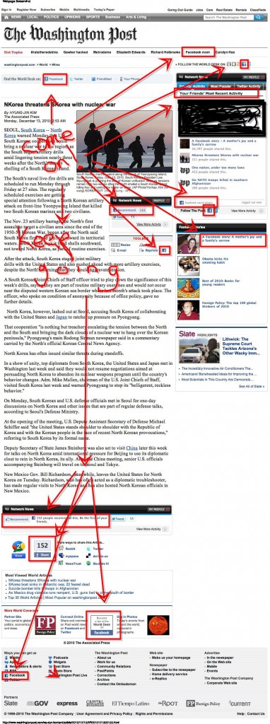
We often think that well-respected, high-circulation national newspapers, like the Washington Post, are among the most influential institutions in the country.  With this in mind, the Post‘s desperate effort to weave itself up with Facebook is a stunning indication of Facebook’s power in American society.  Or, at least, the Washington’s Post‘s perception of Facebook’s power.

Eat Liver, via Blame It On the Voices.

(View original at http://thesocietypages.org/socimages)


Why Every Brand Needs an Open API for Developers

04 Jan


Adam Kleinberg is co-founder and CEO at Traction, an interactive agency that aligns psychology with technology to create ideas that work. Catch him tweeting at @adamkleinberg and blogging at tractionco.com/blog.

The most effective ads today are experiences that provide value to customers. The biggest challenge is providing that value at scale in a world where people are empowered to consume media on their own terms through a dizzying array of gadgets, devices and doodads.

This puts marketers between a rock and a hard place.

For years, marketers have distributed messages to people with banner ads, which are like a rock that we throw at people with the dim hope that we’ll knock them upside the head. These rocks provide no value whatsoever.

Today, we’ve figured out how to create value — apps. Figuring out how to create utility is no easy path. Indeed, it is a “hard place” to reach.

But the reward is so great because with that app comes a deep and meaningful relationship with your customer — a new platform for your brand to foster long-term engagement with your target. And you are no dummy — you’ve even got a plan and a budget to drive downloads of your app. Bases are covered. What could go wrong?


We Already Have an App. What Could Go Wrong?


Application downloads look great in an ROI report, but when you take into account the proliferation of digital devices entering the market, the cost of producing unique brand experiences across all of them is exorbitant. You could spend a boatload of money creating and distributing this app only to have no one use it.

That’s what could go wrong.


Brand APIs as Value Platforms


Ironically, it is because of this proliferation of devices that the overall demand for content and utility is increasing. Brands should create value in the form of content and utility and distribute it via platforms that extend in reach beyond proprietary channels.

Apps are just channels. To establish value platforms, I propose that brands should consider creating their own APIs.

What is an API? An API, or application programming interface, is a hook. It’s one part of a software program that makes it easy for other programs to make use of a piece of its functionality or content. When APIs are made open, they can be accessed and used by anyone.

Facebook has APIs. Twitter has an API. Google has APIs out the wazoo. Why don’t brands have APIs? Well they should.

With APIs, you let other developers do your R&D for you. The benefit? You get development at scale with minimal investment. You effectively outsource risk because failures don’t cost you anything.

Brands need to think like startups. They must devise experiences that not only meet the demands of content and utility that audiences crave, but that are readily consumable in bite-sized chunks so that audiences can devour them on their own terms — and developers can serve them on theirs.

This last point is critical because it allows innovation to happen rapidly and without sustained investment.


“It Doesn’t Make Sense for My Brand”


kraft app image

“Not my brand,” you say. It’s easy to envision how brands whose core business revolves around technology or data could make use of an API. eBay has APIs that allow developers to access their database so they can create new and innovative ways to buy and sell merchandise. Netflix had more than 6,000 developers download its API to participate in its $1 million innovation competition. But what about the rest of us?

First, interfaces are becoming core to the fabric of more and more brands and products. Soon, you’ll have breakfast in the morning and there will be an interface on your refrigerator. You’ll hop in your car and there will be another interface. You drive to the airport, jump on a plane and voila… another interface. All of those interfaces are opportunities for brand APIs.

What if you sell macaroni and cheese? Kraft recently released a behemoth of an application for the iPad called Big Fork Little Fork that is filled with games, recipes and videos to help parents teach their kids about healthy eating and discover ways to do so using Kraft products. A worthy goal, but does it sell Kraft products? I downloaded it two months ago, but neither I nor my kids regularly use the app.

Imagine if Kraft released a simple API that allowed people to type in any ingredient and get back a list of healthy recipes from Kraft’s database? As new form factors emerge (like that refrigerator interface), independent developers could create new distribution mechanisms in a fraction of the time Kraft could — and without the cost.

What’s more, a company like Safeway could use that API to create its own app tied to their grocery delivery service. Customers could have all the ingredients in a selected recipe delivered to their front door. That would sell Kraft products.


APIs to Spread Utility


evian imageBrands could also create APIs to allow for the spread of utility. Here are some examples for major brands. Nike could create a “Just size it” API that allowed you to take a picture of your foot and find the perfect shoe size. How would they distribute it? Let their resellers figure that out. Evian could create a hydration API that calculated how much people really ought to drink each day and then reminded them to do so. Netflix created an API so developers could come up with better ways to make movie recommendations. Why couldn’t wine company Constellation Brands create an API so developers could come up with better ways to make wine recommendations?

Note that any of these ideas could make use of an app as a delivery mechanism for their API, but their underlying value comes first. By providing access to that value through an API, they would allow the delivery of that value to spread exponentially.

Sure, ideas aren’t always obvious or easy to come by. They never have been. That’s why some advertising works and some doesn’t. Today, ideas that actually work are even harder to devise. We must not only understand the psychology of why an idea will work, but how they will work. Rather than truly gaining an understanding of the latter, many marketers fall prey to a disease called “Shiny Object Syndrome.” They follow the pack and slip the latest shiny object into their marketing plans. Last year, it was a Facebook Page. This year, it’s an app.

Before you grab for that shiny object, ask yourself what you’re really trying to accomplish and how best to make that happen. The best answer may not be an app. It may be an API.


More Business Resources from Mashable:


- HOW TO: Get the Most Out of Facebook Insights for Small Business
- Why the Fashion Industry Is Betting Big on Branded Online Content
- Top 10 Digital Advertising Innovations of 2010
- 5 Predictions for the Public Relations Industry in 2011
- 7 Stellar Examples of Branded Content from the Fashion Industry

Image courtesy of iStockphoto, enot-poloskun


Reviews: Apps, Facebook, Google, Twitter, iStockphoto

More About: api, App, apps, brand, business, MARKETING, small business

For more Business coverage:


Internet Advertising Hits New Revenue Record

12 Oct


Online advertising is thriving in the U.S., according to figures released in the latest IAB Internet Advertising Revenue Report.

Businesses and individuals spent approximately $12.1 billion on online advertising in the first six months of 2010, up 11.3% from the from the first half of 2009 and 13.9% from the second quarter of 2009. In fact, this was both the highest first-half and second-quarter revenue ever recorded.

Search advertising continued to monopolize the greater share of online ad dollars, having attracted more than $5.7 billion in spending between January and June this year — a year-over-year increase of 11.6%. Display advertising, which includes banner ads, digital video, rich media and sponsorships, garnered more than $4.4 billion in the first half of 2010, a 16% increase over the same period in 2009.

Digital video recorded the greatest growth of all. More was spent in video advertising from January to June than in any other half-year period before, an increase of 31% from the first half of 2009.

IAB’s SVP of Industry Services Sherill Mane cited growing online advertising budgets among consumer packaged goods and pharmaceutical companies for the growth.

“While the recession clearly affected short term growth in 2009, with double digit growth in both search and display during the first six month of 2010, the long term prospects continue to be strong,” added David Silverman, PwC Assurance partner.

Image courtesy of iStockphoto, tforgo


Reviews: iStockphoto

More About: advertising, MARKETING, online advertising

For more Business coverage:


lostworldsfairs.com/moon/

12 Oct


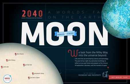
This is the “Moon” website or page from the Lost World’s Fairs website project designed by Jason Santa Maria.

I love this design for “Moon”, the visual depth is really nice. I also love the movement as you scale your browser window down and then back up. The little illustrations are sweet too. It’s really hard to believe this is done with web fonts.


5 Things Magicians Can Teach You About Blogging

09 Sep

At some level, blogging is really just a stage show. We, as bloggers, are up on a virtual stage giving a performance that goes on for as long as we run our sites. Whether it is a stand-up comedy routine or a serious academic lecture, we’re talking to the world and hope that our audience, no matter how large or small, will listen.

On that front magicians are masters of the stage show. Using nothing but a few tricks, which can range from very simple to unbelievably complex, their charisma and whatever effects they have at their disposal, they have to keep a difficult audience entertained and enthralled through their entire act.

So maybe magicians can teach us bloggers a few things about showmanship and how to keep our audience glued to the screen, no matter what type of site we are trying to run.

On that front, here are five tips virtually any magician can tell you that can help make your blog a little bit better.

1. Have a Catchy Name

Good marketing starts with a good name and magicians understand this. You can tell a great deal about a magic act based on just the name it goes by and magicians are constantly honing and improving their brand by seeking publicity and getting their well-chosen name out there by any means necessary.

Application: Spend some time coming up with a good name that is easy to spell and pronounce but is also unique and describes what you are trying to do. Then, promote that brand vigorously and stand by it unless you have some urgent need to change.

2. Dress 1 Step Above Your Audience

Magicians have a general rule that one should dress one step above their audience. If you are performing in front of a completely casual audience, they will wear business casual, if the audience is business casual, they will dress in a suit, if the audience is wearing suits, they’ll wear a tux. The reason is that this gives the performer a sense of authority while making them approachable and relatable.

Application: Your dress is your writing and your language. Try writing your content one small step above what your audience would write, making it more authoritative than casual writing but still easily understood and approachable.

3. If You Mess Up, Be Honest, Break the Tension and Move On

Mistakes happen and when a Magician goofs they do so in a very public way. However, magicians rarely try to hide their mistakes, especially if they know their audience has caught on. Instead, they’ll admit to the mistake, go for a joke to break the tension and then move on quickly and confidently.

Application: Going for the joke may not always be appropriate but when you goof on your site you need to acknowledge the error, end the tension quickly (either with an apology, a joke or whatever is appropriate) and then move on. Don’t linger on your mistakes once you’ve dealt with them.

4. Make People Look Where You Want

Half of magic is about diversion and drawing attention where the magician wants it. A majority of magic tricks wouldn’t work at all if the audience was not looking at the right spot while the trick part takes place out of view. Magicians achieve this by using motion, colors, lighting and anything else at their disposal to distract and direct the audience to their will.

Application: Tell the readers what you want to look at, use subheads, lists, tables, images and other things that draw the eye to make them look at the information you deem most important. Use such tools sparingly, otherwise the eye doesn’t know where to go, but don’t force your readers to figure out what’s important on their own.

5. Know Which Secrets to Keep

Magic thrives on secrets. As the TV character Jonathan Creek was fond of saying, once explained what was once magic becomes mundane. Magicians keep their secrets closely guarded to keep the illusion of their tricks being actual magic. Though the illusion is fleeting, most people realize magic is just an illusion, the ability to deceive oneself for a moment is an important part of enjoying the show.

Application: Blogging isn’t nearly as secretive as magic but you do have to think long and hard about what information you want to give away and what you don’t. You need to ask yourself what information will help your readers better enjoy or learn from your site and what will confuse and complicate things needlessly. Keep the secrets that you need to in order to stay on target and be effective, don’t try to throw everything out.

Bottom Line

Though magic and blogging have many differences, blogging involves significantly fewer rabbits for one, there are definitely enough similarities so that we bloggers can pick up a few pointers, especially when it comes to keeping our audience entertained and informed.

It might be easy to not think of blogging as a public performance but, in reality, that’s exactly what it is, the most public kind of performance possible and the fact that it merely writing, audio or video doesn’t mean that many of the same rules don’t apply.

So let’s listen to the magicians, they might have a lesson or two for us.


Copyright © 2010 Blogging Tips. This Feed is for personal non-commercial use only. If you are not reading this material in your news aggregator, the site you are looking at is guilty of copyright infringement. Please contact us so we can take legal action immediately.

5 Things Magicians Can Teach You About Blogging

Blogging Tips Books
A selection of e-books to help you improve as a blogger. Find out more at www.bloggingtips.com/books/


Starbucks Is the First Brand to Reach 10 Million Facebook Likes

14 Jul

Starbucks became the first brand on Facebook to collect a fan base of 10 million on Wednesday. This growth comes on the heels of Lady Gaga becoming the first person to gather the same number of fans.

Starbucks has undoubtedly been one of the most successful brands on Facebook, partly due to the store’s popularity and ubiquitousness, but also because the company maintains a very active presence on Facebook.

The company’s audience of 10 million people around the world has been hard won with marketing, promotions and advertising. Over the years Starbucks has given away free ice cream on Facebook, been recognized by Facebook and was also the most popular brand.

The Page is consistently one of the top 20 fastest growing Pages, as evidenced by our weekly posts showing the number of fans added to the Pages with the aid of our PageData tool. And Starbucks consistently has an update or promotion for every occasion.