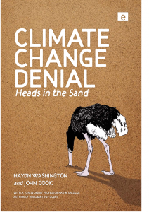
 It would not surprise me if the denialists would deny the existence of the new book by Haydn Washington and John Cook (skepticalscience.com) ‘Climate Change Denial: Heads in the Sand‘. Somehow, I don’t think they will read it – but they are not target group of this book either. Anyway, denialism is, according to the book, a common human trait – we should all know somebody who deny one thing thing or another.
Furthermore, denial is not the same as being skeptical, either, and Washington and Cook argue it is quite the opposite. Hence, the term “skeptics†for these deniers can be described as Orwellian “doublespeakâ€â€œnewspeakâ€.
Denial is apparently caused by our lizard brainstem. What coincidence then, when talking about fossil fuels from plants from the era of huge long dead lizards (the fossil fuels are not made of the dinosaurs), that denying evidence for anthropogenic global warming (AGW) is linked to that lizard part of the brain. So, what about using the labels ‘reptiles’ or ‘dinos’? Washington and Cook opt for ‘deniers’, and so will I hereafter.
‘Climate Change Denial’ is a useful book and resource for those with an open mind – for instance journalists. It reads easy and provides a fairly concise picture of the situation many of climate scientists have to live with.
The book makes many good points, but I’d like to add some of my own thoughts. Many of the deniers dress up in a scientific cloak, but if the criteria of science is Replicability (‘R’), Objectivity (‘O’), and Transparency (‘T’) (remember ‘ROT’), then any rotten argument should easily be discarded. If there is any substance to the counter claims, then there should be no problem replicating these with objective methods, and similar data (science is only interesting if the results are universal). I have tried to get some denialists to show me their method and data, but end up being told that I’m stupid.
One problem is that there is no good public stage for evaluating claims by applying ROT – Internet is just too vast and disorganized, in addition to being limited to people active on the Internet. But books as this are one contribution to examining the claims.
â€Climate Change Denial’ discusses the most common set of denial arguments. When Washington and Cook address the precautionary principle, they provide some examples. They could equally have mentioned that the precautionary principle is used very selectively and inconsistently – such as WMD in Iraq.
I think the discussion about the scientific method, consensus, and basic climate science may be useful for many readers. The book explains that consensus arises when there is a most convincing explanation for the conditions we see – this is often twisted and put on its head, and denialists think that the explanation follows the consensus, exposing ignorance about fundamental aspects of science.
One of my own favorite criticisms of the deniers is their use of dogmatic reference to various texts (described as “cherry picked†in the book) and repeat this claim over and over again. Although repeating it doesn’t make it more true, it’s a cunning way to drive in their message in people’s mind – just like cramming or training. This behavior also shows that there is no dialogue, as any counter argument is almost with out exception neglected. This in addition to making completely illogical connections.
The discussion about the climate science is fairly brief, but I think that the book would have been even more convincing by citing more broadly, rather than keeping referring to a handful of central people. It would be good to show the vast volume of work done in climate science supporting the concept of AGW, as some names (and the IPCC) are getting a bit worn over time through having their work (only) seemingly tarnished by the denialist camp.
The discussion about feedbacks provides a useful list of amplifying or dampening mechanisms playing a role for an AGW, but I missed three dampening feedbacks. Furthermore, ‘negative’ feedbacks in various systems work may be either through reducing the effect of an initial forcing (the black body feedback, lapse rate feedback), or by keeping the state near an optimal state (oscillator, ‘Gaia’-hypothesis, thermostat-type).
For either case of negative feedback, I think it would be a challenge to explain how a planet could sustain a GHE if you consider one with no atmosphere and gradually add a greenhouse gas. This way of analysing the situation is a bit similar to some approaches for solving physics problems, such as estimating the velocity of satellites around the earth by assuming that it’s initially very (infinitely) far away and assuming that loss in potential energy equals gain in kinetic energy. Similarly, if the earth starts with as little atmosphere as the moon, and that it gradually gets thicker and more extensive, how sensitive would the surface temperature be to the gas concentrations if the sensitivity was very low? Or does the fact that earth’s surface is about 30C warmer than if it had no atmosphere mean a more substantial sensitivity – even when the forcing is proportional to the logarithm of the CO2 concentrations? And what about Venus’ hot surface?
Some feedbacks are non-linear, and some act with a time delay (in many systems, that often gives rise to spontaneous fluctuations). I found it surprising that the book discussed a runaway greenhouse effect, but this concept is hardly being discussed – as far as I know – in the research community. Again, I think the book draws on a small number of scientists.
Washington and Cook refer to two studies demonstrating the different view of AGW in the climate research community and the general public. Whereas 97.5% of the (active) climate research community thinks AGW is a real problem (Doran and Zimmerman, 2009), only 58% (Gallup, 2009) of the general society shares this view. This is a really serious situation of great concern. They also list a number of reasons why this may be so. I think they do have a point, but I also think that there are other reasons too. In fact, I wonder if this is not what one would expect, given the circumstances? This question is relevant for their discussion of the ‘deficit model‘. The question is whether the society’s knowledge about AGW is really the major hirdle – which Washington and Cook argue that may not be so, but rather due to our denial.
On the other hand, the amount of effort and work dedicated into communicating our knowledge about our climate has been really tiny! Most scientists are mainly doing other things. Communication has perhaps not been sufficiently valued and not been regarded as an important job. Such activities have in the past not been well coordinated and may have suffered from lack of collaboration, as many scientists often compete with one another for the same funding. In other words, too little resources, too little collaboration, and lack of training (The IPCC report do not reach the masses, but seem to be written by scientist for scientists).
The present situation also suggests that the denial campaign have been hugely successful – due to a well-funded propaganda campaign according to Oreskes and Conway. Communication is probably more important than we think – just consider the fuzz around “Climategateâ€, Wikileaks, Al Jazeera, and the effect of social media in recent days in North Africa.
Although not said explicitly in the book, science must become more ‘domesticated’ in order to make progress. ‘Climate Change Denial: Heads in the Sand‘ is a step in this direction. Science should be something that everybody feel an ownership to and that is relevant for everybody, not just the elite (this is discussed in more detail by Chris Mooney). The deniers campaign may have been successful at increasing the gap between science and the society even further.
There is also the fact that way too little has been done regarding mitigation and adaptation, and too few people work with these issues. So when top politicians travel around to international climate summits, but provide little funding for work on mitigation and adaptation – that really is double communication. Washington and Cook call it ‘governmental denial’. I see some irony in this – at a recent conference (Carbononiums), the Norwegian minister of environment denied that the AGW-deniers matter, as well as that any influential politician denies AGW.
The last part of the book discusses economy, philosophy, politics, and solutions to the climate problem. I think that this part compliments a similar discussion in Paul Epstein and Dan Ferber’s recent book ‘Changing Planet, Changing Health‘, as I don’t think their list is completely exhaustive. Their message about philosophy seems to be that post-modernism has been widely misunderstood, and I gather that too many journalists have got too strong a dose of post-modernism in their journalism education (balance aspect).
What is really needed, I guess, is that they keep in mind ROT and try to examine the evidence for the different views. Basically, do some work rather than just reporting the disagreement in a superficial fashion. I’d urge journalists to act more like detectives and examine the logic of the claims- what is really behind the argument? I can’t imagine post-modern detectives and lawyers.
The book also discusses overpopulation and geo-engineering – for more detailed discussion on the latter, I’d recommend Flemmings recent book ‘Fixing the sky’. Regarding overpopulation, Washington and Cook refer to Paul Ehrlich’s book form 1968 ‘The Population Bomb’, and states that the impact from overpopulation is the product of population × affluence × technology. The validity and usefulness of this equation is debatable.
The last chapters in Washington and Cook book provide a more subjective and compassionate discussion about climate change – which I think also is important. They argue about the urgency in fixing the world’s climate and environmental problem, and suggest a number of solutions, and touch upon the materialistic values (a bit like TheStoryofStuff), and discuss the need to reset our values (perhaps a bit like “Yes Men fix the world“). Their views are sure to cause provocation in some quarters. Nevertheless, I think that these chapters provide a nice complementation to some of the discussion provided in Epstein and Ferber’s book, who also discuss things like wedges, smart power nets, etc.
None of these books discuss possible ‘multiplicative effects’, where several factors proportionally increase the effect. For instance, if more effective cars only use 70% of fuel, the portion of fossil sources for energy use is adjusted down to 80%, smart planning and collaboration results in 4 people in each car (say 30%), and a ‘smart’ organization of the working week means less commuting (80%; TGIT), then combined effect of this can in theory give a reduction by 0.7 x 0.8 x 0.3 x 0.8 = 0.13. Likewise, a combination of increased efficiency at both ends of energy production and consumption can in principle result in an enhanced mitigating effect. Washington and Cook argue that we really need to get on with this work, as the AGW problem is an urgent problem: The longer we wait – the worse the situation.





 We’ve had fun with facetious Amazon customer reviews for a number of odd products, like the
  This thing looks kind of dopey. Not sure if it gets my vote yet.