RSS
 

Posts Tagged ‘showcase’

Showcase of Outstanding Responsive Web Designs

11 Apr

This showcase rounds up a collection of the most inspiring and outstanding examples of responsive web design. These websites not only look great at full scale monitor resolution, but are designed to gracefully scale according to the user’s screen size. Resize you browser, view the site on a smartphone, tablet or netbook and you’ll see the same design in a range of well presented formats.

What is responsive web design?

Screen resolutions

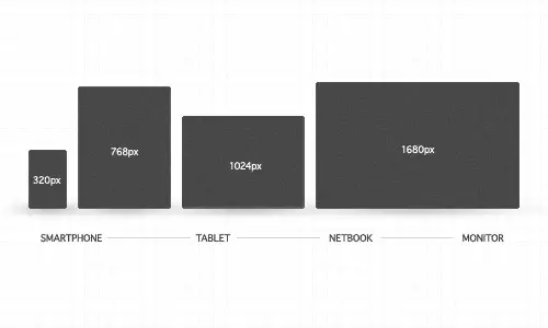
Websites are no longer viewed only on a computer monitor. Smartphones, tablets and netbooks throw a range of resolutions and different screen sizes into the mix for designers to now worry about. The idea of catering for various resolutions isn’t anything new. Back in the days of table based designs designers either chose the fluid or static route. Today’s responsive websites take a similar approach by using fluid widths in percentages and ems, but go a step further by using scalable images and adjustable layouts depending on the browser size.
To achieve this ‘scalability’, CSS media queries are used to apply different page styling according to certain parameters, such as min-width and orientation. The first step is to create a mobile version, but you could go on to customise your design for a range of resolutions.

Showcase of responsive web designs

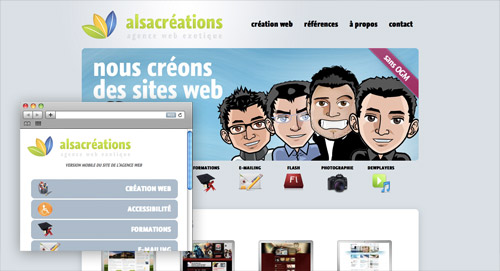
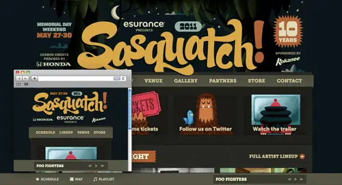
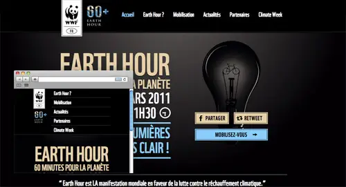
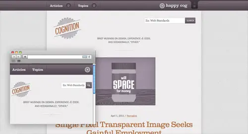
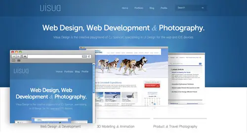
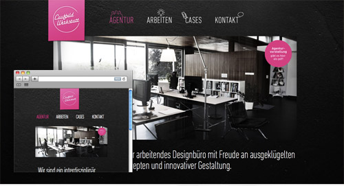
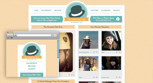
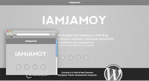
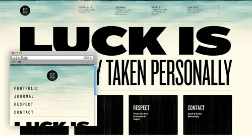
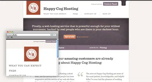
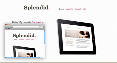
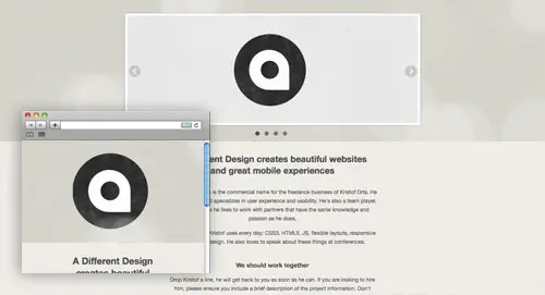
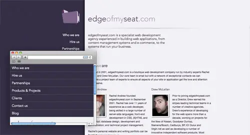
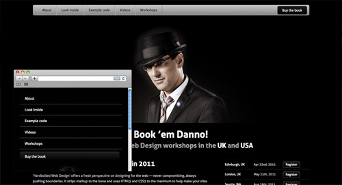
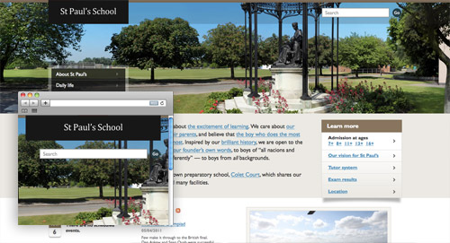
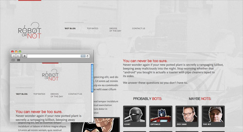
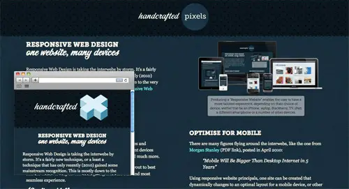
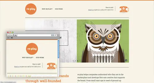
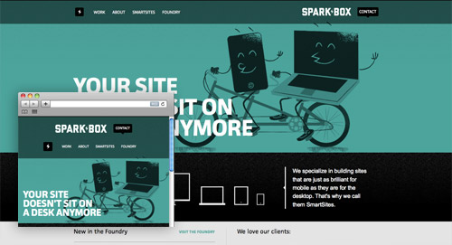
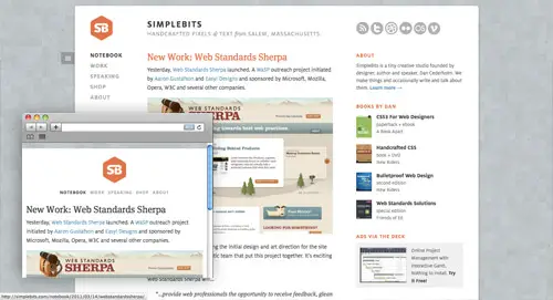
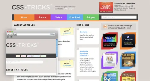
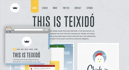
Ready for some examples? Here’s a roundup of 50 of the most outstanding examples of responsive web designs. Each one is displayed with a preview of both the full size website and an example of a small resolution, but to get the full experience be sure to visit the live site and play around with it yourself.

Alsacréations

View the responsive website design

Sasquatch Festival

View the responsive website design

Earth Hour

View the responsive website design

Cognition

View the responsive website design

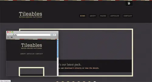
Tileables

View the responsive website design

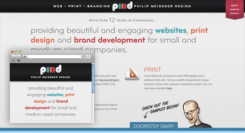
Philip Meissner

View the responsive website design

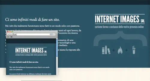
Interim

View the responsive website design

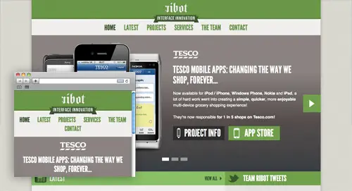
Ribot

View the responsive website design

Visua Design

View the responsive website design

Laufbild Werkstatt

View the responsive website design

Sweet Hat Club

View the responsive website design

iamjamoy

View the responsive website design

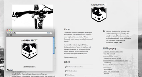
Andrew Revitt

View the responsive website design

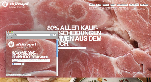
Stijlroyal

View the responsive website design

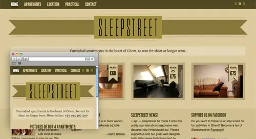
Sleepstreet

View the responsive website design

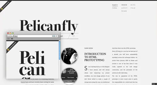
Pelican Fly

View the responsive website design

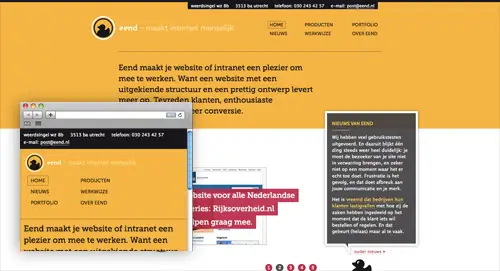
eend

View the responsive website design

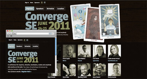
Converge SE

View the responsive website design

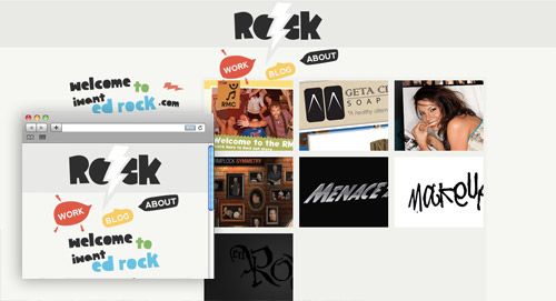
iwantedrock

View the responsive website design

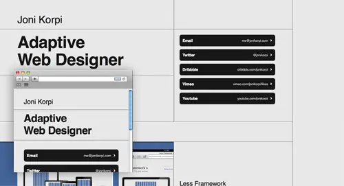
Joni Korpi

View the responsive website design

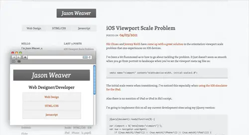
Jason Weaver

View the responsive website design

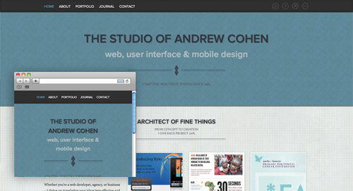
Cohenspire

View the responsive website design

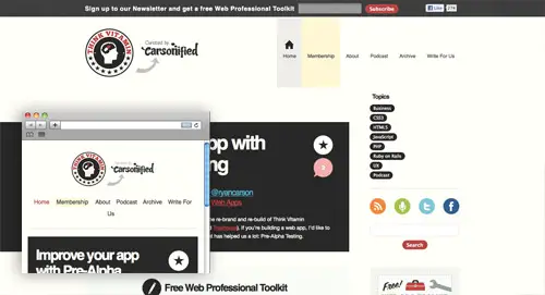
Think Vitamin

View the responsive website design

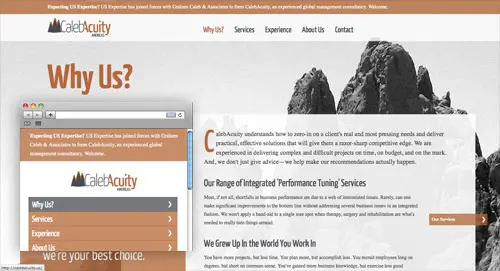
CalebAcuity

View the responsive website design

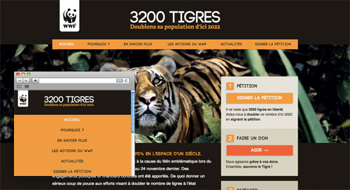
3200 Tigres

View the responsive website design

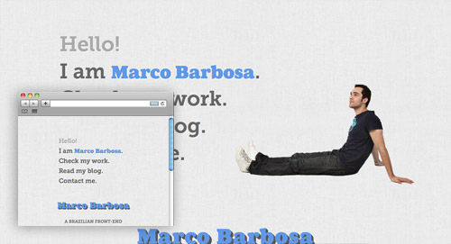
Marco Barbosa

View the responsive website design

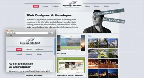
Jeremy Madrid

View the responsive website design

Lapse

View the responsive website design

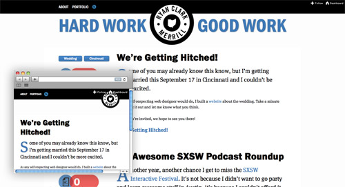
Ryan Merrill

View the responsive website design

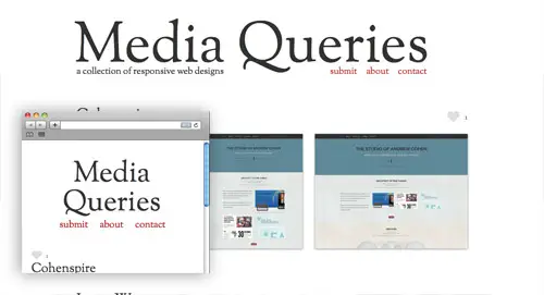
Media Queries

View the responsive website design

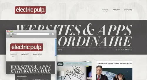
Electric Pulp

View the responsive website design

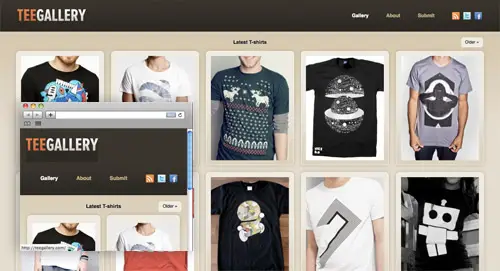
Tee Gallery

View the responsive website design

Stephen Caver

View the responsive website design

Happy Cog Hosting

View the responsive website design

Splendid

View the responsive website design

A Different Design

View the responsive website design

This is Texido

View the responsive website design

Edge of my Seat

View the responsive website design

Hardboiled Web Design

View the responsive website design

St Paul’s School

View the responsive website design

Robot… or Not?

View the responsive website design

Handcrafted Pixels

View the responsive website design

re:play

View the responsive website design

Sparkbox

View the responsive website design

SimpleBits

View the responsive website design

UX London

View the responsive website design

CSS-Tricks

View the responsive website design


A Look into Experimental Typography

15 Nov

To succeed as a graphic designer, you must be willing to take risks. This is a cutthroat industry where only the most creative survive. As such, the sooner you begin experimenting with your design elements and following your creative instincts, the more likely you will be to build up a solid client base.
One of the best ways to improve your work is by experimenting with your typography usage. In fact, in most design work, typography is the main attention grabber with the other design elements supporting that typography. The following are four ways you can begin experimenting with typography usage to improve your designs.

1. Go BIG or go Home

454606506_56e3a51a93_o4708477715_c1aabbfb9d_z

4964431571_d329d46eed_z

If you want your message to grab your audience’s attention and slap them in the face, then big is the way to go. Big, bold and thick typography attracts attention and demands to be heard. However, when experimenting with this typography trend, you must be strategic in the use of big lettering. Sometimes, using large typography creates an unintended interpretation and can even offend audience members. Therefore, test out this experimental usage on friends and colleagues before introducing the design to the general public.

2. Play with Emotions

259149357_5a9d0332dc_z2507264617_b2c9f04dda_z4306781399_7dd413c4d4_z

Colors can stir various emotions within the human mind. As such, a great way to experiment with your typography usage is to incorporate rich, vibrant colors that speak specifically to the emotions you want to call out in your audience members. Red is punchy, loud, and can stir up feelings of anger and lust, while blue is more soothing and calm and can play to the audience’s caring side. To be most effective with your use of experimental color, use it strategically and sparingly. Few things are worse than a color explosion that sends the senses of your audience members into overload.

3. Using Textures

The word no made from jigsaw puzzle pieces4121082019_6f5e072058_z

2229551316_0be3043c77_o

People enjoy viewing designs with interactive elements. While using this interactive element in print design can sometimes be difficult, one option is to incorporate textures into your typography usage. This textural effect can either be authentic, such as by using grainy paper, or it can be simulated by using a design program to create the effect of texture.

4. Improve on the Past

113569013_faed4e79cd_z

The history of graphic design holds many examples of the risks taken by early graphic designers. By looking to the past, you may discover ways to take those old- school trends and place a modern spin on them. Sometimes a mixture of the old and new is just what is needed to start a typography revolution. At the very least, these early designs can rev up your creative side.

The more you experiment with typography usage, the increasingly interesting methods you will find to draw in audience members and portray your intended message. You have chosen a career field that requires immense creativity and the willingness to take risks. Therefore, don’t be afraid to try new things. While using experimental designs poses certain risks, it also provides the chance to set your work apart from the design crowd and become a trend setter.
Sonia Mansfield is the content editor for PsPrint and editor of PsPrint Blog. PsPrint is an online printing solutions company, which you can follow on Twitter and Facebook.

Sponsored by

Made By Tinder

Advertise on Fuel Brand Network.
Fuel Brand Network 2010 cc (creative commons license)


A Look into Experimental Typography


22 Stunning Portfolio Designs for your Inspiration

20 Oct

A portfolio is a wonderful way to showcase artworks online and promote yourself. Here is a collection of exciting portfolio designs. The main aim of these websites is to draw users’ attention and attract potential buyers. Let’s have a look!

A online portfolio is a gallery of excellent and engaging artworks. It tells a lot about designer’s skills, his/her inner world and powerful imagination. It is also an act of communication and an effective tool for self-promotion. Portfolio is often the only thing a person sees before deciding whether or not to contact you. It can be various forms but the most successful and profitable one – is online-portfolio. We live in a digital age, so let’s take its benefits and create websites that are eye-catching, creative and accessible. Take the advantage of the Internet and showcase your works online, extend the borders and present your projects not only in a native country but also in the whole world.

The portfolio appearance is better when it has a minimal style, rich interactive elements and is easy to use. Frame your work in such unique way and provide a really unrivalled experience that can not only attract users’ attention but also show your capabilities as a designer, photographer or a simply talented artist. Don’t underestimate the role of a content, cause this part of the portfolio is really important. Let people know who you are and where you’re from. This is always not only interesting but also useful information, some clients prefer to work with people nearby or in the same time zone. And one more of the ruses – you can place your initials in the logo and in a such brainy way make a brand from your name :) .

If you are stuck with your first or next portfolio design and need new fresh thoughts, look through our showcase and we are sure that you’ll find inspirational ideas. This roundup features 22 original portfolio websites that present different styles, including illustrated, nature-inspired, textured, minimal style and others. Let’s have a look at this amazing artworks that are really worthy of your attention and time. Notice that every screenshot is clickable and leads to the website itself.

Daniel Gutierrez

Beautiful portfolio design with captivating chocolate layout, simple but neat grid-based gallery and cute paper kitten in the header.

daniel gutierrez

Go On Web

The following portfolio is created using HTML 5. Cloth imitating background that changes its color while you scroll is really stunning solution.

go on web

Snopp Media

Truly creative and lively portfolio design with funny faces in cardboard holes. It introduces Snopp Media in a sincere and outgoing manner.

snopp media

Thought & Theory

It’s amazing how some absolutely simple and unpretentious designs can be so much pleasant to look and high quality. Thought & Theory Portfolio is definitely among them.

theory

Joe Nyaggah

This portfolio is clean, simple and featured with some spicy details – great design. Orange owl grabs attention at the first sight.

Joe NYaggah

Squared eye

Professional portfolio features a list of clients this company has worked with.

squared eye

friendly duck

Beautiful portfolio with a grey layout and friendly funny duck with a thought balloon in the header.

friendly duck

Fuzzco

Clean and pleasant design with a creative header and changeable picture centred.

fuzzco

Kenny Meyers

Website uses big bold typography and vivid colors to give visitors memorable experience. Funny comic character in the header attracts attention at a glance.

kenny meyers

Puppetbrain

This portfolio website has very vibrant striking colors and a short friendly statement about what the agency offers.

puppetbrain

PSD to XHTML Conversion

The introduction block in the top of the page blend vivid imagery with big typography.

PSD to XHTML

DaZa

Horizontally centred layout with a scrolling text in the header.

daza

NEWRAFAEL

Portfolio with an amazing photo by Matthew Stone as a background.

newrafael

Mutant Labs

Stylish website portfolio with the button “follow us” in the right corner of the page.

mutant lab

Nosotros

Nosotros portfolio provides prominent data visualization and info-graphics.

nosotros

Camellie

Splendid, original illustration is the spice that makes this site look more than awesome.

camellie

Toy.ny

Bright colors and modest, minimal Flash animation which beautifully renders the typo, provide an enjoyable visual and content exploration experience.

toy

Fat-Man Collective

This portfolio website will win your sympathy immediately with its amusing Flash effects and creative content presentation.

love

Pirolab

A great number of stunning visual effects and all this beauty is without Flash.

pirolab

MopStudio

The appearance of this portfolio is everything but ordinary, creative Japanese web design.

MopStudio

Odd Web Things

This portfolio design stands out against the crowd of others. When pressing the mouse in the header instead of a number appears a cute picture, really unexpected solution.

odd web things

Booreiland

Booreiland’s portfolio gives users a perfect opportunity to jump through the sections on the website.

booreiland


25 Beautifully Colorful Websites – Part 3

14 Oct

Colorful websites are always a good source of design inspiration (See 25 Beautifully Colorful Websites, and 25 Beautifully Colorful Websites - Part 2). These 25 showcase designs make excellent use of color. Hopefully you’ll find at least a few for your own inspiration.
Byron Bay Schoolies

Byron Bay

Branded07

Branded07

Future of Web Design

Future of Web Design

Graphics.net

Graphics.net

Albert Lo

Albertlo

Macalicious

Macalicious

Work Sucks

Work Sucks

Alexandre Prado

Alexandre Prado

Total Eclipse

Total Eclipse

AIGA Los Angeles

AIGA Los Angeles

David Hellman

David Hellman

The Adventure of Cindy Li

Cindy Li

Twiggle Graphics

Twiggle Graphics

Recycle Now

Recycle Now

La Valle

La Valle

Jay Hafling

Jay Hafling

Volunteer Lawn

Volunteer Lawn

Colourpixel

Colourpixel

Fall for Tennessee

Fall for Tennessee

Alisa.mtv.ru

Alisa.ru

CakePHP

CakePHP

The English Riviera Comedy Film Festival

ERCFF

Shylands

Shylands

Gisele Jaquenod

Gisele Jaquenod

Soup Studios

Soup Studios

Mooty Graphic Design

Mooty

Please see some of our other inspirational galleries:


Copyright Vandelay Website Design.

 
Comments Off on 25 Beautifully Colorful Websites – Part 3

Posted in Uncategorized