
Nestled in bustling Covent Garden, the Royal Opera House is home to The Royal Opera, The Royal Ballet and the Orchestra of the Royal Opera House. In its third structural incarnation since 1732 — two previous buildings were burned in fires in 1808 and 1856 — the Royal Opera House is a preeminent international performing arts venue but, unfortunately, the same couldn't be said of its crest, which looks like it has survived its own set of fires.
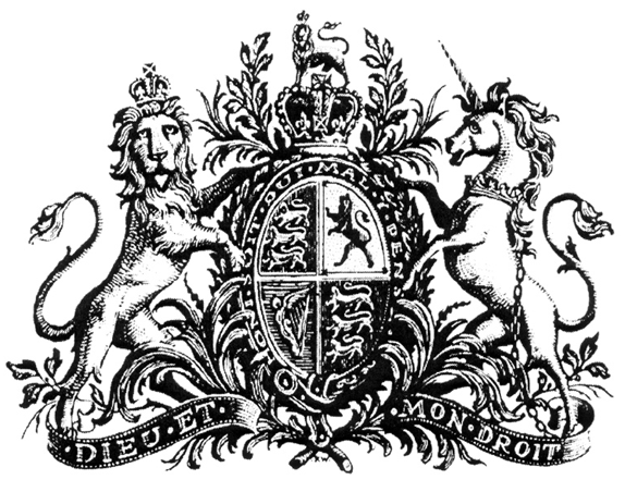
Old crest.

New crest.
The new identity has been designed by London-based SomeOne, who worked with master engraver Christopher Wormell to update the crest. Simon Manchipp, founder of SomeOne explains the challenges of the project:
1) The old royal crest was not digitally adept, it struggled to be clear at smaller sizes and wasn't elegant when employed on large scale applications.
2) The word mark typography only reflected the more classical side of the organization.
3) There were no firm rules for coherent design systems across the multiple messages given to their audiences.
We solved their issues with a re-cut royal crest designed to be equally elegant on both small and large applications. A new typographic approach based in the typeface 'Gotham' that updated the feel of the communications. Finally a series of design principles, grids and systems ensured that all the print, pixel and press applications join up in coherent and flexible branded applications.
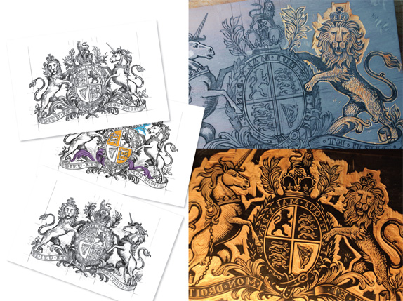
The bottom-right image, if you are wondering (as I was), is the woodblock itself with ink and ready to print.
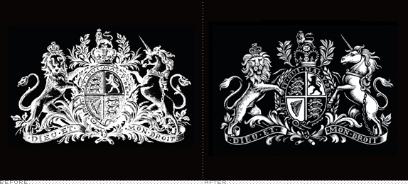
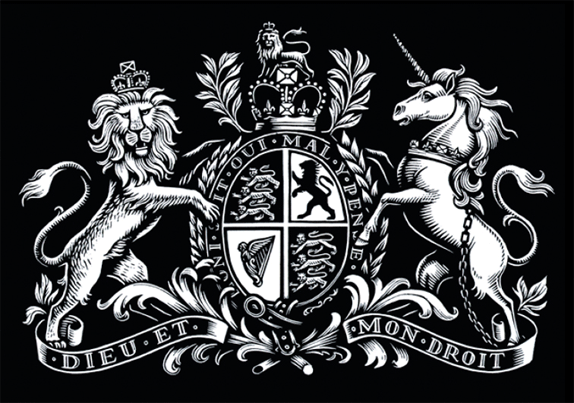

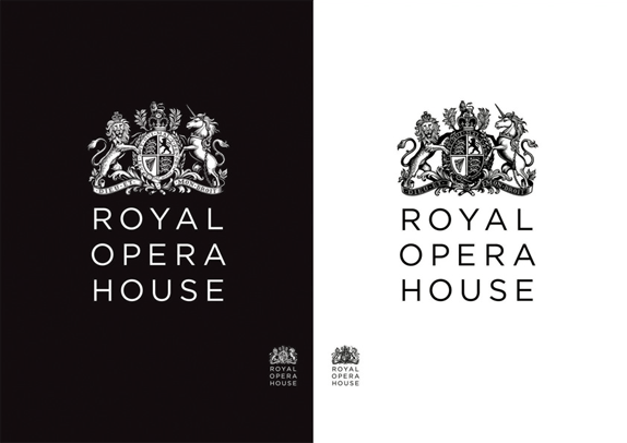
It goes without saying that the new crest is simply fantastic and I'm not one to easily compliment crests. The previous lion and unicorn looked as if Bambi had eaten their families and had nothing but droopy, sad eyes to show for it. The updated versions are proud and strong. And probably ate Bambi. My favorite aspect of it is that they created two versions, positive and negative, to use on light and dark backgrounds — instead of just inverting the positive version, as the old one did.
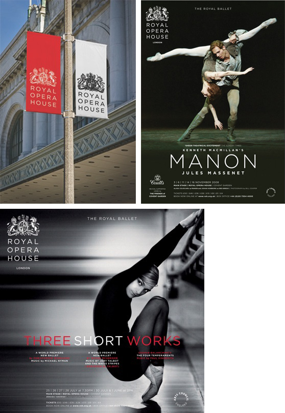
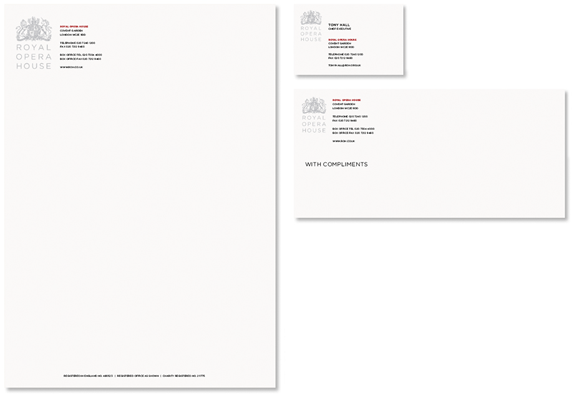
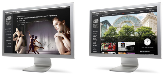
As striking as the new crest is, it would have been easy to screw it up with bad typography or poor use, but SomeOne has created a really sophisticated and contemporary identity that gives more prominence to the name of the venue and provides solid ground to build on the striking imagery of the performers. Set in one of the lighter versions of Gotham this is one of those instances where you forget you are looking at Gotham, because its use is subtle in the role of supporting actor, giving a new-fashioned twist to the old-fashioned crest. As whole, the identity is a very successful evolution of a centuries-old institution. Plus, the Queen agrees:
Naturally "The Palace" was consulted before anything went out, they very kindly granted the branding with Royal approval on the first proposal.

Don't forget to cast your vote about this post online
