RSS
 

Posts Tagged ‘Statistical Visualization’

Kill Math makes math more meaningful

05 Oct

Kill Math

After a certain point in math education, like some time during high school, the relevance of the concepts to the everyday and the real world seem to fade. However, in many ways, math lets you describe real life better than you can with just words. Designer Bret Victor hopes to make the abstract and conceptual to real and concrete with Kill Math.

Kill Math is my umbrella project for techniques that enable people to model and solve meaningful problems of quantity using concrete representations and intuition-guided exploration. In the long term, I hope to develop a widely-usable, insight-generating alternative to symbolic math.

As part of the early project, Victor developed a prototype interface on the iPad to help you understand dynamical systems. It probably sounds boring to you, but the video and explanation will change your mind:

Statistics has the same problem with concepts, and is one of the main reasons why people hate it so much. They learn about curves, hypothesis tests, and distribution tables, and the takeaway is that there are some equations that you plug numbers into. Sad. Of course there are plenty of people working on that, but there's still a ways to go.

[Kill Math | Thanks, Matthew]



Tweets per second during Bin Laden announcement

02 May

Osama Bin Laden

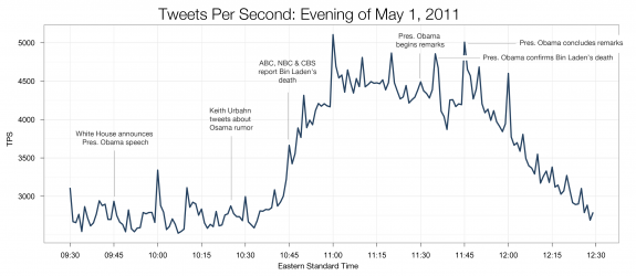
As I listened to my young neighbors run around the parking lot chanting, "U-S-A! U-S-A!" I glanced at my Twitter feed, and it showed a burst of similar sentiment. On the announcement of Osama Bin Laden's death, Twitter recorded the highest sustained rate of tweets ever, at an average of 3,000 per second. The above shows the progression from 9:30pm to 12:30am EST.

[Image Link via @nickbilton]


Watch the world get fatter over the past three decades

08 Feb

Weight of the world

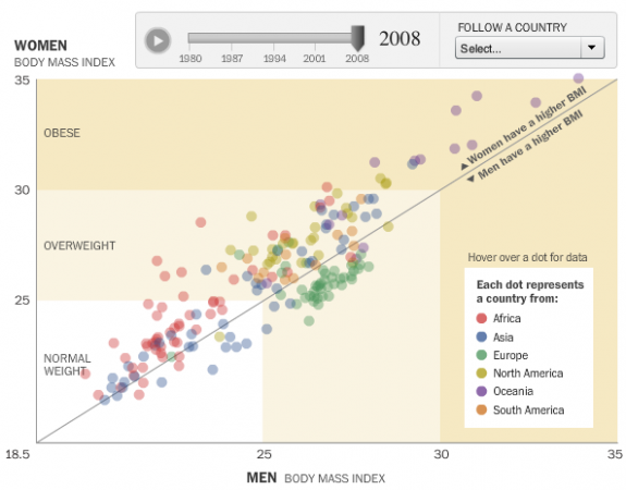
People are getting fatter everywhere. You know this. But there's nothing like the numbers to actually show how we're growing outwards and by how much. With this interactive, Wilson Andrews and Todd Lindeman, for the Washington Post, report:

With a few exceptions, the average body mass index in most countries has risen since 1980, according to a project that tracked risk factors for heart disease and stroke in 199 countries over 28 years.

Each circle represents a country, plotted by men's BMI on the horizontal axis and women's BMI on the vertical. Countries above the diagonal are countries where women have a higher BMI than the men, and vice versa for dots below the diagonal. Press play, and watch how BMI has changed from 1980 to 2008.

While all the countries are moving up and to the right, the Oceanic countries appear to have made the biggest moves over the past few decades, with several countries venturing into the obese BMI range.

Some European countries were actually making a move towards normal weight during the 1990s. Lays got the best of them though, and they could no longer eat just one. Damn you, Lays. I never win that bet.

[Washington Post via @hfairfield]

--
Learn data. Pre-order the FlowingData book.