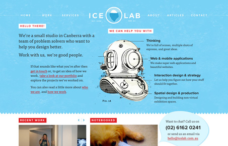
This is a really beautiful website, the colors and light textures mixed in with some great illustration work make for a super great experience. Looking at the experience of the site there are lots of great little spots that just shine, like the mouse over on the logo and the “back to top†link in the footer area. The sub pages have enough variance to keep it interesting too. Really great site.
Posts Tagged ‘typekit’
Top 5 Web Font Design Trends to Follow
The world of web fonts and web typography is exploding. After years of struggle, we’re finally at a point where using real fonts on the web is a viable option.
For web designers, this is huge news because it means a greater degree of control over how content is displayed. For end users, it means a richer web experience.
Thanks to web services like Typekit, Fonts.com Web Fonts, Webtype and others, the opportunities to integrate real fonts on the web is getting better all the time.
Let’s look at five of the biggest trends taking place with web font and web typography design.
1. WOFF as a Standard
The Web Open Font Format, or WOFF, is edging ever closer to becoming the de facto standardized format for using fonts on the web.
Backed by Mozilla, Opera and Microsoft, WOFF allows TrueType, OpenType or Open Font Format fonts to be embedded into web pages.
Right now, WOFF support is built into Firefox 3.6 and above, Google Chrome version 5 and above, Internet Explorer 9, and will be supported in upcoming versions of Safari.

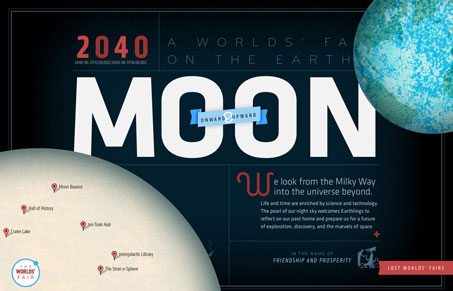
Jason Santa Maria and his Friends of Mighty built Lost World’s Fairs as a way to showcase IE 9 and its support of WOFF. This fantastic piece of typographic web art really shows just how great type can be made to look on the web.
2. Big Foundries Jump on Board
When Adobe announced that they were partnering with Typekit back in August, it was a big move. Historically, the biggest font foundries have led the resistance against getting fonts on the web.
Adobe’s decision was followed recently by the new company, Webtype, a partnership of Ascender, Roger Black and Font Bureau. Similar to Typekit, Webtype offers a way for designers or end users to get high quality fonts for use in their own designs.
Last week, Monotype Imaging formally launched Fonts.com Web Fonts and brought many of the most famous Monotype, Linotype and ITC font families to the web.
At this stage, nearly every major foundry is either offering fonts with web usage licenses or is considering making their fonts usable on the web. Eighteen months ago, that wouldn’t have been a reality. Today it is.
3. Better Letter Control with Lettering.js
When creating the Lost World’s Fairs project, Friends of Mighty realized they would need to have a way to better control individual letters and words to offer proper spacing and better kerning.
Thus, Lettering.js was born. Lettering.js is a JavaScript plugin that allows developers and designers to better control individual letters without having tons of messy markup.

As Dan Rubin recently remarked on Twitter, Lettering.js may just end up having a bigger impact on typography on the web than anyone is expecting.
4. Mobile Support
Fonts.com Web Fonts service and Typekit both offer support for multiple mobile browsers. This continues to increase as more and more mobile browser makers support various aspects of @font-face and draft specifications like WOFF.
It’s not just enough for fonts to look good on the desktop, as more and more web usage shifts to the smartphone, having readable, legible and properly spaced typography on mobile devices will be a bigger and bigger area of interest.
Already companies like Monotype and Typekit are working to make sure that fonts look their best on a number of different screen types and sizes.
5. Font Support in Web Apps
One of the most interesting recent advancements in the web font world has been the ability to choose web fonts when customizing an aspect of a web app. Thanks to Typekit and Google’s Web Font Directory, it’s easy for developers to build these tools into their product.

Already many Tumblr themes are coming with Typekit support and new web services like About.me give users the option to customize their typefaces for various aspects of their profile.
This is a great use of typography on the web because it gives end-users direct interaction with fonts and lets them see directly how different fonts look together and at different sizes.
Web typography is on a tear and we’re at the beginning of a new era of a more beautiful, more legible and more customizable web.
Series supported by Intel AppUpâ„ Developer Program
This series is brought to you by the Intel AppUpâ„ Developer Program, which provides developers with everything they need to create and then sell their applications to millions of Intel Atomâ„¢ processor-based devices. Learn more here.
More Dev & Design Resources from Mashable:
- HOW TO: Be a Hybrid Designer/Developer
- 6 New Mac Apps for Designers and Developers
- Flash vs. HTML5: Adobe Weighs In
- 10 Free Web UI Kits and Resources for Designers
- Top 10 Accessories for Typography Nuts [PICS]
Image courtesy of playgrounder.com
Reviews: Firefox, Google, Google Chrome, Opera, Safari, Tumblr, Twitter
More About: fonts, fonts on the web, monotype, typekit, typography, Web Design Trends Series, web fonts, webtype
For more Dev & Design coverage:
- Follow Mashable Dev & Design on Twitter
- Become a Fan on Facebook
- Subscribe to the Dev & Design channel
- Download our free apps for iPhone and iPad


