RSS
 

Posts Tagged ‘Ui’

Interaction Design Tactics For Visual Designers

09 Sep


Anyone designing Web-based properties today requires a basic understanding of interaction design principles. Even if your training is not formally in human-computer interaction, user experience design or human factors, knowing the fundamentals of these disciplines greatly enhances the chances of your design’s success. This is especially true for visual designers. Many visual designers are formally trained in art school and informally trained at interactive agencies.

While these institutions focus on designing communications, neither typically provides a strong interaction design foundation. Having a broader skill set not only makes your designs more successful but makes you more valuable and employable (i.e. you become the unicorn). While in no way exhaustive, to get you started, here are five key tactics to understand and implement in your next project.

A Graphic Designed Sculpture
Image credit: Kristian Bjornard

1. Talk To Your Customers

The most important thing to understand when designing an online experience is your audience. Understanding who they are, what they do for a living, how old they are, how they work, what they know about the Web, how they use it, on what devices, where and so on provides invaluable insight into their pain points that you are out to solve.

Setting clear constraints on your design also helps. For example, if your audience will predominantly be using mobile devices to access the Web in hospitals, then your design must be responsive to those devices and be compatible with the environments where the devices will be used. In addition, understanding your audience builds on a communication design foundation by revealing your users’ sensitivities (physical or cultural, for example) to things like color and typography.

Understanding your audience requires conversation with target users. These conversations can happen in a variety of forums. While impersonal approaches such as surveys work well enough, nothing beats face-to-face conversations with your customers. Depending on who you’re targeting with your work, finding your target audience may be as simple as going down to the local coffee shop, buying a handful of $5 gift cards and striking up conversations with the patrons there. Most people will gladly exchange 10 to 15 minutes of sharing their opinion for a coffee shop gift card. Other ways to find users are to post ads on websites like Craigslist, pull names off your customer lists, reach out to trade organizations (for specific user types, like nurses) and spend time in locations where your audience spends time (for example, music fans at a concert).

The initial conversations will be awkward, but as more and more take place, a rhythm develops to the questions. Also, patterns begin to emerge, allowing you to tailor the questions more appropriately with each interview. The lessons you take away from these activities can be used to create personas — i.e. aggregate representations of typical users of your design — that can help provide context to future design decisions.


A persona document. (Image: Todd Zaki Warfel)

2. Orient The User

Now that you’ve got an understanding of who your user is, orienting them when they use your design is important. Orienting your users gives them a sense of place in a non-static experience. To effectively provide that sense, your design should tell users three things:

  1. Where they are
    Critical to any online experience is understanding where, in the broader context of the website, the user is currently transacting. If it’s clear to the user where they are, then there is a greater chance they’ll understand what you need them to do on that page. For example, if the user is aware they are on a “product page,” they should expect to see a purchase link and perhaps some other product options.
  2. How they got there
    If providing clarity on the user’s current location provides context for expected actions, then showing them the path they took to get there provides a safety net. That safety net is the comfort of knowing that if the user has wound up in the wrong place, they can back out and try again.
  3. Where they can go from here
    You’ve made it clear where they are and how they got there; if they are in the wrong spot they can backtrack and try another path. But if they’re ready to move forward or they believe the path back won’t provide the content they desire, then letting your users know what options are available from this point on is imperative. Never leave a user in a dead end. There should always be an option to proceed. A perfect example of this is a search results page that yields no results. While you should let the user know that nothing matches their search query, there should be options that lead them to the answers they seek (for example, related search terms). Ways forward can be manifested in your website’s navigation but can also be implemented as affordances. Affordances are elements in the interface that are obviously clickable, such as buttons and sliders.

Amazon no results page
Amazon does a good job with its no-results page.

(For a great primer on affordances, pick up Don Norman’s The Design of Everyday Things. While a bit dated, it lays a solid foundation for how product designers should think about their products.)

Clear website orientation provides comfort to users. It also reduces the chances that users will make mistakes and increases the chances that, when they do, they’ll be able to recover quickly.

3. Simpler Is Better

Visual designers are driven to add elements to a layout that may be aesthetically pleasing but don’t necessarily serve an interaction purpose. While certainly much is to be said for aesthetics adding to the polish and feel of an experience, when designing an interactive experience, consider opting for simpler design. Simplification means reducing the elements on the screen down to the most basic ones, the ones that will facilitate the task that the user has to complete. Start with that as a baseline, and then add ornamentation sparingly. Consider the brand of the website. The brand is a reflection not only of the aesthetic but of the experience. If a website is gorgeous, but its beauty makes completing a transaction impossible, then the website (and brand) will ultimately fail.

Aesthetics will always have a place and powerful purpose in any experience, yet ensuring that the experience is usable first is critical.

4. Design For A Dialog

Where visual design training focuses primarily on communication, interaction design puts a heavy focus on feedback loops — in essence, a conversation between the user and the website. As you work out an experience, provide ways for the system to communicate back to the user when they’ve done something right or wrong. Ensure that your experience makes clear when the user has succeeded and when an action is required to complete a transaction. Use your visual design and communication skills to build a visual language for this feedback dialogue. Ensure that no matter where the user is in the experience, any information that is coming from the website is consistent in design and presentation method. Different types of information will require different treatments. The user will learn the system quickly, and a dialogue with the website will begin to occur. In essence, you’re humanizing the experience (and the company behind it) by proactively predicting your users’ needs and presenting information and actions that mitigate user frustration.

Think Vitamin
Think Vitamin keeps the conversation going with its readers.

5. Workflow: Understanding The Before And After

Visual design is beautiful. It’s also static. Interaction design builds a workflow from page to page and from state to state. As you design each page, consider what the user can do on this page and how the next step in the process fits into the workflow. If you’ve just added a sign-up form to the page, think about what will happen when the user presses the “Submit” button. Will the page refresh? Will there be a confirmation page? What if there are errors in the form? What if the user hits the “Back” button? These are all components of the workflow of the experience. Each page or state is just one small component in the user’s click stream. The challenge is that each user might have a relatively unique click stream, depending on how they got to your website and why they came. You’ve used your knowledge of the user to orient them, and you’ve provided a simple interface that creates a successful dialogue with them: now ensure that each interaction has a logical next step. That next step should fit into the experience and visual language that you’ve created, so that the experience feels whole and consistent. These elements are what add credibility to the brand and increase users’ trust in your design.

Bonus Tip: Understand Your “Materials”

Jonathan Ive, designer of the iPod (among other things), promotes the idea that designers of all types must understand the material they’re working with. This hold true for interaction design as well. Understanding the “materials” that make up the Web is critical. A cursory education in HTML, CSS, JavaScript and related technologies will only enhance your understanding of the medium and provide a realistic perspective on your designs. A great resource for this is the group of developers who will be implementing your work. Strike up regular conversations with them about your design, and get a taste of whether your proposals are feasible given the technologies they employ. Even better, start learning the basics yourself. You don’t have to become a star coder, but knowing enough about how the medium in which you work behaves can greatly shape the interactions you design.

Summary

Interaction design is a multi-faceted discipline that links static communications together to form an experience. Understanding the basic principles of this discipline is core to designing websites that are not only aesthetically pleasing but that actually solve business problems and bring delight to their users. This article just scratches the surface of interaction design. For Web designers of any kind, considering these fundamentals when designing any transaction or interaction is imperative.

(al)


© Jeff Gothelf for Smashing Magazine, 2011.


5 of the Best New User Experiences of 2010

28 Nov

Mashable Awards Image

As part of the ongoing Mashable Awards, we’re taking a closer look at each of the nomination categories. This is “Best Website User Experience.” Be sure to nominate your favorites and join us for the Gala in Las Vegas!

When it comes to user experience, designers and developers must do much more than present their users with a “pretty face” web page.

The user experience (UX) of a site or app involves much more than looks; the UX is something that lingers on after the user has left your site. It lies in ease of use, perceived value, whether desired goals were achieved and so much more. The user interface (UI) is only part of that larger experience, but it can contribute much to a user’s impression of the app.

In writing about the best web designs of 2010, form and function each played a large role in determining our choices. But when we think about user experience, function takes absolute precedence.

What sites and apps were the most interesting, the most useful, the most innovative of the past year? In this post, we examine five groundbreaking new UX/UIs from 2010 and discuss how each one expands our expectations of the user experience.


1. Quora


One of the earlier launches this year, Quora was a buzz-heavy private beta service in 2009. As a product of some of the best design minds at Facebook, the site was almost guaranteed to have an excellent UX from the start.

We love Quora’s elegant interactions. It looks simple; it prompts instant and easy engagement; and it takes the hide-and-seek elements of a Q&A site away, leaving the user with a trove of relevant information at his or her fingertips.

We’re not the only ones who love Quora’s design. For a bit of meta navel-gazing, read this Quora Q&A on why people like Quora’s design.

Initially, another thing that made Quora’s UX so excellent was the quality of its membership. Have a question about Facebook? A Facebooker would likely answer it. Questions about venture capital? Here are some actual investors to talk to you. Marketing? Ad execs were on the site, too.


2. Hipmunk


One thing we loved about Hipmunk from the start is that it took a traditionally bad user experience — airline flight search — and made it into a good one.

This startup reimagined the most important element of online flight search: how results are displayed. It took a convoluted, multi-entry/multi-exit process and made it simple to behold and linear to walk through, creating a user experience that is far from the stress-inducing nightmare flight search once was.

The company has also hinted it will be turning its eyes toward other types of travel services soon, possibly hotel search. We can’t wait.

To get the big picture, check out the video above, and the excellent interview blogger Robert Scoble conducted with Hipmunk co-founder Steve Huffman.


3. Seesmic Desktop 2


Seesmic launched a new iteration of its popular desktop app just a couple months ago. Dubbed Seesmic Desktop 2, the application also included an entire marketplace of plugins, making SD2 an all-in-one social media access point — a great set of features for run-of-the-mill social media narcissists, as well as businesses that need more control and monitoring tools for their web efforts.

Seesmic’s Silverlight-built, Mac- and Windows-compatible product also came wrapped in a gorgeous and functional UI with elegant and subtle details, making it a joy to behold as well as a pleasure to use.

During some turbulent times for third-party applications, Seesmic founder Loic LeMeur proved his very salient point: If you make a great product, build in great functionality, and give users a great experience, you can still build a business on someone else’s platform.


4. Flipboard


Flipboard launched this year as one of the first iPad apps that sought to reimagine social media for a new form factor.

The tablet gave designers and developers a chance to think about lean-back, glossy, high-end design experiences. Of course, magazines had a heyday; their content is already almost a perfect fit for the iPad. But when you think about social media content — those messy, spaghetti-like, intertwining and overlapping feeds of drama, irrelevance and the occasional gem — you begin to see what a challenge the makers of Flipboard had on their hands. Could social media be both beautiful and functional on a tablet?

Flipboard integrates personalized Twitter and Facebook feeds to build a social magazine for each user. In an initial review we called it “gorgeous and a pleasure to use,” and the app has continued to rack up the platitudes from social media junkies around the web. Its core value proposition is more than just its beautiful, mag-like design; it makes the experience of reading social feeds simpler, faster and better.


5. Roku


Without a doubt, 2010 has been the first big year for Internet-connected living room devices. We’ve seen cool things in the past from PlayStation, Xbox and Boxee; however, 2010 brought something new: affordability and ease of entry.

Roku’s set-top boxes start at just $60; already priced to win. Each model also comes with built-in WiFi and they are easy to install — they practically set themselves up. They connect to some of the most popular Internet content providers, including Netflix, MLB.tv and now Hulu, as well.

The Roku UI is simple, clean, bright and intuitive; it reminds us of the more user-friendly gaming interfaces, like that of Nintendo’s Wii. It’s a design language that says, “I’m not technical; I’m fun.” Very quickly, the design itself fades into the background and the content becomes all the user notices.

In a word, Roku’s UX is amazing because it makes something that was supposed to be complicated and scary (bringing Internet content to the living room) inexpensive, easy and a pleasure to use.


What Are Your Picks?


Those are five of our favorite user experiences from 2010; we’d love to know what impressed you this year. In the comments, tell us about the apps, devices and websites that you’ve loved using throughout 2010 or nominate them for a Mashable Award.


The Mashable Awards Gala at Cirque du Soleil Zumanity (Vegas)


In partnership with Cirque du Soleil, The Mashable Awards Gala event will bring together the winners and nominees, the Mashable community, partners, media, the marketing community, consumer electronics and technology brands and attendees from the 2011 International CES Convention to Las Vegas on Thursday, January 6, 2011. Together, we will celebrate the winners and the community of the Mashable Awards at the Cirque du Soleil Zumanity stage in the beautiful New York New York Hotel. The event will include acts and performances from our partner Cirque du Soleil Zumanity. In addition, there will be special guest presenters and appearances.

Date: Thursday, January 6th, 2011 (during International CES Convention week)
Time: 7:00 – 10:00 pm PT
Location: Cirque du Soleil Zumanity, New York New York Hotel, Las Vegas
Agenda: Networking, Open Bars, Acts, Surprises and the Mashable Awards Gala presentations
Socialize: Facebook, Foursquare, Meetup, Plancast, Twitter (Hashtag: #MashableAwards)

Sponsorships are available. Please contact sponsorships@mashable.com for more information.

Register for Mashable Awards Gala at Cirque du Soleil Zumanity stage (Las Vegas - 2011 International CES convention) [Ticketed Event] in Las Vegas, NV  on Eventbrite

Thanks to our sponsors:

Mashable Awards Gala Partner:

cirque logo From a group of 20 street performers at its beginnings in 1984, Cirque du Soleil is now a global entertainment organization providing high-quality artistic entertainment. The company has over 5,000 employees, including more than 1,200 artists from close to 50 different countries.

Cirque du Soleil has brought wonder and delight to nearly 100 million spectators in 300 cities on five continents. In 2010 Cirque du Soleil, will present 21 shows simultaneously throughout the world, including seven in Las Vegas.

For more information about Cirque du Soleil, visit www.cirquedusoleil.com

Mashable Awards Online Partner:

The Fresh DietHave you ever wished for your own personal gourmet Chef?

The Fresh Diet is like having a Cordon Bleu chef prepare your meals in your own kitchen. There’s no cooking, cleaning, shopping – just fresh prepared delicious meals, hand delivered to your door daily! Whether you want to lose weight or just want to eat healthy, The Fresh Diet can help you meet your goals. The best news, we’re giving away a FREE week of The Fresh Diet every day on our Facebook page. Just click here to become a fan and you could be the next winner. Join now!

Mashable Awards Partner:

Join us at the 2011 International CES®, the global platform for inspired ideas and innovation. With 2,500 exhibitors, CES continues to be the world’s largest consumer technology tradeshow and always reflects the dynamic consumer electronics industry. The International CES is not open to the general public and all attendees must be in the CE industry to be eligible to attend the show. Register FREE for the 2011 CES with priority code MSHB, an exclusive promotion for Mashable Readers.

Mashable Awards Category Sponsor:

Research In Motion is a leading designer, manufacturer and marketer of innovative wireless solutions for the worldwide mobile communications market. Through the development of integrated hardware, software and services that support multiple wireless network standards, RIM provides platforms and solutions for seamless access to time-sensitive information including email, phone, SMS messaging, Internet and intranet-based applications including the BlackBerry® wireless platform and the new BlackBerry PlayBook. For the latest on the BlackBerry PlayBook visit the Inside BlackBerry Blog.


Win an iPad!

Join us on Facebook to learn how to enter Dynadot’s I Can Haz iPad Giveaway!

Dynadot is an ICANN accredited domain name registrar and web host where you can register the perfect domain name affordably, reliably, simply and securely. Whether you are a blogger, business owner, or planning on creating the next best Internet meme you need a domain that represents you. Let Dynadot help you establish your web identity today.


Mobile Future is a broad-based coalition of businesses, non-profit organizations and individuals interested in and dedicated to advocating for an environment in which innovations in wireless technology and services are enabled and encouraged. Our mission is to educate the public and key decision makers on innovations in the wireless industry that have transformed the way Americans work and play and to advocate continued investment in wireless technologies.

Our “Mobile Year in Review 2010” animation proves a glimpse into the most notable breakthroughs in the wireless industry this year.


Yahoo! is an innovative technology company that operates the largest digital media, content, and communications business in the world. Yahoo! keeps more than half a billion consumers worldwide connected to what matters to them most, and delivers powerful audience solutions to advertisers through its unique combination of Science + Art + Scale. Yahoo! is headquartered in Sunnyvale, California. For more information, visit the company’s blog, Yodel Anecdotal.

Mashable Awards Gala Silver Sponsor:

Aro Mobile is an intelligent mobile experience that includes better email, connected contacts, smarter calendar and improved browsing.

The Aro system automatically learns what’s important in your life—the people, places, dates and organizations you care about most. In your communications, Aro automatically identifies people, places, events, dates,organizations and locations. From any recognized term, Aro offers quick action menus to speed up your day.

The unique Aro experience is powered by advanced web services: next generation natural language processing and semantic data analytics services. Aro gives you the power to see through the clutter and focus your mobile life.


Research In Motion is a leading designer, manufacturer and marketer of innovative wireless solutions for the worldwide mobile communications market. Through the development of integrated hardware, software and services that support multiple wireless network standards, RIM provides platforms and solutions for seamless access to time-sensitive information including email, phone, SMS messaging, Internet and intranet-based applications including the BlackBerry® wireless platform and the new BlackBerry PlayBook. For the latest on the BlackBerry PlayBook visit the Inside BlackBerry Blog.

Mashable Awards Gala VIP Lounge sponsor:

Influxis image

Influxis specializes in the deployment of creative streaming solutions. Services include large scale deployment, mobile streaming, turn-key applications, and enterprise support with custom network options. With the unique combination of a worldwide network, knowledgeable developer support and nearly a decade of streaming media experience, Influxis is an essential partner to businesses, advertisers, developers, educators, and others who seek expertise in innovative streaming.

Mashable Awards After Party Sponsor:

Research In Motion is a leading designer, manufacturer and marketer of innovative wireless solutions for the worldwide mobile communications market. Through the development of integrated hardware, software and services that support multiple wireless network standards, RIM provides platforms and solutions for seamless access to time-sensitive information including email, phone, SMS messaging, Internet and intranet-based applications including the BlackBerry® wireless platform and the new BlackBerry PlayBook. For the latest on the BlackBerry PlayBook visit the Inside BlackBerry Blog.


Reviews: Boxee, Facebook, Foursquare, Hulu, Internet, Mashable, Seesmic, Twitter, Windows

More About: best user experience, best ux, Flipboard, hipmunk, ix, mashable awards, mashable awards 2010, quora, UI, user experience, ux/ui

For more Dev & Design coverage:


Useful Collection of Cheat-Sheet Desktop Wallpaper for Web Designers

07 Oct

Typical cheatsheets tend to be over-sized documents, far too large to be viewed in its entirety on a desktop and not too handy for the super-fast reference that is needed. To get the full benefit of any cheatsheat, your only real option is to print it out and keep it close at hand. Wouldn’t it be nice if there was an easier way, a quicker way. Of course there is – what good be handier than having a cheatsheet set as your desktop wallpaper? Always there for quick reference, no need to print it out and no need to scroll through an over-long document.

In this post we have rounded up a selection of cheatsheet wallpapers, in various sizes, covering various technologies, like CSS, HTML5, WordPress, Javascript and many more.

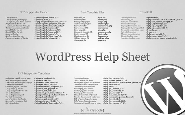
WordPress Help Sheet Wallpaper

WordPress Help Sheet Wallpaper
The WordPress Help Sheet Wallpaper is a simple desktop wallpaper listing Basic Template Files, PHP Snippets for the Header, PHP Snippets for the Templates, Extra Stuff for WordPress, based on the WPCandy WordPress Help Sheet.
Download: 2560x1600px.

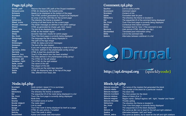
Drupal Cheat Sheet Desktop Wallpaper

Drupal Cheat Sheet Desktop Wallpaper
The Drupal Cheat Sheet Desktop Wallpaper is a desktop wallpaper that features the most popular variables of the open source content management system Drupal.
Download: 1024x768px – 1280x800px – 1440x900px – 1680x1050px – 1920x1200px.

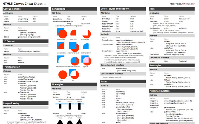
HTML5 Canvas Cheat Sheet

HTML5 Canvas Cheat Sheet
The information on this wallpaper is pretty much just a copy of what is found in the WHATWG specs, just condensed and a little bit easier to read. There are virtually no explanations, and no examples other than some graphics for compositing values. It's basically just a listing of the attributes and methods of the canvas element and the 2d drawing context.
Download: 1388x1027px.

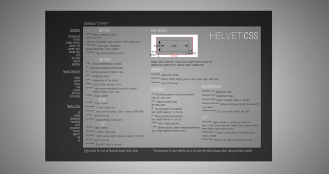
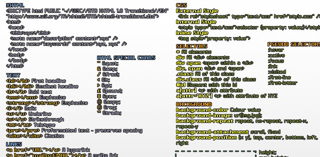
CSS Cheat Sheet Wallpaper in Helvetica

CSS Cheat Sheet Wallpaper in Helvetica
This is the very popular CSS cheat sheet in Helvetica from styl.eti.me. Simplistic in appearance, but very useful for quick referencing. Unfortunately we can not find a working download link for this cool wallpaper, but the good news is they do have a PSD version available. So download it and resize.
Download: CSS Cheat Sheet Wallpaper in Helvetica.

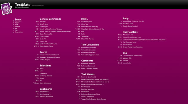
TextMate Shortcuts Wallpaper

TextMate Shortcuts Wallpaper
Here is a TextMate wallpaper that will guide you through some of its powerful features and help you get a handle on all of the keyboard shortcuts. The PSD file is also available.
Download: 1280x800px – 1920x1200px.

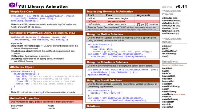
Yahoo! UI (YUI) Cheat Sheets as Wallpaper

Yahoo! UI (YUI) Cheat Sheets as Wallpaper
Yahoo! provides a number of cheat sheets for their YUI library widgets however these are all in PDF format and not usable as wallpaper. However, here you will find all of those cheatsheets converted to PNG images of various sizes all for your desktop.
There are wallpapers available for Animation, Calendar, Connection Manager, Dom Collection, Drag & Drop Event, Utility & Custom Event Logger, Slider and TreeView. And all are available in the following desktop sizes: 1400x1050px, 1280x960px, 1165x900px and 1024x768px.
Download: Yahoo! UI (YUI) Cheat Sheets as Wallpaper.

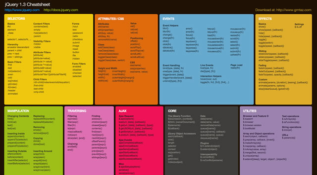
jQuery 1.3 Cheat Sheet Wallpaper

jQuery 1.3 Cheat Sheet Wallpaper
Download: 1440x900px – 1680x1050px – 1920x1200px.

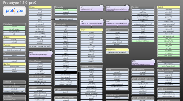
Prototype Dissected Wallpaper

Prototype Dissected Wallpaper
If you need a little help in getting to know Prototype a little better and some help in understanding how the code works, then this is the wallpaper for you. You have a choice of either a dark or white wallpaper, and are available in these sizes: 1280x960px and 1440x900px.
Download: 1280x960px (Dark) – 1440x900px (Dark) – 1280x960px (White) – 1440x900px (White).

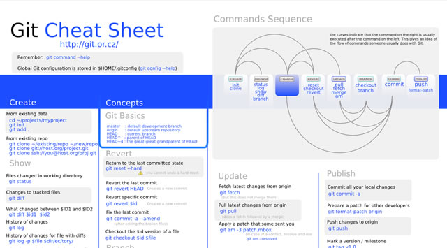
Git Cheat Sheet Wallpaper

Git Cheat Sheet Wallpaper
Download: 1100x850px – 3300x2550px.

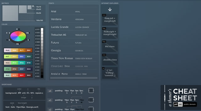
A Themer's Cheatsheet Wallpaper

A Themer's Cheatsheet Wallpaper
A Themer's Cheatsheet Wallpaper is a quick refresher of web design fundamentals directly on your desktop. It is available for download in several different colors and the original SVG has been released to the Public Domain.
Download: 1280x800px (Blue) – 1280x800px (Red) – 1280x800px (Black) – 1280x800px (Green).

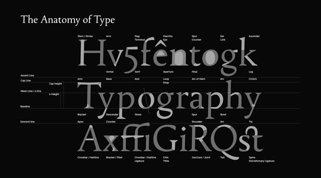
Font Anatomy Wallpaper

Font Anatomy Wallpaper
Download: 1920x1200px.

SEO Wallpapers

SEO Wallpapers
Think of it as a desk reference checklist that is always at your fingertips. From pre-campaign to reporting, the basics (and more) are right here for you to put directly on your desktop.
Download: 1024x768px – 1280x960px – 1280x1024px – 1440x900px.

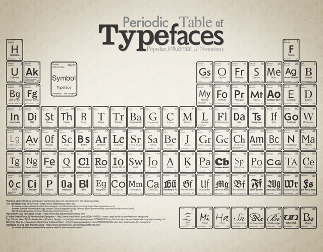
Periodic Table of Typefaces

Periodic Table of Typefaces
Download: 1024x768px – 1280x800px – 1280x1024px – 1440x900px – 1680x1050px – 1920x1200px.

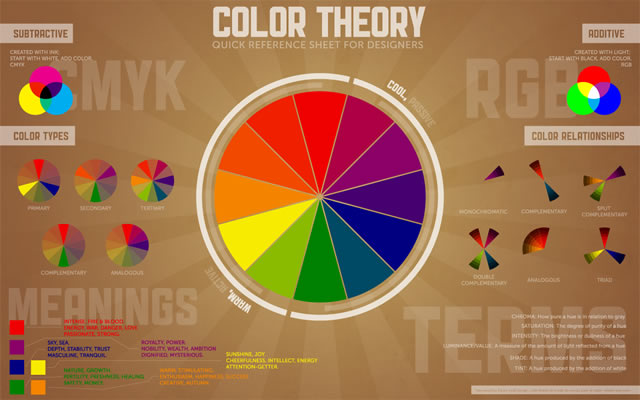
Color Theory Quick Reference Poster

Color Theory Quick Reference Poster
The Color Theory Quick Reference Poster for Designers has all of the basics of color theory contained in one place – specifically, a cool infographic-esque poster. This way, you can quickly reference things that may have slipped to the back of your mind since design school.
Download: 1280x800px – 1440x900px – 1680x1050px – 1920x1200px.

Web Designer Wallpaper

Web Designer Wallpaper
Download: 1280x1024px (White) – 1280x1024px (Dark) – 1680x10050px (Dark) – 1280x1024px (White).

You might also like…

14 Essential WordPress Development and Design Cheat Sheets »
17 Productive Photoshop Cheatsheets and Reference Cards to Download for Free »
The Best Cheat Sheets for Web Designers and Developers (From CSS, Ajax, Perl, Vbscript…) »
CSS References, Tutorials, Cheat Sheets, Conversion Tables and Short Codes »
20 CSS3 Tutorials and Techniques for Creating Buttons »
50 Useful Tools and Generators for Easy CSS Development »
50 Essential Web Typography Tutorials, Tips, Guides and Best Practices »
The Blueprint CSS Framework – Tutorials, How-to Guides and Tools »


17 Classic Car User Interfaces, Otherwise Known as Dashboards [Classic Cars]

10 Sep

Sure, your car dashboard may have a lot of cool buttons and computer displays, but chances are it lacks something that many classic cars have in abundance. A little something I like to call "style." OObject has put together a list of 17 classic cars (and even one new classic in the Audi TT) that fall into this classy category—cars like the 1906 Stanely Steamer (which looks like a friggin' time machine), the '58 Chevy Impala and the '57 Porsche 356 Speedster. [OObject]


Comments Off on 17 Classic Car User Interfaces, Otherwise Known as Dashboards [Classic Cars]

Posted in Uncategorized